Code Monkey home page Code Monkey logo

progress's Introduction

rc-progress

Progress Bar.

NPM version dumi build status Test coverage npm download bundle size

Example

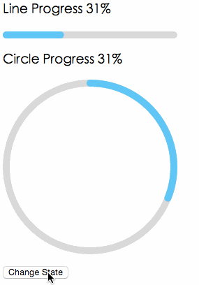
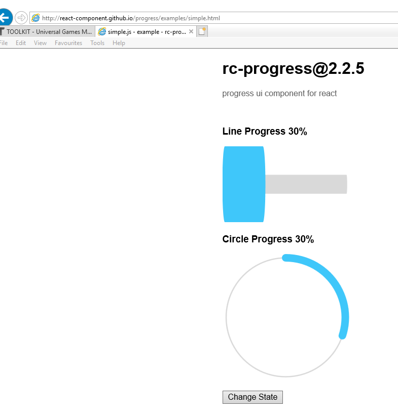
https://progress.react-component.vercel.app/

Screenshots

Browsers

  • support IE9+, Chrome, Firefox, Safari

Install

rc-progress

Usage

import { Line, Circle } from 'rc-progress';

export default () => (
  <>
     <Line percent={10} strokeWidth={4} strokeColor="#D3D3D3" />
     <Circle percent={10} strokeWidth={4} strokeColor="#D3D3D3" /> 
  </>
);

Compatibility

IE / Edge
IE / Edge
Firefox
Firefox
Chrome
Chrome
Safari
Safari
Electron
Electron
IE11, Edge last 2 versions last 2 versions last 2 versions last 2 versions

API

props

name type default description
strokeWidth Number 1 Width of the stroke. Unit is percentage of SVG canvas size.
strokeColor String #2db7f5 Stroke color.
trailWidth Number 1 Width of the trail stroke. Unit is percentage of SVG canvas size. Trail is always centered relative to actual progress path. If trailWidth is not defined, it is the same as strokeWidth.
trailColor String #D9D9D9 Color for lighter trail stroke underneath the actual progress path.
strokeLinecap String 'round' The shape to be used at the end of the progress bar: can be `butt`, `square` or `round`.
prefixCls String rc-progress prefix className for component
className String customized className
style Object style object will be added to svg element
percent Number | Number[] 0 the percent of the progress
gapDegree Number 0 the gap degree of half circle, 0 - 360
gapPosition String top the gap position: can be `top`, `bottom`, `left`, or `right`.

Installation

npm install --save rc-progress

Development

npm install
npm start

License

rc-progress is released under the MIT license.

progress's People

Contributors

afc163 avatar ajuner avatar benjycui avatar damiangreen avatar dependabot-preview[bot] avatar dependabot[bot] avatar hengkx avatar itispal avatar jediwattson avatar krolow avatar li-jia-nan avatar madccc avatar mjfwebb avatar paranoidjk avatar pencilcheck avatar preper avatar raohai avatar rjatkinson2 avatar shane935 avatar singlehcc avatar tsj1107 avatar vdh avatar wbt avatar wemyss avatar xrkffgg avatar yangzhedi avatar yesmeck avatar yiminghe avatar yykoypj avatar zombiej avatar

Stargazers

 avatar  avatar  avatar  avatar  avatar  avatar  avatar  avatar  avatar  avatar  avatar  avatar  avatar  avatar  avatar  avatar  avatar  avatar  avatar  avatar  avatar  avatar  avatar  avatar  avatar  avatar  avatar  avatar  avatar  avatar  avatar  avatar  avatar  avatar  avatar  avatar  avatar  avatar  avatar  avatar  avatar  avatar  avatar  avatar  avatar  avatar  avatar  avatar  avatar  avatar  avatar  avatar  avatar  avatar  avatar  avatar  avatar  avatar  avatar  avatar  avatar  avatar  avatar  avatar  avatar  avatar  avatar  avatar  avatar  avatar  avatar  avatar  avatar  avatar  avatar  avatar  avatar  avatar  avatar  avatar  avatar  avatar  avatar  avatar  avatar  avatar  avatar  avatar  avatar  avatar  avatar  avatar  avatar  avatar  avatar  avatar  avatar  avatar  avatar  avatar

Watchers

 avatar  avatar  avatar  avatar  avatar  avatar  avatar  avatar  avatar  avatar  avatar  avatar  avatar  avatar  avatar  avatar  avatar  avatar  avatar  avatar  avatar  avatar  avatar  avatar  avatar  avatar

progress's Issues

Set percent value from props error

Setting percent value from this.props calls the componentDidUpdate() automatically and the percent value gets set to undefined. Any idea why?

Progress bar and circle do not move

Hi,
The component looks great, but I have an issue with usage of it. I have imported rc-progress it in the project. For example I use it on the first page in react application, the progress indicator Circle is shown in grey color, but no movement is visible in the circle.

import { Circle } from 'rc-progress';
..........
in render method:

<div className="progressInd">
    <Circle percent="10" strokeWidth="4" strokeColor="#D3D3D3" />
</div>

Here is the HTML code produced by the Circle component in the browser page source:

here is what is rendered in the browser:
pi_issue

What could be the problem with the progress indicator?

Should increase stroke-dasharray

The higher the value for the stroke-dasharray the more accurate the progress bar is.

Try this value
10000

And have stroke-dashoffset be like
10000 - percentage

That would make it accurate

Throwing error when progress is 0?

import { Circle } from 'rc-progress';

ReactDOM.render(<div>
  <Circle percent={0} strokeWidth="4" strokeColor="#D3D3D3" />
</div>, container);

is throwing

Uncaught TypeError: Cannot read property 'style' of null
    at Progress.componentDidUpdate (enhancer.js:42)

complaining about this line

this.path.style.transitionDuration = '0.3s, 0.3s';

CSS for Initial Animation

paranoidjk commented 27 minutes ago

there is not a initialAnimate api, please see the api doc https://github.com/react-component/progress#api
If you want custom animate, just use css animation.

@paranoidjk, can you expand on what you mean by CSS animation? I am just looking for that initial animation when the progress bar goes from 0 to whatever the specified percentage is. Can you give me an example for the syntax? How would you add that initial animation to something like:

   <Circle percent="60.2" strokeWidth="5" strokeColor="#4b82b0" />

?

Thanks!

@afc163 @tsj1107 @yiminghe @pencilcheck @wemyss

Great! Now how do we stop it from scaling too large?

Thank you for making this great little component. I am looking for away to prevent the strokeWidth from scaling too large.

I attempted applying vector-effect="non-scaling-stroke" to the React created Paths but it appears to interfere with the pathStyle of the SVG element thus breaking the progress part of the ProgressBar.

Any ideas?

How do you get just a smooth circular animation from 0 to 100?

I tried to do this in two ways.
First way was to set it from 0 to 100 and then just change the speed of the transition. Except that didn't seem to work at all for me. Though I feel like this should achieve the best results since the transitions are smoother than a state update.

The second way was to make a state update loop to bring it from 0 to 100.
I'm doing this the way @matthlavacka is showing in #5

The problem is that it's not very smooth and it seems to have the issue of not updating the circular bar progress until it's at like 45%, not very smooth.

https://jwm.d.pr/xVGSJJ/iR4iQJnY5N
GIF

Here's a somewhat choppy gif showing what I mean. You can see that the numbers start updating before the bar does.

The reset button, aka, setting the state to 0, has a really smooth animation. When I try this with 100 it just glitches for .3 seconds and then appears green.
There must be a better way D:

Why are the dots appear while progress bar is working?

I use rc-progress 2.2.5. It appeared some dots on the down side of progress bar. I checked it in the last version of Google Chrome.
Look at screenshot via link.

My part of code in react application that uses rc-progress:
<Line percent={this.state.progressPercent} strokeWidth="1" strokeColor="#000" />

Circle no longer animates

When the value of percent changes from 0 to 100 it no longer animates when before it did:

<Circle percent={percent} strokeWidth="8" strokeColor="#fff" trailWidth="8" trailColor="#6b6767" />

Fast-progress decrease

Hello!
I'm using fast-progress with function to set timeout for decrease:
decrease = () => {
const percent = this.state.percentage - 1;
if (percent < 0) {
clearTimeout(this.tm);
return;
}
this.setState({ percentage: percent });
this.tm = setTimeout(this.decrease, 30);
}

All is ok. But, when «percent == 0» I see a short delay indicator. After some time it disappears. There is no smoothness. https://codesandbox.io/s/3x6p0w149m

Can you help me, please?

I’m sorry for my English. Thank you very much!

Firefox bug

In firefox, when circle percent 0 - stroke width it is still visible.

Gradient for 'strokeColor'

Are you able to put a gradient as the strokeColor? I've tried the standard way of writing it as the attribute but it doesn't work.

Using useMemo - Disaster for React 15.x

Refactoring progress with hooks seems like a breaking change. Was it appropriate to change version as 2.6.0? Application using React 15.x just crashed after installing new version of progress.

Requirement - Start point option

Hi, Thanks for the nice component. I need an extra option in the Line progress bar like "start and end" points. This progress bar always starts at 0. I need to option set like start from 20 to 55.
Thanks again.

Styles prop

It would be great to be able to pass a style object to the SVG.

Limit rc-rc-slider-track width if props.value goes out of bounds

Hi! Right now I'm setting an intervall of something like [0,100]. I've got a handle that is dynamically adjustable to a value, say 50.

However, if the slider value exceeds the max limit set by the handle, not slider, the progress bar will still adjust the width property according to the slider. Is there any way to limit the rc-slider-track to read and limit the progress styling to the max value of the handle in addition to the slider?

When using cap "square" or "butt" the pathstring d has offset that makes it not accurate

Basically the path data always makes the path starts somewhere half of the width of the stroke and I understand that works for circle but it wouldn't work for square or butt since it is basically adding offset to the beginning of the stroke and missing it up, so "5" percent looks like "15" percent.

Would propose to remove that. I can make a simple pull request for it if you want.

The progress bar in IE11 has redundant part with 0 percent

          <div className={getClass('progress-line')}>
            <Line percent={intPercentage} strokeWidth="6" strokeColor="#d3d3d3" strokeLinecap="square" trailWidth="0" />
          </div>
__progress-line {
  max-height: 30px;
  max-width: 100%;
  overflow: hidden;

  svg {
    max-height: 30px;
  }
}

screen shot 2018-03-23 at 12 09 22 pm

Bar at 50% doesn't look like 50%.

image

As you can see, a bar with these settings <Line percent={votePercent} strokeColor={styles.leftColour} trailColor={styles.rightColour} strokeWidth="5"/> where votePercent is 50 doesn't look at all like it's halfway. The two boxes above are both 100px wide and at equal distance from each other and the line. This is a bit weird, to be honest.

core-js version

Hello,

When installing rc-progress via yarn, I'm seeing the following error:

warning rc-progress > babel-runtime > [email protected]: core-js@<3 is no longer maintained and not recommended for usage due to the number of issues. Please, upgrade your dependencies to the actual version of core-js@3.

Could you please update this package's version of Babel? (Or release an updated version of this package on NPM, if Babel has already been updated in master?)

babel-runtime included in dist file

It seems to me that babel-runtime code is included in the dist file. Can it be excluded somehow? Personally, I do not need it in my bundle and adding rc-progress as a dependency adds a lot of overhead because of it.

I'm trying to understand why it is there and if there are ways to exclude it but so far no luck.

Screen Shot 2019-03-13 at 20 53 38

Recommend Projects

  • React photo React

    A declarative, efficient, and flexible JavaScript library for building user interfaces.

  • Vue.js photo Vue.js

    🖖 Vue.js is a progressive, incrementally-adoptable JavaScript framework for building UI on the web.

  • Typescript photo Typescript

    TypeScript is a superset of JavaScript that compiles to clean JavaScript output.

  • TensorFlow photo TensorFlow

    An Open Source Machine Learning Framework for Everyone

  • Django photo Django

    The Web framework for perfectionists with deadlines.

  • D3 photo D3

    Bring data to life with SVG, Canvas and HTML. 📊📈🎉

Recommend Topics

  • javascript

    JavaScript (JS) is a lightweight interpreted programming language with first-class functions.

  • web

    Some thing interesting about web. New door for the world.

  • server

    A server is a program made to process requests and deliver data to clients.

  • Machine learning

    Machine learning is a way of modeling and interpreting data that allows a piece of software to respond intelligently.

  • Game

    Some thing interesting about game, make everyone happy.

Recommend Org

  • Facebook photo Facebook

    We are working to build community through open source technology. NB: members must have two-factor auth.

  • Microsoft photo Microsoft

    Open source projects and samples from Microsoft.

  • Google photo Google

    Google ❤️ Open Source for everyone.

  • D3 photo D3

    Data-Driven Documents codes.