A theming engine for your Svelte apps using CSS Variables, persisted.
<script>
  import { ThemeWrapper, ThemeToggle } from 'svelte-themer'
</script>

<ThemeWrapper>
  <main>
    <h1>svelte themer</h1>
    <ThemeToggle />
  </main>
</ThemeWrapper>

<style>
  :global(html) {
    background-color: var(--theme-colors-background, initial);
    color: var(--theme-colors-text, initial);
  }
</style>
CSS variables are created for app-wide consumption using the nomenclature --[prefix]-[property!]
For example:
--theme-textby default whereproperty = 'text'--base-textwhereprefix = 'base'andproperty = 'text'--textwhereprefix = null || undefinedandproperty = 'text'
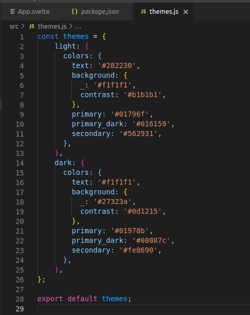
Now supports adding all theme colors as theme-specific CSS variables:
const lightTheme = {
  light: {
    colors: {
      text: '#282230',
      background: {
        _: '#f1f1f1',
        contrast: '#b1b1b1',
      },
      primary: '#01796f',
      primary_dark: '#016159',
      secondary: '#562931',
    },
  },
}
Turns into
:root {
  --theme-light-colors-text: #282230;
  --theme-light-colors-background: #f1f1f1;
  --theme-light-colors-background-contrast: #b1b1b1;
  --theme-light-colors-primary: #01796f;
  --theme-light-colors-primary_dark: #016159;
  --theme-light-colors-secondary: #562931;
}

[theme='light'],
.theme--light {
  --theme-colors-text: var(--theme-light-colors-text);
  --theme-colors-background: var(--theme-light-colors-background);
  --theme-colors-background-contrast: --var(
    theme-light-colors-background-contrast
  );
  --theme-colors-primary: var(--theme-light-colors-primary);
  --theme-colors-primary_dark: var(--theme-light-colors-primary_dark);
  --theme-colors-secondary: var(--theme-light-colors-secondary);
}Use the preset themes supplied by svelte-themer or create your own! Theme names are specified by the key, and all properties are transformed into CSS Variables.
NOTE: svelte-themer is preset with 3 themes to showcase the flexible functionality of toggle()
// src/themes.js
export const themes = {
  light: {
    colors: {
      text: '#282230',
      background: {
        _: '#f1f1f1',
        contrast: '#b1b1b1',
      },
      primary: '#01796f',
      primary_dark: '#016159',
      secondary: '#562931',
    },
  },
  dark: {
    colors: {
      text: '#f1f1f1',
      background: {
        _: '#27323a',
        contrast: '#0d1215',
      },
      primary: '#01978b',
      primary_dark: '#00887c',
      secondary: '#fe8690',
    },
  },
}With svelte-themer there are two components: a wrapper component, and a button for toggling themes. The provided button is more for convenience as the function used to toggle themes is exposed to the theme context.
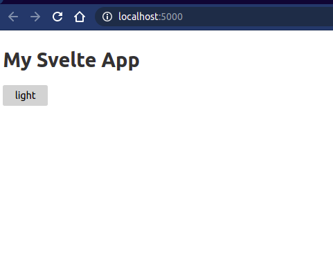
<!-- src/App.svelte -->
<script>
  import { ThemeWrapper } from 'svelte-themer'
  import themes from './themes.js'
</script>

<ThemeWrapper themes="{themes}">
  <main>
    <h1>My Svelte App</h1>
  </main>
</ThemeWrapper>
This allows any components nested to access the theme Context which wraps a writeable theme store
By default svelte-themer persists the chosen theme with localStorage, and can be modified via the key prop. To disabled persistence, provide key={null}.
<ThemeWrapper key="my-svelte-app__theme">
  <!--  -->
</ThemeWrapper>ThemeWrapper will load a theme on first visit based on the following order:
- User-provided - The value specified in the
themeprop. - Saved - User's stored choice (from
localStorage) - Prefers - User's Operating System settings (via
prefers-color-scheme) - Fallback - First theme in
themesspecified (from presets,light)
By default, the "prefers" step will choose a theme based on OS settings, however this can be modified to directly choose "light" or "dark" by leveraging the mode prop:
<ThemeWrapper mode="auto|light|dark">
  <!--  -->
</ThemeWrapper>Described below is the pattern used for accessing theme context to create your own toggle button.
<!-- src/MyToggleButton.svelte -->
<script>
  import { getContext } from 'svelte'
  let { toggle, current, theme } = getContext('theme')
</script>

<button on:click="{toggle}">
  <slot>{$current}</slot>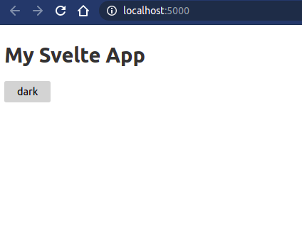
</button><!-- src/App.svelte -->
<script>
import { ThemeWrapper, ThemeToggle } from 'svelte-themer'
import themes from './themes.js'
</script>
<ThemeWrapper themes="{themes}">
<main>
<h1>My Svelte App</h1>
<ThemeToggle />
</main>
</ThemeWrapper><script>
import { theme } from 'svelte-themer/use'
export let myTheme = {
text: 'red',
}
</script>
<div use:theme="{myTheme}">
<p>Hello, World!</p>
</div>
<style>
p {
color: var(--text);
}
</style><script>
import { stylesheet } from 'svelte-themer/use'
export let myTheme = {
text: 'red',
}
</script>
<div use:stylesheet="{myTheme}">
<p>Hello, World!</p>
</div>
<style>
p {
color: var(--text);
}
</style>Refer to the contributing guidelines.


 React
React
 Typescript
 Django
 Laravel
 Facebook
 Microsoft
 Google
 Alibaba
 D3
D3
 Tencent