frappe / charts Goto Github PK
View Code? Open in Web Editor NEWSimple, responsive, modern SVG Charts with zero dependencies
Home Page: https://frappe.io/charts
License: MIT License
Simple, responsive, modern SVG Charts with zero dependencies
Home Page: https://frappe.io/charts
License: MIT License


![dependabot[bot] avatar](https://avatars.githubusercontent.com/in/29110?v=4 "dependabot[bot]")


Currently it is not possible to use this library with React (easily).
Some modifications are needed to use it.
I want to discuss what should happen in this repository and what not.
I already did small changes to use it as a simple React component.
import React, { Component } from 'react'
import PropTypes from 'prop-types'
import Frappe from 'frappe-charts/src/scripts/charts.js'

import 'frappe-charts/dist/frappe-charts.min.css' // to import styling

class Chart extends Component {
  componentDidMount() {
    const {title, data, type = 'bar', height = 250} = this.props
    this.c = new Frappe({
      parent: this.chart,
      title,
      data,
      type,
      height
    })
  }

  render() {
    return <div ref={chart => (this.chart = chart)}/>
  }
}

export default Chart
I created a demo repo for showcase: https://github.com/tobiaslins/frappe-charts-react-example
Drumroll please ... 🎉
So we've received an awesome contribution #28 by @sheweichun to add pie charts to the mix:
We were all for percentage charts, as they are easier to read and don't clump colors (probably the reason GitHub ignores them as well): http://www.storytellingwithdata.com/blog/2011/07/death-to-pie-charts

Even so, what does everyone think? 😃
Will help in case the bar is too small to click on, for example.

I'm using day/dates on the x axis and I'd like to indicate weekends some how. This could be done with some kind of axis options, but since specific y values exist, It seems like specific x would be the implementation path.
Here is what I'd kind of like:

Happy to work on a PR if someone could comment if it would be accepted, and maybe a basic outline of implementation? I'm guessing copying the specific y code wouldn't be too hard.
when I call import Chart from "frappe-charts"
Chart shall be a constructor

I think
import Chart from "frappe-charts" should be change like
import Chart from "frappe-charts/dist/frappe-charts.min.cjs.js"
or
add an index.js in root of this repo
npm install frappe-chartsimport Chart from "frappe-charts"const chart = new Chart({
parent: '#chart',
title: "My Awesome Chart",
data: data,
type: 'bar', // or 'line', 'scatter', 'pie', 'percentage'
height: 250
})Is there anyway to use the current api to display realtime streaming data, say append a value to the end and remove a value from the beginning?
Is it possible to set the max value of the Y axis? Maybe using the data.specific_values?
I think it's quite different than #34
I want to create a line chart that shows the variation of a ratio value through time. So, I want the max value to be 1.
But apparently, the max value of the chart is 8 by default.
I am still learning about the best way to present data. So, if someone has any suggestions for my scenario, I would appreciate it. (:
Hello there,
We are considering using Frappé embedded in our project and thus we'd like to see a list of chart options. Where could we find such list?
We found the examples and there we could find some options, but are they all options available to use?
Also, we would like to have more than two units laid on the chart and therefore more than two y-Axis would be needed. Is there any provision in Frappé for achieving this?
Yours truly,
Rodrigo
It would be great if this has native support for Angular by bringing in type definitions.
Kudos for a cool library 👍
EDIT: To make it more clear, I'm not asking for Angular wrappers. Just type-definitions, which would let me use the library without declare-ing constants all over the place in Typescript and killing the whole purpose of using Typescript. And as @harunurhan has mentioned below, it's also great for documentation as I can simply look up the definition file to know if a method or parameter is required.
Is it possible to format the value displayed in the tooltip?
e.g. 89 > $ 89.00

labels consisting of dates should be displayed temporally with appropriate distances between consucutive dates with gaps.
For example.
a graph with dataset of datasets: [{values: [1,2,10]}] looks the same regardless of if the labels are labels: ["2017-01-01", "2017-01-02", "2017-01-10"] or labels: ["2017-01-01", "2017-01-02", "2017-01-03"]
on the graph with the last date of 2017-01-10 should be set much farther apart and the slope between 01-02 and 01-10 should be much less.
NOTE: Add a GIF/Screenshot if required.


Frappé Charts version: 0.0.7
it has a k line chart
While reading the source, I have seen in many places (almost everywhere) where you use map on arrays to have forEach behavior even several times for reduce.
.map should be used when you want to transforming each items and then use this new transformed array.
Line 218 in 4bb44c0
It’s hiding the seventh day each week. Should be 115px.
When day area is clicked on heatmap chart, click handler callback fires.
Nothing happens. I have tried the following
      chart.parent.addEventListener('data-date', (e) => {
        console.log(e);
      });
Frappé Charts version:
0.0.4
e.g. chart.js
http://www.chartjs.org/samples/latest/charts/line/multi-axis.html
Don't see anything about require('frappe-charts') or import Chart from 'frappe-charts'
Is the only way to use this to have a script tag on the page and have a global Chart object?
Is it possible somehow to display scatter chart more as time series. The effect I would like to achieve is to distribute measurements in a more realistic visual way rather than stacking them on top of each other as it is in the example.
Just to clarify:
Currently, in the example if you have 5 values within the same hour they are displayed stacked on top of each other. What I would like is to display them according to the exact minute.
Thx.
The decimal number in y axis should be rounded to 2 digits
The decimal number has a long tail in y axis.
An array of 2 digits decimal numbers for datasets
*

Frappé Charts version: 0.07
Thanks for making the awesome frappe charts! :-)
Would be great if you could add possibility to show values above the bars like here:

It should have more color customization.
It also should have addons also.
I have a line chart where the minimum Y value is 10,000 and the maximum Y value is 13,000. It would be awesome if frappe automatically adjusted the Y values accordingly. It currently always starts at 0, creating a lot of empty space, and an uninteresting chart.
Thanks!
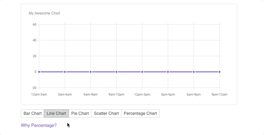
Should show zero

Hi, how can I set the default colors?
I have a color scheme that is used in the project, it's not very convenient for me to override the color of the meaning.
Is it possible to establish that the colors of the graphs will be taken from my polytyra. (Order is not important)
Tooltips appear with triangle below.
Tooltips do not appear with triangle below.
<!DOCTYPE html>
<html>
<head>
	<meta charset="UTF-8" />
	<title>Frappe Charts Tooltip Bug</title>
	<script src="https://frappe.github.io/charts/assets/js/frappe-charts.min.js"></script>
	<!--link rel="stylesheet" type="text/css" href="https://frappe.github.io/charts/assets/css/bootstrap.min.css" media="screen"-->
</head>
<body>

	<div></div>

	<script>
var data = {
	labels: [ 'A', 'B', 'C' ],
	datasets: [{
		title: 'asdf',
		values: [ 1, 2, 3 ]
	}]
};

var chart = new Chart({
	parent: 'div',
	title: 'Test Chart',
	data: data,
	type: 'bar',
	height: 250
});

	</script>
</body>
</html>
And you will see:

Notice that the triangle does not appear properly below the tooltip.
Now comment in the boostrap CSS include in above code
Then you will see:

Notice how the triangle appears properly below the tooltip
This is a bug because Frappe Charts is supposed to have no dependencies.
Frappé Charts version: 0.0.5
When creating a new Chart object per the docs, the chart renders correctly but the functions referenced in the docs (including update_values and add_data_point) don't appear to be included in the newly-created object. This is true for both LineChart and BarChart, both of which inherit AxisChart where the desired methods live. Grateful for any assistance folks can provide in exposing these functions.
The code to gracefully handle invalid parent offsetWidth
The code ends up infinitely looping looking for a valid number
Line 34 in 68906af
<div id="chart-composite-1" class="border" style="width: 0;"><svg height=225></svg></div>
Frappé Charts version: Tested on latest, but existed prior as well
This is an extreme example (explicitly setting a width to 0), but its just an illustration for when a parent offsetWidth is invalid (<= 0). Not sure if this should be handled by the lib though, or whether the user should be required to making sure the container is setup correctly.
A fix that I'm using is switching:
charts/src/js/charts/AxisChart.js
Line 164 in 68906af
to:
if(this.is_series && allowed_space > 0) {
I'm working on a web component wrapper around this library. If you could support this option, life would be much easier.
Printing a chart, the legend would show the reference colours from the chart and chart colours would always be visible
The little dots are not visible when printing a bar chart
Percentage chart doesn't show any colours

Frappé Charts version: 0.0.6
The library looks great! Do you have plans on supporting spline and areaspline charts?
There is a great doc with a variety of options for types of line interpolations:
It simply does not work IE 11. How can I support this library with IE11(polyfills or anything else)
Is it possible to create a horizontal bar/line/points chart with extending/animating from left to right?
Thanks for awesome frappe charts!
C3 library support group columns in bar charts using:
groups: [ ['Writing','Reading', 'Understanding'] ],
Would be nice to be able to do that.
Here is an example using c3: https://jsfiddle.net/joepa37/xg3zx2m4/
Preview:

If I have the following data:
heatmap_data[1490313600.0] = 4; // Friday, 24 March 2017 00:00:00 GMT
heatmap_data[1490400000.0] = 7; // Saturday, 25 March 2017 00:00:00 GMT
heatmap_data[1490486400.0] = 3; // Sunday, 26 March 2017 00:00:00 GMT (UK timezone +1 at 1am)
heatmap_data[1490572800.0] = 6; // Monday, 27 March 2017 00:00:00 GMT
In the UK, the timezone changed from GMT to GMT+1 on the 26th of March (at 1am). If my data is stored in UTC/Epoch, the day after the 26th is +86400 of the 26th's timestamp.
I added some logging:
let timestamp = Math.floor((current_date.getTime()/1000)).toFixed(1);
console.log(timestamp);
which gives:
1490400000.0
1490486400.0
1490569200.0 // 3600 difference
Not sure if this is a bug or a feature request, but ideally I'd like to present all my data in UTC (as that's how it is stored), and then have the graphing library deal with timezone/date issues. I'm pulling from graphite using its summarize() function which returns data at UTC midnight for each day, I'd need a wrapper to tweak the data if this library couldn't handle it for me.
Also, your example on the homepage doesn't work for the heatmap, I believe it's because (after reading the source) the timestamp has to be at midnight for the given day? (this is why the above time zone thing seems to be an issue)
Hi guys thanks a lot for the cool library!
How do I actually set the width/height of the whole thing (I am using pie chart), there is a param height which only seems to affect the pie chart itself?
Hello. Thanks for the great library. One thing that bothers me is that most of the code is written with underscore style which is not so widely adopted code style in the JS world. Can you consider moving to cameCase for function and variable names? Also, it will be good idea to set up eslint with some community adopted style guide such as Airbnb JavaScript Style Guide. Thanks.
I am a kind of newbee here and looking to contribute to any open source projects, just as way to keep learning new things. I have cloned this project and when i run npm run dev on my machine, i see the below error. Could some one please let me know where iam going wrong
303:2 error Expected linebreaks to be 'LF' but found 'CRLF' linebreak-style
303 problems (303 errors, 0 warnings)
303 errors, 0 warnings potentially fixable with the --fix option.
Is it possible and how to outline min - max value region. I see that by default only the 0 (zero) is outlined but is it possible to achieve the same effect with min max values such as 20 (min) and 60 (max). The idea is to change color of the readings such as within range (20-60) green anything out of the range maybe red or yellow...
An example of min max range (70-90 in this example) I found on google images that i would like to achieve:

The range area does not have to be filled with color can be just border outline.
Thx

I was trying to run this example: https://github.com/tobiaslins/frappe-charts-react-example
with next.js.
_frappeCharts2.default is not a constructor
TypeError: _frappeCharts2.default is not a constructor
    at Chart.componentDidMount (http://localhost:3000/_next/1510152164727/page/:45412:19)
    at Chart.proxiedComponentDidMount (http://localhost:3000/_next/1510152164727/main.js:16882:40)
    at commitLifeCycles (http://localhost:3000/_next/1510152164727/commons.js:11511:24)
    at commitAllLifeCycles (http://localhost:3000/_next/1510152164727/commons.js:12300:9)
    at HTMLUnknownElement.callCallback (http://localhost:3000/_next/1510152164727/commons.js:1305:14)
    at Object.invokeGuardedCallbackDev (http://localhost:3000/_next/1510152164727/commons.js:1344:16)
    at invokeGuardedCallback (http://localhost:3000/_next/1510152164727/commons.js:1201:27)
    at commitAllWork (http://localhost:3000/_next/1510152164727/commons.js:12421:9)
    at workLoop (http://localhost:3000/_next/1510152164727/commons.js:12693:13)
    at HTMLUnknownElement.callCallback (http://localhost:3000/_next/1510152164727/commons.js:1305:14)
https://github.com/ronihcohen/frappe-charts-next-example
Frappé Charts version:
^0.0.4
Heys! Cool lib! while scanning through the demos spotted a small bug on tooltip positioning.
Calculation is wrong when tooltip on scroll container, because parent.offsetWidth < parent.scrollWidth.
demo
Since it's not parent that is scrollable, but some outer wrapper div you could:
scrollWidth > offsetwith ? isScrollable : notScrollablecalc_position()this.scroller = 'scrollerEl';
calc_position() {
...
let max_left = (isScrollable? this.scroller.scrollWidth : this.parent.offsetWidth) - this.container.offsetWidth;
}As i've stated, this is pseudo code and i haven't tested it. I might try it and submit a PR if you want but probably only have time on Friday.
Cheers and good luck with this!
What about an option that allows users to set custom class names and change the default ones, mostly for integrating with an existing design system?
Hello 👋, I'm very excited about this library 📚, do you plan to put it on CDNJS for big projects? I really like CDNJS for a lot of reasons (first of all because it's the fastest cdn), and I'm disappointed 😔 about not seeing this library on it. If you do not plan to put on it, I'll open a PR mysel if you want 😊.
charts/src/scripts/charts/BaseChart.js
Line 25 in bb2aeaa
I am trying to create Angular 2+ directive. As I have access to the element in the directive this.el.nativeElement, I want to use it as parent. But its not working. Only works when i set via attribute like id, class etc.
Hi All!
@pratu16x7 created this awesome-sauce lib with an intention to integrate with our primary OSS - https://github.com/frappe/erpnext. The lib as of now contains all the chart kinds we require. We're open for contributions for more chart types. Let's keep this issue to add the kinds of data visualisations we could add to frappe-charts
Primary goal of the lib and the Chart type should be
BaseChartList of Proposed Chart Types
Feel free to edit the list.
A declarative, efficient, and flexible JavaScript library for building user interfaces.
🖖 Vue.js is a progressive, incrementally-adoptable JavaScript framework for building UI on the web.
TypeScript is a superset of JavaScript that compiles to clean JavaScript output.
An Open Source Machine Learning Framework for Everyone
The Web framework for perfectionists with deadlines.
A PHP framework for web artisans
Bring data to life with SVG, Canvas and HTML. 📊📈🎉
JavaScript (JS) is a lightweight interpreted programming language with first-class functions.
Some thing interesting about web. New door for the world.
A server is a program made to process requests and deliver data to clients.
Machine learning is a way of modeling and interpreting data that allows a piece of software to respond intelligently.
Some thing interesting about visualization, use data art
Some thing interesting about game, make everyone happy.
We are working to build community through open source technology. NB: members must have two-factor auth.
Open source projects and samples from Microsoft.
Google ❤️ Open Source for everyone.
Alibaba Open Source for everyone
Data-Driven Documents codes.
China tencent open source team.
