The official font of Excalidraw by Ellinor Rapp.
As we still investigating on how people could contribute, currently we are not accepting any PR, so file an issue instead.
You will need the latest version of FontLab to open source file.
The font that powers Excalidraw
Home Page: https://virgil.excalidraw.com
License: SIL Open Font License 1.1
The official font of Excalidraw by Ellinor Rapp.
As we still investigating on how people could contribute, currently we are not accepting any PR, so file an issue instead.
You will need the latest version of FontLab to open source file.
![dependabot[bot] avatar](https://avatars.githubusercontent.com/in/29110?v=4 "dependabot[bot]")


Not sure what to do about it. One way:

Another way is to play with the line inclinations until it looks better.

Text for testing:
Əlcəzair 6 ölkə ilə həmsərhəddir.
/ˈfam(ə)lē/

Note that ї is very often preceded by an apostrophe in Ukrainian.
Text for tests:
naïve Київ
Мар'їн з'їм
I'm remaking the cyrillic characters in Virgil and I have a problem finding genuine russian printed handwriting for comparing the fonts chars with regular handwritten ones. Are there any russian people here who can write an example to look at how it should look in a context writing? Right now the letter Ф is causing some confusion!
Also is the below text readable?
Thanks in advance,

For example :

Maybe it's easy for some people, but for me personally it's so hard to read that I always switch to Code font in my diagrams (thank you for this option!).
I understand it has to do with the scrappiness of the drawing, but can this scrappy font be more legible please? (I'm not asking to remove the scrappiness, rather tweak the scrappy font to also make it more legible.)
I'm struggling with:
Continuation of excalidraw/excalidraw#747. Three issues.

This one is about readability, pretty annoying. Pairings like гу, гі, гн, гю, etc. are hard to read because the letters collide with each other:

Possible solutions: 1) to add a bit more space after the г, or 2) to make its horizontal bar shorter. Same problem with їм and їн.
This one is rather a nitpick. Љ is originally a ligature Л + Ь, so it should look similar to Л in the same font, but it doesn't:

Old virgil:

New virgil:

The capital N letter has letter-spacing issues, particularly when used in camelCased words. E.g. the hN (e.g. in the word roughNotation) looks like wV.

When multiple underscores are typed adjacent to each other, the result is like this:
PITFALL: ___

It would be nice if there were ligatures such that this can appear as a single solid line (as if drawn in a single longer handwritten stroke). Or perhaps it can be done without ligatures if the single glyph were changed to be perfectly horizontal and the shape of it changed slightly.

Make this part a bit smaller?


Is there any chance that the sigma symbol in Virgil could be changed to more closely represent the actual (lowercase) Sigma symbol? the tick facing 45° upwards makes it hard to recognise

Absolutely love the font! Has the perfect feel what I'm doing: annotating drawings for learning classical Greek. However, the font seems to be missing the extra diacritical marks on letters that the ancient language has, but which are lacking in the modern one. Is it too big an ask to add the versions of the letters that have those extra squiggles? And may we get the half-stop too (the single dot that was their version of the colon)?
Thanks again for your work on this font!

The lowercase and uppercase O look great. The zero could be changed to make it look more zero like. Either by making it thinner, putting a slash through the middle, or something else.

In handwriting, the shape of this letter should be different:
In the cursive lowercase letter, the stroke is horizontal and placed on top of the letter instead of going through the middle of the stem, which would not be distinguishable from the letter t.
(from https://en.wikipedia.org/wiki/%C5%81#Glyph_shape)

That's how it looks now:

is there a way to use this font with Google Slides ?
It's not very readable on its own in captions like "Group 1" (indistinguishable from uppercase I, lowercase L). Captions like "Group 10" or "2019" are fine though.
I think it needs a serif.
Also, ideally, to preserve the spirit of the font, it might be possible to use ligatures to render 1 in its current shape next to other digits.

L2£Ł

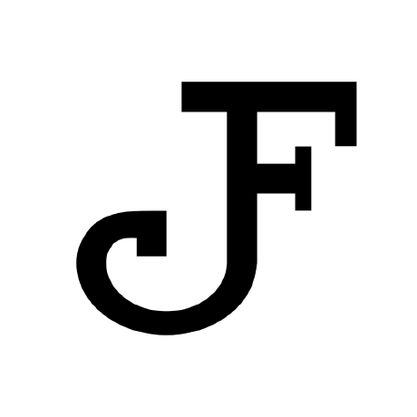
Any good reason for the horizontal line on top of the capital J? It's confusing because in general the font is sans-serif.

Can I install Virgil as a regular font on my Mac. Unable to do so.
If think the lowercase t (new version, as in excalidraw+), is harder to read. Here are a few examples:
t is too high, causing a zig zagl and k

The exported SVGs reference fonts on excalidraw.com. I'd like to host a copy of the fonts on my domain, but that depends on the license.
I can only see the top-level MIT license - which would be fine to host (with a notice), even for commercial use. I just wanted to check because I've never seen an MIT-licensed font before, so I got suspicious. 😛
(Side note: I really like the Virgil font, I find it clean and legible, and it made me love Excalidraw immediately.)
ß should be added to the display page, to clarify that it's supported as it's a more uncommon letter.Would be happy to support as a type designer from the university of Leipzig

At small sizes, it's easy to confuse the Cyrillic е with с. Would be good to make the loop more noticeable, like in the Latin e.

Text for tests:
Черкаси
The difference between some Cyrillic and Latin characters that could but don't look the same seems unjustified. The Latin glyphs almost in every such case look better to me. The Latin letters look streamlined and a bit more readable whereas Cyrillic look clumsy. I can elaborate in more detail if needed. I've used a dictionary to find some words that consist of those homoglyph letters to show what I mean (would be great if all the letters on the right looked exactly the same as on the left):

е у х ← these look the clumsiest, see also #12
Text for testing:
АЕІО ВСНКМРТХ
аеіоу сдтпргх

спірохета і гептахорд
подруга-реготуха
Аспарагус уперехрест
стереопара
відеопротест

Most regularly ⟨Ѝ⟩ is used in Bulgarian and Macedonian languages to distinguish the short form of the indirect object ⟨ѝ⟩ ('her') from the conjunction ⟨и⟩ ('and', 'also'), or less frequently, to prevent ambiguity in other similar cases.
-- https://en.wikipedia.org/wiki/I_with_grave_(Cyrillic)#Bulgarian_and_Macedonian
The accented letters Ѐ and Ѝ are not regarded as separate letters, nor are they accented letters (as in French, for example). Rather, they are the standard letters Е and И topped with an accent when they stand in words that have homographs, so as to differentiate between them (for example, "сè се фаќа" ("everything is touchable"); "и ѝ рече" ("and he/she told her")).
-- https://en.wikipedia.org/wiki/Macedonian_alphabet#Accented_letters

Above, which is a+p and which is atp? Answer is: I don't recall.
![]()
Right now, left and right angles have different sizes/heights which doesn't look good when using them both. Also, the left angle bracket doesn't look good when using in conjunction with a hypen to form an arrow: <-

I'll make this list soon.
Maybe GitHub pages?

basically publish the .woff2 file
Hi there. When I export an SVG image from excalidraw to keep using it on the desktop via Inkscape, I need to install the font. Would it be possible to provide a direct ttf download along the woff2 for desktop use? If I convert with google/woff2, the file is Virgil.ttf, but the system (Gnome) installs it with the logical name Virgil 3 YOFF, and so it does not match the font families as they appears in the SVG, which are given as "Virgil, Segoe UI Emoji". So I think either the SVG should call the font Virgil 3 YOFF, or the generated TTF should have the logical name Virgil. For now, I find-and-replace the names in the SVG with a text editor...
If it support ligatures I would like to use it in vscode
Numbers are written slightly different in different languages.
For the current handwritten numbers 2 and 7 are easy to missread for e.g. german reader
Is there a way to change the font ?
maybe to exchange with the own handwriting http://www.yourfonts.com/

A declarative, efficient, and flexible JavaScript library for building user interfaces.
🖖 Vue.js is a progressive, incrementally-adoptable JavaScript framework for building UI on the web.
TypeScript is a superset of JavaScript that compiles to clean JavaScript output.
An Open Source Machine Learning Framework for Everyone
The Web framework for perfectionists with deadlines.
A PHP framework for web artisans
Bring data to life with SVG, Canvas and HTML. 📊📈🎉
JavaScript (JS) is a lightweight interpreted programming language with first-class functions.
Some thing interesting about web. New door for the world.
A server is a program made to process requests and deliver data to clients.
Machine learning is a way of modeling and interpreting data that allows a piece of software to respond intelligently.
Some thing interesting about visualization, use data art
Some thing interesting about game, make everyone happy.
We are working to build community through open source technology. NB: members must have two-factor auth.
Open source projects and samples from Microsoft.
Google ❤️ Open Source for everyone.
Alibaba Open Source for everyone
Data-Driven Documents codes.
China tencent open source team.
