dagviz's People
Contributors


Watchers


dagviz's Issues
Copy button near block hash, tx hash, tx id and address, on hover
I propose wherever there is a block hash, tx hash, tx id, address, when hovering it, there should be a copy button on the right side of it, while clicking it is a link to go to it in explorer.
Explorer Interface
Since there are many bullets here. I will mark with High, Medium, Low.
General
- M Open modals in a way that it covers everything but the top bar (with the search and hamburger). closing it can be with an X or Esc or a button in the top bar to toggle between explorer and viz.
- M The top bar should still be interact-able while an explorer modal is open.
- L Remove light dark toggle from each screen. It should be global in the settings or top bar.
Suggestion on the fields names, but since some fields are new concepts in kaspa, I thought it might be good to have tooltips or even links to explanations in the kaspa documentation on some of the things, such as Accepted ID Merkle Root, UTXO commitments, Blue score, etc. (no ToDo at the moment. will revisit this once documentation is more established.)
Blocks /blocks
- H Default to last 25 blocks.
- H Sort order descending blue score.
- L Pagination order also reversed? not sure if this is better or not
- H Like in DAGviz, show [xx new blocks] that updates with data from MQTT. Clicking populates the blocks (maybe in an AJAX-ish way highlighting which ones got added?)
Block /block/{hash}
- General info:
- H Naming:
- UTXO Commitment - tooltip: ECMH commitment to the UTXO up to and including this block.
- Accepted ID Merkle Root - tooltip: Merkle Root of accepted transaction IDs.
- Hash Merkle Root - tooltip: Merkle Root of included transaction hashes.
- M All block hashes can be links.
- H This block's directly or indirectly referenced blocks:
- Make Parent Block Hashes a list with selected parent (parent that is a chain block) first.
- Add list of accepted block hashes (blocked by deployment of new API)
- Instead of the two items above: make a table of block hashes with an indication on each if it's a parent?, selected parent?, accepted by block? - this way each hash shows once, unlike in the lists where some block hashes will show in both lists.
- H Naming:
- H Transactions table:
- Add Confirmations after Hash
- Add Including blocks count
- Add Amount and Fee
- Remove Accepting Blue Score
- Add inputs / outputs counts
- Accepting Block Hash can be a link
- M Remove Refresh button
Transaction /transaction/{id} or {hash}
- H Mirror the same fields in the general txn info as above in the Block Transactions table.
- H Add a list of including blocks
- H Add a list of inputs and outputs
- L Inputs, outputs can link to other transactions.
Transaction Id link goes to Transaction Hash
On the Block page, when I click on the txid (showb below), it goes to page /transaction/hash/... instead of /transaction/id/...

Add link to Discord
Signal direction of the DAG
In #6 there was an issue to signal to the uninformed the direction of the DAG.
A way to signal to the uninformed the direction of the dag, direction of arrow, direction of time, or somehow.
I think that with the arrow ends on the edges, it helps to understand, if you know that the arrows point backwards to parents.
What we could do to signal direction is when there are new blocks on the right as a result of mqtt blocks, there could be a badge on the right with a counter of how many new blocks have been created on the far right.
Clicking it can also scroll the DAGviz to the far right.
By doing this, two things are accomplished:
- by knowing where new blocks appear, direction is more clear.
- it can show to new people just how many new blocks are created on the tip of the DAG.
What do you think?
Top Bar UI glitches
- the blocks per second needs to be a color that works on both light and dark.
- the Explorer button could have some border to make it look like a button.
- I think the magnifying glass can go inside the search text field.
- maybe the two buttons can move down a bit, to space things out.
- when you hover on one of the buttons there, it's hover tooltip overlaps the buttons (second screenshot below).
- border around ### new blocks looks unnecessary (third screenshot below)


Proposal:

focus state for search bar,
hover state for blue score bar:

Mobile friendly
- M Default orientation on mobile portrait: North.
- L Orientation can be changed to East when rotating landscape.
- H Make top menu (search, hamburger) bigger (material design size), and with at least 50% white background.
- M Hamburger to hide options. Mobile options: Tracking, dark mode, mass, quality, spacing, no need for orientation toggle on mobile.
- M Make navigator button bigger for easier dragging.
- L Draw inspiration for navigator UX from google photos (see mobile and desktop)
- H Default behavior for tapping a block - open block screen. (no need for small cards)
- M Experiment interaction to do selecting (long hold?)
- Single block selected = highlight links (like hover on desktop )
- Long hold to select.
- Multiple block selection = selection (also highlight interlinks. accepted links color has precedence over interlink color)
- When one or more blocks are selected: show share button.
- L Add momentum to drag (can be on all desktop too).
- L Make dragging DAG off screen not possible (bump DAG against screen bounds?) (can be on desktop too).
Teal highlight when hovering a block to its accepting Chain Block
Related to #11
The info which selected parent chain block is the accepting block of each block is in each block (block.acceptingBlock), correct to the time of the response.
Updates obtainable via MQTT.
No color for anticone of selected tip
@aspect @n15a
Related issue #20
Yoni gave new feedback about the coloring delay we have for blocks without children.
He says it is misrepresenting PHANTOM.
He adds that the blocks that should have no color yet are not only the ones without children (the tips), but their children and grandchildren etc. as well, as long as they are not in the past of the selected tip of the dag - that is: the chain block with the highest blue score.
So, in other words:
Selected Tip = chain block with highest blue score
Anticone(B) = blocks that are not reachable from B via traversing uni-directionally over parent links

The rule: Every block that is in the anticone of the selected tip should not have a color yet.
Now I don't think this is feasible to do on DAGviz because you have no algorithm to tell you in O(const) if a block is in the past of another block and inversely if a block is in the anticone of another block.
Kaspad has a reachability algorithm that allows this, but it is not available in Kasparov.
I will have to think of a way for DAGviz to be able to figure out the blocks in the anticone of the selected tip by itself.
Rendering artifacts due to precision loss
The primary axis scale in which we have developed DAGViz turned out to be too large numerically, resulting in the floating point precision loss when working with coordinates at above 50k-100k blue score range. As you advance past the score of 100k, various problems will start occurring (blocks disappearing, lines missing etc.)
We need to run some tests to determine the best manner in which to rescale the graph domain.
Hover arrow stroke from SPC to SPC is narrower than to non-SPC
Noticed the arrow hover stroke-width="4" for selected parent, while for other parents stroke-width="7". i think 7 is better also for selected parent.
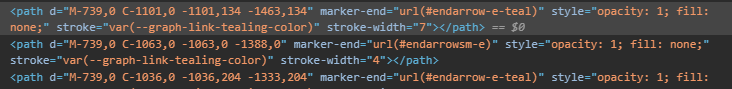
I propose a mild stroke-width="4" for related blocks,
and thicker teal stroke-width="7" for merged blocks<-- and for <--merging chain block
Colorless block - to be grey - works on light and dark mode
maybe in dark mode, the color-less blocks should have the same color as in light mode, and this color should not be white, but grey (works on both light and dark mode).
this way, if we go for the confirmations progress bar around the block (issue #44 ), then the block will still be visible against the background even when it has not reached 100% confirmations.

Confirmations progress proposal
Related to Issue #13
I don't have a good answer yet to what is 100% confirmed transaction. I am waiting for research team to give me an answer on this, after they conduct some research.
If you can make this configurable, so we an put some number of confirmations for 100% and later adjust it, then we can do this issue.
However, we should discuss how to present this in a way that will not overload the UI and also not be too much computer resource consuming.
I have put together one proposal, below. what do you think?
- is it understood enough?
- is it aesthetic?
- is it too much overload on the UI?
Note: let's say 100% = 100 confirmations, the progress bar is only going to appears for blocks until they have 100 confirmations (+/-100 blocks at any given moment). Most of the blocks will still look like today.
Small block card opens when clicking blue score on /blocks
Steps to reproduce
- Go to /blocks
- Click on the blue score of a block (of any row in the table)
Actual result
Small block card opens

Expected result
/block/:hash should be opened
Block cards on vertical view
When in N (genesis on bottom) orientation:
Block cards should be also stacked one on top of the other on the right side (to the left of the blue score navigation).

Bug: Center=Fixed no effect when loading from URL, and blocks are drawn over SPC links
Steps to reproduce
- load DAGviz and change settings to Center=Fixed
- copy URL and load it
Expected
- non-SPC (selected parent chain ) blocks should not be drawn directly on the SPC block links.
- center=fixed should draw the SPC blocks in the center.
Actual
-
non-SPC blocks are drawn over the SPC links.

-
when loading the link from URL, the center=fixed is shown in settings, but the dag is drawn as if center=force or off.

Behavior (desktop)
- H Hovering a block should highlight links to other blocks. accepted links highlight (teal) has precedence over regular link highlight). It can also show the block info either on top like today or as a card (as today when clicking).
- H Default behavior for clicking a block - open block screen (not the small card).
- M To enable selecting blocks (as today when clicking), experiment other interaction ways (right click > select will enter a "selection mode"?).
- M when one or more blocks are selected: show share button.
- L Add momentum when dragging (panning) the dag.
- L Make dragging DAG off the screen not possible (bump DAG against screen bounds?).
- L Draw inspiration for navigator UX from google photos (see mobile and desktop).
Add links to docs.kas.pa specific pages from the DAGviz explorer interface
DAGviz can help people understand Kaspa.
It could be good if it uses the docs to explain unfamiliar/new terms.
It can do that by linking the terms themselves to specific pages in the docs/glossary that explain the terms, or using a small (?) button next to terms to link.
Also relevant for the tutorial steps.
It can do it for unfamiliar/new terms or even for all terms.
Some of the new terms or changed meanings:
- Blue Score https://docs.kas.pa/kaspa/glossary#blue-score
- Confirmations https://docs.kas.pa/kaspa/glossary#confirmations
- Is Chain Block https://docs.kas.pa/kaspa/glossary#chain-block
- ID (tx) https://docs.kas.pa/kaspa/glossary#transaction-id
- Hash (tx) https://docs.kas.pa/kaspa/glossary#transaction-hash
- Mass https://docs.kas.pa/kaspa/glossary#mass
- Payload Hash https://docs.kas.pa/kaspa/glossary#payload-hash
- Payload https://docs.kas.pa/kaspa/glossary#payload
- Gas https://docs.kas.pa/kaspa/glossary#gas
- Subnetwork ID https://docs.kas.pa/kaspa/glossary#subnetwork
- Accepting Block Hash https://docs.kas.pa/kaspa/glossary#accepted-transactions
Notice that this part https://docs.kas.pa/kaspa might change. It could include variants for versions and languages.
Teal highlight when hovering a Selected Parent Chain Block to its accepted blocks
When hovering a Selected Parent Chain Block (SPCB), the links to its accepted blocks are highlighted in teal color.

In the screenshot, supposing SPCB a25958 did not reference block 712749 as its parent, would hovering SPCB 68cc1d highlight in teal also block 712749?
i.e. like in this screenshot, only the thick blue would be thin teal color

Drawing the block size and shape
Current state
Size
Some blocks are drawn with larger square shape than most other blocks.
I guess it is drawn according to block mass?
Nevertheless, this is currently not desireable because the mass can be very large (up to 10 million).
Shape
Some blocks are yellow hexagons. Initially I thought this indicates blocks with isChainBlock=false however the drawing is not consistent with this property (when hovering and viewing the property).
Proposed change
Clearer visualization of the blockDAG (construction: locations and relations) is currently higher priority than visualizing other properties of the blocks.
Therefore, all blocks should be the same size and shape.
We can later find a way to differentiate blocks that are more empty or more full.
I will open a separate issue to discuss visualizing selected chain, blues and reds. #3 (comment)
Example

Block ee with blue score 4603 is bigger than other blocks
Block Confirmations
- From dag/selected-parent-chain mqtt topic, confirmations can be calculated, as follows:
block.confirmations = dag.selected_tip.blue_score - block.accepting_block.blue_score + 1
Note: for the selected tip, you do not need the mqtt dag/selected-tip topic. You simply use the block with the largest blue score received from mqtt dag/selected-parent-chain topic. - Visualizing the Block Confirmations:
For now, let's just recalculate the confirmations correctly. We need to find a good way to visualize it without overburdening the UI too much, as there are already many visual elements.
Running ideas with you (not for development, yet)- Could be a progress bar in the block.
- Could be that the block fill color itself is filling up from left to right (or bottom to up) like a progress bar.
- Could be that the block border will be used as rectangular clock progress bar filling clockwise until the block is said to have enough confirmations.
- We also need a way to signal a first confirmation.
- We need that the confirmations percentages or ranges be configurable somewhere in the backend or a config file (see #3 )
- add confirmations to hover info and block cards, and not all blocks all the time.
Disregard orientation URL parameter on mobile, and get orientation from device API
This can be actually generalized, such that that it's not different code for mobile only.
get the screen viewport.
If viewport.height > viewport.width: default orientation to N
otherwise: defailt orientation to E.
In both cases disregard the parameter in the URL if it's conflicting.
In both cases, leave the orientation in the settings to let the user change.
Visualizing parent chain, confirmations
This issue is dependent on completion of kaspanet/kasparov#44 (comment)
Current State
Currently blue, red and parent chain blocks are not visualized.
Proposed change
-
Confirmations obtained in the block object in the responses of API calls are correct up to the time of the response. After that, they need to be re-calculated each time there is a new selected-tip block.
- The calculation is:
block.confirmations = dag.selected_tip.blue_score - block.accepting_block.blue_score + 1 - The block's accepting block is part of the chain formed by the selected-tips, and its hash is a field inside the block the confirmations are being calculated for.
- New selected-tips are received in the mqtt dag/selected-tip
- We are adding an mqtt topic for diffs in the dag/selected-parent-chain. It will contain two arrays, blocks removed from the dag/selected-parent-chain and blocks added to the dag/selected-parent-chain. After we add that, you can use that topic instead of the dag/selected-tip topic.
- The calculation is:
-
Blocks with block.confirmations=0 --- they can have no color.
-
Blocks with block.confirmations>0 --- they can be colored greener the more confirmations they have.
- the larger the confirmations the "greener" (4 levels . 1-5 confirmations (configurable): 25%; 6-20: 50%; 21-50: 75%; 51+:100%)
-
Selected Parent Chain Blocks are blue blocks with isParentChain=true --- they can have a thicker border to signify part of the selected parent chain.
Objective blocks per second calculation
@elichai suggested today to calculate the bps objectively as research measure it:
- take the last 2640 blocks by blue score;
blue block rate = (timestamp of blue block with highest blue score - timestamp of blue block with lowest blue score) / number of blue blocksrepresented as blocks per second- same for red blocks.
- note: the 2640 is a parameter that can change.
Search by address
E.g. enter this in the search: kaspatest:qpc3hr2kmnu6j0crw42cmryptzqmyqm9gstqp5r863
Will open a page like described in #35
Jitter/variance according to timestamp for blocks
- Jitter/variance according to relative timestamp of blocks with the same blue score (same X-axis index).
Legend, manual or tutorial
- Need some kind of a legend, info/explanation box or tutorial.
Panning vs Tracking
I don't think we need both a Tracking toggle and an [xx new blocks] button (from #16 ).
As soon as the screen is panned and tracking is disabled, the [xx new blocks] button can be shown contextually on the right or top. It provides info how many new blocks are getting added, or say "Return to tip".
Clicking it is functionally the same as getting back to tip and toggling back tracking.
Display the block rate
@hashdag asked to display the block rate.
It can be either hardcoded, or via sampling blocks over time (e.g. [# blocks in last X seconds] / X blocks/sec.
Hovering all blocks and chain blocks - colors of links to related blocks
@aspect @n15a
Related issue: #11
I noticed a bug with regards to this.
Link from chain block back to red blocks shouldn't be teal.

Link to DAGviz of the above blocks
To make a distinction between referenced blocks, I propose the following:
When hovering any block:
- incoming link from accepting block = bold teal (as today, done!)
- any linked block is highlighted darker (as today, done!)
- outgoing links to parent blocks and child blocks = bold
When hovering chain blocks (in addition to the above):
- outgoing links to accepted blocks = bold teal (block.acceptedBlockHashes, shouldn't include red blocks, bold teal overrides bold)
Notes:
- The group block.parentBlockHashes is going to have blue and red blocks.
- block.parentBlockHashes that are blue ∈ block.acceptedBlockHashes.
- block.parentBlockHashes that are red ∉ block.acceptedBlockHashes.
- The group block.acceptedBlockHashes may have blocks that are not in the group block.parentBlockHashes;
but these accepted blocks will be ancestors of the block (so parents of parents, or deeper ancestors);
so it is important that we can cold-teal the links to the accepted blocks on hover, even when they are not direct parents;
the link would span for example from block to parent to grandparent, likewise:
[ GP ]<==[ P ]<==[ B ]
P is a parent of B, and it is accepted by B
GP is not a parent of B, but it is accepted by B
both links should be bold-teal when hovering.
Bug: After hovering away from a selected parent chain block, its thick links become thin
Steps to reproduce
Hover a block in the selected parent chain (the chain with thick borders).
Move pointer away from it.
Expected
The hovered selected parent chain block and its links stay thick.
Actual
The hovered selected parent chain block links become thin (constantly or momentarily).
Block and Arrow Colors - light and dark mode
The extra outside translucent stroke around chain block is unnecessary.
There is already a nice distinction for chainblocks = the thicker grey border and arrow.
Same for dark mode.
Also for consistency, keep the arrow that same off-white color rather than red.

Blue Score navigator starts off at 0, even though dagviz defaults to live view
Steps to reproduce:
- open dagviz
- finish the tutorial
- blocks at the tip start showing up
Actual result:
- Blue Score navigator is at 0.
Expected:
- Blue Score navigator is at Max.
Possible solution: get the genesis block to get a scale for the navigator.
Iteration 3
- When in N (genesis on bottom) orientation:
- blue score axis should be on the right side,
- Auto zoom to fit the dag width to the screen when changing orientation.
- When hovering a block:
- A different way to highlight parent blocks, child blocks. The green/red link highlight is disliked by Yonatan. One option is to highlight the actual connected blocks, rather than the links.
- If it's an accepted chain block, a way to highlight blocks that it accepts (they will be blocks that reference it in their acceptingBlockHash field. It will also be up to k blocks.)
- Notice that for a selected chain block, the set of blocks it accepts and the set of parent blocks might be overlapping, so the highlighting needs to show each in a different way.
- performance drop since last iteration.
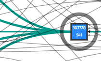
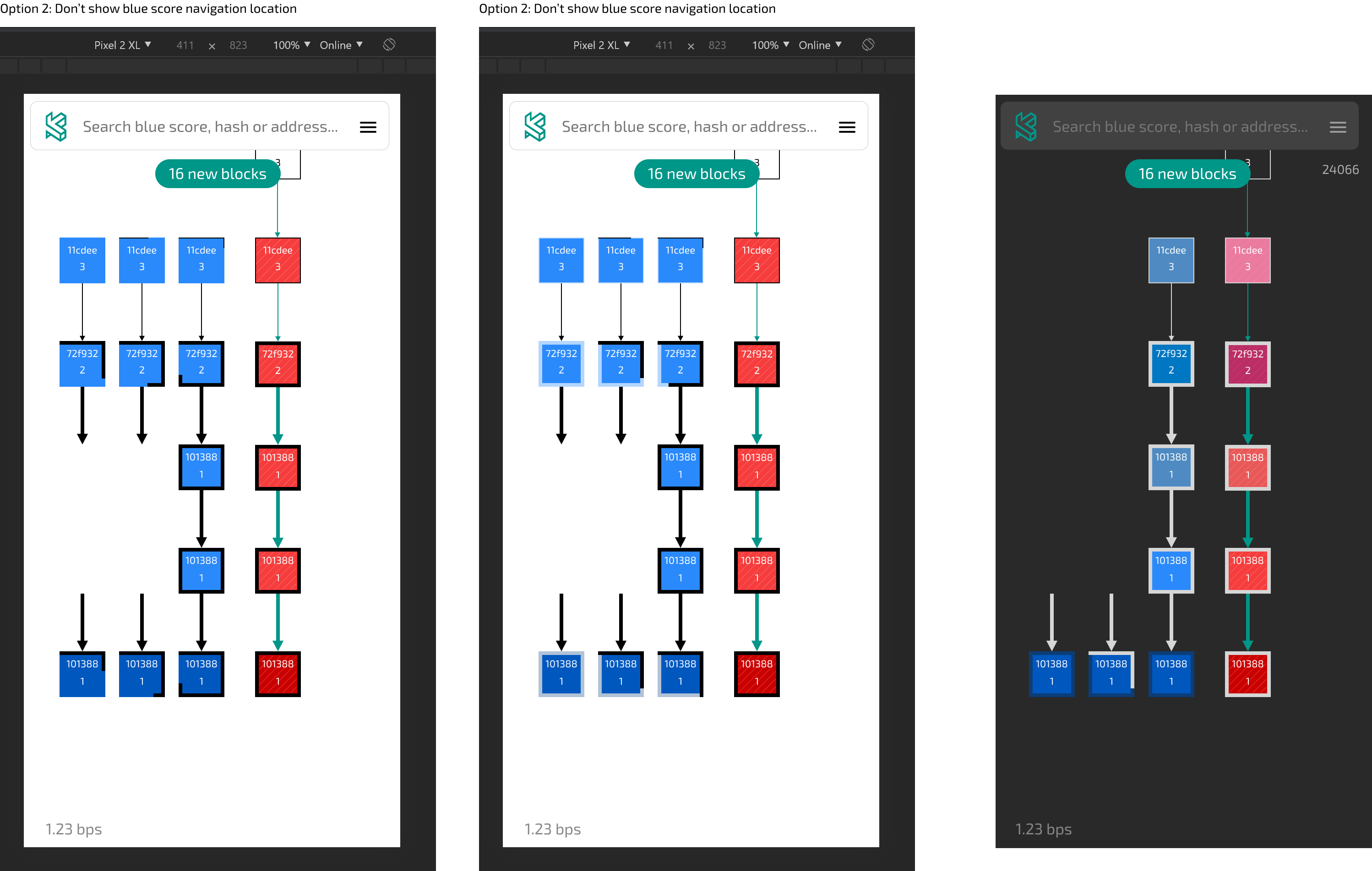
Blue Score Navigator proposal
Option 1: The current location on the blue score axis is always shown.
When panning the viewport or dragging the blue score navigator, the current location is bigger and has some shadow, and some locations on the blue score navigator are shown as labels.

Option 2: The current location on the blue score axis is not shown. (This goes towards a more clean interface. The blue score is seen on each block.)
When panning the viewport, the current location on the blue score axis is shown.
When dragging the blue score navigator, the current location is bigger and has some shadow, and some locations on the blue score navigator are shown as labels.

Handle removals of totals from API calls
Placeholder task to handle the removal of the totals
Iteration 2
- Selected Parent Chain - thick border for selected parent chain (SPC) blocks, same as the thicker link between them.
- Selected Parent Chain - blue instead of green. (what will distinguish blue blocks on the SPC from blue blocks not on the SPC is their thicker border.)
- Remove the SPC toggle option. It should just be blue with the thicker border on the blocks and thicker links.
- Blue/Red Distinction - other than the color, there should be a pattern distinction between blue and red. (You can use the translucent diagonal line pattern you used for SPC blocks (for either the blue or for the red); the SPC blocks already has a distinction of thick border.)
- Selected Parent Chain - straight line in the middle (not letting physics push them), with other blocks distributed more or less evenly between both of the SPC's two sides.
- Links to have Arrow-ends - only if this can be done without much effort (hours, not days).
- Cards - SPC blocks cards also to have thicker border.
- Cards - Remove buttons that do the same. Leave only the info and copy buttons. And clicking the card transitions/animates to it.
- Cards - Cards also same color as blocks (only blue and red).
- Green/Red links - only on hover, not on selected. Also, not bold, just full opacity and green/red.
- Selected blocks - have a much-thicker blue translucent padding to show selected blocks. Keep the blue links between selected blocks.
- Search by block number
- Cards - close the info modal with Escape key.
Red block mini cards have confirmations
Perhaps this is related to #10
Currently, red blocks should not have confirmations.

Defaults
Defaults
- Default view-port: Most recent 100 blocks
- Live updates (Tracking: ON)
- Mass: OFF
- Curves: ON
- L-variance: ON
- Center: FIXED
- Layout: DETERMINISTIC
- Quality: HIGH
- Orientation: E
- Spacing: 1
- Child Shift: ON
- Arrows: MULTI-S
Exposed Options
- Performance:
- High: Quality: HIGH, Tracking: ON (default)
- Low: Quality: Low, Tracking: OFF
- Arrows:
- Curved: Curves: ON, Arrows: Multi-S (default)
- Straight: Curves: OFF, Arrows: Multi-R
- Orientation:
- Genesis on Left: Orientation: E (default)
- Genesis on Bottom: Orientation: N
- Advanced:
- Off: Expose all options (default)
- On: Expose only options above
Address Transactions
Currently, Explorer shows 25 transactions of a given address.
- It should show all transactions, with pagination. (using
/transactions/address/:address?skip=x&limit=y) - At the top, it should show a balance (using
/utxos/address/:address)
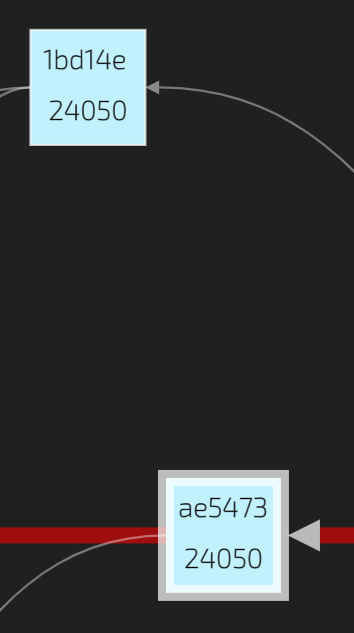
Locating blocks on the time axis
Current state
Two blocks with the same timestamp, but one is the parent of the other are drawn one over the other on the time axis.
Proposed change
Location on the time axis can be deduced from parent relation.
If a block A points to block B, it should be drawn at a later "index" on the time axis.
Examples
Example 1, in the screenshot below:
- block 5b with blue score 4601
- block ae with blue score 4602
- 5b and ae have the same timestamp, and are drawn on the same "index" on the time axis, however, ae points to 5b, thus it should be drawn "later"
Example 2, in the screenshot below:
- block 12 with blue score 4607 comes before..
- block 35 with blue score 4608, which also comes before..
- block 2b with blue score 4609.
- however, they are all drawn with the same "index" on the time axis, and thus it is hard to understand the blockDAG.
Update Accepting Block terminology to Merging Block
We have changed terminology:
- from
accepted blocks (.blues)tomerged blocks. - from
a block's accepting blocktoa block's merging chain block.
Consequently, this terminology should also change in DAGviz and Explorer.
It is mentioned at least in the following places, and maybe in other places:
- Block Explorer: in the Block screen.
- DAGviz tutorial
The reasoning is to separate DAG structure terminology from consensus blue/red coloring and to leave the accepted terminology to transactions.
All the terminology changes regarding this is concentrated here: https://docs.google.com/document/d/19cCvOOfyCnSQATOD_QxrQcekpJch_BBjpUMvjKg1iDY/edit?usp=sharing
It is also updated in docs.kas.pa
Blocks with no children coloring delay
( i ) This issue is to be discussed, and not final yet.
At the tip of the DAG, blocks that are not yet connected back to the selected parent chain are now colored red. However, they are not treatred as Reds per se according to PHANTOM. They will be treated as Reds if in a few more seconds PHANTOM will presume they are not well connected.
- We may need to have a different temporary coloration of the blocks at the tip for a few seconds (configurable), e.g. give them no color yet, for a few seconds.
Issues correctly maintaining isChainBlock state when listening to MQTT
I am having trouble tracking isChainBlock state for blocks based solely on the MQTT feed.
The logic tracking the state is as follows:
- ingest
dag/blocksisChainBlockis alwaystruehere
- ingest
dag/selected-parent-chain- for each addedChainBlocks set:
block[hash].isChainBlock = trueacceptedBlockHashesis not used
- for each removedBlockHashes
block[hash].isChainBlock = false
- for each addedChainBlocks set:
Unfortunately, over time this corrupts the state:

This is the code that handles it in DAGViz: https://github.com/kaspanet/dagviz/blob/master/components/app.js#L972-L999
Not able to scroll to the tips of the DAG
- Scrolling all the way to the end of the DAG (right most in E orientation) does not currently reach the end of the DAG.
Bug: Clicking a block's card scrolls to its location in the viz, momentarily stays there, and goes back to the original location in the viz
Steps to reproduce
- Select a few blocks --> their cards appears below.
- Scroll out of the blocks view in the viz.
- Click on the cards at the bottom --> DAGviz scrolls to the location of the block whose card was clicked.
Expected
DAGviz stays there.
Actual
DAGviz stays there momentarily, then shows the location of the DAG before clicking the card.
Enable switching only between N and E orientations.
Orientation - Only N (genesis on bottom) and E (genesis on left) orientations are needed.
Safari compatibility issues
Reported Safari issues have been addressed. @ey51 please check with whoever has reported the issue to you to ensure that their specific browser/OS is working properly.
Two different sets of blocks are drawn
Current state
Two different sets of blocks are drawn (see example, one set with blue scores in the 4000's and one with blue scores in the 13,000's)

Proposed change
DAGviz gets its data from the following sources:
- A chunk of X (configurable number) of blocks using kasparov's REST API
- GET /blocks[?order=asc/desc&skip=0&limit=25]
- https://docs.kas.pa/kaspa/try-kaspa/kasparov-api-server/api/methods#blocks
- New blocks as they are created and kasparov finds out about them using MQTT.
If the blocks gotten via the REST API are from one kaspa network and the blocks gotten from MQTT are from another different kaspa network (or a different simulation), they won't know about each other and won't connect. It could still be visualized as two separate blockDAGs overlayed one over the other, but it doesn't make sense to draw them together.
All the blocks should come from the same kaspa network, be it the same devnet, testnet or mainnet network, otherwise it is going to wind up having two sets of unrelated blockDAGs.
Block page > Header area > Related blocks
@n15a wrote:
So just discussed with Anton. We dont touch the current structure. In the place of Parent Block Hashes , we can put something like Related Block Hashed and on the right side of each hash indicate whether is Parent, Merged or both.
This is perfect.
I think what you guys suggest is perfect.
This way the same hash is not repeated.
In practice, it's like a table of related blocks
block hash                                                         merged?   parent?   selected parent?
00002e1b937359f91fb516495097322087f0cd23b4d78aef85e02ab2d9f46e14   v         v         v
000072e7f95409ada50955626e3cb7400f331c2d0c74368fbead2710ab62246e   v         v
000007bb1c62f8de6160dc7a9062cb3e90859f73b5314ec2660709484c25039e   v
Recommend Projects
-
 React
React
A declarative, efficient, and flexible JavaScript library for building user interfaces.
-
Vue.js
🖖 Vue.js is a progressive, incrementally-adoptable JavaScript framework for building UI on the web.
-
 Typescript
TypeScript is a superset of JavaScript that compiles to clean JavaScript output.
-
TensorFlow
An Open Source Machine Learning Framework for Everyone
-
Django
The Web framework for perfectionists with deadlines.
-
 Laravel
A PHP framework for web artisans
-
D3
Bring data to life with SVG, Canvas and HTML. 📊📈🎉
-
Recommend Topics
-
javascript
JavaScript (JS) is a lightweight interpreted programming language with first-class functions.
-
web
Some thing interesting about web. New door for the world.
-
server
A server is a program made to process requests and deliver data to clients.
-
Machine learning
Machine learning is a way of modeling and interpreting data that allows a piece of software to respond intelligently.
-
Visualization
Some thing interesting about visualization, use data art
-
Game
Some thing interesting about game, make everyone happy.
Recommend Org
-
Facebook
We are working to build community through open source technology. NB: members must have two-factor auth.
-
Microsoft
Open source projects and samples from Microsoft.
-
Google
Google ❤️ Open Source for everyone.
-
Alibaba
Alibaba Open Source for everyone
-
D3
Data-Driven Documents codes.
-
Tencent
China tencent open source team.