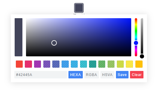
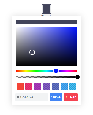
Code Monkey home page Code Monkey logo

simonwep / pickr Goto Github PK

View Code? Open in Web Editor NEW
4.2K 31.0 285.0 6.43 MB

๐ŸŽจ Flat, simple, multi-themed, responsive and hackable Color-Picker library. No dependencies, no jQuery. Compatible with all CSS Frameworks e.g. Bootstrap, Materialize. Supports alpha channel, rgba, hsla, hsva and more!

Home Page: https://simonwep.github.io/pickr

License: MIT License

HTML 4.19% CSS 2.96% JavaScript 75.70% SCSS 17.16%
color-picker colorpicker color js-library widget ux-ui pickr material-design color-palette color-picker-library color-picker-popup ux-design js picker swatches

pickr's Introduction

Logo

Flat, Simple, Hackable Color-Picker.


gzip size brotli size Build Status Download count No dependencies JSDelivr download count Current version Support me Gitpod Ready-to-Code


Features

  • Themes
  • Simple usage
  • Zero dependencies
  • Multiple color representations
  • Color comparison
  • Opacity control
  • Detail adjustments via. mouse-wheel
  • Responsive and auto-positioning
  • Supports touch devices
  • Swatches for quick-selection
  • Fully accessible and i18n
  • Shadow-dom support

Status of this project

This project might continue to get important security- and bug-related updates but its feature set is frozen, and it's highly unlikely that it'll get new features or enhancements.

The reason behind this decision is the way this tool has been build (monolithic, the core is one single file, everything is in plain JS etc.) which makes it incredible hard to maintain, tests become impossible at this stage without a complete rewrite, and the fun is gone at such a level of cramped complexity.

Personally I recommend building these UI-Related "widgets" directly into the app with the framework you're using which takes more time but in return gives you full power of how it should work and look like. Frameworks such as (p)react, vue and svelte will make it a breeze to develop such things within a day.

As of 2021, this project is no longer maintained!

Themes

Classic Monolith Nano
Classic theme Monolith Nano

Nano uses css-grid thus it won't work in older browsers.

Getting Started

Node

Note: The readme is always up-to-date with the latest commit. See Releases for installation instructions regarding to the latest version.

Install via npm:

$ npm install @simonwep/pickr

Install via yarn:

$ yarn add @simonwep/pickr

Include code and style:

// One of the following themes
import '@simonwep/pickr/dist/themes/classic.min.css';   // 'classic' theme
import '@simonwep/pickr/dist/themes/monolith.min.css';  // 'monolith' theme
import '@simonwep/pickr/dist/themes/nano.min.css';      // 'nano' theme

// Modern or es5 bundle (pay attention to the note below!)
import Pickr from '@simonwep/pickr';
import Pickr from '@simonwep/pickr/dist/pickr.es5.min';

Attention: The es5-bundle (e.g. legacy version) is quite big (around a triple of the modern bundle). Please take into consideration to use the modern version and add polyfills later to your final bundle! (Or better: give a hint to users that they should use the latest browsers). Browsers such as IE are not supported (at least not officially).

Browser

jsdelivr:

<!-- One of the following themes -->
<link rel="stylesheet" href="https://cdn.jsdelivr.net/npm/@simonwep/pickr/dist/themes/classic.min.css"/> <!-- 'classic' theme -->
<link rel="stylesheet" href="https://cdn.jsdelivr.net/npm/@simonwep/pickr/dist/themes/monolith.min.css"/> <!-- 'monolith' theme -->
<link rel="stylesheet" href="https://cdn.jsdelivr.net/npm/@simonwep/pickr/dist/themes/nano.min.css"/> <!-- 'nano' theme -->

<!-- Modern or es5 bundle -->
<script src="https://cdn.jsdelivr.net/npm/@simonwep/pickr/dist/pickr.min.js"></script>
<script src="https://cdn.jsdelivr.net/npm/@simonwep/pickr/dist/pickr.es5.min.js"></script>

Be sure to load the pickr.min.js (or the es5 version) after pickr.min.css. Moreover the script tag doesn't work with the defer attribute.

Usage

// Simple example, see optional options for more configuration.
const pickr = Pickr.create({
    el: '.color-picker',
    theme: 'classic', // or 'monolith', or 'nano'

    swatches: [
        'rgba(244, 67, 54, 1)',
        'rgba(233, 30, 99, 0.95)',
        'rgba(156, 39, 176, 0.9)',
        'rgba(103, 58, 183, 0.85)',
        'rgba(63, 81, 181, 0.8)',
        'rgba(33, 150, 243, 0.75)',
        'rgba(3, 169, 244, 0.7)',
        'rgba(0, 188, 212, 0.7)',
        'rgba(0, 150, 136, 0.75)',
        'rgba(76, 175, 80, 0.8)',
        'rgba(139, 195, 74, 0.85)',
        'rgba(205, 220, 57, 0.9)',
        'rgba(255, 235, 59, 0.95)',
        'rgba(255, 193, 7, 1)'
    ],

    components: {

        // Main components
        preview: true,
        opacity: true,
        hue: true,

        // Input / output Options
        interaction: {
            hex: true,
            rgba: true,
            hsla: true,
            hsva: true,
            cmyk: true,
            input: true,
            clear: true,
            save: true
        }
    }
});

You can find more examples here.

Events

Since version 0.4.x Pickr is event-driven. Use the on(event, cb) and off(event, cb) functions to bind / unbind eventlistener.

Event Description Arguments
init Initialization done - pickr can be used PickrInstance
hide Pickr got closed PickrInstance
show Pickr got opened HSVaColorObject, PickrInstance
save User clicked the save / clear button. Also fired on clear with null as color. HSVaColorObject or null, PickrInstance
clear User cleared the color. PickrInstance
change Color has changed (but not saved). Also fired on swatchselect HSVaColorObject, eventSource, PickrInstance
changestop User stopped to change the color eventSource, PickrInstance
cancel User clicked the cancel button (return to previous color). PickrInstance
swatchselect User clicked one of the swatches HSVaColorObject, PickrInstance

Example:

pickr.on('init', instance => {
    console.log('Event: "init"', instance);
}).on('hide', instance => {
    console.log('Event: "hide"', instance);
}).on('show', (color, instance) => {
    console.log('Event: "show"', color, instance);
}).on('save', (color, instance) => {
    console.log('Event: "save"', color, instance);
}).on('clear', instance => {
    console.log('Event: "clear"', instance);
}).on('change', (color, source, instance) => {
    console.log('Event: "change"', color, source, instance);
}).on('changestop', (source, instance) => {
    console.log('Event: "changestop"', source, instance);
}).on('cancel', instance => {
    console.log('Event: "cancel"', instance);
}).on('swatchselect', (color, instance) => {
    console.log('Event: "swatchselect"', color, instance);
});

Where source can be

  • slider - Any slider in the UI.
  • input - The user input field.
  • swatch - One of the swatches.

Options

const pickr = new Pickr({

    // Selector or element which will be replaced with the actual color-picker.
    // Can be a HTMLElement.
    el: '.color-picker',

    // Where the pickr-app should be added as child.
    container: 'body',

    // Which theme you want to use. Can be 'classic', 'monolith' or 'nano'
    theme: 'classic',

    // Nested scrolling is currently not supported and as this would be really sophisticated to add this
    // it's easier to set this to true which will hide pickr if the user scrolls the area behind it.
    closeOnScroll: false,

    // Custom class which gets added to the pcr-app. Can be used to apply custom styles.
    appClass: 'custom-class',

    // Don't replace 'el' Element with the pickr-button, instead use 'el' as a button.
    // If true, appendToBody will also be automatically true.
    useAsButton: false,

    // Size of gap between pickr (widget) and the corresponding reference (button) in px
    padding: 8,

    // If true pickr won't be floating, and instead will append after the in el resolved element.
    // It's possible to hide it via .hide() anyway.
    inline: false,

    // If true, pickr will be repositioned automatically on page scroll or window resize.
    // Can be set to false to make custom positioning easier.
    autoReposition: true,

    // Defines the direction in which the knobs of hue and opacity can be moved.
    // 'v' => opacity- and hue-slider can both only moved vertically.
    // 'hv' => opacity-slider can be moved horizontally and hue-slider vertically.
    // Can be used to apply custom layouts
    sliders: 'v',

    // Start state. If true 'disabled' will be added to the button's classlist.
    disabled: false,

    // If true, the user won't be able to adjust any opacity.
    // Opacity will be locked at 1 and the opacity slider will be removed.
    // The HSVaColor object also doesn't contain an alpha, so the toString() methods just
    // print HSV, HSL, RGB, HEX, etc.
    lockOpacity: false,

    // Precision of output string (only effective if components.interaction.input is true)
    outputPrecision: 0,

    // Defines change/save behavior:
    // - to keep current color in place until Save is pressed, set to `true`,
    // - to apply color to button and preview (save) in sync with each change
    //   (from picker or palette), set to `false`.
    comparison: true,

    // Default color. If you're using a named color such as red, white ... set
    // a value for defaultRepresentation too as there is no button for named-colors.
    default: '#42445a',

    // Optional color swatches. When null, swatches are disabled.
    // Types are all those which can be produced by pickr e.g. hex(a), hsv(a), hsl(a), rgb(a), cmyk, and also CSS color names like 'magenta'.
    // Example: swatches: ['#F44336', '#E91E63', '#9C27B0', '#673AB7'],
    swatches: null,

    // Default color representation of the input/output textbox.
    // Valid options are `HEX`, `RGBA`, `HSVA`, `HSLA` and `CMYK`.
    defaultRepresentation: 'HEX',

    // Option to keep the color picker always visible.
    // You can still hide / show it via 'pickr.hide()' and 'pickr.show()'.
    // The save button keeps its functionality, so still fires the onSave event when clicked.
    showAlways: false,

    // Close pickr with a keypress.
    // Default is 'Escape'. Can be the event key or code.
    // (see: https://developer.mozilla.org/en-US/docs/Web/API/KeyboardEvent/key)
    closeWithKey: 'Escape',

    // Defines the position of the color-picker.
    // Any combinations of top, left, bottom or right with one of these optional modifiers: start, middle, end
    // Examples: top-start / right-end
    // If clipping occurs, the color picker will automatically choose its position.
    // Pickr uses https://github.com/Simonwep/nanopop as positioning-engine.
    position: 'bottom-middle',

    // Enables the ability to change numbers in an input field with the scroll-wheel.
    // To use it set the cursor on a position where a number is and scroll, use ctrl to make steps of five
    adjustableNumbers: true,

    // Show or hide specific components.
    // By default only the palette (and the save button) is visible.
    components: {

        // Defines if the palette itself should be visible.
        // Will be overwritten with true if preview, opacity or hue are true
        palette: true,

        preview: true, // Display comparison between previous state and new color
        opacity: true, // Display opacity slider
        hue: true,     // Display hue slider

        // show or hide components on the bottom interaction bar.
        interaction: {

            // Buttons, if you disable one but use the format in default: or setColor() - set the representation-type too!
            hex: false,  // Display 'input/output format as hex' button  (hexadecimal representation of the rgba value)
            rgba: false, // Display 'input/output format as rgba' button (red green blue and alpha)
            hsla: false, // Display 'input/output format as hsla' button (hue saturation lightness and alpha)
            hsva: false, // Display 'input/output format as hsva' button (hue saturation value and alpha)
            cmyk: false, // Display 'input/output format as cmyk' button (cyan mangenta yellow key )

            input: false, // Display input/output textbox which shows the selected color value.
                         // the format of the input is determined by defaultRepresentation,
                         // and can be changed by the user with the buttons set by hex, rgba, hsla, etc (above).
            cancel: false, // Display Cancel Button, resets the color to the previous state
            clear: false, // Display Clear Button; same as cancel, but keeps the window open
            save: false,  // Display Save Button,
        },
    },

    // Translations, these are the default values.
    i18n: {

        // Strings visible in the UI
       'ui:dialog': 'color picker dialog',
       'btn:toggle': 'toggle color picker dialog',
       'btn:swatch': 'color swatch',
       'btn:last-color': 'use previous color',
       'btn:save': 'Save',
       'btn:cancel': 'Cancel',
       'btn:clear': 'Clear',

       // Strings used for aria-labels
       'aria:btn:save': 'save and close',
       'aria:btn:cancel': 'cancel and close',
       'aria:btn:clear': 'clear and close',
       'aria:input': 'color input field',
       'aria:palette': 'color selection area',
       'aria:hue': 'hue selection slider',
       'aria:opacity': 'selection slider'
    }
});

Selection through a Shadow-DOM

Example setup:

<div class="entry">
  #shadow-root
    <div class="innr">
       <div class="another">
         #shadow-root
           <div class="pickr"></div>
       </div>
    </div>
</div>

To select the .pickr element you can use the custom >> shadow-dom-selector in el:

el: '.entry >> .innr .another >> .pickr'

Every ShadowRoot of the query-result behind a >> gets used in the next query selection. An alternative would be to provide the target-element itself as el.

The HSVaColor object

As default color representation is hsva (hue, saturation, value and alpha) used, but you can also convert it to other formats as listed below.

  • hsva.toHSVA() - Converts the object to a hsva array.
  • hsva.toHSLA() - Converts the object to a hsla array.
  • hsva.toRGBA() - Converts the object to a rgba array.
  • hsva.toHEXA() - Converts the object to a hexa-decimal array.
  • hsva.toCMYK() - Converts the object to a cmyk array.
  • hsva.clone() - Clones the color object.

The toString() is overridden, so you can get a color representation string.

hsva.toRGBA(); // Returns [r, g, b, a]
hsva.toRGBA().toString(); // Returns rgba(r, g, b, a) with highest precision
hsva.toRGBA().toString(3); // Returns rgba(r, g, b, a), rounded to the third decimal

Methods

  • pickr.setHSVA(h:Number,s:Number,v:Number,a:Float, silent:Boolean) - Set an color, returns true if the color has been accepted.
  • pickr.setColor(str: :String | null, silent:Boolean):Boolean - Parses a string which represents a color (e.g. #fff, rgb(10, 156, 23)) or name e.g. 'magenta', returns true if the color has been accepted. null will clear the color.

If silent is true (Default is false), the button won't change the current color.

  • pickr.on(event:String, cb:Function):Pickr - Appends an event listener to the given corresponding event-name (see section Events).
  • pickr.off(event:String, cb:Function):Pickr - Removes an event listener from the given corresponding event-name (see section Events).
  • pickr.show():Pickr - Shows the color-picker.
  • pickr.hide():Pickr - Hides the color-picker.
  • pickr.disable():Pickr - Disables pickr and adds the disabled class to the button.
  • pickr.enable():Pickr - Enables pickr and removes the disabled class from the button.
  • pickr.isOpen():Pickr - Returns true if the color picker is currently open.
  • pickr.getRoot():Object - Returns the dom-tree of pickr as tree-structure.
  • pickr.getColor():HSVaColor - Returns the current HSVaColor object.
  • pickr.getSelectedColor():HSVaColor - Returns the currently applied color.
  • pickr.destroy() - Destroys all functionality.
  • pickr.destroyAndRemove() - Destroys all functionality and removes the pickr element including the button.
  • pickr.setColorRepresentation(type:String):Boolean - Change the current color-representation. Valid options are HEX, RGBA, HSVA, HSLA and CMYK, returns false if type was invalid.
  • pickr.getColorRepresentation():String - Returns the currently used color-representation (eg. HEXA, RGBA...)
  • pickr.applyColor(silent:Boolean):Pickr - Same as pressing the save button. If silent is true the onSave event won't be called.
  • pickr.addSwatch(color:String):Boolean - Adds a color to the swatch palette. Returns true if the color has been successful added to the palette.
  • pickr.removeSwatch(index:Number):Boolean- Removes a color from the swatch palette by its index, returns true if successful.

Static methods

Pickr

  • create(options:Object):Pickr - Creates a new instance.

Pickr.utils

  • once(element:HTMLElement, event:String, fn:Function[, options :Object]) - Attach an event handle which will be fired only once
  • on(elements:HTMLElement(s), events:String(s), fn:Function[, options :Object]) - Attach an event handler function.
  • off(elements:HTMLElement(s), event:String(s), fn:Function[, options :Object]) - Remove an event handler.
  • createElementFromString(html:String):HTMLElement - Creates an new HTML Element out of this string.
  • eventPath(evt:Event):[HTMLElement] - A polyfill for the event-path event propery.
  • createFromTemplate(str:String) - See inline doumentation.
  • resolveElement(val:String|HTMLElement) - Resolves a HTMLElement, supports >>> as shadow dom selector.
  • adjustableInputNumbers(el:InputElement, mapper:Function) - Creates the possibility to change the numbers in an inputfield via mouse scrolling. The mapper function takes three arguments: the matched number, an multiplier and the index of the match.

Use this utils carefully, it's not for sure that they will stay forever!

Static properties

  • version - The current version.
  • I18N_DEFAULTS - i18n default values.
  • DEFAULT_OPTIONS - Default options (Do not override this property itself, only change properties of it!).

FAQ

How do I initialize multiple pickr's? Can I access the instance via class or id?

No, you can't. You need to keep track of your instance variables - pickr is (not yet) a web-component. The best option would be to create new elements via document.createElement and directly pass it as el. example.

I want to use pickr in a form, how can I do that?

You can use useAsButton: true and pass a reference (or selector) of your input-element as el. Then you can update the input-element whenever a change was made. example.

I want to update options after mounting pickr, is that possible?

Unfortunately not. The core-code of this project is rather old (over 2 years), and I made it in my early js-days - the widget is not able to dynamically re-render itself in that way. You have to destroy and re-initialize it.

Contributing

If you want to open a issue, create a Pull Request or simply want to know how you can run it on your local machine, please read the Contributing guide.

pickr's People

Contributors

acepace avatar adityatoshniwal avatar astronomersiva avatar defusion avatar deniskabalkin avatar dependabot[bot] avatar dmancecrg avatar dotkev avatar jackmcdade avatar jaschaio avatar jetroid avatar joallard avatar lacymorrow avatar lcpmarvel avatar mafar avatar mloureiro avatar n1kk avatar nateseymour avatar nisarhassan12 avatar pjfreeze avatar sauldoescode avatar simonwep avatar snc avatar tlaanemaa avatar willsoto avatar zfanli avatar

Stargazers

 avatar  avatar  avatar  avatar  avatar  avatar  avatar  avatar  avatar  avatar  avatar  avatar  avatar  avatar  avatar  avatar  avatar  avatar  avatar  avatar  avatar  avatar  avatar  avatar  avatar  avatar  avatar  avatar  avatar  avatar  avatar  avatar  avatar  avatar  avatar  avatar  avatar  avatar  avatar  avatar  avatar  avatar  avatar  avatar  avatar  avatar  avatar  avatar  avatar  avatar  avatar  avatar  avatar  avatar  avatar  avatar  avatar  avatar  avatar  avatar  avatar  avatar  avatar  avatar  avatar  avatar  avatar  avatar  avatar  avatar  avatar  avatar  avatar  avatar  avatar  avatar  avatar  avatar  avatar  avatar  avatar  avatar  avatar  avatar  avatar  avatar  avatar  avatar  avatar  avatar  avatar  avatar  avatar  avatar  avatar  avatar  avatar  avatar  avatar  avatar

Watchers

 avatar  avatar  avatar  avatar  avatar  avatar  avatar  avatar  avatar  avatar  avatar  avatar  avatar  avatar  avatar  avatar  avatar  avatar  avatar  avatar  avatar  avatar  avatar  avatar  avatar  avatar  avatar  avatar  avatar  avatar  avatar

pickr's Issues

Hex 8 character alpha channel

I suppose you could have the hex value with the alpha channel - 8 digits for web development. You'd have 6 digits with the alpha at 100% or whatever 255? Then if it is less then have an 8 digit hex.

Stop propagation ? (Collapse)

When adding pickr inside a bootstrap collapse, it would be great to have a stop propagation option to prevent the collapse.
Of course, that option could be used in a lot more cases.

Color is not selected when clicking, only when dragging

Do you want to request a feature or report a bug?

Bug.

What is the current behavior?

Clicking into either the Hue-palette, the luminosity slider or the transparency slider does not set the value to where the user clicked. Only once the user drags (even 1px), the color is updated.

If the current behavior is a bug, please provide the steps to reproduce.

Go to https://jsfiddle.net/dL0e569h/1/ or to the official demo https://simonwep.github.io/pickr/ and open the color picker. Click anywhere into the hue palette without moving the mouse while clicking. Nothing happens. But keep the mouse button pressed, and drag a few pixels, and the color is picked.

What is the expected behavior?

The color should be updated just by clicking, without dragging. The pcr-picker circle should move to where the user clicked.

Your environment:

Pickr-version: Newest from npm (0.2.4)
Browser-version:  Google Chrome 69.0.34
Operating-system:  Windows 10 Home

I'd be happy if someone could help me out or offer a workaround. Thanks!

Add destroy method

feature
I'm doing integration with the react, since there is no way to clean the event handlers after this meaningless work (

Pickr Browser Compatibility

I'm having problems getting it running in IE 11. What is the browser compatibility for this widget? So far I've had to Polyfill Object.assign. Next problem I'm having isSymbol is undefined. Is there a way to polyfill this?

Pickr-version: 0.2.4
Browser-version: Internet Explorer 11
Operating-system: Windows 8.1

Interactions for color is unknown

Do you want to request a feature or report a bug?

feature

What is the current behavior?

The interaction options for colors are static, it is not configureable which interaction option is choosen initial. Currently, per default, HEX is selected.
Additional, the selected interaction option for color is not directly accessible when saving.

What is the expected behavior?

The initial selected color interaction option should be defineable in the options - or automatically determined on the default value.
I am using an input field next to the pickr widget where the user is allowed to enter an RGBa String or a HEX code, it is confusing opening the widget with HEX selected when a RGBa String was given.

Furthermore, the onSave or onChange method should be aware which interaction option is currently active. So the return value can be either HEX or a RGBa String in my case.

Your environment:

Pickr-version: 0.1.9
Browser-version:  Chrome 68

Close event callback

Is there a callback for closing?

I want to show a preview to the user on change, cancel removes the color and closing the picker revert back to default. This is what I currently have:

const el = document.querySelector('.picker-open');
const shape = document.querySelector('.picker-shape');

function updateShapeColor(color) {
  if (color) {
    shape.style.backgroundColor = color;
  } else {
    shape.style.backgroundColor = 'transparent';
  }
}

var lastPickedColor;

const pickr = new Pickr({
  el,
  default: 'rgb(215, 223, 33)',
  defaultRepresentation: 'RGBA',
  onChange: function(hsva) {
    if (hsva) {
      updateShapeColor(hsva.toRGBA().toString());
    }
  },
  onSave: function(hsva) {
    if (hsva) {
      lastPickedColor = hsva.toRGBA().toString();
      updateShapeColor(lastPickedColor);
    } else {
      updateShapeColor('');
    }
  },
  onClose: function() {
  	if (lastPickedColor) updateShapeColor(lastPickedColor);
  },
  components: {
    preview: true,
    opacity: true,
    hue: true,
    comparison: false,
    interaction: {
      hex: true,
      rgba: true,
      hsla: false,
      hsva: false,
      cmyk: false,
      input: true,
      clear: true,
      save: true
    }
  },
  strings: {
    save: 'Select',
    clear: 'Cancel'
  }
});

https://jsfiddle.net/2ga3eckL/

Reusing a widget or using it in multiple Pickr-instances

Hi,

i 've some input fields, and add the color-picker class to each of them.

Only the first input field, will work with the picker. Is that not possible to use your picker for multiple fields at same page or did i something wrong?

best regards,
Rene

pickr.Show() Not working well

hi
pickr.show not working with options:
useAsButton: true, comparison: false

i can show pickr only by clicking on button! i need to show on INPUT TEXT focus

Opening page on <iframe> prevents color picker modal to show on mobile devices

Steps to reproduce

  1. Setup a page on a test website that opens the Pickr homepage on an iframe. (I'm using a route on a Ruby on Rails site.)
  2. Open the page on a mobile device browser.
  3. Click on the Pickr button. (Expected: The color picker modal should pop up, but it does not).

Example reproduction

This url opens Pickr's homepage on an iframe:

https://pacific-temple-66916.herokuapp.com/test-color-picker <- No longer available

In my case, it works on Desktop browsers, but not on mobile versions (iOS) of Chrome, Safari & Firefox.

Test variations and other comments

  • I tested it with appendToBody as well with the same results.
  • I noticed that the class containing the visibility trigger is added when I tap the button, so that seems to be working (Although the web inspector was highlighting it on and off as if it was being added then removed then added again, idk). I wanted to keep testing but my mobile web inspector kept crashing for some reason so I could not test it any further.
  • Could this have something to do with my own Rails app's CSP? I might try a different framework later to see if this also occurs.

Environment

Pickr-version: master
Browser-version:
  - iOS Google Chrome (Version: 67.0.3396.87)
  - iOS Safari (Version: Latest?)
  - iOS Firefox (Version: 12.1)
Operating-system: iOS 11.4 (iPhone 7 Plus)

Thanks in advance for this awesome tool! Definitely excited to see where it goes.

Deprecation Warning: Using unescaped '#' characters in a data URI.

I've been getting this deprecation warning the last couple of months, and hope we can fix it before functionality breaks in the latest Chrome. :)

[Deprecation] Using unescaped '#' characters in a data URI body is deprecated and will be removed in M71, around December 2018. Please use '%23' instead.

Environment:

Pickr-version (see Pickr.version): 0.3.2
Browser-version:  Chrome 71.0.3578.98
Operating-system: MacOS

How to keep picker color always show ?

Hello Simonwep,
thanks for nice plugin!

I want to keep picker color always stay on the page without hide.
I tired use pickr.show() but when I click outside on body it will be hide picker color

thanks for your help!

Readme: Node setup instructions incorrect

Do you want to request a feature or report a bug?

bug, kinda...

What is the current behavior?

Importing instructions for using pickr in node use currently a destructuring pattern that is not necessary and lead to an error ('Pickr' is undefined):

import {Pickr} from '/node_modules/pickr-widget/dist/pickr.min';  // Javascript

What is the expected behavior?

The imported script already returns a function that represents the Pickr object, so destructuring is not needed.

import Pickr from '/node_modules/pickr-widget/dist/pickr.min';  // Javascript

Your environment:

Pickr-version: 0.2.2
Node-version: v8.11.3
Operating-system: Windows 10, 1803

Accessibility

For use in Europe, the picker needs to be accessible.

A standard input[type=color] should maybe be polyfilled with the functionality provided, and WAI-ARIA used to tell screen readers what's going on. It also needs to be keyboard accessible.

:)

Broken initialization when using `useAsButton`

Do you want to request a feature or report a bug?

bug

What is the current behavior?

The pickr does not initialize and throws an error.

If the current behavior is a bug, please provide the steps to reproduce.

Check the fiddle:
https://jsfiddle.net/hnwbqmLt/3/

What is the expected behavior?

Initialization and no errors... I guess it is related to #31 .

Your environment:

Pickr-version: 0.2.3 / master
Browser-version:  Chrome 68

Layout bug on Chrome 69. Fix suggestion.

Just got layout bug. Reproduced on clean page (only Pickr included).
<div class="pcr-color-palette"> overlapped interaction bar.
Here is image:
pickr_bug

This is my fix suggestion (cannot create PR right now, sorry):
line 213 of .css file
.pcr-app .pcr-selection .pcr-color-chooser, .pcr-app .pcr-selection .pcr-color-opacity, .pcr-app .pcr-selection .pcr-color-palette { position: relative; user-select: none; display: flex; /* ADDED */ flex-direction: column; /* ADDED */ }

This fixed problem for me

Your environment:

Pickr-version: 0.2.5
Browser-version:  Chrome Version 69.0.3497.100 (Official Build) (64-bit)
Operating-system:  macOs High Sierra 10.13.6

Click to save

For some simple cases, just clicking on the color (or to be more precise, mouseup) to save it is better.

Create some peakers

How to create some color peakers? If I create some instance they crash page or stay on left top corner. Only first peaker work good.

Pickr-version: 0.2.0
Browser-version: Chrome 68.0.3440.106
Operating-system: ubuntu

Feature request: Swatches

Do you want to request a feature or report a bug?

feature

What is the current behavior?

pickr doesn't offer swatches

Would you consider adding a swatches option to pickr?
When enabled, present a bunch of small, colored boxes that the user can click to select that color.
This is how it should work: https://labs.abeautifulsite.net/jquery-minicolors/ (have a look at the "swatches" example in the "More..." paragraph).

Here's an idea of what it could look like. There would be room for about 12 swatches, that's plenty.

swatches

Pickr button background invisible when ancestor background set

Do you want to request a feature or report a bug?

Bug.

What is the current behavior?

When the background of any ancestor of the pickr is set, the pickr button's background (checkerboard pattern indicating transparent colors) is not visible.

If the current behavior is a bug, please provide the steps to reproduce.

  • Go to https://simonwep.github.io/pickr/
  • chose a color with a low alpha value
    ==> checkerboard pattern visible
  • open developer tools
  • Add the following style to the body tag: background-color: white;
    ==> checkerboard pattern no more visible

What is the expected behavior?

The checkerboard pattern should be visible.

Your environment:

Pickr-version: 0.3.1
Browser-version: Chrome, Firefox, Edge, ... (version-independent)
Operating-system:  Mac, Windows, ...

Analysis

The problem is caused by the following style:

.pickr .pcr-button:before {
    ...
    z-index: -1;
}

I suggest using another element for the color selection and setting the checkerboard patter background to the .pcr-button itself.

"appendToBody: true" is broken

Do you want to request a feature or report a bug?

Bug.

What is the current behavior?

When setting "appendToBody: true", the popup does not open on click.

If the current behavior is a bug, please provide the steps to reproduce.

  • Add appendToBody: true, to gh-page/js/script.js
  • Open index.html
  • Click on the example pickr.

What is the expected behavior?

Popup should open.

Your environment:

Pickr-version: master (166ce8d6671be16cf81b7cefa7e29c7b73738490)
Browser-version: 68.0.3440.42 (Official Build) beta (64-bit)
Operating-system:  MacOs

Pickr is great! Thank you so much!!

Pickr fires "onSave" during construction

Do you want to request a feature or report a bug?

Bug (IMHO)

What is the current behavior?

Pickr fires the onSave event during construction.

If the current behavior is a bug, please provide the steps to reproduce.

Add to gh-page/js/script.js the following lines:

        onSave: function (hsva, instance) {
		console.log("onSave");
	}

Open index.html.

What is the expected behavior?

onSave should not be called (IMHO). It should only be called when the user makes a change.

Your environment:

Pickr-version: master (166ce8d6671be16cf81b7cefa7e29c7b73738490)
Browser-version:  68.0.3440.42 (Official Build) beta (64-bit)
Operating-system:  MacOs

HEX Code to HVSA vice versa is not accurate

Do you want to request a feature or report a bug?

bug

What is the current behavior?

Setting specific HEX codes for colors are changed in the preview for colors and for the onSave method.

If the current behavior is a bug, please provide the steps to reproduce.

Open https://jsfiddle.net/fs5re70h/

  • Initial default value is #D6A9DB

  • Opening the Pickr does display #D5A9DB

  • Clicking into the input field for manually setting a HEX code does change it to #D4A9DB

  • Use the button to set #D5A6DB

  • Opening the pickr widget will preview the HEX color code #D4A9DB.

What is the expected behavior?

The HEX color code should not change.

Your environment:

Pickr-version: 0.1.9, reproduced on 0.2.0 with the jsfiddle
Browser-version:  Chrome 68

Fontstack

Why include Montserrat from Google Fonts and then use Source Sans Pro?
Wouldnt it be better using a native fontstack like below?

$font-family:
  -apple-system,
  BlinkMacSystemFont,
  "Segoe UI",
  "Roboto",
  "Helvetica Neue", Arial, sans-serif, !default;

This is taken from Bootstrap but without the Emoji stuff.
https://getbootstrap.com/docs/4.1/content/reboot/#native-font-stack

parseToHSV() does not handle "1" alpha values

Do you want to request a feature or report a bug?

Bug.

What is the current behavior?

Color.parseToHSV("rgba(70,70,70,1)") returns null.

If the current behavior is a bug, please provide the steps to reproduce.

Color.parseToHSV("rgba(70,70,70,1)")

What is the expected behavior?

return the correct value.
This seems to be a regression introduced by 166ce8d

Your environment:

Pickr-version: latest master
Browser-version:  Chrome 68 beta
Operating-system:  MacOs

Append to body

Thanks for this library, looks fantastic!

The problem is that we can't use it with elements that are with overflow hidden, there are any plans to add an option for append to the body?

Thanks in advance.

Color picker closes on click over the palette when useAsButton: false and parent: 'body'

Do you want to request a feature or report a bug?

Bug

What is the current behavior?

A click inside the palette will close the color picker when pickr is created with useAsButton: false and parent: 'body'

2018-10-16_15-28-00

If the current behavior is a bug, please provide the steps to reproduce.

const pickr = new Pickr({
    el: '.color-picker',

    default: '#42445A',
    useAsButton: false,
    parent: 'body',

    components: {

        preview: true,
        opacity: true,
        hue: true,

        interaction: {
            hex: true,
            rgba: true,
            hsva: true,
            input: true,
            clear: true,
            save: true
        }
    }

});

What is the expected behavior?

The palette is kept open on click. The pallete is closed when the Save button is clicked or the user clicks outside the color picker.

Your environment:

Pickr-version: master branch, latest commit: 954f46a
Browser-version:  Chrome 72.0.3581.0 (Official Build) canary (64-bit)
Operating-system:  Windows 10

Pickr sliders and output acting up on page load

Do you want to request a feature or report a bug?

Bug

What is the current behavior?

Pickr initializes with #NANNANNAN even though the default is set to #FF1294 (which you can see in the preview of the last color saved).
The sliders are 100% not working and when clicking the transparency one, the resulting hex value is negative because the selected point is somewhere completely different (no idea where).

If the current behavior is a bug, please provide the steps to reproduce.

I used the following code, and just appended the .pickr div before initializing Pickr with that element (which seems to work just fine).

import Pickr from "pickr-widget/dist/pickr.min";

new Pickr({
  el: $(".pickr"),

  default: "#FF1294",

  components: {
    preview: true,
    opacity: true,
    hue: true,

    output: {
      hex: true,
      rgba: true,
      hsva: true,
      input: true
    }
  }
});

The weird thing is that the demo at https://simonwep.github.io/pickr/ seems to work just fine...
I am not sure of the exact root cause of this problem.
I don't want to show much of my code, but it works fine when I execute it from Devtools (shows expected behavior) but not from JS.
I am using Rollup with CommonJS, and am importing the dist file directly via import Pickr from 'pickr-widget/dist/pickr.min';

What is the expected behavior?

The output color is completely normal and the sliders work properly.

Your environment:

Pickr-version: 61a7ff46a11d9fc84da428fd826a2d03634b9456
Browser-version: Google Chrome Version 68.0.3440.17 (Official Build) beta (64-bit)
Operating-system:  macOS High Sierra 10.13.5

image

Pickr does not update the button color when setColor() is invoked

Do you want to request a feature or report a bug?

Bug.

What is the current behavior?

When calling pickr.setColor('#f00'), the color of the button is not updated correspondingly.

If the current behavior is a bug, please provide the steps to reproduce.

  • Open index.html
  • Open developer tools
  • pickr.setColor('#f00')
  • While the selected color inside the popup is changed, the button color is not updated.

What is the expected behavior?

The button color should be updated as well.

Your environment:

Pickr-version: master (166ce8d6671be16cf81b7cefa7e29c7b73738490)
Browser-version:  68.0.3440.42 (Official Build) beta (64-bit)
Operating-system:  MacOs

Bug: hex text-field not working correctly when alpha channel is disabled

Do you want to request a feature or report a bug?

Bug

What is the current behavior?

When changing the text-hex value the color becomes transparent when only 3 characters are shown, instead of when there are 4

If the current behavior is a bug, please provide the steps to reproduce.

Disable alpha channel via opacity: false
Start removing characters from the displayed hex value
Nothing happens when there are 4 characters (but it should as it doubles to RRGGBBAA)
When there are 3 characters it suddenly shows transparency

Example color used: #FFAAFF

What is the expected behavior?

4 characters should represent transparency, 3 should be a solid color

Your environment:

Pickr-version: 0.2.4
Browser-version:  Chrome  68.0.3440.106 (latest), same in FF
Operating-system:  Win7

onChange fires if a default color is specified

Do you want to request a feature or report a bug?

bug

What is the current behavior?

onChange event fires immediately after creating a pickr object when specifying a default color using default in options

If the current behavior is a bug, please provide the steps to reproduce or create a [JSFiddle]

What is the expected behavior?

onChange should not fire when specifying a default color

Your environment:

Pickr-version (see Pickr.version): 0.3.2
Browser-version:  Firefox 64
Operating-system:  Linux

Using the Dialogtag leads to an inaccessible pickr widget

Do you want to request a feature or report a bug?

bug

What is the current behavior?

Using the "dialog"-Tag as modal with a custom button results in an inaccessible pickr.

As noted in #22 the flag appendToBody is always true in that case. Which does not work with dialogs.

If the current behavior is a bug, please provide the steps to reproduce.

See: https://jsfiddle.net/xjvsfy0n/

What is the expected behavior?

Pickr should be open in front of the dialog.

Your environment:

Pickr-version: 0.1.9
Browser-version:  Chrome 68
Operating-system:  

pcr-picker position, CSS size override and percents

Hello! You did a great job, your colorpicker is awesome.
But, here is some issues. It's about pcr-app size.

1 - CSS Override.
If I set only .pcr-app class height, pcr-picker position is correct.
( here is a demo http://jsfiddle.net/o3e5wqc7/7/ )

If I set .pcr-app height as child of any tag, pcr-picker position is correct.
( here is a demo http://jsfiddle.net/o3e5wqc7/8/ )

If I set .pcr-app height as child of any class, pcr-picker position is INCORRECT.
(It takes a value of default style 240px)
( here is a demo http://jsfiddle.net/o3e5wqc7/9/ )

2 - Size in percents
I need to set height on .pickr and .pcr-app in percents, there is always position: 0 0 after intialization.
( here is a demo http://jsfiddle.net/o3e5wqc7/10/ )

I hope this is not a feature, but just an annoying little bug :)

Horizontal scroll bug

Do you want to request a feature or report a bug?

A bug.

What is the current behavior?

If the color input has positions about right side. Browser displays horizontal scroll after initial pickr. If I open and close pickr the horizontal scroll leaves. Looks like the problem is pcr-app don't has display: none; property

2018-11-17_15-13-21 2

If the current behavior is a bug, please provide the steps to reproduce.

Move input to the right side.

What is the expected behavior?

Without the horizontal scroll.

Your environment:

Pickr-version: 0.3.1
Browser-version:  Firefox 63.0.3
Operating-system:  Windows 7 64

Not initialized with the given color

Do you want to request a feature or report a bug?

bug

What is the current behavior?

Pickr does not initialized with the given color(#42445A),color picker zone is transparent.After I moved .pcr-picker picker's color will appeared,but not I defined.

avatar

avatar

After test,I'm sure this behavior conflicts with my code,but I have not found the problem in my code(allthough my code may has problem),maybe some code in Pickr is not very perfect.

If the current behavior is a bug, please provide the steps to reproduce.

What is the expected behavior?

Initialize with the color I defined.

Your environment:

Pickr-version:0.2.2
Browser-version:  Google Chrome68
Operating-system:  windows10

Bug: Swatches not working

Do you want to request a feature or report a bug?

Bug:

What is the current behavior?

i added option swatches, but it is not working. it is not show in color-picker. hmmm
my code:

const pickr = new Pickr({
            el: '.color-picker',

            default: '#42445A',

            swatches: [
                '#F44336',
                '#E91E63',
                '#9C27B0',
                '#673AB7',
                '#3F51B5',
                '#2196F3',
                '#03A9F4',
                '#00BCD4',
                '#009688',
                '#4CAF50',
                '#8BC34A',
                '#CDDC39',
                '#FFEB3B',
                '#FFC107'
            ],

            components: {

                preview: true,
                opacity: true,
                hue: true,

                interaction: {
                    hex: true,
                    rgba: true,
                    hsva: true,
                    input: true,
                    clear: true,
                    save: true
                }
            }
        });

If the current behavior is a bug, please provide the steps to reproduce or create a JSFiddle.

What is the expected behavior?

Your environment:

Pickr-version (see Pickr.version):
Browser-version:  
Operating-system:  

Inline color picker

Do you want to request a feature or report a bug?

feature

What is the current behavior?

The current build is built for having a fixed poisition at all times, not allowing for the color picker to be inline without custom styling built around it.

If the current behavior is a bug, please provide the steps to reproduce or create a JSFiddle.

What is the expected behavior?

Allow the developer configuring it to give a 'relative' position, which will bypass the fixed position and allow the user to have the color pickr act as a part of their form.

Your environment:

Pickr-version (see Pickr.version): Master (0.3.2 at time of writing)
Browser-version:  Firefox/Chrome
Operating-system:  Debian

Custom template

Hi,

First of all this library is super cool ๐Ÿ‘

Im wondering is there anyway I can use custom template or modify existing template. I see there is a static method createFromTemplate to create, but however I'm not sure how to use.

When I checked the source for createFromTemplate it seems fixed.

Any thoughts?

Feature request: Ability to choose "no color"

It would be great if Pickr has an ability to select no color. "No color" is not the same as the fully transparent color. Selecting nothing can be used when there is a default color (e.g. page background) and a user can select either the default color or a custom color (to customise his background color).

Replace/Disabling of the "button"

Do you want to request a feature or report a bug?

I want a new feature.

What is the current behavior?

Currently it is not possible to replace the "pcr-button" with an icon or something else. The only option is to overwrite the css class and hide the button by setting the opacity to 0. Hiding the button does not work as it breaks the positioning of the component.

What is the expected behavior?

It would be nice if I could replace the button with an icon or disable it in the config like all other buttons.

Your environment:

Pickr-version: 0.1.7  

Saving behaviour

Love the picker and its simplicity!

Would like the ability to save on change though.

Currently the picker crashes if setColor is called within the onChange event. And there is no way to trigger an event when the picker is closed/hidden, which makes it tricky to achieve the behaviour with the current setup.

Consider factory functions

Instead of using classes, consider using factory functions instead because then there would be no need for new and also by avoiding the use of this one would eliminate the need for _.bindClassUnderscoreFunctions(this); completely.

Overall should you consider using factory functions it may actually simplify the codebase and improve the code's portability as functions require no backwards transpilation to ES5 while at the same time improving composability by avoiding this and working only with plain objects instead of class instances.

No need to make everything a factory function but for something like the new Selectable(); helper it could be an improvement.

This is what the selectable.js helper would look like

import * as _ from './../lib/utils';

export default function Selectable(opt) {
    const selectable = {
        // Assign default values
        options: Object.assign({
            onchange: () => 0,
            className: ''
        }, opt),

        _ontap(evt) {
            const opt = selectable.options;

            opt.elements.forEach(e => e.classList.remove(opt.className));
            evt.target.classList.add(opt.className);

            opt.onchange();
        },

        destroy() {
            _.off(selectable.options.elements, 'click', selectable._ontap);
        }
    }

    _.on(selectable.options.elements, 'click', selectable._ontap);

    return selectable;
}

Note: changing this file in the codebase as it stands to the above code will not be breaking as calling new (function () {}) does not cause an error.

Perhaps read this article from Eric Elliott for more information on factory functions.

Recommend Projects

  • React photo React

    A declarative, efficient, and flexible JavaScript library for building user interfaces.

  • Vue.js photo Vue.js

    ๐Ÿ–– Vue.js is a progressive, incrementally-adoptable JavaScript framework for building UI on the web.

  • Typescript photo Typescript

    TypeScript is a superset of JavaScript that compiles to clean JavaScript output.

  • TensorFlow photo TensorFlow

    An Open Source Machine Learning Framework for Everyone

  • Django photo Django

    The Web framework for perfectionists with deadlines.

  • D3 photo D3

    Bring data to life with SVG, Canvas and HTML. ๐Ÿ“Š๐Ÿ“ˆ๐ŸŽ‰

Recommend Topics

  • javascript

    JavaScript (JS) is a lightweight interpreted programming language with first-class functions.

  • web

    Some thing interesting about web. New door for the world.

  • server

    A server is a program made to process requests and deliver data to clients.

  • Machine learning

    Machine learning is a way of modeling and interpreting data that allows a piece of software to respond intelligently.

  • Game

    Some thing interesting about game, make everyone happy.

Recommend Org

  • Facebook photo Facebook

    We are working to build community through open source technology. NB: members must have two-factor auth.

  • Microsoft photo Microsoft

    Open source projects and samples from Microsoft.

  • Google photo Google

    Google โค๏ธ Open Source for everyone.

  • D3 photo D3

    Data-Driven Documents codes.