royal-navy / design-system Goto Github PK
View Code? Open in Web Editor NEWBuild web applications that meet the Royal Navy service standards
Home Page: https://storybook.design-system.navy.digital.mod.uk
License: Apache License 2.0
Build web applications that meet the Royal Navy service standards
Home Page: https://storybook.design-system.navy.digital.mod.uk
License: Apache License 2.0


![dependabot-preview[bot] avatar](https://avatars.githubusercontent.com/in/2141?v=4 "dependabot-preview[bot]")
![dependabot[bot] avatar](https://avatars.githubusercontent.com/in/29110?v=4 "dependabot[bot]")


Describe the bug
The Button Variant examples in the Develop tab on the docs site has missing = for some of the rules.
To Reproduce
Steps to reproduce the behavior:
Expected behavior
The code examples should be consistent and all have onClick={action} rather than the onClick{action} currently been shown by some of the examples.
Screenshots

Describe the bug
Sometimes when you click an internal link nothing happens or it takes a long time for the new page to load.
To Reproduce
Difficult to repro, happens inconsistently.
Expected behavior
Immediate navigation to the next page.
Additional context
Trello: it could still be async loading other bundle chunks on navigation (as opposed to downloading the entire site in one bundle) - that might be where the delay comes in.
I spoke to a user who is using the toolkit to build something.
He was trying to use the form components in a Formik form but they don't work.
The reason is that the user has to use a Formik version (enhanced with withFormik) but there is nowhere in the documentation to address this. We need to add some examples to the example application and something on the docs site to help users understand how to use these components.
A numerical input component that allows users to increment values by a set amount.
Is this component an atom, molecule or organism?
Users often need to be guided as to:
We need a component that allows this input to be made in a quick, accessible and easy to comprehend way.
We should ensure that when using a mobile keypad, the numeric keypad is selected when the element is in focus.

Used in 3x exemplar projects
Describe the bug
The link to 'colour' on the styles page is broken.
https://docs.royalnavy.io/styles
It links to https://docs.royalnavy.io/styles/colour and
To Reproduce
Steps to reproduce the behavior:
Expected behavior
Applications require a top bar that communicates the application/service name and optionally provides features for: search, user profile info, notifications and navigation.
The Masthead may or may not be used in conjunction with the Sidebar.
The Masthead needs to be modular to the application in question is able to use any combination of its features, including all or none of them.
Currently we don't have any applications that require the Masthead to support mobile, but this will come in time.
As this is potentially complex it may be worth creating the Masthead in stages, though the design should include all options to ensure that it will evolve without issue.
Initially the primary project for this simply requires the ability to display a logo and service name.
Another project, re-starting soon will also require the user profile section to be added.
Finally there is a project being worked on elsewhere that requires a Masthead including search and navigation.


The switch component is a form component used to record a selection from a number of values. With regards to behaviour, a switch can be thought of like a radio field, allowing a single choice from a small number of options. The different between a switch and radio is presentation, a switch looks similar to a button group.

A switch should use markup for a field group, complete with legend to act as the label for the range of options.
The switch will need to be compatible with Formik.
Not sure how a switch should present on mobile, this depends how inputs should size. Should they go full width?
At small screen sizes, selecting the Develop tab on the component pages causes the page to horizontally scroll. This is due to the <DataTable /> component not collapsing at smaller screen sizes.
To Reproduce
Steps to reproduce the behavior:
1200px
To fix the issue of the horizontal scrolling, we'll need to reengineer the DataTables so that they can be used responsively. To solve this issue, we should make the tables themselves scrollable, rather than the browser:


The proposed DataTable also has some "niceties" added to improve the general look of the component and to satisfy user feedback.
x-axis when the table width exceeds the width of its parent.monospace font (excluding tooltips and the header).There is a requirement to provide a select component within an application.
The select will act like a regular form Select component, though allows the developer to specify both regular text content or html content.
The code for a select should specify a list of options, each one specifying a value and a text label or children. The current value and field name must be provided to and when a value changes it called onChange with a regular field change type event.
Finally the component must work as a Formik component.
Below are examples of use, note the version to select fleet and how the badge is aligned.


Describe the bug
Homepage title is incorrect and includes the double slash (//) between NELSON and Standards.
To Reproduce
Navigate to homepage and look at the browser title bar.
Expected behavior
Home | NELSON Standards
instead of
Home | NELSON // Standards
Screenshots

A Modal/Dialog to display a header section, main content and a footer with navigation buttons.

A small floating window that provides supplemental information to the user about a particular page element. It is activated by hovering over, or clicking on a separate trigger element.
Is this component an atom, molecule or organism?
Users sometimes need additional explanation or information about an element on a page, such as a technical term or legend.
Tooltips should be activated by clicking on or hovering over a trigger element. Be aware that hover is not an option for touch screen devices.
Some design considerations:
Describe the bug
On the Phase Banner documentation page, the docs underneath the Anatomy section in the design tab has its markdown formatting broken.
To Reproduce
Steps to reproduce the behaviour:
Screenshots

Fix
To fix this issue, a return is needed to be placed between the SVG image and the next block of markdown content to ensure correct rendering. This is currently a limitation of MDX files.
The Masthead should hide the searchbar when a search is submitted and also should focus on the search field when the searchbar is shown.
A range slider is an interactive component that allows the user to move a 'handle' to select a single value or range.
Is this component an atom, molecule or organism?
Range selectors are a highly visual way for users to make a selection from a small number of options.
The ranger slider should have the ability to add a descriptive label and a value label, where the value is the current position of the slider handle.
Range selectors are not suitable for large numbers of options. This should be clearly documented.
Describe the bug
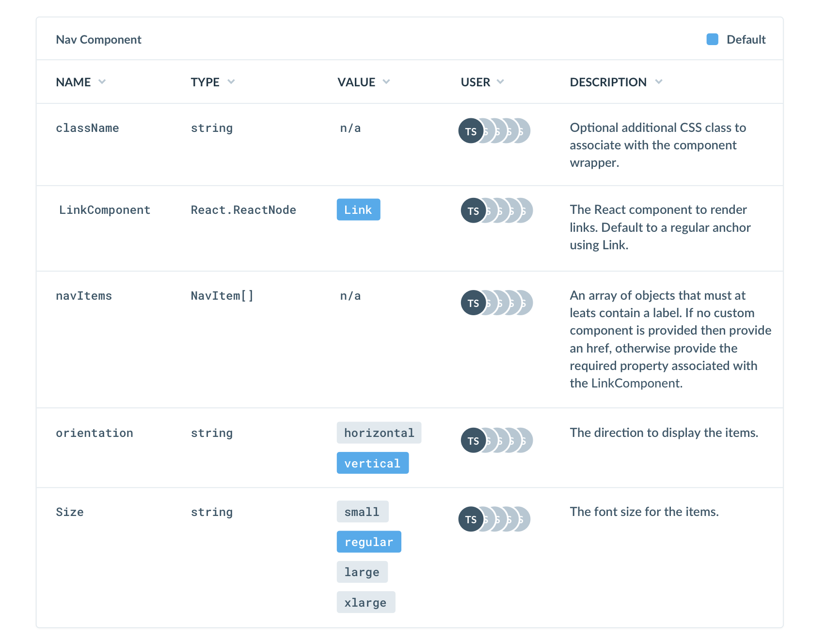
There are several spelling mistakes and grammatical errors in the Nav
To Reproduce
Steps to reproduce the behaviour:
Error
An array of objects that must least contain a label. If no custom component is provided then provide a href, otherwise provide the the required property associated with the LinkComponent
Corrected
An array of objects that must at least contain a label. If no custom component is provided then provide a href, otherwise provide the the required property associated with the LinkComponent
Describe the bug
Tabs have grey background in Windows / non-Mac OS's (see screenshot)
To Reproduce
Steps to reproduce the behaviour:
Expected behavior
Tabs have the white background as viewed on a Mac
Screenshots

Desktop (please complete the following information):
Additional context
Users also seem to miss the tabs completely at various points as they're not clear enough. This is a wider design problem.
When a develop creates a page with a breadcrumb in it
and the LinkComponent property is specified with the React Router Dom Link component
then the Typescript compiler returns an error:
Property 'to' is missing in type 'typeof Link' but required in type 'LinkType'.
Describe the bug
Masthead design docs on the docs-site are missing the SketchWidget component.
To Reproduce
Expected behavior
Should include SketchWidget component like other component documentation.
Dialogues are 'windows' of floating content / UI components that sit over the top of the main content of the screen. They present important information, workflows or decisions that the user needs to make.
Is this component an atom, molecule or organism?
'Dialogue' is an ambiguous term, but is intended to highlight important information to the user. It does this by removing them from the main workflow of the page, and presenting the relevant UI components in a minimal setting.
In Application designs so far, we have approached this by creating a transparent window over the top of the interface, and presenting the dialogue on top. Some points to consider int he design:
Used in 3x exemplar projects
We may need to have a few versions of this. Some examples I can think of include:
A popover is a self-contained modal or dialogue that appears in context next to a trigger element. It contains more content that a tooltip, but is directly related to a trigger element in the same way as a tooltip.
This component is a Molecule.
Popovers provide larger volumes of contextual information to a specific element on an interface. This content can be informative, or include interactive elements.
A number of buttons that are physically joined together.
A series of grouped buttons, indicating to the user they perform related or similar actions. For example: zoom in | zoom out. The buttons should be physically connected.
It should be possible to label the button group.
This should follow the standard button conventions closely.
Note that this is different to a switch were one or more buttons can be active.
Used in 2 exemplar projects
Outstanding questions for the Product Owner, Designers or Developers.
A vertical or horizontal line. Used for dividing up areas of content.
Is this component an atom, molecule or organism?
Rules play an important part in layout out the content of the page, making it easier for users to read, understand and interact with screen content.
We need specific guidance for usage, including on colour. Rules can be placed on a number of background objects and colours, which should be factored into the design.
Used in 2x exemplar projects
Describe the bug
TypeScript compiler is throwing a type error that has been temporarily fixed with an any as part of a hotfix: #242
Type error started being thrown when some deps were bumped as part of hotfix (lock file had to be entirely regenerated).
// src/components/Breadcrumbs/Breadcrumb.tsx:21:37 - error TS2709: Cannot use namespace 'EndTitle' as a type.
// 21   const ComponentToUse: LinkTypes | EndTitle = last ? EndTitle : LinkComponent
To Reproduce
Branch from develop and add original type definition in Breadcrumb.tsx, line 21.
Expected behavior
Correct type definitions declared and no type error thrown by compiler.
The withFormik enhancer is not exported with the react component library so users are unable to use the fields in a formik form.
Can we either export withFormik or possibly already enhance them and have them as Formik.TextInput.
Describe the bug
The component demo pages linked from Readme.md is invalid.
The Radio component appears in the Forms section of the documentation site but the Checkbox is not.
They should both be in the same place.
3:06:51 PM: royalnavy.io: Component SelectComponent was not imported, exported, or provided by MDXProvider as global scope
3:06:51 PM: royalnavy.io: Component SketchWidget was not imported, exported, or provided by MDXProvider as global scope
3:06:51 PM: royalnavy.io: Component PhaseBanner was not imported, exported, or provided by MDXProvider as global scope
3:06:51 PM: royalnavy.io: Component PhaseBanner was not imported, exported, or provided by MDXProvider as global scope
3:06:51 PM: royalnavy.io: Component Form was not imported, exported, or provided by MDXProvider as global scope
3:06:51 PM: royalnavy.io: Component Form was not imported, exported, or provided by MDXProvider as global scope
If I include an icon from @royal-navy/icon-library in the react component library the compile time goes from 6 seconds to 30+ seconds and the bundle size increases by almost a megabyte.
If I include an icon from @royal-navy/icon-library in a markdown file int the documentation site the build time goes from a minute to about 8 minutes and this also causes Netlify to fail as the build times out.
For both options we need to find why it is in effect trying to re-compile the icons and how to tree shake so that in the case of the component library it only includes the icons needed which should barely affect the bundle size.
A linked piece of text that navigates users to another page or area of an Application.
Is this component an atom, molecule or organism?
Hyperlinks are a well established and known UI component that uses are familiar with.
It should be clear what text is marked up as a hyperlink. There should be appropriate states for active, focus, hover, visited etc.
Clear guidance should be provided on hyperlink usage.
See also https://rn-nelson.atlassian.net/browse/EN-567.
Used by 2 exemplar projects
Describe the bug
After entering text in the Text Input, the input does not hold its filled state. This causes the label to revert back to its :empty position, clipping the inputted text.
To Reproduce
Steps to reproduce the behaviour:
Expected behaviour
The label does not revert to its default state.
Screenshots

Standard select input (as per browser native functionality).
Is this component an atom, molecule or organism?
Select elements are core HTML components. Users need them in forms and as standalone elements.
The notification component displays important messages that are relevant to the user. These messages may be triggered while the user is in the App, or whilst they are away.
Is this component an atom, molecule or organism?
We need some way of highlighting to users that there are important messages they should attend to, but without being highly intrusive in the interface,
Some design considerations:
Used in 2x exemplar projects
A switch component is a joined series of two or more buttons, representing a choice to the user. One or more buttons can be selected at a time.
Is this component an atom, molecule or organism?
Users need a simple way to switch between a variety of named options. One or more option can be active / selected at a time. It should be clear which options are currently selected.
Used in 2x exemplar projects
Some of the commands used in the npm scripts for the project are bash commands. These don't work in CMD or Powershell
A large box for the user to enter multi line textual content.
Is this component an atom, molecule or organism?
Interfaces often require users to enter larger passages of text. The textarea is a common element that facilitates this. Generally textareas are understood well by users.
We need an icon library for Standards. This should include Royal Navy (and potentially coalition / NATO) air and sea assets.
Is this component an atom, molecule or organism?
Used in 3x exemplars.
Icons are easily recognisable. If you use common icons in your designs, your audience will recognise them instantly, helping with navigation and tasks.
We need a comprehensive library of icons in a consistent style. These should be scale-able in size and with the ability to re-colour as required by the Application design.
We should include in this accurate deceptions of Royal Navy and coalition partner Units (air and sea).
In our user testing, participants were very distracted if these weren't accurate, so care should be taken in making these accurate. In the case of ships, this should be down to the individual vessel, not just the class.
Used in 3x exemplar projects
Ability to present icons in different states such as 'active', 'inactive', 'hover' etc.
The Table component is used to display tabular data.
From looking at the examples and use cases we have, I’ve split the following section into 2 distinct types of components. As an overview, the Data Table should be used when you want to display a large amount of data that have no to little data visualisation or interactivity associated. The Interactive Table however is much more versatile due to its ability to accept interact-able sub-components.
The Data Table is used to display large amounts of data at once - it’s most appropriately used for feeds and raw data. Each row can be hovered and clicked on, however because of this the table cells containing sub-components are read-only. The Data Table cells can only have a single line of text for each table cell - if a value overflows it should be truncated.


All Tables can accept components within their cells, however how a user interacts with these components depends on the type of base table used. As noted above, the Data Table is used for large amounts of raw data, where the focus is on displaying as much information as possible. Larger sub components that contain interactivity should be used in the Interactive Table.

Much like the Forms section there is an almost infinite way of constructing a table. Due to this I suggest we make another section on our Components page for Tables. This section would outline the basics of the different variations we have and when to use them. We can also include the table specific sub components that can be added.
Moving forward, adding components to the table will be on as-needed basis. Like with Forms, as the component library expands we should decide which components should be made available in the Table. We will also need to consider how we adapt certain components, as they may need tweaking to suit the table context.
A way for a user to select a date and time. Note that there is a separate (but related) component for date and time RANGE selection.
Is this component an atom, molecule or organism?
Users often need to select dates and times to complete simple tasks.
Some design considerations:
Used in 2x exemplar projects
Describe the bug
Some console errors. Files page-data.json and icon-144x144.png are failing load. Could be to do with a missing icon and Gatsby’s cache-control settings?
From FED feedback.
Describe the bug
Navigating to the /feedback page on docs.royalnavy.io results in a 404 page
To Reproduce
Steps to reproduce the behavior:
Expected behavior
Feedback page should either be created or the user should be redirected to the contact page
Describe the bug
the “Quick start” example (https://github.com/Royal-Navy/standards-toolkit) is referencing a non existent stylesheet:
import '@royalnavy/css-framework/dist/style.css'
should be
import '@royalnavy/css-framework/dist/styles.css'
To Reproduce
Expected behavior
Load styles.css
Desktop (please complete the following information):
Browser.
After conducting multiple User Research sessions on the Docs Site, a recurring issue has emerged with the usability of the sidebar. Currently, the active state uses a blue colour to signify the active page in sidebar, however we also use a slightly darker blue to highlight a parent link in the sidebar. This causes the parent link to look active, even when it isn't.
The proposed solution:

Representation of the user within the Application. This could be a simple graphic (such as the users initials), or an uploaded picture.
Is this component an atom, molecule or organism?
Users have come to expect an area in an Application where there settings and preferences are accessed from. Since this is personalised to them, a graphical representation of the user helps make the connection to these settings.
This was discussed recently and the initial suggestion is that it takes the initials of the user.
Used by 2x exemplar projects
Tabsets allow users to view large quantities of data without changing page.
Is this component an atom, molecule or organism?
Tabsets allow users to view large quantities of screen content from a single page. They can be used for a variety of purposes such alternative views of a data set.
Tabsets should contain a box, and ability to switch between data sets.
We have previously discussed two types of tabset:
Other considerations:
Used in 2x exemplar projects
It would be useful to have tabsets that are laid out vertically and horizontally
A number field needs to be a new component that acts like a regular TextInput component, but only accepts number and has arrows to allow the user to increase and decrease the number by a pre-defined amount.
The field should also allow a minimum and maximum amount to be specified.
What is unclear is how the field should behave when the user tries to clear it.
The field needs to be able to work with Formik.

A way for a user to select a date and time RANGE. Note that there is a separate (but related) component for date and time ONLY selection.
These two issues share a number of items in common.
Is this component an atom, molecule or organism?
Users often need to select dates and times to complete simple tasks.
Some design considerations:
Used in 2x exemplar projects
Similar in appearance to a select component, a dropdown can contain a variety of different forms of content such as navigation items, filters etc. It is accessed via a button.
Is this component an atom, molecule or organism?
Dropdowns are a familiar interaction element. They are used to wrap extended functionality into an interface under the wrapper of a single description.
Dropdown's should be designed with flexibility in mind. They can contain a number of types of information and can require different actions from users.
Some design considerations:
Used in 2x exemplar projects
 React
React
A declarative, efficient, and flexible JavaScript library for building user interfaces.
🖖 Vue.js is a progressive, incrementally-adoptable JavaScript framework for building UI on the web.
 Typescript
TypeScript is a superset of JavaScript that compiles to clean JavaScript output.
An Open Source Machine Learning Framework for Everyone
 Django
The Web framework for perfectionists with deadlines.
 Laravel
A PHP framework for web artisans
Bring data to life with SVG, Canvas and HTML. 📊📈🎉
JavaScript (JS) is a lightweight interpreted programming language with first-class functions.
Some thing interesting about web. New door for the world.
A server is a program made to process requests and deliver data to clients.
Machine learning is a way of modeling and interpreting data that allows a piece of software to respond intelligently.
Some thing interesting about visualization, use data art
Some thing interesting about game, make everyone happy.
 Facebook
We are working to build community through open source technology. NB: members must have two-factor auth.
 Microsoft
Open source projects and samples from Microsoft.
 Google
Google ❤️ Open Source for everyone.
 Alibaba
Alibaba Open Source for everyone
 D3
D3
Data-Driven Documents codes.
 Tencent
China tencent open source team.