Code Monkey home page Code Monkey logo

winui-gallery's Introduction

WinUI Gallery

Build Status PRs Welcome GitHub license

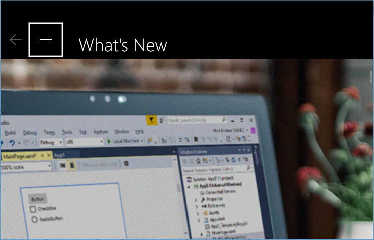
Accompanying Sample App for WinAppSDK

WinUI Screenshot

Shows all of the XAML UI components in an interactive format. This app is the interactive companion to the Fluent Design Guidelines and shows the usage of the WinUI APIs.

The WinUI Gallery shows how to:

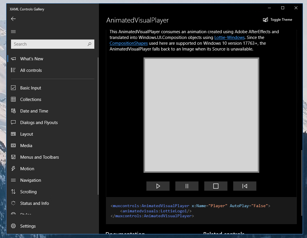
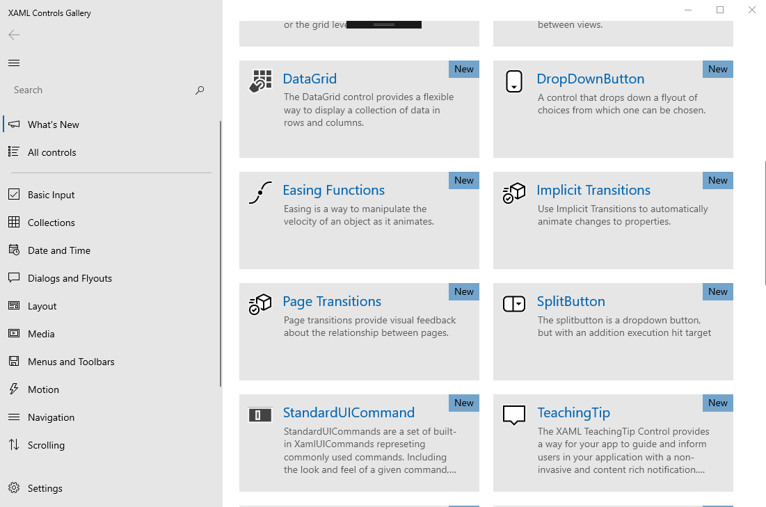
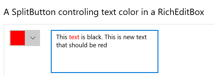
  • Specify XAML controls in markup: Each control page shows the markup used to create each example.
  • Use the Microsoft.UI.Xaml (WinUI) Library: The app includes the latest WinUI NuGet package and shows how to use the WinUI controls like NavigationView, SwipeControl, and more.
  • Basic layout: This sample will show all of the possible layout options for your app and allow you to interact with the panels to show how to achieve any layout you are looking for.
  • Adaptive UI: In addition to showing how each control responds to different form factors, the app itself is responsive and shows various methods for achieving adaptive UI.
  • Version adaptive code: This sample shows how to write version adaptive code so that the app can run on previous versions of Windows while also using the latest capabilities on the most recent verison of Windows.

Further information

Note: The WinUI 3 Gallery requires Visual Studio 2022 or later to build and Windows 10 or later to execute. If you're building an app with the Windows App SDK for the first time, follow the installation instructions here.

To obtain information about Windows 11 development, go to the Windows Dev Center

To obtain information about Microsoft Visual Studio and the tools for developing Windows apps, go to Visual Studio

To contact the authors, please reach out to [email protected]

Related topics

Get started with Windows 11 apps

Install a prebuilt version of this app from Microsoft Store. Each control page in the application has links to relevant Microsoft Docs for that control.

Windows UI Library (WinUI)

Template Studio for WinUI

Related samples

RSS reader sample
Lunch Scheduler app sample
Customers Orders Database sample

winui-gallery's People

Contributors

adambarlow avatar andrewkeepcoding avatar bkudiess avatar bpulliam avatar citelao avatar ghost1372 avatar gregwoo-microsoft avatar hassanuz avatar ho-cooh avatar jay-o-way avatar jevansaks avatar karkarl avatar kikisaints avatar kmahone avatar kmgallahan avatar marcelwgn avatar micahl avatar niels9001 avatar ocalvo avatar pratikone avatar ranjeshj avatar rbrid avatar realtommyklein avatar salmanmkc avatar savoyschuler avatar scottj1s avatar sohchatt avatar stephenlpeters avatar stmoy avatar winston-de avatar

Stargazers

 avatar  avatar  avatar  avatar  avatar  avatar  avatar  avatar  avatar  avatar  avatar  avatar  avatar  avatar  avatar  avatar  avatar  avatar  avatar  avatar  avatar  avatar  avatar  avatar  avatar  avatar  avatar  avatar  avatar  avatar  avatar  avatar  avatar  avatar  avatar  avatar  avatar  avatar  avatar  avatar  avatar  avatar  avatar  avatar  avatar  avatar  avatar  avatar  avatar  avatar  avatar  avatar  avatar  avatar  avatar  avatar  avatar  avatar  avatar  avatar  avatar  avatar  avatar  avatar  avatar  avatar  avatar  avatar  avatar  avatar  avatar  avatar  avatar  avatar  avatar  avatar  avatar  avatar  avatar  avatar  avatar  avatar  avatar  avatar  avatar  avatar  avatar  avatar  avatar  avatar  avatar  avatar  avatar  avatar  avatar  avatar  avatar  avatar  avatar  avatar

Watchers

 avatar  avatar  avatar  avatar  avatar  avatar  avatar  avatar  avatar  avatar  avatar  avatar  avatar  avatar  avatar  avatar  avatar  avatar  avatar  avatar  avatar  avatar  avatar  avatar  avatar  avatar  avatar  avatar  avatar  avatar  avatar  avatar  avatar  avatar  avatar  avatar  avatar  avatar  avatar  avatar  avatar  avatar  avatar  avatar  avatar  avatar  avatar  avatar  avatar  avatar  avatar  avatar  avatar  avatar  avatar  avatar  avatar  avatar  avatar  avatar  avatar  avatar  avatar  avatar  avatar  avatar  avatar  avatar  avatar  avatar  avatar  avatar  avatar  avatar  avatar  avatar  avatar  avatar  avatar  avatar  avatar  avatar  avatar  avatar  avatar  avatar  avatar  avatar  avatar

winui-gallery's Issues

Caption controls sometimes draw in the wrong color

Describe the bug

Sometimes the minimize/maximize/close buttons render black on black or white on white, invisible until hovered over.

Steps to reproduce the bug

Steps to reproduce the behavior:

  1. Launch the app. Ensure it's set to "Use system setting" theme mode
  2. Restart the app
  3. On its settings page, select the theme mode opposite to current system theme (so if my system theme is Light, choose the Dark radio button)
  4. Restart the app

Expected behavior

Caption controls are visible in their rest state

Actual behavior

Caption controls disappear

Screenshots

image

Version Info

Gallery version (found on Settings page):
1.2.8.0

Windows 10 version:

  • Insider Build (xxxxx)
  • May 2019 Update (18362)
  • October 2018 Update (17763)
  • April 2018 Update (17134)
  • Fall Creators Update (16299)
  • Creators Update (15063)
  • Anniversary Update (14393)

Device form factor:

  • Desktop
  • Mobile
  • Xbox
  • Surface Hub
  • IoT

Additional context

Tip control sample

Is this a totally new sample, an addition to an existing sample page, or a modification of an existing sample page?

  • New sample
  • Addition to existing sample
  • Modification to existing sample

If this is an addition/modification to an existing sample page, which one?

Describe the sample

Sample for the Tip control

Is your sample request related to a problem? Please describe it

Additional context

Bug: Pivot Guidelines link has changed

Describe the bug

Pivot's Guidelines link no longer links to the correct address.

Steps to reproduce the bug

Steps to reproduce the behavior:

  1. Go to 'Pivot'
  2. Click on 'Guidelines'

Expected behavior

I expect the Guidelines link to direct to this address:
https://docs.microsoft.com/en-us/windows/uwp/design/controls-and-patterns/pivot

Actual behavior

The Guidelines link directs to this address:
https://docs.microsoft.com/en-us/windows/uwp/design/controls-and-patterns/windows-apps-src/design/controls-and-patterns/pivot.md

Screenshots

Version Info

Gallery version (found on Settings page):
Gallery version 1.1.1.0

Windows 10 version:

  • Insider Build (18331)
  • October 2018 Update (17763)
  • April 2018 Update (17134)
  • Fall Creators Update (16299)
  • Creators Update (15063)
  • Anniversary Update (14393)

Device form factor:

  • Desktop
  • Mobile
  • Xbox
  • Surface Hub
  • IoT

Additional context

Asset names have incorrect qualifier syntax (dashes)

Describe the bug

Some image asset names have dashes and shouldn't, e.g.:

  • Assets/Sun.32.scale-100-White.png

This results in an MSBuild makepri warning:

PRI249: 0xdef00520 - Invalid qualifier: SCALE-100-WHITE

Because it isn't a valid ResourceCandidate for a NamedRseource per standard resource qualifier patterns.

Assets/Sun-100-Black.png probably isn't ideal either but I think it's technically valid.

Steps to reproduce the bug

Steps to reproduce the behavior:

  1. Clone repo
  2. Build with warnings on

Version Info

Gallery version (found on Settings page): Version: 1.1.1.0

Windows 10 version:

  • Insider Build (xxxxx)
  • May 2019 Update (18362)
  • October 2018 Update (17763)
  • April 2018 Update (17134)
  • Fall Creators Update (16299)
  • Creators Update (15063)
  • Anniversary Update (14393)

Device form factor:

  • Desktop
  • Mobile
  • Xbox
  • Surface Hub
  • IoT

Additional context

Flip View navigation by arrow key adds a border.

Flip View navigation by arrow key adds a border.

Steps to reproduce the bug
Install the the xaml control gallery app. go to flip view sample.
when navigate with iocn it works .
but if we navigate by arrow key it it add highlighted border. how i can control this border.

Dark Theme for ContentDialog

Describe the bug
The ContentDialog shows up in Light Theme when Dark Theme is selected

Steps to reproduce the bug
Steps to reproduce the behavior:

  1. Go to 'Settings'
  2. Click on 'Dark' under the 'Theme Mode' options
  3. Navigate to the 'Dialogs and Flyouts' section
  4. Select 'ContentDialog'
  5. Click 'Show Dialog'

Expected behavior
If the Theme of the application is in Dark Theme, the Content Dialog should also be in Dark Theme.

Actual behavior
The Content Dialog appears with a Light Theme

Screenshots

dark-1
dark-2

Version Info

Gallery version (found on Settings page):
1.2.8.0

Windows 10 version:

  • Insider Build (xxxxx)
  • May 2019 Update (18362)
  • October 2018 Update (17763)
  • April 2018 Update (17134)
  • Fall Creators Update (16299)
  • Creators Update (15063)
  • Anniversary Update (14393)

Device form factor:

  • Desktop
  • Mobile
  • Xbox
  • Surface Hub
  • IoT

Additional context

Sample markup doesn't update when the sample code changes

Describe the bug

All the code that dynamically updates the XAML markup doesn't work, because the syntax highlighter replaces all the child elements with a RichTextBlock, so the bindings are happily mutating elements that are no longer in the tree.

Steps to reproduce the bug

Steps to reproduce the behavior:

  1. See the ListView sample page, which has the following run:
    '<Run Text="{x:Bind Control2.SelectionMode, Converter={StaticResource valueToStringConverter}, Mode=OneWay}"/'>

Expected behavior

When the SelectionMode changes, the change should be reflected in the markup

(There are several pages that are affected, not just ListView.)

Actual behavior

The markup doesn't change

Screenshots

Version Info

Gallery version (found on Settings page):

1.2.3.0

Windows 10 version:

  • Insider Build (xxxxx)
  • October 2018 Update (17763)
  • April 2018 Update (17134)
  • Fall Creators Update (16299)
  • Creators Update (15063)
  • Anniversary Update (14393)

Device form factor:

  • Desktop
  • Mobile
  • Xbox
  • Surface Hub
  • IoT

Additional context

Update CommandBar sample to show its properties dynamically

Is this a totally new sample, an addition to an existing sample page, or a modification of an existing sample page?

  • New sample
  • Addition to existing sample
  • Modification to existing sample

If this is an addition/modification to an existing sample page, which one?
CommandBarPage.xaml

Describe the sample

In the screenshot below, the Xaml does not match CommandBar's current state. Would be great to have the Xaml dynamically update.

Additional context

image

Suggestion: Add link to this GitHub issues page directly from Controls Gallery app

Is this a totally new sample, an addition to an existing sample page, or a modification of an existing sample page?

  • New sample
  • Addition to existing sample
  • Modification to existing sample

If this is an addition/modification to an existing sample page, which one?
All of them

The suggestion is to make the link to GitHub issues page available directly from the controls' pages just like guidance doc having it on the bottom of each pages.

Describe the sample

Is your sample request related to a problem? Please describe it

Additional context

Reveal sample on other pages

Is this a totally new sample, an addition to an existing sample page, or a modification of an existing sample page?

  • New sample
  • Addition to existing sample
  • Modification to existing sample

If this is an addition/modification to an existing sample page, which one?
Buttonpage, other components with RevealStyle.

Describe the sample
Currently the button reveal style/border is only shown on the reveal page. Maybe we should also show the reveal style on the button page so developers who are new to UWP notice the reveal style more easily (since they they might not know that there is a reveal page).

Is your sample request related to a problem? Please describe it
While I was trying to fix an issue regarding the ButtonRevealStyle, I wanted to look at how the default button reveal style and did not find it as I forgot there was a separate Reveal page.

Additional context

Source file '...App.g.i.cs' could not be found.

Describe the bug
When trying to build for the x64 or x86 configuration, two errors appear:

Severity Code	Description
Error	CS2001	Source file 'C:\Users\Jay\source\repos\Xaml-Controls-Gallery\XamlControlsGallery\obj\x64\Debug\App.g.i.cs' could not be found.	File: C:\Users\Jay\source\repos\Xaml-Controls-Gallery\XamlControlsGallery\CSC	Line: 1
Error		Cannot resolve Assembly or Windows Metadata file 'Type universe cannot resolve assembly: System.Runtime, Version=4.0.0.0, Culture=neutral, PublicKeyToken=b03f5f7f11d50a3a.'	File: C:\Users\Jay\source\repos\Xaml-Controls-Gallery\XamlControlsGallery\XamlControlsGallery.csproj	

Steps to reproduce the bug
Steps to reproduce the behavior:

  1. Clone using Github desktop
  2. Open with VS 2017 v15.9.7
  3. Select x64 or x86 configuration.
  4. Try to build/rebuild.

Expected behavior
Not getting an error. Nothing was modified on cloning.

Actual behavior
Getting the error.

Screenshots
N/A

Version Info

  • VS version: 15.9.7 (updated tonight 2/19/2019)
  • System type: x64-based PC

Gallery version (found on Settings page):

  • (just downloaded tonight 2/19/2019)

Windows 10 version:

  • April 2018 Update (17134)

Device form factor:

  • Desktop

Additional context
N/A

Should Hub be removed from gallery or marked as not recommended for use?

Describe the bug

Since we de-prioritized hub control in documents, should we do the same for controls gallery sample?

Steps to reproduce the bug

Steps to reproduce the behavior:

  1. Go to '...'
  2. Click on '....'

Expected behavior

Actual behavior

Screenshots

Version Info

Gallery version (found on Settings page):

Windows 10 version:

  • Insider Build (xxxxx)
  • May 2019 Update (18362)
  • October 2018 Update (17763)
  • April 2018 Update (17134)
  • Fall Creators Update (16299)
  • Creators Update (15063)
  • Anniversary Update (14393)

Device form factor:

  • Desktop
  • Mobile
  • Xbox
  • Surface Hub
  • IoT

Additional context

XAML Controls Gallery (aka XamlUiBasics) Code Snippets Contain Incorrect Syntax

Describe the bug

I've run into this a few different places across the XAML Controls Gallery sample app. If you try to copy and paste many of the code snippets from the app, the XAML tags are formatted incorrectly and therefore the sample code taken directly does not actually compile. Take one of the snippets from the TreeView Page as an example:

<controls:TreeView ItemsSource="{x:Bind DataSource}"/>
   <TreeView.ItemTemplate/>
      <DataTemplate x:DataType="local:ExplorerItem"/>
         <TreeViewItem ItemsSource="{x:Bind Children}" Content="{x:Bind Name}"/>
      <DataTemplate/>
   <TreeView.ItemTemplate/>
<controls:TreeView/>

// Note the position of the / characters, the correct code snippet should look like this:

<controls:TreeView ItemsSource="{x:Bind DataSource}">
    <TreeView.ItemTemplate>
        <DataTemplate x:DataType="local:ExplorerItem">
            <TreeViewItem ItemsSource="{x:Bind Children}" Content="{x:Bind Name}"/>
        </DataTemplate>
    </TreeView.ItemTemplate>
</controls:TreeView>

Steps to reproduce the bug

Steps to reproduce the behavior:

  1. Go to the TreeView Page
  2. Copy the code snippet
  3. Paste the snippet into a new UWP project's MainPage.xaml

Expected behavior

The example snippet code should compile.

Actual behavior

The example snippet code does not compile.

Screenshots

Version Info

Gallery version (found on Settings page):

1.2.4.0

Windows 10 version:

  • Insider Build (xxxxx)
  • October 2018 Update (17763)
  • April 2018 Update (17134)
  • Fall Creators Update (16299)
  • Creators Update (15063)
  • Anniversary Update (14393)

Device form factor:

  • Desktop
  • Mobile
  • Xbox
  • Surface Hub
  • IoT

Additional context

CheckBox 3-state sample code says "Two-state CheckBox"

Describe the bug
CheckBox Indetermine sample code doesn't match the running code. It says "Two-state CheckBox".

Steps to reproduce the bug

  1. Go to 'Basic Input'
  2. Click on 'CheckBox'

Expected behavior
Content="Three-state Checkbox"

Actual behavior
Wrong Content string

Screenshots
image

Version Info
Gallery version (found on Settings page):
Version 1.1.1.0

Windows 10 version:

  • Insider Build (xxxxx)
  • October 2018 Update (17763)
  • April 2018 Update (17134)
  • Fall Creators Update (16299)
  • Creators Update (15063)
  • Anniversary Update (14393)

Device form factor:

  • Desktop
  • Mobile
  • Xbox
  • Surface Hub
  • IoT

Additional context
Also it's weird that there are Checked/Unchecked/Indeterminate handlers named here but not defined here.

Connected Animation page: "Go Back" button text is clipped with 200% Text Scaling

Describe the bug

Connected Animation page: "Go Back" button text is clipped with 200% Text Scaling

Steps to reproduce the bug

Steps to reproduce the behavior:
0. Set text scaling to 200% (Settings--> Ease of Access-->Display-->Drag the Display slider to 200%-->Apply)

  1. Launch app
  2. Click on Connected Animation page
  3. Navigate to item 1 in list page -> activate it and observe the button name on "go back" button

Expected behavior

  • Button is not clipped

Actual behavior

  • Button is clipped

Screenshots

go back

Version Info

Gallery version (found on Settings page):

1.2.3.0

Windows 10 version:

  • Insider Build (xxxxx)
  • October 2018 Update (17763)
  • April 2018 Update (17134)
  • Fall Creators Update (16299)
  • Creators Update (15063)
  • Anniversary Update (14393)

Device form factor:

  • Desktop
  • Mobile
  • Xbox
  • Surface Hub
  • IoT

Additional context

Protocol activation does not work when app is already open

Describe the bug

The protocol activation does not work when the application is running. Instead of navigating to the item page, the app opens the "New item" page.

Steps to reproduce the bug

Steps to reproduce the behavior:

  1. Open XAML Controls Gallery
  2. Hit Win+R and enter xamlcontrolsgallery:///item/ProgressRing

Expected behavior

The app continues to the ProgressRing page.

Actual behavior

The app opens the "New item" page.

Screenshots

starting-with-app-started

Version Info

Gallery version (found on Settings page):

1.2.8
Windows 10 version:

  • Insider Build (18950)
  • May 2019 Update (18362)
  • October 2018 Update (17763)
  • April 2018 Update (17134)
  • Fall Creators Update (16299)
  • Creators Update (15063)
  • Anniversary Update (14393)

Device form factor:

  • Desktop
  • Mobile
  • Xbox
  • Surface Hub
  • IoT

Additional context

See this issue: #19 for additional context.

Protocol Activation doesn't work if app is not running

Describe the bug
If you try and open the app with a protocol link (like xamlcontrolsgallery:///item/ProgressRing), it doesn't work unless the app is already open. If the app isn't open, when it launches, it should still respect the protocol launch and navigate to the section or item in the protocol.

Steps to reproduce the bug

  1. Make sure app is closed.
  2. Hit Win+R and enter xamlcontrolsgallery:///item/ProgressRing

Expected behavior
App opens and goes to ProgressRing control page.

Actual behavior
App opens to home page.
If you repeat the steps with the app open, the app correctly navigates to the page, but this should happen regardless of the current state of the app.

Version Info
Gallery version (found on Settings page):
[e.g. 1.2.4.0]

Windows 10 version:

  • Insider Build (18305)
  • October 2018 Update (17763)
  • April 2018 Update (17134)
  • Fall Creators Update (16299)
  • Creators Update (15063)
  • Anniversary Update (14393)

Device form factor:

  • Desktop
  • Xbox
  • Mobile
  • Surface Hub
  • IoT

Make all URLs language+region agnostic

Most documentation throughout the repo uses links with "/en-us/". Consider removing to make the links friendly to users from different regions/ languages.

Suggestion: XAML Controls Gallery App "What's New" with Dates

It's nice we have the XAML Controls Gallery app, but one thing that can be improved is having dates on the What's New section. I see "Preview" or "Updated" or "New" but don't know if it's the same things I've seen the last time it was updated.

Updated as of when?
New as of when?

AnimatedVisualPlayer doesn't correctly fallback on RS4

Describe the bug

On RS4, the AnimatedVisualPlayer control should fall back and use a static image. Instead, a white box is displayed.

Steps to reproduce the bug

Steps to reproduce the behavior:

  1. On an RS4 machine, run the Xaml Gallery
  2. Navigate to the AnimatedVisualPlayerPage

Expected behavior

The AVP sample displays a static image

Actual behavior

The AVP sample displays a gray box

Screenshots

AnimatedVisualPlayer gray box

Version Info

Gallery version (found on Settings page):

Internal build from master branch

Windows 10 version:

  • Insider Build (xxxxx)
  • October 2018 Update (17763)
  • April 2018 Update (17134)
  • Fall Creators Update (16299)
  • Creators Update (15063)
  • Anniversary Update (14393)

Device form factor:

  • Desktop
  • Mobile
  • Xbox
  • Surface Hub
  • IoT

Additional context

Changing color in RichEditBox editor sample removes previously applied color

Describe the bug

When changing the color in the RichEditBox - Editor sample, the color of text written before changes to black instead of staying in that color.
Steps to reproduce the bug

Steps to reproduce the behavior:

  1. Go to RichEditBox page to the "custom editor" sample
  2. Change color to any color except black
  3. Write some text
  4. Change color

Expected behavior

The newly written text will be in the new color while the old text stays in the color it was written in.

Actual behavior

The text changes it color to black

Screenshots

Version Info

Gallery version (found on Settings page):

1.2.8.0
Windows 10 version:

  • Insider Build (18956)
  • May 2019 Update (18362)
  • October 2018 Update (17763)
  • April 2018 Update (17134)
  • Fall Creators Update (16299)
  • Creators Update (15063)
  • Anniversary Update (14393)

Device form factor:

  • Desktop
  • Mobile
  • Xbox
  • Surface Hub
  • IoT

Additional context

ScrollViewer page is confusing

Describe the bug

ScrollViewer sample is confusing because the page doesn't even show scroll indicator or scroll bar unless I zooomed out the image. Perhaps better representation of scroll viewer is better here?

Steps to reproduce the bug

Steps to reproduce the behavior:

  1. Go to '...'
  2. Click on '....'

Expected behavior

Actual behavior

Screenshots

Version Info

Gallery version (found on Settings page):

Windows 10 version:

  • Insider Build (xxxxx)
  • May 2019 Update (18362)
  • October 2018 Update (17763)
  • April 2018 Update (17134)
  • Fall Creators Update (16299)
  • Creators Update (15063)
  • Anniversary Update (14393)

Device form factor:

  • Desktop
  • Mobile
  • Xbox
  • Surface Hub
  • IoT

Additional context

Color of text missing after RichEditBox loses focus in dark theme

Describe the bug

This only applies to dark theme
When the text has been colored using the SplitButton, and the user leaves the RichEditBox (by clicking outside) the text color changes to white (since we are using dark theme). After clicking the box again the color does not change back to the original one (the color chosen using the SplitButton) but instead the text is color black.

Steps to reproduce the bug

Steps to reproduce the behavior:

  1. Open SplitButton page (while using dark mode for the whole app or the sample)
  2. Select text and color it in any color except black
  3. Click outside of RichEditBox
  4. Click inside the RichEditBox

Expected behavior

The text returns to the previously applied colors

Actual behavior

The text is colored black.

Screenshots

Version Info

Gallery version (found on Settings page):
1.2.8.0

Windows 10 version:

  • Insider Build (18956)
  • May 2019 Update (18362)
  • October 2018 Update (17763)
  • April 2018 Update (17134)
  • Fall Creators Update (16299)
  • Creators Update (15063)
  • Anniversary Update (14393)

Device form factor:

  • Desktop
  • Mobile
  • Xbox
  • Surface Hub
  • IoT

Additional context

This applies to the SplitButton page and the RichEditBox page.

The NavigationView menu is not acrylic anymore

The NavigationView menu is not acrylic anymore in the latest version, on Windows 10 May 2019 Update (18362).
It used to be acrylic before, now it is just solid color.
Why this step back?

Also the back navigation arrow was moved from the title bar. I think the UI looked more compact before.

Annotation 2019-07-24 141202

TeachingTip is displayed in the wrong location

Describe the bug

When changing the selected item in the left navigationView of the sample application, and then entering the TeachingTip example page, TeachingTip will be displayed in the wrong location.

Steps to reproduce the bug

Steps to reproduce the behavior:

  1. Navigate to the "All controls" page and back to the "What's New" page.
  2. Navigate to the TeachingTip sample page and click the first "Show TeachingTip" buttonใ€‚

Expected behavior

TeachingTip should appear to the left of the "ToggleTheme" button.
Actual behavior

TeachingTip is displayed in the wrong location.

Screenshots

teachingtipbug

Version Info

Gallery version (found on Settings page):

1.1.1.0

Windows 10 version:

  • Insider Build (xxxxx)
  • October 2018 Update (17763)
  • April 2018 Update (17134)
  • Fall Creators Update (16299)
  • Creators Update (15063)
  • Anniversary Update (14393)

Device form factor:

  • Desktop
  • Mobile
  • Xbox
  • Surface Hub
  • IoT

Additional context

I read the source code and found that PageHeader.TeachingTip1(and PageHeader.TeachingTip2ใ€PageHeader.TeachingTip3) is a wrong reference when switching navigation pages. I will provide a bug fix later.

ToggleSplitButton, SplitButton, and DropDownButton controls should have shadow applied consistently

Describe the bug
ToggleSplitButton, SplitButtion, and DropDownButton all behaves and looks very similar. However if you go to XCL, only DropDownButton gets shadow treatment.

Steps to reproduce the bug
Steps to reproduce the behavior:

  1. Go to 'DropDownButton' control
  2. Click on the button
  3. Do the same for ToggleSplitButton and SplitButton

Expected behavior
All 3 controls (ToggleSplitButton, SplitButtion, and DropDownButton) gets shadow on the flyout UI element.

Actual behavior
Only DropDownButton flyout UI element gets shadow

Version Info
I've installed gallery from Store (RS5 version). Insider build 18309.rs_prelelease.181220-1256

Additional context
This is by design of the shadow implementation. Due to the complexity of supporting flyout, flyout does not turn on shadow on older builds (so shadow will work on 19H1 version).

Suggested fix are two folds:

  1. Use MenuFlyout instead of Flyout for the flyout UI element of the buttons here if the design allows it.
  2. Apply IsShadowEnabled property that we added to enable just this into the control gallery sample code.

Typo in the first code snippset of the MenuFlyout session.

Is this a totally new sample, an addition to an existing sample page, or a modification of an existing sample page?

  • New sample
  • Addition to existing sample
  • Modification to existing sample

If this is an addition/modification to an existing sample page, which one?

First code snippset example In the MenuFlyout Page.
"An AppBarButton with a MenuFlyout"

Describe the sample

Current Version, there are no tag closing.

<MenuFlyoutItem Text="By rating" Click="MenuFlyoutItem_Click" Tag="rating">
<MenuFlyoutItem Text="By match" Click="MenuFlyoutItem_Click" Tag="match">
<MenuFlyoutItem Text="By distance" Click="MenuFlyoutItem_Click" Tag="distance>

It should be implemented like this.

<MenuFlyoutItem Text="By rating" Click="MenuFlyoutItem_Click" Tag="rating"/>
<MenuFlyoutItem Text="By match" Click="MenuFlyoutItem_Click" Tag="match"/>
<MenuFlyoutItem Text="By distance" Click="MenuFlyoutItem_Click" Tag="distance"/>

Is your sample request related to a problem? Please describe it

Additional context

DEP6957: Failed to connect to device '127.0.0.1' using Universal Authentication.

Describe the bug

I am getting an error when trying to run the app

Error DEP6957: Failed to connect to device '127.0.0.1' using Universal Authentication. Please verify the correct remote authentication mode is specified in the project debug settings. COMException - Error HRESULT E_FAIL has been returned from a call to a COM component. [0x80004005] XamlControlsGallery

Steps to reproduce the bug

Steps to reproduce the behavior:

  1. Download or clone the repo
  2. Build and start the solution

Expected behavior

The app should run normally

Actual behavior

I am getting the error upove

Screenshots

Version Info

Windows 10
Visual Studio 2019

Gallery version (found on Settings page):

Latest version

Windows 10 version:

  • Insider Build (xxxxx)
  • October 2018 Update (17763)
  • April 2018 Update (17134)
  • Fall Creators Update (16299)
  • Creators Update (15063)
  • Anniversary Update (14393)

Device form factor:

  • Desktop
  • Mobile
  • Xbox
  • Surface Hub
  • IoT

Additional context

Compact Sizing example doesn't work

Describe the bug

In the 'styles' part of the sample app, there is a 'Compact Sizing' page to demonstrate the much awaited desktop-density UI promised by Microsoft in May this year. However, it doesn't work. Text is clipped in the boxes and everything looks wrong. When you look at the resource dictionary there's nothing really of value there, so this hasn't really been done in any meaningful way. Is this something that Microsoft is working on? or is this something that the community is expected to pick up? If it is the latter, then I might be tempted to have a go. Just looking for clarification.

Steps to reproduce the bug

Steps to reproduce the behavior:

  1. Go to '...'
  2. Click on '....'

Expected behavior

Actual behavior

Screenshots

Version Info

Gallery version (found on Settings page):

Windows 10 version:

  • Insider Build (xxxxx)
  • October 2018 Update (17763)
  • April 2018 Update (17134)
  • Fall Creators Update (16299)
  • Creators Update (15063)
  • Anniversary Update (14393)

Device form factor:

  • Desktop
  • Mobile
  • Xbox
  • Surface Hub
  • IoT

Additional context

Context menu in StandardUICommand sample is broken

Describe the bug

Right-clicking an item to delete doesn't work. The item gets desected on right-click and choosing the Delete menu option does nothing.

Steps to reproduce the bug

Steps to reproduce the behavior:

  1. Go to StandardUICommand page
  2. Right-click on "List item 2"
  3. Click Delete in the open context menu

Expected behavior

List item 2 is removed from the list of items.

Actual behavior

List item 2 loses its hovered/pressed backplate as the context menu opens, so the context menu doesn't appear connected to any list item. The Delete menu option has no effect.

Screenshots

image

Version Info

Gallery version (found on Settings page):

1.2.8.0

Colors in SplitButton sample don't always work as expected

Describe the bug

Steps to reproduce the bug

Steps to reproduce the behavior:

  1. Go to SplitButton page
  2. Type some text (e.g. "This text is black.")
  3. Select a subset of the text (e.g. the word "text") and choose red from the SplitButton flyout
  4. Click at the end of the text and type a few more characters

Expected behavior

The new characters will be red

Actual behavior

The new characters are still black like the older text
Screenshots

image

Version Info

Gallery version (found on Settings page):
1.2.8.0

Windows 10 version:

  • Insider Build (xxxxx)
  • May 2019 Update (18362)
  • October 2018 Update (17763)
  • April 2018 Update (17134)
  • Fall Creators Update (16299)
  • Creators Update (15063)
  • Anniversary Update (14393)

Device form factor:

  • Desktop
  • Mobile
  • Xbox
  • Surface Hub
  • IoT

Additional context

SplitButton sample doesn't show full functionality

Is this a totally new sample, an addition to an existing sample page, or a modification of an existing sample page?

  • New sample
  • Addition to existing sample
  • Modification to existing sample

If this is an addition/modification to an existing sample page, which one?
SplitButton

Describe the sample
SplitButton Guidance shows the event of clicking on the button to cycle to the next color. The XAML Controls gallery sample with a similar example doesn't do this, so it's hard to see the behavior of the click action and how the control differs from the DropDownButton.

Code snippet for Luminosity in-App Acrylic is wrong

The bug is that the code snippet in Acrylic section for Luminosity In-App Acrylic refers to a resource by a different non-existing name than what it is. Custom resource is created with key CustomAcrylicBrush but the code tries to refer CustomAcrylicInAppLuminosity which doesn't exist.

Navigation events are fired when moving to a page but not from.

Describe the bug

OnNavigatedFrom and related navigation events do not surface when navigated from any control's sample page.

Steps to reproduce the bug

Steps to reproduce the behavior:

  1. Add OnNavigatedFrom function to any control's sample page codebehind (e.g., TeachingTipPage.xaml.cs) with an attached break point.
  2. Navigated to and from this page.

Expected behavior

I expect the break point to be triggered.

Actual behavior

The break point is not triggered.

Screenshots

Version Info

Gallery version (found on Settings page):

1.1.1.0

Windows 10 version:

  • Insider Build (18865)
  • October 2018 Update (17763)
  • April 2018 Update (17134)
  • Fall Creators Update (16299)
  • Creators Update (15063)
  • Anniversary Update (14393)

Device form factor:

  • Desktop
  • Mobile
  • Xbox
  • Surface Hub
  • IoT

Additional context

I am attempting to add a function to close open teaching tips when navigating away from the TeachingTip sample page and OnNavigatedFrom is not working.

Add Xaml sample to NavigationView's API in Action section

Is this a totally new sample, an addition to an existing sample page, or a modification of an existing sample page?

  • New sample
  • Addition to existing sample
  • Modification to existing sample

If this is an addition/modification to an existing sample page, which one?
NavigationViewPage.xaml

Describe the sample

Add sample markup that dynamically updates to match current state of the control.

Styles > Acrylic page still crashes in 1.2.9.0

Describe the bug

Since updating the Xaml Controls Gallery app in the store to version 1.2.8 (which includes 19H1 and WinUI2.2 preview), the app has become unstable per reports in the dev center.

One known issue is that the Acrylic Luminosity Opacity slider causes a crash. Is that the only issue?

Version Info

Gallery version (found on Settings page):

1.2.8

Additional context

A MenuFlyout with ToggleMenuFlyoutItems and MenuFlyoutSeparator has padding for icons/glyphs

Describe the bug

A MenuFlyout with ToggleMenuflyoutItems and MenuFlyoutSeparator has padding for icons/glyphs

Steps to reproduce the bug

Steps to reproduce the behavior:

  1. Go to MenuFlyout
  2. Click on "Options" under "A MenuFlyout with ToggleMenuflyoutItems and MenuFlyoutSeparator has padding for icons/glyphs"

Expected behavior

image

Actual behavior

image

Screenshots

Version Info

Gallery version (found on Settings page):
1.2.8.0

Windows 10 version:

  • Insider Build (xxxxx)
  • May 2019 Update (18362)
  • October 2018 Update (17763)
  • April 2018 Update (17134)
  • Fall Creators Update (16299)
  • Creators Update (15063)
  • Anniversary Update (14393)

Device form factor:

  • Desktop
  • Mobile
  • Xbox
  • Surface Hub
  • IoT

Additional context

Implicit Transitions page: App crashes when invalid text characters are entered in the TextBox

Describe the bug

Implicit Transitions page: App crashes when invalid text characters are entered in the TextBox

Steps to reproduce the bug

Steps to reproduce the behavior:

  1. Launch XAML Control Gallery app.
  2. Navigate to "All Controls" menu item and activate it.
  3. Navigate to the "Implicit Transitions" button and activate it.
  4. Navigate to any editable box, enter a text character in it e.g. 'a' , click on Set button and observe.

Expected behavior

  • The text box gives a warning about invalid values

Actual behavior

  • Application crashes

Screenshots

Version Info

Gallery version (found on Settings page):

1.2.3.0

Windows 10 version:

  • Insider Build (xxxxx)
  • October 2018 Update (17763)
  • April 2018 Update (17134)
  • Fall Creators Update (16299)
  • Creators Update (15063)
  • Anniversary Update (14393)

Device form factor:

  • Desktop
  • Mobile
  • Xbox
  • Surface Hub
  • IoT

Additional context

Suggestion: Sanitize text input
Note that pressing the "Enter" button doesn't do anything. Consider wiring up "Enter" to submit the value as part of this fix.

Unable to build the XAMLControlsGallery project in VS2017

Downloaded the zip file of the project from GitHub. After unzipping and opening the solution in VS2017 on Windows 10 pro ver 1809, I built the project successfully but when I run the project using either ctrl+F5 or F5, I get the message shown in image below. Then, from VS2017 top toolbar menu, I tried Build-->Deploy XAMLControlsGallery but it says Deploy failed giving no reason. Please help as there are no instructions on the above GitGub link on how to build the project in VA2017.

NOTE: I'm interesting only in source code build and NOT the prebuilt version of the app available online.

Error:

untitled

Expand menuing sample to include shortcuts/accelerators

Is this a totally new sample, an addition to an existing sample page, or a modification of an existing sample page?

  • New sample
  • Addition to existing sample
  • Modification to existing sample

If this is an addition/modification to an existing sample page, which one?
Commanding/Menu/MenuBar

Describe the sample

The https://docs.microsoft.com/en-us/windows/uwp/design/input/keyboard-accelerators docs page has a lot of good information about how to have a menu item bound to certain keyboard accelerators (like "CTRL+F5") but the Gallery doesn't demonstrate this scenario very clearly. We should better integrate this information into the gallery.

Is your sample request related to a problem? Please describe it

N/A

Additional context

CommandBarFlyout sample needs tooltips

Describe the bug
The sample shows icon-only app bar buttons. To show best practices, we need to ensure that the buttons show a tooltip to label these icons.

Update sample markup to show IsEnabled property for buttons

Is this a totally new sample, an addition to an existing sample page, or a modification of an existing sample page?

  • New sample
  • Addition to existing sample
  • Modification to existing sample

If this is an addition/modification to an existing sample page, which one?
ButtonPage.xaml
HyperlinkButtonPage.xaml
RepeatButtonPage.xaml
ToggleButtonPage.xaml

Describe the sample

All three of these samples have a setting to disable the control. The property that setting is tied to does not appear in the Xaml example. This should update dynamically.

Additional context

image


image

Search should be more inclusive than literal

Describe the bug
Searching is done by type but users who don't know the exact type or using a more descriptive search may get 'no results'

Steps to reproduce the bug

Steps to reproduce the behavior:

  1. Open the app
  2. Click on search box
  3. Type 'Split Button'

Expected behavior
See 'SplitButton'

Actual behavior
no results

Screenshots
image

Version Info

Gallery version (found on Settings page):
1.2.7.0

Windows 10 version:

  • Insider Build (xxxxx)
  • 18362
  • October 2018 Update (17763)
  • April 2018 Update (17134)
  • Fall Creators Update (16299)
  • Creators Update (15063)
  • Anniversary Update (14393)

Device form factor:

  • Desktop
  • Mobile
  • Xbox
  • Surface Hub
  • IoT

focus on search upon launch

Is this a totally new sample, an addition to an existing sample page, or a modification of an existing sample page?

  • New sample
  • Addition to existing sample
  • Modification to existing sample
    None of the above

If this is an addition/modification to an existing sample page, which one?
None

Describe the sample

N/A

Is your sample request related to a problem? Please describe it

Not a sample request

Additional context

PageHeader contents are not properly unloaded.

Describe the bug

Elements of PageHeader's visual tree are not successfully unloaded when navigating across pages where the PageHeader is not visible. It instead appears to collapse to the origin coordinates.

Steps to reproduce the bug

Steps to reproduce the behavior:

  1. Set up an unloaded event on an element of PageHeader's visual tree (such as the ThemeButton AppBarButton for my use case).
  2. Add a break point to the unloaded event.
  3. Navigate to and from any control's sample page.

Expected behavior

I expect the break point to be triggered.

Actual behavior

The break point is not triggered.

Screenshots

Version Info

Gallery version (found on Settings page):

1.1.1.0

Windows 10 version:

  • Insider Build (18865)
  • October 2018 Update (17763)
  • April 2018 Update (17134)
  • Fall Creators Update (16299)
  • Creators Update (15063)
  • Anniversary Update (14393)

Device form factor:

  • Desktop
  • Mobile
  • Xbox
  • Surface Hub
  • IoT

Additional context

I am attempting to leverage the unloaded event to close any open teaching tips when navigating away from the TeachingTip sample page and I am currently unable to do this.

It is possible to catch teaching tip that did not close properly on what should be an unloaded instance of the ThemeButton AppBarButton. When this happens, the TeachingTip will reopen targeting (0,0). To repro:

  1. Navigate to TeachingTip sample.
  2. Click 1st or 3rd "Show TeachingTip" button as these will call teaching tips that target the ThemeButton AppBarButton.
  3. Click "All Controls" - here is where the ThemeButton AppBarButton should be unloaded.
  4. Navigate to TeachingTip sample.
  5. Click the same "Show TeachingTip" button
  6. You will see the shadow of a TeachingTip pointing down at the origin coordinates because it is still targeting the former instance of the ThemeButton AppBarButton which was never unloaded. This teaching tip can be manipulated to prefer bottom or center placement to prove that it exists.

Title is the same when window is active and inactive

Describe the bug

The title of the app stays the same when inactive

Steps to reproduce the bug

Steps to reproduce the behavior:

  1. Open XAML Controls Gallery
  2. Click on an empty spot in the taskbar

Expected behavior

Title would be a lighter grey with the light theme

Actual behavior

Title is the same colour.

Screenshots

Version Info

Gallery version (found on Settings page):

1.2.8.0

Windows 10 version:

  • Insider Build (xxxxx)
  • May 2019 Update (18362)
  • October 2018 Update (17763)
  • April 2018 Update (17134)
  • Fall Creators Update (16299)
  • Creators Update (15063)
  • Anniversary Update (14393)

Device form factor:

  • Desktop
  • Mobile
  • Xbox
  • Surface Hub
  • IoT

Additional context

Search bar outline is invisible

Describe the bug

Search bar outline is invisible

Steps to reproduce the bug

Steps to reproduce the behavior:
N/A

Expected behavior

Search bar would have an outline to discern it from everything else

Actual behavior

Search box doesn't look like a search box

Screenshots

https://user-images.githubusercontent.com/51363864/60203697-8aa08900-9890-11e9-8399-e4f465b34d92.png

Version Info

Gallery version (found on Settings page):

Windows 10 version:

  • Insider Build (xxxxx)
  • May 2019 Update (18362)
  • October 2018 Update (17763)
  • April 2018 Update (17134)
  • Fall Creators Update (16299)
  • Creators Update (15063)
  • Anniversary Update (14393)

Device form factor:

  • Desktop
  • Mobile
  • Xbox
  • Surface Hub
  • IoT

Additional context

microsoft/microsoft-ui-xaml#947 (comment)

Change the new/updated/preview tags for samples

Describe the bug

The new/updated/preview designations haven't been updated in a little while. Feels like it's time to make a pass through the samples and update their status.

@stmoy, I would love your help in wrangling this information and filling out the New state column. (If the sample shouldn't appear on the What's New page, let's call its New state None.)

Sample name Current state New state
AnimatedVisualPlayer New
Animation interop New
ColorPaletteResources New
CommandBarFlyout New Updated
Compact Sizing New
Connected Animation New
DataGrid New
DropDownButton New
Easing Functions New
Implicit Transitions New
ItemsReater New New
Page transitions New
SplitButton New
StandardUICommand New Updated
TeachingTip New New
Theme Transitions New
ToggleSplitButton New
WebView New
XamlUICommand New
ComboBox Updated
CommandBar Updated
ListView Updated
MenuBar Updated Updated
NavigationView Updated Updated
RichEditBox Updated
TreeView Updated
ScrollViewer (preview) Preview Preview
Acrylic None Updated
TabView n/a New

Recommend Projects

  • React photo React

    A declarative, efficient, and flexible JavaScript library for building user interfaces.

  • Vue.js photo Vue.js

    ๐Ÿ–– Vue.js is a progressive, incrementally-adoptable JavaScript framework for building UI on the web.

  • Typescript photo Typescript

    TypeScript is a superset of JavaScript that compiles to clean JavaScript output.

  • TensorFlow photo TensorFlow

    An Open Source Machine Learning Framework for Everyone

  • Django photo Django

    The Web framework for perfectionists with deadlines.

  • D3 photo D3

    Bring data to life with SVG, Canvas and HTML. ๐Ÿ“Š๐Ÿ“ˆ๐ŸŽ‰

Recommend Topics

  • javascript

    JavaScript (JS) is a lightweight interpreted programming language with first-class functions.

  • web

    Some thing interesting about web. New door for the world.

  • server

    A server is a program made to process requests and deliver data to clients.

  • Machine learning

    Machine learning is a way of modeling and interpreting data that allows a piece of software to respond intelligently.

  • Game

    Some thing interesting about game, make everyone happy.

Recommend Org

  • Facebook photo Facebook

    We are working to build community through open source technology. NB: members must have two-factor auth.

  • Microsoft photo Microsoft

    Open source projects and samples from Microsoft.

  • Google photo Google

    Google โค๏ธ Open Source for everyone.

  • D3 photo D3

    Data-Driven Documents codes.