Code Monkey home page Code Monkey logo

jhildenbiddle / docsify-themeable Goto Github PK

View Code? Open in Web Editor NEW
524.0 5.0 272.0 1.78 MB

A delightfully simple theme system for docsify.js. Features multiple themes with rich customization options, an improved desktop and mobile experience, and legacy browser support (IE11+).

Home Page: https://jhildenbiddle.github.io/docsify-themeable

License: MIT License

JavaScript 15.95% CSS 22.86% SCSS 61.19%
docsify documentation theme themes custom properties variables legacy

docsify-themeable's Introduction

docsify-themeable

NPM GitHub Workflow Status (master) Codacy grade License: MIT jsDelivr Sponsor this project

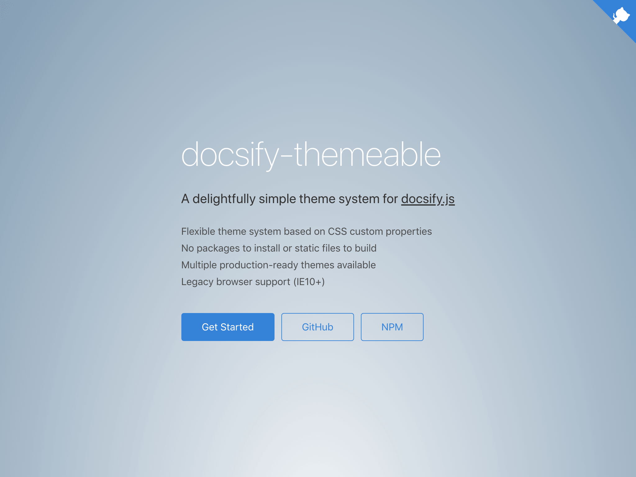
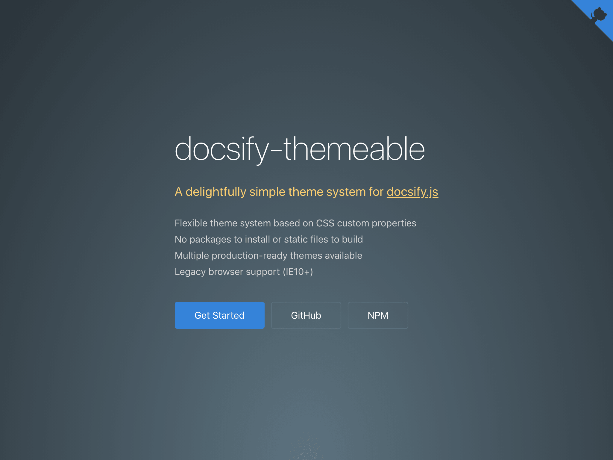
Docsify-themeable is a delightfully simple theme system for docsify.js. Features multiple themes with rich customization options, an improved desktop and mobile experience, and legacy browser support (IE11+).

Screenshots

Simple Theme

Simple theme cover page Simple theme content

Simple Dark Theme

Simple dark theme cover page Simple dark theme content

๐Ÿ’ก Like docsify-themeable? Check out docsify-tabs for tabbed content, docsify-plugin-ethicalads for EthicalAds integration, and docsify-plugin-runkit for live JavaScript REPLs!

Installation & Options

See the documentation site for details.

Sponsorship

A sponsorship is more than just a way to show appreciation for the open-source authors and projects we rely on; it can be the spark that ignites the next big idea, the inspiration to create something new, and the motivation to share so that others may benefit.

If you benefit from this project, please consider lending your support and encouraging future efforts by becoming a sponsor.

Thank you! ๐Ÿ™๐Ÿป

Contact & Support

  • Follow ๐Ÿ‘จ๐Ÿปโ€๐Ÿ’ป @jhildenbiddle on Twitter and GitHub for announcements
  • Create a ๐Ÿ’ฌ GitHub issue for bug reports, feature requests, or questions
  • Add a โญ๏ธ star on GitHub and ๐Ÿฆ tweet to promote the project
  • Become a ๐Ÿ’– sponsor to support the project and future efforts

License

This project is licensed under the MIT License. See the LICENSE for details.

Copyright (c) John Hildenbiddle (@jhildenbiddle)

docsify-themeable's People

Contributors

jhildenbiddle avatar noraj avatar

Stargazers

 avatar  avatar  avatar  avatar  avatar  avatar  avatar  avatar  avatar  avatar  avatar  avatar  avatar  avatar  avatar  avatar  avatar  avatar  avatar  avatar  avatar  avatar  avatar  avatar  avatar  avatar  avatar  avatar  avatar  avatar  avatar  avatar  avatar  avatar  avatar  avatar  avatar  avatar  avatar  avatar  avatar  avatar  avatar  avatar  avatar  avatar  avatar  avatar  avatar  avatar  avatar  avatar  avatar  avatar  avatar  avatar  avatar  avatar  avatar  avatar  avatar  avatar  avatar  avatar  avatar  avatar  avatar  avatar  avatar  avatar  avatar  avatar  avatar  avatar  avatar  avatar  avatar  avatar  avatar  avatar  avatar  avatar  avatar  avatar  avatar  avatar  avatar  avatar  avatar  avatar  avatar  avatar  avatar  avatar  avatar  avatar  avatar  avatar  avatar  avatar

Watchers

 avatar  avatar  avatar  avatar  avatar

docsify-themeable's Issues

documentation for making styles for mobile vs desktop (or for various document sizes in general)

There's no @media queries here or in the Docsify source. When someone wants to make specific styling for small devices, it isn't at all clear how to do this.

For example, the sidebar somehow starts closed on mobile, without media queries.

What I imagine doing is to make the window smaller and smaller, and make my own media queries as necessary (one break point will be namely at the point when the sidebar becomes hidden for mobile). But this means I have to do some work and add my own queries.

How can we improve this, so that there can be a standard way for people to style for certain sizes (and thus document it)?

Looking forward to docsify-themeable (or whatever it will be called that point) to be integrated. :)

Table contents can overflow without being scrollable

E.g. see:
https://docs.liveryvideo.com/web-sdk

Here's how I patched it there with CSS for now:

/* Allow docsify-themeable tables to scroll horizontally when necessary */
.markdown-section .table-wrapper {
  overflow-x: auto;
}

/* Prevent docsify-themeable responsive table cells from overflowing (unscrollable) */
@media (max-width: 30em) {
  .markdown-section .table-wrapper td {
    flex-wrap: wrap;
  }
}

I think in the case of the responsive table (max-width: 30em) with the ::before being used to repeat the column header that the td contents should be wrapped by a div with word wrapping and hyphens enabled.

idea: choose theme in Customization page and see variable value for selected theme

I thought I'd write this random idea. Not sure if it is worth it, but might help people know what they want to override.


What would be neat is perhaps a select/dropdown to choose which theme to view the values for, and the page would update to show those values.

What would be a clean way to do this?

Maybe we could

  • place the <select> HTML at the top of the markdown along with a <script> tag to make it interactive (or make it a Vue component or Custom Element).
  • We could duplicate the list of CSS variables, once per theme, and wrap each one with a <div> with a display: none style.
  • the <select> would control which <div> has a .visible class on it to set it back to display: block.

Or something along those lines. I like that the markdown is effectively the same as plain HTML, so we can stick any code in them.

I'm not sure if Docsify handles Vue component cleanup on page switches, but if we use custom elements then that isn't an issue as we can clean up anything in disconnectedCallback.

How to automate workflow

First of all, thank you for the theme.

Repo in question: noobs-term

I would like to automate the workflow. Currently, updating requires me to edit README.md in the root of the project folder and since I cannot reinitialize (something like docsify init -t simple ./docs) I have to manually edit /docs/README.md as well.

Keeping them in sync is becoming a chore. I am probably overlooking something very simple, but I would like the ability to automate this with docs init or something similar.

I will add it to my TODOs and research it, but I thought you may have an idea.

Thanks again.

Have both simple and simple dark theme and switch with button

I'm using the Simple Theme.

It would be possible to include both Simple Theme and Simple Dark Theme in my index.html and a switch button that allows the user to toggle between the two themes? For example with Sun/Moon icons, or a toggle button.

I don't have an idea on how to do it right now.
A consideration could be save in a cookie the theme chosen.

Thank you in advance for any replies or explanations.

feat: allow setting color of sidebar dropdown

Maybe I'm missing something but, there seems to be no way to set a custom color for the dropdown arrows in the sidebar both in the default themes (Simple and Simple Dark)

ref: (note the blue dropdown arrow)
image

After doing some digging, I found out that those arrows are base64 SVGs. Problem with this approach is that CSS variables do not work with SVGs because SVGs act like a separate document.

The arrows can be easily made using CSS and transformed between active and inactive states. This would allow the user to customize the color of the arrows.

css for dropdown arrow:

.inactive-arrow {
  border: var(--sidebar-nav-pagelink-toggle-color);
  border-width: 0 1.5px 1.5px 0;
  display: inline-block;
  padding: 1.5px;
}

.active-arrow {
  border: var(--sidebar-nav-pagelink-toggle-color--active);
  border-width: 0 0 1.5px 1.5px;
  display: inline-block;
  padding: 1.5px;
}

Allow custom properties for changing font size of inline code blocks in headers.

What's the issue about ?

Often times, one needs to explain about certain function or modules in a given header section & the said function/module is wrapped in back ticks. However, the wrapping decreases the font size and the heading looks inconsistent.

Solution

Add custom properties --heading-h{1-6}-code-font-size to allow the user to change the font size of header inline code blocks.

Ability to change hover colour for links styled with a class?

Hello!

I've begun on a possible second starter kit using Docsify and Themeable, this time for course websites.

However, I am stuck on trying to adjust the hover link colour of objects with a button class vs. links everywhere else. If you view this page and hover over the "Required Reading Quiz" button you will see the standard blue colour is used for the hover, while I am trying to style it white (scroll down):
https://paulhibbitts.github.io/docsify-open-course-starter-kit/#/

Is it possible to change the hover link colour of just objects with a certain class?

Any tips etc. would be greatly appreciated!

Thank you very much,
Paul

404 for .min.js.map files

While testing locally I noticed that some .min.js.map files were returning a 404 but I then realized that also happens on https://jhildenbiddle.github.io/docsify-themeable/#/

image

DevTools failed to load SourceMap: Could not load content for https://cdn.jsdelivr.net/npm/docsify-themeable.min.js.map: HTTP error: status code 404, net::ERR_HTTP_RESPONSE_CODE_FAILURE
DevTools failed to load SourceMap: Could not load content for https://cdn.jsdelivr.net/npm/docsify-tabs.min.js.map: HTTP error: status code 404, net::ERR_HTTP_RESPONSE_CODE_FAILURE
DevTools failed to load SourceMap: Could not load content for https://cdn.jsdelivr.net/npm/docsify-copy-code.min.js.map: HTTP error: status code 404, net::ERR_HTTP_RESPONSE_CODE_FAILURE

Locally I was just using docsify-themeable so changing:

<script src="https://cdn.jsdelivr.net/npm/docsify-themeable@0"></script>

to:

<script src="https://cdn.jsdelivr.net/npm/docsify-themeable@0/dist/js/docsify-themeable.min.js"></script>

fixed the issue for the docsify-themeable.min.js.map file.

I'm not sure if it is recommended to use that URL.

Deployment

Hi there,
is there a way to deploy the whole thing locally, so that I can put it on my own website?

Thanks and a nice weekend
Gerhard

Feature request: align navbar on the left

Hello! I would love the ability to toggle the alignment on the top navbar so the links can align left instead of the default right. I believe it would just be a simple change to make this value a variable, but let me know what you think. Happy to submit a PR or test out!

Print-friendly CSS & options

Basic print-friendly CSS would be helpful. The ability to print all pages would also be helpful, but that functionality is probably better delivered asa plugin or part of docsify core.

Images in a table disappear when resizing window to smartphone size.

I have images in a table. When I preview the site in a smaller window, the pictures disappear. Do you have any idea what is going on? Is this a bug?

Normal size:
normal-size

Mobile size:
mobile-size

Table looks like this:

![nassau lamp](nassau-lamp.jpg)  | ![nassau lamp](nassau-lamp.png) | ![nassau lamp](nassau-lamp.webp)  | ![nassau lamp](nassau-lamp.bmp)
:-------------------------:|:-------------------------:|:-------------------------:|:-------------------------:
`nassau-lamp.jpg` *465 KB*  |   `nassau-lamp.png` *2.9 MB*   | `nassau-lamp.webp` *122 KB* |  `nassau-lamp.bmp` *7.6 MB*```

Change sidebar toggle position

Thanks for your excellent theme. I am using it for my gravity language documentation but so far I wasn't able to position the sidebar toggle on bottom left (like in the vue.css default theme). Any help would be really appreciated.

Why heading is affecting paragraphs below?

Hi, first of all thanks for this beautiful theme.

I've realized that heading level 5 and 6 is affecting the styles of followed paragraphs.
screen shot 2019-01-14 at 17 11 33

By inspecting the styles I found this:

markdown-section h6, .markdown-section h6+p, .markdown-section h6+p+p {
    font-size: var(--heading-h6-font-size);
    color: var(--heading-h6-color, var(--heading-color));
}

That means next two paragraphs will have reduced font size, same as the heading (5 or 6) and the third paragraph is normal then. I wonder by which conventions or design rules that was made. Why only 2 paragraphs?

More important what if I want to show the second paragraph with a normal font size, how do I reset the font-size for the 2nd paragraph without creating another heading (level 1-4)?

Ability to apply themeable visual styles to embedded HTML?

Hello!

I am a pretty recent newbie user to both Docsify and Themeable, but I am finding the combination amazing - thanks for this great plugin! So much so that I've created a little Starter Kit for others: https://github.com/hibbitts-design/docsify-open-publishing-starter-kit

I have a page with an HTML button, and was wondering if there was a way to apply a themeable visual style (such as button color) to the button in a form? Here is a snippet of my HTML:

<form action="https://www.paypal.com/cgi-bin/webscr" method="post" target="_top">
<input type="hidden" name="cmd" value="_s-xclick">
<input type="submit" value="Contribute to this Project" name="submit1" alt="PayPal - The safer, easier way to pay online!" class="button">
</form>

I'd also love to be able to style a Markdown link as a button if possible.

Thanks very much,
Paul

Emoji is killing datetime

emoji :01:

emoji :01: is breaking formatted datetime ๐Ÿ˜ข i couldn't find an option to ignore them on themeable plugin

style for sidebar non <a href> elements

Hi! First of all, thanks a lot for the great theme.
I'm not very experienced on web development and my english isn't the best, so I apologise if my question is hard to read.
I tried my best to make it work, but after some long hours I gave up ๐Ÿ˜ฟ

I'm using docsify-themeable, alongside with docsify-sidebar-collapse and it is currently working as expected, but the styles applied to the auto-generated <li><a href> itens are not applied to the simple <li> that I added in the _sidebar.md. And I can't use the dummy link <a href="#"> inside docsify, because it will redirect to the homepage and cause the sidebar to malfunction.

My _sidebar.md looks like this:

  - Section1 Toggle1
    - [Doc1.1](section1/doc1.1)
    - [Doc1.2](section1/doc1.2)
    - [Doc1.3](section1/doc1.3)
    - [Doc1.4](section1/doc1.4)
  - Section2 Toggle2
    - [Doc2.1](section1/doc2.1)
    - [Doc2.2](section1/doc2.2)
    - [Doc2.3](section1/doc2.3)
    - [Doc2.4](section1/doc2.4)

Screenshot from 2020-07-16 11-20-38
Screenshot from 2020-07-16 11-20-56

And if I use - [Section1 Toggle1](#) the style is correctly applied, but then the toggle doesn't work

What I want is for it to look like this:
Screenshot from 2020-07-16 11-27-33

Thanks in advance and I apologise again if this is a simple request, but I couldn't make it work

Problem with docsify-embed-pdf

Is this plugin compatible with docsify-themeable, or am I missing something ?

Uncaught TypeError: Cannot read property 'localeCompare' of undefined
at pdf_renderer (docsify-pdf-embed.js:22)

my index file:
index.html.txt

Thanks in advance.

A way to make non-link sidebar menu items collapsible?

I have a _sidebar.md with some root-level items that aren't links, and the sub-items are pages (rather than subsections).

-   Getting Started

    -   [Install](install.md)
    -   [Workflows](workflows.md)

-   Examples

    -   [Hello 3D](examples/hello3d.md)
    -   [Morphing Spiral](examples/spiral.md)

Here's what it looks like:

Screen Shot 2019-08-12 at 9 55 01 PM

Under "Getting Started" and "Examples", those are separate pages.

Then if I click on the "Install" page, for example, the menu shows the sub-sections:

Screen Shot 2019-08-12 at 9 56 56 PM

Is there some way to make those root items expandable/collapsible? (The "Getting Started" and "Examples" items)

PrismJS Not Working

They simply don't appear to be working as expected

<link rel="stylesheet" href="https://unpkg.com/docsify-themeable/dist/css/theme-defaults.css">
:root {
      --base-font-size: 16px;
      --code-font-size: 14px;
      /*--code-theme-text: #00a1df;*/
      --code-inline-color: #ff0bd3;
    }
  <!-- Docsfiy Library -->
  <script src="//unpkg.com/docsify/lib/docsify.min.js"></script>

  <!-- Themeable Library -->
  <script src="//unpkg.com/docsify-themeable"></script>

  <!-- Plugins -->
  <script src="//unpkg.com/docsify/lib/plugins/search.min.js"></script>
  <script src="//unpkg.com/docsify-copy-code"></script>

  <!-- Syntax Highlighting -->
  <script src="//unpkg.com/prismjs/components/prism-php.min.js"></script>
  ...

RESULTS:
image

Hide sidebar on a large screen

The sidebar toggle appears to be disabled when the screen is large (even though it still shows on the screen).

Why not enable the button so that it can still be clicked, even on a large screen? I thought it was broken until I realized this behavior.

Updates for Docsify 5

Hello! I haven't tried this with the latest Docsify yet. I'm curious to know if everything works fine with the latest Docsify. If not, it'd be great to get things back in sync.

We've been chatting about Docsify maintenance and future work at https://gitter.im/docsifyjs/reviewers. Would you like to join us there? EDIT: Oh way, it is a private channel I think. @anikethsaha is managing that.

Navigation buttons click area extends across screen

The navigation items are clickable all the way across the screen.

<!DOCTYPE html>
<html lang="en">
<head>
  <meta charset="UTF-8">
  <link rel="stylesheet" href="https://cdn.jsdelivr.net/npm/docsify-themeable@0/dist/css/theme-simple.css">
</head>
<body>
  <nav>
    <a href="http://www.google.com">Google clickable</a>
  </nav>
  <div id="app"></div>
  <script>
    window.$docsify = {
      homepage: 'introduction.md'
  }
  </script>
  <script src="//unpkg.com/docsify/lib/docsify.min.js"></script>
  <script src="https://cdn.jsdelivr.net/npm/docsify-themeable@0"></script>
</body>
</html>

--sidebar-nav-strong-font-size is not styling navbar strong items.

I think the reason is that I'm using nested menu items, like this:

-   **Guide**

    -   [Install](/install.md)
    -   [Workflows](/workflows.md)

-   **Examples**

    -   [Hello 3D](/examples/hello3d.md)
    -   [Hello 3D, Parent Transforms](/examples/hello3d-parent-transforms.md)
    -   [Ripple flip](/examples/ripple-flip.md)
    -   [Autolayout (declarative)](/examples/autolayout-declarative.md)
    -   [Autolayout (imperative)](/examples/autolayout-imperative.md)
    -   [Morphing spiral](/examples/spiral.md)
    -   [obj-model](/examples/obj-model.md)
    -   [Buttons with shadow](/examples/buttons-with-shadow.md)
    -   [material-texture](/examples/material-texture.md)
    -   [Origin](/examples/origin.md)

-   **API Reference**
    <!-- __API_AUTOGENERATED_BEGIN__ -->
  - components/
    - [Cube](/api/components/Cube.md)
  - core/
    - [ImperativeBase](/api/core/ImperativeBase.md)
    - [Node](/api/core/Node.md)
    - [TreeNode](/api/core/TreeNode.md)
  - html/
    - [WithUpdate](/api/html/WithUpdate.md)

<!-- __API_AUTOGENERATED_END__ -->

The following screenshot shows that, despite the item (highlighted as I have selected it in the element inspector) being in a <strong>, it does not have a --sidebar-nav-strong-font-size property:

sidebar-strong

Setting --sidebar-nav-strong-font-size: 100px; doesn't have an effect.

style variables for top-level navbar links

There don't appear to be any yet. I see variables that apply to nested ul/li elements (I suppose for the drop downs), but I don't see any variables being applied for styling the top-level navbar links.

Is this intentional, because it is easy enough to write selectors to target those? Or docsify-themeable should have it, but is still a ToDo item?

How can we make sidebar padding scale well with the search bar?

The default is 0 25px but if you start to increase the number, the search bar starts not to fit.

For example, inspect the .sidebar element, and add this style:

--sidebar-padding: 0 25px;

then start to increase 25 to higher numbers.

sidebar-padding

I think we also need to map the sidebar padding size as well as sidebar height to the negative margin of the search bar. Currently only the size is mapped.

Support for Docsify`hidesidebar` feature?

Hello!

I am looking into embedding Docsify content into another platform, and came across the amazing new feature hidesidebar:
docsifyjs/docsify#1026

While this works as expected with a standard Docsify theme I get this result when using Themable:
2020-08-17_16-36-14

Is there any chance Themeable could also support hidesidebar and not still display the empty sidebar space?

Thanks very much,
Paul

guide for making docsify plugin themeable compatible

Hi, cheers for your work!

I'm wanting to develop a few Docsify plugins and would like to know how to make them support multiple themes.

There aren't really any guides on making plugins, let alone themeable-compatible ones, so I'm just reading other peoples source code at this time.

Do you have any recommendations of which plugins I should be looking at for themeable compatibility? Also, do you plan on making any guides?

How do I change color of the sidebar 'arrow'?

[feature] RTL layout

Someone asked about a right-to-left layout option here. This doesn't exist in Docsify yet.

I wonder if it is possible as a pure-CSS variable option here in docsify-themeable. I'm hoping we may not need to make structural HTML changes or modify JS to achieve this.

Docsify-themeable has by far the most control over Docsify theming, so I thought you may have insights on how possible this is. :)

search not working

Search didn't work for me. Reverting commit linked below:

jrappen/sublime-wkhtmltopdf@9fcc5b1

Any suggestions?

Recommend Projects

  • React photo React

    A declarative, efficient, and flexible JavaScript library for building user interfaces.

  • Vue.js photo Vue.js

    ๐Ÿ–– Vue.js is a progressive, incrementally-adoptable JavaScript framework for building UI on the web.

  • Typescript photo Typescript

    TypeScript is a superset of JavaScript that compiles to clean JavaScript output.

  • TensorFlow photo TensorFlow

    An Open Source Machine Learning Framework for Everyone

  • Django photo Django

    The Web framework for perfectionists with deadlines.

  • D3 photo D3

    Bring data to life with SVG, Canvas and HTML. ๐Ÿ“Š๐Ÿ“ˆ๐ŸŽ‰

Recommend Topics

  • javascript

    JavaScript (JS) is a lightweight interpreted programming language with first-class functions.

  • web

    Some thing interesting about web. New door for the world.

  • server

    A server is a program made to process requests and deliver data to clients.

  • Machine learning

    Machine learning is a way of modeling and interpreting data that allows a piece of software to respond intelligently.

  • Game

    Some thing interesting about game, make everyone happy.

Recommend Org

  • Facebook photo Facebook

    We are working to build community through open source technology. NB: members must have two-factor auth.

  • Microsoft photo Microsoft

    Open source projects and samples from Microsoft.

  • Google photo Google

    Google โค๏ธ Open Source for everyone.

  • D3 photo D3

    Data-Driven Documents codes.