digitalcityscience / coup-frontend Goto Github PK
View Code? Open in Web Editor NEWCOUP: Cockpit for Collaborative Urban Planning
License: GNU General Public License v3.0
COUP: Cockpit for Collaborative Urban Planning
License: GNU General Public License v3.0
Currently, when you enter the tool or click on "Pedestrians"button, even before a scenario has been loaded, the graph is visible. The graph in the bottom left should only appear after a scenario has been run (after the user clicks on "Run Scenario").

When making a change to a simulation scenarios, the buttons change to red to show changes or when a simulation hasn't been run yet. However, these should be blue when the selection matches the results being shown. This works most of the time for the ABM module, but doesn't work properly with the other modules.
For example, stormwater is always blue:

Wind turns red again after you have run a simulation, then click away to a new simulation topic, and return to wind, even though the scenario selected still matches the results map shown.

When playing an animation -- when the graph slider is moving -- it is difficult to drag the slider back and forth. Sometimes it is easy to click and drag, sometimes it moves when you click elsewhere on the line.
Dragging and clickong on the line seems to work as expected when the animation is paused.

The "scenario" for sun exposure for GB is of the old design (on hcu-dev). Any chance this can be updated to fit the "new" ie final disign?

The distance between the module selection menu (blue buttons for modules) and the tab heading (e.g. "Sun Exposure | About") is in consistant between tabs.
Use the distance / padding from the "Scenario Settings" tab.


Add an info tab to the right menu panel that appears once the ABM module has been run. This is the same tab style as for all other modules (wind, sun, stormwater, noise).
Content for the ABM info tab still to be prepared.

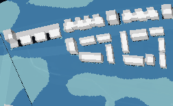
"Punch" / cut out the Wind and Noise results using the GB design area boundaries, as is done for Sun. It used to be like this for Wind in an earlier version.
Noise [Screenshot from 15.12.2021]

Wind [Screenshot from 15.12.2021]

-> it should look more like this... (e.g. earlier version of wind)

Create a folder for each application context (e.g. grasbrook, science city, ...) and provide a build route to build only that folder, when building for production.
There are multiple usability issues with the menu buttons "Layers" and "Buildings."
"Layers" button issues

"Buildings" button issues
blue button to show building use type legend -> confusing color choice. We use blue buttons as action buttons. Showing a legend doesn't need an action button.
when the building use type legend appears, it pushes the buttons downwards as the element recenters. These buttons shouldn't move. Consider making a new checkbox for "Show Building Use Types" -> this would activate the colored map of the buildings. Then the legend for the buidling colors should appear automatically, for example at the bottom center of the screen where the other legends appear.


Provide text for ABM "About"/"Information tab.

The dropdown menus in "Layer Selection" have different spacing than in "Criteria Selection," resulting in the dropdown menus overlapping the "Layer Selection" text in my browser.
Make the formatting of the dropdowns in "Layer Selection" match the "Criteria Selection" dropdown menus.

When "Toggle UI" is on, the camera button appears in the upper left corner. This overlaps with the north arrow button.
Move the north arrow button to the navigation button bar on the left center of the screen. Maintain the gap between the "buildings" and "layers" buttons and the navigation buttons.

In the functional scope rocks branch -- following initial fix:
The first building you click on, a yellow line appears on top of the info box, reaching from the center to the building outline. It then gets sent behind once you click on the box.
This line should be behind the box so that it appears as though it originates from the box outline. Then, when you click on multiple buidlings, you can rearrange the info boxes in a way that allows you to compare multiple buildings with eachother -- and you always have a visual connection between the info box and the building it refers to.
The line:

The idea:

Low prio until we have a clearer picture of where to move with the tool
Let user create a 200m*200m square for which to calc wind results.
Front-End:
Back-End
-> new route for custom calc square, pass bbox, wind direction and velocity as params
-> create new "Project" at AIT endpoint for the bbox plus 150m buffer in each direction
-> find buildings for the buffered bbox. Create buildings at endpoint.
-> trigger calculation
-> return result
As the resulting datasets are too large to be queried from backend
Move calculation heavy task to external workers.
build of vinh's branches
front-end: use-dynamic-assets
swimdock : basic-auth
@JLSievert Hello :))
i am trying to throw some weight/technical dept over board. What do you think about these questions?
We no longer need ABM Filters right? To filter agents by age, modality etc? That would save a huge chunk of spaghetti in which we separate "active" abm sets from the unfiltered one. Plus data preparation for faster filtering and storing huge lookup tables in memory and so on. --> Time Filter should still work! Might be intertwined with the other filters?
Do we need the relative data heatmap or should we throw the code for it away?
To be honest I never really understood the difference between them (same data displayed different way, no comments)

Do we need the arcs?

Do we need the ABM and Amenity Stats?
Stormwater module not working? Is this just because it's a dev branch?

One cronjob that regularly logs in at infrared and asks for the current projects existing. This will keep the projects from being deleted at the Infrared endpoint.
Only show "Reload saved scenario" text when saved scenarios are available. Remove "no data available" text.
So far, this only affects noise.

Fix layer stacking with central function.
The scale of colors for simulation results maps shown at the bottom of the screen need margins / buffer from the edge of the screen and around the color squares.

Add "Save" scenario options for stormwater module, same as for Noise and Wind.

The graph in the lower left should disappear when the ABM and stormwater results are hidden from the map. The user expects to see only the noise results when clicking on "noise" and only the sun results when clicking on "sun." The user is also able to view multiple layers simultaneously by clicking on the "Layers" button on the left-hand menu, but that isn't the default.
The overlapping of the scale legend at the bottom and the graph is also an issue. The modules requiring the graph - ABM and stormwater - should also have scale legends, although the colors are not yet set.

The Call-To-Action buttons (BLUE) have inconsistent formatting:


@JLSievert (Julia writes ticket)
The very first click on a building always seem to position the modal dialog on the upper left side of the screen and not near the the selected building

g.
Update the website name in upper right corner for all logins associated with the SCHB "project"
Replace: "Grasbrook CityScope" with "SCHB CityScope"
Replace: "Tool for Functional Planning" to "Competition Tool"

Improvement to reactive design. Move map scale to a vertical position on the left side of the screen, either above or below the left toolbar, when window size is made narrow. Or, consider an alternative solution for hiding the scale on narrow screens or mobile devices.

Change the name of the button for the ABM module to "Pedestrians."
Update the title of sub-tabs:


Currently the rain configuration displayed in SWTimesheet comes from the static file 'src/config/rain.json'.
It should however come from the backend!
After selecting a a completely new wind scenario, but before the results have loaded, the user is currently able to select different scenarios (both "saved" scenarios and another new scenario). Then as the results come in for the other secenario, they appear instead of the other selected results. At that point, it's not clear what the resulting map is representing.
Possible improvements might include:
@totev @andredaa : any other ideas for solving this issue? / do I understand the issue correctly?
What's going on in this screenshot? I had selected a new scenario with very high windspeeds, close to 80 kmh. Then, I clicked on the "Annual Average" scenario and the scenario settings reset -- but the "Annual Aaverage" scenario didn't load, because the frontend was still waiting on the results of the pending simulation. When the results of the high-wind scenario came in, they no longer matched the scenario setttings displayed. This is confusing.

Hide the "Change Selection" / "Compare by Transit Mode" button on the ABM graph. This button is a sort of filter for different mobility types, but since this is a simulation of pedestrian movement only, the choice of categories is confusing to users. This feature might come in handy in the feature. This feature will also likely be affected by updates to the data export format from GAMA.

Add:
Formatting:
Rename:
Delete:

Cronjobs to perform request with standard calculation
Zip all data coming from cityPyo or the calc modules.
Skip directly to the "Information"/"About" tab when a simulation has been run. Why "i"? Because that's the tab that is most complete for all modules at the moment. Eventually, we will want to automatically switch to the "Dashboard" tab after running a simulation.
Alternatively: only implement switch to "Dashboard" for ABM.

slider dragging behaves weird. i think it is because the map behind is also draggable.
try set map as undraggable on slider touch ??
The results of the wind simulations are looking funkier -- different than in the past. Almost as if the wind is directionless? (In both screenshots, wind should be coming from the west.

We can save some space at the bottom of the screen, if we realign the spacing of the AIT/CIL/Infrared logos at the bottom left of the map (only for Wind and Sun). This is something we have tried to adjust before, and this is the closest we got. Might be worth another attempt.
To do would be: reduce spacing between AIT/CIL/Logos. Make spacing consistent.

Why does it say "Version Oct. 2020" when viewing the SCHB version of the web app? Left over from the frontend for externals?
-> this also means that detailed building layers are hidden. Is that intentional? Did we do that because were going to share the login with external folks?

Temporarily remove the filter button of the ABM-Module on the right side panel until the calculation method can be updated. Leave all of the functionality and just hide the button.

The current set of eslint linting rules seems very strict and is currently not enforced.
Maybe we should re-examine them and/or start a new with the least amount of recommended settings and work our way up from there?

When clicking on a building, the info box should appear next to the building. Now, the first time you click on a building, the info box appears in the upper lefthand corner.

Add minimize and expand buttons to graph, even on the non-mobile version.
When graph is shown, align minimize button to the upper right of the graph widget.
When graph is hidden, stack the expand button (show graph) on top of fast forward and play, but with a gap between.
Tooltips:
Icons:


Menu content should be connected to user, so that
The Science City user gets to have it's own ABM menu options
Menu differences for restricted users do not have to be hardcoded
There will potentially be restricted users for both application cases grasbrook and science city.
Suggestion: Save the user's application (science city, grasbrook, ...) in cityPyo. Create menu-config in front-end based on these applications.
A declarative, efficient, and flexible JavaScript library for building user interfaces.
🖖 Vue.js is a progressive, incrementally-adoptable JavaScript framework for building UI on the web.
TypeScript is a superset of JavaScript that compiles to clean JavaScript output.
An Open Source Machine Learning Framework for Everyone
The Web framework for perfectionists with deadlines.
A PHP framework for web artisans
Bring data to life with SVG, Canvas and HTML. 📊📈🎉
JavaScript (JS) is a lightweight interpreted programming language with first-class functions.
Some thing interesting about web. New door for the world.
A server is a program made to process requests and deliver data to clients.
Machine learning is a way of modeling and interpreting data that allows a piece of software to respond intelligently.
Some thing interesting about visualization, use data art
Some thing interesting about game, make everyone happy.
We are working to build community through open source technology. NB: members must have two-factor auth.
Open source projects and samples from Microsoft.
Google ❤️ Open Source for everyone.
Alibaba Open Source for everyone
Data-Driven Documents codes.
China tencent open source team.