dazuaz / responsive-loader Goto Github PK
View Code? Open in Web Editor NEWA webpack loader for responsive images
License: BSD 3-Clause "New" or "Revised" License
A webpack loader for responsive images
License: BSD 3-Clause "New" or "Revised" License
As in the title, I have installed this and used crako to plug the module but it seems to be ignored by the one create-react-app use under the hood.
Did anyone succeed to use this in webpack and non ejected create react app?
Any change to add webp as an option?
Ideally it would be nice to build something like
<picture>
    <!--[if IE 9]><video style="display: none;"><![endif]-->
    <source type="image/webp" srcset="2700x1209/rocket-pods-mr-ben-01-2700x1209.webp 2700w,
                    1800x806/rocket-pods-mr-ben-01-1800x806.webp 1800w,
                    1536x1536/rocket-pods-mr-ben-01-1536x1536.webp 1536w,
                    1024x1024/rocket-pods-mr-ben-01-1024x1024.webp 1024w,
                    900x900/rocket-pods-mr-ben-01-900x900.webp 900w,
                    600x600/rocket-pods-mr-ben-01-600x600.webp 600w"
            sizes="100vw" />
    <source srcset="2700x1209/rocket-pods-mr-ben-01-2700x1209.jpg 2700w,
                    1800x806/rocket-pods-mr-ben-01-1800x806.jpg 1800w,
                    1536x1536/rocket-pods-mr-ben-01-1536x1536.jpg 1536w,
                    1024x1024/rocket-pods-mr-ben-01-1024x1024.jpg 1024w,
                    900x900/rocket-pods-mr-ben-01-900x900.jpg 900w,
                    600x600/rocket-pods-mr-ben-01-600x600.jpg 600w"
            sizes="100vw" />
    <!--[if IE 9]></video><![endif]-->
    <img class="rsImg" src="600x600/rocket-pods-mr-ben-01-600x600.jpg" alt="Visit MrBen" />
</picture>
Expected behavior:
When I set Background: '#FFFFFF' I expect white background ONLY on JPGs converted from transparent PNGs.
Current behavior:
Applies white background to ALL transparent PNGs, not just the ones being converted to JPGs.
I am using the Sharp adapter.
A simple option in plugins or the loader query perhaps?
So the loader would only return the images data and skip emit of files.
I use sharp adapter and i get:
/Users/grzegorzzajac000/Praca/webpack-www-starter/node_modules/responsive-loader/lib/adapters/sharp.js:30
var height = _ref2.height;
                            ^

TypeError: Cannot read property 'height' of null
    at /Users/grzegorzzajac000/Praca/webpack-www-starter/node_modules/responsive-loader/lib/adapters/sharp.js:37:29

(sharp:97516): GLib-CRITICAL **: g_hash_table_lookup: assertion 'hash_table != NULL' failed

(sharp:97516): GLib-CRITICAL **: g_hash_table_insert_internal: assertion 'hash_table != NULL' failed

(sharp:97516): GLib-CRITICAL **: g_hash_table_lookup: assertion 'hash_table != NULL' failed
Magick: abort due to signal 11 (SIGSEGV) "Segmentation Fault"...
/bin/sh: line 1: 97516 Abort trap: 6           node_modules/.bin/webpack --config webpack/prod.config.babel.js -p --hide-modules
error Command failed with exit code 134.
I'm aware of the discussion in #3 but it seems that responsive-loader is able to optimize jpegs via the quality setting. Why is it possible to optimize jpegs but not png? Or can optipng and/or pngquant be added? I'd love to be able to handle both jpegs and pngs with this loader.
Hello,
I'm having a question.
Can we just use percent instead of width or size?
I am using SASS with PostCSS together with responsive-loader in a webpack setup.
The size parameter is ignored, always the original (max) size file used.
Example:
.test {
  background-image: url(../images/background.jpg?size=1600&quality=10);
}
parsedResourceQuery is empty for the files referenced from within the SCSS files.
Love the pure-js approach but also really like the placeholder image support in https://github.com/Levelmoney/resize-image-loader
Looks like JIMP can do the same resize + blur effect.
Does it make sense using the webpack cache-loader with this responsive-loader for speeding up builds?
I can't seem to find a way to change where the resulting files are output. At the moment they are all put in webpack's output.path, but in my case this isn't ideal. Is there any way to change this?
Many thanks
JIMP is pretty neat because it doesn't depend on some binary (makes it easy to run anywhere) but performance degrades quickly with many images.
Also, the resized image quality could be better (noticeable when scaling down 1px lines in transparent PNGs).
These problems could potentially be remedied with using another library/binary. Maybe add a configuration option for the 'engine'.
Responsive-loader is generating all my images beautifully with the correct names and sizes, but I can't figure out how to reference other sizes than the default (smallest one) in my template!
// webpack.config file
...
{
  test: /\.(jpe?g|png)$/i,
  loader: 'responsive-loader',
  options: {
    adapter: require('responsive-loader/sharp'),
    sizes: [600, 1200],
    placeholder: true,
    placeholderSize: 50,
    name: '/assets/img/[hash]-[width].[ext]'
  }
},
...
And this is how I'm referencing the images in my template html
<img src="${require('./assets/img/image_0.jpg')}" alt="">
This gives me the 600px wide image and I would like to get different images based on screen size. Any pointers?
Jimp can resize images using different modes. I suggest to add another option to pass with adapter settings.
Hi,
why is responsiveImage.src set to the smallest of all values defined in "sizes" instead of the original imagesize?
doesn't seem straight forward to me, any thought behind this?
Hey! I'm currently attempting to integrate a responsive images loader into html-loader, as currently it just outputs full sized images.
Would you accept a PR enabling this syntax?
require('responsive?min=100&max=300!./myImage.jpg');From there, it'll calculate the best sizes (maybe another argument to say the number of images?), and generate the images. This could be done from html-loader, but I figure it's best to do it from the place that actually accesses the image file so that max can be taken down if necessary.
A valuable option would be to only make the URL-encoded placeholder version, plus srcSet and src for requested sizes clamped to real file size. The custom name formatting + publicPath will then allow requesting the resized images from imgIX or Cloudinary, which handle things static hosting can't easily do such as accept headers for webp.
Hi, thanks for the amazing work
question: Can this work with web image url s from other domains?
Is this lib compatible with webpack 2?
I've tried
 @include breakpoint(mobile) {
     background-image: url('responsive?size=480!../../../../assets/hero.jpg');
  }
However this breaks my build. Webpack seems to no longer support the ! loader syntax?
Also would this be correct?
module: {
        rules: [
            {
                test: /\.(png|jpg|svg)$/,
                use: 'url-loader?limit=8192',
                include: PATHS.app,
            },
            {
                test: /\.(jpg|png|svg)$/,
                use: 'file-loader?name=[path][name].[hash].[ext]',
                include: PATHS.images,
            },
{
                test: /\.(jpg)$/,
                use: 'responsive',
                include: PATHS.images,
            }
        ]
    }
Because srcSet's paths are not escaped, it will produce this invalid output;
<img
  src="/_next/static/images/Review List-711-834bd42895bd86b4f618f1dedcf9df31.png"
  srcSet="/_next/static/images/Review List-711-834bd42895bd86b4f618f1dedcf9df31.png 711w"
/>
resulting in this error in the conosle (in Chrome):
Dropped srcset candidate "/_next/static/images/Review"
Failed parsing 'srcset' attribute value since it has an unknown descriptor.
I've found this loader particularly useful. However, it's looking like I'm going to be using parcel more and more, and one of the only things I can't find an alternative for is this loader. While I realise it's much easier said than done, it would be nice if this was rewritten as a postcss plugin, then it could be used by webpack, parcel, and others.
Is it possible to use this loader to also resize/crop images? For instance, it could be great to use it to create thumbnails with different ratio, ...
Thank you
I'm using the <img {...responsiveImage} /> shorthand syntax. I just recently noticed the warning although I'm not sure when it started occurring. Not sure anything can be done about it. I should note that I'm using next-optimized-images but as far as I can tell the issue stems from this loader.
Thank you for developing this fantastic project!
Hello,
Sharp allowing the possibility of extract an image (a crop) using http://sharp.pixelplumbing.com/en/stable/api-operation/#extract. Does it make sense to add it to this package?
With this, it would be nice to be able to chain images transformation, with something like:
              use: [
                   {
                       loader: 'file-loader',
                   }
                   {
                       loader: 'responsive-loader',
                       options: {
                           adapter: require('responsive-loader/sharp-extract'),
                           name: "images/responsive/[name]-[width].[ext]"
                       }
                   },
                   {
                       loader: 'responsive-loader',
                       options: {
                           adapter: require('responsive-loader/sharp')
                       }
                   },
               ],
this way, we can resize then extract the image (looks like another feature request).
Output image file are stay in the root dist folder. But i want to put them into dist/img folder how can i do this ????
{
    test: /\.(jpe?g|png)$/i,
    use: {
      loader: 'responsive-loader',
      options: {
        name: '[name].[hash].[ext]',
        size: 768,
        placeholder: false
      }
    }
}
It returns filename.784f17d8a8c77977b1c087cc21edb553.jpgjpg and if I remove .[ext] there will be no dot before jpg
Get this error when doing it in SASS:
Module not found: Error: Can't resolve ./responsive'
Here's the code to reproduce the error:
background-image: url("responsive?size=3840!../../images/myimage.png");Hello,
First, thanks for this loader, very useful :)
I just wanted to share my solution for integrating this loader with SASS.
SASS users that are using, for example, Bootstrap, can have responsives images very easily, without the boilerplate of the pure-CSS version as showed in the readme:
@mixin responsive-background-image($url) {
    @each $breakpoint in map-keys($grid-breakpoints) {
        $next-breakpoint: breakpoint-next($breakpoint);

        @include media-breakpoint-up($breakpoint) {
            @if ($next-breakpoint == null) {
                background-image: url('#{$url}?size=3840'); // max: 4k images
            } @else {
                $next-width: map-get($grid-breakpoints, $next-breakpoint);
                background-image: url('#{$url}?size=#{$next-width}');
            }
        }
    }
}
Usage:
@include responsive-background-image('image.jpg');I use it in conjunction with a responsive-loader config that uses Bootstrap breakpoints by default:
options: {
    loader: 'responsive-loader',
    adapter: require('responsive-loader/sharp'),
sizes: [576, 768, 992, 1200], // copied from Bootstrap breakpointsAccording to https://caniuse.com/#search=srcset, secret in iOS 8, w is not supported. Is there any workaround to support iOS 8?
It would be great if a background color can be applied per image
(when converting an alphatransparent PNG/transparent GIF to flat JPEG).
Related issue: #50
Hello,
It could very usefull to have different name for an image based on an attribute.
For example:
A name in french set with i18n and another one in english.
2 pictures will be generated.
This is mainly for SEO optimisation.
It could be also usefull to set the name dynamically even for a unique language.
Do you think it could be, is it already possible ?
Thanks
Can I also use this loader for images (<img>) used in a PHP/Blade template?
Currently this loader can't be combined with other loaders which optimize image file size like image-webpack-loader. Add that option (how though?) or directly use imagemin.
See #51 (comment)
I currently have the need to dynamically get images inducing require statements of strings concatenated with vars.
This loader works totally fine with statics assets but throws an error whit dynamic paths
import test from '../../images/orbital/ALL/0.jpg?size=1920'
console.log(test) // outputs the object
const test2 = require('../../images/orbital/ALL/0.jpg?size=1920')
console.log(test2) // outputs the object
const foo = 'ALL'
const test3 = require('../../images/orbital/' + foo + '/0.jpg?size=1920') // Error: Cannot find module
Would you be open to a PR to change how the file extension is attached to the base file name?
I'm wary as it could potentially be breaking change, but it seems odd—and not in line with other loaders—that you need to include a trailing period when including a name query.
For instance with a file named test.jpg:
responsive?name=[name]-[width].[ext] outputs test-500.jpgjpg
responsive?name=[name]-[width] outputs test-500jpg
responsive?name=[name]-[width]. outputs test-500.jpg (note the trailing period in the query)
The PR would make it so that:
After installing this my webpack built times have gone up to 5+ seconds making my feedback look much longer. Would it be possible for this plugin to cache the created images and only re-compress them if the parameters were different?
It'd be useful for building <picture> elements to have each image's mime type along with its other data, for use in the type attribute of the <source> element.
In web pack 2.x, I'm having issues using responsive-loader inside of my sass files. CSS loader throws an error..
 ERROR in ./~/css-loader?{"sourceMap":true,"importLoaders":1,"modules":true,"localIdentName":"[name]__[local]--[hash:base64:5]","di
scardComments":{"removeAll":true}}!./~/sass-loader/lib/loader.js?{"sourceMap":true}!./src/views/Main/Home/style.scss
    Module not found: Error: Can't resolve './responsive-loader' in '/Users/projects/am/am-web/src/views/Main/Home'
     @ ./~/css-loader?{"sourceMap":true,"importLoaders":1,"modules":true,"localIdentName":"[name]__[local]--[hash:base64:5]","discardC
omments":{"removeAll":true}}!./~/sass-loader/lib/loader.js?{"sourceMap":true}!./src/views/Main/Home/style.scss 6:6240-6315
Any ideas? I've looked through the source but I don't understand how it handles css files...
Thanks
Webpack modules
module: {
        rules: [
            {
                test: /\.(jpg)$/,
                use: 'responsive-loader',
                include: PATHS.images,
            },
            {
                test: /\.tsx?$/,
                use: 'ts-loader',
                include: PATHS.app,
            },
            {
                test: /\.(png|jpg|svg)$/,
                use: 'url-loader?limit=8192',
                include: PATHS.app,
            },
            {
                test: /\.(jpg|png|svg)$/,
                use: 'file-loader?name=[path][name].[hash].[ext]',
                include: PATHS.images,
            }
        ]
    }
Webpack css loader rules
{
                    test: /(\.scss|\.sass)$/,
                    use: ExtractTextPlugin.extract({
                        fallback: "style-loader",
                        use: [
                            {
                                loader: 'css-loader',
                                options: {
                                    sourceMap: true,
                                    importLoaders: 1,
                                    modules: true,
                                    localIdentName: '[name]__[local]--[hash:base64:5]',
                                    discardComments: {
                                        removeAll: true
                                    }
                                }
                            },
                            {
                                loader: "sass-loader",
                                options: {
                                    sourceMap: true
                                }
                            }
                        ]

                    }),

                }
My sass
hero {
  background-image: url('../../../../assets/hero.jpg');
  background-size: cover;
  color: #fff;
  text-align: center !important;

  @include breakpoint(desktop) {
    background-image: url('responsive-loader?size=1000!../../../../assets/hero.jpg');
  }

  @include breakpoint(laptop) {
    background-image: url('responsive-loader?size=800!../../../../assets/hero.jpg');
  }

  @include breakpoint(tablet) {
    background-image: url('responsive-loader?size=600!../../../../assets/hero.jpg');
  }

  @include breakpoint(mobile) {
    background-image: url('responsive-loader?size=480!../../../../assets/hero.jpg');
  }
}
"responsive-loader": "^1.1.0"
"webpack": "^3.10.0"
Great loader, much thanks. One issue I'm finding is when an image is created from a CSS url, the path that's generated to pull in the resource results in a "can't be found" type error. To clarify, an image with the correct name gets created however it gets assigned a path that can't be found. However, an image created from importing in a JS file is located and pulls in fine.
Example of a path generated from within a JS file:
file:///C:/Users/kcantrell/Desktop/offline-dev-projects/practice-router/dist/imgs/cloud-200.jpg
Example of a path generated from a CSS url:
file:///C:/Userskcantrell%C3%9Esktopoffline-dev-projectspractice-router/dist/imgs/calculator-background-700.jpg
Is this a bug or perhaps am I missing something and there's some configuration I need to do to get CSS urls to work with the loader. Webpack config below:
const path = require('path'),
	  ExtractTextPlugin = require('extract-text-webpack-plugin'),
	  CompressionPlugin = require('compression-webpack-plugin'),
	  webpack = require('webpack');

module.exports = {
	entry: {
		app: './src/js/index.js'
	},
	output: {
		path: __dirname + '/dist',
		publicPath: __dirname + '/dist/',
		filename: "[name].bundle.js",
		chunkFilename: "[name].bundle.js"
	},
	module: {
	    rules: [
			{
			      test: /\.js$/,
			      include: path.resolve(__dirname, 'src/js'),
			      use: [{
			        loader: 'babel-loader',
			        options: {
			          presets: [
			            ['env', { modules: false }]
			          ]
			        }
			      }]
			    },
		      {
		        test: /\.(png|jpg|gif)$/,
		        use: {
		        	loader: 'responsive-loader',
		        	options: {
		        		name: 'imgs/[name]-[width].[ext]'
		        	}
		        }
		      },
		      {
		        test: /\.css$/,
		        exclude: path.resolve(__dirname, 'src/css'),
		        loader: 'css-loader',
		        options: {
		        	minimize: true
		        }
		      },
		      {
		        test: /\.css$/,
		        include: path.resolve(__dirname, 'src/css'),
		        loader: ExtractTextPlugin.extract(
		        	{use: [
		        		{ loader: 'css-loader',
		        			options: { minimize: true }
		        		}
                                 ]}
                         )
		      }
	    ]
	},
  plugins: [
    new ExtractTextPlugin("app.css"),
    new webpack.optimize.CommonsChunkPlugin({
				name: 'commons',
				filename: 'commons.js'
		}),
		new webpack.optimize.LimitChunkCountPlugin({
		  maxChunks: 6
		  // minChunkSize: 1000
		})
  ]
}
In the old version, I did something like this when importing the image:
import topImage from 'responsive-loader!./images/contact-us.jpg';And then had a section with options in my webpack 2 config:
new webpack.LoaderOptionsPlugin({
	options: {
		responsiveLoader: {
			sizes: [1000, 500, 1500],
			placeholder: true,
			placeholderSize: 20,
			quality: 75,
			name: 'images/[name]-[sha512:hash:base64:5]-[width].',
		},
	},
}),
But with v1.x there are only examples specifying options when responsive-loader is configured as a loader? Is there any other way to specify default settings (without LoaderOptionsPlugin since that will be deprecated eventually)?
@herrstucki:
It would be great if there is an example for using this loader in HTML/Blade (PHP template language).
It should be used in a Sage (WordPress base) theme.
Hello.
I'm trying to use responsive-loader with a html file.
My loader setup:
       {
          test: /\.(png|jpg)$/,
          use: {
            loader: 'responsive-loader',
            options: {
              placeholder: true,
              sizes: [400, 600, 800, 1000, 1200],
              name: 'assets/images/[name]-[width].[hash:4].[ext]'
            }
          }
        }
Inside .html file:
<img src="${require('../../assets/images/image.png').src}" srcset="${require('../../assets/images/image.png').srcSet}"/>
In the output:
<img src="undefined" srcset="undefined"/>
When I omit .src or .srcSet in html and write it like this:
<img src="${require('../../assets/images/image.png')}" />
it will return a smallest image of the set:
<img src="assets/images/image-400.png' />
In the same time, when I require an image inside my .js file, it returns an object with all properties as it's supposed.
I read a similar issue #68 but the solution proposed there did not work for me as I am not using Vue.
It seems that the rescaling of assets is currently one of the longest (~1m) parts of our build right now, and I wonder if this step is even needed at all, since the static files do not change.
Some details:
Can you replace the name option with outPath and publicPath?
For example when using Laravel the outPath is /public/images/image.png. However the publicPath should be /images/image.png This is now impossible to do.
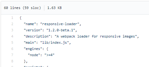
It seems that the code served from NPM is more recent (1.2.0) than the code in master on GitHub (1.2.0-beta.1 as in package.json).
Please push the latest code to GitHub. Thanks!
NPM:
GitHub:
I am using CRA with responsive-loader, and I am getting the following errors:
 FAIL  src/pages/User/test.tsx
  ● Test suite failed to run

    Cannot find module './assets/user_background.jpg?min=320&max=800&steps=3' from 'index.tsx'

    However, Jest was able to find:
        './index.tsx'

    You might want to include a file extension in your import, or update your 'moduleFileExtensions', which is currently ['web.js', 'js', 'web.ts', 'ts', 'web.tsx', 'tsx', 'json', 'web.jsx', 'jsx', 'node'].

    See https://jestjs.io/docs/en/configuration#modulefileextensions-array-string

      20 |
    > 21 | const userBackground = require('./assets/user_background.jpg?min=320&max=800&steps=3')
         |                        ^
      22 |
Are there any solutions to fix the test?
The only way around it I can find it edit my import into const userBackground = require('./assets/user_background.jpg') and so not having any benefits of the loader.
It is not always necessary to output resized images, local development for instance, and this becomes cumbersome if you need to stop and start the local build process.
I'd like to clean up the pass option to simply spit out the original image, without resizing it.
Currently this partially works but I'm getting corrupted images, and no placeholder data URI output.
Height & Width would be that of the original image.
For placeholder I see three approaches:
A side question, is a more explicit option name better? skip for example?
What do you think @herrstucki?
@herrstucki Please just answer a few words about your future plans with this plugin.
😅
 React
React
A declarative, efficient, and flexible JavaScript library for building user interfaces.
🖖 Vue.js is a progressive, incrementally-adoptable JavaScript framework for building UI on the web.
 Typescript
TypeScript is a superset of JavaScript that compiles to clean JavaScript output.
An Open Source Machine Learning Framework for Everyone
 Django
The Web framework for perfectionists with deadlines.
 Laravel
A PHP framework for web artisans
Bring data to life with SVG, Canvas and HTML. 📊📈🎉
JavaScript (JS) is a lightweight interpreted programming language with first-class functions.
Some thing interesting about web. New door for the world.
A server is a program made to process requests and deliver data to clients.
Machine learning is a way of modeling and interpreting data that allows a piece of software to respond intelligently.
Some thing interesting about visualization, use data art
Some thing interesting about game, make everyone happy.
 Facebook
We are working to build community through open source technology. NB: members must have two-factor auth.
 Microsoft
Open source projects and samples from Microsoft.
 Google
Google ❤️ Open Source for everyone.
 Alibaba
Alibaba Open Source for everyone
 D3
D3
Data-Driven Documents codes.
 Tencent
China tencent open source team.