Code Monkey home page Code Monkey logo

stimulus-datepicker's Introduction

Stimulus Datepicker

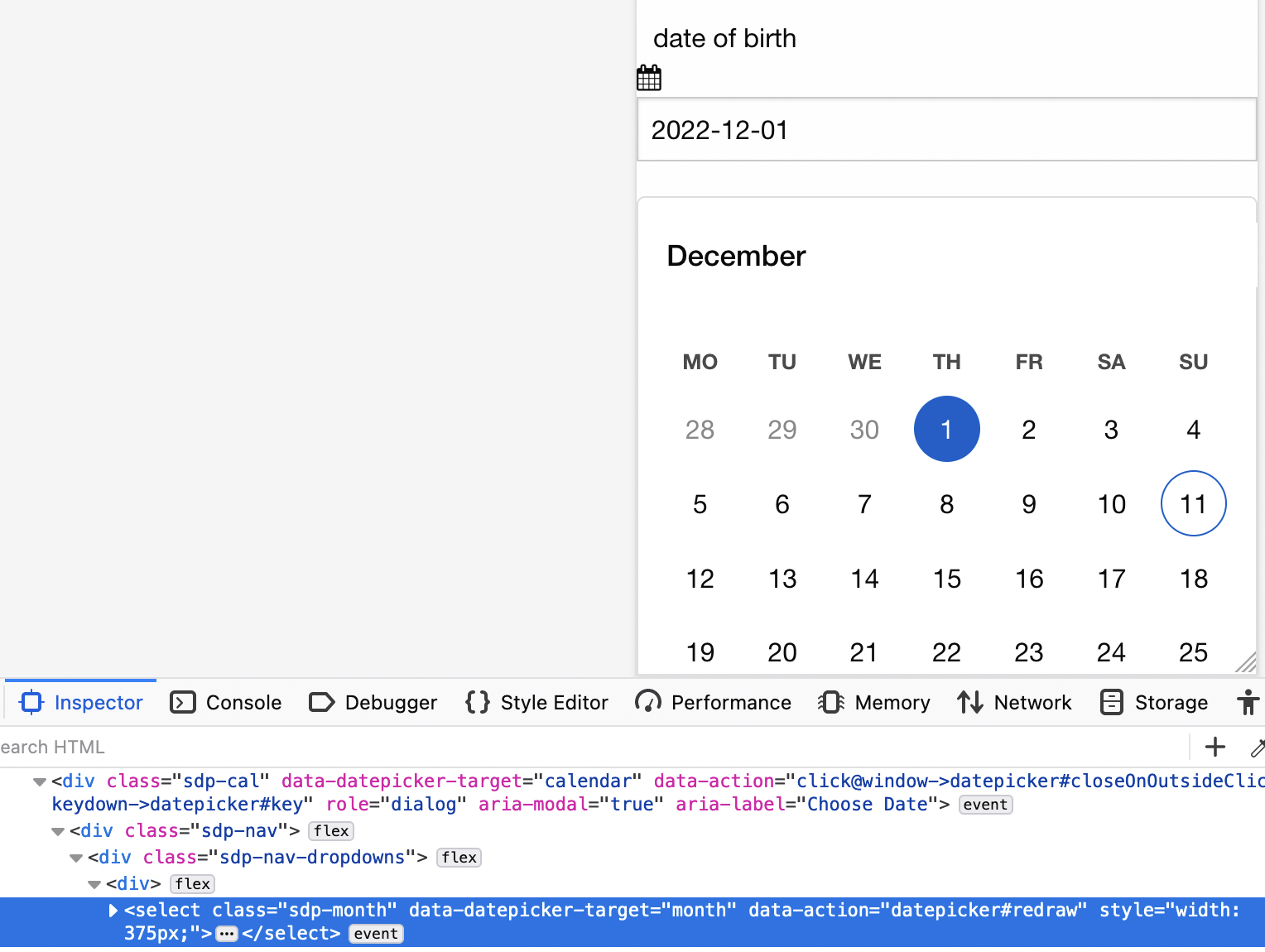
This is a Stimulus-powered datepicker which:

  • localises and parses dates in the input field according to the strftime directives you configure;
  • presents a calendar closely adhering to the WAI-ARIA date picker dialog design pattern;
  • sends the date back to the server in ISO8601 format (YYYY-MM-DD).

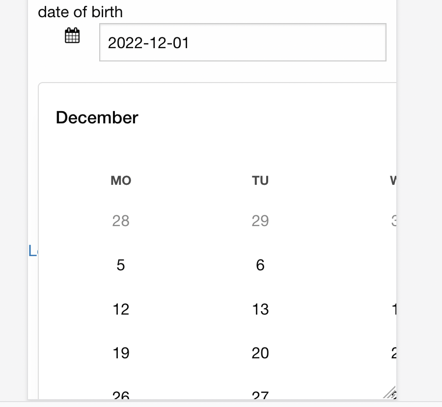
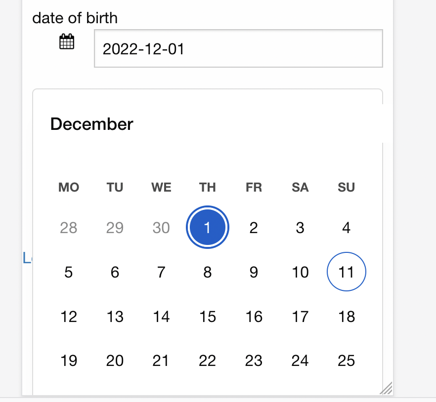
Please see the demo page for a few simple examples.

Your server produces an ISO8601 date; your user interacts with it in the format you configured and/or via the popup calendar; the form sends the date back to the server in ISO format.

Month and day names are generated in the user's locale. Button titles and ARIA labels are customisable, e.g. for localisation.

Dates are local; no timezones or daylight savings are involved.

You can easily adjust the calendar's appearance via CSS custom properties or just overriding the CSS classes.

Size: JS 3.6kB minified and gzipped, CSS 2.7kB gzipped.

Installation

The project contains JavaScript and CSS. If you only use importmaps, i.e. you don't use jsbundling-rails or cssbundling-rails, first install the JavaScript:

bin/importmap pin stimulus-datepicker

And then add a link to the stylesheet to your view:

<link rel="stylesheet" href="https://unpkg.com/[email protected]/css/datepicker.css" data-turbo-track="reload">

If you use jsbundling-rails or cssbundling-rails, follow their instructions for installing packages.

Then register the datepicker controller with your Stimulus application:

  // app/javascript/controllers/application.js

  import { Application } from '@hotwired/stimulus'
+ import { Datepicker } from 'stimulus-datepicker'

  const application = Application.start()
+ application.register('datepicker', Datepicker)

Usage

To use the datepicker, wrap your input field with a controller div.

<div data-controller="datepicker">
  <input data-datepicker-target="input" type="text" name="foobar" value="2022-03-23"/>
  <span data-datepicker-target="toggle">calendar</span>
</div>

Your calendar icon or equivalent must have the data attribute data-datepicker-target="toggle".

The input field:

  • must have the data attribute data-datepicker-target="input";
  • should have type="text", not type="date", to avoid conflicting with built-in browser functionality;
  • must have a name;
  • its value, if given, must be a YYYY-MM-DD date string.

Configuration

You can configure your datepicker with the following attributes. Declare them on your controller as data-datepicker-[name]-value.

Name Default Description
format "%Y-%m-%d" Format for the date in the input field (see below).
first-day-of-week 1 First day of the week in the calendar (Sunday is 0).
day-name-length 2 Length of the abbreviated day names in the calendar, e.g. "Mo".
allow-weekends "true" Whether weekends are selectable.
month-jump "dayOfMonth" When jumping to the previous/next month, whether to go to the same day of the month ("dayOfMonth") or the same day of the week ("dayOfWeek").
min "" The earliest choosable date (YYYY-MM-DD).
max "" The latest choosable date (YYYY-MM-DD).
underflow-message "" Client-side form validation message when the selected date is earlier than the min date. %s is replaced with the formatted min date. E.g. "Date must be %s or later."
overflow-message "" Client-side form validation message when the selected date is later than the max date. %s is replaced with the formatted max date. E.g. "Date must be %s or earlier."
disallow [] Dates which cannot be selected. E.g. ["2022-12-25", "2023-01-01"]
text
{
underflow: "",
overflow: "",
previousMonth: "Previous month",
nextMonth: "Next month",
today: "Today",
chooseDate: "Choose Date",
changeDate: "Change Date"
}
User-facing text. The value object is merged into the defaults.
  • underflow: client-side form validation message when the selected date is earlier than the min date. %s is replaced with the formatted min date. E.g. "Date must be %s or later."
  • overflow: client-side form validation message when the selected date is later than the max date. %s is replaced with the formatted max date. E.g. "Date must be %s or earlier."
  • previousMonth, nextMonth, today: button titles and ARIA labels
  • chooseDate, changeDate: ARIA labels
locales ["default"] Locale for month and day names, along with fallbacks. Use BCP 47 language tags. E.g. ["de-DE", "default"].

You can use the following strftime directives in data-datepicker-format-value:

Directive Meaning
%d Day of the month, zero-padded (01..31)
%-d Day of the month, no padding (1..31)
%m Month of the year, zero-padded (01..12)
%-m Month of the year, no padding (1..12)
%B The full month name in the browser's locale (January)
%b The abbreviated month name in the browser's locale (Jan)
%Y Full year, four digits (2022)
%y Year in 21st Century, two digits (22)

Keyboard support

The datepicker is fully navigable by keyboard. In addition to the WAI-ARIA keys, you can also use Vim-style movement keys.

Toggle target (your calendar icon)

Key Result
Space, Enter
  • Open the datepicker dialog.
  • Move focus to selected date, i.e. the date displayed in the input text field. If no date has been selected, focus on the current date.

Datepicker dialog (the calendar)

Key Result
Escape Close the dialog and return focus to the toggle target.
Tab
  • Move focus to next element in the dialog's tab sequence.
  • The dialog "traps" focus so if focus is on the last item, move focus to the first.
Shift + Tab
  • Move focus to previous element in the dialog's tab sequence.
  • The dialog "traps" focus so if focus is on the first item, move focus to the last.

Previous-month / today / next-month Buttons

Key Result
Space, Enter Change the month displayed in the calendar grid.

Date grid

Key Result
Space, Enter Select the date, close the dialog, move focus to the toggle target.
Up Arrow, k Move focus to the same day of the previous week.
Down Arrow, j Move focus to the same day of the next week.
Right Arrow, l Move focus to the next day.
Left Arrow, h Move focus to the previous day.
Home, ^, 0 Move focus to the first day of the current week.
End, $ Move focus to the last day of the current week.
Page Up, b Change the grid of dates to the previous month and focus on the corresponding* date one month earlier.
Shift + Page Up, B Change the grid of dates to the previous year and focus on the same date one year earlier.
Page Down, w Change the grid of dates to the next month and focus on the corresponding* date one month later.
Shift + Page Down, W Change the grid of dates to the next year and focus on the same date one year later.

* The corresponding date in the adjacent month depends on data-datepicker-month-jump-value:

  • "dayOfMonth": the corresponding date is the same date, e.g. 7th;
  • "dayOfWeek": the corresponding date is the same day of the week, four weeks earlier/later.

CSS

You can alter the appearance of the calendar by setting these custom properties, or of course by just overriding the CSS classes.

Property Default Description
--sdp-selected #005fcc Background colour of selected date; colour of date focus ring.
--sdp-selected-invert #ffffff Colour of selected date.
--sdp-prev-month #888888 Colour of dates in the previous month.
--sdp-next-month #888888 Colour of dates in the next month.
--sdp-disabled #1010104d Colour of disabled dates; background color of selected date when disabled.
--sdp-disabled-invert #ffffff Colour of selected date when disabled.
--sdp-background #ffffff Background colour.
--sdp-border #dddddd Border colour.
--sdp-shadow 0deg 0% 50% Box shadow colour (hsl).
--sdp-icon #4a4a4acc Colour of the icons, e.g. previous-month button.
--sdp-nav-button-background #f5f5f5 Background colour of the navigation buttons.
--sdp-nav-button-background-hover #eeeeee Background colour on hover of the navigation buttons.
--sdp-days-of-week #4a4a4a Colour of the days of the week.

Intellectual Property

This package is copyright Andrew Stewart.

This package is available as open source under the terms of the MIT licence.

stimulus-datepicker's People

Contributors

airblade avatar luki215 avatar mateusnava avatar yasser avatar

Stargazers

 avatar  avatar  avatar  avatar  avatar  avatar  avatar  avatar  avatar  avatar  avatar  avatar  avatar  avatar  avatar  avatar  avatar  avatar  avatar  avatar  avatar  avatar  avatar  avatar  avatar  avatar  avatar  avatar  avatar  avatar  avatar  avatar  avatar  avatar  avatar  avatar  avatar  avatar  avatar  avatar  avatar  avatar

Watchers

 avatar  avatar  avatar  avatar  avatar

stimulus-datepicker's Issues

Feature request: add a "clear" function

Hi, I'm very pleased with the usage of this lib, but I would like it if it was possible to have a "clear" button โŒ on the widget when a date is already set. What do you think ?

Make titles and labels configurable

So that they can all be localised or tweaked invidivually.

For example:

<button class="sdp-goto-prev" data-datepicker-target="prevMonth" data-action="datepicker#prevMonth" title="Previous month" aria-label="Previous month"></button>
<button class="sdp-goto-today" data-datepicker-target="today" data-action="datepicker#today" title="Today" aria-label="Today"></button>
<button class="sdp-goto-next" data-datepicker-target="nextMonth" data-action="datepicker#nextMonth" title="Next month" aria-label="Next month"></button>

flex framework is throwing off fit-content and objects sizes

Context: Using Zurb foundation CSS framework in XY grid mode which has proved concise and useful.

However, using a browser emulation of mobile terminal (both Chromium and Firefox) the calendar goes off the deep end with
Screen Shot 2022-12-11 at 11 12 25
fit-content
Doing a modification to the CSS

.sdp-cal {
  max-width: fit-content;
==>
.sdp-cal {
  max-width: 100%;

now occupies reasonable space. But the dropdowns are now rendering EACH to full-width of div
Screen Shot 2022-12-11 at 11 12 51
with the size matching the emulated browser window width

Screen Shot 2022-12-11 at 11 13 11

The curiosity here is that there is both a class (that is not in the src file) AND a style whose value is set outside of my control (as I understand it) resulting in the year and forward-reverse buttons being thrown off the useful part of the page.

Note: I have also tried to exclude the div for the calendar entirely from the XY grid, but leading to the same result

Screen Shot 2022-12-11 at 11 44 44

With the style forced upon the tag, I cannot see how can this be overcome ?

Unable to dismiss calendar

A user reported that they were unable to dismiss the calendar.

Their steps to reproduce:

  1. Click the calendar icon to open the calendar.
  2. Click on another date.

Expected: the calendar disappears and the text input changes to show the clicked date.
Actual: the text input changes but the calendar does not disappear. Neither clicking the calendar icon nor clicking elsewhere on the page has any effect. At this point pressing F12 does not open the developer console. The JavaScript console does not show any errors.

Firefox 105.0 (64-bit) on Ubuntu 18.04.

Dispatch change event only when dateValue has changed

Currently, Event('change') is being dispatched by selectDate after setting dateValue. However, dateValueChanged (a Stimulus callback) sets the actual input value. This means that the 'change' event is being triggered before the input value has actually changed, which may be unexpected for those who have registered eventListener(s) on the input element.

Does it make sense to move the dispatch to dateValueChanged?

Does not display dates before the year 2000

Any time I use the datepicker to pick a date before 2000-01-01, the input element does not display the date. This happens on the demo page too.
https://airblade.github.io/stimulus-datepicker/

If I provide the input element with a value like "1999-12-31", I can briefly see the text inside the input element before it disappears again.

<!-- good -->
<input data-datepicker-target="input" type="text" value="2000-01-01" name="user[birthdate]" />

<!-- bad -->
<input data-datepicker-target="input" type="text" value="1999-12-31" name="user[birthdate]" />

Improve month and year selects

In order to look a little cleaner, the month and year <select>s have appearance: none and a custom down-arrow.

However there are a few problems:

  • For months with shorter names, the arrow is far away from the name.
  • The arrow is not clickable.
  • The focus ring encompasses the name only, not the arrow, and doesn't have enough padding.

Screenshot 2022-05-05 at 11 42 07 am

Screenshot 2022-05-05 at 11 46 41 am

Optimise for near dates

I think the vast majority of dates which crop up in webapps fall into two categories:

  • near dates: within a year of the current date and usually within a few weeks;
  • far dates: more than a year away; e.g. an adult's date of birth.

These categories pull the UI in different directions. For example, for a near date it's better to have only previous-month and next-month buttons. There's no need to have a month dropdown or a year dropdown. For a far date, you probably want some kind of decade chooser, and after the user has chosen a decade something like the current datepicker with a year dropdown covering the decade.

A datepicker which tries to cover both near and far dates is not going to be great at either. This is the datepicker at the moment.

The main benefit of a datepicker is the presentation of dates in a calendar. This is useful for near dates when the target date probably has some relation to the current date, and the day of the week is probably relevant. A calendar is not nearly as useful for a far date, where you most probably don't know or care about the day of the week, nor need to click through previous and next months.

Therefore it makes sense for a datepicker to optimise for near dates. If the user needs to enter a far date, they should be given simple year, month, and day dropdowns, or a text input which can parse what they enter (which this datepicker can do ๐Ÿ˜‰).

Therefore I plan to replace the month and year dropdowns with static values.

It could be argued that the month and year dropdowns are working fine, and provide some flexibility for jumping to different months or years, and don't complicate the UI much. But I'd rather the datepicker were really good at one thing (near dates) than quite good at near dates and OK at medium (not near and not far) dates.

Recommend Projects

  • React photo React

    A declarative, efficient, and flexible JavaScript library for building user interfaces.

  • Vue.js photo Vue.js

    ๐Ÿ–– Vue.js is a progressive, incrementally-adoptable JavaScript framework for building UI on the web.

  • Typescript photo Typescript

    TypeScript is a superset of JavaScript that compiles to clean JavaScript output.

  • TensorFlow photo TensorFlow

    An Open Source Machine Learning Framework for Everyone

  • Django photo Django

    The Web framework for perfectionists with deadlines.

  • D3 photo D3

    Bring data to life with SVG, Canvas and HTML. ๐Ÿ“Š๐Ÿ“ˆ๐ŸŽ‰

Recommend Topics

  • javascript

    JavaScript (JS) is a lightweight interpreted programming language with first-class functions.

  • web

    Some thing interesting about web. New door for the world.

  • server

    A server is a program made to process requests and deliver data to clients.

  • Machine learning

    Machine learning is a way of modeling and interpreting data that allows a piece of software to respond intelligently.

  • Game

    Some thing interesting about game, make everyone happy.

Recommend Org

  • Facebook photo Facebook

    We are working to build community through open source technology. NB: members must have two-factor auth.

  • Microsoft photo Microsoft

    Open source projects and samples from Microsoft.

  • Google photo Google

    Google โค๏ธ Open Source for everyone.

  • D3 photo D3

    Data-Driven Documents codes.