validproject / mtdb2 Goto Github PK
View Code? Open in Web Editor NEWVisual exploration of media transparency data
License: BSD 2-Clause "Simplified" License
Visual exploration of media transparency data
License: BSD 2-Clause "Simplified" License


A "plus" icon is used for combined entities (in the tables).
This could be confusing -- it looks like it is possible that you click to add something.
possible metaphors:
Currently the footline of the table states "Showing 0- 9", also if there are less than 10 results.
Addtionally:
The tooltip of the chord diagram is placed too low. Maybe place it above the chord diagram?
It would be nice if the browser would save for a session some remove and combine operations so that after reloading the page this operations are not lost.
Add lowlevel documentation for global variables and functions
I use bootstrap as css framework and i don't want to change their source. Currently I am testing other methods...
In the sparkline-size bar chart of transfered money in the Rechtsträger and Media tables, the bar for a value of zero looks like the bar for a (comparatively) small value.
I think it is useful to have a mark also for zero value but we could color them in grey to differentiate?
The mouse interaction in the tables is an inconvinient interaction and therefor confusing. Considering removing it.
After combining data the selection of the combined data in the table is broken.
When clicking "reset" it seems to work.
The medien-transparenz.at project has data since 2012/Q3 and has already cleaned some duplicate items/different spellings. It is available from https://github.com/AnotherCodeArtist/medien-transparenz.at/tree/master/data
Idea for an alternative representation of trend in the table of legal entity/medium:
3 or 5 arrows icons qualitatively abstracting an increasing, stable, decreasing trend.
See also discussion in #32.
Mein Eindruck (mit Hilfe von MTDB2) ist aber das die Quartale hier zu
detailiert sind, weil es bei vielen RT-M Beziehungen nur 1 Peak pro Jahr
(zB immer Q1) oder Peaks jedes zweite Quartal gibt. Deshalb würde ich
den Trend als Vergleich zwischen 2 Jahren abbilden. D.h. bei den
momentanen Daten 2013Q3-2014Q2 versus 2014Q3-2015Q2.
Absolute Veränderung versus Relativ: Ich halte einen relativen Wert mit
dem alten Wert als 100% für am sinnvollsten.
Bsp. Wien->Kurier
2013Q3-2014Q2 1.507.773,46 €
2014Q3-2015Q2 2.030.712,34 €
+35%
In den Tabellen der Rechtsträger und Medien können diese Prozentzahlen
dargestellt (auf ganze Prozent gerundet) und zur Sortierung verwendet
werden.
Grafisch vlt. als Pfeil: 5 Pfeil Icons hinauf > 100%, schräg hinauf >
20%, gerade nach rechts, schräg hinunter, hinunter
(Aber vlt. fällt dir oder uns da noch was besseres ein.)
Ggf. dafür die Ränder schmäller machen (bei unseren 16:9 Bildschirmen am
PC bleibt da einiges an Platz leer)
Oben bei den Balkendiagrammen könnte Trend analog zu den Ausgaben
funktionieren. Also Trend auf x-Achse. Anzahl der Relationen auf der
y-Achse.
Everything is very "colorful" and the colors don't seem to fit together. Ideas for a better use of colors:
Useful tool for color: http://colorbrewer2.org/
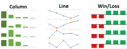
Implement Sparkline Barcharts in tables for development over time.
Something like this:
A button to reset all filters.
This could be located above the Tags for combinations or removed data
Den Filter über dem Ausgaben Diagramm kann man nicht entfernen.
--> ein Reset Link wie bei Quartale
IMHO "last" page is the ultimate page after all "next" pages.
Anyway in German it will be "vorige"
The first click on a column header e.g. Summe or "#" Relationen sorts the column ascending (showing small values). IMHO entities with big values are usually more interesting.
Reverse default for number columns.
(For text column ascending order is fine.)
Now preprocessed data is saved in local storage.
As long as such data is available in local storage, updated raw data will not be displayed.
The tooltip of the years chart disappears sometimes. Not reproduceable yet.
Data-based labels are in German e.g. Quartale, Rechtsträger .
Numbers are also in German
(obviously) names of Rechtsträger and Medien are also in German.
Generic UI elements are in English such as "2 entries", "reset all filters", "showing", ...
-> propose consistent German UI
In the tables of Rechtsträger and Medium one or more rows can be selected by clicking.
However unselection seems to be inconsistent.
If more than one row is selected and I click on a selected row, the most recently selected row is unselected.
I would expect that the clicked row is unselected.
Code comments
In chord diagram and maybe also in the table it could be necessary to shorten the names:
if (name.length > 30)
displayedname = name.substr(0, 20) + "..." + name.substr(-7);
Currently a relation maps directly to a row in the CSV file.
For example, the # column shows that Land Kärnten has 43 relations (but these are to 14 distinct media).
Land Kärnten -> Kleine Zeitung are 9 relations: 7 quartes §2 and 2 quarters §4.
After filtering to these two entities the number 9 is displayed in the # columns and also the Ausgaben charts shows a sum of 9 relations
IMHO a user understands relation count rather as Rechtsträger -> Medium connection irrespective of time/quarter and legal background.
Thus Land Kärnten -> Kleine Zeitung would have 1 relation.
If there are no filters I will see in the # column that Land Kärnten has had connection to 14 media.
And in the Ausgaben chart this single relation would be positioned based on the sum of money flow over the selected quarters and laws.
When setting up the project anew, I needed the following steps:
npm install -g brunch
npm install -g bower
npm install # use deps as listed in package.json
bower install
brunch build
Current working versions:
node: 7.9.0 (via nvm)
npm: 4.2.0
brunch: 1.8.5
bower: 1.8.0
If one (or more) quarters are selected in the "Quartale" chart, the sum of money is changed in the tables of Rechtsträger and Media, but the small bar chart next to it stays the same.
I could reflect the quarters going into the sum by using the same tones of blue like the "Quartale" chart.
Currently the distinction between earlier and later sum is fixed on the half of all time steps regardless if they are selected. Then, the selected time steps of each half are summed.
Idea for an alternative calculation of trend depending on selected time steps:
See also discussion in #32.
A declarative, efficient, and flexible JavaScript library for building user interfaces.
🖖 Vue.js is a progressive, incrementally-adoptable JavaScript framework for building UI on the web.
TypeScript is a superset of JavaScript that compiles to clean JavaScript output.
An Open Source Machine Learning Framework for Everyone
The Web framework for perfectionists with deadlines.
A PHP framework for web artisans
Bring data to life with SVG, Canvas and HTML. 📊📈🎉
JavaScript (JS) is a lightweight interpreted programming language with first-class functions.
Some thing interesting about web. New door for the world.
A server is a program made to process requests and deliver data to clients.
Machine learning is a way of modeling and interpreting data that allows a piece of software to respond intelligently.
Some thing interesting about visualization, use data art
Some thing interesting about game, make everyone happy.
We are working to build community through open source technology. NB: members must have two-factor auth.
Open source projects and samples from Microsoft.
Google ❤️ Open Source for everyone.
Alibaba Open Source for everyone
Data-Driven Documents codes.
China tencent open source team.