


Material-Datatable is a data tables component built on Material-UI V1. It comes with features like filtering, resizable + view/hide columns, search, export to CSV download, printing, selectable rows, pagination, and sorting. On top of the ability to customize styling on most views, there are two responsive modes "stacked" and "scroll" for mobile/tablet devices.
npm install material-datatable --save

Typescript definition included
For a simple table:
import MaterialDatatable from "material-datatable";

const columns = [
    {
        name: 'Name',
        field: 'name',
        options: {
            width: 70,
        },
    },
    {
        name: 'Title',
        field: 'title'
    },
    {
        name: 'Location',
        field: 'location',
        options: {
            width: 100,
        },
    },
    {
        name: 'Age',
        field: 'age'
    },
    {
        name: 'Salary',
        field: 'salary'
    },
    {
        name: 'Veeeeery loooooooooong naaaaaaaaaaame title',
        field: 'salary',
        options: {
            headerNoWrap: true,
            customBodyRender: (value, tableMeta, updateValue) => {
                return `${value.name} (${value.title})`;
            }
        },
    }
];
 const data = [
    {name: "Veeeeery loooooooooong naaaaaaaaaaame", title: "Title 1", location: "Location 1", age: 30, salary: 10},
    {name: "Name 2", title: "Title 2", location: "Location 2", age: 31, salary: 11},
];

const options = {
    filterType: 'checkbox',
};

<MaterialDatatable
    title={"Employee List"}
    data={data}
    columns={columns}
    options={options}
/>
Or customize columns:
import MaterialDatatable from "material-datatable";

const columns = [
 {
  name: "Name",
  field: "name",
  options: {
   filter: true,
   sort: true,
  }
 },
 {
  name: "Company",
  field: "company",
  options: {
   filter: true,
   sort: false,
  }
 },
 {
  name: "City",
  field: "city",
  options: {
   filter: true,
   sort: false,
  }
 },
 {
  name: "State",
  field: "state",
  options: {
   filter: true,
   sort: false,
  }
 },
];

const data = [
    {name: "Name 1", title: "Title 1", location: "Location 1", age: 30, salary: 10},
    {name: "Name 2", title: "Title 2", location: "Location 2", age: 31, salary: 11},
];

const options = {
  filterType: 'checkbox',
};

<MaterialDatatable
  title={"Employee List"}
  data={data}
  columns={columns}
  options={options}
/>Warnings like:
Warning: Material-UI: You are using the typography variant body2 which will be restyled in the next major release.Can be turned off with follow code:
const theme = createMuiTheme({
    typography: {
        useNextVariants: true
    },
});

ReactDOM.hydrate(
    <MuiThemeProvider theme={theme}>
        <App/>
    </MuiThemeProvider>,
    document.getElementById('react-app')
mui/material-ui#12741 (comment)
The component accepts the following props:
| Name | Type | Description |
|---|---|---|
title |
array | Title used to caption table |
columns |
array | Columns used to describe table. Must be either an array of simple strings or objects describing a column |
data |
array | Data used to describe table. Must be an array of strings or numbers |
options |
object | Options used to describe table |
| Name | Type | Default | Description |
|---|---|---|---|
page |
number | User provided starting page for pagination | |
count |
number | User provided override for total number of rows | |
serverSide |
boolean | false | Enable remote data source |
usePaperPlaceholder |
boolean | true | When false, component use React.Fragment as placeholder |
filterList |
array | User provided filter list | |
rowsSelected |
array | User provided selected rows | |
filterType |
string | 'dropdown' | Choice of filtering view. Options are "checkbox", "dropdown", or "multiselect" |
textLabels |
object | User provided labels to localize text | |
pagination |
boolean | true | Enable/disable pagination |
selectableRows |
boolean | true | Enable/disable row selection |
resizableColumns |
boolean | false | Enable/disable resizable columns |
customToolbar |
function | Render a custom toolbar | |
customToolbarSelect |
function | Render a custom selected rows toolbar | |
customFooter |
function | Render a custom table footer. function(count, page, rowsPerPage, changeRowsPerPage, changePage) => string| React Component |
|
caseSensitive |
boolean | false | Enable/disable case sensitivity for search |
responsive |
string | 'stacked' | Enable/disable responsive table views. Options: 'stacked', 'scroll' |
rowsPerPage |
number | 10 | Number of rows allowed per page |
rowsPerPageOptions |
array | [10,15,20] | Options to provide in pagination for number of rows a user can select |
rowHover |
boolean | true | Enable/disable hover style over rows |
sortFilterList |
boolean | true | Enable/disable alphanumeric sorting of filter lists |
sort |
boolean | true | Enable/disable sort on all columns |
filter |
boolean | true | Show/hide filter icon from toolbar |
search |
boolean | true | Show/hide search icon from toolbar |
print |
boolean | true | Show/hide print icon from toolbar |
download |
boolean | true | Show/hide download icon from toolbar |
downloadOptions |
object | Options to change the output of the CSV file. Default options: {filename: 'tableDownload.csv', separator: ','} |
|
viewColumns |
boolean | true | Show/hide viewColumns icon from toolbar |
onRowsSelect |
function | Callback function that triggers when row(s) are selected. function(currentRowsSelected: array, allRowsSelected: array) => void |
|
onRowsDelete |
function | Callback function that triggers when row(s) are deleted. function(rowsDeleted: array) => void |
|
onRowClick |
function | Callback function that triggers when a row is clicked. function(rowData: string[], rowMeta: { dataIndex: number, rowIndex: number }) => void |
|
onCellClick |
function | Callback function that triggers when a cell is clicked. function(colData: any, cellMeta: { colIndex: number, rowIndex: number }) => void |
|
onChangePage |
function | Callback function that triggers when a page has changed. function(currentPage: number) => void |
|
onChangeRowsPerPage |
function | Callback function that triggers when the number of rows per page has changed. function(numberOfRows: number) => void |
|
onSearchChange |
function | Callback function that triggers when the search text value has changed. function(searchText: string) => void |
|
onFilterChange |
function | Callback function that triggers when filters have changed. function(changedColumn: string, filterList: array) => void |
|
onColumnSortChange |
function | Callback function that triggers when a column has been sorted. function(changedColumn: string, direction: string) => void |
|
onColumnViewChange |
function | Callback function that triggers when a column view has been changed. function(changedColumn: string, action: string) => void |
|
onTableChange |
function | Callback function that triggers when table state has changed. function(action: string, tableState: object) => void |
On each column object, you have the ability to customize columns to your liking with the 'options' property. Example:
const columns = [
    {
        name: "Name",
        field: "name",
        options: {
            width: 150,
            headerNoWrap: true,
            filter: true,
            sort: false
        }
    },
    ...
];| Name | Type | Description |
|---|---|---|
Name |
string | Name of column (This field is required) |
Field |
string | Field of object field (This field is required) |
options |
object | Options for customizing column |
| Name | Type | Default | Description |
|---|---|---|---|
display |
string | 'true' | Display column in table. enum('true', 'false', 'excluded') |
filter |
boolean | true | Display column in filter list |
sort |
boolean | true | Enable/disable sorting on column |
width |
number | null | Set width for column (header and data) |
headerNoWrap |
boolean | false | No wrap for table header cell |
download |
boolean | true | Display column in CSV download file |
customHeadRender |
function | Function that returns a string or React component. Used as display for column header. function(rowDataObject, tableMeta, updateValue) => string|` |
|
customBodyRender |
function | Function that returns a string or React component. Used as display data within all table cells of a given column. function(rowDataObject, tableMeta, updateValue) => string| React Component |
|
customValue |
function | Function that returns a string or number. Can be used just with customBodyRender. For example you added some React component like Link into the column, but still wants to use that column for filtering. function(rowDataObject) => string|number. Example https://codesandbox.io/s/lp8pvk1zk9 |
|
customSortValue |
function | Function that returns a string or number. Return value for which will be used for sorting. For example you added some data like string "Fed 10, 2016" which provide create date into the column, but still wants to use that column for correct sorting by date. function(rowDataObject) => string|number Example https://codesandbox.io/s/lp8pvk1zk9 |
customHeadRender is called with these arguments:
function(columnMeta: {
  display: enum('true', 'false', 'excluded'),
  filter: bool,
  sort: bool,
  sortDirection: bool,
}, updateDirection: function)
customBodyRender is called with these arguments:
function(value: any, tableMeta: {
  rowIndex: number,
  columnIndex: number,
  columnData: array, // Columns Options object
  rowData: array, // Full row data
  tableData: array, Full table data
  tableState: {
    announceText: null|string,
    page: number,
    rowsPerPage: number,
    filterList: array,
    selectedRows: {
      data: array,
      lookup: object,
    },
    showResponsive: boolean,
    searchText: null|string,
  },
}, updateValue: function)
Using Material-UI theme overrides will allow you to customize styling to your liking. First, determine which component you would want to target and then lookup the override classname. Let's start with a simple example where we will change the background color of a body cell to be red:
import React from "react";
import MaterialDatatable from "material-datatable";
import { createMuiTheme, MuiThemeProvider } from '@material-ui/core/styles';
class BodyCellExample extends React.Component {
getMuiTheme = () => createMuiTheme({
overrides: {
MaterialDatatableBodyCell: {
root: {
backgroundColor: "#FF0000"
}
}
}
})
render() {
return (
<MuiThemeProvider theme={this.getMuiTheme()}>
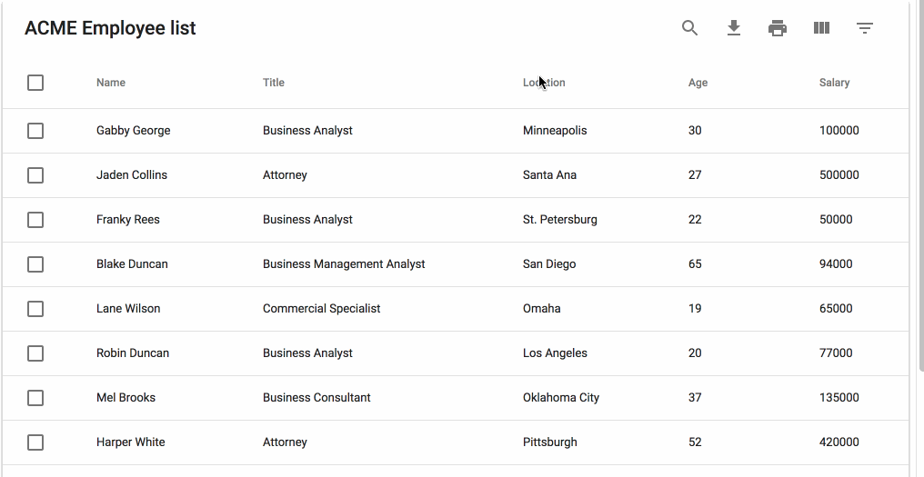
<MaterialDatatable title={"ACME Employee list"} data={data} columns={columns} options={options} />
</MuiThemeProvider>
);
}
}If you are looking to work with remote data sets or handle pagination, filtering, and sorting on a remote server you can do that with the following options:
const options = {
  serverSide: true,
  onTableChange: (action, tableState) => {
    this.xhrRequest('my.api.com/tableData', result => {
      this.setState({ data: result });
    });
  }
};
This package decided that the cost of bringing in another library to perform localizations would be too expensive. Instead the ability to override all text labels (which aren't many) is offered through the options property textLabels. The available strings:
const options = {
  ...
  textLabels: {
    body: {
      noMatch: "Sorry, no matching records found",
      toolTip: "Sort",
    },
    pagination: {
      next: "Next Page",
      previous: "Previous Page",
      rowsPerPage: "Rows per page:",
      displayRows: "of",
    },
    toolbar: {
      search: "Search",
      downloadCsv: "Download CSV",
      print: "Print",
      viewColumns: "View Columns",
      filterTable: "Filter Table",
    },
    filter: {
      all: "All",
      title: "FILTERS",
      reset: "RESET",
    },
    viewColumns: {
      title: "Show Columns",
      titleAria: "Show/Hide Table Columns",
    },
    selectedRows: {
      text: "rows(s) selected",
      delete: "Delete",
      deleteAria: "Delete Selected Rows",
    },
  }
  ...
}
The files included in this repository are licensed under the MIT license.
0.2.5 (2018-12-24)
- Avoid crash when changing rows per page
0.2.4 (2018-12-22)
- Fixed bug when multiselect filter crash when filter item is null
0.2.3 (2018-21-21)
- Updated Readme and link to an example
0.2.2 (2018-21-21)
- Added new option for column which can be used just with customBodyRender - "customValue(value)"". For example you added some Link into the column, but still wants to use that column for filtering by some value.
- Added new option for column "customSortValue(value)"". For example you added some data like Date string "Fed 10, 2016" into the column, but still wants to use that column for correct sorting by date.
0.2.1 (2018-11-17)
- Fixed exception when customBodyRender return null
0.1.9 (2018-11-08)
- customBodyRender doesn't require anymore rear field name
- Added warning message in case if column field doesn't exist in DTO
0.1.8 (2018-10-14)
- Fixed readme instructions How to turn off Material UI Typography warnings
0.1.7 (2018-10-14)
- Updated readme with instructions How to turn off Material UI Typography warnings
0.1.6 (2018-10-14)
- Downgrade to "@material-ui/core": "^3.0.2",
0.1.5 (2018-10-14)
- Updated material-ui to the latest version 3.2.1
0.1.4 (2018-10-14)
- Updated material-ui to the latest version 3.0.2
- Removed Deprecated variants for Typography: title => h6,subheading => subtitle1
0.1.3 (2018-10-14)
- Fixed bugs with filter and search by sub level data
- Fixed bugs with download and print
0.1.2 (2018-10-13)
- Added width and headerNoWrap options for columns (table header cell and table body cell)
- Reduced table body cell padding to "4px 8px 4px 8px"
0.1.1 (2018-10-13)
- Updated readme for new link on sandbox
0.1.0 (2018-10-13)
- CustomRenderBody receive full object, not just one field
0.0.9 (2018-10-13)
- updated TS definition for new option usePaperPlaceholder
0.0.8 (2018-10-13)
- added new option usePaperPlaceholder. By default it is true. Can be turned off if you don't need paper placeholder
- moved back to original styles. Need to fix it in future


 React
React
 Typescript
 Django
 Laravel
 Facebook
 Microsoft
 Google
 Alibaba
 D3
D3
 Tencent