Code Monkey home page Code Monkey logo

ha-lcars's Introduction

Home Assistant LCARS

Star Trek LCARS theme for Home Assistant

hacs_badge

Discord Banner 2

Color codes and font choice from https://www.thelcars.com --thanks Jim Robertus!

Examples

Dashboard

image

Edit modes

image

Mobile view

Included themes

LCARS Themes Classic, Lower Decks, Romulus, Cardassia, Kronos, Nemesis.

Preamble

I am most definitely not a real web developer, and fumbled my way into the initial release with the help of Stack Exchange and various blogs on CSS techniques. My main goal was and still is to keep this theme 100% CSS/JS with no extra assets required besides the font. I'm positive there are better ways to implement anything and everything I've done thus far, so PRs are welcome. I will continue to improve things as I learn and add more comments to my CSS so that you can know what things do and maybe tell me how it can be better if you know. I have tested this theme with most of the out-of-the-box cards that ship with Home Assistant, and some available in HACS like the Mail and Packages card. However, I'm sure there are some that could still be terribly broken. Simply create an issue and I will address it.

Installation instructions

Prerequisites

I. Enable themes and install card-mod

  1. Install card-mod per the instructions on its GitHub page.

  2. Make sure in your configuration.yaml file you have the following:

frontend:
  javascript_version: latest
  themes: !include_dir_merge_named themes
  extra_module_url:
    - /local/community/lovelace-card-mod/card-mod.js #or wherever you ended up putting card-mod.js
  1. Under the Home Assistant Config folder, create a new folder named themes.
  2. Restart Home assistant to apply the changes.

II. Add the font and JavaScript file

This theme requires you to add both the Antonio font and lcars.js file as resources to your lovelace configuration.

Navigate to SettingsDashboards3-dot menuResources and add the following new Resources:

  1. https://fonts.googleapis.com/css2?family=Antonio:wght@400;700&display=swap and select 'stylesheet'
  2. https://cdn.jsdelivr.net/gh/th3jesta/ha-lcars@js-main/lcars.js and select javascript
-OR-

If you don't trust someone's random JavaScript hosted on a CDN (I get it), you can download the lcars.js file directly from GitHub, audit it yourself, and place it in your <home-assistant-directory>/www/community/; this will need to be done with every HA-LCARS update. Do not add /local/community/lcars.js to extra_module_url; it will not work there.

IF YOU USE CLOUDFLARE IN FRONT OF YOUR SITE: Purge your site cache in CloudFlare (Purge Cache under Quick Actions) anytime you update the local file or if you are using the JSDelivr link and a new version of HA-LCARS is released. This needs to happen whether you are using the JSDelivr link or putting it in your www folder. Unless you tell it not to, CloudFlare caches anything in your site that it can.

III. Set up the clock

In order for the clock to work, you need to set up the Time & Date integration by adding the following to your configuration.yaml:

sensor:
  - platform: time_date
    display_options:
      - 'time'
      - 'date'
      - 'date_time'
      - 'date_time_utc'
      - 'date_time_iso'
      - 'time_date'
      - 'time_utc'

More info: https://www.home-assistant.io/integrations/time_date/

IV. Create the entities

This theme has two controls for sound and textures that require creating simple toggle entities. Create them by going to Settings > Devices & Services > Helpers and create two of type Toggle named as below:

  • LCARS Sound (entity id should be input_boolean.lcars_sound)
  • LCARS Texture (entity id should be input_boolean.lcars_texture)

image

These entities can be controlled directly from viewing the entity, or you can even add buttons to your dashboard to control them, just like any other entity.

Install the theme

Install via HACS by searching "LCARS" or download the latest release and extract and drop the lcars folder into your themes folder.

Enable theme

Option 1: Via profile

  1. Open your Home Assistant Profile
  2. Under, Themes, select one of the new LCARS themes
  3. Call the frontend.reload_themes service.

Option 2: Setting the default backend-selected theme

In order to have this theme set automatically as the backend selected default, add the following automation to your Home Assistant:

- alias: Set Default Theme
  description: ''
  trigger:
  - event: start
    platform: homeassistant
  condition: []
  action:
  - data:
      name: LCARS Default # or whichever other theme is available, like LCARS Lower Decks
    service: frontend.set_theme

Usage instructions

Classes

The theme includes some classes that can be added to cards like this to give them special styling:

card_mod:
  class: header

The class names are only indications of what types of cards they were intended for, but the classes can be applied to any card you like. I cannot guarantee how well they will work outside of their intended uses, however.

The classes are as follows:

  1. header header-right header-contained header-open - top blue bar (in Default theme) meant for Markdown cards with one H1 line that will start a section
YAML Result
type: markdown
card_mod:
  class: header
content: '# header'

type: markdown
card_mod:
  class: header-right
content: '# header-right'

type: markdown
card_mod:
  class: header-contained
content: '# header-contained'

type: markdown
card_mod:
  class: header-open
content: '# header-open'
image
  1. middle middle-right middle-contained - side red bar (in Default theme) meant for non-button sections below header and above footer
YAML Result
type: markdown
card_mod:
  class: middle
content: '# middle'

type: markdown
card_mod:
  class: middle-right
content: '# middle-right'

type: markdown
card_mod:
  class: middle-contained
content: '# middle-contained'
    
type: markdown
card_mod:
  class: middle-blank
content: '# middle-blank'
image
  1. footer footer-right footer-contained footer-open - bottom gray bar (in Default theme) meant for the last card in a section
YAML Result
type: markdown
card_mod:
  class: footer
content: '# footer'

type: markdown
card_mod:
  class: footer-right
content: '# footer-right'

type: markdown
card_mod:
  class: footer-contained
content: '# footer-contained'

type: markdown
card_mod:
  class: footer-open
content: '# footer-open'
image
  1. button-small - squared off buttons intended to go in middle sections and horizontal-stacks and grids
YAML Result
type: light
entity: light.jesse_s_desk
name: Desk Lamp
card_mod:
  class: button-small
image
  1. button-large - rounded button meant to be standalone outside of header/middle/footer sections
YAML Result
show_name: true
show_icon: true
type: button
tap_action:
  action: call-service
  service: frontend.reload_themes
  data: {}
  target: {}
show_state: true
card_mod:
  class: button-large
image
  1. button-lozenge button-lozenge-right - pill-shaped button; only works on standard button cards; also works on button cards in a horizontal-stacks and grids up to two columns wide; more columns get glitchy and is not advised
YAML Result
show_name: true
show_icon: true
type: button
tap_action:
  action: toggle
entity: switch.speakers
icon: mdi:speaker-multiple
card_mod:
  class: button-lozenge
  
show_name: true
show_icon: true
type: button
tap_action:
  action: toggle
entity: switch.lightsaber
card_mod:
  class: button-lozenge-right
image
  1. button-bullet button-bullet-right - similar to the lozenge, but with a squared-off side; same column restrictions apply
YAML Result
show_name: true
show_icon: true
type: button
tap_action:
  action: toggle
entity: light.bedroom_tree
card_mod:
  class: button-bullet
  
show_name: true
show_icon: true
type: button
tap_action:
  action: toggle
entity: switch.counter_lights
card_mod:
  class: button-bullet-right
image
  1. button-capped button-capped-right - similar to the bullet, but capped on the round side; same column restrictions apply
YAML Result
show_name: true
show_icon: true
type: button
tap_action:
  action: toggle
entity: light.bathroom
card_mod:
  class: button-capped
  
show_name: true
show_icon: true
type: button
tap_action:
  action: toggle
entity: switch.built_in
card_mod:
  class: button-capped-right
image
  1. bar bar-right bar-large bar-large-right - standalone header-type bar; only intended for and tested with Markdown cards
YAML Result
type: markdown
content: '# bar'
card_mod:
  class: bar
  
type: markdown
content: '# bar-large'
card_mod:
  class: bar-large
  
type: markdown
content: '# bar-right'
card_mod:
  class: bar-right
  
type: markdown
content: '# bar-large-right'
card_mod:
  class: bar-large-right
image

Make your own color themes

Custom themes can be created down at the bottom of lcars.yaml. Or, search for "===THEMES", which will take you right there. To create your own theme, copy the LCARS Default section to the bottom of the file and change the lcars-ui-* and lcars-card-* variables to your liking, using the color references at the top of the file, The LCARS website, or define your own.

Tips and tricks

If you have anything to add here, create a PR with your tip and I will review it to add to this list.

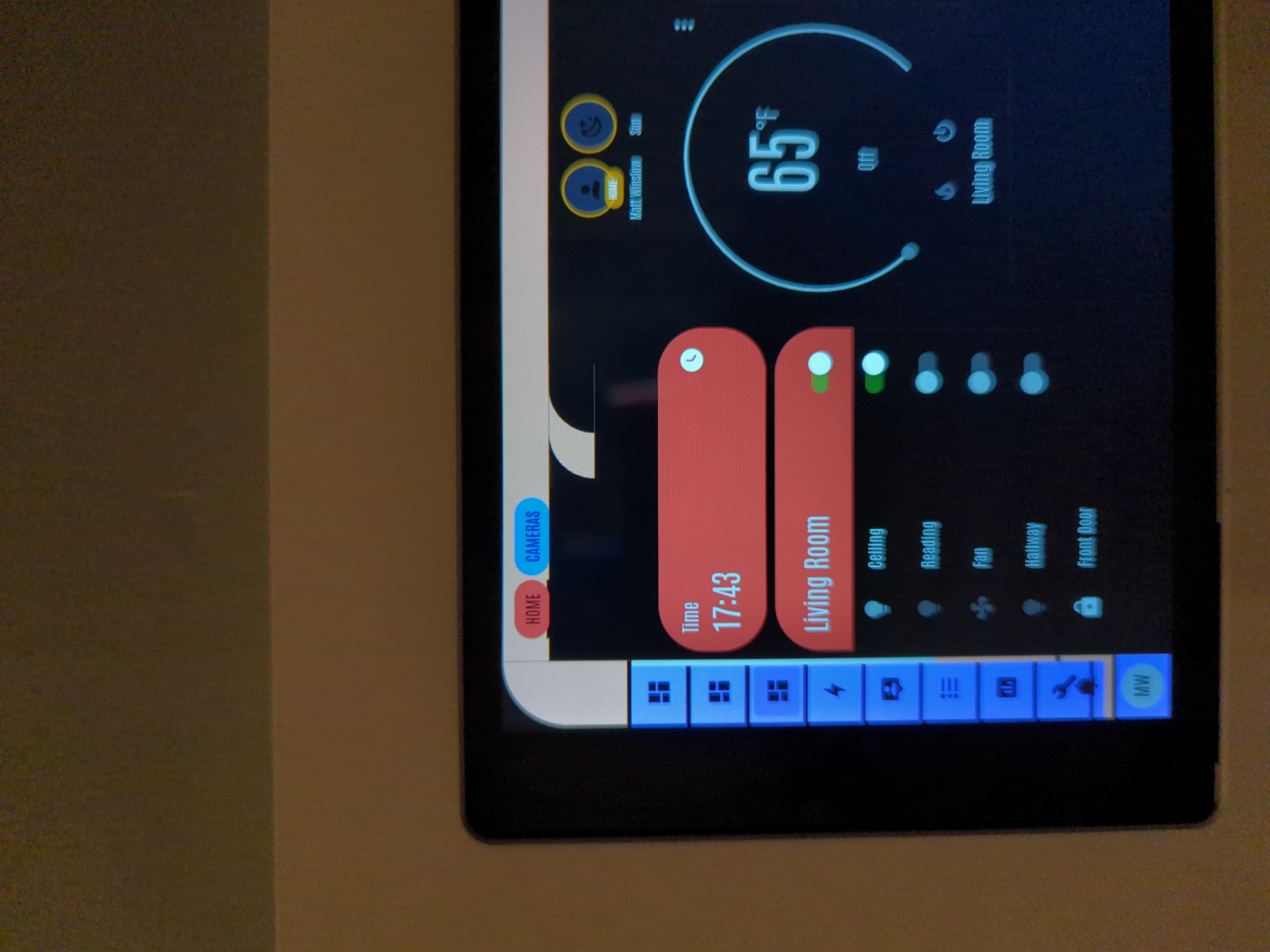
  • Make use of Vertical Stack cards. Whether in this theme or any other theme, they are invaluable for keeping dashboards organized. In LCARS, a Vertical Stack card should contain a Markdown card first with the title of the group and the
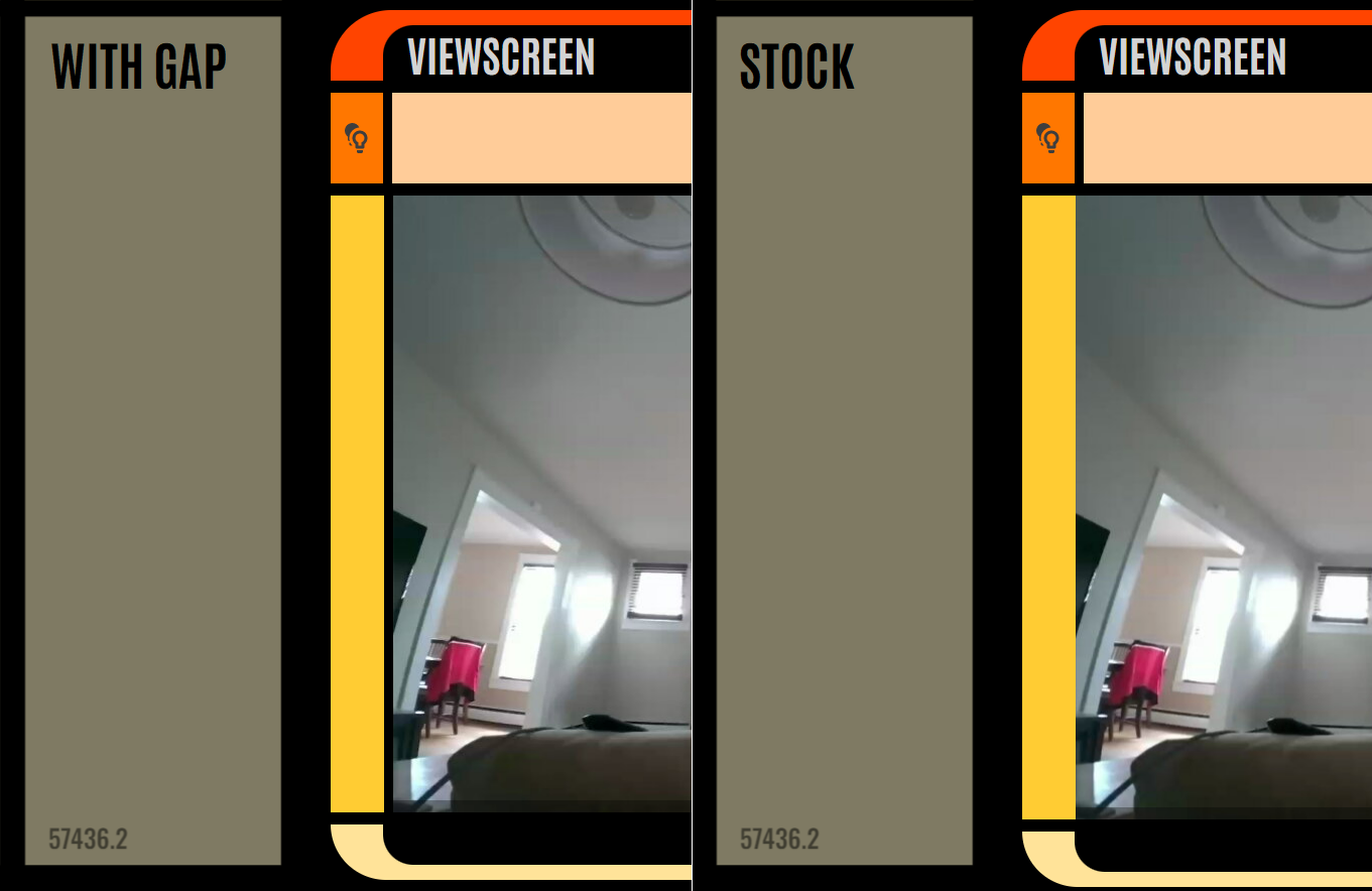
 header class applied, then any number of middle class cards and button class single buttons or in horizontal stacks or grids, and then finally a footer class applied to the last card in the vertical stack. You can see this formation in all of the screenshots at the top of this page. Here's an example Vertical Stack card and all of its contents:
YAML Result
type: vertical-stack
cards:
  - type: markdown
    card_mod:
      class: header
    content: '# Climate'
  - type: weather-forecast
    entity: weather.home
    card_mod:
      class: middle
  - type: thermostat
    entity: climate.dining_room
    card_mod:
      class: footer
image
  • You can create a blank header or footer by creating a Markdown card and putting ## &nbsp; in the Content field, and change the size by modifying the number of #. It looks like this: image

  • If you are only applying the theme to a dashboard or a card, the font won't render on the cards. You can brute-force loading the font on a per-card basis by adding the following style to every card:

YAML Result
type: markdown
content: '# Card-level theming'
theme: LCARS Default
card_mod:
  class: header
  style: |
    ha-card > * {
      font-family: Antonio
    }
image
  • If you want to host the font yourself, such as running a Home Assistant instance in a car or on an air-gapped network, you can learn how to download the font and install it from issue #69.

  • You can switch the alignment of text in a card, such as the markdown card for header-right, by adding custom CSS per card like so:

YAML Result
card_mod:
  class: header-right
  style: |
    ha-card {
      text-align: right;
    }
image
  • You can set a button's background color to the color of the light by adding custom CSS per card like so:
YAML Result
card_mod:
  class: button-capped-right
  style: |
    ha-card {
      {% if is_state('light.terasa', 'on') %}
        {% set rgb_color = state_attr('light.terasa', 'rgb_color') %}
        background-color: rgba({{ rgb_color[0] }}, {{ rgb_color[1] }}, {{ rgb_color[2] }}, 1);
        color: black;  /* or any other logic for text color */
      {% else %}
        background-color: #dd4444;
        color: black;
      {% endif %}
    }
image

Known issues

  • Font and sidebar and header CSS styles only load when a dashboard has been loaded first. If you navigate directly to a non-dashboard page without loading a dashboard first, things will look pretty awful, though still functional. Simply load a dashboard and hit the back button. This is a quirk of the card-mod addon on which this theme relies, so it's outside my ability to fix.
  • card-mod classes do not work with Vertical Stack and Horizontal Stacks cards (though they do work with the cards they contain). This is a quirk of the card-mod addon on which this theme relies, so it's outside my ability to fix. There is, however, a hacky workaround I have identified though have opted to not include at this time. Please submit a feature request if you would like to see this included.
  • Collapsing and expanding the sidebar or zooming the interface will jack with the noise and gradient overlays. A simple refresh will set everything right again. I hope to find a way to make the pseudo elements that contain the textures to dynamically adjust with the DOM. PRs are welcome. Bug here.
  • Menu pages like Development Tools and Profile are functional, but not great. Unfortunately, there's not much I can do to address this as card-mod does not provide a method to change these pages. Issues raised for anything comepletely broken and unsuable that I may have missed are welcome, as are PRs to make to make things better.
  • Sometimes when a dashboard loads, not all CSS styles will load and all or most cards will end up looking like the button-large cards. This is more prevalent on large dashboards. Try reloading the page, and if that doesn't work, load a smaller dashboard and then go back to the offending dashboard.

Acknowledgements

  • Thanks to @JHuckins for color theming support and testing!
  • Thanks to @csanner for the new classes and additional fixes and tweaks!
  • Thanks to @Anthrazz for the bar classes!
  • Thanks to @mtezzo for the entity toggle for textures/gradients, and the Modern theme (my new favorite)!
  • Thanks to @CmdreIsaacHull for various fixes, improvements, themes, and new classes!
  • Thanks to @askpatrickw for figuring out how to self-host the font!
  • Thanks to @z3r0l1nk for light color-matching button trick!
  • Thanks to @smugleafdev for the right-justified text tip!
  • Thanks to @Routhinator (via Discord) for the right-footer fix!

Links

Discord: https://discord.gg/gGxud6Y6WJ

LCARS Resources: https://www.thelcars.com

ha-lcars's People

Contributors

csanner avatar jhuckins avatar jongilmore avatar th3jesta avatar

Stargazers

 avatar  avatar  avatar  avatar  avatar  avatar  avatar  avatar  avatar  avatar  avatar  avatar  avatar  avatar  avatar  avatar  avatar  avatar  avatar  avatar  avatar  avatar  avatar  avatar  avatar  avatar  avatar  avatar  avatar  avatar  avatar  avatar  avatar  avatar  avatar  avatar  avatar  avatar  avatar  avatar  avatar  avatar  avatar  avatar  avatar  avatar  avatar  avatar  avatar  avatar  avatar  avatar  avatar  avatar  avatar  avatar  avatar  avatar  avatar  avatar  avatar  avatar  avatar  avatar  avatar  avatar  avatar  avatar  avatar  avatar  avatar  avatar  avatar  avatar  avatar  avatar  avatar  avatar  avatar  avatar  avatar  avatar  avatar  avatar  avatar  avatar  avatar  avatar  avatar  avatar  avatar  avatar  avatar  avatar  avatar  avatar  avatar  avatar  avatar  avatar

Watchers

 avatar  avatar  avatar  avatar  avatar  avatar  avatar  avatar  avatar  avatar  avatar

ha-lcars's Issues

Markdown elements mostly only work as header

Here's a screenshot that shows it better than I can really describe:
HA-lcars-markdown-class-weirdness

Note the border-radius in the top-left of all but the middle one.
It looks like it's coming from the 'ha-markdown.no-header' element, when I unset the border-radius on that element in the browser's inspector, it removes that rounded corner for all of them, including the actual header one, even though it does seem to be set properly on the parent ha-card.header element.
I was struggling to find a solve for this using the inspector, but I'm not well versed in CSS styling.

Pseudo-elements don't update with changes to the DOM

Any time the DOM changes (viewport resizes or zooms; sidebar is collapsed or expanded) the pseudo-elements that contain the noise and gradient texture overlays don't update their sizes and locations accordingly.

Workaround: refresh the page.

Sounds not constrained to theme

When using the LCARS Sounds helper toggle, sounds are playing even when a different theme than HA LCARS is selected.

The use-case I have for this is that I use a different theme for the majority of my HA use - desktop, phones, etc - but I have an NSPanel Pro replacing the light switch in my study that I use the LCARS theme for to make it look like a door panel from the shows. The problem is, when I have the sounds toggle set to on, I am getting the LCARS sound from every other device as well that isn't using the theme.

Surely the sounds should only be loaded when the theme is in active use? I also get the "removing sidebar border" and "adding audio" messages in the console even when the toggles are off, so the script in general is just running regardless.

Digging around in the dev panel in chrome, I can see there is a "selected theme" item that could be used for checking this - though it looks to be the user's selected theme, and shows as "" when you have 'Use backend preferred theme' set, which makes things trickier to implement without another helper option. Having a very brief dig around, there doesn't seem to be a straight-forward way to identify the current backend-selected theme, so maybe a quick and dirty solution here is to have an if statement that checks the selected theme in local storage against a regex for lcars, and then based on the state of a third toggle (lcars_backend_theme_sounds perhaps?), have it also include an empty string in that if statement?

Middle Class Padding

I've been going through my cards and adding some gaps to the middle cards, since these are the only classes where there are no gaps between the solid border bars and the content. I thought it might be cool to add that to the overall theme for everyone.

I'm not sure where exactly these lines would go in the .yaml, so I am posting here instead of a pull request.

#Middle
    ha-card {
      padding-left: 6px !important;
    }

#Middle Right
    ha-card {
      padding-right: 6px !important;
    }

image

I think it looks so much better than stock.

Button text overflows

Great theme, appreciate the instructions for custom colors. I've a problem with overflowing text on buttons.
I tried adding a "word-wrap: break-word;" property to the classes, but it didn't have an effect. Also tried it in a card_mod style, but it appears to be beyond my CSS knowledge.

image

Please add example YAML for some of your cards to the documentation

There are a number of things you're doing in your example dashboards that I'm curious about, and card type appears to be critically important when using this theme. the lozenge-style cards named "speakers", for example, aren't obvious what they do or how you're getting them.

support for tile card?

Has anybody tested the tile card with this theme? I'm new to this theme, but I can't seem to get it render like I'd expect. Here's my code and a screenshot how it renders.

      - type: tile
        entity: group.main_floor_lights
        name: Main
        icon: mdi:lightbulb
        tap_action:
          action: navigate
          navigation_path: "/ui-lcars/lights-main"
        icon_tap_action:
          action: call-service
          service: button.press
          target:
            entity_id: button.basement_equipment_room_phantom_kp_position_1_keypad_main_off
        card_mod:
          class: button-bullet

image

Setting LCARS as front-end theme messes up the sidebar

When I run the automation to set the them, once I refresh the browser the sidebar only shows the very top part - I can't access any of the additional buttons/links.

It does work properly until I refresh the browser and clearing my cache doesn't solve the problem.

Make menu icon visible on mobile

Menu icon is not visible in the mobile view. Workaround to access the menu is to swipe in from the left, but that is problematic if the mobile OS already has the left swipe assigned.

Set button colour to match active light colour

On other cards (custom-button) I am able to change the colour of the button to match that of the light when it is turned on.

This involves using 'state' and a variable which holds the colour of the light when it is turned on.

Am I able to do this on LCARS please and, if so, how? I've scoured the web but can't find anything which pulls in that colour variable.

Many thanks.

-contained?

Hi - just updated to the latest release. I've cleared the cache etc but the new lozenge-right, -contained etc don't seem to work. Any ideas?

Clock not displaying for non-admin user

Title says it all really.
It works fine for the administrator user, but I mostly want this theme for an Android kiosk-like device or 2 around the house, and I don't really want them set up with administrator users.

I see a little bit of blue where the clock would be, but it's less than a digit wide and there's no actual time displayed.

New Class Request

I would love to have a few new classes so that I can streamline my MSD markers. I thought about making changes in the don't make changes section, but I decided making this request would be safer and could help anyone 🤣

Here is what I have been doing for my markers with plain button cards. I'd give them a class of msd-left and msd-right:

#class: msd-left
show_name: true
show_icon: false
type: button
name: environmental controls
tap_action:
  action: navigate
  navigation_path: /dashboard-home/environmental-controls
card_mod:
  style: |
    ha-card {
      margin: 0px 15px 23px 0px !important;
      background: black !important;
      font-size: 1.5em !important;
      font-weight: 700 !important;
      color: var(--lcars-orange) !important;
      text-transform: uppercase !important;
      text-align: right !important;
      display: flex !important;
      align-items: flex-end !important;
      border-radius: 0 0 0 0 !important;
    }
#class: msd-right
show_name: true
show_icon: false
type: button
name: lighting controls
tap_action:
  action: navigate
  navigation_path: /dashboard-home/lighting-controls
card_mod:
  style: |
    ha-card {
      margin: 0px 15px 23px 18px !important;
      background: black !important;
      font-size: 1.5em !important;
      font-weight: 700 !important;
      color: var(--lcars-orange) !important;
      text-transform: uppercase !important;
      text-align: left !important;
      display: flex !important;
      align-items: flex-start !important;
      flex-direction: column-reverse !important;
      border-radius: 0 0 0 0 !important;
    }

Obviously some or a lot of that code isn't needed, but I just kept adding and hitting the !important; button over and over until it was right.

Media controls volume unreadable

Looks like you've got white-on-white in the theme colours
image

I believe you need to change the colour of the knob here or the colour of the actual text here

I've worked around it with this style in card_mod: ha-card{--paper-slider-font-color:black}

Text/font 'thickness/boldness' issue and/or modification

Hi,

Loving the LCARS theme. The only main issue I have is that on many screens the font is a little too ‘thin’, if that makes sense. It actually makes the font quite difficult to read. Is there a way to modify the font ‘heaviness’ (like bolding or simply making the letters/numbers a little ‘thicker’)?

If I do choose to create my own custom theme to do this, how do I go about it? I can see how I can create my own themes color scheme at the bottom of the lcars.yaml file but there is no mention of font in that section.

Any help is appreciated, thanks.

lcars font

Leftover corner when minimizing

Installed today and it works great! Only issue I've found is when minimizing the left bar, a quarter-round piece of the top bar doesn't move to the left with the rest of the menu. Not sure if it's something I missed during setup.

Other than that, this is a great theme!!

I'm not the world's best with CSS but if I can figure it out, I'll create a branch and submit the changes.

16679473950687288569418399499955

Calendar card is a bit of a mess

I did a bunch of card_mod: style: ... work to make the calendar card render better for me, so I figured I'd share that here.
Here's the yaml:

card_mod:
  class: $class$
  style:
    div.header: |
      div.header {
        /* This header only holds the "name" which,
           when empty, still takes up a lot of empty space. */
        /* display:none; */
        /* LCARS made a mess of the background colour */
        background: var(--paper-listbox-background-color);
      }
    ha-full-calendar$: |
      .header {
        /* LCARS made a mess of the background colour */
        background: var(--paper-listbox-background-color);
      }
      #calendar {
        /* LCARS made a mess of the background colour */
        --card-background-color: var(--paper-listbox-background-color);
      }
      #calendar, div.fc-scroller {
        border-radius: 0px 0px 20px 0px !important;
      }

Some before screenshots (the pink is my redactions for privacy, not an issue with the theme)
before_middle-rightbefore_footer-right
And finally, some after screenshots (the pink is my redactions for privacy, not an issue with the theme)
after_middle-rightafter_footer-right

Cleanup font color assignments

Right now:

  primary-text-color: var(--lcars-text-gray)
  secondary-text-color: var(--lcars-text-gray)
  text-primary-color: var(--lcars-text-gray)

This is great for cards with black backgrounds, but assigning the text color var(--lcars-text-gray) destroys the legibility of text on menu pages outside of dashboards. It may be better to assign the primary text color to black, and update the dark background cards to use var(--lcars-text-gray). This will be quite a bit to make sure all text in all places renders legibly, as it was quite a bit of work to get it in the hodge-podge state it's in now.

Recommend a separate branch for this mamajama.

Button color fades with light percentage

I noticed an odd thing today. When I have lights in a room that are dimmed to a level less than 100%, the button highlight color also dims the same amount. If the lights are completely off or are all at 100%, then the highlight renders normally. This is separate from the icon color. That does adjust normally.

image

Add sound effects

...only if we find a way to complete #5, though. We'll use the same method to implement the SFX as the gradients/noise.

Large UNKNOWN text right upper corner

Nice work!

I have an issue that a large UNKNOWN text is covering the right upper corner.
Scherm­afbeelding 2023-05-18 om 09 36 47

This occours with any LCARS theme except the default non-LCARS HA theme.
HA 2023.5.2

How to fix this?

Font and background - same color

I am using the LCARS Kronos theme and when a new device is discovered in Home Assistant, the button, which normally says "configure", is just a black box:
image

image

Feature: Possibility to deactivate clock and mobile layout

THANK YOU for this great theme! I have been waiting forever for a really good LCARS theme!

My HA UI is organized so that every user has their own dashboard and the dashboards have multiple views. On my mobile device, the clock takes so much space that the dashboard is almost unusable.

Screenshot_20230110-104708

I would like to suggest adding an option which disables the clock either completely or when the screen is narrower than x.

Malformed YAML Forces Safe Mode

Tried installing this theme and when restarting HA it booted into safe mode with the following error:

Found duplicate anchor 'card-mod-root'; first occurrence in "/config/themes/lcars/lcars.yaml", line 357, column 18 second occurrence in "/config/themes/lcars/lcars.yaml", line 577, column 18

I had to delete the lcars folder in /config/themes/ in order to fully boot HA

Create right-handed lozenge and bullet classes

If it's possible, the following would be useful:

a right-hand lozenge button
A header/footer (handed, as currently) where you didn't have to enter any content (you may already know a way to do this?

Loving it so far - currently moving stuff over so I can start turning off other dashboards.

Recommend Projects

  • React photo React

    A declarative, efficient, and flexible JavaScript library for building user interfaces.

  • Vue.js photo Vue.js

    🖖 Vue.js is a progressive, incrementally-adoptable JavaScript framework for building UI on the web.

  • Typescript photo Typescript

    TypeScript is a superset of JavaScript that compiles to clean JavaScript output.

  • TensorFlow photo TensorFlow

    An Open Source Machine Learning Framework for Everyone

  • Django photo Django

    The Web framework for perfectionists with deadlines.

  • D3 photo D3

    Bring data to life with SVG, Canvas and HTML. 📊📈🎉

Recommend Topics

  • javascript

    JavaScript (JS) is a lightweight interpreted programming language with first-class functions.

  • web

    Some thing interesting about web. New door for the world.

  • server

    A server is a program made to process requests and deliver data to clients.

  • Machine learning

    Machine learning is a way of modeling and interpreting data that allows a piece of software to respond intelligently.

  • Game

    Some thing interesting about game, make everyone happy.

Recommend Org

  • Facebook photo Facebook

    We are working to build community through open source technology. NB: members must have two-factor auth.

  • Microsoft photo Microsoft

    Open source projects and samples from Microsoft.

  • Google photo Google

    Google ❤️ Open Source for everyone.

  • D3 photo D3

    Data-Driven Documents codes.