Code Monkey home page Code Monkey logo

sora-font's Introduction

SORA typeface

Sample Sample

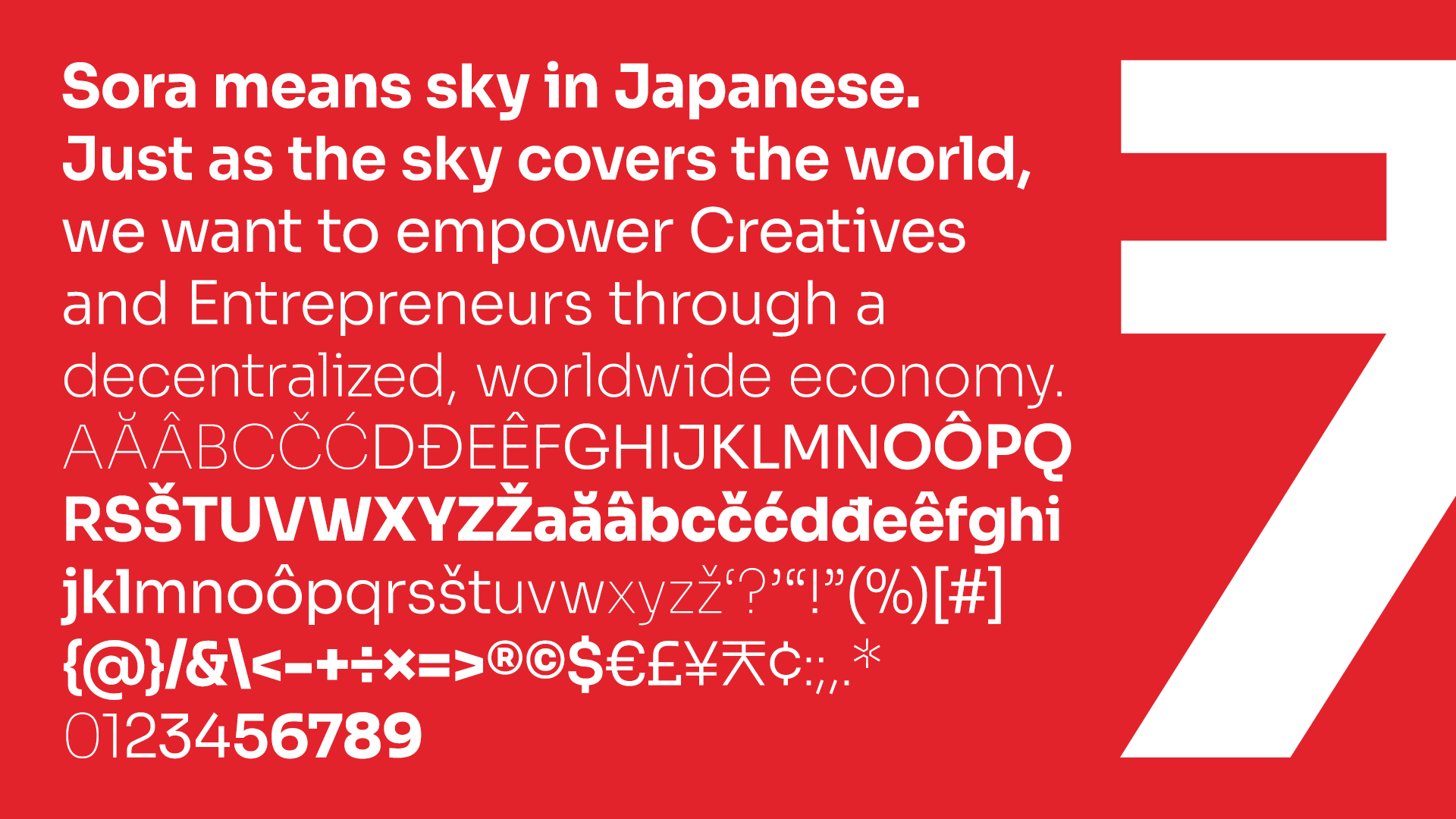
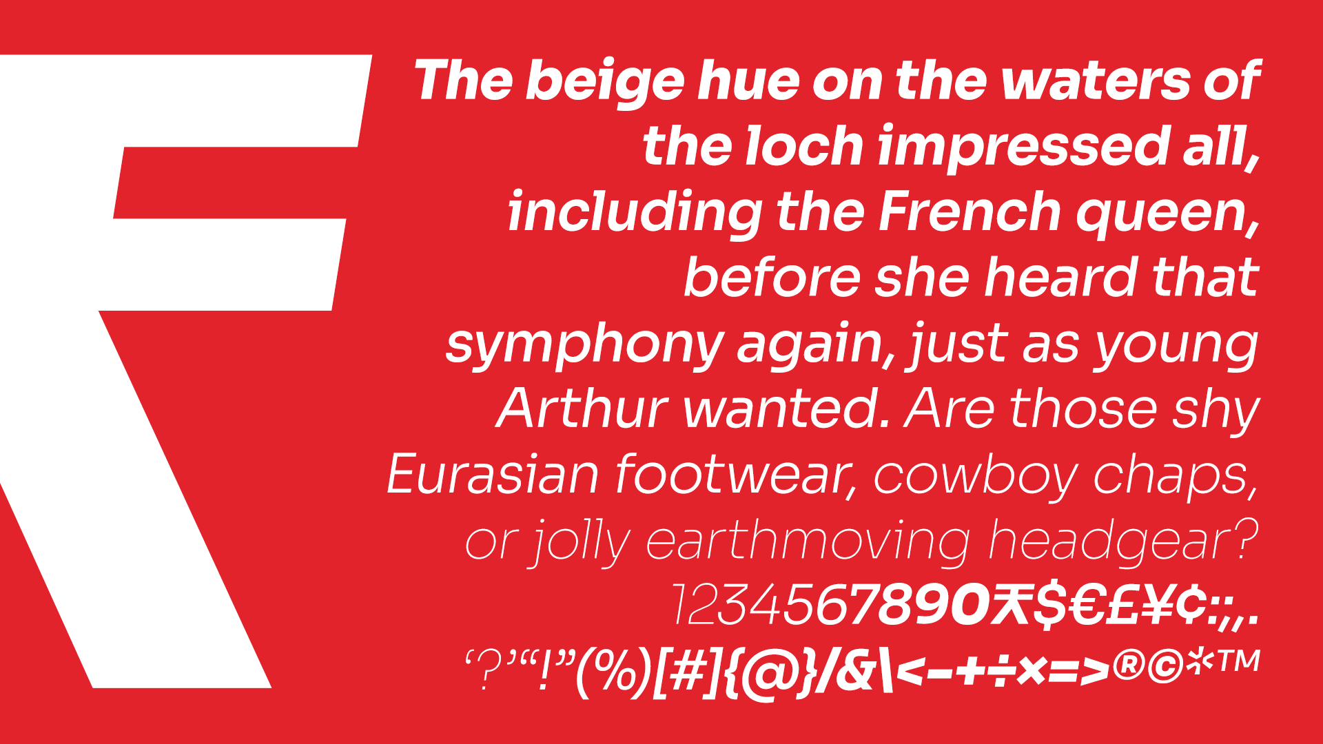
SORA is a typeface family commissioned for the SORA decentralized autonomous economy as a custom solution for branding and interface design. SORA, meaning sky in Japanese, is focused on empowering projects that benefit society by delivering new goods and services. The SORA typeface was designed to capture the spirit and heritage of SORA and is highly optimized for user interfaces. The outcome is a type family with cues of low-resolution aesthetics and early screen typography but without nostalgia, as every decision was considered towards the crisp digital environment of today. The particularly big x-height combined with evidently generous counters turns the family into a convenient tool for app and web interfaces, where clarity and effectiveness at any size is an imperative. Therefore giving us a neutral, yet distinctive, sans serif typeface with excellent legibility across various mediums.

The SORA typeface is an open-source project and available for download and use following the Open Font License (OFL).

Currently available styles

Name Weight class
Thin 100
Thin Italic 100
ExtraLight 200
ExtraLight Italic 200
Light 300
Light Italic 300
Regular 400
Italic 400
Medium 500
Medium Italic 500
SemiBold 600
SemiBold Italic 600
Bold 700
Bold Italic 700
ExtraBold 800
ExtraBold Italic 800

SORA is also available as a variable font.

sora-font's People

Contributors

cssobral2013 avatar takemiyamakoto avatar tarmovannas avatar vv-monsalve avatar

Stargazers

 avatar  avatar  avatar  avatar  avatar  avatar  avatar  avatar  avatar  avatar  avatar  avatar  avatar  avatar  avatar  avatar  avatar  avatar  avatar  avatar  avatar  avatar  avatar  avatar  avatar  avatar  avatar  avatar  avatar  avatar  avatar  avatar  avatar  avatar  avatar  avatar  avatar  avatar  avatar  avatar  avatar  avatar  avatar  avatar  avatar  avatar  avatar  avatar  avatar  avatar  avatar  avatar  avatar  avatar  avatar  avatar  avatar  avatar  avatar  avatar  avatar  avatar  avatar  avatar  avatar  avatar  avatar  avatar  avatar  avatar  avatar  avatar  avatar  avatar  avatar  avatar  avatar  avatar  avatar  avatar  avatar  avatar  avatar  avatar  avatar  avatar  avatar  avatar  avatar  avatar  avatar  avatar  avatar  avatar  avatar  avatar  avatar  avatar  avatar  avatar

Watchers

 avatar  avatar  avatar  avatar  avatar  avatar  avatar  avatar  avatar

sora-font's Issues

Vertical metrics are misaligned

I noticed that the vertical metrics are off on the google version of Sora.

The image below has line-height: 1. I would expect it to be centered within the padded area of the badge.

Screen Shot 2021-08-15 at 1 25 49 AM

problem building master

i've tried to build the sora font with fontmake, but it stops here:

fontmake: Error: In 'sora-italic.glyphs': Loading Glyphs file failed: Missing delimiter in list before content:
;
CR;
A;
Aacute;
Abreve;
Acircumflex;
Adieresis;
Agrave;
Amacron;
Aogonek;
Arin
make[1]: *** [debian/rules:8: override_dh_auto_build] Error 1
make[1]: Leaving directory '/var/www/debian/fonts-sora/2022/fonts-sora-0+git20220718+ds'
make: *** [debian/rules:5: binary] Error 2
dpkg-buildpackage: error: debian/rules binary subprocess returned exit status 2
debuild: fatal error at line 1182:
dpkg-buildpackage -us -uc -ui failed

Alternative 'a'

Tried blending Sora's 'a' with an alternative 'a' glyph from another typeface on Google Fonts called Epilogue.

Actually looks good. Might be worth considering in future versions perhaps?
Screenshot 2020-08-15 at 5 21 07 PM

Love the typeface! Thank you

Faux Bold (Ctrl + B) Display issue, Windows - Miscrosoft Office Powerpoint and Word.

Hello.

First, this is a beautiful font - Thank you for developing! I'm using Sora in a large branding project and have hit a few snags with some Windows users when creating powerpoint presentations and word docs. I cannot recreate this issue on a Mac in any application. So it's localized to the way windows (specifically Microsoft PPT and Word) handles bolding.

When someone on a Windows machine is using Thin, Extra Light, etc and uses the keyboard shortcut CTRL + B to bold words the display for certain letters becomes garbled. I'm guessing this happens because ctrl b just synthesizes a thicker weight of the currently selected thin font instead of switching to the real thicker font face (ie: Sora Regular, Semi-Bold, etc).

Here you can see when someone faux-bolds thin, portions of the lowercase w's and i's disappear.

Screenshot_SoraFont

When you look through the font list, they're all separate and not under the same family. I was wondering if it was a way the font names were organized in the family and if that might resolve the issue? Are they organized into separate faces instead of a group? Have you seen this issue before? Do you suggest installing the font in a specific way?

We've told them not to bold words in this way, but bad habits are hard to break :) Really hoping to continue using this beautiful font on this project and not have to default to a system font that is more "faux-bold friendly".

Thanks!
Trent

release?

could you please tag versioned releases?

Inconsistent font metrics?

I hope I'm not being stupid here, but I've been troubleshooting for days and I'm pretty sure this is a problem with the fonts.

This issue concerns: https://github.com/sora-xor/sora-font/tree/master/fonts/ttf/v2.1beta

Specifically, these fonts seem to have inconsistent metrics (ascent, descent etc.):

  • Sora-Thin.ttf
  • Sora-ExtraLight.ttf
  • Sora-Light.ttf
  • Sora-Regular.ttf
  • Sora-Medium.ttf
  • Sora-SemiBold.ttf
  • Sora-Bold.ttf
  • Sora-ExtraBold.ttf

In a design tool like Figma, this results in incorrectly sized text boxes, which makes aligning text unfeasible:

GIF showing misaligned text and incorrectly sized text boxes in Figma

In a font tool like Glyphr Studio, the problem is easier to see (notice how the ascent and descent guides are not consistent between fonts):

GIF showing the metrics for each font

Bold

Hello.

Sora-Bold.ttf and Sora-Regular.ttf have the same name "Sora". On Windows, it generate problem with selecting Bold font.

image

image

Recommend Projects

  • React photo React

    A declarative, efficient, and flexible JavaScript library for building user interfaces.

  • Vue.js photo Vue.js

    🖖 Vue.js is a progressive, incrementally-adoptable JavaScript framework for building UI on the web.

  • Typescript photo Typescript

    TypeScript is a superset of JavaScript that compiles to clean JavaScript output.

  • TensorFlow photo TensorFlow

    An Open Source Machine Learning Framework for Everyone

  • Django photo Django

    The Web framework for perfectionists with deadlines.

  • D3 photo D3

    Bring data to life with SVG, Canvas and HTML. 📊📈🎉

Recommend Topics

  • javascript

    JavaScript (JS) is a lightweight interpreted programming language with first-class functions.

  • web

    Some thing interesting about web. New door for the world.

  • server

    A server is a program made to process requests and deliver data to clients.

  • Machine learning

    Machine learning is a way of modeling and interpreting data that allows a piece of software to respond intelligently.

  • Game

    Some thing interesting about game, make everyone happy.

Recommend Org

  • Facebook photo Facebook

    We are working to build community through open source technology. NB: members must have two-factor auth.

  • Microsoft photo Microsoft

    Open source projects and samples from Microsoft.

  • Google photo Google

    Google ❤️ Open Source for everyone.

  • D3 photo D3

    Data-Driven Documents codes.