Code Monkey home page Code Monkey logo

crimson's Introduction

Crimson is a free and open-source text type family.

Versions/History

Crimson was first released in 2010 (as Crimson Text) and has undergone major revisions since then.

Version Specimen Info

2018
("Crimson Pro")

🔗 Google Fonts
🔗 Github Repo

A professionally produced redesign by Jacques Le Bailly (@Fonthausen), commissioned by Google, this new Crimson is a fresh take on the first version and the result of months of painstaking work to perfect colour, glyph balance and legibility.

2012
(current master branch)

🔗 Google Fonts (Amiri)
🔗 Fontsquirrel

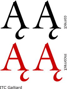
A complete overhaul to take care of the wonky outlines and inconsistent spacing of the first version.

Adaptation of this version has been slow, because Google Fonts continues to provide the 2010 version.

However, this font is available as the Latin character set of Khaled Hosny's lovely Amiri font (also available on Google Fonts).

Similarity to Minion is rather coincidental (it's certainly not an intentional clone). Nevertheless, this version works well with LaTeX packages like minionmath (TeX users, check out cochineal as well).

🚨 There are a good number of production issues still – if you are willing to help maintain this generation of Crimson, please let me know; I am generous with commit rights! 🚨

2010

🔗 Google Fonts

First release.

At a time when quality libre text fonts were scarce (unlike today), Crimson Text was intended to serve as a workhorse font for the masses, inspired by the fantastic work of designers like Jan Tschichold (Sabon), Robert Slimbach (Arno, Minion) and Jonathan Hoefler (Hoefler Text).

The Crimson Text family was meant to be accompanied by a Crimson Display family, which never came to be.

Directories and Releases

Note: The current directory structure will be replaced with the release of Crimson Prime. The 2012 version will likely be kept (though not maintained) in a separate branch.

The Desktop Fonts and Web Fonts directories above always contain the most up-to-date binaries, respectively.

Desktop Fonts contains both OTF and TTF versions of the font. While OTF is generally regarded as the more modern and powerful format, some Windows users may prefer the rendered appearance of the TTF files, at least for screen use.

Web Fonts contains subsetted (!) TTF, EOF and WOFF files. If the provided files do not meet the requirements of your website, which may well be the case, you will need to generate the webfonts yourself – using either a font editor like Fontforge or an online service such as fontsquirrel.com.

For TeX users, two packages are available: Crimson and Cochineal, maintained by Bob Tennent and Michael Sharpe, respectively. The latter doesn't include the Semibolds, but has been extended by a ton of glyphs and adjusted to work well in math environments (a remarkable effort in its own right!).

Background

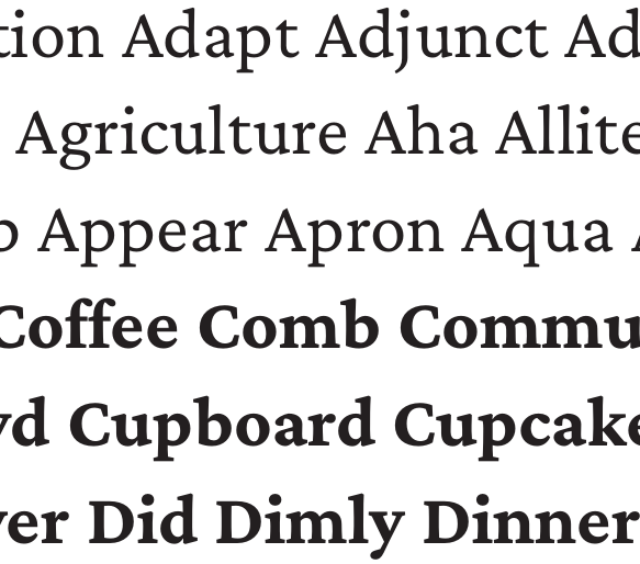
The font is designed in the tradition of beautiful oldstyle type, and inspired particularly by the fantastic work of people like Jan Tschichold (Sabon), Robert Slimbach (Arno, Minion) and Jonathan Hoefler (Hoefler Text). It features

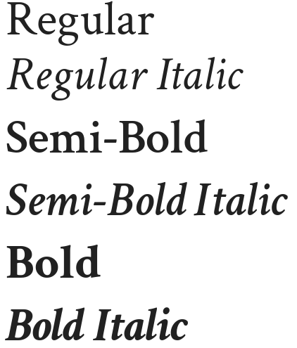
  • six cuts (regular, semibold and bold; with a Roman and Italic each)
  • characters for a wide range of European languages – though some are still better supported than others between different cuts
  • spacing/kerning done by Igino Marini's spectacular iKern
  • an unbeatable price of zero!

Contributors

This project owes its success to (in no particular order)

  • Google's generous funding,
  • a handful of anonymous donors,
  • Adrien Tétar, for tirelessly fixing bugs,
  • Rainer Schuhsler, for correcting the vertical metrics,
  • Hector Haralambolous from Athens, who contributed many of the Coptic and Cyrillic glyphs,
  • Georg Duffner of EB-Garamond fame, who helped with OpenType wizardry,
  • Khaled Hosny, font guru, for fixing things I never knew were broken,
  • George Williams, author of FontForge,
  • Kate F., for hours and hours of overtime put into all of the font's rough edges
  • the many talented and generous people I forgot to mention, including those submitting bug reports

Contributing

Contributions to the project in any form are very much welcome. I am generous with commit rights – if you would like to help maintain this project, gimme a shout!

crimson's People

Contributors

adrientetar avatar jlami avatar katef avatar lrjunior avatar rainerschuhsler avatar simonfoxe avatar skosch avatar

Stargazers

 avatar  avatar  avatar  avatar  avatar  avatar  avatar  avatar  avatar  avatar  avatar  avatar  avatar  avatar  avatar  avatar  avatar  avatar  avatar  avatar  avatar  avatar  avatar  avatar  avatar  avatar  avatar  avatar  avatar  avatar  avatar  avatar  avatar  avatar  avatar  avatar  avatar  avatar  avatar  avatar  avatar  avatar  avatar  avatar  avatar  avatar  avatar  avatar  avatar  avatar  avatar  avatar  avatar  avatar  avatar  avatar  avatar  avatar  avatar  avatar  avatar  avatar  avatar  avatar  avatar  avatar  avatar  avatar  avatar  avatar  avatar  avatar  avatar  avatar  avatar  avatar  avatar  avatar  avatar  avatar  avatar  avatar  avatar  avatar  avatar  avatar  avatar  avatar  avatar  avatar  avatar  avatar  avatar  avatar  avatar  avatar  avatar  avatar  avatar  avatar

Watchers

 avatar  avatar  avatar  avatar  avatar  avatar  avatar  avatar  avatar  avatar  avatar  avatar  avatar  avatar  avatar  avatar  avatar  avatar  avatar  avatar  avatar  avatar  avatar  avatar  avatar  avatar  avatar  avatar  avatar

crimson's Issues

Sinhala glyph set

I'm looking for a matching latin set for this project - A Sinhala font for web. Found Crimson is working nicely. You can see the file here and test it with Sinhala+ Latin text here

  • Crimson is under OFL right? no mention of it.

screen shot 2014-11-16 at 2 19 44 am

Can't install the Bold Italic version on Windows

I have tried everything I can think of to install the Crimson font family into my Windows 10, but I can't seem to be able to install the Bold Italic font properly. Although the Crimson-BoldItalic.otf file gets copied into the Windows Fonts folder, I don't see the Bold Italic version when viewing the family in Windows Explorer (Control Panel\Appearance and Personalisation\Fonts\Crimson).

When I install Crimson-BoldItalic.otf separately, the name of the font family is shown as "Crimson BoldItalic", instead of "Crimson", which is what I see when I install the other variants.

Some programs, such as Photoshop, don't seem to mind and simply use the font anyway, but others (when generating a PDF in LibreOffice, for example) seem not to be able to work with the bold italic font.

Is there anything that could be done about that?

Provide smcp ß by character substitution instead of a ligature

I think we have almost exactly the opposite situation to #34 for ß - that is, a ligature which I think ought to be substituted for two characters.

Currently germandbls.sc (can we name it esset instead?) is drawn as two capital 'S' characters, which I think is correct because ß is lowercase, and so would become two S characters on converting to capitals.

However I would rather provide smcp for ß as a substitution to two s.sc glyphs instead, and remove germandbls.sc.

The reason is that I'd rather avoid having pictures of two characters with a space between them because that space would be incorrect if a user adjusts the letter spacing. That's all the more likely for small caps, since at larger sizes spacing between capitals is often made a little looser.

I'd implement this after #29.

Generating OTF produces wrong metrics

With the current revision, fontforge generates OTF which has the wrong metrics (or something); glyphs appear as if their height is about half is what it ought to be.

I'm using fontforge from git, but the same happens for other people using different versions of fontforge; I asked people to confirm for me.

I bisected the history, and this seems to have been introduced by 2d24623, and is still present in 4ab614e. Earlier commits do not have the problem.

Various accents aren't emboldened for Bold

Ł, č, ō and a few others have accents which are not bold, and these need fattening up a little. This is true for Semibold, too. Other accents, such as ċ, do seem to match the font weight.

Round coordinates to integers

I think TrueType suffers on some implementations when outputting non-integer coordinates; this applies inside OTF, too. FontForge also complains about this. I think we need to round off all coordinates to integers.

Do something with long s for smcp

Curiously I see Minion Pro leaves ſ as-is under smcp. But other typefaces substitute it for a smallcap S. There's also an obscure capital ſ form, which looks like a ʕ. I've never seen that used, and I doubt anybody would recognise it, but it does exist.

My complaint about leaving ſ is that I'd expect a consistent x-height from smcp, and this glyph breaks that. So I think we should do ''something'' with it. My hunch would be to substitute ſ for s.sc, but I don't know if that would annoy people.

Kerning references non-existent glyph names

520f689 commits Igino Marini's iKern feature files. Unfortunately the glyphs he references seem to have been renamed since then. Merging them gives lots of errors like:

Reference to a non-existent glyph name on line 1573 of ik/Crimson-Roman#00_ik.fea.
Empty position on line 1573 of ik/Crimson-Roman#00_ik.fea
Expected ';' at statement end on line 1573 of ik/Crimson-Roman#00_ik.fea
Reference to a non-existent glyph name on line 1577 of ik/Crimson-Roman#00_ik.fea.
Reference to a non-existent glyph name on line 1578 of ik/Crimson-Roman#00_ik.fea.
Reference to a non-existent glyph name on line 1579 of ik/Crimson-Roman#00_ik.fea.
Reference to a non-existent glyph name on line 1580 of ik/Crimson-Roman#00_ik.fea.

Smallcaps for dotless j and dotless i

Dotless j currently has no entry for smcp; dotless i does.

I propose adding a new dotlessj.sc to go alongside the existing dotlessi.sc. I think dotlessj.sc should reference j.sc in the same way that dotlessi.sc references i.sc.

Ligatures for italic

The italic face puts "fi" awfully close together, and these would suit a ligature to give a less cluttered feel. I didn't check, but I suspect the same would be true for the other usual ligatures, fl, ffi and such.

Thank you,

Greek accented letters are missing inside \emph{} or \textbf{} commands

Thank you very much for providing such a beautiful font!

I noticed that Greek accented letters disappear inside \emph{} or \textbf{}. Try this for example:

\documentclass{article}
\usepackage{fontspec}
\usepackage{crimson}

\begin{document}
λέγων \emph{λέγων} \textbf{λέγων}
\end{document}

Roman fl too close

I realise the Roman face is designed intentionally such that the usual f- ligatures should not be neccessary, but this looks too close for comfort, to me:

b

some kerning pairs involving "a" are off point.

screenshot_20170319_123543

a+b, a+f, a+i, a+m, a+n, a+r, a+t, a+u, and a+z. Have too much spacing relative to the other a combinations making words containing those combinations appear to have gaps.

Note: using (linux) opensuse tumbleweed.

Qu contextual alt

Hello! I saw there's a glyph for a long-tailed Q, Q.alt01, and I thought I'd try that as an example for contextual alts.

The way I've implemented this involves two parts:

  1. Substitute QQ.alt01 for salt
  2. Have calt match Q u and apply salt for the Q

I tested this on Roman only, illustrated here with smcp set:
quickly

What do you think? Is this the right way to implement this?

+Lookup: 5 0 0 "'calt' Contextual Alternates lookup 9" { "'calt' Contextual Alternates lookup 9-1"  } ['calt' ('DFLT' <'dflt' > 'cyrl' <'dflt' > 'grek' <'dflt' > 'latn' <'TRK ' 'dflt' > ) ]
+Lookup: 3 0 0 "'salt' Stylistic Alternatives lookup 10" { "'salt' Stylistic Alternatives lookup 10-1"  } ['salt' ('DFLT' <'dflt' > 'cyrl' <'dflt' > 'grek' <'dflt' > 'latn' <'TRK ' 'dflt' > ) ]
 Lookup: 4 0 1 "'liga' Ligatures standard lookups7" { "'liga' Ligatures standard lookups7-1"  } ['liga' ('DFLT' <'dflt' > 'cyrl' <'dflt' > 'grek' <'dflt' > 'latn' <'TRK ' 'dflt' > ) ]
 Lookup: 4 0 0 "'dlig' Discretionary Ligatures lookup 8" { "'dlig' Discretionary Ligatures lookup 8-1"  } ['dlig' ('DFLT' <'dflt' > 'cyrl' <'dflt' > 'grek' <'dflt' > 'latn' <'TRK ' 'dflt' > ) ]
 Lookup: 1 0 0 "'ccmp' Turkish i" { "'ccmp' Turkish i-1"  } ['ccmp' ('latn' <'TRK ' > ) ]
@@ -817,6 +819,13 @@ KernClass2: 14+ 24 "'kern' Horizontal Kerning in Latin lookup 0 kerning class 1"
  25 zero zero.slash zero.prop
  55 d dcaron dcroat uni1E0B uni1E0D uni1E0F uni1E11 uni1E13
  0 {} -37 {} -30 {} -28 {} -22 {} -34 {} 0 {} 0 {} 0 {} 0 {} 0 {} 0 {} 0 {} 0 {} 0 {} 0 {} 0 {} 0 {} 0 {} 0 {} 0 {} 0 {} 0 {} 0 {} 0 {} 0 {} 0 {} -17 {} -14 {} -22 {} -21 {} -10 {} -15 {} -21 {} 0 {} 0 {} 0 {} 0 {} 0 {} 0 {} 0 {} 0 {} 0 {} 0 {} 0 {} 0 {} 0 {} 0 {} 0 {} 0 {} 0 {} 0 {} 0 {} 0 {} 0 {} 9 {} 0 {} 0 {} 6 {} 0 {} 0 {} 0 {} 0 {} 0 {} 0 {} 0 {} 0 {} 0 {} 0 {} 0 {} 0 {} 0 {} 0 {} 0 {} 0 {} -14 {} -11 {} -16 {} 0 {} 0 {} 0 {} 0 {} 0 {} 0 {} 0 {} 0 {} 0 {} 0 {} 0 {} 0 {} 0 {} 0 {} 0 {} 0 {} 0 {} 0 {} 0 {} 0 {} 0 {} -15 {} -13 {} -17 {} 0 {} 0 {} 0 {} 0 {} 0 {} 0 {} 0 {} 0 {} 0 {} 0 {} 0 {} 0 {} 0 {} 0 {} 0 {} 0 {} 0 {} 0 {} 0 {} 0 {} 0 {} 30 {} 28 {} 36 {} 0 {} -41 {} 0 {} 0 {} 0 {} -57 {} 0 {} 0 {} 0 {} 0 {} 0 {} 0 {} 0 {} 0 {} 0 {} 0 {} 0 {} 0 {} 0 {} 0 {} 0 {} -13 {} -11 {} -14 {} 0 {} 0 {} 0 {} 0 {} 0 {} 0 {} 0 {} 0 {} 0 {} 0 {} 0 {} 0 {} 0 {} 0 {} 0 {} 0 {} 0 {} 0 {} 0 {} 0 {} 0 {} -10 {} 0 {} -13 {} 0 {} -26 {} 0 {} 0 {} 0 {} -34 {} -11 {} 0 {} 0 {} 0 {} 0 {} 0 {} 0 {} 0 {} 0 {} 0 {} 0 {} 0 {} 0 {} 0 {} -46 {} -41 {} -33 {} -48 {} 0 {} 0 {} 0 {} 0 {} 0 {} 0 {} 0 {} 68 {} -18 {} 16 {} 0 {} 0 {} 0 {} 0 {} 0 {} 0 {} 0 {} 0 {} 0 {} 0 {} 0 {} 0 {} 0 {} -13 {} 0 {} -33 {} 0 {} 0 {} 0 {} 0 {} -14 {} 0 {} 0 {} 0 {} -11 {} -51 {} -38 {} 0 {} 0 {} 0 {} 0 {} 0 {} 0 {} 0 {} -46 {} -37 {} -30 {} -50 {} 0 {} 0 {} 0 {} 0 {} 0 {} 0 {} 0 {} 84 {} -14 {} 0 {} -11 {} 0 {} -13 {} -10 {} 0 {} 0 {} 0 {} 0 {} 0 {} 0 {} 0 {} 0 {} 0 {} 0 {} 0 {} 0 {} 0 {} 0 {} 0 {} 0 {} 0 {} 0 {} 0 {} 0 {} 0 {} 0 {} -24 {} 0 {} -14 {} -12 {} 0 {} 0 {} 0 {} 0 {} 0 {} 0 {} 0 {} 0 {} 0 {} 0 {} 0 {} 0 {} 0 {} 0 {} 0 {} 0 {} 0 {} 0 {} 0 {} 0 {} 0 {} 0 {} 0 {} 0 {} -23 {} 0 {} 0 {} 0 {} 0 {} 0 {} 0 {} 0 {} 0 {} -35 {} 0 {} 0 {} 0 {} 0 {} 0 {} 0 {} 0 {} 0 {} 0 {} -59 {} -14 {} 0 {} 0 {} 0 {} 0 {} -8 {}
+ContextSub2: glyph "'calt' Contextual Alternates lookup 9-1" 0 0 0 1
+ String: 3 Q u
+ BString: 0
+ FString: 0
+ 1
+  SeqLookup: 0 "'salt' Stylistic Alternatives lookup 10"
+EndFPST
@@ -2647,6 +2607,7 @@ SplineSet
  600 464 513 633 358 633 c 0
  208 633 148 484 148 350 c 0
 EndSplineSet
+AlternateSubs2: "'salt' Stylistic Alternatives lookup 10-1" Q.alt01

Reproducible build process

I am not an expert on font production. I don't know how fonts (should) behave across different browsers, applications and OS, let alone what users' requirements are regarding OpenType features, hinting, subsetting, webfonts, etc.

I would like to figure out a process (build script?) to take care of the above, in order to help me and others take care of the 30+ issues that have accumulated on this repo.

  • Does it make sense to convert sources to UFO?
  • In 2017, what is the best way to maintain OT features?
  • What binaries do users need? OTFs? TTFs? Subsetted/web-optimized? (or should we leave the latter to users?)
  • Run FontBakery on all commits? Worth the trouble, yes/no?
  • Anything else?

@katef, you have written a Makefile, and I would love to get your input. @adrientetar and @khaledhosny, you guys have been so helpful in the past – if you know of any resources on the current best practices, I would be grateful if you could point me to them.

Thank you!

Redraw ligatures to current outlines

Discussed in #13; some ligatures have outlines based on glyphs which have since been re-styled. These ligatures need re-drawing based on the new shapes for their constituents.

Standard ligatures don't work

I have used old version of Crimson Text and the standard ligatures (fi, ff ...) worked fine. Somehow in the new version (0.8), the standard ligatures won't turn on automatically in InDesign. Is it a bug? Thanks so much.

Web fonts are gone and new TTF files have old vertical metrics

I commented on the last issue but I'm opening a new one just in case my comment wasn't seen.

The last commit was more destructive than constructive.

The web fonts should not have been removed. The TTF web fonts aren't meant to be installed as desktop fonts; they were generated to have a basic subsetting for browsers to download them faster and to have an adjusted x-height to match Georgia. Font Squirrel did not touch the settings for hinting, so the differences in hinting between the web TTF files and the new desktop TTF files weren't caused by the generator.

It looks like ttfautohint improved the hinting of the TTF files on Windows, but I fail to see why this is necessary at all, when the OTF files are technically superior. The reason the TTF files appear to render "better" on Windows (at least at small point sizes) is the way they're aliased. As you can see by the 72pt size type, the OTF characters appear smooth while the TTF characters appear jagged. I'll concede that Windows desktop users should have to option to install TTF files if they prefer them over OTF fonts, but these files shouldn't outright replace the web versions.

Further, it appears the new TTF files were generated by the SRF files, which retain the issues with vertical metrics that are fixed in the OTF files, so new web fonts can't be generated from the new TTF files because the baseline will be inconsistent among different weights. See http://uh.edu/~jrschuhs/crimson/December-2013/baseline-test.html and http://uh.edu/~jrschuhs/crimson/May-2014/baseline-test.html to compare.

Script greek style incongruous with serifed roman glyphs

For Crimson-Roman, the greek glyphs are drawn with a rounded, handwritten script style. These look lovely, of course, but don't go with the style for the rest of the font. I presume this is an intentional design decision, since I can't find any alternate greek glyphs in the source. What's the rationale for these?

Here for example, I would expect the capital lambda to have the same style as the capital A.
ABΛΒ

My suggestion is to have the greek glyphs in serifed style by default, and to move the existing glyphs to stylistic alternates instead.

I realise that drawing new glyphs is quite a lot of work. TeX Gyre's Pagella has quite similar greek glyphs; perhaps some could be borrowed from there, and tweaked to fit the same proportions as for Crimson's existing script-style glyphs.

Line-height or H align

I have a problem with the vertical alignment of the characters. This is most obvious when changing the line-height to align the text vertically in block elements.
I have made a preview to show the problem: http://jsfiddle.net/Lepsnvy9/1/
The fonts used are from google and I know there have been updates, but when I tried the new versions of the font they all showed this error.

What I expect is that the font would line the middle of the H with the red line. Most other fonts do this. But Crimson I guess has wrong Ascent or Descent? I don't really know how to fix this myself. I will try, but you might have more insight.

Some glyphs overhang their Em square

Is this okay? I know some fonts do this on purpose (Zapfino is an extreme example) but I don't think it's intentional for Crimson.
Should the Em square be increased?

Switch to Feature File format for OpenType features

I want to have better control over specifying features; FontForge's GUI presents a relatively low-level interface for what's going on. It's much saner to use Adobe's Feature File format to encode these as higher-level constructs, and keep that as the canonical source. FontForge can then load this data. Here's a nice description: http://ansuz.sooke.bc.ca/entry/131

This will also make features like #26 aalt far simpler to encode:

feature aalt {
     feature salt;
     feature smcp;
     substitute Q by Q.alt01; # e.g. some glyph not in salt
} aalt;

I'll switch over in a few steps:

  1. Export the current features (which will come out "as-is" — that is, an explicit listing of every substitution);
  2. Then re-factor that into some more human readable (i.e. group together sets of glyphs)
  3. Re-import those to FontForge

The GUI can be used to export feature files, but only one lookup at a time. So it's more convenient to use Font Forge's scripting interface, with GenerateFeatureFile thus:

#!/home/kate/bin/fontforge
Open($1);
GenerateFeatureFile($1:r+".fea");
Quit(0);

Italic long S shouldn't have an arm

I've been looking at similar typefaces; for those which have an arm for an f-like ſ, their corresponding italic faces do not have an arm. I think Crimson's italic should follow suite.

Stylistic alt for A-ogonek

There are two correct ways of attaching ogonek to the base serif of capital A:

a1ogonek

Note this is not an accented letter A; it's a different letter, and the ogonek is part of the letter shape.

Crimson currently attaches in the centre of the stem. I think the style merging with the inner part looks rather lovely, and I wanted to ask for opinions. In particular a lot of fonts treat the characters sloppily, and although Crimson's current attachment is very well done, I think this is an opportunity to show special care for the language.

I'd like to offer this as a stylistic alt.

I've sketched this out (roughly) using aogonek.sc as an example:
@skosch What do you think?

aogonek

Intersecting paths in some glyphs may cause improper rendering

I noticed that some glyphs in this font are constructed from referenced glyph and path crossing that glyph. Unfortunately, this may cause problems with their rendering. As I checked, freetype2 seemd to render mentioned glyphs as intended, however Windows XP at some sizes displayed empty areas where the shapes intersected. Below is illustration of this issue.

crimson-text-problem

So far I noticed this problem with the following glyphs: /oslash, /Oslas, /dcroat, /Dcroat, /lslash and /Lslash. Full list can be obtained thanks to FF's “Find problems…”. One way to fix this would be to simply “place” the reference in the given glyph and use “Remove Overlap”. I didn't do it myself because a) time, b) I didn't know if that's the smartest way to do it (don't know if, by a chance, FF can do that automatically when it generates binary file).

Bar for Ł slightly unbalanced

It strikes me that the bar for Ł seems a little bit too long on the right hand side. I find it unbalanced. I don't think it should be exactly symmetrical, but I do think it should be a little bit shorter on the right hand side. Looking at other similar fonts, that seems to be the consensus. What do people think?

Unrelated, there's also the optical illusion that a diagonal going through a vertical stem will have the right hand half appearing higher than it actually is. So I also think the right hand side ought to be made a tiny amount lower, to cater for that.

Łódź

Inconsistent line height in Safari

Italic text causes uneven line height when viewing the page in Safari (Mac and iPhone). The attached screenshot illustrates the problem.

gll

(The text is from the article "General Parser Combinators in Racket".)

What's curious is that the standard web fonts do not have this problem. The problem occurred when I went to Font Squirrel to generate my own web fonts without subsetting. The problem also occurs if I disable web fonts altogether and let the browser use the Crimson version installed on the system.

I have tried to generate the web fonts with the default settings (in generator_config.txt), as well as other settings (enabling/disabling auto-adjusted vertical metrics, TrueType hinting, and x-height matching). No luck. I have also checked out earlier versions of the fonts.

The problem does not occur in Firefox.

old style numerals

Maybe it's possible to set the old style numerals figures very easy, 'cause the numbers seems to fit very good if there are in other positions for the oldstyle.

Just a thought...

"Roman" italicized

I just downloaded the latest Crimson release -- and it looks like the files labeled "roman" are italicized! I don't see a non-bold, non-italic, non-small-caps version in there.

Duplicate `slash` glyph in Roman

Roman has two glyphs named slash. These look identical in shape, but the outlines have control points specified slightly differently. Which one do we want to keep?

Encoding: -1 47 14:
xxxslash

Encoding: 15 47 1422:
yesslash2

Recommend Projects

  • React photo React

    A declarative, efficient, and flexible JavaScript library for building user interfaces.

  • Vue.js photo Vue.js

    🖖 Vue.js is a progressive, incrementally-adoptable JavaScript framework for building UI on the web.

  • Typescript photo Typescript

    TypeScript is a superset of JavaScript that compiles to clean JavaScript output.

  • TensorFlow photo TensorFlow

    An Open Source Machine Learning Framework for Everyone

  • Django photo Django

    The Web framework for perfectionists with deadlines.

  • D3 photo D3

    Bring data to life with SVG, Canvas and HTML. 📊📈🎉

Recommend Topics

  • javascript

    JavaScript (JS) is a lightweight interpreted programming language with first-class functions.

  • web

    Some thing interesting about web. New door for the world.

  • server

    A server is a program made to process requests and deliver data to clients.

  • Machine learning

    Machine learning is a way of modeling and interpreting data that allows a piece of software to respond intelligently.

  • Game

    Some thing interesting about game, make everyone happy.

Recommend Org

  • Facebook photo Facebook

    We are working to build community through open source technology. NB: members must have two-factor auth.

  • Microsoft photo Microsoft

    Open source projects and samples from Microsoft.

  • Google photo Google

    Google ❤️ Open Source for everyone.

  • D3 photo D3

    Data-Driven Documents codes.