In this advanced theming guide, we walk through how to create a custom Flutter Material theme that adapts to the platform it runs on. We use a custom seed generated ColorScheme that gets vibrant colors and uses multiple seed colors. We give the ColorScheme a platform adaptive response, so that surface colors are only primary color tinted on Android, while using monochrome greyscale surfaces on all other platforms.
We also go through several component theming tips and tricks. Additionally, we look at a practical example of using theme extensions for semantic colors and content text styles. Finally, we harmonize the custom static semantic colors towards the theme's primary color.
The theming guide repository is the same one that was used in the talk "Everything Material All At Once", presented by Mike Rydstrom and Taha Tesser, July 4th, 2024, in Berlin at the Fluttercon conference. This repo was only used for the adaptive theming part of the talk, and the talk did not go into all the theming details. This article covers the gap.
You can find the entire presentation deck that was used at the Fluttercon24 talk "Everything Material All At Once" here. It contains detailed speaker notes, with additional information that was not covered in depth during the "all at once" fast-paced and super packed talk.
We create a custom platform adaptive Flutter Material theme where:
- We use multiple input colors to make a custom seed generated
ColorScheme. - The seeded
ColorSchemecontain our brand color tokens and use vivid colors. - We use theme extensions for custom semantic colors and content text styles, their changes animate with the overall app theme changes.
- We only have animated Material spreading ink effect splash on Android, on all other platforms the splash taps are just an instant highlight color on tap. This makes tap interactions feel less "Material" like on iOS, desktop and web platforms.
- The
AppBartheme includes some less known tricks and an issue work-around. - Buttons have iOS like radius and style on other than Android platforms, while they still use Material-3 defaults on Android.
- The
Switchlooks like an iOS switch on other than Android platforms, but as a default Material-3Switchon Android. - The legacy
ToggleButtonsis themed to match the style of the FilledButton and OutlinedButton. - Chips are stadium shaped on other than Android platforms, but have Material-3 default rounded corners on Android. This gives them a style in both adaptive modes that differentiates them from the used button styles.
| iPhone iOS | Pixel Android |
|---|---|
 |
 |
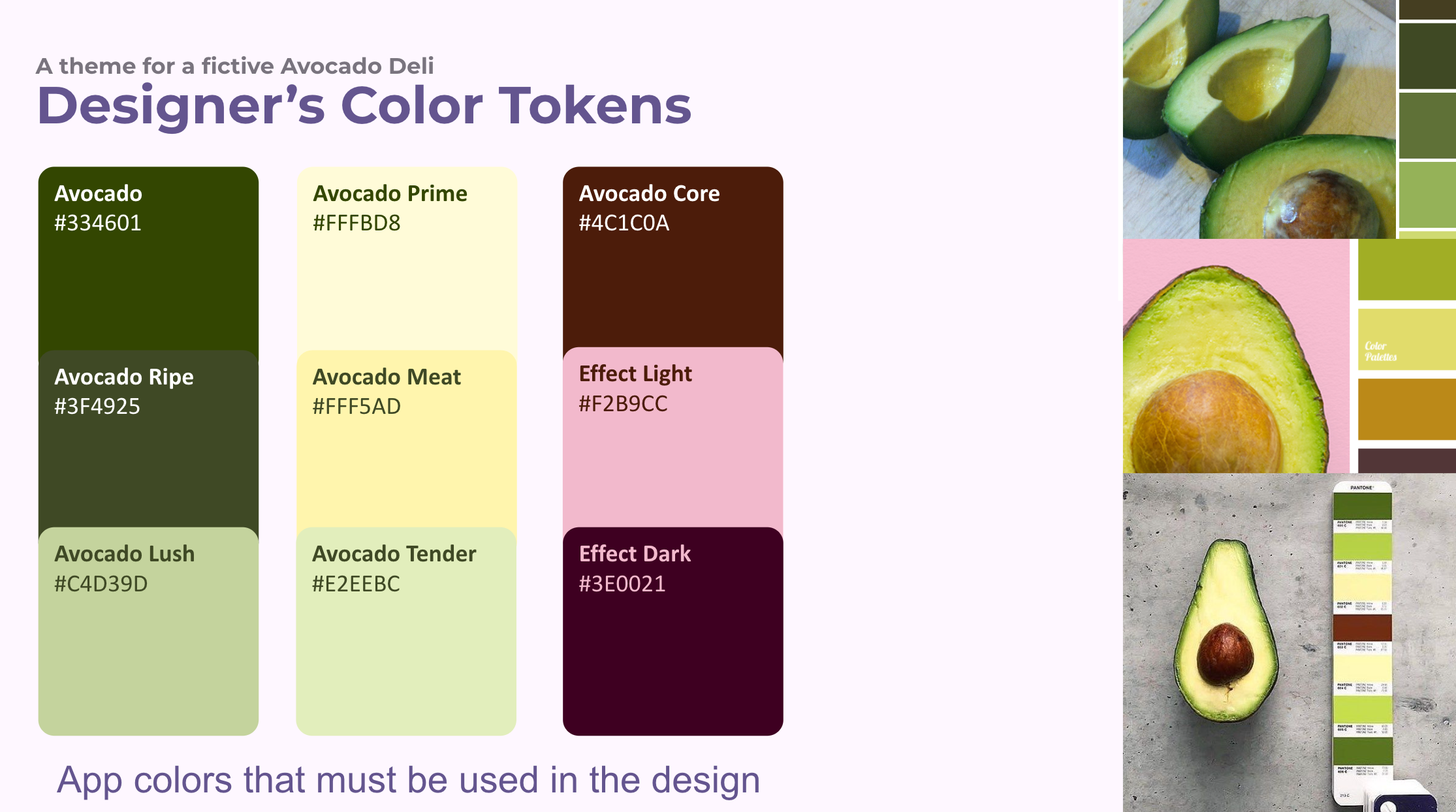
In a custom branded app, we often have one or two brand colors that must be present in our app's colors to some extent. In some cases, we may have an entire palette of colors that are part of the brand or desired ambiance of the app.
In this fictive brand example, we use a palette with nine colors that define the brand, and create an ambiance for a Deli, that has Avocado as their signature ingredient. The colors are shown below.
Using and getting all these colors into a seed generated ColorScheme might seem challenging. In fact using more than just one seed color with Flutter's SDK and the ColorScheme.fromSeed API is not possible. How can we solve this?
We will soon get back to this question. First, let's capture all the color values as static const values, so we can easily use them in our app theme.
/// Const theme token values.
///
/// These could be token definitions from a design made in Figma or other
/// 3rd party design tools that have been imported into Flutter.
sealed class ThemeTokens {
  // Colors used in the app brand palette.
  static const Color avocado = Color(0xFF334601);
  static const Color avocadoRipe = Color(0xFF3F4925);
  static const Color avocadoLush = Color(0xFFC4D39D);

  static const Color avocadoPrime = Color(0xFFFFFBD8);
  static const Color avocadoMeat = Color(0xFFFFF5AD);
  static const Color avocadoTender = Color(0xFFE2EEBC);

  static const Color avocadoCore = Color(0xFF4C1C0A);
  static const Color effectLight = Color(0xFFF2B9CC);
  static const Color effectDark = Color(0xFF3E0021);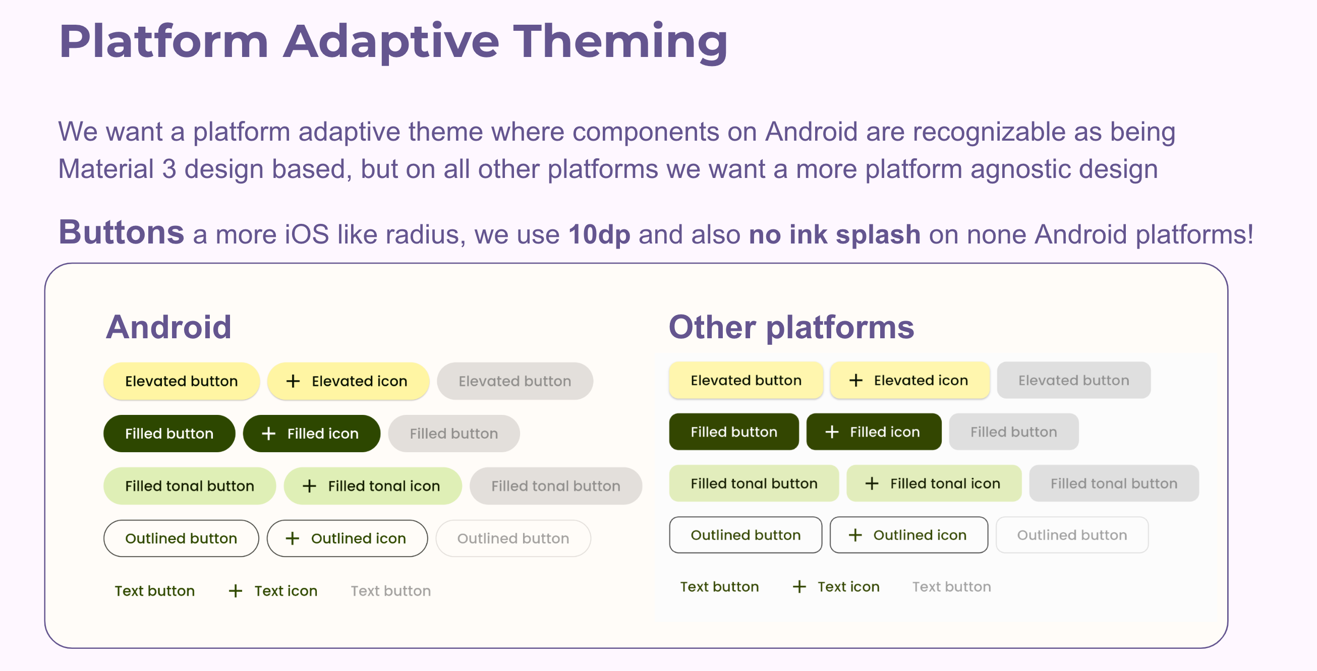
}We create a custom theme that is adaptive to the platform it runs on. On Android, we use default Material-3 designs when it comes to its shapes and interaction effects. For all other platforms and also any build used on the web, we use a more platform-agnostic design. It is more iOS like in its design, for shapes and interaction effects and surface colors.
The choice to make our platform adaptive response impact web builds on all used platforms means that when the app is run in a browser on Android, it also uses the none Material design.
We could make the platform adaptive response so that in a web browser on Android it also uses the default Material-3 style. This is a good choice if we intend for the web build to be used as a PWA on Android devices, as an occasional replacement for the actual Android build, so it looks the same as the Android build. This is useful we want to offer the PWA as an option for causal users that do not want to install an app.
In this case, we wanted all web usage to look the same and use the none Material design. Only the build for Android devices use the Material-3 default design. We could say that the web usage is primarily intended for users using our app via a web browser on a desktop or laptop computer.
To make the web build have just one style is slightly more complicated than letting it keep the Android style when using the web build in a browser on an Android device. With this demo, we also wanted to highlight this difference in adaptive design choices.
Our platform adaptive design examples are shown below:
To achieve this design goal, we add a few more design tokes to our ThemeTokens class. The main one is used to determine if the build is made for an Android device or not.
We also add design tokens that are used to define the shape and style of the buttons, switches, and chips in the app. Mostly, border radius and shapes that we use on other platforms than Android. On Android, we use the default Material-3 shapes.
/// Const theme token values.
///
/// These could be token definitions from a design made in Figma or other
/// 3rd party design tools that have been imported into Flutter.
sealed class ThemeTokens {
  // Colors used in the app brand palette.
  // : as above ...

  // Boolean for using our adaptive theme response or not.
  //
  // We will use a custom platform adaptive theme for anything else than
  // Android and we also always use it, if it is a web build.
  static bool isNotAndroidOrIsWeb =
      defaultTargetPlatform != TargetPlatform.android || kIsWeb;
  // Tokens for used button border radius on none Android platforms.
  static const double appRadius = 10.0;
  static const BorderRadius borderRadius = BorderRadius.all(Radius.circular(appRadius));
  static const OutlinedBorder buttonsShape = RoundedRectangleBorder(
    borderRadius: borderRadius,
  );
  // We need a stadium like border radius for our ToggleButtons on Android.
  // If we make it big enough, it will look like a stadium shape.
  static const BorderRadius borderRadiusStadiumLike =
      BorderRadius.all(Radius.circular(100));
  // Outlined width used by some styled buttons.
  static const double outlineWidth = 1.0;

  // Default minimum button size for ToggleButtons.
  // The values results in width 40 and height 40.
  // The Material-3 guide specifies width 48 and height 40. This is an
  // opinionated choice in order to make ToggleButtons min size squared.
  static const Size toggleButtonMinSize =
      Size(kMinInteractiveDimension - 8, kMinInteractiveDimension - 8);
}The ColorScheme is a core part of ThemeData in Flutter. It is used to define the colors used by all the Material components in the app. We start by first defining our ColorScheme for the app.
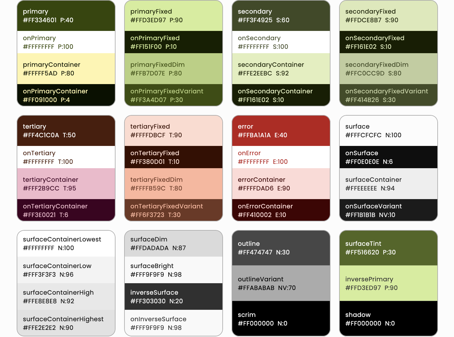
If we make a seed generated ColorScheme with our main color ThemeTokens.avocado in our color design palette. Then pin it to primary color in light mode and primaryContainer color in dark mode, we get these light and dark color schemes:
They do not fully represent the desired vibe and ambiance of our color token palette.
Since ColorScheme.fromSeed can only use one seed color, we are going to take a pass on it and instead use a package that can generate a ColorScheme from multiple seed colors. We use the flex_seed_scheme package for making our seed generated ColorScheme.
With the flex_seed_scheme package we can use the SeedColorScheme.fromSeeds constructor to generate a ColorScheme from multiple seed colors. It also offers many other useful methods to tune and modify the generated ColorScheme. We will use some of those features as well.
In addition to creating our ColorScheme from multiple seed colors, we use a seed generation algorithm that creates a ColorScheme that is colorful, which is what we want for our app. To do so, we use the FlexTones.chroma configuration as the tones property to configure the ColorScheme generation algorithm. This creates a colorful ColorScheme based on the chromacity of each seed color, or key colors, as they are called in the flex_seed_scheme package. That this algorithm uses the chromacity or "colorfulness" of our seed color inputs, means that if they are colorful, the generated ColorScheme colors will be that as well.
As primary key color we use the avocado color. As secondary the avocadoRipe color. We selected the avocadoRipe color as secondary, because it is a color that is close to the primary color, but also a bit dimmer and less colorful that our primary avocvado color selection. This selection fits well with the design intent of the Material-3 color system.
As tertiary key color, we use the avocadoCore color. Tertiaries are intended to be used as supporting effect colors when so desired in apps. By default, the tertiary palette colors are not really used by Material-3 components in their default color mappings. Tertiaries are currently only used by default for one element in the Material time picker. We can always change color mappings on components if we want them to use the tertiary colors more.
We can use any color in our ColorScheme by getting it with Theme.of(context).colorScheme and then use the color we want in our custom widgets, or use it as a one-off override on defaults for some built-in components. However, if we want built-in Material components to use another color than their defaults all the time, we should change the default color mappings by creating component themes in our ThemeData, with the desired overrides. We will see many examples of this.
To make our seed generated ColorScheme contain all the target design palette colors, we pin all the design color tokens to carefully selected ColorScheme colors. Like the primaryContainer color to the avocadoMeat color in light mode, and to the avocadoPrime color in dark mode.
/// The ColorScheme made from SeedColorScheme.fromSeeds.
///
/// Begin with figuring out your ColorScheme.
///
/// Here we map our app color design tokens to the SeedColorScheme.fromSeeds
/// key colors and pin color tokens to selected ColorScheme colors.
sealed class AppColorScheme {
  /// App's light ColorScheme.
  static final ColorScheme light = SeedColorScheme.fromSeeds(
    brightness: Brightness.light,
    primaryKey: ThemeTokens.avocado,
    secondaryKey: ThemeTokens.avocadoRipe,
    tertiaryKey: ThemeTokens.avocadoCore,
    // We use the tones chroma that has colorfulness that is fully driven
    // by the given key colors' chromacity. We also make all surface shades
    // monochrome on none Android builds or if it is a web build.
    tones: FlexTones.chroma(Brightness.light)
        .monochromeSurfaces(ThemeTokens.isNotAndroidOrIsWeb),

    // Color overrides to design token values.
    // TIP: Visualize the color scheme without any pinned colors first and
    // then see what colors you need to pin to get the desired result and where
    // the colors in your palette will fit in the generated color scheme.
    primary: ThemeTokens.avocado,
    primaryContainer: ThemeTokens.avocadoMeat,
    secondary: ThemeTokens.avocadoRipe,
    secondaryContainer: ThemeTokens.avocadoTender,
    tertiary: ThemeTokens.avocadoCore,
    tertiaryContainer: ThemeTokens.effectLight,
    onTertiaryContainer: ThemeTokens.effectDark,
  );

  /// App's dark ColorScheme.
  static final ColorScheme dark = SeedColorScheme.fromSeeds(
    brightness: Brightness.dark,
    // Use the same key colors and tones as light mode in dark mode.
    primaryKey: ThemeTokens.avocado,
    secondaryKey: ThemeTokens.avocadoRipe,
    tertiaryKey: ThemeTokens.avocadoCore,
    tones: FlexTones.chroma(Brightness.dark)
        .monochromeSurfaces(ThemeTokens.isNotAndroidOrIsWeb),

    // Color overrides to design token values.
    // Overrides are different from light mode, typically inverse selections,
    // but you can also deviate from this when appropriate as done here.
    primary: ThemeTokens.avocadoLush,
    primaryContainer: ThemeTokens.avocadoPrime,
    onPrimaryContainer: ThemeTokens.avocado,
    secondary: ThemeTokens.avocadoTender,
    secondaryContainer: ThemeTokens.avocadoRipe,
    tertiary: ThemeTokens.effectLight,
    onTertiary: ThemeTokens.effectDark,
    tertiaryContainer: ThemeTokens.avocadoCore,
    onTertiaryContainer: ThemeTokens.effectLight,
  );
}
The first colors to pin in light theme mode, is to pin the seed colors to the corresponding palette's main colors. So in this case, in light mode:
- The
primaryKeycolorThemeTokens.avocadois pinned toprimary - The
secondaryKeycolorThemeTokens.avocadoRipeis pinned tosecondary - The
tertiaryKeycolorThemeTokens.avocadoCoreis pinned totertiary.
This guarantees that the ColorScheme's main colors primary, seondary and tertiary will have exactly the same color values as the important design tokens. Typically, the seed or key color values do not end up in the generated ColorScheme. The above overrides in light mode works well when the seed colors have high chromacity (are colorful) and also have a brightness that prefers white or light contrast color. Typically, if we have brand colors that are intended to be used on white printed paper, they work fine as main colors in light theme mode.
Due to contrast issue of brand colors intended for printing on white paper, they may not always work well if pinned and used as main colors in dark mode.
If we only had the above three colors as our design tokens, and no colors suitable for dark mode, we would then typically pin them to primaryContainer, secondaryContainer and tertiaryContainer. This ensures the main colors are also present in dark mode. In this case we did so for the secondaryContainer and tertiaryContainer colors in dark mode. However, for primaryContainer we used ThemeTokens.avocadoPrime, to get it into our scheme as well.
We also make sure to add all the rest of our ThemeToken colors to the ColorScheme as selected overrides in both light and dark mode. It is important to use care when doing this. Do it in a way that fits with the palettes generated by each seed color. As long as the override is a reasonable match in brightness and hue to the color generated by the respective seed color, it will work well. If the override is too different, it may not work as well.
We also used one of the tones modifier functions in the flex_seed_scheme package, the monochromeSurfaces(). This modifier makes all the surface colors monochrome, it removes the slight primary color-based tint surface colors we normally get in seed generated color schemes. There is one more twist, we use the boolean flag ThemeTokens.isNotAndroidOrIsWeb to trigger this method only when we build the app for any none Android platform. Android builds will thus still use their signature Material-3 surface color tinting.
It is also worth noticing that the FlexTones.chroma based seed generation configuration, is also very subtle in its surface color tinting. Typically ColorScheme.fromSeed and its DynamicSchemeVariants are much more aggressive in their surface tinting.
We demonstrate more subtle surface color tinting in this design example. The FlexTones.chroma tones configuration achieves this too. To use tinted surfaces or not, and when used, how strong, is a matter of personal or design preferences. There are many different preconfigured FlexTones available in the flex_seed_scheme package, and we can also make our own custom configurations to control the style of generated ColorScheme colors.
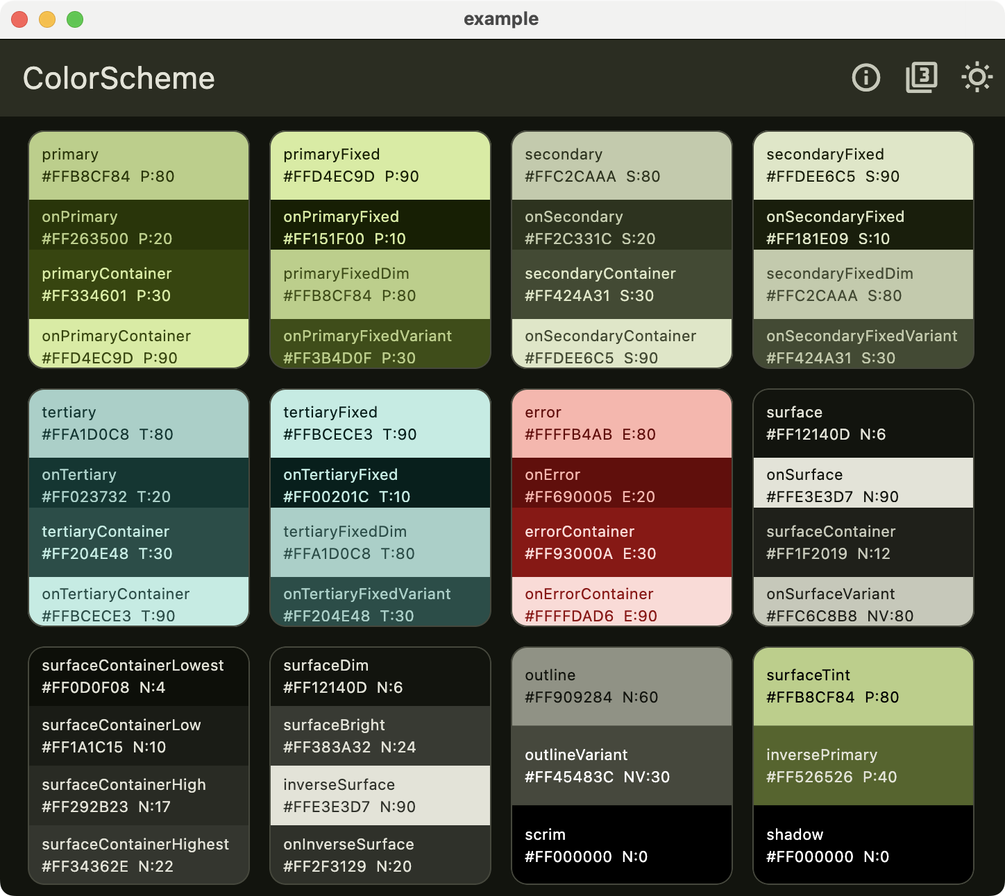
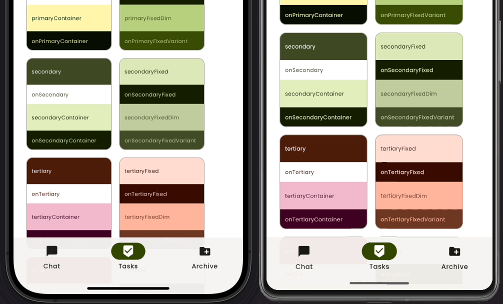
With the above settings we get a generated ColorScheme that incorporates all our design tokens and is also colorful and vibrant. It has a slight different result on Android builds, there is still a very subtle primary color tint in all the surface colors. This color tint is missing on iOS and all other none Android platforms, their surface colors are fully monochrome.
The light mode ColorScheme result on iOS and all none Android platforms:
The light mode ColorScheme result Android platform. There is a very subtle primary color tint in all the surface colors:
The dark mode ColorScheme result on iOS and all none Android platforms:
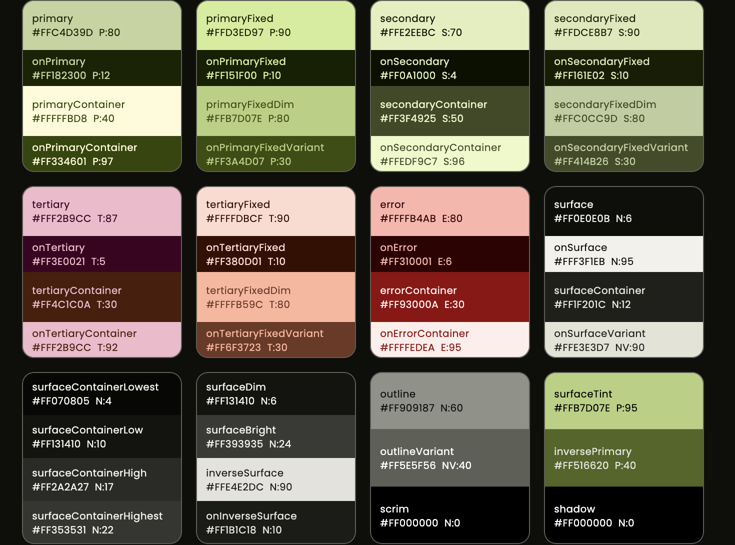
The dark mode ColorScheme result Android platform. There is a very subtle primary color tint in all the surface colors:
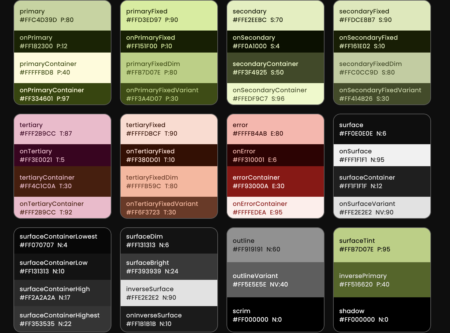
The tinting used on Android is quite subtle, the difference to the tinted version is not super obvious, but it is there.
We can also see that the above generated ColorsSchemes all include our designer colors from the provided design palette and generally match the design intent of the designer's palette. The color schemes are also colorful and have good contrast, except for the fixedDim colors, which intentionally have much lower contrast as a part of their design.
Now that we have our platform adaptive ColorScheme defined we can start using it and defining our adaptive application theme. Before we do so, let's look at how we use the theme in our app.
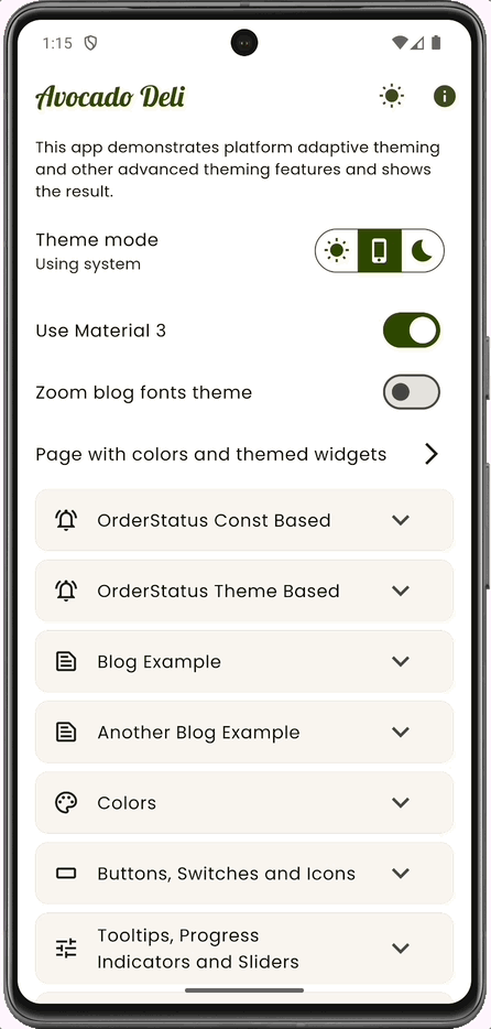
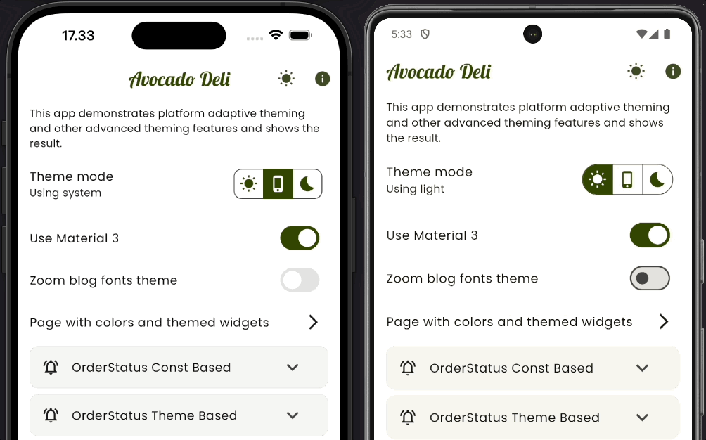
The MaterialApp for our adaptive theme demo app looks like this:
class AdaptiveThemeDemoApp extends StatefulWidget {
  const AdaptiveThemeDemoApp({super.key});

  @override
  State<AdaptiveThemeDemoApp> createState() => _AdaptiveThemeDemoAppState();
}

class _AdaptiveThemeDemoAppState extends State<AdaptiveThemeDemoApp> {
  ThemeSettings themeSettings = const ThemeSettings(
    useMaterial3: true,
    zoomBlogFonts: false,
    themeMode: ThemeMode.system,
  );

  @override
  Widget build(BuildContext context) {
    return MaterialApp(
      debugShowCheckedModeBanner: false,
      title: 'Avocado Deli',
      theme: AppTheme.use(Brightness.light, themeSettings),
      darkTheme: AppTheme.use(Brightness.dark, themeSettings),
      themeMode: themeSettings.themeMode,
      home: HomePage(
        settings: themeSettings,
        onSettings: (ThemeSettings settings) {
          setState(() {
            themeSettings = settings;
          });
        },
      ),
    );
  }
}
There is no state management package used in this example. We just pass the
data class ThemeSettings around and modify it where needed via callbacks.
The MaterialApp's theme and darkTheme uses the AppTheme.use(brightness, themeSettings) with the Brightness.light and Brightness.dark respectively. The themeMode is set to themeSettings.themeMode.
The HomePage widget is the home of the app, it is passed the themeSettings and a callback onSettings that will update the themeSettings in the AdaptiveThemeDemoApp widget.
The ThemeSettings is a small data class that we use to hold the theme settings for our app. It is passed down to the HomePage widget, where we have a settings page that can change the theme settings.
The HomePage widget will then call the onSettings callback to update the theme settings in the AdaptiveThemeDemoApp widget. We on purpose avoid all state management packages in this example, to keep it focused on the theme design and adaptive theming.
Since ThemeSetting is implemented as a data class with equality and hashcode, we can easily compare it and use it in a ValueNotifier if we want to. We could also modify it and use it with a ChangeNotifier if we wanted to, but in this example we just pass it down and update it via callbacks.
/// A Theme Settings class to bundle properties we want to modify in our
/// theme interactively.
@immutable
class ThemeSettings with Diagnosticable {
  final bool useMaterial3;
  final bool zoomBlogFonts;
  final ThemeMode themeMode;

  const ThemeSettings({
    required this.useMaterial3,
    required this.zoomBlogFonts,
    required this.themeMode,
  });

  /// Flutter debug properties override, includes toString.
  @override
  void debugFillProperties(DiagnosticPropertiesBuilder properties) {
    super.debugFillProperties(properties);
    properties.add(DiagnosticsProperty<bool>('useMaterial3', useMaterial3));
    properties.add(DiagnosticsProperty<bool>('zoomBlogFonts', zoomBlogFonts));
    properties.add(EnumProperty<ThemeMode>('themeMode', themeMode));
  }

  /// Copy the object with one or more provided properties changed.
  ThemeSettings copyWith({
    bool? useMaterial3,
    bool? zoomBlogFonts,
    ThemeMode? themeMode,
  }) {
    return ThemeSettings(
      useMaterial3: useMaterial3 ?? this.useMaterial3,
      zoomBlogFonts: zoomBlogFonts ?? this.zoomBlogFonts,
      themeMode: themeMode ?? this.themeMode,
    );
  }

  /// Override the equality operator.
  @override
  bool operator ==(Object other) {
    if (identical(this, other)) return true;
    if (other.runtimeType != runtimeType) return false;
    return other is ThemeSettings &&
        other.useMaterial3 == useMaterial3 &&
        other.zoomBlogFonts == zoomBlogFonts &&
        other.themeMode == themeMode;
  }

  /// Override for hashcode.
  @override
  int get hashCode => Object.hashAll(<Object?>[
        useMaterial3.hashCode,
        zoomBlogFonts.hashCode,
        themeMode.hashCode,
      ]);
}We make a class called AppTheme, it is sealed so it cannot be extended or implemented. It only contains static methods and properties bundled together in a nicely readable name space. To make a theme with our AppTheme helper we call the AppTheme.use(brightness, themeSettings) function.
Tip
This theme setup walk-through will be quite long, you may also want to view the full code in the AppTheme class here while going through it.
In the AppTheme.use function, we use the passed in brightness to get the correct
platform adaptive ColorScheme that we defined earlier.
/// The platform adaptive application theme design for our app.
sealed class AppTheme {
  /// Select the used theme, based on theme settings and brightness.
  static ThemeData use(Brightness brightness, ThemeSettings settings) {
    // Check if theme is light or dark, used repeatedly later in theming.
    final bool isLight = brightness == Brightness.light;

    // Get our app color scheme based on the brightness.
    // When making custom component themes we typically need to use the app's
    // ColorScheme to make sure our component designs match the rest of the app.
    final ColorScheme scheme =
    isLight ? AppColorScheme.light : AppColorScheme.dark;

    // Define a custom platform adaptive visual density.
    // We also need to use this in a component theme (ToggleButtons) that does
    // not have built-in visual density support.
    final VisualDensity visualDensity = comfortablePlatformDensity;
    // continued...
  }
}
We also define a custom visualDensity for our app. This is a platform adaptive visual density that we use in our ThemeData and also in the ToggleButtons component theme that does not have built-in visual density support. This platform adaptation is used to demonstrate that we don't have to use the default one that is adaptive to compact on desktops. This is an alternative that is adaptive to comfortable on desktops and to standard on mobile platforms.
This approach makes desktop builds a bit less dense and more touch friendly. It is useful if an app is used on laptops with touch screens. It is still significantly denser than the standard density would be. Using standard on desktop builds makes the user interface a bit too large. The usage of comfortable is here presented as an alternative that is more touch-friendly than dense, but still not as space wasting as standard would be.
/// Returns a [VisualDensity] that is [defaultTargetPlatform] adaptive to
/// [VisualDensity.comfortable] instead of to [VisualDensity.compact].
///
/// For desktop platforms, this returns [VisualDensity.comfortable], and
/// for other platforms, it returns the default [VisualDensity.standard].
///
/// This is a variant of the [VisualDensity.adaptivePlatformDensity] that
/// returns [VisualDensity.compact] for desktop platforms.
///
/// The comfortable visual density is useful on desktop and desktop web
/// laptops that have touch screens, as it keeps touch targets a bit larger
/// than when using compact.
VisualDensity get comfortablePlatformDensity =>
    defaultComfortablePlatformDensity(defaultTargetPlatform);

/// Returns a [VisualDensity] that is adaptive based on the given [platform].
///
/// For desktop platforms, this returns [VisualDensity.comfortable], and for
/// other platforms, it returns a default [VisualDensity.standard].
///
/// See also:
///
/// * [comfortablePlatformDensity] which returns a [VisualDensity] that is
///   adaptive based on [defaultTargetPlatform].
VisualDensity defaultComfortablePlatformDensity(TargetPlatform platform) {
  switch (platform) {
    case TargetPlatform.android:
    case TargetPlatform.iOS:
    case TargetPlatform.fuchsia:
      break;
    case TargetPlatform.linux:
    case TargetPlatform.macOS:
    case TargetPlatform.windows:
      return VisualDensity.comfortable;
  }
  return VisualDensity.standard;
}Time to define ThemeData since that is always fun and interesting.
While this app allows us to toggle to Material-2, it is only provided for demo purposes. Please do not use Material-2 in a new app in Flutter anymore. Use Material-3! Really don’t use Material-2 anymore! Why not? Its support will eventually be removed from Flutter.
We apply our platform adaptive ColorScheme and VisualDensity (1) that we stored in local variables scheme and visualDensity in the AppTheme.use function.
We also set the cupertinoOverrideTheme to true. This ensures that all CupertinoThemeData properties will inherit defaults from the ColorScheme in our ThemeData. This part is needed to ensure that CupertinoSwitch and Switch.adaptive use the same colors as our themed Material Switch.
    // ...continued from above AppTheme and `use` function.
    //
    // Let's make a custom ThemeData object. It's fun! Right!? :)
    return ThemeData(
      // For demo purposes M2 is supported, but don't use Material-2 in Flutter
      // anymore in a new app. In this example we can still try it to see what
      // this demo and all widgets look like with it if we so desire.
      useMaterial3: settings.useMaterial3,

      // Pass the ColorScheme to the theme. We do not need to set the
      // brightness property in the ThemeData factory, passing a ColorScheme
      // takes care of it, as it already contains the brightness.
      colorScheme: scheme,

      // Make sure our theme and its colors apply to all Cupertino widgets,
      // without this `CupertinoSwitch` and `Switch.adaptive` will use the
      // default iOS colors, system green, we do not want that, we want it to
      // match our primary color.
      cupertinoOverrideTheme: const CupertinoThemeData(applyThemeToAll: true),

      // 1) Add our custom density.
      visualDensity: visualDensity,

      // 2) Add our custom instant splash factory on none Android and web
      // platforms. For the Android we pass null so we get the defaults.
      splashFactory:
          ThemeTokens.isNotAndroidOrIsWeb ? InstantSplash.splashFactory : null,
Above we also use a custom splash factory called InstantSplash (2), on any other platform than Android.
The InstantSplash is a copy of built-in InkSplash.splashFactory, with modified animation durations and splash velocity. There is also a built-in NoSplash.splashFactory in Flutter, alternatively it can be used. It animates the tap highlight, this custom one is instant. Used as an example in this demo app, you may prefer the NoSplash.splashFactory for a similar, but a less instant effect.
You can find the custom InstantSplash.splashFactory here.
Prefer using the Material-3 typography, even if you still use Material-2, it is much nicer. Below (3), we ensure that we use the Material-3 typography even if we switch to M2 mode, which this demo app allows us to do for demo purposes.
Next we fix all legacy colors (4, 5 and 6) in ThemeData. Eventually these colors will be deprecated, but as long as they exist, set them to our ColorScheme colors that we have in the scheme object.
      // 3) We use M3 Typography, even if you still use M2 mode I recommend this
      // as it is a much nicer default.
      typography: Typography.material2021(
        platform: defaultTargetPlatform,
        colorScheme: scheme,
      ),

      // 4) Fix the ThemeData legacy divider color to match our ColorScheme.
      //    Planned to be deprecated in ThemeData.
      dividerColor: scheme.outlineVariant,

      // 5) Fix legacy primary colors and secondary header color.
      //    Planned to be deprecated in ThemeData.
      primaryColor: scheme.primary,
      primaryColorDark: isLight ? scheme.secondary : scheme.onPrimary,
      primaryColorLight: isLight ? scheme.secondaryContainer : scheme.secondary,
      secondaryHeaderColor:
          isLight ? scheme.primaryContainer : scheme.secondaryContainer,

      // 6) Fix legacy surface colors.
      //    Planned to be deprecated in ThemeData.
      canvasColor: scheme.surface,
      cardColor: scheme.surface,
      scaffoldBackgroundColor: scheme.surface,
      dialogBackgroundColor: scheme.surface,
The above color mappings are important to make sure that all the legacy colors in ThemeData are set to correct colors from our ColorScheme. This is important as these colors are used by many built-in components and widgets in Material-2 mode. If we do not set them, they will not match the rest of our app's design. By defining them, we also ensure that if they are used in our app anywhere, they will also match the rest of our app's design.
You can read more about ThemeData colors deprecation plan in issue #91772.
Defining a lot of elaborate component themes can be tedious in Flutter. However, with component themes, we can often bring the Material components default styles exactly to where we want them to be, or close enough to what our design calls for.
With component theming, we can often avoid using custom widget wrappers to style the components. To build our app, we then use the standard Material components. They will now, by default, have the correct style they should have in our app.
This also makes it easy to on-board new developers to our codebase. Developers can use the standard components to build user interfaces without any extra styling. No need to know which custom-wrapped widgets to use where, just use the built-in ones. All built-in widgets will look as intended for our application's design by default.
So while component theming can feel tedious, the benefits may also be worth the effort. Also, once we have set it up for one app, we can reuse the same definitions with slight modifications in other apps.
We make an AppBar theme with custom color mappings with slight opacity and a very minor scroll under elevation, combined with a shadow color. This looks like a faint underline in light theme mode when the AppBar is scrolled under. A subtle effect that enhances the scrolled under separation.
Our AppBar theme has a minor “secret sauce” in it. It includes a shape that is the same as its default shape. Why? Adding it is needed to get the scroll under effect change to animate. It should animate in Material-3 design, but it does not do so in Flutter. The color change is instant. The need for this trick is actually a work-around to issue #131042. I had incorporated this work-around for more than a year in FlexColorScheme package as a "secret sauce" feature. When the issue was later discovered by others, I added an explanation of what causes the issue, and offered this as a work-around until the issue is hopefully fixed one day.
The scroll-under color is also modified by defining a custom surfaceTintColor for the AppBarTheme so that it is a monochrome color for other than Android platforms. After the Flutter 3.22 release, the AppBar is one of the few widgets that still use the elevation tint effect to change its color with elevation. Here we customize its tint color, so we do not get any primary tint on it on other platforms than Android. Instead, we get just a monochrome color that is a bit darker than the surface color.
Shadow is put back and used as a faint underline separation for the scrolled under state. It is more visible in light mode, it is there in dark mode too, but shadows are not very visible in dark mode.
We also use none default (3 dp) scroll-under elevation and even different values for light (0.5 dp) and dark mode (2 dp). The lower elevations make the elevation tints more subtle. The reason why it is only 0.5 in light mode is because at 0.5 dp, the elevation looks like an underline. Also, the 0.5 dp level is visually enough in light mode and matches 2 dp in dark mode better than using the same level.
We also use a custom font on the AppBar.
      // 7) AppBar

      appBarTheme: AppBarTheme(
        backgroundColor: scheme.surface.withOpacity(isLight ? 0.96 : 0.95),
        foregroundColor: scheme.secondary,
        elevation: 0,
        scrolledUnderElevation: isLight ? 0.5 : 2,
        shadowColor: scheme.shadow,
        centerTitle: defaultTargetPlatform == TargetPlatform.iOS,
        surfaceTintColor:
            ThemeTokens.isNotAndroidOrIsWeb ? scheme.outline : scheme.primary,
        shape: const RoundedRectangleBorder(),
        titleTextStyle: appBarTextStyle(scheme),
      ),
Caution
Generally do not try to change the application's TexTheme and its TextStyles to make a given component use a different style by adjusting the style it uses by default from ThemeData.textTheme. Many other components may use the same style as their default, and you typically do not want them to use the same modified style. Instead, prefer making a new TextStyle that fits your component and use it in the component theme.
We define a custom TextStyle that will only be used by all AppBars in the app, nothing else.
  // 25) Make a totally custom text style for a component theme: AppBar
  static TextStyle appBarTextStyle(ColorScheme scheme) {
    return GoogleFonts.lobster(
      fontWeight: FontWeight.w400,
      fontSize: 26,
      color: scheme.primary,
    );
  }
With this AppBarTheme we get an AppBar style that looks like this:
In our theme, we also forced the AppBar to always be centered on iOS platform. It is actually so by default, but only if we have max one action button in the AppBar. If we have more than one action button, the title will be left aligned. For this demo, we wanted it to be centered, even if there are multiple action buttons, just to make it easy to recognize the iOS device in the demos.
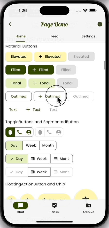
We define custom Material button themes that use our custom buttonsShape (8 and 9) as our platform responsive shape on other than Android platforms. On the Android platform, we use null to get the default button shapes.
For the ElevatedButton we also change its default color mapping to use our primaryContainer color as its background color and onPrimaryContainer color as its text color. This is done to make the ElevatedButton more colorful. Its default surfaceContainerLow background and primary foreground based mapping is kind of boring. This is just an example, you can keep the defaults or use any color mapping you want for your buttons.
// 8) ElevatedButton with custom color mapping and adaptive shape.
elevatedButtonTheme: ElevatedButtonThemeData(
style: ElevatedButton.styleFrom(
backgroundColor: scheme.primaryContainer,
foregroundColor: scheme.onPrimaryContainer,
shape:
ThemeTokens.isNotAndroidOrIsWeb ? ThemeTokens.buttonsShape : null,
),
),
// 9) Custom adaptive shape on other buttons
filledButtonTheme: FilledButtonThemeData(
style: FilledButton.styleFrom(
shape:
ThemeTokens.isNotAndroidOrIsWeb ? ThemeTokens.buttonsShape : null,
),
),
outlinedButtonTheme: OutlinedButtonThemeData(
style: OutlinedButton.styleFrom(
shape:
ThemeTokens.isNotAndroidOrIsWeb ? ThemeTokens.buttonsShape : null,
),
),
textButtonTheme: TextButtonThemeData(
style: TextButton.styleFrom(
shape:
ThemeTokens.isNotAndroidOrIsWeb ? ThemeTokens.buttonsShape : null,
),
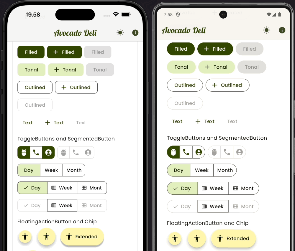
),With the above theme in place for our Material Buttons, we get this result:
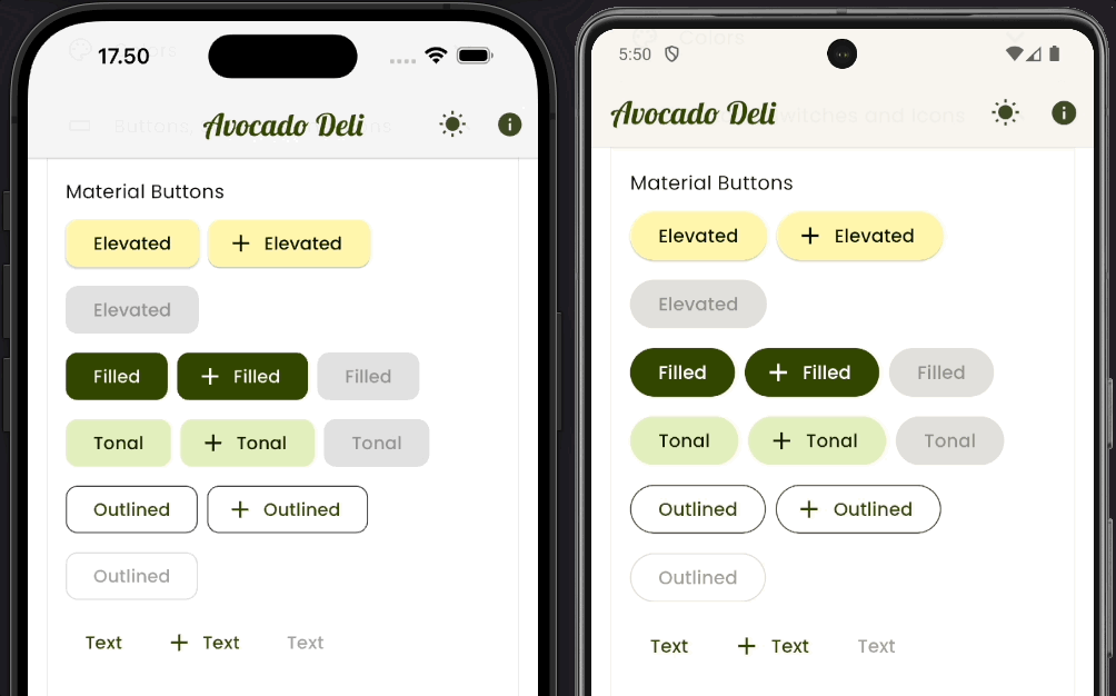
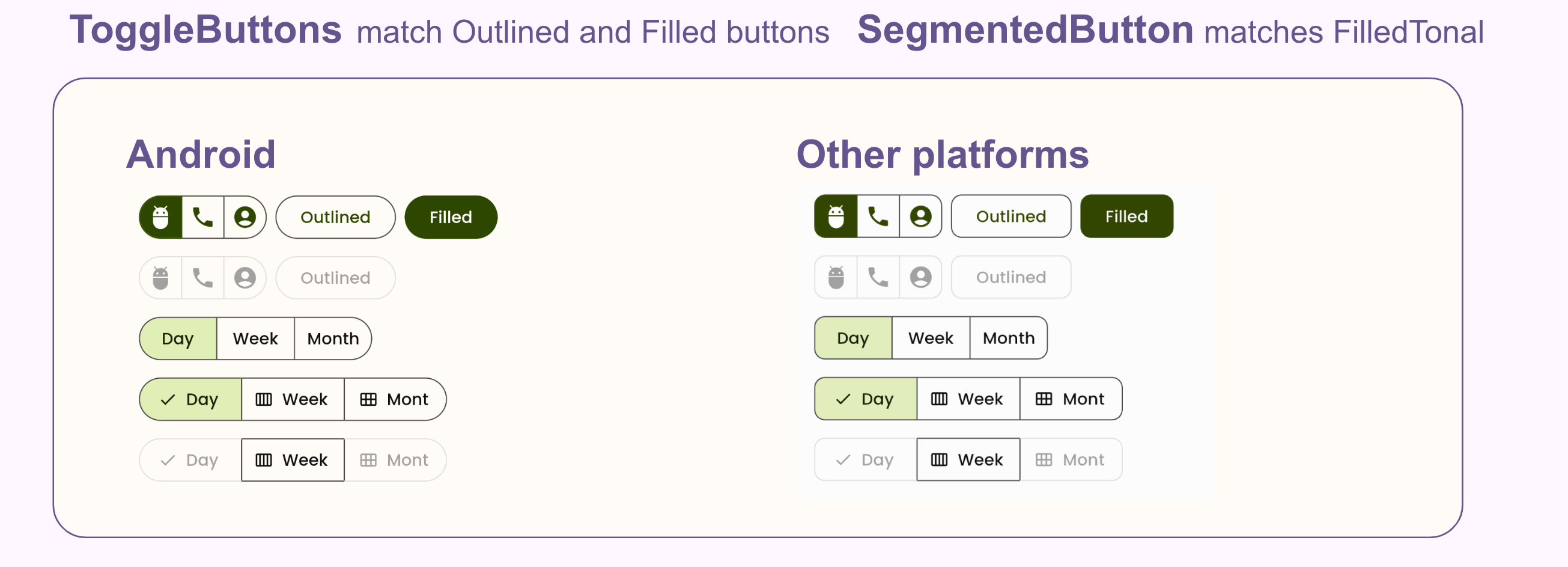
We can theme ToggleButtons and SegmentedButton differently and use them for different use cases. The ToggleButtons is an older Material-2 widget, theming it is a bit tricky. In this case we want it to match the style of our OutlinedButton and FilledButton.
By default, the legacy ToggleButtons component does not react to ThemeData and its visual density changes. We can use the visualDensity we defined as input to its constraints in a way that makes it match the height of FilledButton and OutlinedButton, also when they react to visual density on different platforms.
ToggleButtons is an older Material-2 design based widget, but it can still look nice when themed and fit well with Material-3 design too. It is a nice button component for compact icon-only based toggles, as shown in this example. Where we also make its shape follow the same platform adaptive button shapes as the other buttons.
      // 10) ToggleButtons Theme, made to match the filled and outline buttons.
      toggleButtonsTheme: ToggleButtonsThemeData(
        borderWidth: ThemeTokens.outlineWidth,
        selectedColor: scheme.onPrimary,
        color: scheme.primary,
        fillColor: scheme.primary,
        borderColor: scheme.outline,
        selectedBorderColor: scheme.primary,
        hoverColor: scheme.primary.withAlpha(0x14),
        focusColor: scheme.primary.withAlpha(0x1F),
        highlightColor: scheme.primary.withAlpha(0x14),
        splashColor: scheme.primary.withAlpha(0x1F),
        disabledColor: scheme.onSurface.withAlpha(0x61),
        disabledBorderColor: scheme.onSurface.withAlpha(0x1F),
        borderRadius: ThemeTokens.isNotAndroidOrIsWeb
            ? ThemeTokens.borderRadius
            : ThemeTokens.borderRadiusStadiumLike,
        constraints: BoxConstraints(
          minWidth: ThemeTokens.toggleButtonMinSize.width -
              ThemeTokens.outlineWidth * 2 +
              visualDensity.baseSizeAdjustment.dx,
          minHeight: ThemeTokens.toggleButtonMinSize.height -
              ThemeTokens.outlineWidth * 2 +
              visualDensity.baseSizeAdjustment.dy,
        ),
      ),
The colors and opacities above were a bit tricky to figure out, they are used to make the highlight and splashes very similar to those used by the FilledButton and OutlinedButton.
The splash type cannot be changed for ToggleButtons, it does not follow the one defined by ThemeData, it is hard coded into the widget. It will thus sadly keep its hard coded Material-2 based ink style splashes on all platforms.
For the SegmentedButton we keep its default style, it is quite nice as it is. We only add the platform adaptive shape to it (11).
      // 11) SegmentedButton, made to match the filled tonal button, but with
      // an outline.
      segmentedButtonTheme: SegmentedButtonThemeData(
        style: SegmentedButton.styleFrom(
            shape: ThemeTokens.isNotAndroidOrIsWeb
                ? ThemeTokens.buttonsShape
                : null),
),The buttonThme and its ButtonThemeData is the old theme used by the old Material buttons, that no longer exist at all in the Flutter framework. Oddly this old theme still has a property that can be considered important, the alignedDropdown property. It is used to set that we want to align the DropdownButton and DropdownButtonFormField to their parents. Without this setting, these older Material-2 based dropdown components will expand to a width slightly wider than the parent. You typically do not want that.
      // 12) The old button theme still has some usage, like aligning the
      // DropdownButton and DropdownButtonFormField to their parent.
buttonTheme: const ButtonThemeData(alignedDropdown: true),For the theme of the FloatingActionButton we use custom color mapping and a custom shape (13). We use the stadium shape for the FloatingActionButton we prefer the round shape in this demo app. We prefer this design generally too, it is just a better shape for the FAB than the new rounded corner defaults used in Material-3. Just an example, use the default shape if you prefer it.
      // 13) FloatingActionButton.
      // With custom color mapping and classic round and stadium shapes.
      floatingActionButtonTheme: FloatingActionButtonThemeData(
        backgroundColor: scheme.primaryContainer,
        foregroundColor: scheme.onPrimaryContainer,
        shape: const StadiumBorder(),
      ),
With the above component themes in place, we get the following styles for our ToggleButtons, SegmentedButton and FloatingActionButton:
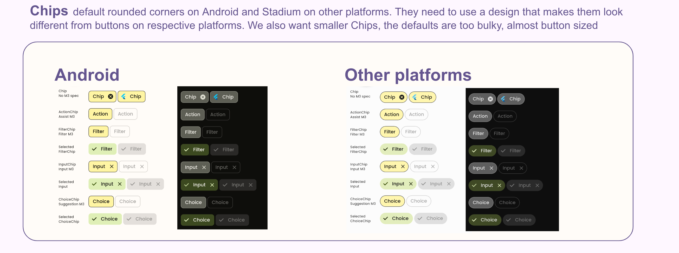
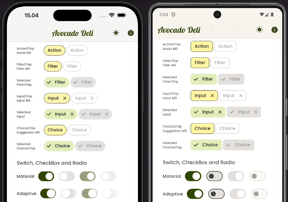
We want Chips with custom color mapping and a platform adaptive shape (14). We make them stadium shaped on none Android platforms to look different from the buttons, while on Android they use their default slightly rounded corners.
We also want smaller and more compact Chips. The Chips grew so big in default Material-3 design that they almost look like buttons, we want them to be more compact. We reduce their text style size and padding to make them smaller and more compact. They are still big enough to be easy tap targets.
      // 14) ChipTheme
      chipTheme: ChipThemeData(
        labelStyle:
            textThemeFromStyles.labelSmall!.copyWith(color: scheme.onSurface),
        padding: const EdgeInsets.all(4.0),
        backgroundColor:
            isLight ? scheme.primaryContainer : scheme.outlineVariant,
        shape: ThemeTokens.isNotAndroidOrIsWeb ? const StadiumBorder() : null,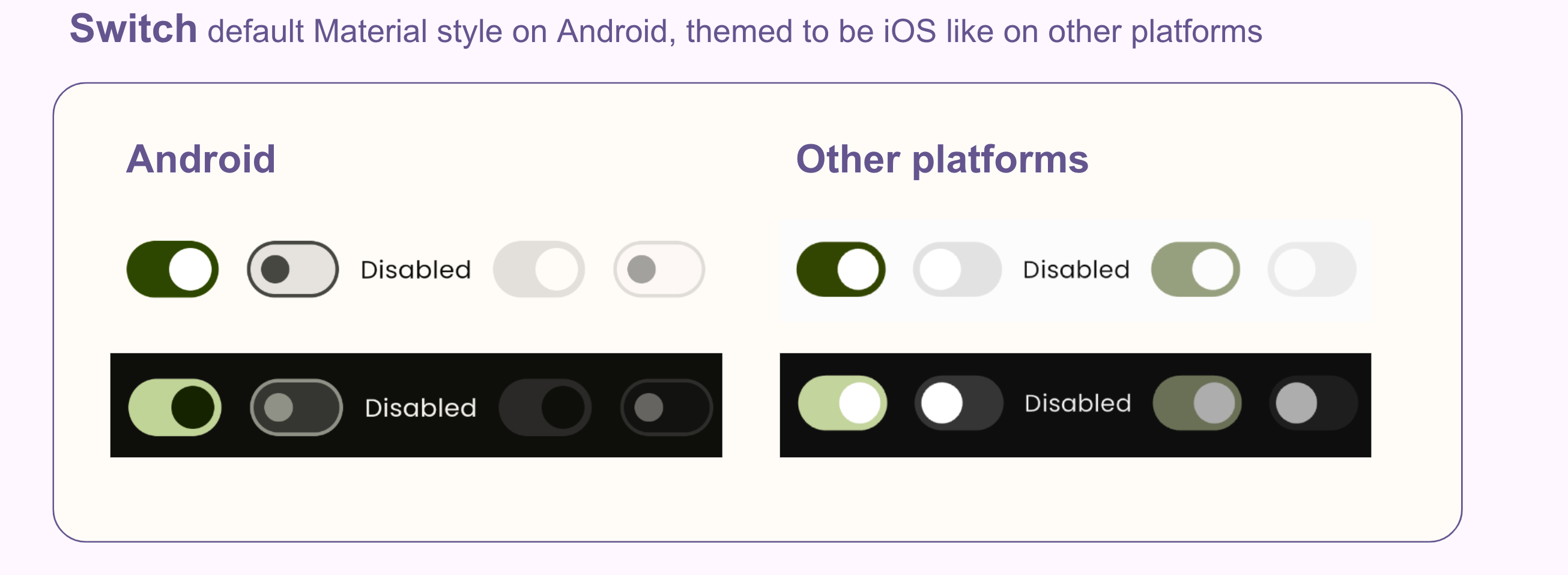
),On other than Android platforms we use an iOS like Switch theme, but on Android we use the default Material-3 style on the Switch.
Here is an interesting twist as a result of our design. If we use Switch.adaptive we will get the actual iOS Switch design on iOS and macOS. It will still use our ColorScheme colors and not iOS default system green. This happens because we used the cupertinoOverrideTheme: const CupertinoThemeData(applyThemeToAll: true) in our ThemeData earlier. The none iOS and macOS adaptive response for Switch.adaptive will be the themed Switch that will use the Material default style on Android, but the themed iOS look alike Switch on Windows and Linux, while of course still using Material-3 design on Android. If we use Switch.adaptive we thus get three different Switch responses. One selection is made via the .adaptive constructor, then if on a platform that results in the none iOS/macOS being used by the .adaptive constructor, its style is based on the Switch theme we defined in our ThemeData, which has two styles.
      // 15) Switch theme
      switchTheme: ThemeTokens.isNotAndroidOrIsWeb ? switchTheme(scheme) : null,
The actual theming of the Switch is quite elaborate, we added it as its own function for better readability of the ThemeData definition.
There is a slight trick used in this theme, and that is the invisible icon added to the thumbIcon property. By adding an icon to it, we get a Switch in Material-3 mode that has a thumb with a fixed size when ON and OFF. Without an icon in the thumb, the size shrinks when it is OFF.
To make an iOS look-alike Switch using Material theming, we want the thumb size to remain fixed. It is not an exact size match for the iOS thumb, which is a bit bigger, but close enough for our purposes.
The color mappings are quite elaborate and taken from the actual used ones in the Flutter CupertionoSwitch implementation. So they do match Flutter's iOS Switch.
  // 15 a) A custom SwitchTheme that resembles an iOS Switch.
  // The intention is that feels familiar on iOS and that it can also be used as
  // a platform agnostic Switch on other platforms than Android.
  static SwitchThemeData switchTheme(ColorScheme scheme) {
    final bool isLight = scheme.brightness == Brightness.light;
    return SwitchThemeData(
      thumbIcon:
          WidgetStateProperty.resolveWith<Icon?>((Set<WidgetState> states) {
        return const Icon(Icons.minimize, color: Colors.transparent);
      }),
      trackOutlineColor:
          WidgetStateProperty.resolveWith((Set<WidgetState> states) {
        return Colors.transparent;
      }),
      trackColor: WidgetStateProperty.resolveWith((Set<WidgetState> states) {
        if (states.contains(WidgetState.disabled)) {
          if (states.contains(WidgetState.selected)) {
            return scheme.primary.withOpacity(0.5);
          }
          return scheme.onSurface.withOpacity(0.07);
        }
        if (states.contains(WidgetState.selected)) {
          return scheme.primary;
        }
        return scheme.surfaceContainerHighest;
      }),
      thumbColor: WidgetStateProperty.resolveWith((Set<WidgetState> states) {
        if (states.contains(WidgetState.disabled)) {
          return isLight ? scheme.surface : scheme.onSurface.withOpacity(0.7);
        }
        return Colors.white;
      }),
    );
  }
The Material Switch component contains many private styling properties that are not exposed in its public API. If they were exposed we could do a lot more styling to the Switch, even make it look like the old Material-2 Switch if we wanted to. Here is a proposal to expose those properties.
With the above ChipThemeData and SwitchThemeData defined, we get these styles on Chips and Switches:
Don’t be afraid to tweak the Material Navigation bar. For example, make it less tall and use a more distinct selected color than the default one.
We make a navigation bar that is slightly transparent and with more distinct and clear selection indication. The default height 80 dp wastes vertical space, we make it less tall. The default background in light mode is also a bit dark, we make it a bit lighter in light mode.
      // 16) NavigationBar
      navigationBarTheme: NavigationBarThemeData(
        height: 72,
        backgroundColor: isLight
            ? scheme.surfaceContainerLow.withOpacity(0.96)
            : scheme.surfaceContainer.withOpacity(0.95),
        indicatorColor: scheme.primary,
        iconTheme: WidgetStateProperty.resolveWith((Set<WidgetState> states) {
          return IconThemeData(
            size: 24.0,
            color: states.contains(WidgetState.disabled)
                ? scheme.onSurfaceVariant.withOpacity(0.38)
                : states.contains(WidgetState.selected)
                    ? scheme.onPrimary
                    : scheme.onSurfaceVariant,
          );
        }),
),Consider making the Android system navigation nicer, like on iOS. To do so, make it edge-to-edge and transparent. Use the AnnotatedRegion to style it.
  Widget build(BuildContext context) {
    return AnnotatedRegion<SystemUiOverlayStyle>(
      value: customOverlayStyle(),
      child: ...
With a custom SystemUiOverlayStyle.
/// A quick and easy way to style the navigation bar bar in Android
/// to be transparent and edge-to-edge, like iOS is by default.
SystemUiOverlayStyle customOverlayStyle() {
  unawaited(SystemChrome.setEnabledSystemUIMode(SystemUiMode.edgeToEdge));
  return const SystemUiOverlayStyle(
    systemNavigationBarColor: Colors.transparent,
    systemNavigationBarDividerColor: Colors.transparent,
  );
}
Seriously, can we please stop using system navigation bars on Android that do not follow the theme mode and also ones that do not match the color of any present bottom navigation bar?
One reason why iOS always looked nicer is because it always did this. Same with the top status bar on the AppBar. At least that is fixed by default now, in Material-3 and Flutter on Android, now uses a one-toned surface colored AppBar. This is still not the case with the system navigation bar. Please fix this in your Android apps! A coming change in Flutter might eventually make this the default for the system navigation bar on Android too. It is the default in new Android versions and generally recommended. Until it is made default in Flutter, you need to fix it manually. It cannot be themed, you have to add the style fix to your widget tree.
Below we can see the themed Navigation Bar and also the Android System Navigation Bar styled to be transparent and edge-to-edge. It always matches the color of the theme background color and also the color used by the bottom navigation bar, since the system navigation is transparent, and the screen is set to extend edge-to-edge.
When using a screen extended edge-to-edge, you may need to add safe area for the sides. In list views, you may also need to add padding widgets to the top and bottom of the list, to avoid content being hidden under the system navigation bar and the AppBar.
Making a nice custom InputDecorationTheme can be tedious and complex. You also need to use it in some component themes that can accept an input decoration, like DropdownMenu.
      // 17) Input decorator
      // Input decorator is one of the more confusing components to theme.
      // Here we use the same custom style on all platforms.
      inputDecorationTheme: inputTheme(scheme),

      // 18) Dropdown menu theme
      // We need to match the dropdown menu to the input decoration theme.
      dropdownMenuTheme: DropdownMenuThemeData(
        inputDecorationTheme: inputTheme(scheme),
      ),
Input decoration theming is one of the more tedious and tricky things to do in Flutter theming. What makes it extra tricky is that it contains many legacy none WidgetState (formerly MaterialState), based properties and also newer ones that do use some form WidgetState. I recommend using only the WidgetState based properties.
If we define any of its legacy border properties, those are all the ones with a state named style, and then also use the border property with a MaterialStateUnderlineInputBorder or MaterialStateOutlineInputBorder it will have conflicting definitions and the legacy properties will be used. Using WidgetState based properties gives us more flexibility, but they are more complex to define.
Since we may need the input decoration theme as input in other component themes, it is a good idea to define it separately. We can then re-use its definition in other component themes, like we did above.
Below the rather long design we used in this demo to make an opinionated TextField instead of the default style. We liked this design and decided to use it on all platforms in this demo, but you can of course also make its usage platform adaptive. You can also use this example as a starting point for your own InputDecorationTheme designs.
// 17 a) A custom input decoration theme.
static InputDecorationTheme inputTheme(ColorScheme scheme) {
final bool isLight = scheme.brightness == Brightness.light;
return InputDecorationTheme(
filled: true,
fillColor: WidgetStateColor.resolveWith((Set<WidgetState> states) {
if (states.contains(WidgetState.disabled)) {
return scheme.onSurface.withOpacity(0.04);
}
return isLight
? scheme.primary.withOpacity(0.06)
: scheme.primary.withOpacity(0.15);
}),
prefixIconColor: WidgetStateColor.resolveWith((Set<WidgetState> states) {
if (states.contains(WidgetState.disabled)) {
return scheme.onSurface.withOpacity(0.38);
}
if (states.contains(WidgetState.error)) {
return scheme.error;
}
if (states.contains(WidgetState.focused)) {
return scheme.primary;
}
return scheme.onSurfaceVariant;
}),
floatingLabelStyle:
WidgetStateTextStyle.resolveWith((Set<WidgetState> states) {
const TextStyle textStyle = TextStyle();
if (states.contains(WidgetState.disabled)) {
return textStyle.copyWith(color: scheme.onSurface.withOpacity(0.38));
}
if (states.contains(WidgetState.error)) {
return textStyle.copyWith(color: scheme.error);
}
if (states.contains(WidgetState.hovered)) {
return textStyle.copyWith(color: scheme.onSurfaceVariant);
}
if (states.contains(WidgetState.focused)) {
return textStyle.copyWith(color: scheme.primary);
}
return textStyle.copyWith(color: scheme.onSurfaceVariant);
}),
border: MaterialStateOutlineInputBorder.resolveWith(
(Set<WidgetState> states) {
if (states.contains(WidgetState.disabled)) {
return const OutlineInputBorder(
borderRadius: ThemeTokens.borderRadius,
borderSide: BorderSide.none,
);
}
if (states.contains(WidgetState.error)) {
if (states.contains(WidgetState.focused)) {
return OutlineInputBorder(
borderRadius: ThemeTokens.borderRadius,
borderSide: BorderSide(color: scheme.error, width: 2.0),
);
}
return OutlineInputBorder(
borderRadius: ThemeTokens.borderRadius,
borderSide: BorderSide(color: scheme.error),
);
}
if (states.contains(WidgetState.focused)) {
return OutlineInputBorder(
borderRadius: ThemeTokens.borderRadius,
borderSide: BorderSide(color: scheme.primary, width: 2.0),
);
}
if (states.contains(WidgetState.hovered)) {
return const OutlineInputBorder(
borderRadius: ThemeTokens.borderRadius,
borderSide: BorderSide.none,
);
}
return const OutlineInputBorder(
borderRadius: ThemeTokens.borderRadius,
borderSide: BorderSide.none,
);
}),
);
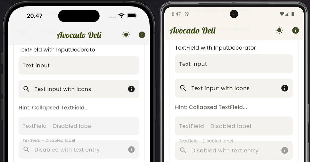
}With this InputDecorationTheme we get the following result:
To the Dialogs we only make some minor color re-mapping. We want a brighter surface color in light mode and use surfaceContainerLow instead of default surfaceContainerHigh, that we still use for dark mode, where it fits well.
We also bring back shadows to all dialogs, we think dialogs need shadows to stand out a bit more, like they did in Material-2.
      // 19) Dialog theme
      // We use a custom dialog theme with a custom color mapping and shadow.
      dialogTheme: DialogTheme(
        backgroundColor:
            isLight ? scheme.surfaceContainerLow : scheme.surfaceContainerHigh,
        shadowColor: scheme.shadow,
      ),

      // 20) Time picker with customized colors.
      timePickerTheme: TimePickerThemeData(
        backgroundColor:
            isLight ? scheme.surfaceContainerLow : scheme.surfaceContainerHigh,
      ),

      // 21) Custom date picker style.
      datePickerTheme: DatePickerThemeData(
        backgroundColor:
            isLight ? scheme.surfaceContainerLow : scheme.surfaceContainerHigh,
        headerBackgroundColor: scheme.primaryContainer,
        headerForegroundColor: scheme.onPrimaryContainer,
        dividerColor: Colors.transparent,
        shadowColor: scheme.shadow,
      ),
The surface colors on Android have minor primary chroma in them. On other platforms, the surface colors are monochrome shades of gray. This comes automatically via the difference in the platform adaptive ColorScheme we made, and it is visible in the dialogs. Below our customized and more refined look for the Dialogs:
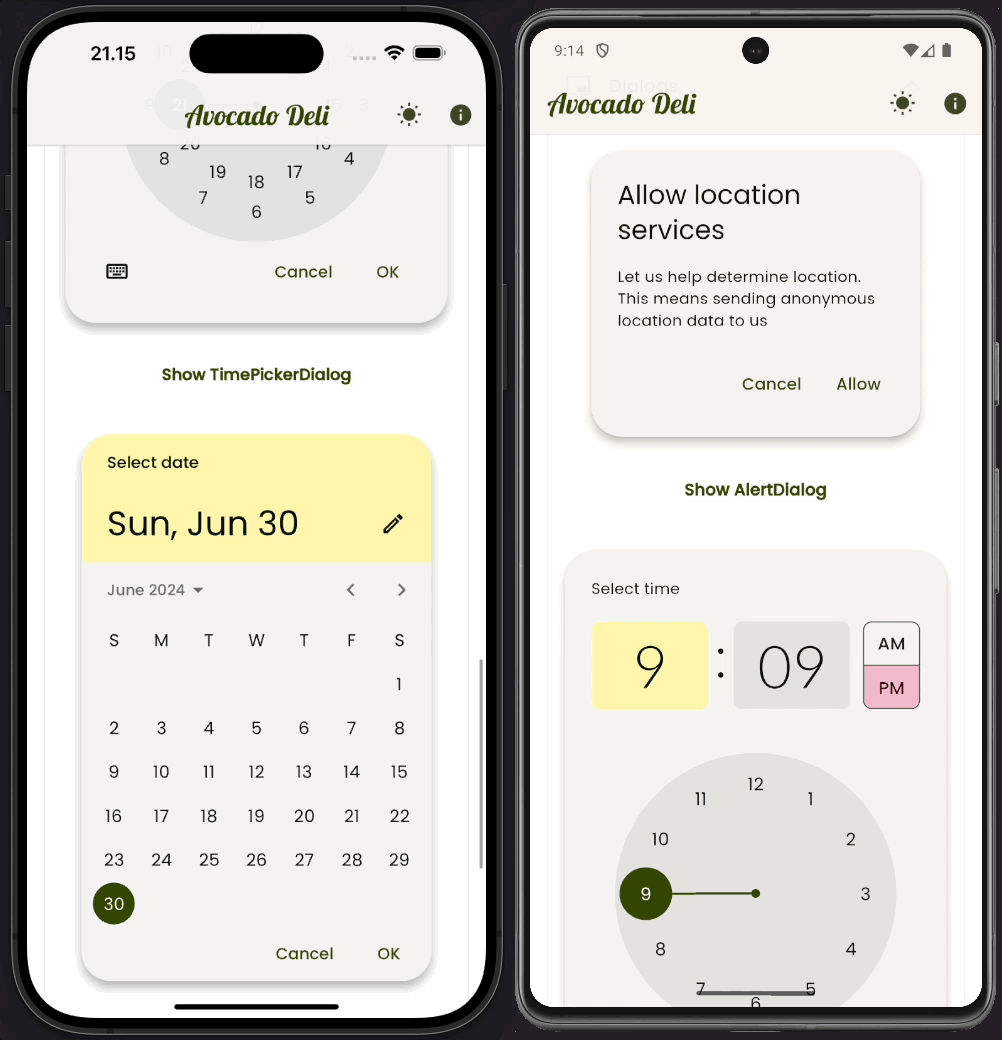
If you want to make the dialogs feel more native on iOS and macOS, one way to do so is to use the .adaptive constructor. This constructor is however still only available on the AlertDialog. Using it will make the AlertDialog use the Cupertino style on iOS and macOS, while still using our themed Material style on all other platforms.
You should treat the TextTheme and its text styles only as styles that determine the text style of built-in UI and also your custom UI components where you use them to match the styles of built-in components.
If you want a radically different text style for a specific component, make a new TextStyle for that component and use it in its component theme. Like we did for the AppBar title font in this demo.
If you have a lot of content in your app, that requires different and more flexible text styles than what it is offered in the TextTheme, do not try to modify and use the TextTheme for that. Add such TextStyles in one or more theme extensions. We will look at an example of this later too.
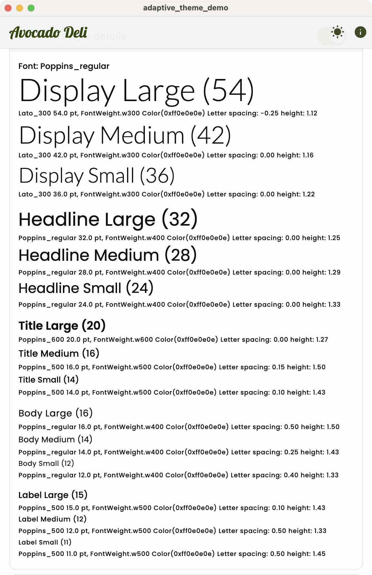
A common approach when customizing the TextTheme for your application UI components, is to use the GoogleFonts package and select two or maybe max three custom fonts for your application's TextTheme and the styles it contains.
Often one font for the Display and Headline styles and another for the Title, Body and Label styles. Maybe even an own style for Title, but three different fonts push it a bit. The Title style can alternatively use the same font that you used on Display and Headline styles. The official web Material Theme Builder does this. However, Title styles often look better in apps when they use the same font as the one used by Body and Label styles. Depends on the used font combination of course, feel free to experiment.
When it comes to custom text style size definitions in the TextTheme, for the large Display style you can resize them a fair bit without breaking default component designs that use them. However, the more you go down in the styles default sizes, the less you can tweak their size, maybe just a few points or even just one point up or down. If you do more, you may break some default intended designs of UI Widgets that are based on these text styles by default.
You can also modify the TextStyless default font weights, but be careful with this too. The default font weights are often chosen to match the intended design of the UI components that use them. Again, tweaking it for the larger styles is typically fine.
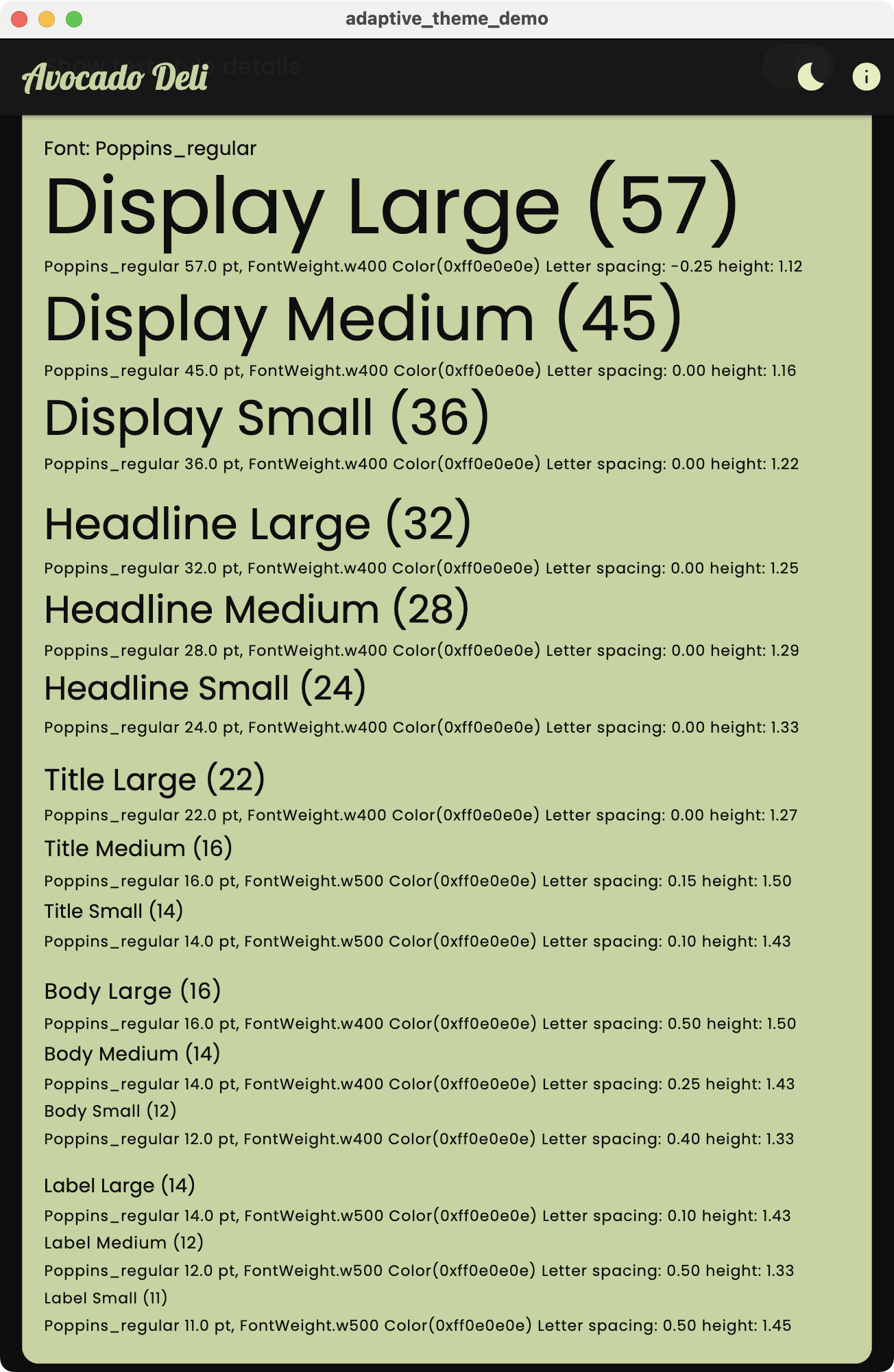
      // 22) Add a custom TextTheme made from TextStyles
      textTheme: textThemeFromStyles,
With GoogleFonts define styles for each TextStyle in a TextTheme using google fonts text styles. To actually get and download a font with another font weight, we must specify the weight in the GoogleFonts call. If we do it with a copyWith like with the fontSize size change below, on an already defined style in the TextTheme definition, the weight will not have any effect. We will get one of the two built-in weights and not the actual one we defined. The same applies to italics.
The fontSize we can however specify per style in the TextTheme, if we do not override it, the defaults from used Typography will be used.
The default sizes in Typography and even some letter spacing also vary a bit by locale. If the application supports locales that have other than English like Typography, we may need to adjust font sizes and letter spacing based on application locale too, if we customize them.
  // 22 a) Make a TextTheme from TextStyles to customize fonts per style.
  static TextTheme get textThemeFromStyles {
  final TextStyle light = GoogleFonts.lato(fontWeight: FontWeight.w300);
  final TextStyle regular = GoogleFonts.poppins(fontWeight: FontWeight.w400);
  final TextStyle medium = GoogleFonts.poppins(fontWeight: FontWeight.w500);
  final TextStyle semiBold = GoogleFonts.poppins(fontWeight: FontWeight.w600);

      return TextTheme(
        displayLarge: light.copyWith(fontSize: 54), // Default: regular, Size 57
        displayMedium: light.copyWith(fontSize: 42), // Default: regular
        displaySmall: light, // Default: regular
        headlineLarge: regular, //Default: regular
        headlineMedium: regular, // Default: regular
        headlineSmall: regular, // Default: regular
        titleLarge: semiBold.copyWith(fontSize: 20), // Default: regular, Size 22
        titleMedium: medium, // Default: medium
        titleSmall: medium, // Default: medium
        bodyLarge: regular, // Regular is default
        bodyMedium: regular, // Regular is default
        bodySmall: regular, // Regular is default
        labelLarge: medium.copyWith(fontSize: 15), // Default: medium, Size 14
        labelMedium: medium, // Default: medium
        labelSmall: medium, // Default: medium
      );
  }
The above gives use the following text styles in our app in light and dark mode for our Theme.of(context).textTheme. This is the result on other than Android platforms. On Android it would be marginally different via the slightly tinted onSurface colors, since we have a slightly different onSurface color on Android in our platform adaptive ColorScheme.
| ThemeData.textTheme (light) | ThemeData.textTheme (dark) |
|---|---|
 |
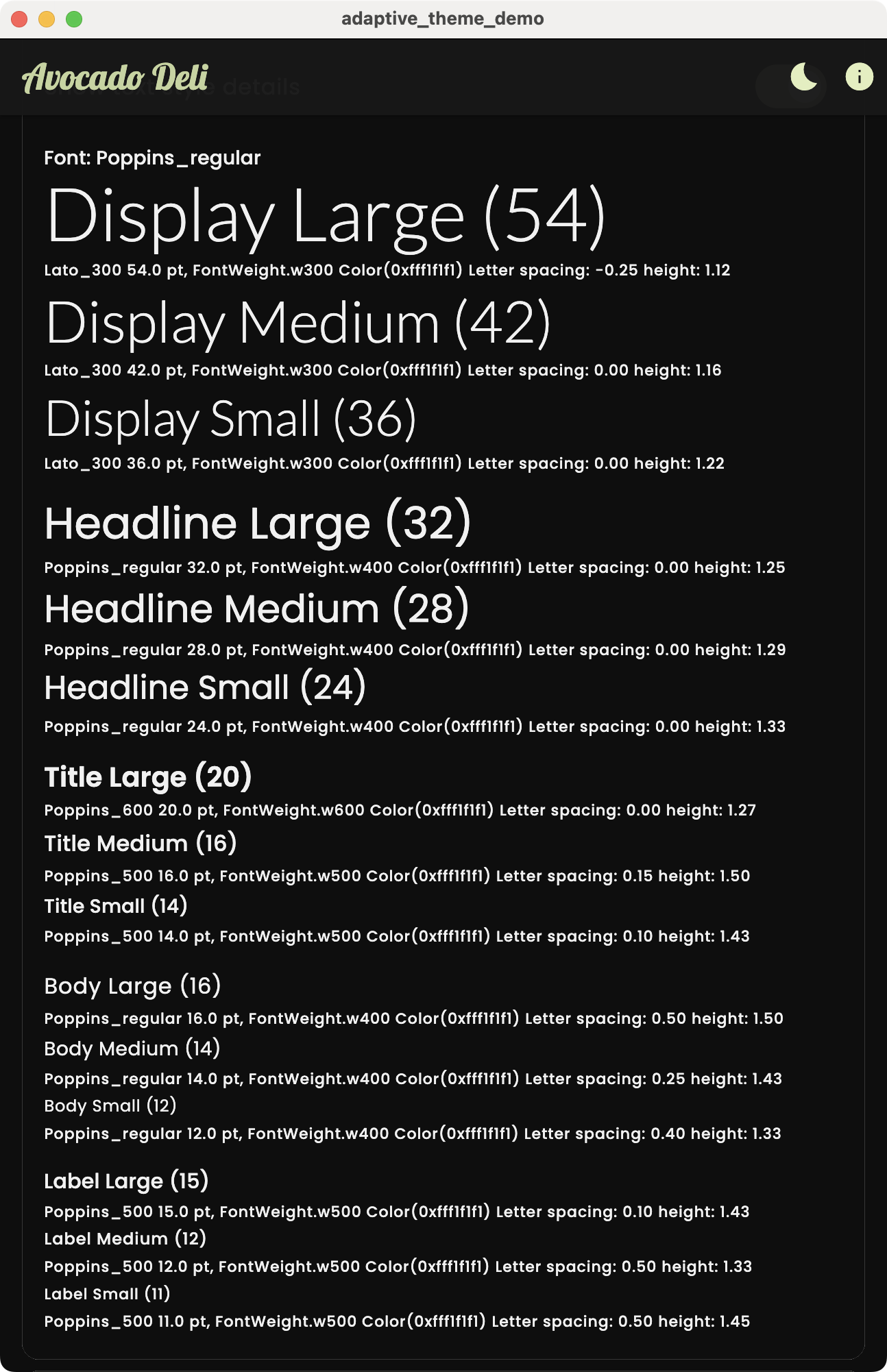 |
The GoogleFonts package also comes with nnnTextTheme functions (where nnn = font name) that return an entire TextTheme with a single font used by all its TextStyles. This can then in theory be easily assigned to ThemeData.textTheme or ThemeData.primaryTextTheme. This sounds good for when we just want a different font for everything.
      // 23) Add a custom primary TextTheme with GoogleFonts.nnnTextTheme
primaryTextTheme: googleFontsTextTheme,Unfortunately, it is not this simple. This function contains a bug. It returns a TextTheme where font color is predefined to be black for all styles in the TextTheme. While this will work visually for ThemeData.textTheme in light theme. It is actually the incorrect color for all TextStyles in both light and dark mode in both Material-3 and Material-2 design. You can read more about this bug in issue #401.
If GoogleFonts.nnnTextTheme would return a TextTheme where the font color is null for all its TextStyles, then we would get the correct color applied by the ThemeData factory regardless of if it is for light or dark mode, or used in Material-3 or Material-2 mode.
With the TextTheme.apply() function we can change, for example, the color property value in all its TextStyles to a given color with single call. Setting it to ThemeData.textTheme.apply(displayColor: scheme.onSurface) would be correct for Material-3. For ThemeData.primaryTextTheme.apply(displayColor: scheme.onPrimary) would be correct in our theme in Material-3 mode. However, in an app that also supports Material-2, like this demo does, these colors are incorrect for Material-2, since it uses opacities on some text styles.
The easiest way to get correct colors is if we can set the color property to null for all TextStyles in the TextTheme before we pass it to ThemeData. Then we let the built-in color contrast logic in the ThemeData factory take care of assigning the colors depending on brightness and Material-2 or -3 mode.
The TextTheme.apply function will however not do anything if we pass null as the displayColor. To get around this, we made a small TextTheme extension called fixedColors, that sets the color to null for all TextStyles in the TextTheme.
Below we use it to fix the colors when we use the GoogleFonts.poppinsTextTheme() for our primaryTextTheme. You can find the code for the .fixColors TextTheme extension here
  // 23 a) Get our custom GoogleFonts TextTheme: poppins
  // Issue: https://github.com/material-foundation/flutter-packages/issues/401
  static TextTheme get googleFontsTextTheme {
    // Add ".fixColors", remove it to see how text color breaks.
    return GoogleFonts.poppinsTextTheme().fixColors;
  }
A better name for the extension would have been .nullColors to describe what it actually does. We just wanted to point out its "fixing" nature in this demo.
The above gives use the following text styles in our app in light and dark mode for our Theme.of(context).primaryTextTheme. This is the result on other than Android platforms. On Android it would be marginally different via the slightly tinted onSurface colors, since we have a slightly different onSurface color on Android in our platform adaptive ColorScheme.
| ThemeData.primaryTextTheme (light) | ThemeData.primaryTextTheme (dark) |
|---|---|
 |
 |
Typically, in ThemeData, you should use a TextTheme with the same TextStyles for your primaryTextTheme and textTheme, their only differences should be their color. However, for this adaptive theme demo app we used different ones to also demonstrate the GoogleFonts.nnnTextTheme API and its issue.
As long as primaryTextTheme exists in ThemeData we use it as a TextTheme that has the right contrast color when used on the theme's colorScheme.primary color. However, it is actually defined as having the correct contrast color for the ThemeData.primaryColor color, which by default in dark mode is a dark gray color and not colorScheme.primary.
This is a legacy thing. The dark gray color on primaryColor in dark mode, was used to make the AppBar dark gray in dark mode in very early Material designs in Flutter. In our theme we set ThemeData.primaryColor to be colorScheme.primary also in dark mode, so it does not contain any surprises. Thus, in our case it effectively becomes a TextTheme that always has the correct contrast for colorScheme.primary, as its name kind of implies. To read more about this check out issue 118146.
Also be aware that the primaryTextTheme may be deprecated as no longer needed or used. Instead, it is recommended to use the ThemeData.colorScheme and any of its relevant on-colors for the use case. Use the correct contrasting on-color from the ColorScheme for text and icons, depending on what background color the text is being displayed on.
As the last piece, we use ThemeExtension as a means to add custom theme properties to our ThemeData. In this example we only make one ThemeExtension with a few color and TextStyle properties. You can define as many ThemeExtensions as you need for your application.
Theme extensions are well explained in this YouTube video where Craig Labenz from the Flutter team explains the ThemeData extension feature.
For our fictive app, we want to have some special semantic colors. Semantic colors are colors that have specific meaning in our application or domain. In the ColorScheme there is only one set of semantic colors, all the error color variants. We could add warning and success colors, they are common in many designs. However, as an alternative example, we add semantic colors that are used to describe the status of orders for our Avocado Deli.
We use these semantic order status colors:
- Order received
- Order in preparation
- Order in delivery
- Order delivered
Again, to use them, we first add them to our ThemeTokens class:
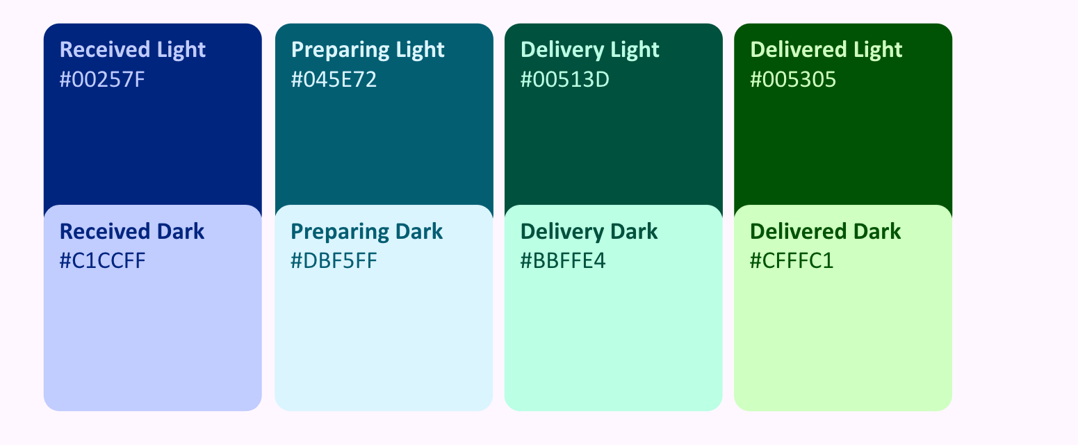
  // Semantic color tokens for order status.
  static const Color receivedLight = Color(0xFF00257F);
  static const Color receivedDark = Color(0xFFC1CCFF);
  static const Color preparingLight = Color(0xFF045E72);
  static const Color preparingDark = Color(0xFFDBF5FF);
  static const Color deliveryLight = Color(0xFF00513D);
  static const Color deliveryDark = Color(0xFFBBFFE4);
  static const Color deliveredLight = Color(0xFF005305);
  static const Color deliveredDark = Color(0xFFCFFFC1);
You can find ThemeTokens in its entirety here.
We also add two content related custom TextStyles to our ThemeExtension. We can often think of text styles not used by the TextTheme to default style built-in components or their themes, or our customized UI components, more as content TextStyles or as a form of semantic TextStyles as well. Here we use two such custom styles for a blog header and blog body text styles.
Generally don't try to change the application's TexTheme and its TextStyles to fit styles needed by content in your application, instead define new styles that fits your content. Then add them as a ThemeExtension to your ThemeData.
For convenience, we added them as statics to the AppTheme class in this demo, where we had a few TextStyle definitions already. They could just as well, or maybe even better, fit in our ThemeTokens class, as that is what they are as well.
  // 26) A "semantic" blog header text style that we use for custom content.
  static TextStyle blogHeader(ColorScheme scheme, double fontSize) {
    return GoogleFonts.limelight(
      fontWeight: FontWeight.w400,
      fontSize: fontSize,
      color: scheme.onSurface,
    );
  }

  // 27) A "semantic" blog body text style that we use for custom content.
  static TextStyle blogBody(ColorScheme scheme, double fontSize) {
    return GoogleFonts.notoSerif(
      fontWeight: FontWeight.w400,
      fontSize: fontSize,
      color: scheme.onSurface,
    );
  }
Defining a ThemeExtension has a bit of boilerplate. We need to define all our properties in a class that extends ThemeExtension having a type of the class we just defined. We must override its copyWith and lerp methods.
To define our AppThemeExtension class, we add the properties for our semantic colors and content text styles. We also add a fallback color value, that is used for all colors in both theme modes, this fallback will not be seen when the theme extension is defined correctly.
/// A theme extension for semantic colors and content text styles.
class AppThemeExtension extends ThemeExtension<AppThemeExtension> {
  const AppThemeExtension({
    required this.received,
    required this.onReceived,
    required this.making,
    required this.onMaking,
    required this.inDelivery,
    required this.onInDelivery,
    required this.delivered,
    required this.onDelivered,
    this.blogHeader,
    this.blogBody,
  });

  final Color? received;
  final Color? onReceived;
  final Color? making;
  final Color? onMaking;
  final Color? inDelivery;
  final Color? onInDelivery;
  final Color? delivered;
  final Color? onDelivered;
  final TextStyle? blogHeader;
  final TextStyle? blogBody;

  // Fallback color value that is used for all colors in both theme modes.
  // This will never be seen when the theme extension is setup correctly.
  static const int _fail = 0xFF1565C0; // Bright dark blue
Next we define the copyWith method. This method is used to create a new instance of the AppThemeExtension with the properties we want to change. We use the ?? operator to check if the property is null, if it is, we use the current value. This is the well-known common pattern in copyWith methods.
  // You must override the copyWith method.
@override
AppThemeExtension copyWith({
  Color? received,
  Color? onReceived,
  Color? making,
  Color? onMaking,
  Color? inDelivery,
  Color? onInDelivery,
  Color? delivered,
  Color? onDelivered,
  TextStyle? blogHeader,
  TextStyle? blogBody,
}) =>
        AppThemeExtension(
          received: received ?? this.received,
          onReceived: onReceived ?? this.onReceived,
          making: making ?? this.making,
          onMaking: onMaking ?? this.onMaking,
          inDelivery: inDelivery ?? this.inDelivery,
          onInDelivery: onInDelivery ?? this.onInDelivery,
          delivered: delivered ?? this.delivered,
          onDelivered: onDelivered ?? this.onDelivered,
          blogHeader: blogHeader ?? this.blogHeader,
          blogBody: blogBody ?? this.blogBody,
        );
Next, we define the lerp method override for all properties. It is a bit more complex than the copyWith method. We must check if the other ThemeExtension is of the correct type, if it is not, we return the current instance. In our extension, we used the Color.lerp and TextStyle.lerp methods to lerp the properties. The lerp methods are used to animate theme transitions for each of our theme extension properties. This linearly animated transition of every property in our theme extension will occur in sync with the rest of ThemeData, when it transitions from one ThemeData value to a new one.
  // You must override the lerp method.
  @override
  AppThemeExtension lerp(ThemeExtension<AppThemeExtension>? other, double t) {
    if (other is! AppThemeExtension) {
      return this;
    }
    return AppThemeExtension(
      received: Color.lerp(received, other.received, t),
      onReceived: Color.lerp(onReceived, other.onReceived, t),
      making: Color.lerp(making, other.making, t),
      onMaking: Color.lerp(onMaking, other.onMaking, t),
      inDelivery: Color.lerp(inDelivery, other.inDelivery, t),
      onInDelivery: Color.lerp(onInDelivery, other.onInDelivery, t),
      delivered: Color.lerp(delivered, other.delivered, t),
      onDelivered: Color.lerp(onDelivered, other.onDelivered, t),
      blogHeader: TextStyle.lerp(blogHeader, other.blogHeader, t),
      blogBody: TextStyle.lerp(blogBody, other.blogBody, t),
    );
  }
Next we define static consts constructors for light and dark theme mode colors, that return an AppThemeExtension where the correct color values for light and dark theme mode are used for our semantic order status colors. We use the light and dark token as the main color, and the inverse mode as their on-color in the respective theme mode.
  // Constructor with our semantic order status colors in light mode.
  static const AppThemeExtension light = AppThemeExtension(
    received: ThemeTokens.receivedLight,
    onReceived: ThemeTokens.receivedDark,
    making: ThemeTokens.preparingLight,
    onMaking: ThemeTokens.preparingDark,
    inDelivery: ThemeTokens.deliveryLight,
    onInDelivery: ThemeTokens.deliveryDark,
    delivered: ThemeTokens.deliveredLight,
    onDelivered: ThemeTokens.deliveredDark,
  );

  // Constructor with our semantic order status colors in dark mode.
  static const AppThemeExtension dark = AppThemeExtension(
    received: ThemeTokens.receivedDark,
    onReceived: ThemeTokens.receivedLight,
    making: ThemeTokens.preparingDark,
    onMaking: ThemeTokens.preparingLight,
    inDelivery: ThemeTokens.deliveryDark,
    onInDelivery: ThemeTokens.deliveryLight,
    delivered: ThemeTokens.deliveredDark,
    onDelivered: ThemeTokens.deliveredLight,
  );
As the final step, we add a factory constructor called make. It constructs our custom AppThemeExtension using a few parameters, ColorScsheme scheme and bool zoomBlogFonts as inputs.
From the ColorScheme we use the primary color as source color, to harmonize all our input semantic order status colors to the theme's primary color.
We will also as a demo use a boolean parameter that zooms the font size of our content blog text styles. We could have used a double parameter to set the font size directly, but we wanted to use a bool toggle to later demonstrate that we are not manually animating or manipulating the font size, we just give it a new immediate value via a bool toggle.
  /// A factory to make the light or dark extended theme with its custom
  /// colors harmonized towards the used scheme primary color.
  /// The custom blog fonts can be zoomed.
  ///
  /// Since we are using theme extensions all changes to the theme properties
  /// will lerp animate when theme values are changed. Thus light/dark mode
  /// color changes in our custom colors automatically animate with the
  /// rest of the mode switch colors and when we turn ON/OFF the custom blog
  /// fonts zooming, this text style size change also animates.
  factory AppThemeExtension.make(ColorScheme scheme, bool zoom) {
    if (scheme.brightness == Brightness.light) {
      return light
          .copyWith(
            blogHeader: AppTheme.blogHeader(scheme, zoom ? 40 : 24),
            blogBody: AppTheme.blogBody(scheme, zoom ? 24 : 12),
          )
          .harmonized(scheme.primary);
    } else {
      return dark
          .copyWith(
            blogHeader: AppTheme.blogHeader(scheme, zoom ? 40 : 24),
            blogBody: AppTheme.blogBody(scheme, zoom ? 24 : 12),
          )
          .harmonized(scheme.primary);
    }
  }
The last piece is the harmonized method in our AppThemeExtension. It will slightly nudge the colors of each order status color, in the direction of the theme's primary color. This is done, so they will fit better with the ambient theme.
  /// An [AppThemeExtension], where all its colors are harmonized towards a
  /// given [sourceColor], typically the theme's primary color.
  AppThemeExtension harmonized(Color sourceColor) {
    final int source = sourceColor.value;
    return copyWith(
      received: Color(Blend.harmonize(received?.value ?? _fail, source)),
      onReceived: Color(Blend.harmonize(onReceived?.value ?? _fail, source)),
      making: Color(Blend.harmonize(making?.value ?? _fail, source)),
      onMaking: Color(Blend.harmonize(onMaking?.value ?? _fail, source)),
      inDelivery: Color(Blend.harmonize(inDelivery?.value ?? _fail, source)),
      onInDelivery:
          Color(Blend.harmonize(onInDelivery?.value ?? _fail, source)),
      delivered: Color(Blend.harmonize(delivered?.value ?? _fail, source)),
      onDelivered: Color(Blend.harmonize(onDelivered?.value ?? _fail, source)),
    );
  }
Using color harmonization is useful if our theme is dynamic, or if we have many fixed themes user can select from. We can then use harmonization to ensure that our semantic or custom static colors outside the ColorScheme will always fit with the ambiance of the used ColorScheme. Plus, when we change theme, the custom semantic colors will also lerp animate to their new harmonized color values, when used in a theme extension like above. This also happens if you change to a new theme style within the same theme mode, and of course, between light and dark mode switches.
You can read more about harmonizing your custom semantic and static colors in the Material-3 guide style section.
In this demo the Blend.harmonized color function came from the FlexSeedScheme package we already imported for the more advanced seed generated ColorScheme features. The same function also exists in the Material Color Utilities package.
Finally, we add our ThemeExtension to our AppTheme utility in its static use function in the part where we return ThemeData. We add it as an extension in the extensions map.
      // The AppTheme.use and its returned ThemeData, continued from earlier above.
      //
      // 24) Add all our custom theme extensions, we have only one in this demo.
      // Used to demonstrate color and font animation and color harmonization.
      extensions: <ThemeExtension<dynamic>>{
        AppThemeExtension.make(scheme, settings.zoomBlogFonts)
},To use a theme extension in our application, we can access it with Theme.of(context).extension<MyExtensionType>. This is quite long and verbose. You can make convenience context extension functions to get the extension. We leave this as an exercise to the reader.
Why should we prefer adding custom content TextStyles via theme extensions?
- There is no need to worry about clashes with
textThemestyles. - We can add as many as we need.
- We access them using a similar mechanism as our
textThemestyles, viaTheme.of(context).extension. - The main kicker is that they animate their themed
TextStyleproperty changes.
This last reason is really nice. Let's look at that next, by using our custom blog content text styles in a BlogPostCard widget that shows fictive blog posts. It looks like this:
import 'package:flutter/material.dart';
import '../../../../theme/app_theme_extension.dart';
import '../../universal/stateful_header_card.dart';

@immutable
class BlogPostCard extends StatelessWidget {
  const BlogPostCard({
    super.key,
    required this.cardHeading,
    required this.blogHeading,
    required this.blogContent,
  });
  final String cardHeading;
  final String blogHeading;
  final String blogContent;

  @override
  Widget build(BuildContext context) {
    final ThemeData theme = Theme.of(context);
    return StatefulHeaderCard(
      margin: const EdgeInsets.symmetric(horizontal: 16, vertical: 4),
      leading: const Icon(Icons.text_snippet_outlined),
      title: Text(cardHeading),
      child: Padding(
        padding: const EdgeInsets.symmetric(vertical: 8),
        child: Column(
          crossAxisAlignment: CrossAxisAlignment.start,
          children: <Widget>[
            Padding(
              padding: const EdgeInsets.symmetric(horizontal: 16),
              child: Text(
                blogHeading,
                style: theme.extension<AppThemeExtension>()?.blogHeader ??
                    theme.textTheme.headlineSmall,
              ),
            ),
            Padding(
              padding: const EdgeInsets.symmetric(horizontal: 16),
              child: Text(
                blogContent,
                style: theme.extension<AppThemeExtension>()?.blogBody ??
                    theme.textTheme.bodySmall,
              ),
            ),
          ],
        ),
      ),
    );
  }
}
The key part above is grabbing the text style from our extension. For example for the blogHeader text style. We use the theme.extension<AppThemeExtension>()?.blogHeader to get the text style. If it is null we use a default headlineSmall text style from the TextTheme as fallback.
   Text(blogHeading,
     style: theme.extension<AppThemeExtension>()?.blogHeader ??
            theme.textTheme.headlineSmall,
   ),
In case there was no extension added to our ThemeData we should have a fallback text style. This is important if the extension cannot always be guaranteed to be added to ThemeData.
This might be the case if we have made a custom packaged widget that comes with a theme extension for additional custom styling. In such cases we want to make sure our custom-packaged widget falls back to nice default values, if its theme extension is not added to ThemeData to theme it. This is like the Material UI widgets also behave when there is no component theme defined, they then get their default values from a private class with fixed values.
When we are using a theme extension in our own app, for our own custom app properties, we can always guarantee that the ThemeExtension is always added to ThemeData. We can then alternatively skip the fallback and just bang it.
So what happens now when we use this font extension in a widget and toggle the font zooming ON and OFF via zoomBlogFonts?
The text size will animate between the two sizes we defined, this will happen everywhere in our app where we used the two custom blog text styles. All we did was update the font size values that the two styles use in their theme extension.
In this demo we toggle a ListTileSwitch that creates a new ThemeSettings value and updates our theme with a new extension having another font size. Since ThemeExtension properties animate, the font size will animate between the two sizes we defined in the AppThemeExtension.make factory constructor.
  ListTileSwitch(
    title: const Text('Zoom blog post fonts'),
    value: settings.zoomBlogFonts,
    onChanged: (bool value) {
      settings = settings.copyWith(zoomBlogFonts: value);
      AppTheme.update(context, settings);
    },
  ),
This will animate the font size change in all places in our app where we have used the custom font styles via our theme extension. Feels and looks a bit like magic.
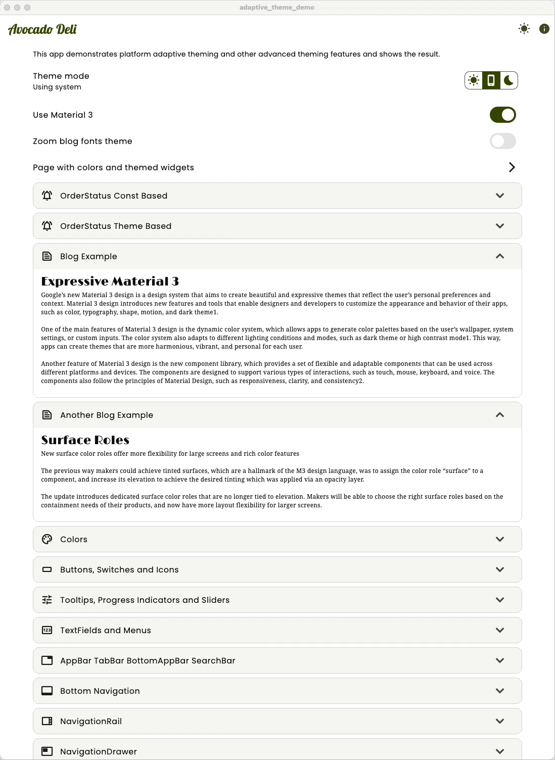
We could use our theme extension for the semantic color in our app the same way as we used it for the blog text styles in the example above. But let's look at a more advanced and convenient, domain-specific usage of them.
Since we have four colors related to order status, we also want to have an enum representing our OrderStatus. We give this enum a label and describe text, plus an icon related to each order state as well.
/// Enum used to model our order status value,
/// also includes labels, icons and colors for each status.
enum OrderStatus {
  received(
    label: 'Order received',
    describe: 'Thank you!\nWe have received your order\n'
        'and will prepare it shortly.',
    icon: Icons.thumb_up,
  ),
  preparing(
    label: 'Preparing',
    describe: 'Our chef is preparing your order from\nfresh sustainably '
        'produced ingredients.',
    icon: Icons.soup_kitchen,
  ),
  inDelivery(
    label: 'In delivery',
    describe: 'We are delivering your\nAvocado Deli meal to you.',
    icon: Icons.electric_moped,
  ),
  delivered(
    label: 'Delivered',
    describe: 'Your order has been delivered.\nEnjoy your meal and thank '
        'you\nfor choosing Avocado Deli!',
    icon: Icons.ramen_dining,
  );

  const OrderStatus({
    required this.label,
    required this.describe,
    required this.icon,
  });

  final String label;
  final String describe;
  final IconData icon;

}
To this enum we add helper methods to get the color token values related to each OrderStatus value. This getter needs a context, so we can figure out if we should get the token for the light or the dark theme mode. We also add a method to get the on-color for each status.
  /// Returns the color associated with the order status. Uses the
  /// context to determine if it should be the token for light or dark mode.
  Color orderStatusTokenColor(BuildContext context) {
    final bool isLight = Theme.of(context).brightness == Brightness.light;
    switch (this) {
      case OrderStatus.received:
        return isLight ? ThemeTokens.receivedLight : ThemeTokens.receivedDark;
      case OrderStatus.preparing:
        return isLight ? ThemeTokens.preparingLight : ThemeTokens.preparingDark;
      case OrderStatus.inDelivery:
        return isLight ? ThemeTokens.deliveryLight : ThemeTokens.deliveryDark;
      case OrderStatus.delivered:
        return isLight ? ThemeTokens.deliveredLight : ThemeTokens.deliveredDark;
    }
  }

  /// Returns the on-color associated with the order status. Uses the
  /// context to determine if it should be the token for light or dark mode.
  Color onOrderStatusTokenColor(BuildContext context) {
    final bool isLight = Theme.of(context).brightness == Brightness.light;
    switch (this) {
      case OrderStatus.received:
        return isLight ? ThemeTokens.receivedDark : ThemeTokens.receivedLight;
      case OrderStatus.preparing:
        return isLight ? ThemeTokens.preparingDark : ThemeTokens.preparingLight;
      case OrderStatus.inDelivery:
        return isLight ? ThemeTokens.deliveryDark : ThemeTokens.deliveryLight;
      case OrderStatus.delivered:
        return isLight ? ThemeTokens.deliveredDark : ThemeTokens.deliveredLight;
    }
  }
The above definitions are getters for the static order status color token values. We can also add helper methods that get the same order status related colors from our theme extension, that are also harmonized to the theme's primary color.
  /// Returns the color associated with the order status. Uses
  /// Theme.of(context).extension, to get the color. If the extension is not
  /// defined, it falls back to the direct token based color.
  Color orderStatusColor(BuildContext context) {
    final ThemeData theme = Theme.of(context);
    switch (this) {
      case OrderStatus.received:
        return theme.extension<AppThemeExtension>()?.received ??
                orderStatusTokenColor(context);
      case OrderStatus.preparing:
        return theme.extension<AppThemeExtension>()?.making ??
                orderStatusTokenColor(context);
      case OrderStatus.inDelivery:
        return theme.extension<AppThemeExtension>()?.inDelivery ??
                orderStatusTokenColor(context);
      case OrderStatus.delivered:
        return theme.extension<AppThemeExtension>()?.delivered ??
                orderStatusTokenColor(context);
    }
  }

  /// Returns the on-color associated with the order status. Uses
  /// Theme.of(context).extension, to get the color. If the extension is not
  /// defined, it falls back to the direct token based on-color.
  Color onOrderStatusColor(BuildContext context) {
    final ThemeData theme = Theme.of(context);
    switch (this) {
      case OrderStatus.received:
        return theme.extension<AppThemeExtension>()?.onReceived ??
                onOrderStatusTokenColor(context);
      case OrderStatus.preparing:
        return theme.extension<AppThemeExtension>()?.onMaking ??
                onOrderStatusTokenColor(context);
      case OrderStatus.inDelivery:
        return theme.extension<AppThemeExtension>()?.onInDelivery ??
                onOrderStatusTokenColor(context);
      case OrderStatus.delivered:
        return theme.extension<AppThemeExtension>()?.onDelivered ??
                onOrderStatusTokenColor(context);
    }
  }
In the theme extension based getters, we used the direct token-based order status colors as fall back color values, should the theme extension not be defined in our ThemeData.
Now that we have an order status enum where we can get both color styles based on order status, we can build some custom components that can be used to display an order status in our app. For example, some order status boxes that show the order status icon and label. We added showing the color value for demo purposes as well. We can even open a dialog with more details when we click on it.
/// Order status widget
class OrderStatusWidget extends StatelessWidget {
  const OrderStatusWidget({
    super.key,
    required this.status,
    required this.useTheme,
  });

  final OrderStatus status;
  final bool useTheme;

  @override
  Widget build(BuildContext context) {
    final Color backgroundColor = useTheme
        ? status.orderStatusColor(context)
        : status.orderStatusTokenColor(context);
    final Color foregroundColor = useTheme
        ? status.onOrderStatusColor(context)
        : status.onOrderStatusTokenColor(context);

    return GestureDetector(
      onTap: () async {
        await OrderStatusDialog.show(context, status, useTheme);
      },
      child: Card(
        margin: EdgeInsets.zero,
        color: backgroundColor,
        child: SizedBox(
          width: 170,
          height: 50,
          child: Column(
            mainAxisAlignment: MainAxisAlignment.center,
            children: <Widget>[
              Row(
                mainAxisAlignment: MainAxisAlignment.center,
                children: <Widget>[
                  Icon(status.icon, color: foregroundColor),
                  const SizedBox(width: 8),
                  Text(
                    status.label,
                    style: TextStyle(color: foregroundColor),
                  )
                ],
              ),
              Text(
                backgroundColor.toString(),
                style: TextStyle(color: foregroundColor, fontSize: 10),
              ),
            ],
          ),
        ),
      ),
    );
  }
}
If we display all OrderStatus states using the above OrderStatusWidget via const token or theme extension, in light theme mode, they look like this.
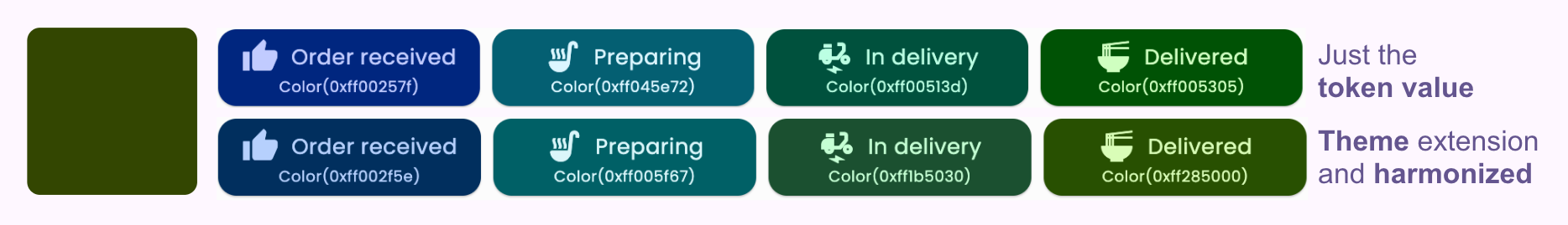
In the demo app, we display them like this on the home screen in our list view:
  // Token based style, no theme animation.
  const OrderStatesCard(useTheme: false),
  // Theme extension based styles, has theme animation.
  const OrderStatesCard(useTheme: true),
Where the OrderStatesCard is a StatelessWidget that shows OrderStatusWidgets using all OrderStatus values in a Wrap widget, either by using the theme-extension-based colors or the direct token values.
// Display all the order status widgets in an expandable container.
class OrderStatesCard extends StatelessWidget {
  const OrderStatesCard({super.key, required this.useTheme});
  final bool useTheme;

  @override
  Widget build(BuildContext context) {
    return StatefulHeaderCard(
      margin: const EdgeInsets.symmetric(horizontal: 16, vertical: 4),
      leading: const Icon(Icons.notifications_active_outlined),
      title: useTheme
          ? const Text('OrderStatus Theme Based')
          : const Text('OrderStatus Const Based'),
      child: Padding(
        padding: const EdgeInsets.all(8.0),
        child: Wrap(
          spacing: 8,
          runSpacing: 8,
          children: <Widget>[
            for (final OrderStatus status in OrderStatus.values)
              useTheme
                  ? OrderStatusWidget(status: status, useTheme: true)
                  : OrderStatusWidget(status: status, useTheme: false)
          ],
        ),
      ),
    );
  }
}
We can then open up both in our demo and examine the difference.
If we look at them and toggle between light/dark theme mode, we can see that the const token-based ones switch color values instantly half-way through the theme mode transition.
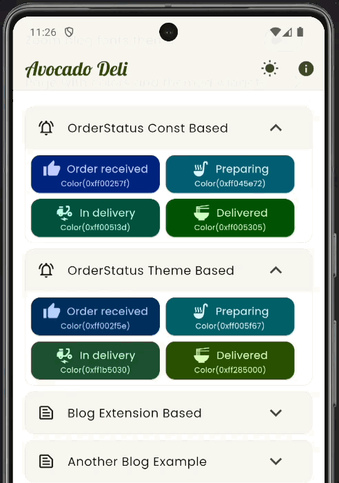
The theme-extension-based colors lerp animate their color change with the rest of the theme transition, this is much nicer and professional looking. We also see that the harmonized colors from the theme extension OrderStatus based widgets, have colors that fit a bit better with the theme's primary color.
We have shown how to make an application that uses a theme that is platform adaptive. It used default Material-3 styles on Android. It got another custom, more platform-agnostic style, a bit iOS inspired, on all other platforms. We also walked through many advanced custom component theming topics.
We showed how to make a ColorScheme that while seed generated, used several seed key colors and pinned a custom app color palette, with nine colors pinned to the seed generated scheme. We even made the ColorScheme have a platform adaptive response, so that surface colors are only primary color tinted on Android builds, while using monochrome greyscale surfaces on all other platforms.
We also looked at a practical example of using theme extensions for semantic colors and content text styles. Additionally, we harmonized the custom semantic colors to the theme's primary color.
Tip
The walk through of the AppTheme class was pretty long, but the setup is not that long and complicated. It might be easier to get an overview by looking at its code here.
Hope you enjoyed this Flutter adaptive theming guide by @RydMike (on X/Twitter) aka "MaterialMike" 😃


 React
React
 Typescript
 Django
 Laravel
 Facebook
 Microsoft
 Google
 Alibaba
 D3
D3
 Tencent