This project goes through the Production and Inventory Analysis of the Microsoft AdventureWorks Database. Adventure Works is a fictional bicycle manufacturing company, this database contains standard transactions data from an Enterprise Resource Planning System. It contains data from the following scenarios of the company: Human Resources, Product Management, Manufacturing, Purchasing, Inventory, Sales, and Admin. This analysis focuses on the Manufacturing and Inventory part of the data. Microsoft Power BI has been used to create an interactive dashboard while pulling data from SQL Server.
Defining an effective data structure in a dashboard is important, incorporating a star schema model gives an efficient design and makes the data refresh faster. The image below shows the tables used in the process:-
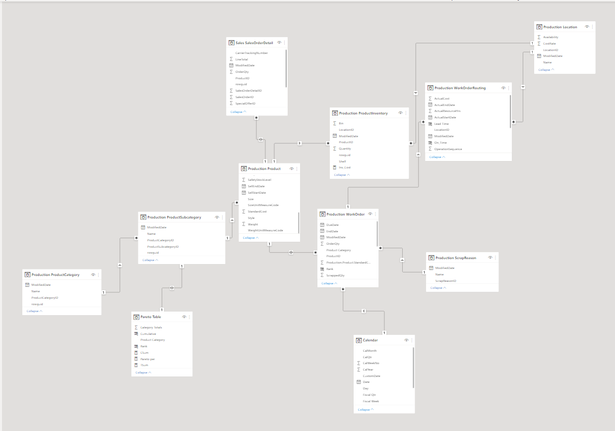
- Production Location - Has Production assembly data, 1.e. Parts used to manufacture each product are defined here with an assembly location category
- Production Product - Data related to products, their physical details, price, etc.
- Production ProductCategory - Products and their defined categories
- Production ProductSubcategory - Products and their subcategories
- Production ProductInventory - Inventory data of the produced products
- Production ScrapReason - Waste Data related to manufacturing
- Production WorkOrder - Production transactions and related data
- Production WorkOrderRouting - Production work order scheduling data and details
- Sales SalesOrderDetail - Transactional Sales Data
This dashboard analyses manufacturing and inventory operations, the dashboard is made to have an app-like navigational interface. The main page includes leads to two areas namely Production Overview and Inventory Overview. Each then breakdown details and KPIs on their own page afterward.
The dashboard is made according to the fiscal year terms, a custom date table was created using DAX, to automatically generate Fiscal year segregations. An assumption is made that the fiscal year starts on October 1st and ends on September 30th.
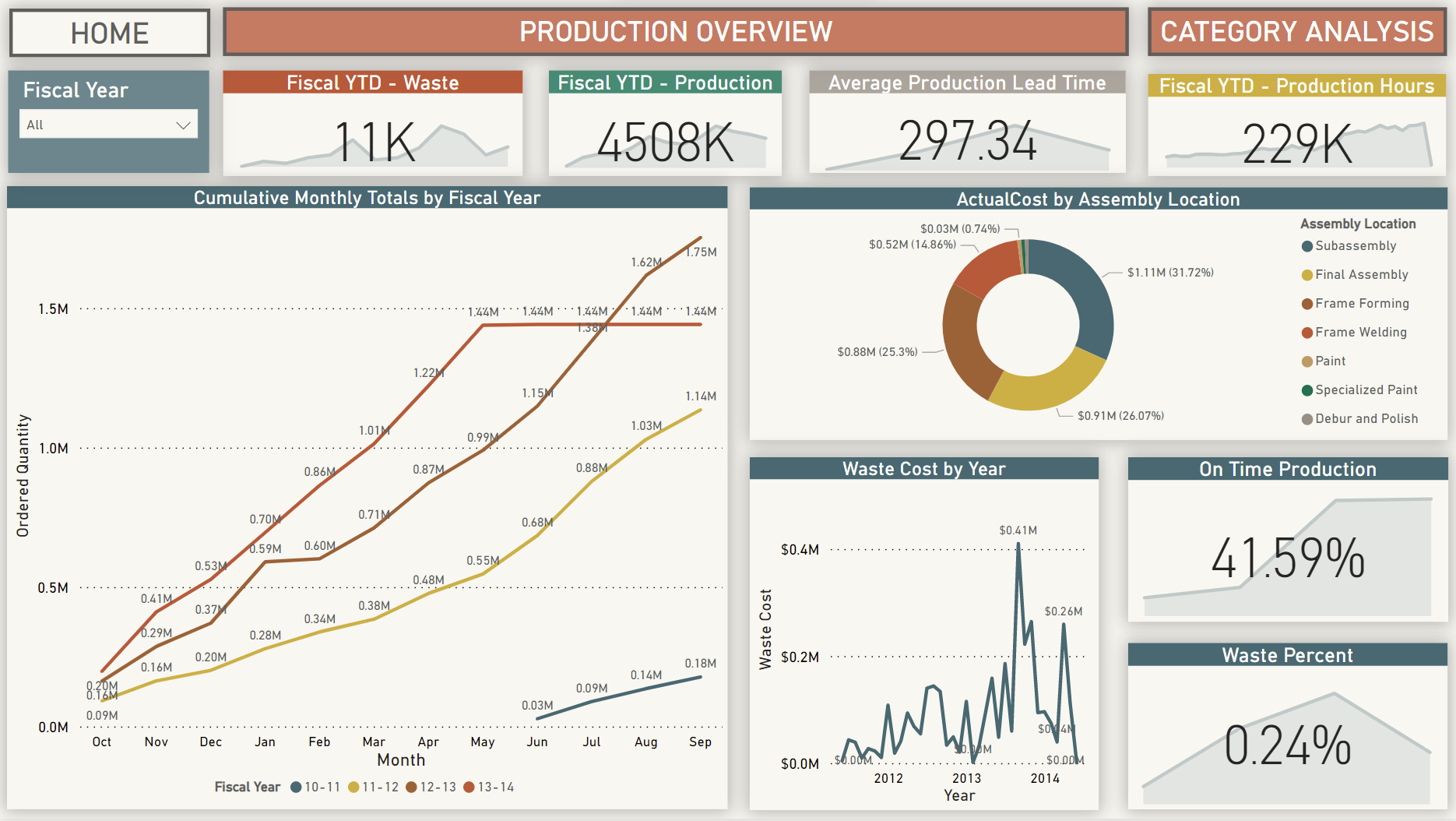
This page gives information about the manufacturing overview of the company, Measures were created in Power BI in order to have custom KPIs. All the charts and KPIs are described below: -
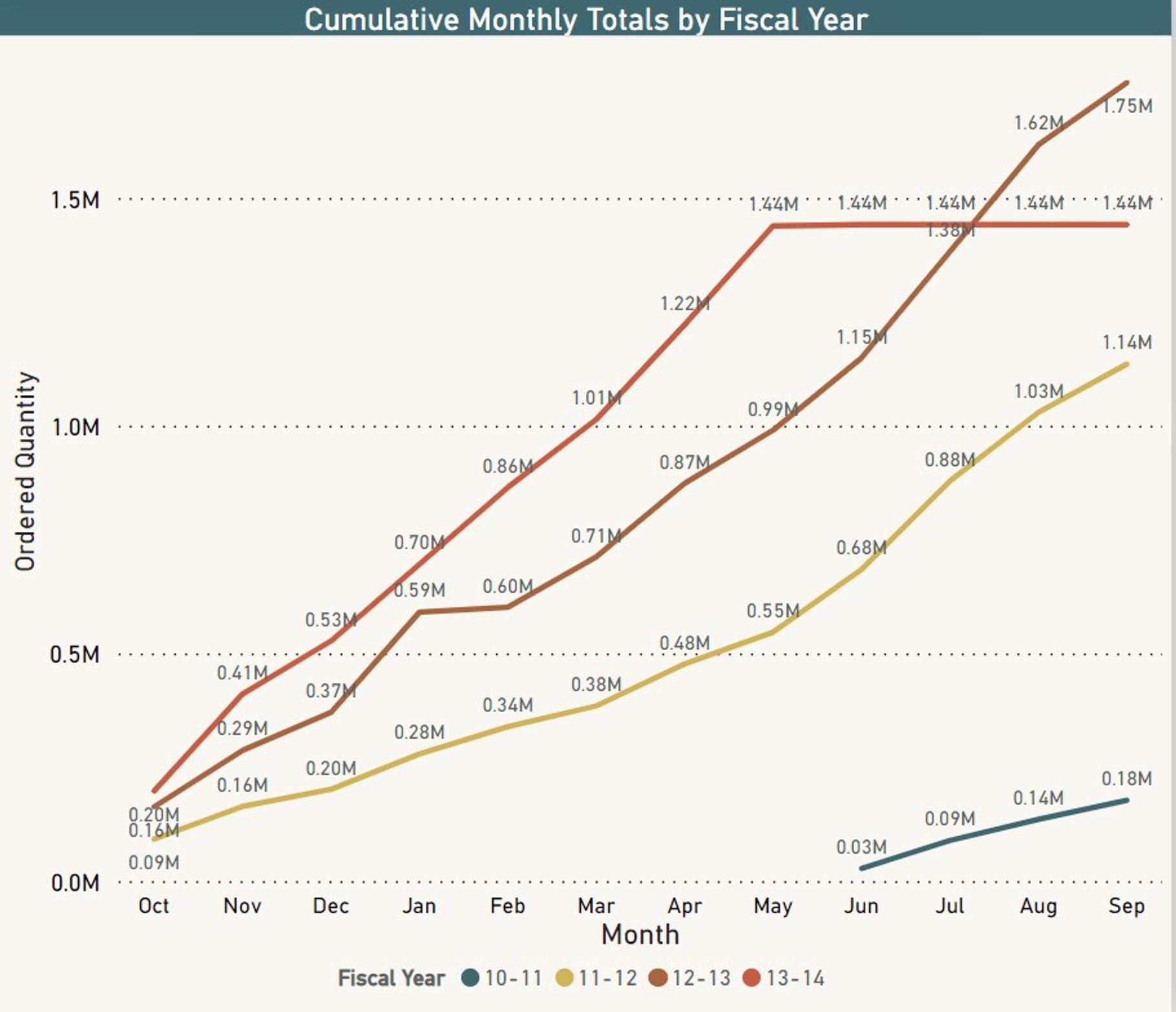
- Cumulative Multiline chart showing Production totals helps compare the fiscal year production trends and helps remove bottlenecks in manufacturing. *
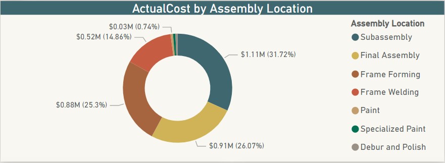
- Donut Chart showing Actual cost distribution over different parts of the assembly line. Helps determine which parts cost more and where improvement is needed so that production costs are reduced. *
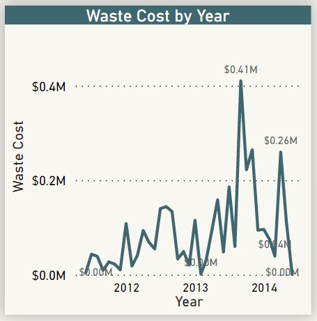
- Waste cost by year line chart. A simple chart showing how much money is the company wasting on discarded products and what is the trend. *
After looking at the overview of the manufacturing department, one can navigate to the Product Category Page for a more detailed analysis. Which will help identify specific issues in the manufacturing system.
This section consists of 4 charts that show an in-depth analysis of the Production components and help determine specific issues.
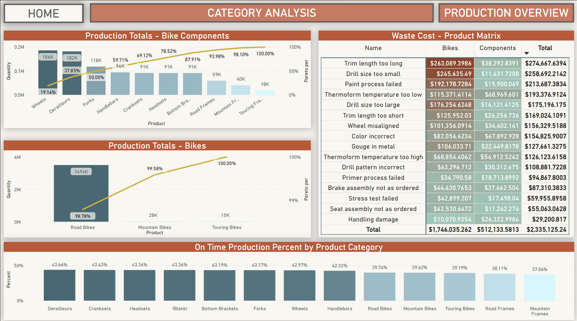
Pareto Charts
A Pareto chart is a Bar graph, the length of the chart represents frequency or cost, the longest bars are arranged on the left and the shortest to the right which amplifies the importance of the category with the highest bar. A line overlaps over the bar graph showing the percent contribution of the specific bar chart towards the total and the line accumulates the percent showing how many categories are important and consume most of the process. There are 2 Pareto Charts on this page, first is for the components required to manufacture a bike showing where most of the production is occupied and the other one is for the finished bike products showing categories of bikes produced.
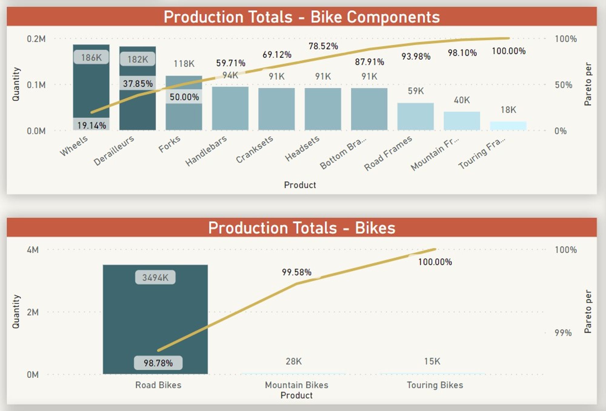
Waste Cost - Product Matrix Visual
The Matrix visual shows the reason where exactly the waste is costing money to the company and due to which reasons. The first column provides the reason for waste, while the other two columns are divided into two categories Bikes (Actual bikes wasted in production) and Components (Components of bikes wasted in production). The Cost is conditionally formatted showing which portion is costing more and the reason for it. There are subtotals on rows and columns and grand total for total waste money.
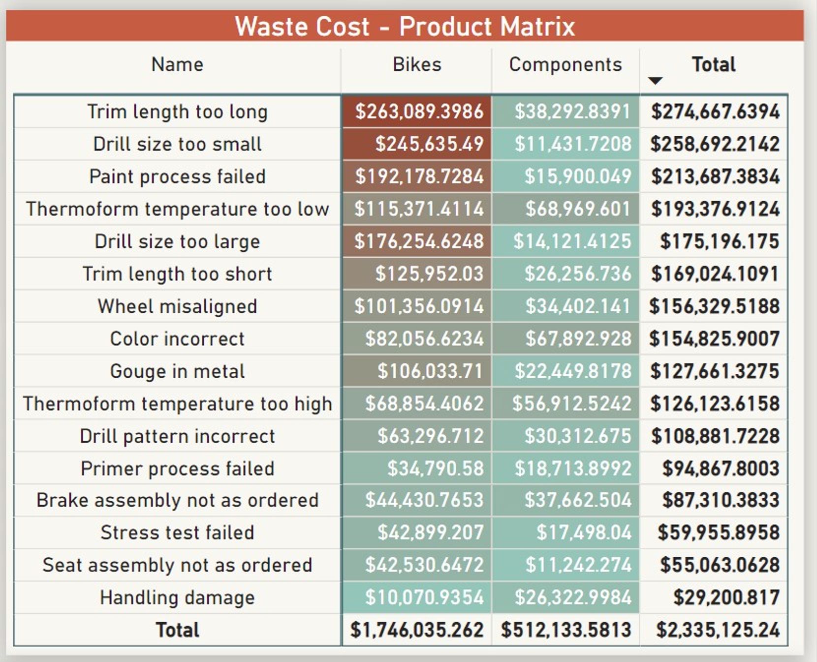
Bar chart
A simple bar chart showing how many Product categories are produced on time.
Another major component of the dashboard is the Inventory overview, although there is no data regarding the distribution supply chain in the database this analysis is done assuming the is one location.
Main Page
The overview includes 3 KPI's, 3 Filters to slice the data, and 2 charts.
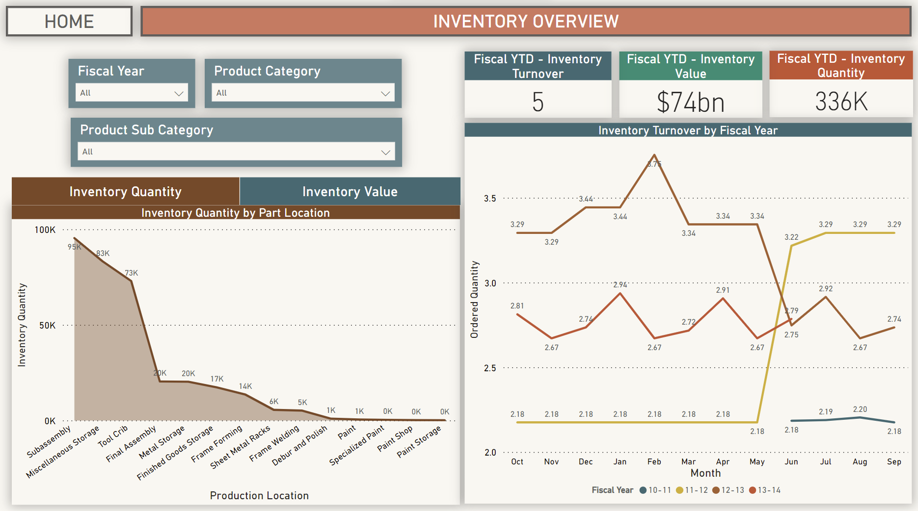
KPIs
Area Charts
Area charts showing how much Inventory quantity and Inventory value does the company hold by the Assembly location category are shown in the area chart. This shows which part of the manufacturing is holding most of the money and if the company is making the right choices of investing in those parts. There is a button on top of the chart so the end-user can choose if he wants to view the quantity or value on the chart.
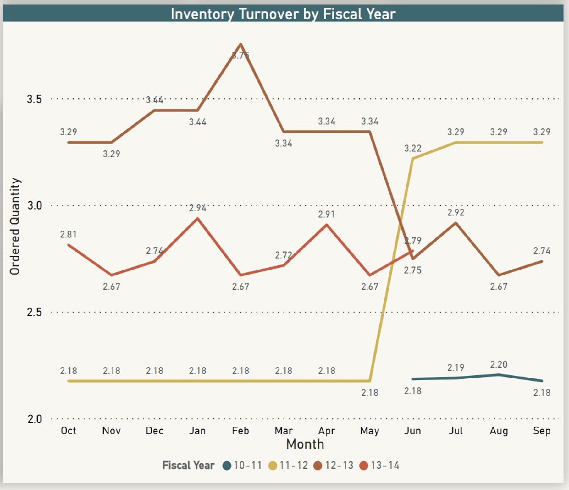
Inventory Turnover Multiline chart
Comparing inventory turnover on different fiscal years can show important data. It can help show the trends in previous years of how the inventory has been used and can help plan the production process in a better way.