React TreeSelect Component


npm install
npm start
http://localhost:8000/examples/
online example: https://tree-select-react-component.vercel.app/

| name | description | type | default |
|---|---|---|---|
| className | additional css class of root dom node | String | '' |
| prefixCls | prefix class | String | '' |
| animation | dropdown animation name. only support slide-up now | String | '' |
| transitionName | dropdown css animation name | String | '' |
| choiceTransitionName | css animation name for selected items at multiple mode | String | '' |
| dropdownMatchSelectWidth | whether dropdown's with is same with select. Default set min-width same as input |
bool | true |
| dropdownClassName | additional className applied to dropdown | String | - |
| dropdownStyle | additional style applied to dropdown | Object | {} |
| onDropdownVisibleChange | control dropdown visible | function | () => { return true; } |
| notFoundContent | specify content to show when no result matches. | String | 'Not Found' |
| showSearch | whether show search input in single mode | bool | true |
| allowClear | whether allowClear | bool | false |
| maxTagTextLength | max tag text length to show | number | - |
| maxTagCount | max tag count to show | number | - |
| maxTagPlaceholder | placeholder for omitted values | ReactNode/function(omittedValues) | - |
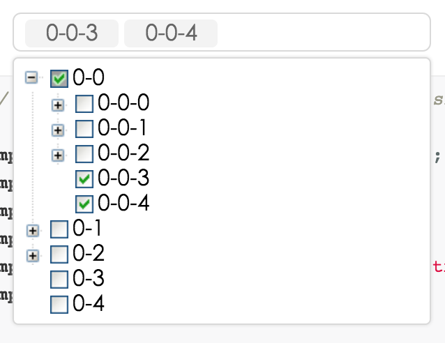
| multiple | whether multiple select (true when enable treeCheckable) | bool | false |
| disabled | whether disabled select | bool | false |
| searchValue | work with onSearch to make search value controlled. |
string | '' |
| defaultValue | initial selected treeNode(s) | same as value type | - |
| value | current selected treeNode(s). | normal: String/Array. labelInValue: {value:String,label:React.Node}/Array<{value,label}>. treeCheckStrictly(halfChecked default false): {value:String,label:React.Node, halfChecked}/Array<{value,label,halfChecked}>. | - |
| labelInValue | whether to embed label in value, see above value type | Bool | false |
| onChange | called when select treeNode or input value change | function(value, label(null), extra) | - |
| onSelect | called when select treeNode | function(value, node, extra) | - |
| onSearch | called when input changed | function | - |
| onTreeExpand | called when tree node expand | function(expandedKeys) | - |
| onPopupScroll | called when popup scroll | function(event) | - |
| showCheckedStrategy | TreeSelect.SHOW_ALL: show all checked treeNodes (Include parent treeNode). TreeSelect.SHOW_PARENT: show checked treeNodes (Just show parent treeNode). Default just show child. |
enum{TreeSelect.SHOW_ALL, TreeSelect.SHOW_PARENT, TreeSelect.SHOW_CHILD } | TreeSelect.SHOW_CHILD |
| treeIcon | show tree icon | bool | false |
| treeLine | show tree line | bool | false |
| treeDefaultExpandAll | default expand all treeNode | bool | false |
| treeDefaultExpandedKeys | default expanded treeNode keys | Array | - |
| treeExpandedKeys | set tree expanded keys | Array | - |
| treeExpandAction | Tree open logic, optional: false | click | doubleClick, same as expandAction of rc-tree |
string | boolean | click |
| treeCheckable | whether tree show checkbox (select callback will not fire) | bool | false |
| treeCheckStrictly | check node precisely, parent and children nodes are not associated | bool | false |
| filterTreeNode | whether filter treeNodes by input value. default filter by treeNode's treeNodeFilterProp prop's value | bool/Function(inputValue:string, treeNode:TreeNode) | Function |
| treeNodeFilterProp | which prop value of treeNode will be used for filter if filterTreeNode return true | String | 'value' |
| treeNodeLabelProp | which prop value of treeNode will render as content of select | String | 'title' |
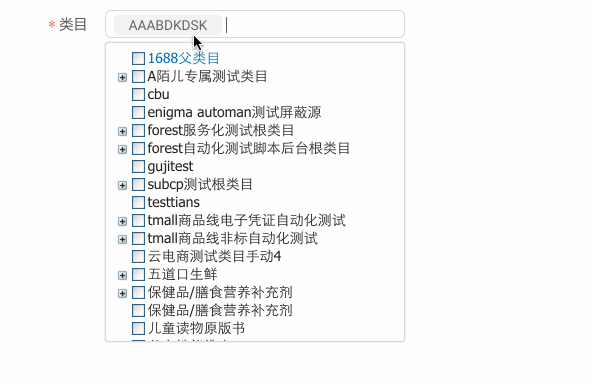
| treeData | treeNodes data Array, if set it then you need not to construct children TreeNode. (value should be unique across the whole array) | array<{value,label,children, [disabled,selectable]}> | [] |
| treeDataSimpleMode | enable simple mode of treeData.(treeData should be like this: [{id:1, pId:0, value:'1', label:"test1",...},...], pId is parent node's id) |
bool/object{id:'id', pId:'pId', rootPId:null} | false |
| loadData | load data asynchronously | function(node) | - |
| getPopupContainer | container which popup select menu rendered into | function(trigger:Node):Node | function(){return document.body;} |
| autoClearSearchValue | auto clear search input value when multiple select is selected/deselected | boolean | true |
| suffixIcon | specify the select arrow icon | ReactNode | (props: TreeProps) => ReactNode | - |
| clearIcon | specify the clear icon | ReactNode | (props: TreeProps) => ReactNode | - |
| removeIcon | specify the remove icon | ReactNode | (props: TreeProps) => ReactNode | - |
| switcherIcon | specify the switcher icon | ReactNode | (props: TreeProps) => ReactNode | - |
| virtual | Disable virtual when false |
false | - |
note: you'd better to use
treeDatainstead of using TreeNode.
| name | description | type | default |
|---|---|---|---|
| disabled | disable treeNode | bool | false |
| key | it's value must be unique across the tree's all TreeNode, you must set it | String | - |
| value | default as treeNodeFilterProp (be unique across the tree's all TreeNode) | String | '' |
| title | tree/subTree's title | String/element | '---' |
| isLeaf | whether it's leaf node | bool | false |
- Optimization tips(when there are large amounts of data, like more than 5000 nodes)
- Do not Expand all nodes.
- Recommend not exist many
TreeSelectcomponents in a page at the same time. - Recommend not use
treeCheckablemode, or usetreeCheckStrictly.
- In
treeCheckablemode, It has the same effect when clickx(node in Selection box) or uncheck in the treeNode(in dropdown panel), but the essence is not the same. So, even if both of them triggeronChangemethod, but the parameters (the third parameter) are different. (中文:在treeCheckable模式下,已选择节点上的x删除操作、和相应 treeNode 节点上 checkbox 的 uncheck 操作,最终效果相同,但本质不一样。前者跟弹出的 tree 组件可以“毫无关系”(例如 dropdown 没展开过,tree 也就没渲染好),而后者是 tree 组件上的节点 uncheck 事件。所以、即便两者都会触发onChange方法、但它们的参数(第三个参数)是不同的。)
http://localhost:8000/tests/runner.html?coverage
rc-tree-select is released under the MIT license.


![dependabot-preview[bot] avatar](https://avatars.githubusercontent.com/in/2141?v=4 "dependabot-preview[bot]")
![dependabot[bot] avatar](https://avatars.githubusercontent.com/in/29110?v=4 "dependabot[bot]")


![lgtm-com[bot] avatar](https://avatars.githubusercontent.com/in/17324?v=4 "lgtm-com[bot]")


 React
React
 Typescript
 Django
 Laravel
 Facebook
 Microsoft
 Google
 Alibaba
 D3
D3
 Tencent