React Select


- support IE11+,Chrome,Firefox,Safari
- Open select (focus input || focus and click)
- KeyDown/KeyUp/Enter to navigate menu
import Select, { Option } from 'rc-select';
import 'rc-select/assets/index.css';

export default () => (
  <Select>
    <Option value="jack">jack</Option>
    <Option value="lucy">lucy</Option>
    <Option value="yiminghe">yiminghe</Option>
  </Select>
);| name | description | type | default |
|---|---|---|---|
| id | html id to set on the component wrapper | String | '' |
| className | additional css class of root dom node | String | '' |
| data-* | html data attributes to set on the component wrapper | String | '' |
| prefixCls | prefix class | String | '' |
| animation | dropdown animation name. only support slide-up now | String | '' |
| transitionName | dropdown css animation name | String | '' |
| choiceTransitionName | css animation name for selected items at multiple mode | String | '' |
| dropdownMatchSelectWidth | whether dropdown's width is same with select | boolean | true |
| dropdownClassName | additional className applied to dropdown | String | - |
| dropdownStyle | additional style applied to dropdown | React.CSSProperties | {} |
| dropdownAlign | additional align applied to dropdown | AlignType | {} |
| dropdownMenuStyle | additional style applied to dropdown menu | Object | React.CSSProperties |
| notFoundContent | specify content to show when no result matches. | ReactNode | 'Not Found' |
| tokenSeparators | separator used to tokenize on tag/multiple mode | string[]? | |
| open | control select open | boolean | |
| defaultOpen | control select default open | boolean | |
| placeholder | select placeholder | React Node | |
| showSearch | whether show search input in single mode | boolean | true |
| allowClear | whether allowClear | boolean | { clearIcon?: ReactNode } |
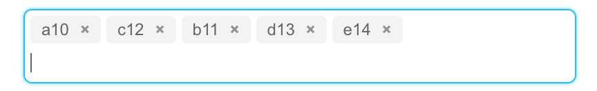
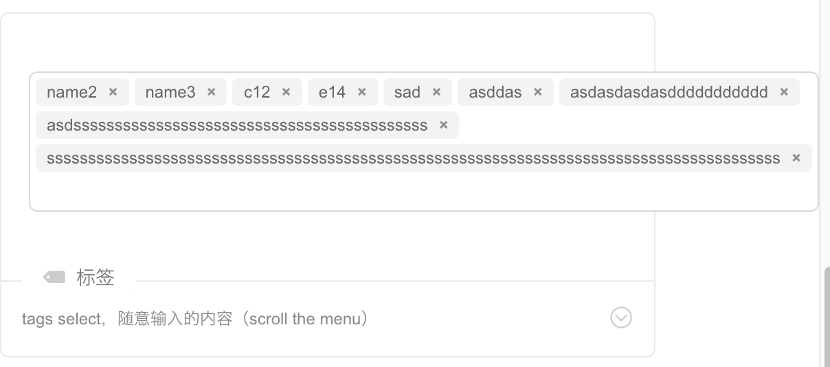
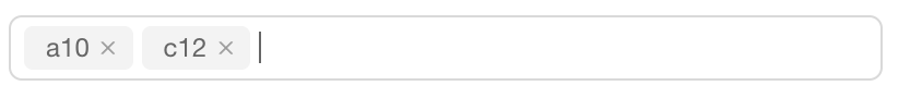
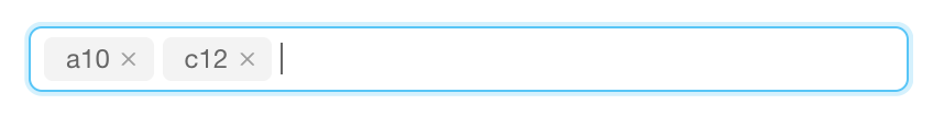
| tags | when tagging is enabled the user can select from pre-existing options or create a new tag by picking the first choice, which is what the user has typed into the search box so far. | boolean | false |
| tagRender | render custom tags. | (props: CustomTagProps) => ReactNode | - |
| maxTagTextLength | max tag text length to show | number | - |
| maxTagCount | max tag count to show | number | - |
| maxTagPlaceholder | placeholder for omitted values | ReactNode/function(omittedValues) | - |
| combobox | enable combobox mode(can not set multiple at the same time) | boolean | false |
| multiple | whether multiple select | boolean | false |
| disabled | whether disabled select | boolean | false |
| filterOption | whether filter options by input value. default filter by option's optionFilterProp prop's value | boolean | true/Function(inputValue:string, option:Option) |
| optionFilterProp | which prop value of option will be used for filter if filterOption is true | String | 'value' |
| filterSort | Sort function for search options sorting, see Array.sort's compareFunction. | Function(optionA:Option, optionB: Option) | - |
| optionLabelProp | render option value or option children as content of select | String: 'value'/'children' | 'value' |
| defaultValue | initial selected option(s) | String | String[] | - |
| value | current selected option(s) | String | String[] | {key:String, label:React.Node} | {key:String, label:React.Node}[] | - |
| labelInValue | whether to embed label in value, see above value type. Not support combobox mode |
boolean | false |
| backfill | whether backfill select option to search input (Only works in single and combobox mode) | boolean | false |
| onChange | called when select an option or input value change(combobox) | function(value, option:Option | Option[]) | - |
| onSearch | called when input changed | function | - |
| onBlur | called when blur | function | - |
| onFocus | called when focus | function | - |
| onPopupScroll | called when menu is scrolled | function | - |
| onSelect | called when a option is selected. param is option's value and option instance | Function(value, option:Option) | - |
| onDeselect | called when a option is deselected. param is option's value. only called for multiple or tags | Function(value, option:Option) | - |
| onInputKeyDown | called when key down on input | Function(event) | - |
| defaultActiveFirstOption | whether active first option by default | boolean | true |
| getPopupContainer | container which popup select menu rendered into | function(trigger:Node):Node | function(){return document.body;} |
| getInputElement | customize input element | function(): Element | - |
| showAction | actions trigger the dropdown to show | String[]? | - |
| autoFocus | focus select after mount | boolean | - |
| autoClearSearchValue | auto clear search input value when multiple select is selected/deselected | boolean | true |
| suffixIcon | specify the select arrow icon | ReactNode | - |
| clearIcon | specify the clear icon | ReactNode | - |
| removeIcon | specify the remove icon | ReactNode | - |
| menuItemSelectedIcon | specify the item selected icon | ReactNode | (props: MenuItemProps) => ReactNode | - |
| dropdownRender | render custom dropdown menu | (menu: React.Node) => ReactNode | - |
| loading | show loading icon in arrow | boolean | false |
| virtual | Disable virtual scroll | boolean | true |
| direction | direction of dropdown | 'ltr' | 'rtl' | 'ltr' |
| optionRender | Custom rendering options | (oriOption: FlattenOptionData<BaseOptionType> , info: { index: number }) => React.ReactNode | - |
| labelRender | Custom rendering label | (props: LabelInValueType) => React.ReactNode | - |
| maxCount | The max number of items can be selected | number | - |
| name | description | parameters | return |
|---|---|---|---|
| focus | focus select programmably | - | - |
| blur | blur select programmably | - | - |
| name | description | type | default |
|---|---|---|---|
| className | additional class to option | String | '' |
| disabled | no effect for click or keydown for this item | boolean | false |
| key | if react want you to set key, then key is same as value, you can omit value | String/number | - |
| value | default filter by this attribute. if react want you to set key, then key is same as value, you can omit value | String/number | - |
| title | if you are not satisfied with auto-generated title which is show while hovering on selected value, you can customize it with this property |
String | - |
| name | description | type | default |
|---|---|---|---|
| label | group label | String/React.Element | - |
| key | - | String | - |
| value | default filter by this attribute. if react want you to set key, then key is same as value, you can omit value | String | - |
| className | same as Option props |
String | '' |
| title | same as Option props |
String | - |
npm install
npm start
local example: http://localhost:9001/
online example: http://select.react-component.now.sh/
npm test
npm run coverage
rc-select is released under the MIT license.


![dependabot-preview[bot] avatar](https://avatars.githubusercontent.com/in/2141?v=4 "dependabot-preview[bot]")
![dependabot[bot] avatar](https://avatars.githubusercontent.com/in/29110?v=4 "dependabot[bot]")


 React
React
 Typescript
 Django
 Laravel
 Facebook
 Microsoft
 Google
 Alibaba
 D3
D3
 Tencent