#RKTabView - easy applicable toolbar/tabbar component for iOS
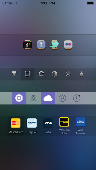
RKTabView provides the opportunity to create toolbars with customizable behavior, functions and appearance. Standard iOS components such as UITabBar or UIToolbar sometimes are not customizable as needed and always behave in a certain way. Unlike them, this component can be installed anywhere, anytime, but the most important thing - all elements appearance and behavior can differ. Imagine, that part of bar should work as UITabBar(one is on - others are off), elements of second part should work as switchers(any element can be turned on or off independently), third part - ordinary buttons. All this can be done with RKTabView.
##Features
###Elements and behavior
- element creation and behavior customization
Create elements of 3 types:
* Excludable element(Same as UITabBar elemets. One is on - others are off)
* Unexludable element (can be turned on or off independently)
* Button element (work as ordinary button)
To do this, use one of 3 initialization methods.
Initialization method require element images for "enabled" and "disabled" states.
"Button element" initialization method requires target and selector in addition.
- put elements to tab view easily:
No need to care about elements size, location and other appearance stuff. Passing elements array to tab view is enough. - tab view delegate:
Interaction implemented via delegate. Delegate parameter should be specified. Delegate methods tell which element (index of element) changes state.
###Appearance
- customizable view (RKTabView subclassed from UIView)
- bar items automatic location:
Bar area is divided equally betwen elements. All elements have the same height as tab view. - autoresize:
All elements are set up to adjust their sizes. - separator lines:
Option allows to draw top and bot separator lines to separate content. - customizable horizontal insets:
Distance between edges and content can be specified. - marking element:
Option allows to mark "enabled" elements with darker background. - selected backgound color:
Option allows to specify background color which will be applied to element when it gets "enabled" state. Can be specified for whole tab view or for separate elements. - elements background color:
Any element can have its own background color. - elements content:
Element image usually located in center and has it's original size.
###Titles
- titled elements:
Title can be cpecified for any element. - title font:
Title font can be cpecified for whole tab view or for separate elements. - title color:
Title font color can be cpecified for whole tab view or for separate elements.
##Adding to project
###Adding as pod
CocoaPods is the recommended way to use RKTabView in your project.
- Simply add this line to your
Podfile:pod 'RKTabView', '~> 1.0.0' - Run
pod install. - Include with
#import <RKTabView.h>to use it wherever you need.
###Adding manually
- Add
RKTabViewandRKTabItem.h .m files to your project (4 files total). - Include
RKTabView.h(#import "RKTabView.h").
##Usage
###Step 1 - Create tab items
There are 3 initialization methods for tab items. Each method used for specialized tab item type.
Create standard element (one is on - others are off) with 'createUsualItemWithImageEnabled:imageDisabled:' class method:
RKTabItem *tabItem = [RKTabItem createUsualItemWithImageEnabled:(UIImage *) imageDisabled:(UIImage *)];Create independent element (can be turned on or off independently) with 'createUnexcludableItemWithImageEnabled:imageDisabled:' class method:
RKTabItem *tabItem = [RKTabItem createUnexcludableItemWithImageEnabled:(UIImage *) imageDisabled:(UIImage *)];Disabled and enabled images should be specified. If enabled image is nil, disabled image will be used instead.
To make item instantly enabled set tabState property to TabStateEnabled.
Create button element with createButtonItemWithImage:target:selector: class method:
RKTabItem *tabItem = [RKTabItem createButtonItemWithImage:(UIImage *) target:(id) selector:(SEL)];Target and selector should be specified. This item works as an ordinry UIButton.
Items should be collected into an array and passed to tabItems property of RKTabView. See below.
###Step 2 - Create tab view
Initialize RKTabView using 'initWithFrame:andTabItems:' method:
RKTabView *tabView = [[RKTabView alloc] initWithFrame:(CGRect) andTabItems:(NSArray *)];You can use standard 'initWithFrame:' method and pass tabItems array later.
RKTabView *tabView = [[RKTabView alloc] initWithFrame:(CGRect)];
tabView.tabItems = @[item1, item2, item3, ...];
To display tab view add it to your view's as subview:
[self.view addSubview:tabView];Tab view can be created in Interface builder. Then you just have to pass items array to it.
###Step 3 - Implement delegate methods
Your delegate should conform to 'RKTabViewDelegate' protocol and have these methods implemented:
- (void)tabView:(RKTabView *)tabView tabBecameEnabledAtIndex:(int)index tab:(RKTabItem *)tabItem; - (void)tabView:(RKTabView *)tabView tabBecameDisabledAtIndex:(int)index tab:(RKTabItem *)tabItem;Delegate methods do not relate to "button" items. First method gets called for standard and unexludable items. Second - only for unexcludable items.
After tab view created you should specify delegate:
RKTabView *tabView = [[RKTabView alloc] initWithFrame:CGRectMake(0,0,320,44)]; tabView.delegate = self;###Customization
-
customize horizontal insets
To set distance between tab view content and edges set horizontalInsets property of RKTabView:tabView.horizontalInsets = HorizontalEdgeInsetsMake(70, 70);
-
draw separator lines at top and bottom
Set drawSeparators property to 'YES' to enable this option:tabView.drawSeparators = YES; -
mark enabled elements with darker background
Set darkensBackgroundForEnabledTabs property to 'YES' to enable this option:tabView.darkensBackgroundForEnabledTabs = YES; -
enabled backgound color
Background color for state "enabled" can be specified for whole tab view or for any separate element.
If you want same "enabled" color for all elements set enabledTabBackgrondColor property for tab view:tabView.enabledTabBackgrondColor = [UIColor redColor];If you want some element have individual "enabled" background color, then specify enabledBackgroundColor property for tab item:
tabItem.enabledBackgroundColor = [UIColor blueColor];Note: tabItem ignores tabView's "enabled" background color and uses it's own color if it is specified.
-
elements background color
To set it elements background color specify 'backgroundColor' propery:tabItem.backgroundColor = [UIColor redColor]; -
title
To set title for element set 'titleString' property for tab item:tabItem.titleString = @"Title";Title font and title font color can be specified both for tab view and tab item similiary as for "enabled background color". If tab item's properties specified, tabView's properties are ignored:
 tabView.titlesFont = [UIFont systemFontOfSize:9];
    ```
    ```objc
 tabView.titlesFontColor = [UIColor darkTextColor];
or
 tabItem.titleFont = [UIFont systemFontOfSize:9];
    ```
    ```objc
 tabItem.titleFontColor = [UIColor darkTextColor];
##Licence
RKTabView published under the MIT license:
Copyright (c) 2013 RafaelKayumov
Permission is hereby granted, free of charge, to any person obtaining a copy of this software and associated documentation files (the "Software"), to deal in the Software without restriction, including without limitation the rights to use, copy, modify, merge, publish, distribute, sublicense, and/or sell copies of the Software, and to permit persons to whom the Software is furnished to do so, subject to the following conditions:
The above copyright notice and this permission notice shall be included in all copies or substantial portions of the Software.
THE SOFTWARE IS PROVIDED "AS IS", WITHOUT WARRANTY OF ANY KIND, EXPRESS OR IMPLIED, INCLUDING BUT NOT LIMITED TO THE WARRANTIES OF MERCHANTABILITY, FITNESS FOR A PARTICULAR PURPOSE AND NONINFRINGEMENT. IN NO EVENT SHALL THE AUTHORS OR COPYRIGHT HOLDERS BE LIABLE FOR ANY CLAIM, DAMAGES OR OTHER LIABILITY, WHETHER IN AN ACTION OF CONTRACT, TORT OR OTHERWISE, ARISING FROM, OUT OF OR IN CONNECTION WITH THE SOFTWARE OR THE USE OR OTHER DEALINGS IN THE SOFTWARE.


 React
React
 Typescript
 Django
 Laravel
 Facebook
 Microsoft
 Google
 Alibaba
 D3
D3
 Tencent