Meteor Autoform Modals
Adds bootstrap modals to insert/update/remove docs from Meteor collections.
meteor add yogiben:autoform-modals- Include the template in the layouts that will use the modals
{{> autoformModals}} - Add a button to trigger the modal
##Example Button Markup##
<a href="#afModal" data-toggle="modal" class="btn btn-primary" collection="Posts" operation="insert" doc="mpb8f7m6x929DwTau">Add a new post</a>
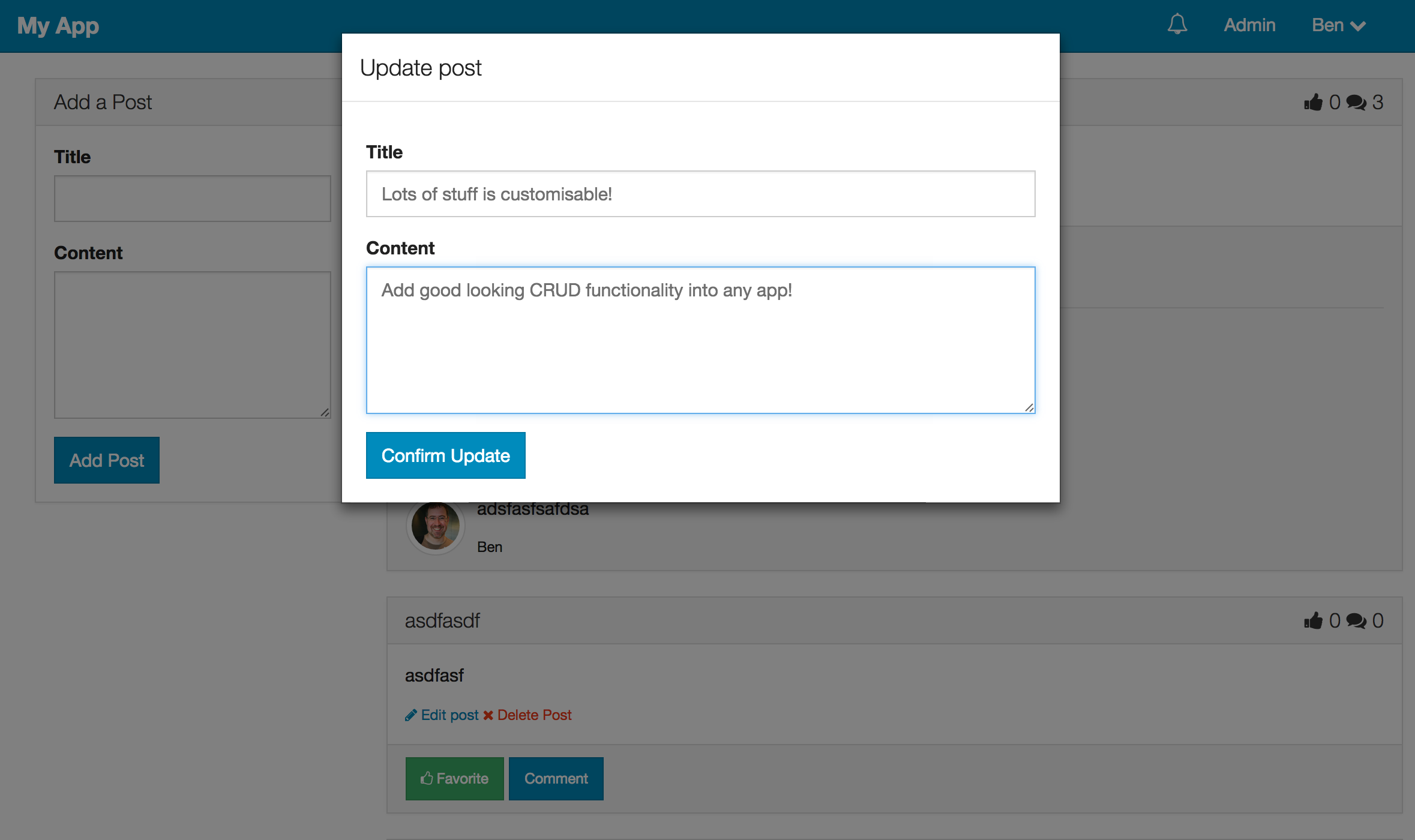
<a href="#afModal" data-toggle="modal" class="btn btn-primary" collection="Posts" operation="update" doc="{{_id}}">Update post</a>
<a href="#afModal" data-toggle="modal" class="btn btn-danger" collection="Posts" operation="remove" doc="mpb8f7m6x929DwTau">Delete post</a>
<a href="#afModal" data-toggle="modal" class="btn btn-primary" collection="Posts" omitFields="createdAt,owner,upvotes" operation="update" buttonContent="Update Challenger" prompt="Use this form to update your doc" title="Update your great content" buttonClasses="btn-success">Update your post</a>
##Usage##
Elements with href="#afModal" and data-toggle="modal" will trigger the modal.
The required attributes on this element are collection & operation.
Collection should be the name of the global collection object e.g. Posts.
Operation can be insert,update or remove.
If operation="update or operation="remove" you also need to set the doc property to the _id of the document.
It is possible to customise the modals by adding additional attributes to the href="#afModal" element that triggers the modal.
titlewill be the title of the modal (default to html of the button clicked)buttonContentis the html content of the modals' button (default to html of the button clicked)fieldsis a comma separated list of the only fields that should be in the form. See the autoform docs.omitFieldsis a comma separated list of fields to omit. See the autoform docs.buttonClassesallows you to add different classes to the submit button. See the autoform docs.prompta paragraph appears above the form / delete button. Defaults to 'Are you sure?' on delete.


 React
React
 Typescript
 Django
 Laravel
 Facebook
 Microsoft
 Google
 Alibaba
 D3
D3
 Tencent