Responsimple is a mobile first's grid system written 100% pure CSS code with awesome features
- A Simple Reset inspired by
- Paul Irish's * { Box-sizing: Border-box } FTW
- Zero Box Model * { margin:0; padding:0; }
- Nicolas Gallagher's normalize.css
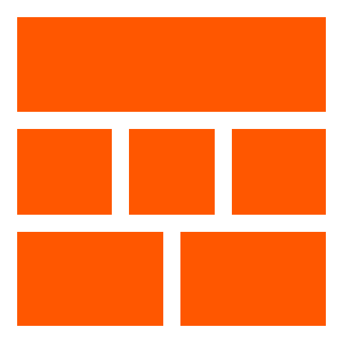
- Structure based on Containers & Items
- 2 Types of Containers:
- Container with page's width, use .container-full
- Container with 1200px's maximum width, use .container
- A Mobile First Grid System with 12 Columns & 4 Media Queries Sizes:
- Phones < (30em or 480px) use .ph1 to .ph12
- Small Devices < (48em or 768px) use .sm1 to .sm12
- Medium Devices < (64em or 1024px) use .md1 to .md12
- Large Devices > (64em or 1024px) use .lg1 to .lg12
- Layout's Multiple Techniques
- Floats
- Display inline-block
- Flexbox
- Additional Features:
- Vertical & Horizontal Alignments
- Font Sizes
- Margins & Paddings
- Borders & Displays
###Download or Install:
- responsimple.min.css 1.0.1
- responsimple on GitHub
- npm install responsimple
- bower install responsimple


 React
React
 Typescript
 Django
 Laravel
 Facebook
 Microsoft
 Google
 Alibaba
 D3
D3
 Tencent