


The official Nord website and documentation

Copyright © 2016-present Sven Greb


The official Nord website and documentation
Home Page: https://www.nordtheme.com
License: MIT License


![dependabot[bot] avatar](https://avatars.githubusercontent.com/in/29110?v=4 "dependabot[bot]")


Must be resolved after #17
Integrate Husky, the tool that make Git hooks easy and can prevent bad Git commits, pushes and more 🐶 woof!
The configuration file .huskyrc.js will be placed in the project root and includes the command to run for any supported Git hook. It will at least contain configs for the following hooks:
pre-commit - Run lint-staged (#17) before each commit (via lint-staged command) to ensure all staged files are compliant to all style guides..huskyrc.js configuration file.
The import/no-extraneous-dependencies rule allows to define a array of glob pattern that are allowed to define import devDependencies. In #15 the rule was overridden to include the project specific path **/.gatsby/** which whitelists all Gatsby specific scripts. Unfortunately this removes all glob pattern defined in the used eslint-config-arcticicestudio (rule is defined in the -base package) resulting in errors in other projects paths like tests.
This can be fixed by importing the paths defined in the preset from the eslint-config-arcticicestudio-base package and merge it with the additional **/.gatsby/** path.
Initialize the NPM package.json file that contains the project's metadata and dependency definitions.

For type validation and checking, Nord Docs will for the time being make use of React prop types through the prop-types package. This technique is sufficient for the beginning of the project and might be revised and refactored later on e.g. by migrating to TypeScript or integrating Flow. Details will be documented in related future epics.

This epic documents the design concept for the brand design & styling of Nord Docs.
🚧 This is a living document which means it is work in progress, not completed yet and will be extended!
The UI branding will be based and build on Nord's style ideas that tries to achieve a simple, uncluttered and clear design. It follows the approach of minimal and flat designed elements with an elegant and non-disturbing charisma.
All elements will adhere to a global site theme for a fluid transition between elements and a uniform appearance.
The main global theme will represent Nord's “bright_snow_flurry” aura that represents a light style with bright elements while “dark night frost” represents the darker aesthetic impression of Nord that is initially used for syntax and UI port projects.
Many fantastic design inspiration sources like Dribbble, Uplabs and awesome resources like Refactoring UI are part of Nord Docs the design and development process.
All implementation details and requirements are documented and tracked in the corresponding issues:
-
All styles will be implemented with the fantastic and one of the most popular CSS-in-JS libraries styled-components. It alows to use the power of JavaScript within CSS which was previously only possible via CSS pre-processors like Sass or LessCSS. It comes with builtin support to provide themes, the polished utility library to simplify the CSS styling and many more features.
Listing all of the great features is out-of-scope of this document. The well-written and really extensive documentation contains all information to get started and guides users through features and setups with tutorials.
All implementation details and requirements are documented and tracked in the corresponding issues:

This epic documents the design concept for the continuous deployment & hosting of Nord Docs with Netlify, a fantastic and one of the most popular services providing a single, simplified deployment workflow and a great hosting performance through a ultra-redundant global Application Delivery Network. They invest a lot into the open source community by hosting public projects for free with a lot of features like HTTPS with a free TLS certificate via Let's Encrypt, custom domain, automated preview deployments through integrations with GitHub and many more awesome features.
Listing all of the almost endless features is out-of-scope of this document. The well-written and really extensive documentation contains all information to get started. It also includes a lot of videos in sections to introduce a feature or guide the user through a setup with a tutorial.
🚧 This is a living document which means it is work in progress, not completed yet and will be extended!
All implementation details and requirements are documented and tracked in the corresponding issues:

Nord Docs will be hosted through Netlify with a custom domain, structured in the primary (apex/root/naked), the www subdomain and the Netlify domain. The primary domain will be the recommended Netlify hosting by using the www domain instead of using the naked domain.
To provide a even better insight and community integration, Netlify's great branch subdomain deployments will also be used, including deploy previews of pull requests.

To take full advantage of Netlify's ultra-redundant global Application Delivery Network (ADN), Nord Docs will used the managed DNS feature.
Nord Docs will use the fantastic continuous deployment features of Netlify. This is divided into the multiple deploy types: production-, branch- and preview.
All deployments are highly configurable to e.g. skip deployments on specific conditions, dependency caching, deploy contexts, build environment variables, language specific setup and many more.
During the major version zero (0.x.x*) the main development branch develop will be deployed including all of its branch & pull request deployments. This approach allows to always see the current development state of Nord Docs so the community can test the latest changes, give feedback, report bugs and submit enhancements suggestions.
Starting from the initial launch only the master branch will be deployed to the primary prodution domain to reflect tagged and stable release versions. The develop branch will continue to be available as branch subdomain to provide deployments of the latest development changes.
All deployments will also take advantage over the GitHub integration with fine-grained permissions.

To provide the best security for all users, Nord Docs will adapt to the up-to-date security standards and best practices by hosting the domain with HTTPS through Netlify's awesome free SSL support via the awesome Let's Encrypt project.
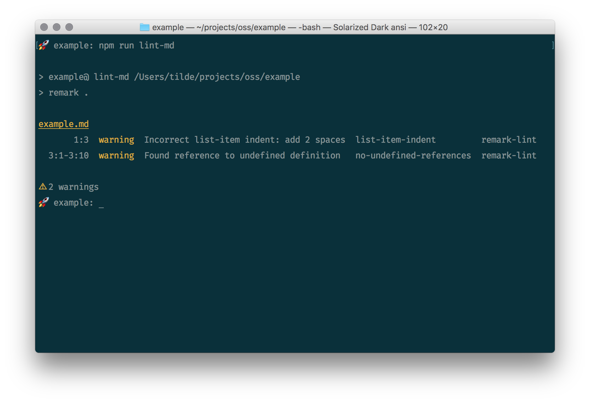
Integrate remark-lint which is built on remark, the powerful Markdown processor powered by plugins such as remark-lint.
Ensuring the markdown you (and contributors) write is of great quality will provide better rendering in all the different markdown parsers, and makes sure less refactoring is needed afterwards.
remark-lint can be used through remark-cli through a preset. This preset will be remark-preset-lint-arcticicestudio, the custom preset that implements the Arctic ice Studio Markdown Style Guide.
Since the custom preset is still in major version 0 note that the version range should be >=0.x.x <1.0.0 to avoid NPM's “SemVer Major Zero Caveat”. When defining package versions with the the carat ^ or tilde ~ range selector it won't affect packages with a major version of 0. NPM will resolve these packages to their exact version until the major version is greater or equal to 1.
To avoid this caveat the more detailed version range >=0.x.x <1.0.0 should be used to resolve all versions greater or equal to 0.x.x but less than 1.0.0. This will always use the latest 0.x.x version and removes the need to increment the version manually on each new release.
The .remarkrc.js configuration file will be placed in the project root as well as the .remarkignore file to also define ignore pattern.
To allow to run the Markdown linting separately a lint:md npm script/task will be added to be included in the main lint script flow.
devDependencies..remarkrc.js configuration file..remarkignore ignore pattern file.lint:md script/task.Add the EditorConfig file to define and maintain consistent coding styles between different editors and IDEs.
GitHub provides a feature to define multiple issue templates.
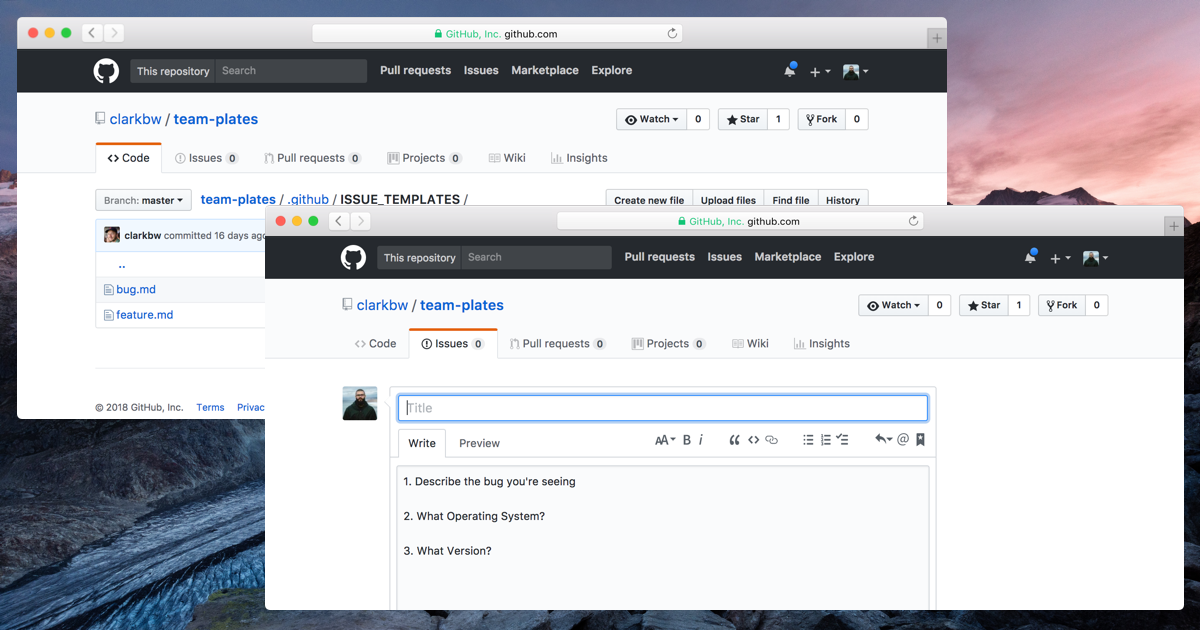
The initial template file that has been used when the feature was introduced can now be used as a fallback/generic template.

The UI helps users to open a new issue in projects by prompting them to choose from multiple issue types.
See the GitHub Help for more details about issue and pull request templates. Also check out how to manually create issue templates and a pull request template. There's also a guide on how to create the (deprecated) fallback/generic issue template.

Associated epic: #52
To start implementing components with responsive styled through media queries, a basic setup must be created based on the “Responsive Web Design” design concept.
To simplify the usage of media queries with styled-components, a utility function to generate media templates will be implemented. It'll use the min-width parameter to fulfill the used mobile-first approach. The base size that'll be used has been implemented as theme property in #54.
Always adjust media queries to the content individually and not vice-versa.
The design supports the content. Not the other way around.
Like documented in the #52, Nord Docs uses the mobile-first pattern and follows the great “Google Developer Responsive Web Design” guidelines. The recommended way is to create media queries not based on any device sizes but individually based on the content which is unique for each project. This is the best practice and, contrary to most popular CSS framework like Bootstrap, the correct way since each site is different and there are thousands of devices and in the future new sizes will appear.
The first media query template will define the smallest min-width.
generateMediaQuery media query generator function.min-width.

Related epics: #25
Gatsby comes with an already optimized Babel configuration to create SSR “static” websites and apps, but there are also use cases that require to modify and extend this configuration to e.g. add a new Babel plugin for the latest syntax feature/proposal support.
Of course Gatsby provides a way through the Node API by implementing the onCreateBabelConfig function.
Nord Docs will make use of the following proposals and plugins:
@babel/plugin-proposal-class-properties (NOTE: This plugin will be configured with the enabled loose option!)@babel/plugin-proposal-export-default-from@babel/plugin-proposal-nullish-coalescing-operator (NOTE: This plugin will be configured with the disabled loose option!)@babel/plugin-proposal-optional-chaining (NOTE: This plugin will be configured with the disabled loose option!)propTypes from production builds. NOTE: This plugin will only be used in production mode with enabled removeImport option and will ignore the node_modules folder through the ignoreFilenames option!The plugins and Babel options will be implemented using Gatsby's provided actions setBabelPlugin and setBabelOptions.
setBabelPlugin API function.babel-plugin-transform-react-remove-prop-types for production build via the setBabelOptions API function.The Webpack resolve alias pages for Gatsby pages is configured to the invalidsrc/components/pages path instead of the correct src/pages path.

Related epics: #38
To start writing tests the basic testing environment must be set up. As also mentioned in #38, Nord Docs requires some special changes when it comes to the testing setup because of Gatsby. Apart from that the setup is the same like in most projects and is also documented in the official Jest docs.
The scope of this issue is to get started to write unit tests. Of course, Gatsby provides a extensive documentation and great guides for this setup which will be implemented for Nord Docs.

The first step is to get Jest up and running which is quite easy since it works out-of-the-box™ after installing the main package jest.
This step is documented in the sections “Setting up your environment” of the Gatsby guide and the Jest docs about how to get started.
The main configuration file jest.config.js will be placed in the project root and initially contains the following options:
coverageDirectory - The path to the directory where all coverage reports will be placed. It'll be set to the main build directory within the reports sub-directory.collectCoverageFrom - To ensure only relevant files are included in the coverage stats this array will set paths to find sources to measure the coverage from.globals - This will include the __PATH_PREFIX__ variable which is usually set by Gatsby, and which some components need.moduleNameMapper - A map from regular expressions to module names that allow to stub out resources, like images or styles with a single module while also allows to set up resolve aliases which will reflect the same setup like the ones configured for Webpack in #31.modulePaths - This will include paths to additional locations to search when resolving modules which is useful to define test specific utils which can then be imported like a aliased module.setupFiles - This also includes setup scripts that'll be run to configure and set up tests (executed before setupTestFrameworkScriptFile) and will initial include a shim mock for the ___loader function used by Gatsby.setupTestFrameworkScriptFile - The setup file that'll be run to configure or set up the testing framework before each test. It'll import and run the cleanup function of react-testing-library and jest-dom's custom matchers to extend the expect global.testPathIgnorePatterns - Paths for files that'll be ignored when matching test files have been found.transform - Contains regex matcher for files that will be transpiled with Babel first before run them with Jest. See the “Use Jest with Babel” section below for details.transformIgnorePatterns - This is required since Gastby includes un-transpiled ES6 code and by default Jest doesn’t try to transform code inside node_modules, therefore the gatsby-browser-entry.js isn't transpiled before running Jest so the gatsby module must be excluded.
To write tests using the latest ECMAScript syntax and proposals, Babel must be in place and set up to transpile the sources before passing them to Jest to run them.
This step is documented in the sections “Creating a configuration file for Jest” of the Gatsby guide about the preprocess file and the Jest docs about using babel.
The main Babel configuration file babel-config.js will be placed in the base test folder within the project root. It'll initially use the babel-preset-gatsby preset package which includes all necessary Babel plugins to write tests for Gatsby based projects. This includes all plugins mentioned in the Jest Babel setup guide and additionally adds useful syntax proposal plugins that are also used in the project sources like e.g. babel-plugin-proposal-class-properties and babel-plugin-proposal-optional-chaining.
The the custom transformer will be exported using babel-jest's createTransformer function which takes the created Babel config object as parameter.
react-testing-library provides a function to get elements by an test ID using the data-testid property (attribute) that can be added to any React component's JSX so it can be easily queried in tests. Note that this should only be done when there is no other way which is documented in the guiding principles!
Since this property is only relevant for test purposes it should and will be removed for production builds using the babel-plugin-react-remove-properties package that'll be included in Gatsby's Babel configuration and loaded when in production mode.


Like documented in #38, Nord Docs will use the awesome react-testing-library by Kent C. Dodds to render React components and test them with a bunch of useful DOM utils. Nord Docs testing principle is based on the concept of the author to not test implementation details for UIs but see your app/website only from the sight of the user.
The setup documentation provides instruction for best practices on how to configure the library for a optimal and easy developer workflow. This includes a global configuration that'll be added and loaded via Jest's setupTestFrameworkScriptFile option and will be placed within the test base directory named setup.js.
Initially it'll import the react-testing-library/cleanup-after-each script which will automatially execute afterEach(cleanup) for each test which prevents unnecessary boilerplate per test file and possible problems when the function is not called accidentally. It'll also import jest-dom/extend-expect to automatically extend the expect global with jest-dom's custom matchers.
Like documented in Gatsby's official testing setup guide there are some configurations that are specific to Gatsby projects. One is the global ___loader function used by Gatsby which must be mocked using Jest's fn() mocking function. The ___loader.js file will be created in a folder called __shims__ within the base test directory.
With Webpack, there are many loaders available to load any kind of file type, e.g. CSS or Sass/Less for styles and images/videos of many types. Jest doesn't know how to handle these when these are imported within source files that are normally processed by Webpack so it'll throw errors during the import.
A Jest mock is a dummy module that is used instead of the real module inside tests. It is good when there are something that you can’t or don’t want to test. Almost everything can be mocked and the examples are assets rather than code. For stylesheets, there is a package called identity-obj-proxy which is also already configured for this project. For all other assets a manual mock will be created called file.js that'll be created in a new __mocks__ folder within the base test directory.
To configure Jest to use these mocks the matching regex for the files will be added to the moduleNameMapper option.
Since Jest makes use of the globally provided functions, ESLint's environment must be configured to know that Jest is used in the project. This can easily be done by adding the jest: true property to the env option in the .eslintrc.js config file.
To allow to run all tests with various options there will be some new NPM scripts:
test - Run all tests with Jest.test:cov - Run all tests with coverage reports.test:watch - Run all tests in Jest's watch mode.jest.config.js)test/babel-config.js)test/setup.js) for react_testing-library and jest-domjest environment<Fragment>)
This issue handles the integration of the typefaces documented in the “Typograhpy” design concept. All fonts will be included through the great typefaces project that provides NPM packages for almost all open source fonts to simply add and import them in web & Node based projects.
Install the main stylistic and visualization sans-serif font Rubik through the typeface-rubik package.

Install the sans-serif font Inter UI for documentations, technical and factual content through the inter-ui package. Note that the font is currently not available through Google Fonts yet, but might be added in the future very soon due to its large popularity and perfect implementation.


Install the main monospace font Source Code Pro for all code elements through the typeface-source-code-pro package.


In order to use the fonts is must be added to Nord Docs theme. It will define all used font families and the basic typography properties and values like the font size and units based on the used modular scale documented in #2.

Associated epic: #51
This issue handles the implementation of the React.Context provider and consumer for the global theme modes. It will provide the name of the currently active theme and a function to toggle the active theme.
Both the context consumer and provider components will be implemented in the Root core container component. The consumer will be exported which can then be imported in any component to consume the provided values.
The Root component will be changed from a SFC to a class component to store the currently active state and handle the theme mode toggle logic through a function. It will also migrate the currently used simple styled-component theme (provided through the <ThemeProvider component) to the styled-theming theme that provides the initially implemented theme (#53).
To persist the current active theme mode when changing the route (which unmounts the Root component and therefore resets the state), the value will be written to the browser's session storage. The storage type has been preferred over the local storage since this would persist the active theme mode even when the user closes the tab, but the desired behavior is to optimize the site for the “bright snow flurry” aura theme mode.
To simplify the read- and write handling as well as prevent possible errors due to wrong storage keys, two utility functions will be implemented: readSessionCache(key : string) and writeSessionCache(key : string, value : any).
readSessionCache and writeSessionCache utility functions.Root core container as class-based component.
state.state with the theme mode stored in the session storage on component instantiation.theme to the GlobalStyle component for global theme styles.
Must be resolved before #16
Integrate ESLint, the pluggable and de-facto standard linting utility for JavaScript.
The configuration preset that will be used is eslint-config-arcticicestudio which implements the Arctic Ice Studio JavaScript Style. It it built on top of eslint-config-arcticicestudio-base and includes various rules of the following plugins:
Since the custom preset is still in major version 0 note that the version range should be >=0.x.x <1.0.0 to avoid NPM's “SemVer Major Zero Caveat”. When defining package versions with the the carat ^ or tilde ~ range selector it won't affect packages with a major version of 0. NPM will resolve these packages to their exact version until the major version is greater or equal to 1.
To avoid this caveat the more detailed version range >=0.x.x <1.0.0 should be used to resolve all versions greater or equal to 0.x.x but less than 1.0.0. This will always use the latest 0.x.x version and removes the need to increment the version manually on each new release.
To allow to lint all valid Babel code babel-eslint will be included and specified as main parser. Also to make use of the latest experimental Babel features and proposals eslint-plugin-babel will be added:
babel/camelcase with level error - doesn't complain about optional chaining (let foo = bar?.a_b;). Note that the core rule camelcase must be disabled!babel/no-unused-expressions with level error - doesn't fail when using do expressions or optional chaining (a?.b()). Note that the core rule no-unused-expressions must be disabled!See the documentation of provided rulesand required configurations to use them.
The .eslintrc.js configuration file will be placed in the project root next to the .eslintignore file to define ignore pattern. Initially it will specify the environments which define global variables that are predefined:
browser - browser global variables.node - Node.js global variables and Node.js scoping.To prepare for a better developer experience with Webpack (that will be used later on through Gatsby) the resolvers of the eslint-plugin-import will be configured for the src and src/components paths.
Due to compatibility problems and message noise the no-confusing-arrow rule will be disabled. It can be re-enabled again when the used preset handles the problem or disables the rule too.
Also to suppress errors in the future with Gatsby the import/no-extraneous-dependencies will also be overridden (still error level) by adding the devDependencies option and add the exception for ./.gatsby/**/*.js. This allows to use development dependencies in Gatsby configuration files without linting errors since these are necessary and some will be provided by Gatsby itself without being explicitly added to the package.json.
To allow to run the JavaScript linting separately a lint:js npm script/task will be added to be included in the main lint script flow. To use the great auto-fixing feature another format:js script/task will be added.
devDependencies:
.eslintrc.js configuration file.
node and browser environmentsno-confusing-arrow ruleimport/no-extraneous-dependencies rulebabel/no-unused-expressions and babel/camelcase rules including the deactivation of their associated core rules.babel to the array of enabled plugins..eslintignore ignore pattern file.lint:js and format:js scripts/tasks.
Must be resolved after #14 #15 #16
Must be resolved before #18
Integrate lint-staged to run linters against staged Git files to prevent to add code that violates any style guide into the code base.
The configuration file lint-staged.config.js will be placed in the project root and includes the command that should be run for matching file extensions (globs). It will include at least the three following entries with the same order as listed here:
prettier --list-different - Run Prettier (#16) against *.{js,json,jsx,mdx,yml} to ensure all files are formatted correctly. The --list-different prints the found files that are not conform to the Prettier configuration.eslint - Run ESLint (#15) against *.{js,jsx} to ensure all JavaScript files are compliant to the style guide after being formatted with Prettier.remark --no-stdout - Run remark-lint (#14) against *.md to ensure all Markdown files are compliant to the style guide. The --no-stdout flag suppresses the output of the parsed file content.lint-staged.config.js configuration file.
Related epics: #46
This issue documents a part of the implementation of the hosting & continuous deployment concept with Netlify's configuration file.
See the “Hosting” and “Continuous Deployment” (sub)sections for more details about the architecture.
netlify.toml configuration file
command for the production [build] sectionpublish path for the production [build] section
This epic documents the design concept of Nord Doc's web development architecture and serves as a plan for the initial launch.
It defines the process steps of the three key criteria.
🚧 This is a living document which means it is work in progress, not completed yet and will be extended!
JAMstack: noun \’jam-stak’
Modern web development architecture based on client-side JavaScript, reusable APIs, and prebuilt Markup.
It is not about specific technologies, but a new way of building websites and apps that delivers better performance, higher security, lower cost of scaling, and a better developer experience.
A project is built with the JAMstack if it meets the three key criteria JavaScript, APIs and Markup:
Any dynamic programming during the request/response cycle is handled by JavaScript, running entirely on the client. This could be any frontend framework, library, or even vanilla JavaScript.
All server-side processes or database actions are abstracted into reusable APIs, accessed over HTTPS with JavaScript. These can be custom-built or leverage third-party services.
Templated markup should be prebuilt at deploy time, usually using a site generator for content sites, or a build tool for web apps.
For detailed information check out the official website that provides information about how projects can adapt to it, best practices, examples, resources and a great community.
Implementation issues: #25
Any dynamic programming during the request/response cycle is handled by JavaScript, running entirely on the client. This could be any frontend framework, library, or even vanilla JavaScript.
We 💙 React!
All web related projects we've developed are built with React and we're not alone. React is not just a trend, it's more like a new standard how the web is built. It revolutionized the way to think about the components a website is made of and how to compose and orchestrate them to form a fluid running unit. It's finally a new way to solve the complicated topic of state handling and the most performant technique to update only necessary parts of the DOM without the large overhead to re-render it completely every time.
React describes itself as…
Next to this React can also render on the server using Node and power mobile apps using React Native.
There are so many more arguments and we think all most every developer heard or read about it so this little summary here is only a small introduction.
If you like to get to know more about React your first touchpoint should be the official website and their extensive and absolute fantastic docs, tutorials and blog. They are maintained and well-written by the React core team itself and the contributors from one of the largest open source community. They are made with a flat learning curve in mind to be very beginner-friendly but at the same time are the main source for every advanced and experienced React developer. They increase the degree of knowledge up to deep-dives into the heart of React and include many great articles about best practices, how to increase the performance and maintainability of apps, the latest features and updates from the React ecosystem, tips & tricks of the core team and many more.
Nord Docs will be built with the currently latest stable version 16.6 and will update and adapt to upcoming features like e.g. Hooks and Async Rendering when they become stable to always enhance the project and code base.
All implementation details and requirements are documented and tracked in the corresponding issues:

Implementation issues: #25
The plan is to make use of the official GitHub GraphQL API (v4) to get data about all Nord projects which can then be used to e.g. show the actual count of stars, the latest release version, interact with issues and pull requests and many more. There are also GitHub Apps that allow to work and interact with the projects.
More APIs might be added later on for many more flexible data fetching using the awesome GraphQL API provided by Gatsby (implemented in #25).

Implementation issues: #25
This criteria is the actual content of a website.
Gatsby (#25) allows to use Markdown for it. This comes with the nice side effect that the already existing documentations can simply be adapted and reused, but unfortunately it is limited to it's reduced and simplified syntax.
To use the great power of React this project will make use of the MDX specification, a new language and abstract syntax tree definition.
In order to ensure a vibrant ecosystem and community, tooling needs to exist for formatting, linting, and plugins. This tooling requires a foundational specification and abstract syntax tree so that parsing is properly handled before transforming to JSX/Hyperscript/React/etc and potentially leveraging existing plugin ecosystems.
We will use the official implementation, the fully-featured MDX parser, loader and JSX renderer to allow to seamlessly use JSX in Markdown documents by importing components and export metadata or any other ECMAScript compliant data structures like frontmatter.
- 💻 Everything is a component: Use existing components inside your MDX and import other MDX files as plain components.
- 🔧 Customizable: Decide which component is rendered for each Markdown element ({ h1: MyHeading }).
- 📚 Markdown-based: The simplicity and elegance of Markdown remains, you interleave JSX only when you want to.
- 🔥 Blazingly blazing fast: MDX has no runtime, all compilation occurs during the build stage.
More details are provided through the official website that includes docs to get started, usage examples and advanced configuration and customization information.
This epic documents the design concept of the static site generator that'll be used to build Nord Doc's and serves as a plan for the initial launch. It defines the process steps to decide about aspects like the Gatsby core configuration, Gatsby API implementations, required Gatsby plugins, custom configurations for Babel and Webpack and many more.
🚧 This is a living document which means it is work in progress, not completed yet and will be extended!
Gatsby is a blazing fast modern site generator to build secure, modern and blazing fast websites and apps with React. It is fully compliant to JAMstack which is the web development architecture used to built Nord Docs as documented in #24.

Gatsby is much more than just a static “site” generator powered by React as explained by the founder and core team members:
It produces static HTML and then rehydrates into a React app.
Think of it as an opinionated CRA with built-in SSR and nice integrations with CMS.
Gatsby is also there to build apps. — Kyle Mathhews, Founder of Gatsby
Gatsby can handle apps with:
- User authentication? ✅
- Dynamic data? ✅
- Asynchronous requests? ✅
- Ecommerce? ✅
- Full-blown SaaS? ✅
You can do SO MUCH MORE than static sites with Gatsby. — Jason Lengstorf , Gatsby Core Team Developer
There are countless more features, but it is out of scope for this document to introduce these here. Instead, make sure to check their official project website with the extensive, well-written docs and really intense and beginner-friendly tutorials. It also includes a large overview and comparison of all features, a plugin library and inspiring showcases.
In their blog they publish a lot of great guides, tips & tricks and articles like how Gatsy got so popular that they founded Gatsby Inc. and blog posts about the companies feature plans and values.

To build Nord Docs with Gatsby there are several process steps that must be planned and implemented. This section splits it up into categories and theirs tasks that will be documented and tracked within this epic.
The core configuration of Gatsby is the gatsby-config.js file that will be placed in the project root. It will define project-wide site metadata that can be used through the GraphQL API and configures all plugins that will be used.
All implementation details and requirements are documented and tracked in the corresponding issues:
Gatsby can be customized and extended to the core by providing…
gatsby-config.js file placed in the project root.gatsby-ssr.js file placed in the project root.gatsby-browser.js file placed in the project root.All APIs come with a collection of functions called “Actions” that can be used to manipulate the build.
For more details make sure to read the API specification and philosophy and references for the GraphQL API.
All implementation details and requirements are documented and tracked in the corresponding issues:
Gatsby is designed to be easily extensible while being functional out-of-the-box™. This is possible by using the powerful plugin API to simply create own plugins or browse the plugin library since there is already a large ecosystem and a plugin for almost everything.
Nord Docs will make use of various plugins to implement features and simplify the code base for a better developer experience.

All implementation details and requirements are documented and tracked in the corresponding issues:
Gatsby comes with an already optimized Babel configuration to create SSR “static” websites and apps, but there are also use cases that require to modify and extend this configuration to e.g. add a new Babel plugin for the latest syntax feature/proposal support.
Of course Gatsby provides a way through the Node API by implementing the onCreateBabelConfig function.
All implementation details and requirements are documented and tracked in the corresponding issues:
This is almost the same like the section above about how to modify and extend the Babel configuration but now for Webpack instead of Babel. This can be necessary to e.g. add a builtin or third-party plugin or to add resolve aliases. For sure Gatsby supports this too by providing the onCreateWebpackConfig function through the Node API.
All implementation details and requirements are documented and tracked in the corresponding issues:
This issue documents Nord typography design concept and serves as a plan for the initial launch.
It defines the process steps to decide about all typography aspects like the font face, base sizes, usage within components/themes and the modular scale(s).
All implementation details and requirements are documented and tracked in the corresponding issues:
🚧 This is a living document which means it is work in progress, not completed yet and will be extended!
To achieve a uniform design across Nord and its brand the main font face and font stack will be friendly and warm for visual elements while being simple and allow users to stay focused on the actual content, e.g. documentations or blog posts.
All fonts that will be used are open source like Nord itself.
The main stylistic and visualization sans-serif type will be Rubik. With its slightly rounded corners it conveys a smooth appearance which matches the overall design of Nord visual elements. Nunito was also a possible choice, but Rubik provides a bit more strength due to its thicker glyphs which improves the mode of expression and the better recognizability.
For documentations, technical and factual content a more straight and clear font will be used. This led to the brilliant open source font family Inter UI, a typeface specially designed for user interfaces with focus on high legibility of small-to-medium sized text on computer screens.
The family features a tall x-height to aid in readability of mixed-case and lower-case text. Several OpenType features are provided as well, like contextual alternates that adjusts punctuation depending on the shape of surrounding glyphs, slashed zero for when you need to disambiguate "0" from "o", tabular numbers, etc.
The font is well designed and thought out to provide a consistent and clear typographic feel.
Other types in the shortlist that were considered as font families:
The main mono spaced type will be Source Code Pro. It is also a well-designed and popular font proven to be easy-on-the-eyes with slightly rounded glyphs while keeping a good feeling of a consistent and uniform character baseline with a balanced spacing.
In order to provide easy legibility, without the need to zoom or increase the font size manually, the browser's default root font size of 16px will be kept, but the main font size will be scaled to 18px using the modular scale factor like documented in the section below. All other values will be calculated based on this size using the rem and em units. There are some exceptions where the px unit will be used, e.g. small and static sizes.
The modular scale that Nord Docs will use is “major second”. It stands for a ratio of 1.125. There will only be one base of 1em which depends on the used root HTML font size of 16px.
Thanks to Google Design for their great and well-written Typography Library. Good starting points are the articles “Choosing Web Fonts: A Beginner’s Guide” and “Space Mono's Retro-Future Voice”.
Not to forget the awesome Google Fonts library to crawl through for inspirations.
Another fantastic information and inspiration origin is Material Design. It provides an extensive knowledge base for almost all details for UI and web design. Their Material Studies also makes use of the Rubik font within the Shrine and Owl studies.
The Inter UI font family website provides a great interactive collection of samples to see how the font works in production and also a lab to test various font settings and features.

This epic documents the design concept for the React function and class components of Nord Docs. The architecture and project structure is documented in the “Component & Project Structure” design concept.
🚧 This is a living document which means it is work in progress, not completed yet and will be extended!
🚧 This section is work in progress, not completed yet and will be extended!
All implementation details and requirements are documented and tracked in the corresponding issues:
🚧 This section is work in progress, not completed yet and will be extended!
All implementation details and requirements are documented and tracked in the corresponding issues:
-This is the regular batch update for outdated dependencies and actually the first one for this project 😄
Anyway, it is also a important update since it includes updates for the hijacked package
event-stream that includes malicious code which has been revealed yesterday. Nord Docs is affected passively because the package is a traverse dependency of the used package npm-run-all. The maintainer has reacted quickly and released the fix version 4.1.5.
Note that packages marked with an ❗ have been affected by the security incident!
2.0.50 ➔ 2.0.552.0.8 ➔ 2.0.91.1.4 ➔ 1.2.08.0.5 ➔ 8.1.04.1.3 ➔ 4.1.50 ❗


Related epics: #43
This issue documents the implementation and configuration of the workflow for the continuous integration & testing concept with Circle CI, Travis CI and Codecov.
All tasks of the workflow are documented in the design concept (#43).
Like also documented in #43 the integration of the CI and coverage services with GitHub requires to configure the rules for protected branches. See the design concept for more details.
.circleci/config.yml configuration file for Circle CI.jest-junit reporter.travis.yml configuration file for Travis CI.
Associated epic: #51
This issue handles the implementation of the basic theme styles like font and background colors. They will be initially used in the global theme styles implemented in #53.
background and font CSS module styles.background-color and color in global CSS theme styles.
transition for both attributes to ensure a smooth theme mode transition.Related epics: #26
The Root core container is the first and one of the important main data provider React components of this project. It represents the base element and entry point that wraps the all custom application components and serves as a data provider later on. Some of the tasks in the future will be to
ThemeProvider componentcreateglobalstyle function including typography (#2) related data like application-wide used fontsRoot that renders the passed children within a React.Fragment.Landing root/index page component and render an self-closing Root component.
Associated epic: #69
This issue documents the implementation of the core atom A that represents the inline text semantic HTML element <a>. This is a special dynamic and failsafe component since it'll internally use Gatsby Link component to route within the site (internal links) while also being able to link to external data.
To handle the logic of conditionally rendering a Gatsby Link or a basic <a>, based on the passed target URL (internal & external), utility functions will be implemented to evaluate the passed target.
A.
Related epics: #25
This story is almost the same like the modified Babel configuration implemented in #29, but for the Webpack configuration instead. It will be used to
Gatsby also supports this by providing the onCreateWebpackConfig function through the Node API.
src/assetssrc/atomssrc/configsrc/containerssrc/datasrc/layoutssrc/moleculessrc/organismssrc/pagessrc/storessrc/stylessrc/templatessrc/utilsgit-revision-webpack-plugin to provide the version, commit hash and branch as environment variables through through the webpack.DefinePlugin.webpack-bundle-analyzer to generate a "static" report with a JSON stats file stored in a newly created build directory within the project root.Add a Git mailmap file to link to in documentations to allow contributors to send mails regarding security issues. This prevents unnecessary overhead of updating all documents when new core team and members and contributors are added and additionally adds the main functionality of the file: Mapping commits when someone uses a different email address.

This epic documents the project concept and serves as a plan for the initial launch. It defines the web design process in several steps this project will go through. It is also the main issue to track all related sub-epics that contain detailed documentations about the concepts described in this issue.
🚧 This is a living document which means it is work in progress, not completed yet and will be extended!
The main reason to start this project is to create a „single source of truth“ for information, assets and resources of the Nord project and all of its ports. There are currently more than 35 repositories providing ports of Nord to various applications and platforms where each project is mostly self-contained regarding its source and documentation. However, there is always a correlation to the main project, the color palette itself, that makes it necessary to link between repositories or even include some assets of these.
On the other hand, the main repository need to keep references to all of its port projects making it time consuming to adapt to changes like documentations. Many port project repositories currently include both the code and documentation sources and even host them at the same time e.g. with GitHub Pages through a dedicated gh-pages branch.
Another important reason is the fact that there are currently no clear communication channels to publish information and news about the project. Instead, these are distributed across different media like Twitter, Slack, Reddit and Keybase (Chat). These channels will also get more attention to build up a more connected community where users can help each other. This should improve the current situation where users need to open a “support“ issue on the repository to get help with e.g. their setup problems. Instead, they can join one of the channels and in the best case get immediate help. I also hope to reduce the support / management overhead I currently have to deal with (which costs almost 80% of the time I can work on the projects) and concentrate more on development.
The site will be created as the the „single source of truth“ and bundle all information. The listed channels above and a new project blog are then used to announce and link new site content. This will also allow to create extensive and customized content instead of being limited to the possibilities of the respective platform.
This section contains what goals the site needs to fulfill and what its purpose. It should…
Please read the “JAMstack” design concept for all details and information.
Nord Docs will be designed and compliant to JAMstack, a modern web development architecture based on client-side JavaScript, reusable APIs, and prebuilt Markup.
The detailed design concept and all tracked implementation issues are documented in #24.
This section lists the technologies that will be used to build the site. The detailed design concepts are documented in the related epics linked in each section.
Please read the “JAMstack” & [“Gatsby”][gh-25] design concepts for all details and information.
Nord Docs UI will be build with Gatsby, the blazing fast modern site generator to build secure, modern and blazing fast websites and apps with React. It is fully compliant to JAMstack which is the web development architecture used to built Nord Docs as documented in #24.
The detailed design concept and all tracked implementation issues are documented in #25.
Since the website will be build with React the whole styling with the CSS-in-JS technique using one of the most popular libraries styled-components.
Please read the “JAMstack” design concept for all details and information.
To use the great power of React, Nord Docs will make use of the MDX specification, a new language and abstract syntax tree definition. It be integrated through the official implementation, a fully-featured MDX parser, loader and JSX renderer to allow to seamlessly use JSX in Markdown documents by importing components and export metadata or any other ECMAScript compliant data structures like frontmatter.
The detailed design concept and all tracked implementation issues are documented in #24 in the Markup section.
Thanks to GraphQL API provide by Gatsby, every data source can be used whether it is from headless CMSs, SaaS services, APIs, databases or the file system: It can be pulled directly into the pages using GraphQL.
When it comes to fire up dynamic REST API requests (not during build time), the popular axios library will be used.
Please read the “Hosting & Continuous Deployment” design concept for all details and information.
The website will be hosted on a dedicated domain with Netlify, the all-in-one workflow that combines global deployment, continuous integration, and automatic HTTPS to build, deploy, and manage modern web projects. It's a awesome provider that invests a lot into the open source community and sets new standards for web development for JAMstack based projects.
The detailed design concept and all tracked implementation issues are documented in #46.
A detailed and extensive design documentation will be linked as soon as it is available, but a short description is that the site will follow a simple, uncluttered and clear design.
There are a lot of resources, information and inspirations that can be found in the web, whether it's other great websites, well-written articles/blogs or other awesome OSS projects.
This is a listing of some of the resource that have been used for the planing and concept processes described in this issue:
To start implementing components the basic styles must be set up. As documented in #51, Nord Docs will uses the CSS-in-JS library styled-components. To use uniform global theme definitions and to simplify CSS styling, the styled-theming and polished libraries will be integrated next to some useful and required specific Babel & Gatsby plugins.
The modern-normalize is a great project that normalizes the browsers default styles for a consistent appearance across different modern browsers. For the best usage with styled-components the npm-styled-modern-normalize project will be used. It exports the styles via the css API and will be added to the created global styles component mentioned above.
To simplify the CSS styling, the polished package will be used that provides a lightweight toolset for writing styles in JavaScript (CSS-in-JS).
Global and normalization CSS styles will be implemented using styled-components css API. They extend modern-normalize and define, next to the browser normalization, styles of the available global themes like documented in the sections below.
In order to use fonts in Nord Docs style & themes (implemented in #54) the basic properties and values must be added and integrated into this CSS base styles.
To inject global styles, styled-components v4 createglobalstyle API will be used to create a <GlobalStyle> component that can then be used to inject various styles globally.
To provide the global theme, the ThemeProvider component will be added to the Nord Docs Root core container component. The global theme, placed in src/styles/themes will then be passed to the provider.
To simplify the usage of styled-theming's theme() and theme.variants() API functions, two utility functions will be implemented:
themeMode(modeStyles : object) — Shorthand function for the theme API to define styles based on the global theme mode(s).themedModeVariant(modeStyles : object, variantPropName : string) — Shorthand function for the theme.variants API to define variant styles based on the global theme mode(s).Initially Nord Docs will be build with the “bright snow flurry” and “dark night frost” theme modes. The names will be implemented as constants with values BRIGHT_SNOW_FLURRY and DARK_NIGHT_FROST to be used with the utility functions mentioned above to define the styles of a component for each available global theme.
styled-components great Babel plugin adds support for server-side rendering, minification of styles, and a nicer debugging experience. It will be integrated via the corresponding Gatsby's plugin.
Since the main JavaScript implementation of Nord is currently not completed and released yet, the colors and palettes will be provided "manually" via the nord and palettes modules. As soon as the implementation has been done they will be replaced through imports from the official package.
Some basic configurations for motion related styles like animations will be implemented inspired by Material Designs great documentation and guide about motion speed. This includes values for speed like transition durations. It'll be used to set the CSS transition for the base background and font color within the globals CSS style module.
css API.<GlobalStyle> component to inject styled-modern-normalize and CSS base styles.ThemeProvider component to Root core container.themeMode and themeModeVariants theme utility functions.BRIGHT_SNOW_FLURRY and DARK_NIGHT_FROST theme modes.nord and palettes modules.
This issue documents the core organism component Header which is an essential part of Nord Docs. It'll provide the main site navigation and a user action component to toggle between the global theme modes.
The header will use a CSS flexbox layout consisting of two container components with the maximum of flexible space between both. The containers will contain the branding component and the navigation like documented in the sections below.
To allows users to simply navigate around the site, the component will provide the quickly accessible navigation. The navigation will be placed in the right-sided container.
As of now the following items are planned:
/ports, the landing page for all Nord port projects./docs, the landing page for Nord's documentation./blog, the landing page for Nord's blog./community, the landing page of the Nord community channels.To represent Nord's branding, the left-sided container will contain the Nord logo with a label. It'll link to Nord Docs landing page to allow quick access to the root (/) page.
The user action component mentioned in the introduction paragraph above will allows to toggle between the available global theme modes. Both modes will be represented through icons where a sun is used for “bright snow flurry” and a moon for “dark night frost” mode. They'll be implemented using the awesome React Pose project to animate the switching. The icons will “fly out and in” within the bounds of the component that'll take the form of a button.
Like documented in the Iconography design concept, the awesome Eva Icons project will be used where the “moon” and “sun” icons will represent the both available theme modes.
For reduced width views (responsive design) the header will adjust several styles and composed components.
The main navigation link list will be hidden and replaced by a user action element (button) that toggles an animated slide down menu containing the navigation links. The drop down will start right below the header and take up the available height and width to cover the full screen. As soon as the animation starts all scroll events will be removed from the underlying content (body) using the body-scroll-lock project. This prevents users from scrolling the content below the menu when the menu itself overflows the Y-axis and shows a scroll bar.

To allow quick access while also being inconspicuous, the component will be sticky at the top of the site, but will collapse as soon as the user scrolls down. It'll only switch into expanded mode when at top of the site.
In expanded mode, the height of the header will be larger and the label of the logo will be visible. As soon as switching into collapsed mode the height will decrease and the logo label will fade out with a smooth transition animation.
To achieve the resizing animation based on the scroll position the subscribe-ui-event project will be used to listen to scroll events. It provides throttling by default, only calls document.body.scrollTop and window.innerWidth once and uses requestAnimationFrame for the best performance.
z-index order of all components.A to handle innerRef forwarding.Header.Header component.Add the LICENSE.md file for the MIT license.

The project should adapt to GitHub's code owners feature. This will allow to define matching pattern for project paths to automatically add all required reviewers of the core team and contributors to new PRs.
See GitHub Help for more details.
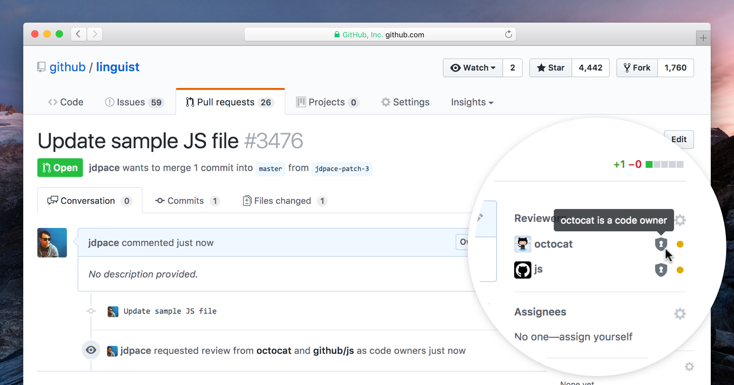


Image source: Kent C. Dodds's awesome "Testing JavaScript" workshop
All rights on the image belong to https://testingjavascript.com
This epic documents the design concept of the testing architecture of Nord Docs to ensure the project has a high quality as much as possible. Therefore a setup of stable and proven testing principles, libraries and tools will be used which are tailored for React based projects.
🚧 This is a living document which means it is work in progress, not completed yet and will be extended!
Most information in this document are based on fantastic references like the (in my option best) “Testing JavaScript” workshop by Kent C. Dodds who is a full-stack JavaScript engineer at PayPal (represents it on the TC39), a Google Developer Expert and teaches on egghead.io for many years. He is a important part of the React & JS open source community.
Next to the work on many testing libraries he's the creator of the react-testing-library and cypress-testing-library, that will be used for Nord Docs, (see Technologies section below) which grow fast in popularity and functionality while being simple and intuitive in usage. They encourage good testing practices by following avoiding to test implementation details of components and rather focus on making tests to give confidence for which they are intended and seen from the side of the user. The libraries are also recommended by the React core team itself in the official “Test Utils” docs and by Gatsby's Testing Guide (see section “Gatsby Setup” below).

Image source: Kent C. Dodds's awesome workshop website "https://testingjavascript.com"
All rights on the image belong to https://testingjavascript.com
The Testing Trophy is a principle of the “JavaScript Testing” workshop and is a bottom-to-top professional method for testing web applications.
It’s about writing just enough tests — the right tests. It’s not about reaching for 100% coverage.
Like described above, Nord Docs will use a stable and proven tech stack tailored for React that encourages best practices for testing. To do so the following chapters document which libraries and tools will be used and how they are set up to work together smoothly to provide the optimal developer workflow.
Image source: Official “Jest” website
Jest is the official React testing library used by Facebook to test all JavaScript code including React applications.
Nord Docs will use Jest since it is officially recommended and developed by Facebook, is established and proven in the community and provides all required tools to simply and extensively test React components. It has a lot of support libraries and is flexible to be used with other libraries.
See the official website and docs for more information and guides about all functionalities.
All implementation details and requirements are documented and tracked in the corresponding issues:
Image source: GitHub Repository of “react-testing-library”
The react-testing-library is one of the awesome and most popular libraries for React testing, recommended by the React core team itself in the official “Test Utils” docs and by Gatsby's Testing Guide (see section “Gatsby Setup” below).
All implementation details and requirements are documented and tracked in the corresponding issues:

Image source: Official Cypress website
For end to end tests Nord Docs will use the awesome open source project Cypress that provides a complete testing experience. It is easily and quickly to set up, can (like Jest for unit testing) execute in real time while coding, allows easy debugging in CI and locally and can record test data like screenshots and videos.
Cypress is a great tool to easily build end to end tests without the overhead required when using other outdated and no longer suitable solutions. It is also recommenced by many experienced and known JS developers including Kent C. Dodds who makes use of it and teaches it in his tutorials and workshops.
For more information check out the official website and docs.
All implementation details and requirements are documented and tracked in the corresponding issues:
-
Nord Docs is build with Gatsby (#25) and requires some changes compared to a “vanilla” or CRA React app, but like almost all aspects of Gatsby this is really well documented and explained with a work-through setup and usage guide in a large “Testing” chapter. These specific setup details described in the testing types/layer guides will be included in all other sections of this document.
All implementation details and requirements are documented and tracked in the corresponding issues:

The first layer of the “testing trophy” is the static testing which can catch typos and type errors when actually writing the code. This has already been set up and implemented in #15 using ESLint and React's prop types in #35. Also as described in both mentioned issues, it is considered to switch and refactor the code to a more advanced solution e.g. with typed languages like TypeScript or syntax extensions like Flow.
The second layer of the “testing trophy” is unit testing which allows to verify that individual, isolated parts and components work as expected.
As a starting point the extensive Gatsby guide for unit testing will be used. Like documented in the technologies section above, Nord Docs will use the great react-testing-library which is combined with the also mentioned Jest library.
For more information check out the GitHub repository and Kent C. Dodds YouTube channel for testing tutorials and workshop recordings.
The third layer of the “testing trophy” is integration testing to verify that several units work together in harmony. The setup is almost the same like for unit tests, but might include additional aspects like data fetching from APIs or integrations with third-party components.
The the fourth and last layer of the “testing trophy” is end to end testing (also called “E2E” or “functional testing”) that represents the user behavior in form of an automated test tool that clicks around the app and verifies it functions correctly. Like documented above, the awesome open source project Cypress will be used that provides a complete end-to-end testing experience.
This epic documents the design concept of the structure for React components, the general layout of the project files and the composition of content like the docs, guides and blog posts.
🚧 This is a living document which means it is work in progress, not completed yet and will be extended!
This project follows the Atomic Design pattern to create and maintain a robust React component design system.

All implementation details and requirements are documented and tracked in the corresponding issues:
Associated epic: #63
To achieve a consistent and uniform style and layout, the basic HTML elements, like e.g. a <h1> or <ul> should be used through a React component. These components render to the base HTML element they represent, but will apply styles, behavior and layout properties to ensure they match the project's design guidelines instead of using default browser configurations that might be even differ for each user agent.
This allows to use base HTML elements with all the advantages of React and JS without worrying about different render output.
This collection issue tracks the implementations of all the different individual React components. They are all based on the awesome MDN HTML elements reference documentation and will use the same categorization.
AImplementation: #70 “Core Atom HTML Element: A”
Represents the <a> HTML element (or anchor element). This is a special dynamic and failsafe component since it'll internally use Gatsby Link to route within the site (internal links) while also being able to link to external data.
This will be handled through a utility function to conditionally render based on the passed target URL (internal & external).
This issue documents the BaseLayout core layout component, the default layout of Nord Docs. It'll consist of the Root core container as root element and the core components representing the header, the main page container and the footer.
GitHub introduced a feature for recommended community standards. Nord tries to adhere to the great Open Source Guides and will adapt to the recommendations to complete the projects community profile.

To facilitate a healthy and constructive community behavior, Nord will adhere and enforce a code of conduct.
It will include sections about
See the GitHub Help for more details about the provided integrations.
The contribution guidelines help to build a community that encourages people to use, contribute to, and evangelize a project.
It will include sections about
See the GitHub introduction blog post and GitHub Help for more details about the provided integrations.
“Adobe Illustrator“ .ai artwork project files are currently handled as "normal" plain text by Git. This will be changed to the binary attribute instead to prevent encoding problems and noisy diff views.
Add the .gitattributes and .gitignore configuration files to define the pattern.
Initially implement the core configuration of Gatsby through the gatsby-config.js file that will be placed in the project root. It will define project-wide site metadata that can be used through the GraphQL API and configures all plugins that will be used.
All metadata will be, like defined in #26, placed in the corresponding folders for configurations (src/config) and data (src/data). Initially this will include information stored in the package.json file of the project and the nord package. There will also be constants for important project root folders to be used in imports later on.
This initial implementation will include the following basic plugins:
To provide a simple development flow new NPM scripts will be created to start the Gatsby's development mode and build a production bundle. This also includes basic scripts like a clean up to remove possible cache problems and previously created bundles and the currently not available „collected“ scripts to run all scripts of the same type/task. The npm-run-all package will be installed to simplify the scripts and prevent unnecessary long chained commands and OS related problems.
Related epics: #24
Since Gatsby v2, React is a peer dependency which allows users to freely choose the version they'd like to use. Nord Docs will initially be build with the currently latest stable version 16.6.3.
This epic documents the design concept for the continuous integration & testing of Nord Docs to ensure a great project quality. Therefore a setup of stable and proven continuous integration providers will be used which attaches great importance to the support of open source projects.
🚧 This is a living document which means it is work in progress, not completed yet and will be extended!
All implementation details and requirements are documented and tracked in the corresponding issues:
Circle CI is one of the most popular and proven CI providers that allows to automate pipelines from commit to deploy with a quick, safe, and scaled process. They support many languages and provide great and unique features like orbs, job orchestration, powerful caching, SSH or local builds for easy debugging and first-class Docker and GitHub integration (apps, hooks, etc.) support.
The extensive and well-written documentations make it easy to set up and configure it for the usage in projects.
Circle CI has been used for almost all open source projects of Arctic Ice Studio and will be used as primary CI provider for Nord Docs too.
Before starting to run builds, Circle CI must be authorized on a per project basis to access the code on GitHub. After the process has been authorized (GitHub OAuth) the project will be added to the dashboard and required webhooks to listen for new Git events will be automatically set up. See the documentation about how to get started and add a project to the dashboard.
NOTE: The latest config 2.1 features are currently still in Beta Preview and must be enabled explicitly for each project via Settings → Advanced Settings > “Enable build processing (preview)”! See the “Enabling Build Processing” documentation for more details.
The Docker image of the CI container will be the currently latest stable Node.js LTS version 10.x.x and the previous LTS version 8. The -browsers-legacy tag suffix can be used later on for end-to-end tests (#38) with Cypress. Next to Node.js these images currently include Chrome, Firefox, Java 8, and PhantomJS.
Travis CI is also one of the most popular and proven CI providers and will also be used for Nord Docs as a secondary CI provider. They provide similiar features like Circle CI and allow parallel builds with different system environment (Linux and macOS).
Update: Travis CI will not be used for the time being since Circle CI already provides all features that made Travis CI an additional solution, but Circle CI version 2.0 and 2.1 include a lot of more unique features and it developed activly with a great API, CLI, and powerful & flexible build configuration.
Codecov is a service to improve the code review workflow and quality. They provide highly integrated tools to group, merge, archive, and compare coverage reports with an great integration for GitHub and many CI providers like the ones used for this project: Circle CI and Travis CI. The support for open source is given through the free plan.
The fantastic and detailed docs include all necessary information to set up the automated CI tasks that Nord Docs will go through.
To gather and upload all created coverage reports Nord Docs will use the codecov/codecov Circle CI orb which provides the upload command for easy integration into jobs and workflows. The specified flags can be everything like e.g. “unit” or “e2e” which are also configurable in .codecov.yml for custom paths which flag should be used.
This section documents Nord Docs's continuous integration & testing workflow steps.
NOTE:: There are small differences between the setup for  Circle CI and
  Travis CI so all steps are marked which provider the step will be applied to!
Important: If the build configuration make use of custom environment variables defined and injected through contexts or per-project environment variables make sure that these have been created through the Circle CI UI or via the API before running the project!
node_modules) - Restore the node_modules folder based on the checksum of the package-lock.json file and an version prefix which allows to simply invalidate the cache. See the provider specific documentations for Circle CI ci command to install all dependencies.lint NPM script.test NPM script.build NPM script.node_modules) - Save the node_modules folder again to the cache based on the checksum of the package-lock.json file and the version prefix which allows to simply invalidate the cache. See the provider specific documentations for Circle CI public folder, the coverage and webpack bundle reports in the build/reports folder and the node_modules_ dependency folder to allow to reproduce the build locally with the exact same resolved dependencies.To integrate all used services some GitHub repository settings must be made:
Configure protected branch rules - To enforce rules for branches to pass the CI build and include updates for changed code coverage stats GitHub provides a way to create rules for branches. Nord Docs will enforce a minimum of one required green build per PR.
Jest is able to generate JUnit formatted reports using the jest-junit package. It can be defined in the reporters array in the main configuration file or specified with the --reporters CLI option. It will be added as additional reporter next to the default report format.
See Circle CI's documentation about to how to collect test data for more details about setups with Jest.
Next to the generated reports by Jest, it is also possible to create lint reports in the JUnit format by using builtin formatters. This is useful to create an overview of linted files and found errors/warnings. These reports can be evaluated by services like Circle CI and Codecov to create detailed code style analyzes.
To simplify the workflow, new NPM scripts will be added tailored for CI environments. This includes the generation of the JUnit formatted reports by Jest and ESLint.

Must be resolved after #15
Integrate Prettier, the opinionated code formatter with support for many languages and integrations with most editors. It ensures that all outputted code conforms to a consistent style.
This is one of the main features of Prettier: It already provides the best and recommended style configurations of-out-the-box™.
The only option we will change is the print width. It is set to 80 by default which not up-to-date for modern screens (might only be relevant when working in terminals only like e.g. with Vim). It'll be changed to 120 used by all of Arctic Ice Studio's style guides.
The prettier.config.js configuration file will be placed in the project root as well as the .prettierignore file to also define ignore pattern.
To be fully compatible with ESLint (implemented in #15), eslint-plugin-prettier will be included and added to the plugins array of the ESLint configuration. To enable full compatibility the prettier/prettier rule must be added with the error level.
To allow to format all sources a format:pretty npm script/task will be added to be included in the main format script flow.
prettier.config.js configuration file..prettierignore ignore pattern file.prettier/prettier rule with the error level.format:pretty script/task.During the initial implementation of Gatsby (#27) the gatsby-plugin-react-helmet has been added, but the required react-helmet main package was accidentally forgotten to be added too.
The initial content of the project's repository README will only contain the hero and various badges provided by the great shields.io project. They will make use to the available query parameters to style and customize the badges which come closest to Nord's design.
Further documentations about the design concept, architecture and technologies as well as guides for contributions to develop, run and maintain the project will be documented within the docs itself. Minimal instructions might be added later on within a “Getting Started” / “Quick Start” section.
sanitize=true query parameter to allow rendering SVG's hosted within the repository and served via the raw.githubusercontent subdomain.
This epic documents the design concept for the responsive web design pattern of Nord Docs which is the most used, best thought out and Google’s recommended design pattern that provides a great user experience and the best SEO through multi-device & full mobile compatibility.
🚧 This is a living document which means it is work in progress, not completed yet and will be extended!
Nord Docs will follow the mobile first pattern using best practices and recommended techniques. Even though most of Nord's port projects are build for desktop applications, the colors can be used for all purposes and the website and documentation should be targeted for all platforms.
Approaching the mobile-first design is the best approach for a responsive design and Google's recommended pattern for mobile-friendly sites.
Compared to a desktop first approach, it comes with the “advantage” of forcing the designer/developer to identify the most important site elements and information to fit on the on the smallest screen. When increasing the available screen size, the used elements can now expand and scale to use more space, transform to include more content or visualize existing functionalities in more detail.
All components of Nord Docs will be implemented with this approach in mind to consistently comply with this principle.
The used resources for information will be the really well-written and extensive Google Developer Documentations with their web fundamentals, tools and their great and detailed guide for mobile-friendly sites that are the base for a good SEO. The Mobile-Friendly Test will be used to continuously check the development process while their recently launched web.dev website includes guides tour on how to build a optimized site from scratch. Next to Google's large knowledge bases and libraries there are other great resources and articles:
All implementation details and requirements are documented and tracked in the corresponding issues:
This issue documents the core container component Page, the base wrapper for page content of Nord Docs. It renders the HTML main element to wrap page content and will be used in layout component like the BaseLayout.
 React
React
A declarative, efficient, and flexible JavaScript library for building user interfaces.
🖖 Vue.js is a progressive, incrementally-adoptable JavaScript framework for building UI on the web.
 Typescript
TypeScript is a superset of JavaScript that compiles to clean JavaScript output.
An Open Source Machine Learning Framework for Everyone
 Django
The Web framework for perfectionists with deadlines.
 Laravel
A PHP framework for web artisans
Bring data to life with SVG, Canvas and HTML. 📊📈🎉
JavaScript (JS) is a lightweight interpreted programming language with first-class functions.
Some thing interesting about web. New door for the world.
A server is a program made to process requests and deliver data to clients.
Machine learning is a way of modeling and interpreting data that allows a piece of software to respond intelligently.
Some thing interesting about visualization, use data art
Some thing interesting about game, make everyone happy.
 Facebook
We are working to build community through open source technology. NB: members must have two-factor auth.
 Microsoft
Open source projects and samples from Microsoft.
 Google
Google ❤️ Open Source for everyone.
 Alibaba
Alibaba Open Source for everyone
 D3
D3
Data-Driven Documents codes.
 Tencent
China tencent open source team.


