supervenn is a matplotlib-based tool for visualization of any number of intersecting sets. It takes native Python
sets as inputs. Note that supervenn does not produce actual (Euler-)Venn diagrams.
The easiest way to understand how supervenn diagrams work, is to compare some simple examples to their Euler-Venn counterparts. Top row is Euler-Venn diagrams made with matplotlib-venn package, bottom row is supervenn diagrams:

pip install supervenn
Python 2.7 or 3.6+ with numpy andmatplotlib.
The main entry point is the eponymous supervenn function. It takes a list of python sets as its first and only
required argument and returns a SupervennPlot object.
from supervenn import supervenn
sets = [{1, 2, 3, 4}, {3, 4, 5}, {1, 6, 7, 8}]
supervenn(sets, side_plots=False)
Each row repesents a set, the order from bottom to top is the same as in the sets list. Overlapping parts correspond
to set intersections.
The numbers at the bottom show the sizes (cardinalities) of all intersections, which we will call chunks.
The sizes of sets and their intersections (chunks) are up to proportion, but the order of elements is not preserved,
e.g. the leftmost chunk of size 3 is {6, 7, 8}.
A combinatorial optimization algorithms is applied that rearranges the chunks (the columns of the array plotted) to minimize the number of parts the sets are broken into. In the example above each set is in one piece ( no gaps in rows at all), but it's not always possible, even for three sets:
supervenn([{1, 2}, {2, 3}, {1, 3}], side_plots=False)
By default, additional side plots are also displayed:
supervenn(sets)
If you need only one of the two side plots, use side_plots='top' or side_plots='right'
Use the set_annotations argument to pass a list of annotations. It should be in the same order as the sets. It is
the second positional argument.
sets = [{1, 2, 3, 4}, {3, 4, 5}, {1, 6, 7, 8}]
labels = ['alice', 'bob', 'third party']
supervenn(sets, labels)
Create a new figure and plot into it:
import matplotlib.pyplot as plt
plt.figure(figsize=(16, 8))
supervenn(sets)
The supervenn function has figsize and dpi arguments, but they are deprecated and will be removed in a future
version. Please don't use them.
Use the ax argument:
supervenn(sets, ax=my_axis)Use .figure and axes attributes of the object returned by supervenn(). The axes attribute is
organized as a dict with descriptive strings for keys: main, top_side_plot, right_side_plot, unused.
If side_plots=False, the dict has only one key main.
import matplotlib.pyplot as plt
supervenn(sets)
plt.savefig('myplot.png')
Use the chunks_ordering argument. The following options are available:
'minimize gaps': default, use an optimization algorithm to find an order of columns with fewer gaps in each row;'size': bigger chunks go first;'occurrence': chunks that are in more sets go first;'random': randomly shuffle the columns.
To reverse the order (e.g. you want smaller chunks to go first), pass reverse_chunks_order=False (by default
it's True)
Use the sets_ordering argument. The following options are available:
None: default - keep the order of sets as passed into function;'minimize gaps': use the same algorithm as for chunks to group similar sets closer together. The difference in the algorithm is that now gaps are minimized in columns instead of rows, and they are weighted by the column widths (i.e. chunk sizes), as we want to minimize total gap width;'size': bigger sets go first;'chunk count': sets that contain most chunks go first;'random': randomly shuffle the rows.
To reverse the order (e.g. you want smaller sets to go first), pass reverse_sets_order=False (by default
it's True)
supervenn(sets, ...) returns a SupervennPlot object, which has a chunks attribute.
It is a dict with frozensets of set indices as keys, and chunks as values. For example,
my_supervenn_object.chunks[frozenset([0, 2])] is the chunk with all the items that are in sets[0] and
sets[2], but not in any of the other sets.
There is also a get_chunk(set_indices) method that is slightly more convenient, because you
can pass a list or any other iterable of indices instead of a frozenset. For example:
my_supervenn_object.get_chunk([0, 2]).
If you have a good idea of a more convenient method of chunks lookup, let me know and I'll implement it as well.
Use the widths_minmax_ratio argument, with a value between 0.01 and 1. Consider the following example
sets = [set(range(200)), set(range(201)), set(range(203)), set(range(206))]
supervenn(sets, side_plots=False)
Annotations in the bottom left corner are unreadable.
One solution is to trade exact chunk proportionality for readability. This is done by making small chunks visually
larger. To be exact, a linear function is applied to the chunk sizes, with slope and intercept chosen so that the
smallest chunk size is exactly widths_minmax_ratio times the largest chunk size. If the ratio is already greater than
this value, the sizes are left unchanged. Setiing widths_minmax_ratio=1 will result in all chunks being displayed as
same size.
supervenn(sets, side_plots=False, widths_minmax_ratio=0.05)The image now looks clean, but chunks of size 1 to 3 look almost the same.

- Use the
min_width_for_annotationargument to hide annotations for chunks smaller than this value.
supervenn(sets, side_plots=False, min_width_for_annotation=100)
-
Pass
rotate_col_annotations=Trueto print chunk sizes vertically. -
There's also
col_annotations_ys_countargument, but it is deprecated and will be removed in a future version.
Use arguments bar_height (default 1), bar_alpha (default 0.6), bar_align (default edge)', color_cycle (
default is current style's default palette). You can also use styles, for example:
import matplotlib.pyplot as plt
with plt.style.context('bmh'):
    supervenn([{1,2,3}, {3,4}])
Use side_plot_width (in inches, default 1) and side_plot_color (default 'tab:gray') arguments.
Just use plt.xlabel and plt.ylabel as usual.
Other arguments can be found in the docstring to the function.
If there are are no more than 8 chunks, the optimal permutation is found with exhaustive search (you can increase this
limit up to 12 using the max_bruteforce_size argument). For greater chunk counts, a randomized quasi-greedy algorithm
is applied. The description of the algorithm can be found in the docstring to supervenn._algorithms module.
letters = {'a', 'r', 'c', 'i', 'z'}
programming_languages = {'python', 'r', 'c', 'c++', 'java', 'julia'}
animals = {'python', 'buffalo', 'turkey', 'cat', 'dog', 'robin'}
geographic_places = {'java', 'buffalo', 'turkey', 'moscow'}
names = {'robin', 'julia', 'alice', 'bob', 'conrad'}
green_things = {'python', 'grass'}
sets = [letters, programming_languages, animals, geographic_places, names, green_things]
labels = ['letters', 'programming languages', 'animals', 'geographic places',
          'human names', 'green things']
plt.figure(figsize=(10, 6))
supervenn(sets, labels , sets_ordering='minimize gaps')
And this is how the figure would look without the smart column reordering algorithm:

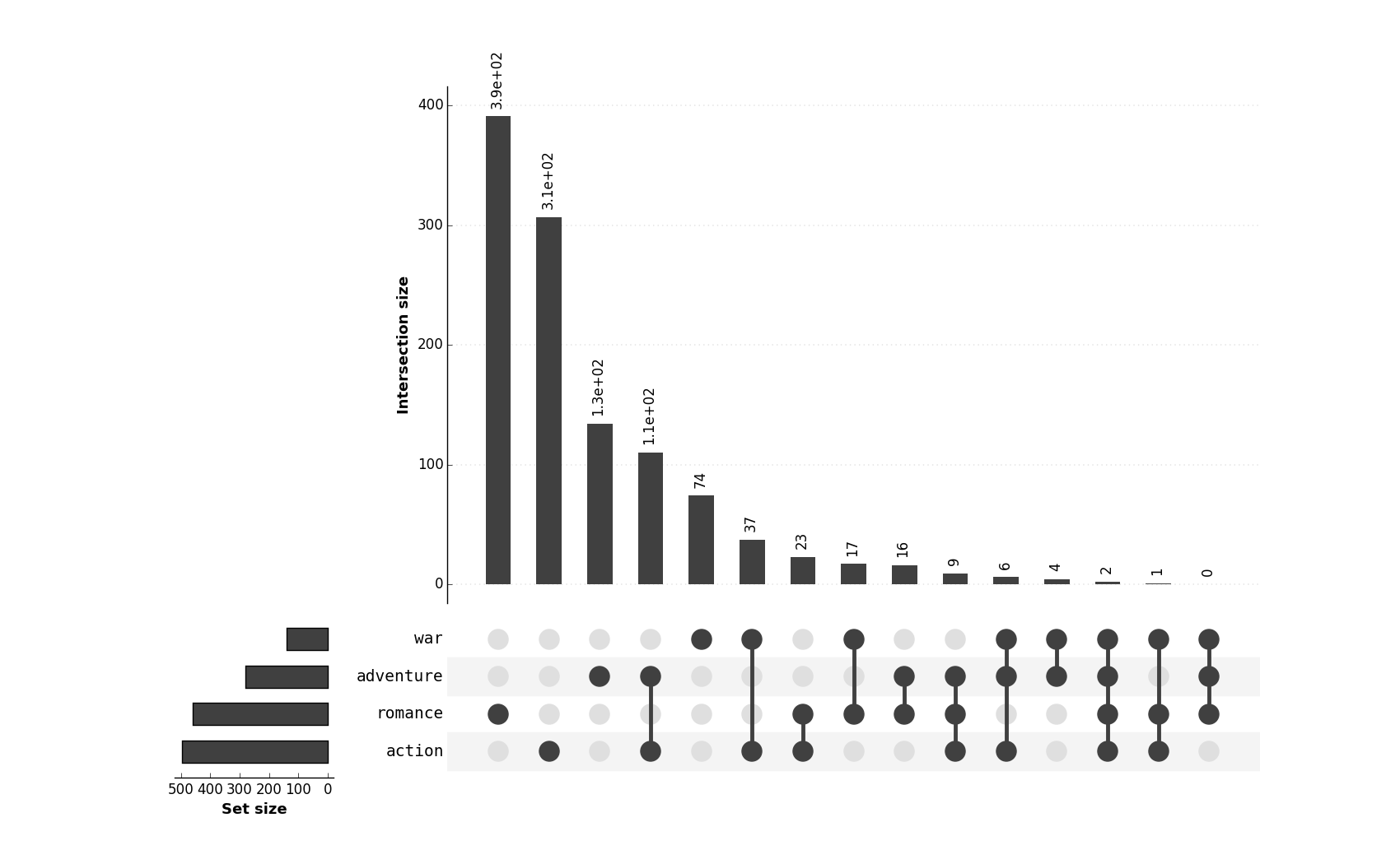
Data courtesy of Jake R Conway, Alexander Lex, Nils Gehlenborg - creators of UpSet
Figure from original article (note that it is by no means proportional!):

Figure made with UpSetR

Figure made with supervenn (using the widths_minmax_ratio argument)
plt.figure(figsize=(20, 10))
supervenn(sets_list, species_names, widths_minmax_ratio=0.1,
          sets_ordering='minimize gaps', rotate_col_annotations=True, col_annotations_area_height=1.2)
For comparison, here's the same data visualized to scale (no widths_minmax_ratio, but argument
min_width_for_annotation is used instead to avoid column annotations overlap):
plt.figure(figsize=(20, 10))
supervenn(sets_list, species_names, rotate_col_annotations=True,
          col_annotations_area_height=1.2, sets_ordering='minimize gaps',
          min_width_for_annotation=180)
It must be noted that supervenn produces best results when there is some inherent structure to the sets in question.
This typically means that the number of non-empty intersections is significantly lower than the maximum possible
(which is 2^n_sets - 1). This is not the case in the present example, as 62 of the 63 intersections are non-empty,
hence the results are not that pretty.
This was actually my motivation in creating this package. The team I'm currently working in provides an API that solves a variation of the Multiple Vehicles Routing Problem. The API solves tasks of the form "Given 1000 delivery orders each with lat, lon, time window and weight, and 50 vehicles each with capacity and work shift, distribute the orders between the vehicles and build an optimal route for each vehicle".
A given client can send tens of such requests per day and sometimes it is useful to look at their requests and understand how they are related to each other in terms of what orders are included in each of the requests. Are they sending the same task over and over again - a sign that they are not satisfied with routes they get and they might need our help in using the API? Are they manually editing the routes (a process that results in more requests to our API, with only the orders from affected routes included)? Or are they solving for several independent order sets and are happy with each individual result?
We can use supervenn with ome custom annotations to look at sets of order IDs in each of the client's requests.
Here's an example of an OK but nit perfect client's workday:

Rows from bottom to top are requests to our API from earlier to later, represented by their sets of order IDs. We see that they solved a big task at 10:54, were not satisfied with the result, and applied some manual edits until 11:11. Then in the evening they re-solved the whole task twice over, probably with some change in parameters.
Here's a perfect day:

They solved three unrelated tasks and were happy with each (no repeated requests, no manual edits; each order is distributed only once).
And here's a rather extreme example of a client whose scheme of operation involves sending requests to our API every 15-30 minutes to account for live updates on newly created orders and couriers' GPS positions.

This tool plots area-weighted Venn diagrams with circles for two or three sets. But the problem with circles is that they are pretty useless even in the case of three sets. For example, if one set is symmetrical difference of the other two:
from matplotlib_venn import venn3
set_1 = {1, 2, 3, 4}
set_2 = {3, 4, 5}
set_3 = set_1 ^ set_2
venn3([set_1, set_2, set_3], set_colors=['steelblue', 'orange', 'green'], alpha=0.8)
See all that zeros? This image makes little sense. The supervenn's approach to this problem is to allow the sets to be
broken into separate parts, while trying to minimize the number of such breaks and guaranteeing exact proportionality of
all parts:

This approach is quite similar to supervenn. I'll let the reader decide which one does the job better:

Thanks to Dr. Bilal Alsallakh for referring me to this work
This tool has a similar concept, but only available as a Javascript web app with minimal functionality, and you have to
compute all the intersection sizes yourself. Apparently there is also an columns rearrangement algorithm in place, but
the target function (number of gaps within sets) is higher than in the diagram made with supervenn.

Thanks to u/aboutscientific for the link.
This package was created and is maintained by Fedor Indukaev. My username on Gmail and Telegram is the same as on Github.
- If you like supervenn, you can click the star at the top of the page and tell other people about this tool
- If you have an idea or even an implementation of a algorithm for matrix columns rearrangement, I'll be happy to try it, as my current algorithm is quite primitive. (The problem in question is almost the travelling salesman problem in Hamming metric).
- If you are a Python developer, you can help by reviewing the code in any way that is convenient to you.
- If you found a bug or have a feature request, you can submit them via the Issues section.
