We have learned a little about what Tableau has to offer and a few of the features, now we will get into downloading and installing Tableau Public and getting familiar with the workspace and see how we can interact with the data using Tableau.
You will be able to:
- Download and install Tableau Public
- Understand core components of the desktop
- Perform basic functions such as create a new worksheet, dashboard, and story, clear a worksheet and save work
Tableau Public is the free version of the software and requires the user to download the software package to their local machine. In order to use this public version, you will need to create an account first on the Tableau website. Follow the link below and click on the SIGN UP button to create an account.
Tableau Public Account Creation
Once you have created your account, you will want to install the app on your local machine. The download page can be found on the Tableau website as well. Click on the link below then download the app by clicking on the DOWNLOAD THE APP button and follow the instructions.
Download the Tableau Public App
Once the download is complete, you may need to restart your machine for the changes to take affect. After downloading, you can continue with the lesson and get familiar with the interface.
When Tableau opens, you will be ojn the Start Page. This is where you will import or connect to the data you want to use in your notebook. On the left side of your screen, you will see the various options for connecting to data. Tableau provides a few data sets to help you to get familiar with the platform.
Tableau provides a generous variety of sample datasets which can be accessed via the Resources menu in the lower right corner of your screen. Click the Sample Data Sets link and you will be taken to the sample data sets page on the Tableau website. The Superstore Sales data set is one that we will be working with in future lessons, so take a moment to download it now.
- Click on the link to the data set to download it
- A dialogue box will open to chose the location to save the file
- For ease of access, choose the
datasourcesfolder which is found in the folder created by default during installation calledMy Tableau Repository - Once you save the file, you can return to the Tableau workspace
Go ahead and download the Superstore Sales data, we will use it to demonstrate other features of Tableau.
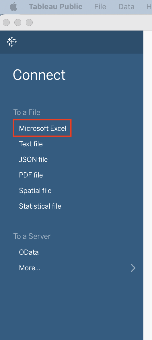
Once you have data to work with, you can connect to it via the Connect menu. One option for a data connection is an Excel spreadsheet. In order to connect to an Excel spreadsheet you would choose the Microsoft Excel option from the menu to locate the file you wish to open.
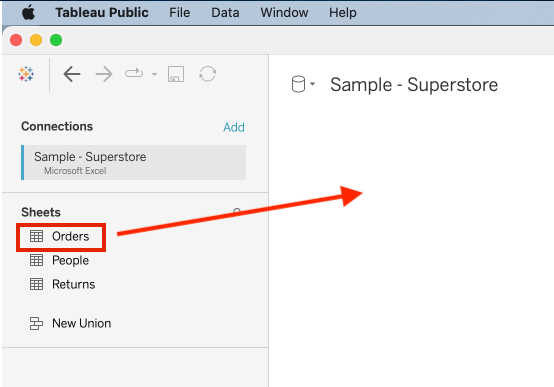
Often, a data set includes multiple sources, or in the case of an Excel spreadsheet, multiple sheets. If your data has only one source, it will be selected by default, but if there are more than one, you will need to select the sheet(s) you wish to work with. For this lesson, we will be working with the Orders sheet. To select it, simply drag and drop it into the workspace.
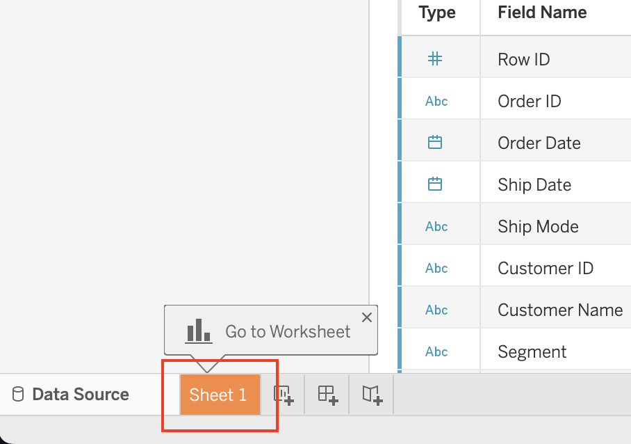
Once you drag the sheet to the workspace, you will see a preview of the data. In this view, you can also filter the data, but we will explore this in later lessons. Tableau starts your worksheet for you, you can find it at the bottom of the screen labeled with the default name Sheet 1. Click on this tab and you will be taken to the worksheet.
Let's first take a look at the Data tab. In this section you will find all of your data fields. Tableau calls these Dimensions and Measures but we will touch more on that later. This tab is where you will find your different data sets if you connect multiple data sources. This is also where your custom measures will appear once you create them such as a column that is created from a calculation of other columns. We will dive into this in another lesson.
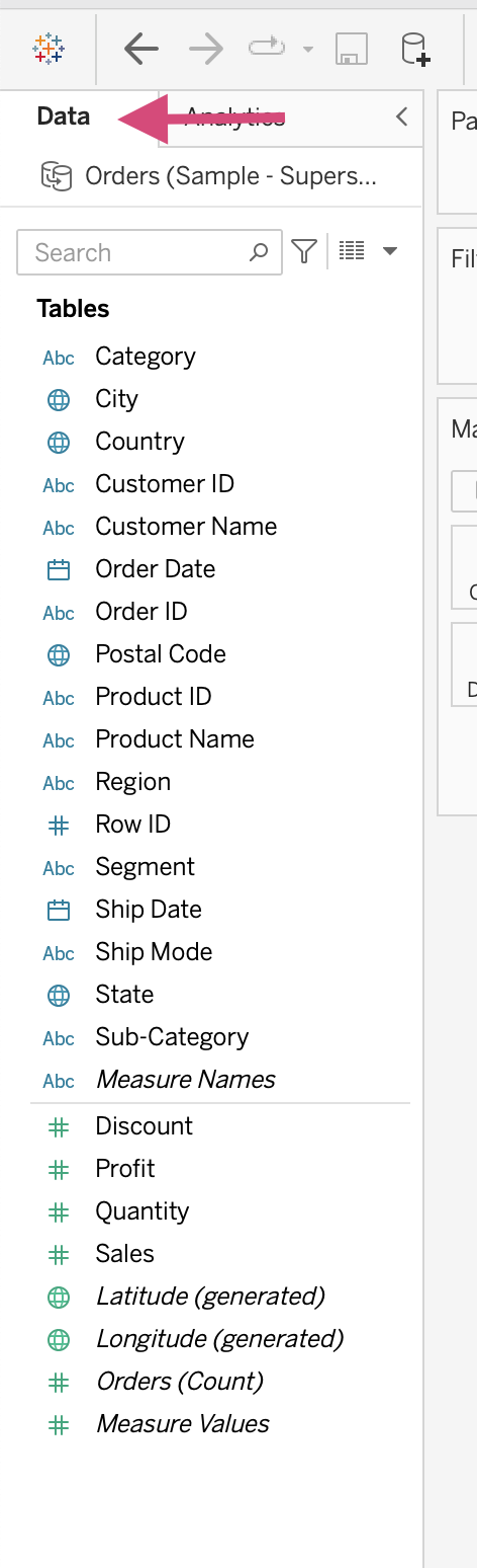
You might have noticed that data have two distinct colors, blue and green. These colors help to distinguish between Measures and Dimensions.
Measures which are colored in GREEN contain the quantitative values that can be measured such as sales, height, and age. These values can be aggregated. When you add measure to your workspace Tableau automatically applies a defalt aggregation which is usually sum. If you look just before the name of each measure, you will see a small icon. These icons are generated by default by Tableau, and represent the type of data the measure is. If the data type is not accurate or you just want to customize it, you can do so by hovering over the measure, and then clicking the arrow to open the options menu. In this menu you will see change data type. You will have the option to change the type to string, decimal, whole number, date and time, or just date. You can also assign a geographic role if the data corresponds with such information. If Tableau detects that your data contains some geographic data, such as state, zip code, or country, latitude and longitude measures will be generated automatically.
Dimensions which are colored in BLUE contain qualitative values. These are values which are discrete such as month, state, and date. Dimensions, when added to the workspace, will affect the level of detail in the view. For example, if you have sales in your workspace already and you add the state dimension to your workspace your view will consist of the sum sales in each state represented by a bar graph. Just like with the measures, Tableau will assign data types to your dimensions, and you can change or customize the type of data in the same manner as the measures. Your options for data types will consist of the same options.
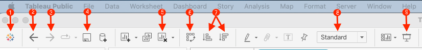
At the top, you will see the menu bar. This menu bar contains many functions to help you in your creation of worksheets and dashboards. Below you will see an image with numbers corresponding to the description of each item. We will highlight just a few of the common items and the others will be introduced as they are needed or they become relavent.
- The Tableau icon will return you to the start page where you can start a new worksheet and connect to new data.
- Undo will undo the last action
- Redo will do the last action that was undone
- Save will allow you to save your work either to Tableau Desktop or Tableau Public depending on which version you are using
- Clear Sheet will allow you to remove everything from the sheet and start from scratch
- Swap will allow you to swap the rows and columns of your chart or graph like in the case of a bar chart it would change a horizontal bar to a vertical bar
- Sort will allow you to sort the values in your visualization with the choice of either ascending or descending
- Fit will allow you to fit your visualization to the screen with the options of width, height, standard, and entire view
- Presentation Mode will allow you to hide all of the editing tools and present your worksheets or dashboards
In between the workspace and the data are three windows, the first two, Pages and Filters are called shelves, and the third, Marks is called a card. These cards and shelves have many functions that we will dive into later, but here is an overview.
Pages
The Pages shelf helps to break up your view into multiple pages so you can better analyze the effect one specific field has on the rest of the data.
Filters
The Filters shelf allows you to choose which data to include and exclude from your view.
Marks
The Marks card allows you to add context and detail to your visualizations. You can also customize the appearance of the visualizations in the marks card such as adding color, text and adjusting the size of different features.

When you add data to your worksheet, you do so by dragging it to either the Rows or Columns shelf. This is Tableau's version of an X and Y axis.
Rows
When data is added to the Rows shelf, it will become the horizontal axis, and each entry in the data will become a row or a point on the horizontal axis in a visualization.
Columns
When data is added to the Columns shelf, it will become the vertical axis, and each entry in the data will become a column or a point on the vertical axis in a visualization.

On the right side of the screen is the Show Me pane. With this pane you can choose the type of visualization. You can also see the type of data needed for each visualization at the bottom of the Show Me pane, Tableau tells you how many dimensions and measures are necessary to generate the visualization. Additionaly, when you have data in the workspace, the visualizations that will work with that data will become emphasized so you will know that those visualizations apply to that data.
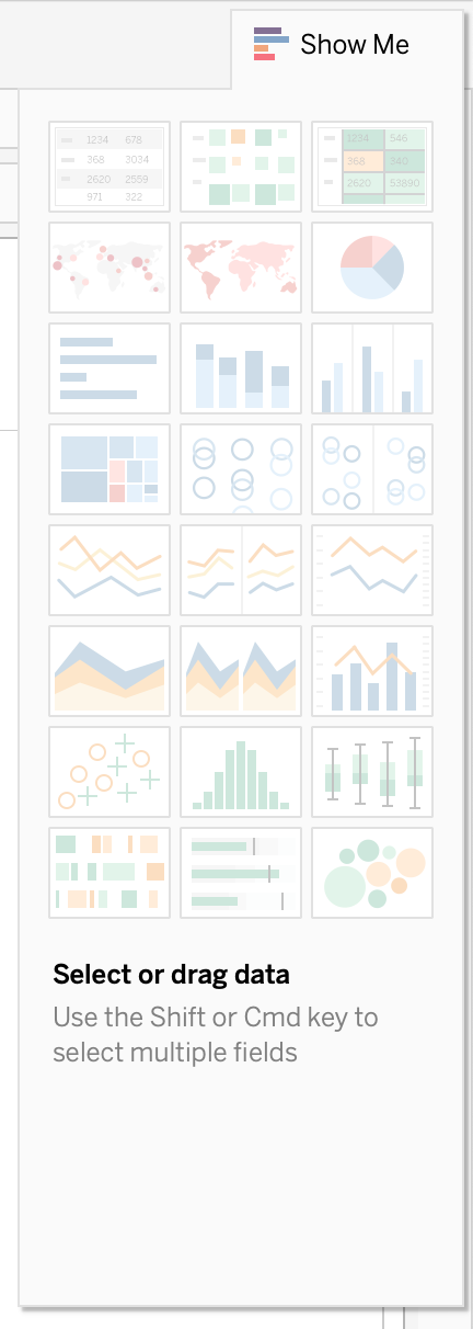
Tableau is organized like Excel is, with a workbook format. A workbook can contain indvidual Worksheets, a Dashboard or multiple Dashboards, and a Story or multiple Stories.
Worksheets
A Worksheet is composed of one visualization view along with the shelves, cards, and other tools used to create each view. Each view is a visualization that has been created to display a specific part of the data in a patrticular manner. Creating a worksheet is as simple as opening the sheet and placing the apropriate data in one of the column or row shelves and creating a basic visualization. You can add a new sheet with the icon in the bottom toolbar.
A Dashboard is a collection of views from many worksheets. We will go over how to create a dashboard in detail later, but for now, just know that a new dashboard can be started by clicking on the dashboard icon in the bottom toolbar.
A Story is a collection of worksheets or dashboards that have been organized in a presentation like format so the viewer is able to understand the data in the order the creator intended. We will touch on stories in a later lesson, bu you can start a new story by clicking on the new story icon in the bottom toolbar.
Great!! Now you should be familiar with the layout of the Tableau interface. In this lesson you learned how to download and install Tableau Public. You were able to connect your Tableau account and find the free practice data sets provided by Tableau. You should now be able to locate all of the main components of the workspace and understand a little about each function they have. In the next lesson, we will put this new knowledge to work and start creating some visualizations!!
