Code Monkey home page Code Monkey logo

powerbi-visuals-enhancedscatter's Introduction

EnhancedScatter

Build

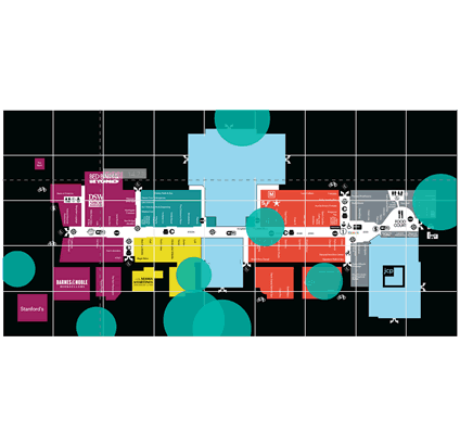
A few more properties were added to the existing scatter chart visual, including shapes as markers, background image support, and developer crosshairs for positioning elements onto an image background.

Enhancedscatter screenshot

Supported display figure shapes

Shape Number value String value
Circle 0 "circle"
Cross 1 "cross"
Diamond 2 "diamond"
Square 3 "square"
Triangle Down 4 "triangle-down"
Triangle Up 5 "triangle-up"
Star 6 "star"
Hexagon 7 "hexagon"
X 8 "x"
Up Arrow 9 "uparrow"
Down Arrow 10 "downarrow"

Overview

Enhanced Scatter introduces a few more properties that were added on top of the existing scatter chart visual, including shapes as markers, background image support, and developer crosshairs for positioning elements onto an image background.

See also Enhanced Scatter at Microsoft Office store

powerbi-visuals-enhancedscatter's People

Contributors

avisander avatar blackleaden avatar demonkratiy avatar dependabot[bot] avatar eugeneelkin avatar ignatvilesov avatar mrmeison avatar mulyukovaidar avatar mvgaliev avatar pbicvbot avatar savvinsergey avatar uve avatar v-ruboranov avatar vtkalek avatar

Stargazers

 avatar  avatar  avatar  avatar  avatar  avatar  avatar  avatar  avatar  avatar  avatar  avatar  avatar  avatar  avatar  avatar  avatar  avatar  avatar  avatar  avatar  avatar  avatar

Watchers

 avatar  avatar  avatar  avatar  avatar  avatar  avatar  avatar  avatar  avatar  avatar  avatar  avatar  avatar

powerbi-visuals-enhancedscatter's Issues

Y- Axis constant line

Hey, I want to add some horizontals line on y-axis according to the data and also need to handle these lines in the format pane. An example screen shot is attached. Kindly help. Thank you in advance.

2018-04-02 14_25_46-microsoft teams

Can not compile this

I really need to modify this little. I did npm install and then I tried "pbiviz package"

Getting too many of following errors.
(745,5) Duplicate string index signature.

Please help this is urgent.

Symmetry shading

Hello! I want to add Symmetry Shading in my custom Scattered chart in Analytics panel? how can I do this?

Disappeared when publish

In the desktop app I can see the visual, but when I published it the visual just disappeared.

Dot color and shape customization options

There are 11 shape options. Please add either more shapes (as in R there are 25 where some don't have filling and only outline or unicode characters support) or/and add customization field for the data dot outline color. That way some dots can be only outlined with customized color and some filled.
Thank you.

Problem with X-Y start-end

I'm trying to insert a measure into X/Y start/end but these columns do not work. I would like to be able to change the scale of my Scatter plot.
What in that case do these four variables cause? X-start / X-end and Y-start / Y-end.

Context menu and drill through

Now the Microsoft powerbi builtin scatter chart supports context menu and drill through. will this feature be available in enhanced scatter soon?

Axis labels font size spec is missing

you cannot specify the font size of the x and y axis labels. Changing to the normal Scatter chart, changing it there, and changing back to the EnhancedScatter, is no workaround, since the font size is lost.

Logarithmic Scale on Y-Axis (and x-Axis)

Hi,

for some data visualization which have a huge variety in values it would be helpful to have alternatively to linear scales a logarithmic scale.

Best regards,
Frank

Draw Line from origin

Hello, I want to add a static regression line from origin to increasing toward x and y axis just like this. How can I do this?

Zoom in Chart and move chart

Hi, just wondering if the enhanced scatter plot can add zoom in and chart move by holding the mouse click like other BI tools have?

two issues : Chart not to show data by default, Time part (of DateTime field) not showing on X-axis

There are 2 visuals (upper visual is standard Table visual, bottom visual is this Enhanced Scatter chart Plus other slicers. If no selection is made from the slicer, table visual doesn't show any data. However, this Enhanced Scatter chart still shows data. How do i disable that?
Second issue is DateTime field is on x-axis. Values on x-axis are shown as Dates only , how do i change that behavior to show both Date and Time? (plot area shows date and time if i hover over it)

X-Axis does not show up correctly a date

Hello,

when assosciating a date to the x-axis only a yyyy (literally) apears. So it does only appear several times the text "yyyy" depending on the width. Obviously (proven by test) a integer number for the year is ok, but with that the scatter plot looses the accurracy.

Regards,
Frank

npm test fails

Chrome 57.0.2987 (Mac OS X 10.12.3) ERROR
Uncaught ReferenceError: exports is not defined
at test/_references.js:27

Add Shape Size

In enhanced scatter chart, there are no shapes and no meter for increasing or decreasing the size of the bubble. Is it possible to add shapes and shape size changer in enhanced scatter chart?

X-Axis dont display Dates correctly

ENHANCED SCATTER PROBLEM

as you can see in the image
I have an X-axis to see the Date, we have an Y-axis to count number of items (total), and z-value to determine how big the (xi,yi) point should be (Weighted Value). Apart I have a legend for the Market and I want to have details on the Date.

There are two problems for my scenario:
A) X-Axis doesnt display dates, like some other scatter chars available in the market,
B) The reason I think that happen it is because we are force to Group X-Axis with Earliest or Latest, instead of having them ungroup.

Can you guys improve this to not Summarize? and to display date labels in the X-Axis?

Thanks in advance for the time and effort.

Best regards

Larethian

Play Axis

I need to add play axis in the enhanced scatter plot. Is there any way through which I can do this?

Recommend Projects

  • React photo React

    A declarative, efficient, and flexible JavaScript library for building user interfaces.

  • Vue.js photo Vue.js

    ๐Ÿ–– Vue.js is a progressive, incrementally-adoptable JavaScript framework for building UI on the web.

  • Typescript photo Typescript

    TypeScript is a superset of JavaScript that compiles to clean JavaScript output.

  • TensorFlow photo TensorFlow

    An Open Source Machine Learning Framework for Everyone

  • Django photo Django

    The Web framework for perfectionists with deadlines.

  • D3 photo D3

    Bring data to life with SVG, Canvas and HTML. ๐Ÿ“Š๐Ÿ“ˆ๐ŸŽ‰

Recommend Topics

  • javascript

    JavaScript (JS) is a lightweight interpreted programming language with first-class functions.

  • web

    Some thing interesting about web. New door for the world.

  • server

    A server is a program made to process requests and deliver data to clients.

  • Machine learning

    Machine learning is a way of modeling and interpreting data that allows a piece of software to respond intelligently.

  • Game

    Some thing interesting about game, make everyone happy.

Recommend Org

  • Facebook photo Facebook

    We are working to build community through open source technology. NB: members must have two-factor auth.

  • Microsoft photo Microsoft

    Open source projects and samples from Microsoft.

  • Google photo Google

    Google โค๏ธ Open Source for everyone.

  • D3 photo D3

    Data-Driven Documents codes.