Code Monkey home page Code Monkey logo

powerbi-visuals-drilldown-choropleth's Introduction

Drilldown choropleth

Build Status

Displays a hierarchical map set with each location filled in a color from specified values

screenshot

Overview

With the Drilldown Choropleth and Drilldown Cartogram visuals, you can explore deep geographic data, plotting hundreds or even thousands of items (all US counties at once, all the precincts in a county, etc.) and then drilling down their data hierarchy (like from state, to county, to precinct). These controls were designed specifically to help large and small political campaigns explore and draw insights from their data – but they’re useful for other audiences, too.

To use the visuals, bring a dataset into Power BI, and put the custom visual on your page.

There are two map types as part of this set:

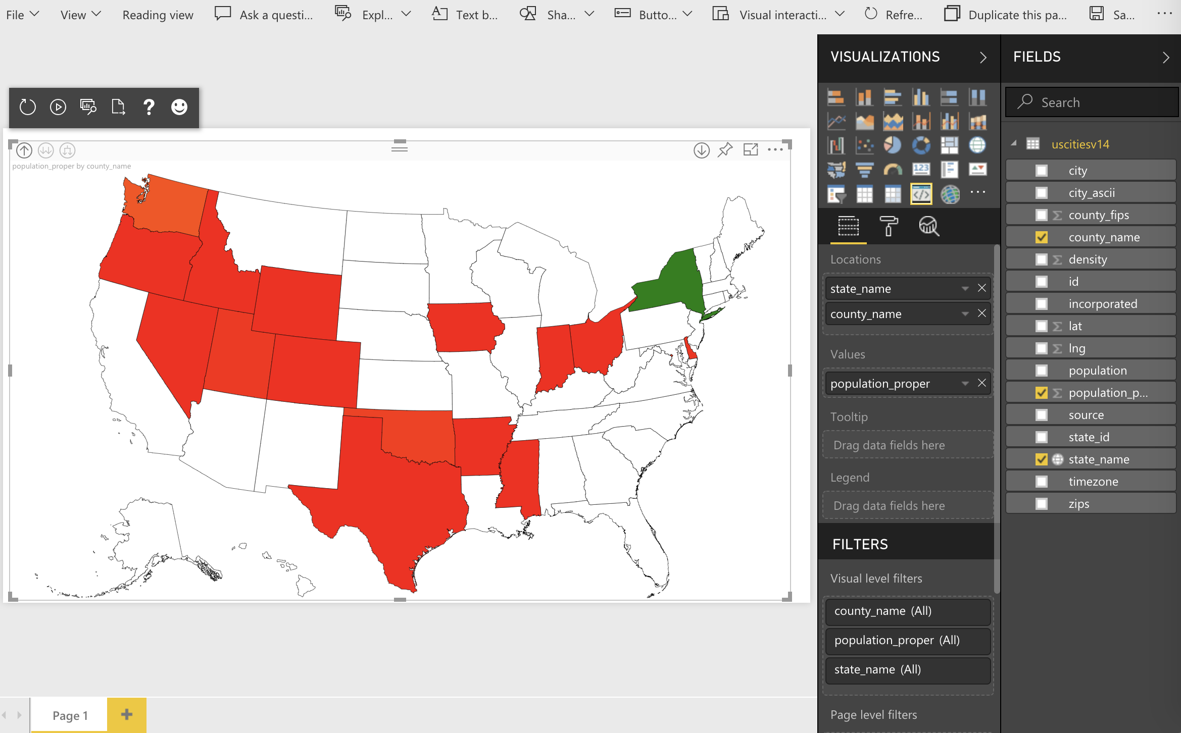
  • The Drilldown Choropleth displays each location on a map filled with a color based on the value for each location.
  • The Drilldown Cartogram displays a circle for each location, with the size and color based on the values you specify

Put your data’s first-level location property in the Locations field, and the property you want to chart in the Values fields.

Then on the visual’s Formatting pane, open the Shape customization and put the URL to the first level of your map in the Level 1 box, the URL to your next level in the Level 2 box, and so on. If the name of the geographic property of your map doesn’t match the name of the field in your data, you can set that property name in the ID boxes.

You can alternately set a Legend property to control the color of each area on the map; this is useful to reflect things like which candidate or party had the most votes in an area.

Note that you’ll need to put your topojson-formatted maps on a web server; the Tips page of the sample reports have guidance about how to do that.

This visual was built in conjunction with our partner Gramener.

Contributing

This project has adopted the Microsoft Open Source Code of Conduct. For more information see the Code of Conduct FAQ or contact [email protected] with any additional questions or comments.

powerbi-visuals-drilldown-choropleth's People

Contributors

demonkratiy avatar ignatvilesov avatar microsoftopensource avatar msftgits avatar nikhilkabbin avatar

Stargazers

 avatar  avatar  avatar  avatar  avatar  avatar  avatar  avatar  avatar  avatar  avatar  avatar  avatar  avatar  avatar  avatar  avatar  avatar  avatar  avatar  avatar  avatar  avatar  avatar  avatar  avatar  avatar  avatar  avatar  avatar  avatar

Watchers

 avatar  avatar  avatar  avatar  avatar  avatar  avatar  avatar  avatar  avatar  avatar  avatar  avatar

powerbi-visuals-drilldown-choropleth's Issues

Data Colors reset on each filter (when using Legend)

When using the Drill Down Choropleth visual with a Legend, you can set Data Colors in the normal manner. However (unlike most visuals) these dont "stick" - every time the visual is filtered it re-assigns colors from the default palette.

You can repro this behaviour using the sample PBIX file provided with the visual. From the page: Choropleth with Legend, go to the Visual Level Filters and filter the Party field, e.g. select B and D. You can also try using the Format / Data Colors property to set a specific color, then change the filter and watch it reset to the default palette.

For my scenario, each value in the Legend field should show in a specific colour, regardless of filtering. This is achievable with other visuals e.g. TreeMap. Please fix this aspect of an otherwise outstanding Custom Visual.

Display is wrong if fields are added in the wrong order

When I add state_name and county_name in this order to the location role everything works just fine, when I add them in the opposite order however I add county_name below state_name, the display is ruined.

Normal:
normal

With added in wrong order:
wrongorder

And if I drill down 1 level to the county level (with fields added in the wrong order):
level1

I think the reason for this issue is the same as for #19

cc. @uve

Map background

This is a great visual but what would make it even better would be if you can have map options as the background for the visual under data.

SSAS Key and Named Column

Is there a way to use SSAS dimension attributes which have key and named columns defined?

The Drill Down Choropleth only works, when a key column is defined for a dimension attribute. When you add a named column the choropleth can't visualize the data.

It seems that there is a conflict between the key and the name attribute. The data is bounded to the key property. But the choropleth works with the name property.

County drilldown issue

I am trying to use this app to drill down to the county level but it seems this has issues displaying certain states. This is what it looks like before I click on a state I want to drilldown to.

image

Some states do work. Ex. California

image

But others are completely messed up. ex. Texas

image

or washington

image

This tool would be great if all states worked.

Maximum Zoom Level

This is a great visual that we are just starting to explore. Thanks for creating it.

We are currently prototyping it to drill down from a country level (Canada) to a province, to a very detailed municipal level. So there are 3 drilldown levels altogether.

We are running into an issue with scaling of the most detailed level. It appears that the control is limited to approximately 9 zoom levels. While this may seen like a lot it results in many municipalities zoomable to a max of approximately 10-20% of the visualization's surface area.

Is it possible to increase the maximum area so the user has an option to fill 100% of the visualization's surface?

Repo Status

Is this visualization/repo still maintained or can it be considered discontinued? If it's still active, when is the next version coming out? Thanks.

Validation of Center Value for colors

Can we please have extra validation to ensure this value falls between between Min and Max? It's currently very easy to accidentally misconfigure during report authoring.

It appears the ID fields are ignored when this visual reads a TopoJSON file.

I've created a simple test example using 2 TopoJSON files (zip attached). The one with a single attribute works fine. The one with multiple attributes does not work - the visual seems confused about which one to use. It seems to ignore whatever is specified for the ID field, and just scan the properties looking for matches?

I realise my multi ID properties data is nonsense/unlikely, but I actually stumbled across this issue using numeric IDs. So "1" from one property was being confused with "1" from another.

If I've misunderstood how this should be handled, then please let me know how to fix it.

Drilldown Choropleth issue - IDs are ignored.zip

Drilldown Features is not intuitive - Please Help

Hello,

I have spent countless hours working to make this visualization work for me. I am pretty close to getting it to do what I need it to do, but do not know where to go from here. I will explain my process and I hope that somebody can help me troubleshoot.

I am trying to use the IRS business master file to count the number of nonprofit organizations in my state by county, then zip. I am currently able to toggle between the two levels (county and zip), but I am not able to use the drilldown function to click on a county and have it zoom in to the zip codes of that county only (a function that works intermittently in the US drilldown example provided). For example, Oklahoma only shows one county when one uses the drilldown feature in the Power Bi example doc, but Florida shows all counties.

Eventually I will be doing this with national data as well. So I will need to drilldown three levels - State, County, and Zip code.

This is what I have done so far.
I started by downloading a county TopoJson Files from https://github.com/deldersveld/topojson/tree/master/countries/us-states

I then needed a zip code level so I downloaded a map file from: https://okmaps.org/ogi/search.aspx in WGS84 Lat/Long format and uploaded them into MapShaper. From there I generated the TopoJSON file and uploaded to a GitHub Repository. This allowed me to toggle levels, but I cannot use the drilldown feature with good results.

Sidenote: I have also used okmaps and mapshaper to create a county map to use, but the one from GitHub I used worked better.

These are some of my ideas as to why it is not working:

  • I noticed that the India example in the provided PowerBi file has greatly simplified the lines of the map. I am curious if perhaps I need to reduce the file size for it to properly render in PowerBI.
  • I noticed that in example document, the raw view of the TopoJSON files Include the hierarchy on levels within the code in the properties. (Country, state, third level) When I generate maps with mutiple layers in mapshaper it does not include the hierarchy within the properties. It essentially layers the code one after the other. I am wondering the the hierarchy has to be written into the properties or if I can use single layer maps. Example, i would like to just have one county level map for level 1 and one zip code level map for layer 2 - but it seems the layers may need to be written into the code. I hope this is not the case.
  • My column names are not named the same as in the properties of the TopoJSON file. Do I need to rename the columns of the data set to reflect whatever is the the properties of the TopoJSON file?

Please help! I really want to use this visualization, but it has been very difficult to figure out.

Thank you
Trent Brewer

Issue when a field added to location is also added to legend

When I add a field (county_name) that is used for drilldown to the legend role, the display is completely ruined.

Normal display without legend:
normal

The same data, the same settings with county_name added to legend
legend

Looking at the code it seems to me that the issue comes from the way the plugin calculates which drilldown level we are currently at (curr_level in the code).

@uve Is there a better way to determine the current level of drilldown?

cc. @ryanbaumann

Conditional Formatting based on values

Hi ,

are there any option to define the colors based on the legend(conditional formatting), at the moment, colors cannot be fixed based on the legend values

Thanks in Advance

pbiviz start - errors

Hi, I'm struggling to get this visual working in PBI. I've got good topojson files that I use in the preview shape map visual but keep getting 'Invalid json' error in Desktop.

I've tried downloading the source files with a view to investigate but I can't start it.

Errors.....
error Could not find source file: '.api/v1.7.0/PowerBI-visuals.d.ts'.
error undefined
error ENOENT: no such file or directory, open 'C:\Users\me\Documents\Power BI custom
visuals\powerbi-visuals-drilldown-choropleth-master.tmp\build\visual.js.map'

Thanks

Requirements for maps posted at URLs

Can we please have some guidance on the security requirements around these URLs? For example, do the URLs need to be publicly available? Or are credentials passed from PBI to the URLs to facilitate authentication (and if so, how)?

Local .topoJSON files

Can the visual please be extended to allow it to be used with maps embedded into the .pbix file (i.e. same as Shape Map visualization)? The requirement to host maps at a URL is a barrier to usage.

Values formating

The values that are showing when you hover over the map ignore the formatting of the measure or column. It would be great if you values would use the formatting set for the measure/column.

Custom Map Not Displaying Correctly

After importing a GEOJSON custom map file into GitHub and exporting a TOTOJSON file into Power BI, the map does not display correctly as the entire map is considered one region, and only a different region is bolded (all though the others are grayed out).

The GEOJSON file in GitHub looks perfect, so I did not expect any issues after that point. Is there something else that could be driving this?

Customize Data Colors by Level

Is it possible to open up the color customization capability so the color ranges can be tweaked independently for each level?

The colors that are ideal at a high level are often not the best ones for a lower level. This is especially true if all 3 levels are used in this visualization.

Issues_Choropleth

Following issues have been noted in Drilldown Choropleth Chart, Please advise if there are any solutions

  1. I would like to predefine data colors based on Legend

  2. once we go to last drilldown(lets Say - Country,Province,District), when i select District, map gets zoomed in , but the district does not get selected

3.values shown in the tooltip are not formatted(value shown as 2464645 instead 2,464,645) due to the issue percentage values cannot be used in legend, we will have to multiple by 100

4.Data labels option is not available in the map

Recommend Projects

  • React photo React

    A declarative, efficient, and flexible JavaScript library for building user interfaces.

  • Vue.js photo Vue.js

    🖖 Vue.js is a progressive, incrementally-adoptable JavaScript framework for building UI on the web.

  • Typescript photo Typescript

    TypeScript is a superset of JavaScript that compiles to clean JavaScript output.

  • TensorFlow photo TensorFlow

    An Open Source Machine Learning Framework for Everyone

  • Django photo Django

    The Web framework for perfectionists with deadlines.

  • D3 photo D3

    Bring data to life with SVG, Canvas and HTML. 📊📈🎉

Recommend Topics

  • javascript

    JavaScript (JS) is a lightweight interpreted programming language with first-class functions.

  • web

    Some thing interesting about web. New door for the world.

  • server

    A server is a program made to process requests and deliver data to clients.

  • Machine learning

    Machine learning is a way of modeling and interpreting data that allows a piece of software to respond intelligently.

  • Game

    Some thing interesting about game, make everyone happy.

Recommend Org

  • Facebook photo Facebook

    We are working to build community through open source technology. NB: members must have two-factor auth.

  • Microsoft photo Microsoft

    Open source projects and samples from Microsoft.

  • Google photo Google

    Google ❤️ Open Source for everyone.

  • D3 photo D3

    Data-Driven Documents codes.