mgrubinger / blog Goto Github PK
View Code? Open in Web Editor NEWHome Page: https://www.grooovinger.com/
License: MIT License
Home Page: https://www.grooovinger.com/
License: MIT License


When you need to immediately export a javascript module again (useful for creating index files):
export { namedImport } from './path/to/module';This project was realized at Fluxguide
We developed a brand new media guiding system to further enhance the visitor experience at the Kennedy Space Center in Orlando, Florida.
Visitors to the complex can rent a media guide to explore attractions and shows during their visit. As they walk around,
the app will automagically show closeby exhibits and attractions. A map prevents getting lost.
The guide is available in 14 languages and can also be used inside the theatres
to listen to synchronized audio in the visitor's own language. At specific locations
the exhibits come to live using Augmented Reality.
In addition to the onsite visitor guide, we developed a downloadable educational/quiz app: Space Chase! (on iOS and Android )
Fluxguide – App: Design, Development, Integrations
Q Media Productions – Project Lead, Production and Storytelling
Imagineer – Hardware (Android Players, Charging Racks, Headphones)
Psiori – AR development


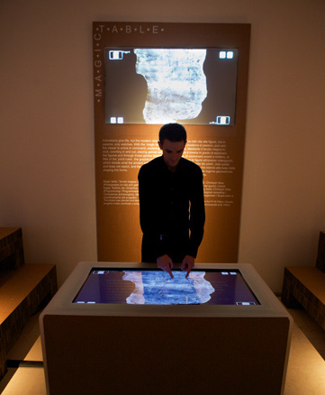
During the master's course Digital Media Technologies we developed a multi-touch game for an exhibition on prehistoric rock art in Valcamonica, a valley in northern Italy.
After several weeks of brainstorming and discussions within the team and with archaeologists we came up with a concept involving two main parts:
The central module of the application displays one of the largest rocks in the valley with several hundreds of engravings ("Pitotis") as a high resolution image (3.5 gigapixels). Visitors of the exhibition can explore the rock using multi-touch gestures. By zooming in on the figures it is possible to see the figures almost in real-life size. In order to achieve this, we systematically photographed the rock and manually stitched 214 photos together to create the first complete image of this rock.
Scattered across this huge rock, there are several small games which visitors can play. These mini-games tell short stories about the figures and encourage visitors of the exhibition to play together and discuss about the way, these engravings were drawn.
From October 1st, 2012 to November 4th, Playing Valcamonica is installed at the exhibition PITOTI at the Triennale Design Museum in Milano, Italy. In March 2013, the exhibition was displayed at the Museum of Archaeology and Anthropology in Cambridge, UK.
Playing Valcamonica was awarded the APA IT Challenge in the category Academia. We feel very honored about this!
The project was also awarded the Golden Wire, the media award of St. Pölten University of Applied Sciences two categories: Interactive and Audience-Favorite.
Ursula Egger, Martin Grubinger, Nadine Jax, Georg Seidl, Christoph Weis
The project was developed under supervision, support and advice by Markus Seidl and Peter Judmaier.
Playing Valcamonica was realized in cooperation of:
Museum of Archaeology and Anthropology and St. Pölten University of Applied Sciences


Most of the steps required to setup Bitbucket Pipelines are documented well enough, so I'm just going to list the steps together with the relevant links here:
Getting Started:
If you have never used Bitbucket Pipelines, I recommend reading the official guide for getting started with Bitbucket Pipelines first.
Exchange SSH keys:
In order to enable your pipeline to talk to your server via ssh, you will need to set up SSH keys. Please follow along this article to do so.
Bitbucket Pipelines allow you to run commands in a fresh docker image that already contains your code every time you push a commit to a certain branch. We'll use it to build our Next.js application and then push it to the server via rsync.
Create a file called bitbucket-pipelines.yml in the root of your git repository.
I use the following configuration:
# Using the node image provided by bitbucket
image: node:10.15.3

pipelines:
  branches:
    # run this on every commit to the branch "staging"
    staging:
      - step:
          name: buildAndDeploy
          # define which caches to use
          caches:
            - node # provided by bitbucket to cache node_modules
            - nextcache # see definitions section below
          script:
            # install rsync
            - apt-get update && apt-get -qq install rsync
            # install node modules
            - npm install
            # build Next.js app
            - npx next build
            # create deploy directory (to contain .next folder, package.json, node_modules, public)
            - mkdir deploy
            - cp -a .next ./deploy
            - cp package.json ./deploy
            - cp -a node_modules ./deploy
            - cp -a public ./deploy
            # rsync to a temp directory on remote server
            - rsync -arz --delete $BITBUCKET_CLONE_DIR/deploy/ $USER@$REMOTE_IP:/var/www/staging-temp
            # clear current serving directory, sync from temp directory to serving directory, restart next server
            - ssh $USER@$REMOTE_IP "rsync -ar --delete /var/www/staging-temp/ /var/www/staging && pm2 restart next-staging && rm -r /var/www/staging-temp"
definitions:
  caches:
nextcache: .next/cachestagingmaster, but deploy to a different server or folder depending on your server setup.nextcache we can cache the directory .next/cache between builds as recommended by Next.js.deploy directory first (another approach would be to use a include-list for rsync)/var/www/staging)staging directory I am transferring them to a staging-temp folder first, then rsync'ing them locally to staging.bitbucket-pipelines.yaml would probably include tests etc.If you don't want certain pieces of information about your target server in your repository (like the IP address or the user), I recommend using environment variables for the build process.
In the Bitbucket Repository page, go to Settings → Pipelines → Repository Variables. In my example I used these two variables:
These Repository Variables can be used in the bitbucket-pipelines.yaml file using $-notation, like $REMOTE_IP�. There are also a bunch of default variables provided by Bitbucket.
If everything is setup correctly (especially ssh keys), your Next.js-app should be deployed to the target server after every commit to staging branch. Visit the Pipelines section of your repository on Bitbucket (<your-bitbucket-repo-url/addon/pipelines/home) to watch what's happening (or see what's going wrong
Let me know what you think of this approach: Send me a message on Twitter or an email
For my slide show Transasia – Mit dem Motorrad von Meidling nach Malaysia I needed an interactive way to visualize the route I traveled through asia. I built this little web app, where I can control the drawing of my route simply by scrolling.
The plot: for one scrolled pixel, you travel for one kilometer. Thus the name "28771 kilometers" as this is the total length of the trip.
Additionally I needed a way to zoom in to specific areas/countries as I speak, so a quick, reliable and most of all invisible (for the audience) UI was needed. Inspired by one of Marcin Wicharys talks, I implemented an "invisible UI":
Start typing the first letters of a country along the route to zoom in and fit the country into the viewport (also jumps the head of the route to the border). For example: "IRA" for Iran, "MAL" for Malaysia.
This is in no way a finished product but it served me well during my presentations and was fun to build.
Visit "28771 kilometers"


In spring 2016 I arrived back home from a 6-month+ motorcycle trip from Vienna, Austria to Kuala Lumpur, Malaysia (see my blog and project 28771 Kilometers). I had a stack of SD-cards full of photos and a bag full of stories to tell. I decided to recompile the stories I wrote for the blog and a selection of the best photos into a beautiful book.
After months of photo editing, writing, layouting and designing I finally printed the book: Transasia – Mit dem Motorrad von Meidling nach Malaysia. I'm pretty happy with the results.
Currently I only sell the book directly, so if you're interested please contact me: [email protected]


Let's see how this works
Lately I've been using the plugin SQLTools for VS Code for viewing and editing SQL databases.
It's easy to set up (don't forget to install the required drivers for your database engine, see the description of SQLTools) and easy to use.
I have not yet figured out, why it sometimes would open the result of a query in a new editor pane. Besides that, I find it comfortable to be able to quickly view and edit the database right from my editor.
By the way, this extension also works if you're working on a remote environment via VS Codes Remote-SSH tools.
As a team of five students, we were invited to create a piece of interactive art using the facade of the Ars Electronica Center in Linz. For a couple of hours during the Ars Electronica 2009 visitors were able to play games and control visuals on the 38.500 LEDs of the 5.100 square meters large facade of the Center using smartphones.
To get a better impression, please watch the video.
Blumenstein Kerstin, Eitler Thomas, Grubinger Martin, Kuba Roman, Maurice Wohlkönig
This project was awarded the Golden Wire 2009.


For the 15th anniversary of my university, St. Pölten University of Applied Sciences, I was commissioned to create a digital guest-book on a 46-inch multi-touch screen.
I developed a multi-touch drawing application using emerging and standard web-technologies. This was a great opportunity to examine the current state of multi-touch enabled web-applications.
Additionally, a large projection showed the eight most recent drawings on a large projection wall.
As a result of this project I wrote my master thesis on the possibilities of multi-touch-enabled web applications.


Yesterday I rode my bike home in pitch black darkness, because the bike lamps ran out of battery. Luckily I was able to go almost all the way on backcountry gravel roads and/or cycle paths. No way I would have survived had I ridden on the main road without lights. I felt helpless without those lamps.
I thought: wouldn't it be great if we had bike lamps powered by the circular motion of the wheels?
Wait, we had that!
When I was a kid*, every bike would be equipped with a dynamo which powered the head- and taillamps of the bike. No worrying about low batteries! No taking the lamps off the bike when parking it in public because otherwise they would be stolen 100%.
Another example: switching on a TV was a matter of pressing one button on a clunky remote. Now? I have to switch on the TV, the receiver, the sound system and set them all to the correct inputs. Luckily I still own a Logitech Harmony, so at least I can do it all through one remote, and some things the Harmony sets up automatically. But this is not the norm, I know many people with two or more remote controls for their TV setup.
This thought lead to the broader question: How come we are accepting such obvious degradations in end-user experience? Sure, the lamps are brighter and the TV sound is from a different league, but still.
Speaking about degradation of end user experience: a big chunk of the "modern" web is barely usable. Ads cluttering the UI, forms failing to submit without proper display of the problem, layout shifts all over the place, text contrast nowhere near conforming WCAG AA levels, janky scrolling experience — I could go on, but you get my point. (Except: have you tried using the facebook mobile website?)
Chris Coyer recently wrote about this topic as well in A lot of stuff is just fine. While I generally agree with his article, I do think a lot of things in the "real" world are not fine and could be significantly better.
What’s extra fricked about all this is that you really gotta try to screw up a website as much as we do. — Chris Coyer in A lot of stuff is just fine
Where do we go from here? In my opinion, there are a few things we can all do:
* I know these things are still around, but most bikes are sold without.
In a production environment, you should not need node_dependencies from listed in the devDependencies section of your package.json.
NODE_ENV=production npm ci will only install dependencies listed in dependencies of your package.json. devDependencies will not be installed.
Alternative: use npm ci --omit=dev
I just needed to quickly serve a simple html document on a remote machine.
Usually I would go for npx serve in the directory where the .html file resides. But serve does not support https, so I found this fork of vercels serve package: https://github.com/warren-bank/node-serve
Just hit npx @warren-bank/serve --ssl
If no certificate is provided, you'll need to do the "this page is insecure but I still want to see it" dance in your browser, but that was enough for my use case (just needed a "secure context" to use secure browser APIs)
Optionally, you can provide a real certificate/key/passphrase as described in the docs.
window is not defined👉 Heads-up: This post is probably outdated, but the main concept remains the same: don't use
windowvariables if you do server side rendering or static site generation.
I have been a long time user and fan of Leaflet, a popular mapping library by @mourner. Recently I needed to integrate a rather simple map (with about 20 markers) to a Gatsby site*.
As it turns out, there's a wrapper for Leaflet in React out there: react-leaflet (Some crazy naming right there, I know!). So I installed react-leaflet as a dependency and imported it, created a <Map>, <TileLayer> as well as a few <Markers> in my page component. Et voilà, we have a leaflet map up and showing up in my gatsby site in no time (running in development mode)!
I simply commited and pushed my changes, as always expecting Netlify to do the rest (i.e. building the site and deploying it). Only later that day I realized the builds were throwing an error: window is not defined 😧
Leaflet uses the window object internally. When trying to do SSR (server side rendering) as Gatsby does, there is no window (because the app is not acually loading in a brower environment). As a newcomer to React and SSR, this was new to me (although it makes sense).
So wherever I need use window. in my code, I have to add checks if window actually exists. This can be done easily in my application code. But, we're using an external library (Leaflet) here and the last thing I want to do is to mess with the library itself.
After trying a few different approaches without success, I came across this page in the Gatsby docs: Debugging HTML Builds
We can configure webpack to basically ignore certain modules for the build-stage. To do this, add this code to your gatsby-node.js file:
exports.onCreateWebpackConfig = ({ stage, loaders, actions }) => {
  if (stage === "build-html") {
    actions.setWebpackConfig({
      module: {
        rules: [
          {
            test: /leaflet/,
            use: loaders.null(),
          },
        ],
      },
    })
  }
}
That's it. Our Gatsby build works again! 🙃
* Right now I can't share the site we are working on as it is not published yet. But here's a screenshot:

The component which defines the type needs to do so in a <script context="module"> block (see Svelte docs on context="module")
// ReusableComponent.svelte
<script context="module">
/**
 * An option object for <Select>
 * @typedef {Object} SelectOption
 * @property {string} value the value of this option
 * @property {string} label the visible label to render
 */
</script>

// ... rest of the component
then, in the importing component you can refer to the type by importing it from the module:
// MyComponent.svelte

<script>
import ReusableComponent from './ReusableComponent.svelte`

/** @type {import('./ReusableComponent.svelte').SelectOption[]} */
let optionsList = [
  {label: 'Option 1', value: 1},
  {label: 'Option 2', value: 2},
]
</script>You can now use CSS to check if JavaScript is supported using the new Scripting media query.
@media (scripting: none) {
  .show-for-noscript-users {
    display: block;
  }
}
This example media query would show elements with the class .show-for-noscript-users if JavaScript is disabled in the users browser.
@media (scripting: enabled) {
  .show-for-script-users {
    display: block;
  }
}
This example media query would show elements with the class .show-for-script-users if JavaScript is enabled in the users browser.
Possible values are:
enabled – JavaScript is enablednone – JavaScript is not enabledinitial-only – JavaScript is only enabled during the initial page load, not afterwards.This one is weird. It means that JavaScript is active during page load, but not afterwards. When would that happen? I can't think of a case, but Chrome Platform Status mentions that this can never happen in a browser environment. This issue mentions printing environments. My conclusion is: good to know it's there, probably never going to use it.
Support is pretty decent as of January 2023, with Samsung Internet being the only major browser to not support it.
What happens if the browser does not recognize the media query? It will skip the whole block (query), so keep that in mind when using it.
Traditionally we would use a combination of <noscript> and <style> elements to achieve styling that only applies to noscript environments (JavaScript disabled). However, sometimes an additional <noscript> element can break flex or grid layouts. Using this media query, we can set the display property of the <noscript> element to contents to skip it as a direct flex/grid child.
Demo on CodePen: Grid with a second row of items only for noscript environments (Visit this link with JavaScript disabled to see the second row of the grid)
According to Progressive Enhancement (PE) approach to building resilient websites, we can use this media query to style things in a certain way if JavaScript is turned off, but enhance the styles with additional rules for when JavaScript it turned on (or vice versa, depending on the use case).
Keep in mind that there are plenty of situations where JavaScript is on, but does not execute, or has not finished executing yet!
download attribute on an HTML anchor is not enough. Also: how to zip on the fly with Next.js API routes.'👉 Heads-up: This post is probably outdated! Proceed with care.
Recently I needed to create a component in a Next.js app that triggers a fiel download prompt. Typically, using the download attribute on the link to the file would be enough to trigger a download instead of opening the file directly in the browser.
This would be an example to ask the browser to open the download dialog for the file (instead of opening it):
<a href="/path/to/my/file.jpg" download>Download file.jpg</a>(additionally you could provide a custom filename, like this: download="othername.jpg")
As it turns out, the download attribute only works for same-origin resources. In my application the images are living on a different server, therefore this approach fails (i.e. the browser ignores download attribute and simply opens the file directly).
I decided to use a fairly new feature of Next.js: API routes
The aim is to create an API endpoint that takes the URL to the file as a parameter and acts as a simple proxy to the target server. Before sending it back to the user the proxy sets the Content-Disposition header, in order to trigger a download.
Here's what the final function looks like:
const request = require("request");

export default (req, res) => {
  // path to file
  const filePath = req.query.filename;

  // filename only
  const fileName = filePath.substring(filePath.lastIndexOf("/") + 1);

  // set header
  res.setHeader("content-disposition", "attachment; filename=" + fileName);

  // send request to the original file
  request
    .get(process.env.REMOTE_URL + filePath) // download original image
    .on("error", function(err) {
      res.writeHead(404, { "Content-Type": "text/html" });
      res.write("<h1>404 not found</h1>");
      res.end();
      return;
    })
    .pipe(res); // pipe converted image to HTTP response
};
Now, I can link to /api/proxy?filename=public/mybeautifulpicture.jpg to trigger a download prompt in the browser, even if the file is on a different domain.
Be aware of potential Server Side Request Forgery (SSRF) vulnerability when using the url to the file directly. Thanks to Thomas Konrad for pointing this out! 🙏
As an addition to above solution, I implemented a way to request multiple files from the remote server, which are zipped up on the fly before delivered to the user. Using this approach, there's no need to do a cleanup job to remove generated zips from the server after the user has downloaded them.
Using the following script, I can request a zip of multiple files by sending a POST request e.g. to /api/zip with a body of {files: ["file1.jpg", "file2.jpg"]}.
This is a proof of concept implementation. You might want to add some checks like an allow-list and limits to prevent potential malicious usage.
// file: api/zip.js
var async = require("async");
var request = require("request");
var archiver = require("archiver");

export default (req, res) => {

  // name of final zip file
  const zipFileName = "downloads.zip";

  // check for "files" in request body
  if (req.body.files == undefined || req.body.files == "") {
    outputError(res);
    return;
  }

  // split up files
  let filesArray = req.body.files.split(",");

  // check if files is an array
  if (!Array.isArray(filesArray)) {
    outputError(res);
    return;
  }

  // prepend every file with the base url of the remote server
  // this assumes REMOTE_URL is set as an environment variable
  filesArray = filesArray.map(f => process.env.REMOTE_URL + f);

  // set content-disposition header
  res.setHeader("content-disposition", "attachment; filename=" + zipFileName);

  // zip them files
  zipURLs(filesArray, res);
};

/**
 * Zip files and send it as response
 * @param urls {array} files to zip
 * @param outStream the response object
 */
function zipURLs(urls, outStream) {
  var zipArchive = archiver.create("zip");

  async.eachLimit(urls, 3,
    function(url, done) {
      try {
        var stream = request.get(url);
      } catch (error) {
        outputError(outStream);
        return;
      }

      stream
        .on("error", function(err) {
          return done(err);
        })
        .on("end", function() {
          return done();
        });

      // Use the last part of the URL as a filename within the ZIP archive.
      zipArchive.append(stream, { name: url.replace(/^.*\//, "") });
    },
    function(err) {
      if (err) throw err;
      zipArchive.pipe(outStream);
      zipArchive.finalize();
    }
  );
}

/**
 * Output 404 Error
 * @param res
 */
function outputError(res) {
  res.writeHead(404, { "Content-Type": "text/html" });
  res.write("<h1>Whoops, something went wrong</h1>");
  res.end();
}
Let me know what you think about this approach by leaving a comment below.
For the last year or so, we started implementing client side widgets on the public facing Geizhals Preisvergleich websites using Svelte as our go-to library for more complex UIs.
Both the page for managing your pricealerts as well as the dialog to create a new pricealert for a product are built using Svelte.
Similar to Pricealerts, all the UI around wishlists is rendered using Svelte.
Certain product categories now feature a longform text for people who want to get a better understanding of things to take into consideration when choosing a product. These texts are authored by a dedicated team at Geizhals (no AI!).
If you're using a <form> element inside a <dialog> element, you might want to consider setting its method attribute to dialog.
This will cause the dialog to close automatically on form submission and set the value of the submit button to dialog.returnValue. It will not actually submit the form though.
More details:
I learned about this from Dominik Reitz ner at the Svelte Vienna Meetup.
window.performance.getEntriesByType("navigation")[0].type === "back_forward";This is how to detect if a page was loaded because the user navigated via back or forward buttons.
Possible values:
back_forward if the navigation happened because of a back or forward navigationnavigate if the navigation happened because of a regular navigation event (like clicking a link).reload after reloading the pageprerender if the navigation has happened during a prerender hintFor Cinema Paradiso's 10-year anniversary, we created an interactive guestbook. Choosing one of five brand colors, visitors could leave a painting or written message on a multitouch screen. After publishing, their painting was shown to other visitors on a tv screen.
Additionally, visitors were asked to insert their email address after saving the image, if they want to take part in a competition.
The Guestbook is based on my previous project Kunstenaar. We added a mobile admin UI to have more control over what's visible on the tv and improved the performance of the drawing application as well as the tv application significantly.
Realized in coorporation with Christoph Weis.


For the new science center for renewable energy Sonnenwelt in Großschönau, Austria I developed a multitouch application for the final stage of the interactive journey through the center.
During their visit, visitors can collect items and play games to learn more about energy usage in our daily lifes on a mobile guide.
At the end of the visit the customized house gets transfered to a 55 inch multitouch table showing a growing village. By choosing a good spot and correct alignment for the house visitors earn additional points for saving energy.
Every day a different village gets created depending on how and where visitors decide to place their houses.
This application was developed as a subcontractor to St. Pölten University of Applied Sciences in collaboration with Christoph Weis.

(Klaus Pichler)
A mysterious puppet theatre supported by analogue/digital projected visuals and sound effects, synthesizers, a beat machine and various hacked toys/things from the scrapeyard.
Premiered on 28th of April 2009 at the Donaufestival Krems, Austria.
Progressive Factory: Christian Munk, Martin Grubinger
Surrealistic Theatre: Robert Binder, Barbara Binder


Sometimes you can't test the native [Navigator.share()](https://developer.mozilla.org/en-US/docs/Web/API/Navigator/share) API, e.g. when the site you're developing is not served via https.
I used this tiny logger to preview what would have been passed to navigator.share()
!navigator.share && navigator.share = (...args) => {
  return new Promise(() => {
    console.log(...args)
  , () => {
     console.log("error");
  }})
}Christopher Thomson, a talented writer, filmmaker and photographer, asked me to transform two of his hand-drawn maps into an interactive experience.
The two intriguing maps show the area around the village of Dordolla, Italy in an interesting perspective. One at daytime looking west, one at nighttime looking east. The maps show hiking paths, almost forgotten places and the peaks around the village.
The application enables users to explore the maps in all their beautiful detail. Every place on the map also has a photograph attached to it. This way you can get a sense of the beauty of the area even if you're far away.
This project was realized as part of the exhibition EWIGE BAUSTELLE in May 2014.


Autowuzzler is a virtual foosball (table soccer) multiplayer game. Invite your friends and shoot those goals. Play for free over at: autowuzzler.com
Note: This game is in public beta right now and far from finished (I have plenty of ideas how to take this further). If you experience any issues, please do not hesitate to contact me (@grooovinger or [email protected])

During the first Covid-19 lockdown, I missed playing foosball with my colleagues at the Geizhals-office, so I decided to do something about it. While playing toy cars with my kid, I had the idea of mixing virtual toy cars with a foosball setup and combining it with a simple Join-via-PIN à la kahoot.it to enable frictionless sessions.
The game resembles a 2D topdown view of a foosball table. Each player is assigned to one of two teams and tries to kick the ball into the correct goal. The first team reaching 10 goals wins.
To start a new game, a player creates a game PIN for a session. This game PIN can then be shared with friends as a unique URL to their game session. When a player first loads the game, they enter a nickname which will appear next to the players car.
This application is built on the following stack:
Read more about the idea, process and development of Autowuzzler on Smashing Magazine.
There's a new CSS property landing in Chrome 123 that will automatically resize textareas and inputs based on its content. Since I could not remember its name and only found it by digging through my Mastodon conversations and finding this post by Jen Simmons again, I thought I'd note it down here.
The property is called field-sizing and has two possible values: strict (default, just as before) and content which will automatically grow the element if needed.
The team at Polypane did a great job explaining it in more detail in this blog post: Field-sizing just works! – go read it if you have not heard about it.
For an assignment for the course Interaction Design at St. Pölten University of Applied Sciences we created a litte game that combines physical level design and a digital, projected avatar.
Player 1 uses a physical controller to print the level that Player 2 has to play in real time.
The printing is done using a thermoprinter. As this represented a quick and dirty prototype we used a camera and OpenCV to detect the created level.
As you can see in the video, it was great fun to play, while at the same time it's not exactly what you would call eco-friendly...
Christian Munk, Daniel Werndl, Guilia Raberger, Martin Grubinger. A project of Progressive Factory.


A form can have multiple input[type=submit] (or <button type=submit>) elements. You can specify different values, targets, methods or even different actions for these.
In JavaScript, the information which submit-button was used to submit the form can be accessed in the SubmitEvents submitter property.
Recently, I've been exploring the html <form> element more, mainly because it's such a central building block for SvelteKit apps. Or, more precisely: forms have been a major building block for web applications forever, but I feel that it's importance and role has been neglected in the last decade or so of JavaScript-heavy SPAs. Personally, I feel that I have a knowledge gap around such an important building block, and maybe I'm not alone.
The example above has two sections:
name attribute, but different values. By default, hitting one of the two submits will submit the form and change the URL of the example website, depending on the value of the clicked element. Kinda like a radio group, but for distinct actions a user can take.submit event and updating text on the website via JavaScript – again, depending on which button was used.There are more things you can specify on a submit element, like the action to submit to or the forms method. See this MDN page on the input[type=submit] element.
A collection of tricks and niceties you might find useful when working with Svelte. This list is intended to be updated from time to time.
I can think of multiple options to apply external styling for a reusable component:
style prop:global() selector in the parent componentIn the example above I used the CSS vars approach. The idea is, that you allow overriding of certain styles based on CSS vars that get applied to the component. Svelte supports setting CSS vars directly when using a component, like this:
<Component --bg-color=”blue” />
Note how you don't need the style attribute, just pass in the props via
--propnameattribute!
Then, in the <style> block of your reusable component, use the CSS variable – ideally with a fallback value:
<style>
.mycomponent {
    --bg: var(--bg, red);
}
</style>
I think that’s a clean way to open up styling adjustments for a component. I think of this approach like a separate set of props, just for styling. You might also want to consider using special prefixes for these kind of variables to prevent naming clashes.
If you want a component to pass an event to its parent, all you need to do is to set the attribute on: on the element triggering the event. Like this:
// within InnerComponent.svelte
<div class="card">
  <button on:click type="button">Open</button> // <<-- note the on:click here
</div>

// within ParentComponent.svelte
<MyComponent on:click={openCard} />
This is not a secret trick, it's even in the new official tutorial. I find it very useful and it's a svelte feature that just makes me authoring components such a joy.
(a weird name that I just made up)
In Svelte, you can set individual CSS rules to be global using the :global() keyword in the style section. Sometimes you might want to have styles, that are global, but only as long as the element is a child of a certain element to prevent clashes.
Utilizing svelte-preprocess with Less or Sass and postcss you can write rules like this:
<style lang="less">
.mycomponent {
  /* local styles of this component */

  :global {
    .dynamically-added-element {
        color: deeppink;
    /* global styles that are only available for elements with class dynamically-added-element which are children of .mycomponent */
    ...
    }
  }
}
</style>
Note that the :global {} block is a feature of svelte-preprocess
To run an each loop over just a part of an array, use a dynamically constructed array straight in the template:
{#each {length: 5} as _, index (index)}
    {@const item = items[index] }
    <!-- do stuff with {item} -->
{/each}
You might argue that extracting the slice of the array in the <script> area of a component is more readable. I agree.
To dynamically load a component, you can import it straight from the template using #await:
{#await import("$lib/path/to/ComponentName.svelte") }
  <p>loading...</p>
{:then { default: ComponentName }}
  <ComponentName />
{/await}
Line number 5 destructures the imported module to get the default export (our svelte component) and renames it to ComponentName. Be careful not to accidently create request waterfalls by only loading components lazily your application does not need for the initial render.
You can set an offset for CSS background-position to specify the position of a background image from right and/or bottom boundaries, like this:
.my-element {
  background-image: url('path/to/image.png');
  background-position: right 10px bottom 5px;
This will place the image in the bottom-right corner, but move it 10px to the left and 5px towards the top. Kinda like setting a transform: translateX(-10px, -5px) (which you can't for background images).
So far I've only ever used right bottom or a percentage/pixel based position for background images, but background offset comes in handy when making sure a flush right or bottom background-icon is positioned exactly where you need it.
Also see css-background-offsets on caniuse
When I was a kid, I loved to play a game called Lights Out by Tiger Electronics.
It was my first portable "game console", and this is what it looked like:
<iframe width="560" height="315" src="https://www.youtube.com/embed/pj0lVmhkx7M" frameborder="0" allow="accelerometer; autoplay; encrypted-media; gyroscope; picture-in-picture" allowfullscreen></iframe>OMG, this commercial is gold!
Recently a similar grid pattern reminded me of this game, so I decided to recreate it – but as a progressive web app.
While I'm not a big fan of the Neomorphism design trend, I wanted to play around with it to get an idea how the gradients and shadows are combined for that special look.
Stuff I used for this project:


Detect if the document is currently hidden (which means, not active. e.g. user currently has a different tab open)
document.hiddenhttps://developer.mozilla.org/en-US/docs/Web/API/Document/hidden
The <template> element is useful if you want to dynamically create markup based on a predefined “template” (great naming right there).
Example markup:
<template>
	<div>
		<h3>any markup, really</h3>
		<!-- watch out for FOUT if you also load relevant styles -->
		<link rel="stylesheet" href="url-to-stylesheet.css">
	</div>
</template>

<div class="my-target"></div>
Example script
// grab the template
const template = document.getElementById('my-template');
// clone the templates content
const clonedTemplate = template.content.firstElementChild.cloneNode(true);
// optionally modify the cloned tree here
// append to `.my-target`
document.targetSelector('.my-target').appendChild(clonedTemplate);
👉 The first child of (the
Group all elements on the current page by their font size:
let elementsBySize = [];
[...$$('body *')].forEach(el => {
  let fontSize = window.getComputedStyle(el).fontSize;
  if(!elementsBySize[fontSize]) elementsBySize[fontSize] = [];
  elementsBySize[fontSize].push(el)
});
elementsBySize now contains an array with key: font size and value of an array containing all the elements with that font size.
Note: this only works in the chrome(ium) devtools, since it uses the $$ syntax. You can replace it with document.querySelectorAll('*')
It is possible to make an element stick to the top and bottom of a scroll container! You could say: "Of course!", but I guess I was just surprised it actually works.
Here's the CSS:
.i-am-sticky {
	position: sticky;
	top: 0; /* or any other value if you want some offset */
	bottom: 0; /* or any other value if you want some offset */
}
I find this especially useful for a List/Detail two-column layout where items in the right column shows details when item in the left column is selected (think Apple Mail etc).
This way the selected item always stays visible to the user.
(Imagine trying to solve this using JS, urgh.)
Here's a quick demo:
Every day at around noon we face the same problem at the Fluxguide office: What are we going to eat today?
Because of that, and, more importantly, because I really wanted to build something using Svelte, I decided to build an app for that.
Using What are we going to eat today? you can add all the possible things you can get for lunch (along with price and distance information) and then hit that bigass yellow button. Using Artificial Intelligence on a Blockchain and AR, the app decides to read your mind and suggest what you should get for lunch today.
(Ok, actually it is simply a simple dumb randomizing function.)
<iframe width="177" height="315" src="https://www.youtube.com/embed/ONdeBfgvK8E?rel=0&controls=0&showinfo=0&autoplay=1&fs=0&modestbranding=1&showinfo=0" frameborder="0" allow="accelerometer; autoplay; encrypted-media; gyroscope; picture-in-picture" allowfullscreen></iframe>This app has been retired in the meantime.
Tech: I used svelte to build the app, which was really easy to get started with. I especially like how many things are already baked in (transition, stores, settings tags in the <head> of your document, to name just a few) and still it's very simple to use.
For storing data as well as authentication, I used Google Firebase. It was quite easy to set up and use in a svelte app. Unfortunately I only discovered late in the process that it adds around 500kb to my Javascript-bundle. Uarg! Since this is just a fun side-project, I did not bother to implement an other data storing and auth solution.
The app was hosted on Netlify, of course.


Cypress Testing Library outputs a rather verbose log message when it can't find an element using e.g. findByRole. The intention is to help you, the developer to fix the test and figure out which accessible elements are available.
However, I find this not very useful and too verbose, especially in a CI environment.
Luckily, Cypress Testing Library allows for customization of the message.
I use this configuration to limit the log messag length, while still keeping the relevant information about which element was not found:
// file: cypress/support/commands.js
import '@testing-library/cypress/add-commands';
import { configure } from '@testing-library/cypress'

configure({
  getElementError: (message, container) => {

    // truncate everything after 'Here are the accessible roles:'
    let indexOfRoleListMessage = message.indexOf('Here are the accessible roles:');
    let shortMessage = message.substring(0, indexOfRoleListMessage);

    // return a new error with the shorter message
    let error = new Error(shortMessage);
    error.name = 'AccessibleElementNotFoundError';
    return error;
  }
})During my internship at Second Story Interactive Studios in Portland, Oregon I was honored to be part of the team to develop the website accompaning the exhibition Henri Cartier-Bresson: The Modern Century at the Museum of Modern Art NY.
Even though in spring of 2010 the term "responsive webdesign" was not yet a coined term, the site is built in a responsive manner. This was especially important as the website was also installed at a public kiosk at the museum.
Looking back I find it highly interesting that the result of the project was a static website. There was no Gatsby or Hugo back then, so we exported the php views from Symfony using a custom-built exporter.
The project was awarded a Best of the Web Award by Museums and the Web in 2011.


 React
React
A declarative, efficient, and flexible JavaScript library for building user interfaces.
🖖 Vue.js is a progressive, incrementally-adoptable JavaScript framework for building UI on the web.
 Typescript
TypeScript is a superset of JavaScript that compiles to clean JavaScript output.
An Open Source Machine Learning Framework for Everyone
 Django
The Web framework for perfectionists with deadlines.
 Laravel
A PHP framework for web artisans
Bring data to life with SVG, Canvas and HTML. 📊📈🎉
JavaScript (JS) is a lightweight interpreted programming language with first-class functions.
Some thing interesting about web. New door for the world.
A server is a program made to process requests and deliver data to clients.
Machine learning is a way of modeling and interpreting data that allows a piece of software to respond intelligently.
Some thing interesting about visualization, use data art
Some thing interesting about game, make everyone happy.
 Facebook
We are working to build community through open source technology. NB: members must have two-factor auth.
 Microsoft
Open source projects and samples from Microsoft.
 Google
Google ❤️ Open Source for everyone.
 Alibaba
Alibaba Open Source for everyone
 D3
D3
Data-Driven Documents codes.
 Tencent
China tencent open source team.