Regular:

High Contrast:

Darker:

Stealth:

A color theme for VS Code based on emacs-zenburn.
GPL3, like emacs-zenburn.
Port of Emacs Zenburn theme to VS Code
Home Page: https://marketplace.visualstudio.com/items?itemName=matklad.pale-fire
Regular:
High Contrast:
Darker:
Stealth:
A color theme for VS Code based on emacs-zenburn.
GPL3, like emacs-zenburn.
![dependabot[bot] avatar](https://avatars.githubusercontent.com/in/29110?v=4 "dependabot[bot]")


Hey @matklad, I’ve recently been thinking about some (possibly overengineered) changes I think might be nice for Pale Fire.
I recently fixed a bug that arose from not having "fontStyle": "" somewhere. After fixing it I thought it might be a good idea to add this to every single rule so that:
"fontStyle": "" and think about why it’s there – it really doesn’t matter)Rather than doing it manually, I thought it might be a good idea to use a generator program instead. I’ve done this previously, and it worked really well. Another benefit of generating the theme is that colours can be synced between semantic and TextMate rules. The current approach of ‘hopefully remember to update both the semantic and TextMate colour’ has led to at least one bug.
The Zenburn palette that Pale Fire uses has generated all its different colour variations through the RGB colour space. For example, here are zenburn-green and zenburn-green+1:


Notice how the H and S values stay the same – only V changes.
The problem with this is that the movement along any one of these three dimensions does not appear smooth to humans. For example, take a look at the hue dimension (the colourful bar) – although this is only meant to be changing the hue, the blues look much darker than everything else, and the yellow looks less saturated than the other colours. To us, it appears as if the hue dimension is also affecting the other two dimensions. This page has some good examples of these kinds of problems arising in gradients.
Although physically the change in the photons is linear, it isn’t perceived as such by our visual system. This is something which HSV (along with HSL and CMYK) has inherited from sRGB.
This ‘perceptual non-uniformity’ can be fixed by using a colour space that has been deliberately warped so that it appears smooth to us, such as CIELAB or CIECAM02. As far as I can tell, CIECAM02 is the state of the art in this field, but I’m just someone who’s done a bit of Googling and don’t know what any of the equations on that page mean :)
It’s hard to say whether this change would actually make the theme appear more harmonious without actually trying it, but I think it might be worth a shot.
If the theme is being generated, why not generate the colour palette in the same program? This could allow changing, e.g. contrast by modifying the value of a single constant and running the generator. This idea is really appealing to me, as it allows changing the overall colours of the theme without having to manually change each value. Additionally, it would also allow fixing #10 by generating a second theme with increased contrast.
I know these changes are large and stray further from the original intention of this theme (port Emacs Zenburn to VS Code), which is why I wanted to ask you before actually trying to implement anything.
Hi! First of all, thanks for keeping this theme supported and up-to-date. It's my daily driver and I really appreciate it :).
I just started using inlay hints for the first time now that vscode lets you quickly toggle them on and off. In pale-fire, these show up with the same color as comments. Here's an example slice of code with inlay hints off:

and with inlay hints on:

It's difficult to put into words but the inlay hints just don't stand out enough for me to want to read them and utilize their information. I have a different voice in my head for "human things" (comments written in human language) vs. "machine things" (code written in programming language), and inlay hints being colored as comments makes me read them subconsciously in my "human things" voice which makes my brain sort of glaze over them (comments lie sometimes okay 😛).
For contrast, here's how the default dark theme in vscode colors inlay hints:

I like this a lot:
Do you have any thoughts / feels on inlay hints? Should we consider changing their style in pale-fire?
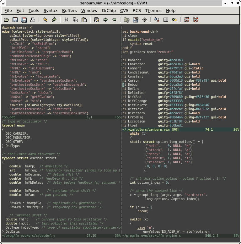
I often find that my screen looks like this:

That’s too much cyan in my opinion. Here’s the original Zenburn for Vim:
And here’s a Zenburn port to Eclipse:
 (source: http://www.eclipsecolorthemes.org/?view=theme&id=2)
I’ve been trying to work some of these colours into Pale Fire, but haven’t been particularly successful.
At the moment this is a faded grey, which I find a little hard to read. I’ve noticed that this colour is often expected to be a deemphasised colour by CLIs, so maybe it makes more sense to use the green from comments instead?
Open VSX is an alternative marketplace for VS code used by default on arch/manjaro (and maybe other systems).
If I see it correctly its a one line change to the workflow after the initial registration & setup is finished.
So it would be great if this extension could be added there as well.
Greetings Chris
Links:
PS: It took me way too long to find out why I had such an old version of pale fire installed and why I couldn't update it :-D

Both occurrences of TEST in the screenshot above should be colored dark red in the same way occurrences of scarry are.
This is probably due to modifiers in themes not being additive, see rust-lang/rust-analyzer#15797 (comment)
Now that rust-lang/rust-analyzer#8024 has been implemented, it would make sense to utilise rust-analyzer’s new highlighting capabilities to differentiate items that come from traits. I think this is a good idea because it can sometimes be confusing why a given type has a certain method or associated constant when this came from a trait. With highlighting, this becomes obvious at a glance.

I would expect untracked files to be grey.
For the reference, emacs version

I like Vim (neovide / neovim) more than I like VSCode and would prefer to use that, but it is hard to not have this delightful semantic highlighting and color scheme when working on my Rust programs.
Is there a Vim version of this, preferably with semantic highlighting? I'm using Coc w/ rust-analyzer
Highlighted text looks great in the editor:

however, in the terminal it's much lower contrast, and difficult to see:

(Both screenshots with the default theme, not the high-contrast version.)
I’m not convinced if this is very useful, but we already have slight variations in lightness between user-defined types, primitive types and interfaces, so might as well extend this for more variety and detail.

Note the odd trailing gray color behind each highlighted line. Not sure why that's appearing, but it doesn't display like that in other themes 🤔

would be useful to mark such items somehow, especially in rust-analyzer's own tests

There's a checkbox which is really hard to see in the "Pale Fire" theme. Really hard to see. Really, really h—... look, maybe just scroll down to look at the screenshots first, then you can come right back to the TLDR.
(What? Yes, it's a lot of scrolling, I promise that screenshots are down there. No, you don't have to read the stuff you're scrolling past, it's just backstory. Why'd I put it then? Look, this is the TLDR. Why would I write a TLDR, but put a line in it that says you need to read the whole damn thing anyway? I'm not a monster)
... Anyway, I think that this checkbox (which I will now call "the bad checkbox") should somehow be made more visible.
Why? Well, I wrote short (but far too long for a GitHub issue!) autobiographical story about how confused I got by misunderstanding the UI.
Also, it's more visible in other themes. Look, scroll down again, further this time, to the part where the section heading says something about "links to screenshots". There's a list in it. Each item in the list starts with a link. That link is a screenshot of the checkbox in other themes, they don't have the issue).
Okay. That's the TLDR. You basically have 90% of the gist of this issue — now I don't have to feel guilty because I wrote over 2000 words about things mostly unrelated to my complaint in someone's GitHub issue tracker, and buried a real problem they probably want to fix in the middle
P.S. Uh, sorry5 about this in advance. Hopefully this... unconventional... issue doesn't leave you so annoyed that you refuse to fix it out of spite7, since IMO it is a real problem. My only defense for all this writing is that I got in a bit of a strange mood, and couldn't stop until was already... out of hand. Too much coffee, maybe? Let's go with that. If you find my writing insufferable (you should already know by now if this is the case), you can probably stop here, or only skim the rest.
First, a story: Yesterday I started to get some modal popups in VSCode which asked whether I trust the authors of the code in the workspace I was in.
Today, after a few times (I jump around workspaces a lot) I decided to actually read it, probably out of dread for the project I was opening. What I saw was... pretty concerning, In particular, I noticed a line which read: "Trust the authors of all files in parent folder 'src'", and that was located right above the boxes labeled "Yes, I trust the authors" and "No, I don't trust the authors".
Immediately, I thought I had misunderstood what this popup was asking before — that it was actually asking if it was okay to trust my ~/src. Unfortunately, while I could probably be convinced to trust the authors of that workspace6... the same definitely wasn't true for ~/src.
My ~/src folder is a radioactive wasteland. It contains... a lot of complete trash that I just downloaded to read, back when I didn't like reading stuff on GitHub's website (the dark theme improves this, but I still do it sometimes so that I can reformat things I find hard to read). As a result, that folder has some stuff I don't trust, or more-or-less trust, but definitely would rather VSCode not execute (okay, that one should be neutered, but you get the point). Not to mention, my ~/src folder also has a lot of completely unknown code, for example: at least one of those folders in src has a node_modules subfolder containing at least 80 skillion JavaScript dependencies, and I'm not sure I trust any of those.
And so... panic started to set in. I began to worry about everything I'd need to do to as a workaround for this flaw in VSCode's trust model, which seemed to implicitly trust everything inside the parent directory of a trusted workspace:
cargo new $proj $cargo_new_args with scripts that performed something like mkdir $proj && cd $proj && cargo new $proj $cargo_new_args.
git clone <repo-url>... The thought of the string manipulation that would be necessary in the shell script for that one started to make my head spin...~/trusted folder for them...
However, while I considered this, I also began to complain online... At least, until @BlackHoleFox, a friend of mine, pointed out to me: "hm, that's a checkbox".
... Oh.
My fears were unfounded! Turns out: that isn't what that line means! Or... maybe it is, but it isn't a standalone line! It's a line which holds a checkbox — an unchecked checkbox. That is, a checkbox indicating that line does not apply! Phew! I hadn't agreed to let VSCode blindly execute or evaluate every file inside ~/src, or whatever else I was worried it might do.
(Anyway, my guess is: this combination checkbox+label is probably just VSCode's way of letting more careful (err, am I sure careful is the right word to use there?) users permanently dismiss the popup10)
Anyway, (regardless of whether or not you think that section "got away" from me...) that problem happened because the background of the checkbox was too hard to see against the background of the modal. Anyway, in case you're unconvinced, I have a screenshot.

Do you see it? There's a square to the left of the line beginning with "Trust the authors of all files...". This square is very very slightly lighter than the background. If you're like me, you probably need to look very carefully, and do at least a (minor) exaggerated squint.
If you're still having trouble, here's another screenshot. I've attempted to use the powers of "entering raw HTML into markdown" in order coerce GitHub into rendering this one far larger than it normally would like to (that said, these powers are often forbidden in the name of security, so we shall see...).

See it now? It's to the right of the left of the image, and to the left of the "T". (... Nailed it. That was absolutely the clearest to describe that)
If you're still having trouble seeing it... Then I'm right1! To confirm how right I am, you can probably check the color values of the pixels, like with an image editor, or a tool like "Digital Color Meter"4.
Anyway, it's time⁷ that I get to the point: I would the Pale Fire theme to find some way to make "the bad checkbox" (described above) more visible. Two decent options are:
I'm aware this is the reduced contrast version of an already low-contrast theme (or at least, zenburn-style themes have used reduced contrast for a while, since it reduces eye strain2, according to some person or people who wrote a README for a text editor theme), but I think that it's worth it regardless.
Currently, the colors here (as reported by "Digital Color Meter") are sRGB 57, 57, 57 and sRGB 60, 60, 60. The first of these is #393939, which shows up in Pale Fire's JSON... but the second is #3c3c3c, which... dunno where that comes from.
That... might mean that VSCode doesn't not let you style this directly. Which might suck and require some hacks. Or maybe it is configurable, but by default it figures it out by blending other colors?
The contrast ratio between these is ~1.047 (this is on a scale from 1 to 21). I'm not sure there are really guidelines for what this should be (probably not the same as the ones for text, since this is still part of the background), and I'm not sure the reduced-contrast variant of a zenburn-based theme should follow any contrast ratio guidelines we could find...
So, I dunno conclusion to make about this, but uh, yeah. Subjectively speaking, a ratio of 1.05 seems too low for me.
I just checked a few other color themes that I have installed (including Pale Fire High Contrast), to see if this is the kind of thing that's bad everywhere, or it should be something we can improve. They all do better, so we should too.
"One Monokai": This is still not great, but is more visible — importantly, it's visible enough that I wouldn't be filing this bug. It helps a lot that there's an outline around the checkbox that for some reason is omitted or is the same.
"Solarized Dark": The outline really makes it stand out, even though the inner/outer backgrounds seem to be the same color.
"Pale Fire High Contrast": Completely visible, although probably a bit on the low side for the "high contrast" theme (but, also maybe not, IDK).
Because of, erm, reasons3, I'd rather not use this version of the theme. That said, I might start if it can't be fixed in the reduced contrast version, so that I don't miss stuff like this.
So, all of those seem to do better than Pale Fire here, so it would be nice to get on-par with them.
(Note: these footnotes aren't all in order. Sorry. Several started their lives inside parentheses, but when checking for typos, I decided they were too long, too off-topic, or both, so I added them to the list of footnotes... and didn't really feel like renumbering all of them each time I did this... That said, I did go through and make them into links, which was actually much more work, so I should have renumbered them while I was at it. But at this point, maybe I just refuse)
1: This is, of course, just always great news. You love to hear it.
2: I... I think nobody believes this though? Or at least, I don't believe it. I mean, isn't that the... opposite of how it works?
3: Important reasons, like my refusal to admit that I too experience the passage of time, "I kinda think the other one looks prettier", and "I'm more used to it".
4: Digital Color Meter comes with macOS, and I like using it a lot. There's probably something on other OSes, although maybe not build in.
That said, if you're downloading something to install so that you can look at the pixels, then I think you should go with the image editor option instead, since it's a bit more useful, and I'm surprised you haven't gotten one by now.
5: Apparently not that sorry though... Clearly I'm not sorry enough to not do it. And apparently, I'm also not sorry enough to delete any of the footnotes, let alone a paragraph, let alone one of the sections.
Honestly, you're lucky that I even labeled all some11 of the sections that I should delete, so that you know what you can skip.
6: In this case: 'past me', 'distant past me', and 'some GitHub user who submitted a single patch fixing a typo in the README'.
7: Or if not only spite, then a mixture of both spite, and the hope that if you don't fix it, then I won't report this kind of issue in the future8, or at least I won't do so here.
8: Unfortunately, as the saying goes: I will never log off.
9: What? You don't think GitHub issues need footnotes? ... C'mon, it's just my writing style, dude... that kind of restrictive thinking is really harshin' the vibes...
10: I imagine this person will enable the checkbox while wonder to themselves something like "what sort of gormless rube would ever be so foolish as to not only download code that they didn't trust, but to then go and but it into sibling folders of the code they do trust.".
Well, user who I just made up: this sort (you should imagine that I'm pointing at myself in some manner).
11: Nope, that's not true anymore because I changed the name of the "Background" section. (Okay, okay, I've added an explicit notice that you can skip it)
Honestly, you probably skip just about everything except for the pictures, and get a good idea about the rest. You probably should too, would save a lot of time. I guess now isn't the right time to mention this though.
(Alright, I went back and reworked the start. Now it's clear that you don't actually have to put up with my bullshit, even if that would have been a very funny thing to end this with)
In Rust with rust-analyzer, when viewing a module/impl/whatever which is #[cfg()] off under the current configuration for whatever reason, essentially every identifier gets the unresolvedReference semantic token scope. Right now, this is highlighted as red and underlined, which makes this code pretty unpleasant to view, to say the least.
Concretely, my complaint is that it's worse with semantic highlighting than without it in that case. (For some cases, the solution is to reconfigure things so that that code is not #[cfg()]ed off, but that's not always viable or worthwhile)
Anyway, practice, I don't know how important it is that unresolveReference be so noisy. (I tried to disable it for myself to see if i missed it, but couldn't — see bottom). I feel like most of the time it might be redundant with the error squiggles you typically get from r-a running cargo check or whatever.
(The obvious exception to that of the "hey this module isn't understood for some reason" case, which is occasionally useful, but honestly, IME is more annoying than useful in practice...)
If it is important, maybe it could be a bit less obtrusive? IDK how though. Although, I guess there's no support for background color in semantic tokens styles in vscode, which suck since would probably be my ideal alternative (a very slight red background color, and no semantic color for foreground)... Bummer.
As mentioned above, I tried disabling this myself to see if it's something I'd miss, but wasn't able to figure out how really.
E.g. my ideal would be setting foreground for unresolvedReference to "whatever the non-semantic coloring would be", but it doesn't seem possible:
    "editor.semanticTokenColorCustomizations": {
        "[Pale Fire]": {
            "enabled": true,
            "rules": {
                "unresolvedReference": {
                    // Unsure what to put here. `"inherit"`, `"default"` and `""` aren't
                    // allowed, `"#00000000"` makes the tokens fully transparent
                    // (which... I guess is what I asked for), ...

                    // "foreground": ???,

                    "underline": false  // this one works tho
                }
            }
        }
    },
doesn't do the trick. Maybe it's impossible, or just PEBCAK though. Either way, this wouldn't be pale-fire's fault, but if it can't be overridden then IMO that's a argument in favor of at least making it less aggressive
Hi!
I was looking for something lighter than Darker but darker than High Contrast, and Stealth is perfect background wise, but the icon and unfocused tabs are unreadable for me.
Is there a way to lighten up the icon and unfocused tab's title?
In the merge conflict side-by-side view1, vscode has some indication of which part of the line is different, however it's very hard to see, even on high contrast mode.
For example, on the following line, the difference is that one has 40 in the version number, and the other 39.

If you look carefully, you can see that the background color of 40 and 39 have very slightly different shades of green and red when compared to the rest of the line, which is identical.
It would be really cool if this were more visible. I tried to see what scopes these are so that I could point you in the right direction, but the scope inspector doesn't seem to be aware of the diff view (I didn't try very hard at all though).
FWIW this is hard to see in every theme, so I guess there might be nothing we can do 😞 (however, I have some mildly-naive optimism because of all of the diff/git related colors that happen to be in the theme json).
P.S. Just noticed the new variant color themes. Cool!
That is to say: the view that shows when you click the "Compare Changes" label above a merge conflict. I don't know what it's called. Hopefully this is clear enough (well, I added an image now, so that probably helps).
Possibly worth noting that I use merge.conflictstyle = diff3 in my gitconfig, and while I can't imagine this is related, it could cause the UI for the label to be slightly different. I'm 99% certain that I had the same or similar option in the past, prior to switching to diff3, but I'm noting it just to avoid this throwing you off. ↩
Hey! My Pale Fire theme just updated automatically in VS Code, and up until now I have been very happy with the theme.
However, the changes to the colour contrast on the UI elements is making it difficult for me to distinguish errors from warnings on the scroll bar, and file names in the explorer bar.
I am slightly colour blind, so these two colours look almost exactly the same to me unless I focus really hard:
![]()
Would it be possible to either raise the contrast of those elements back to their previous levels, or, alternatively, offer a "High Contrast" variant in the same extension for my bad eyes? 😄
Hey, @arzg, you've put significantly more work into maintaining this than I ever did.
I think it makes sense to fully transfer the extension into your hands, if you wish so.
Repo transfer shouldn't be a problem, but I am less clear on extension transfer. Ie, it seems like it is impossible to switch to a new publisher id: microsoft/vscode#21478 (comment)
We can keep the status quo where CI publishes the stuff on my behalf, or we can publish a separate extension, and point this one to the new one.
Right now they're the same color. This kinda makes sense, since they're both things you want to avoid, but in a very different way. I think they should be changed to different colors, but don't have very strong feelings about what.
I can override it locally (and probably will after filing this issue), but figured I'd say something.
I've been writing more macros lately, and one thing I've noticed is that pale-fire's highlighting of macro definitions makes things a bit difficult to read.
For instance, here's a macro definition syntax-highlighted by Gitlab's diff viewer:

Here's that same macro definition in pale-fire:

Gitlab's syntax highlighting provides helpful color differentiation for important bits of the macro definition here, such as the $ symbol and the argument definitions / designators. Pale-fire lacks color and everything turns into one blob, making it harder to read.
Hi,
I was just poking around the source of Pale Fire because I’m porting it for an editor I’m working on, and noticed that a bunch of the colours are different to those I’m used to seeing in VS Code. After looking some more, I realised that the last release was v0.1.0; around two months ago.
Is there some way I can try out the latest changes? Or would you have to release again for this? Is that something you would be comfortable with, or are these new colours not definitely going into the next release?
Thanks for Pale Fire by the way, it’s my favourite colour scheme for Rust at the moment (I tend to be very indecisive when it comes to colour schemes). rust-analyzer is amazing too, so good in fact you managed to get a lifelong (well, as long as I’ve been programming for) Vim user to switch to VS Code, without any kind of Vim emulation either!
VS Code:

Emacs:

I think Emacs approach of using lighter background is more readable
Emacs:

VS Code:

A declarative, efficient, and flexible JavaScript library for building user interfaces.
🖖 Vue.js is a progressive, incrementally-adoptable JavaScript framework for building UI on the web.
TypeScript is a superset of JavaScript that compiles to clean JavaScript output.
An Open Source Machine Learning Framework for Everyone
The Web framework for perfectionists with deadlines.
A PHP framework for web artisans
Bring data to life with SVG, Canvas and HTML. 📊📈🎉
JavaScript (JS) is a lightweight interpreted programming language with first-class functions.
Some thing interesting about web. New door for the world.
A server is a program made to process requests and deliver data to clients.
Machine learning is a way of modeling and interpreting data that allows a piece of software to respond intelligently.
Some thing interesting about visualization, use data art
Some thing interesting about game, make everyone happy.
We are working to build community through open source technology. NB: members must have two-factor auth.
Open source projects and samples from Microsoft.
Google ❤️ Open Source for everyone.
Alibaba Open Source for everyone
Data-Driven Documents codes.
China tencent open source team.