Code Monkey home page Code Monkey logo

material-components's Introduction

Material Components: Shared Documentation and Policies

Material Components for Android, iOS, web and Flutter help developers execute Material Design with modular and customizable UI components. Developed by a core team of engineers and UX designers at Google, these components enable a reliable development workflow to build beautiful and functional user experiences.

This repo contains all common documentation for Material Components projects across the different platforms.

Repos

Useful Links

material-components's People

Contributors

ajsecord avatar chaficnajjar avatar hebbet avatar jesselucas avatar sfdexter avatar traviskaufman avatar willlarche avatar

Stargazers

 avatar  avatar  avatar  avatar  avatar  avatar  avatar  avatar  avatar  avatar  avatar  avatar  avatar  avatar  avatar  avatar  avatar  avatar  avatar  avatar  avatar  avatar  avatar  avatar  avatar  avatar  avatar  avatar  avatar  avatar  avatar  avatar  avatar  avatar  avatar  avatar  avatar  avatar  avatar  avatar  avatar  avatar  avatar  avatar  avatar  avatar  avatar  avatar  avatar  avatar  avatar  avatar  avatar  avatar  avatar  avatar  avatar  avatar  avatar  avatar  avatar  avatar  avatar  avatar  avatar  avatar  avatar  avatar  avatar  avatar  avatar  avatar  avatar  avatar  avatar  avatar  avatar  avatar  avatar  avatar  avatar  avatar  avatar  avatar  avatar  avatar  avatar  avatar  avatar  avatar  avatar  avatar  avatar  avatar  avatar  avatar  avatar  avatar  avatar  avatar

Watchers

 avatar  avatar  avatar  avatar  avatar  avatar  avatar  avatar  avatar  avatar  avatar  avatar  avatar  avatar  avatar  avatar  avatar  avatar  avatar  avatar  avatar  avatar  avatar  avatar  avatar  avatar  avatar  avatar  avatar  avatar  avatar  avatar  avatar  avatar  avatar  avatar  avatar  avatar  avatar  avatar  avatar  avatar  avatar  avatar  avatar  avatar  avatar  avatar  avatar  avatar  avatar  avatar  avatar  avatar  avatar  avatar  avatar  avatar  avatar  avatar  avatar  avatar  avatar  avatar  avatar  avatar  avatar  avatar  avatar  avatar  avatar  avatar  avatar  avatar  avatar  avatar  avatar  avatar  avatar  avatar  avatar  avatar  avatar  avatar  avatar  avatar  avatar  avatar  avatar  avatar  avatar  avatar  avatar  avatar  avatar  avatar  avatar  avatar  avatar  avatar

material-components's Issues

[Tooltip] Font size for desktop web application is too small

Overview

Recommended Tooltip font height 10 px for desktop is too small.

Reproduction steps

  1. Go to https://material.io/design/components/tooltips.html#spec
  2. Ask for user feedback to read text within the tooltip using desktop settings.

Version number

Actual design specification.
I can not find any version number on your site (Found in CHANGELOG.md ?)

Actual behavior

I created web application for desktop that follows the material principles for tooltips. App users complain to me about a small and hard to read font.

Expected behavior

The tooltip font is well readable for most users. Tooltip is presented visually mainly by frame and background, not by small (difficult to read) font.

Screenshots

In documentation.

Operating system and device

Any, it is design specification request.

Additional context

Please, if you have any study that confirms that the appropriate font size for the desktop tooltip is 10 px, can you refer me to it?

Possible solution

Increase recommended font size, eliminate specific font size for tooltip, or set it in proportion to the basic font size.

Related requests

The first time it was incorrectly specified here, but this is a design / specification problem / bug.

Poor mouse interaction with menus

Overview

The conventional interaction with menus and dropdown menus is that the user can press down the mouse button on the menu header, move the cursor and release the mouse button to select. This makes a lot of sense, it is efficient, fast and accurate. The interaction of the menus in Material is a step backwards with reduced usability - the user is forced to click, then wait for the transition animation, move the mouse and click again. The pause adds an additional mental effort as well.

I suggest experimenting with menus so that they open with mouse down, maybe also with a finger down on touch screens.

Reproduction steps

Try any version of material menu component.

Version number

Any

Operating system and device

All


Useful Links

https://material.io/design/components/menus.html

Sketch material design plugin issue with label for formfield

I have installed the MAT design theme editor and symbols for Sketch(52.6).
When I add type in a label that is longer than the word label it doesn't stretch horizontally (see image).
This because the label in the symbol ✱ / Text / Caption / Primary / On Surface / Left was set to Fixed with and not Auto.
When set to fixed, it will grow horizontally, but then the top border of the outlined formfield doesn't make room for the label.

image

I followed this tutorial to fix the issue for one formfield:
https://medium.com/sketch-app-sources/create-an-adaptive-sketch-symbol-for-material-designs-outlined-text-field-6a4e0ad20ae9
However, it would be nice it would be standard behaviour in the symbols.

Just a FYI of a small bug on the material.io

This is simply about a minor bug found on material.io that caused me a bit of frustration/confusion.

How to reproduce:

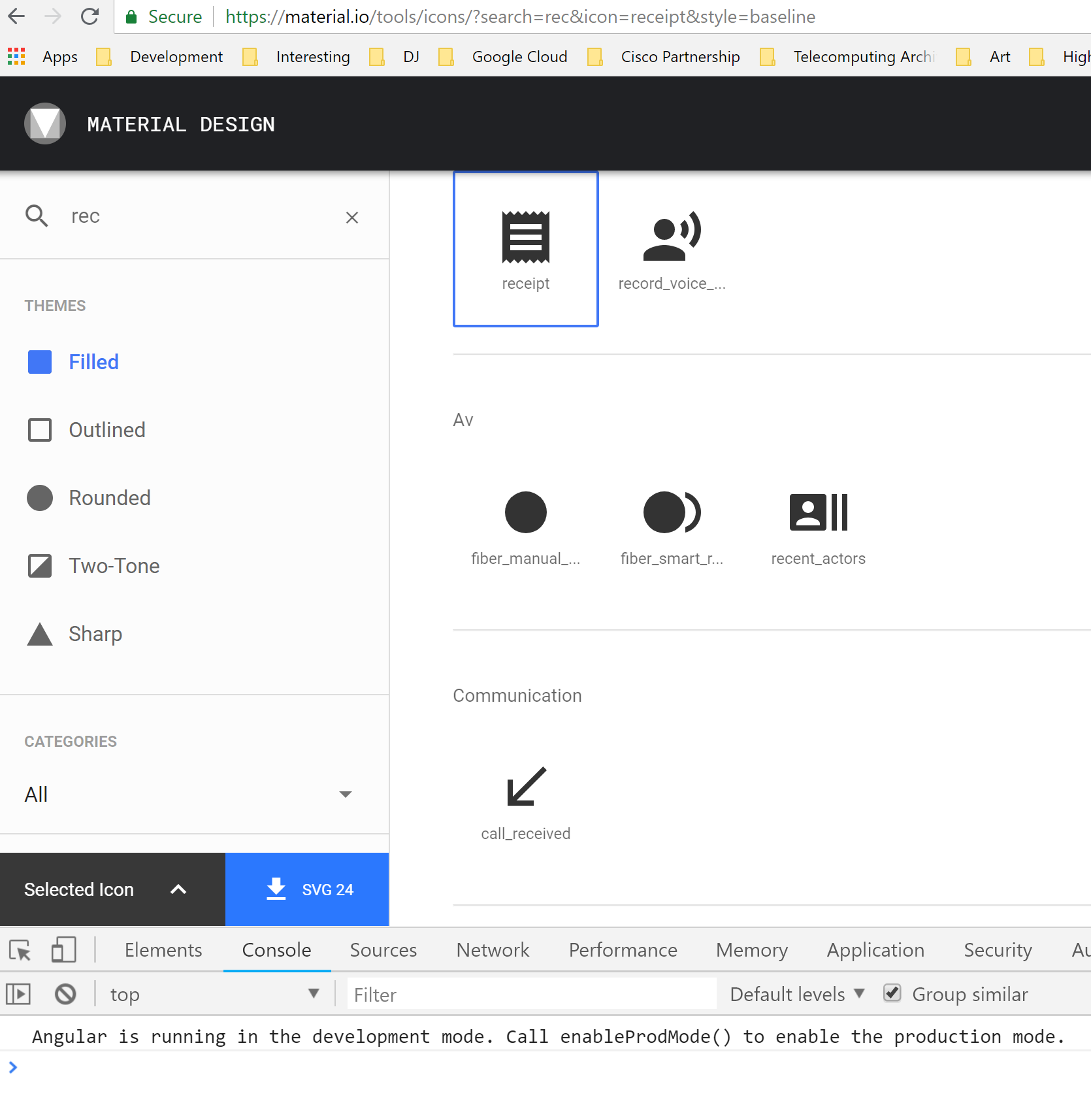
  1. Go to icons section
  2. Search for arrow_downward
  3. Press to download said icon
  4. Change icon to color of white
  5. Look at it

It's not white, it's black. I wasted a little time thinking something was up with my cache or build process. So, just wanted to let you guys know of this problem on the site. I would of looked to fix it myself but could not find a repo.

Documentation not clear on how to add accessibility options to snackbar

Documentation not clear on how to add accessibility options to snackbar.

I am using the Material Design snackbar notification and have the duration set for 99999 for now (would prefer an infinite option if there is one). On the snackbar we have two actions "close" and a link to another page. I have tabindex=0 on this component template that's within the snackbar... however the keyboard users cannot access anything within the snackbar.

On your site: https://material.io/develop/web/components/snackbars/#screen-readers
I read this:

Dismiss Icon
Snackbars are intended to dismiss on their own after a few seconds, but a dedicated dismiss icon may be optionally included as well for accessibility purposes.

How do you set the dedicated dismiss icon? What does this mean?

Choice chips state naming: Activated -> Selected

Description

In the State section of Choice chips, the state for a chip the user has chosen I understand is Activated.

And after reading Material state definitions, I think the proper name for that state should be Selected.

I think calling Activated for that state is pretty confusing, as does not match neither the Material state definitions for Activated IMHO and can be confusing with the default Enabled state (opposed state of Disabled)

Am I missing something here?

Overview

For usage questions: ask on Stack Overflow.

  • Context, problem or idea, solution or next step
  • Screenshots/Video (if possible)
  • Stack trace (if possible)

Reproduction steps

  • Reading states of Choice chips

Version number

  • Found in CHANGELOG.md

Operating system and device

Related issues

  • Type # and the issue number or # and select the from the inline drop down.

Useful Links

New Icon request

i am missing some icons form this collection.

  1. usb pendrive.
  2. hdd
  3. externel drive.
  4. paint tools(like pen,eraser,spray,color bucket)

i hope this will be in the material icon list.
thanks.

Use layer style for colors in Design Kit for Sketch

Overview

I'm following the instructions in the Getting Started page of Design Kit for Sketch material-design-stickersheet.sketch from Google's Material Resources page. The document says:

To customize the default color, elevation, or states, update the selected layer style with your custom value under the appearance section. Use our color palette generator to help come up with pairings and check your color contrast: https://material.io/design/color/the-color-system.html#tools-for-picking-colors

I opened the Material Light Theme page, Color artboard. The Primary colors are shades of purple. I changed them all. No purple appears on the page.

Screen Shot 2019-10-31 at 19 06 53

Unfortunately, many of the widgets on the Symbols page still show the original purple colors. These widgets are not using the layer style.

Screen Shot 2019-10-31 at 19 09 21

Notably:

  • App bar / ... / _Light
  • ΩElements/System bar/Primary

This is slowing me down. I just want to design my app, not fix Google's widget library. Please fix.

Slider Component border radius not displaying in safari browser

Overview

I am trying to apply custom style Stack Overflow.

i) Slider component border radius not displaying in ios safari browser,
ii) And first time try to change the slider value, but colour is not continue in the slider.

This two issue reproducing in safari browser

border radius issue
slider-issue

slider colour not displaying when first time trying to slider
slider-issue-1

Reproduction steps

-i am trying this customizing the slider

.mat-slider.mat-slider-horizontal .mat-slider-wrapper {
  top: 18px;
}
.mat-slider.mat-slider-horizontal .mat-slider-track-wrapper {
  height: 12px;
  border-radius: 10px
}
.mat-slider.mat-slider-horizontal .mat-slider-track-background,
.mat-slider.mat-slider-horizontal .mat-slider-track-fill {
  height: 100%;
}
.mat-slider.mat-slider-horizontal .mat-slider-track-fill {
  background-color: blue;
}
.mat-accent .mat-slider-thumb {
  height: 30px;
  width: 30px;
  background-color: white;
  border: solid 2px gray;
  bottom: -20px;
  right: -20px;
}
.mat-slider-min-value:not(.mat-slider-thumb-label-showing) .mat-slider-thumb {
  background-color: white;
}

Example:
for sample reference [Stackblitz]

Version number

 "@angular/material": "^7.0.4",
  "@angular/cli": "~7.0.5",

Operating system and device

  MAC 10.14.11 Safari version 12.1.1
  Mobile IOS 13 , safari browser

Icon "star" SVG files has merged layers

I'm not 100% sure where this request should live, but I just wanted to bring attention to what seems to be a slight oops on one of the icons SVG files.

When downloading the "star" icon from material.io/tools/icons if you select any other version besides the default "Filled" version (ie. "Outlined", "Rounded", "Two-Tone", or "Sharp") the layers in the SVG version seem to be merged or flattened and requires some surgery to dismantle the background / area layer from the actual star shape.

When you drop these files into a platform such as Figma they show up like the below screenshot. The default "Filled" is the leftmost and working down through the options on material.io they show as you look rightward respectively:
withoutediting

Looking at the layers of these SVGs you can see the issue:
layers

You can also see that the two-tone star icon actually has it's layers properly separated but the background/area layer at the bottom comes with a fill color which makes it also have a black box look when initially imported.

[material.io] image is not displayed

Overview

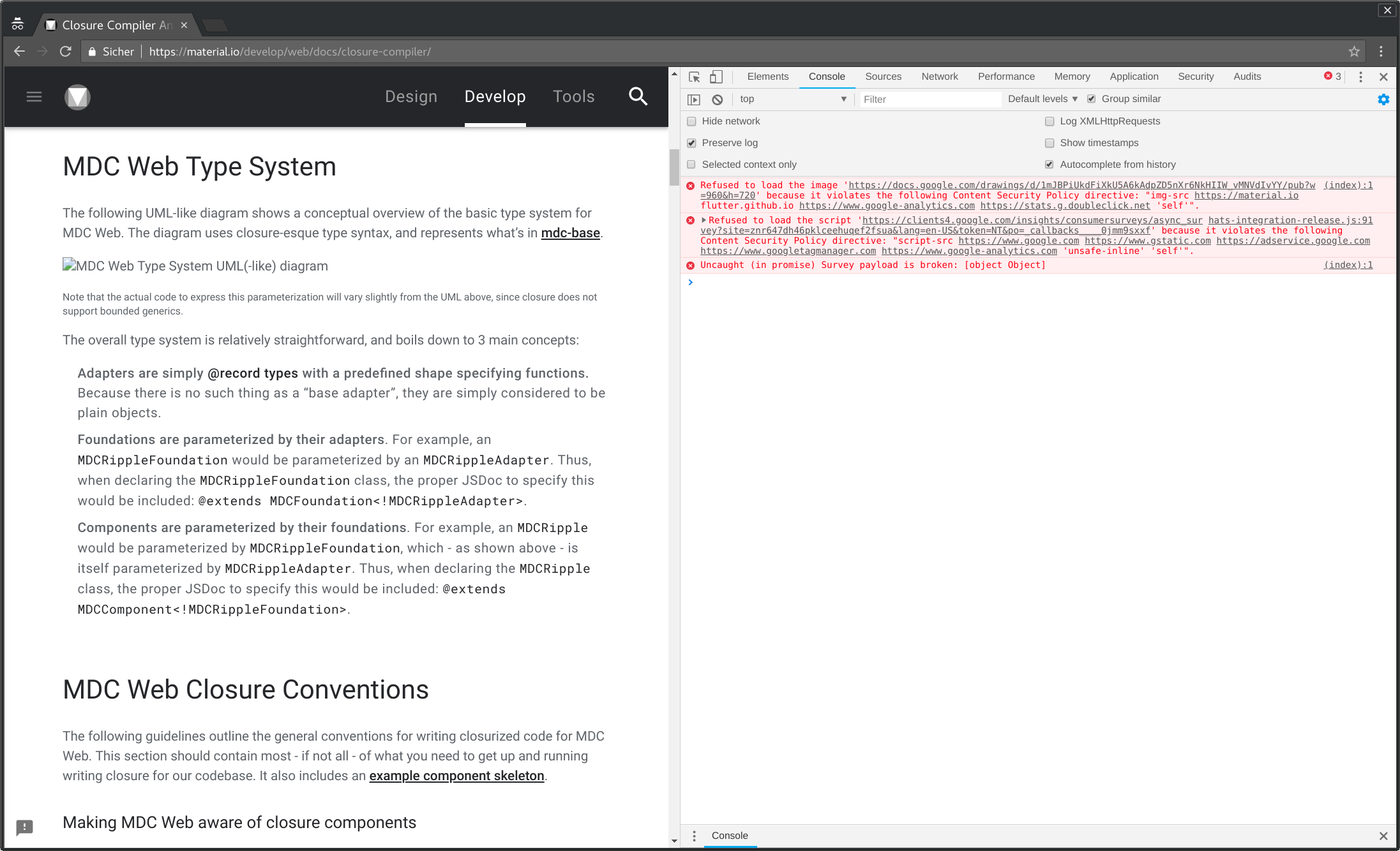
On the page Annotating MDC Web for the Closure Compiler in the section MDC Web Type System the image "MDC Web Type System UML(-like) diagram" is not displayed.

The reason seems to be the following error, which can be found in the developer console:

Refused to load the image 'https://docs.google.com/drawings/d/1mJBPiUkdFiXkU5A6kAdpZD5nXr6NkHIIW_vMNVdIvYY/pub?w=960&h=720' because it violates the following Content Security Policy directive: "img-src https://material.io flutter.github.io https://www.google-analytics.com https://stats.g.doubleclick.net 'self'"

Screenshot:
screenshot

Reproduction steps

Open https://material.io/develop/web/docs/closure-compiler/#mdc-web-type-system in a web browser.

Operating system and device

Affected are all web browsers which support content security policy.
My browser is Chrome 67 on Linux

Cannot instantiate CircularRevealHelper in custom CircularRevealWidget

CircularRevealHelper's constructor requires CircularRevealHelper.Delegate which is package-private.
When instantiating CircularRevealHelper in custom CircularRevealWidget we will get a runtime error:

Caused by: java.lang.IllegalAccessError: Illegal class access: 'com.paranoid.mao.expandablewidgetexample.CircularRevealConstraintLayout' attempting to access 'com.google.android.material.circularreveal.CircularRevealHelper$Delegate' (declaration of 'com.paranoid.mao.expandablewidgetexample.CircularRevealConstraintLayout' appears in /data/app/com.paranoid.mao.expandablewidgetexample-5YHhd7UhQyED2qYo7p4TxQ==/base.apk:classes2.dex)

[material.io] "Send feedback" form does not work

Overview

I wanted to report the issue #37 via the "Send feedback" form, which seems to be integrated on every page under https://material.io/develop/web/docs/ -- Unfortunately it did not work:

screenshot

I guess this is another content security policy issue.

Reproduction steps

Operating system and device

My browser is Chrome 67 on Linux

AS Preview doesn't match TextInputLayout actual appearance on device

Overview

Problem
The layout preview in Android Studio doesn't match how the Material Components TextInputLayout actually appears on an Android device. It just displays a very simple layout with a grey baseline.

  • Screenshots/Video (if possible)
    image

  • Stack trace (if possible)
    N/A

Reproduction steps

  • Add a com.google.android.material.textfield.TextInputLayout to any layout
  • Open the Android Studio layout preview

Expected

Looks the same as on a real device

Actual

Looks very basic (see screenshot) and nothing like the real Material component

Version number

  • Found in 1.1.0-alpha07

Operating system and device

Any, doesn't make a difference

Related issues

Couldn't find any

Add possibility for Week numbers to Date Picker design

In many countries it's very common to use week numbers in addition to dates. We have customers that require us to display the week numbers and have previously been using the jQuery UI Date Picker that have support for this feature.

Now when we have started to use Material Design instead we run into issues with this. The lack of possibility to add week numbers is forcing us away from the standard Date Pickers built on top of the Material Design and away from the very nice implementations that exist for standard Material Design.

Material picker
https://material.io/components/pickers

jQuery UI Date Picker for reference with the week numbers on the left
https://jqueryui.com/datepicker/#show-week

[Slider] Configurable Tracks

Hello,
first of, thank you for your great work on the material spec. It really makes our applications more usable.

I hope I came to the right place for this feature request / spec addition.

Problem

We have a use-case, where we want to make a slider from -100% to +100%, with the default value being 0.

The problem is, that the current spec only allows the "track" to start from the left, or from the right:
grafik
grafik

Idea

It would be nice, to make the "track" zero position configurable:
grafik

One could even imagine supporting switching the values for left/right reading languages.

Icons thumb_up_alt and thumb_up_down do not display an outlined icon but a filled one

What is the expected behavior?
The icons should be displayed as outlined thumbs up and downs as seen on the example page
https://material.io/tools/icons/?icon=thumb_down_alt&style=outline

What is the current behavior?
The icon codes thumb_down_alt and thumb_up_alt show filled thumbs that are a bit smaller then the regular filled thumbs (thumb_down and up) instead.

What are the steps to reproduce?
https://stackblitz.com/edit/angular-material2-issue
The behaviour in stackblitz is different as opposed to the behaviour in edge en Chrome. In the 2 browsers the outlined icons are displayed as filled icons on a white background, in stackblitz they become invisible. Only when changing the background to black are they visible.
I would like the icons to appear the same way as depicted on the icons example page of material.io

Which versions of Angular, Material, OS, TypeScript, browsers are affected?
Angular material version 6.4.1
Angular cli 6.2.8
typescript 2.9.2
Windows 10:
Microsoft Edge 42.17134.1.0
Chrome version: 71.0.3578.98

Is there anything else we should know?

Search for "errors" results in links that do not provide expected content.

Overview

Searching for "errors" on material.io has a top result for Errors - Patterns - Material Design. Following that link just directs you to the main Design page.

Reproduction steps

  • Go to https://material.io
  • Click the search (magnifying glass) icon in the top right of page.
  • Enter errors in the search bar and Enter/Return
  • Observe 10 matching results with "Errors - Patterns - Material Design" as the first.
  • Click the first link.
  • Observe the Design page is shown with no information on Errors.

Version number

  • Observed August 2, 2019 17:37 UTC

Operating system and device

  • Ubuntu 19.04
  • Chrome Browser

Rule of capitalization in writing guidelines

Overview

The writing guidelines of Material do not have an explicit statement about the title or sentence case in UX writing.

Reproduction steps

  • Read the writing guidelines.

Version number

  • 1.2.0

Operating system and device

Related issues

  • Type # and the issue number or # and select the from the inline drop down.

Useful Links

Guidelines are inconsistent about number min of tabs for Bottom Navigation

The design guideline "Understanding navigation" contains a table that says that Bottom navigation bars should be used for 2-5 Top-level destinations :

image

However on the documentation for the "Bottom navigation" component, there's a clear example that says Don’t use a bottom navigation bar for fewer than three destinations (use tabs instead) :

image

Also, under Representing destinations there's no mention of a case with Two destinations.

So it looks like the guideline table is wrong.

Rename Cards to Figures

Sufficient overlap exists between Google's Material UI Card component and HTML's <figure> and associated <figcaption> element to consider renaming Material UI Cards to Material UI Figures.

Material Cards

Cards contain content and actions about a single subject.

Material Cards Usage

Contained: A card is identifiable as a single, contained unit.
Independent: A card can stand alone, without relying on surrounding elements for context.
Individual: A card cannot merge with another card, or divide into multiple cards.

figure: The Figure with Optional Caption element

The HTML <figure> (Figure With Optional Caption) element represents self-contained content, potentially with an optional caption, which is specified using the (<figcaption>) element. The figure, its caption, and its contents are referenced as a single unit.

figure: Usage notes

  • Usually a <figure> is an image, illustration, diagram, code snippet, etc., that is referenced in the main flow of a document, but that can be moved to another part of the document or to an appendix without affecting the main flow.
  • Being a sectioning root, the outline of the content of the <figure> element is excluded from the main outline of the document.
  • A caption can be associated with the <figure> element by inserting a <figcaption> inside it (as the first or the last child). The first <figcaption> element found in the figure is presented as the figure's caption.

Material roadmap outdated

Hi,
it is written in the roadmap that from May on (R15), there would be a monthly update.

Last update dates back to September.
Is the project slowing down or has just moved to another place ?

Thank you for all your awesome work.
Best regards,
JB

Add a note on how Images List can adapt the number of column displayed according to the device width

Overview

I love the Images List component. It is a very great way to organize pictures and other graphics. I remark that currently, the image-list is only implemented in the web platform.

In the web implementation, the masonry variant let the developer choose how many columns are displayed depending the device viewport.

I think the fact that Images List can adapt to the device width should be mentioned in the spec, because I actually think this could also beneficiate for the Android & iOS teams (portrait and landscape).

Reproduction steps

Version number

Operating system and device

Every platform and devices.

Related issues

Incorrect SSL certifcate

The certificate delivered by material.io is not valid, after running a Symantex Crypto Report, I could determine that the certificate is not correctly installed. It also looks like the server may be vulnerable to Heartbleed, BEAST and Poodle attacks.

I've also had problems trying to access the site from non-browser means (Using Node.js https.get), reason being the "unverified first certificate".

Make Sketch library Backdrop resizable

Overview

I'm designing the UX of a Flutter app. I downloaded the Design Kit for Sketch from Google's Material Resources page. Our app needs to work well on cheap Android phones with small screens. I wish to use Google's provided Sketch widgets to design for such phones.

The very first widget I tried to use doesn't work for small phone sizes. This ticket is about fixing that widget. The larger problem is to make the entire kit work for small phones.

Reproduction steps

  1. Download Google's provided material-design-stickersheet.sketch file.
  2. Open Sketch and create a new document.
  3. Click the menu Sketch / Preferences.
  4. Click the Libraries icon.
  5. Click the "Add Library" button.
  6. Select the file you downloaded and click Open.
  7. Close the Preferences window.
  8. Click the menu Insert / Artboard. The right-hand panel changes to show artboards.
  9. Click the "Create Custom Size..." button at the bottom of the right-hand panel.
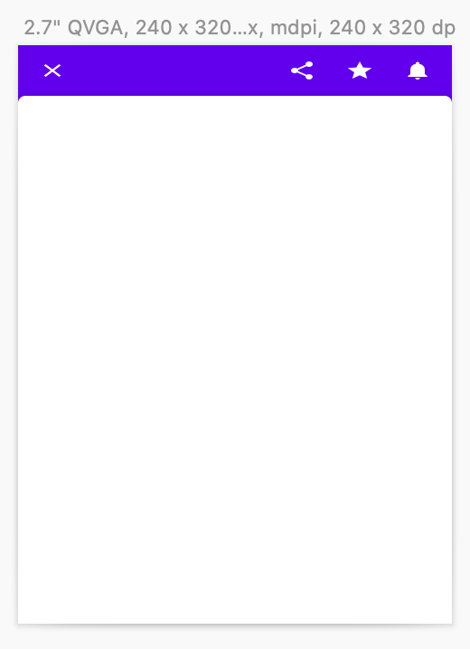
  10. Enter a size of 240x320px. This corresponds to the 2.7" QVGA device type in Android Emulator. It is an mdpi device with a logical screen size of 230x320dp.
  11. Click the menu Insert / Symbols - material-design-stickersheet / Backdrop / 2. Active Front Layer / _Light.
  12. Align the widget with the upper-left corner of the artboard and click to place it.
  13. Resize the widget to fill the artboard.

Expected behavior:
The Backdrop widget should maintain its proportions. The icons should maintain their proportions. The top bar should remain thick.

Observed behavior:
The icons are flattened. The top bar is too thin.

Screenshot:
Screen Shot 2019-10-31 at 16 31 43

Example file:
backdrop-not-resizable.sketch.zip

Version number

  • The downloaded file material-design-stickersheet.sketch has no version number. Its SHA-1 digest is d20842107db0282cee376c2ec974278ae1e60c5a.

Operating system and device

MacOS 10.15, Sketch 59.1, Macbook Pro.

[Crane Example] Collapsed card arrows incorrect

In the card examples under Crane's components, the return flight row reads departure ⬅️ arrival:
image

This is not true for the expanded view, but the icon directions are inconsistent:
image

Given that there are trade offs in every icon or JFK/SEL adjustment, maybe the "⇄" inconsistency was noticed and deemed unimportant for an example product, or in general.
I would change the arrow direction to departure ➡️ arrival and add a 🏠 icon, or some other return indicator.

Or close this and do nothing because its just an example 😅

Supporting text in determinate progress indicators

I wish to display an user's progress in a course, or may be display number of files uploaded on server or steps completed ( along number of steps remaining ) in any kind of work-flow. But the design spec. does not contain any details for the Text.

For e.g.
Circular-Determinate

progress-bar

Recommend Projects

  • React photo React

    A declarative, efficient, and flexible JavaScript library for building user interfaces.

  • Vue.js photo Vue.js

    🖖 Vue.js is a progressive, incrementally-adoptable JavaScript framework for building UI on the web.

  • Typescript photo Typescript

    TypeScript is a superset of JavaScript that compiles to clean JavaScript output.

  • TensorFlow photo TensorFlow

    An Open Source Machine Learning Framework for Everyone

  • Django photo Django

    The Web framework for perfectionists with deadlines.

  • D3 photo D3

    Bring data to life with SVG, Canvas and HTML. 📊📈🎉

Recommend Topics

  • javascript

    JavaScript (JS) is a lightweight interpreted programming language with first-class functions.

  • web

    Some thing interesting about web. New door for the world.

  • server

    A server is a program made to process requests and deliver data to clients.

  • Machine learning

    Machine learning is a way of modeling and interpreting data that allows a piece of software to respond intelligently.

  • Game

    Some thing interesting about game, make everyone happy.

Recommend Org

  • Facebook photo Facebook

    We are working to build community through open source technology. NB: members must have two-factor auth.

  • Microsoft photo Microsoft

    Open source projects and samples from Microsoft.

  • Google photo Google

    Google ❤️ Open Source for everyone.

  • D3 photo D3

    Data-Driven Documents codes.