By the end of this talk, developers should be able to:
- Use % width for responsive web design
- Write media queries for responsive web design
- Describe mobile first development


Why don't you tell me! http://screensiz.es

| Unit | Description | Usage |
|---|---|---|
| px | Referred to as absolute units because px (pixel) units will always be the same size regardless of any other related settings. | Most frequently with font sizes, margins, padding, max- and min- properties. |
| em, rem | Relative to the current element's font-size (em), or the root font-size (rem). When used to set the font-size of an element, em is relative to the element's inherited size. | Most frequently with font sizes, margins, padding, widths or heights that may need to be changed but remain relative to other elements. |
| vh, vw | Relative to the viewport width (vw), where one unit is equal to 1/100th of the viewport's current width, or the viewport height (vh), where one unit is equal to 1/100th of the viewport's current height. | Most frequently with width and height of structural page elements. Commonly used in responsive design. |
| % | Percentages are relative values. What the percentage is relative to, is determined by the property associated with the percentage value. | Most often used with width. Can be helpful to approximate intrisic sizing. |
It is becoming harder and harder to find non-responsive websites. But here is an example of a non-responsive website for you to try out.
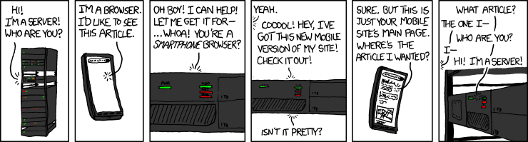
One way to create optimal experiences for mobile users is a dedicated mobile site.
You know you're on one when you see m. in the url!
Compare https://m.xkcd.com with https://xkcd.com
Avoid these... please.
What's the difference between these? Let's resize again. Interestingly, Boston Globe was the first example of a responsive website.
Instead of manually resizing the page, which can be a pain, we can use Google Chrome DevTools.
Chrome DevTools in Action:
- Let's visit GA's homepage
- Click on the device icon next to the magnifying glass
- You can change the pixel width (displayed at the top) using the drag tool
- You can select any device using the dropdown menu at the top
We need images that fit their containers. By default, images will try to take up as much
space as it's initial dimensions. This can cause some pain when you size up and size down
your picture, especially if you are trying to control the size of your elements via a
parent div.
It turns max-width: 100% is the answer. Most of the time. For any media.
Even as our flexible container resizes, shrinking or enlarging our image, the image’s aspect ratio remains intact.
img,
embed,
object,
video {
  max-width: 100%;
  height: auto;
} React
React
 Typescript
 Django
 Laravel
 Facebook
 Microsoft
 Google
 Alibaba
 D3
D3
 Tencent