tkinter
tkinter 2.7
Qt
WxPython
Web (Remi)
Python GUI For Humans - Transforms tkinter, Qt, Remi, WxPython into portable people-friendly Pythonic interfaces
This manual is crammed full of answers so start your search for answers here. Read/Search this prior to opening an Issue on GitHub. Press Control F and type.
pip install pysimplegui
or
pip3 install pysimplegui
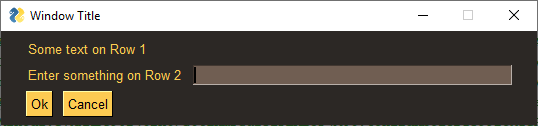
import PySimpleGUI as sg

sg.theme('DarkAmber')	# Add a touch of color
# All the stuff inside your window.
layout = [  [sg.Text('Some text on Row 1')],
            [sg.Text('Enter something on Row 2'), sg.InputText()],
            [sg.Button('Ok'), sg.Button('Cancel')] ]

# Create the Window
window = sg.Window('Window Title', layout)
# Event Loop to process "events" and get the "values" of the inputs
while True:
    event, values = window.read()
    if event in (None, 'Cancel'):	# if user closes window or clicks cancel
        break
    print('You entered ', values[0])

window.close()and returns the value input as well as the button clicked.
- looking to take your Python code from the world of command lines and into the convenience of a GUI?
- sitting on a Raspberry Pi with a touchscreen that's going to waste because you don't have the time to learn a GUI SDK?
- into Machine Learning and are sick of the command line?
- an IT guy/gal that has written some cool tools but due to corporate policies are unable to share unless an EXE file?
- want to share your program with your friends or families (that aren't so freakish that they have Python running)
- wanting to run a program in your system tray?
- a teacher wanting to teach your students how to program using a GUI?
- a student that wants to put a GUI onto your project that will blow away your teacher?
- looking for a GUI package that is "supported" and is being constantly developed to improve it?
- longing for documentation and scores of examples?
Look no further, you've found your GUI package.
- Create windows that look and operate identically to those created directly with tkinter, Qt, WxPython, and Remi.
- Requires 1/2 to 1/10th the amount of code as underlying frameworks.
- One afternoon is all that is required to learn the PySimpleGUI package and write your first custom GUI.
- Students can begin using within their first week of Python education.
- No callback functions. You do not need to write the word
classanywhere in your code. - Access to nearly every underlying GUI Framework's Widgets.
- Supports both Python 2.7 & 3 when using tkinter
- Supports both PySide2 and PyQt5 (limited support)
- Effortlessly move across tkinter, Qt, WxPython, and the Web (Remi) by changing only the import statement
- The only way to write both desktop and web based GUIs at the same time in Python
- Developed from nothing as a pure Python impelementation with Python friendly interfaces.
- Run your program in the System Tray using WxPython. Or, change the import and run it on Qt with no other changes.
- Works with Qt Designer
- Built in Debugger
- Actively maintained and enhanced - 4 ports are underway, all being used by users.
- Corporate as well as home users.
- Appealing to both newcomers to Python and experiened Pythonistas.
- The focus is entirely on the developer (you) and making their life easier, simplified, and in control.
- 170+ Demo Programs teach you how to integrate with many popular packages like OpenCV, Matplotlib, PyGame, etc.
- 200 pages of documentation, a Cookbook, built-in help using docstrings, in short it's heavily documented
July-2019 Note - This readme is being generated from the PySimpleGUI.py file located on GitHub. As a result, some of the calls or parameters may not match the PySimpleGUI that you pip installed.
(None of these comments were solicited & are not paid endorsements - other than a huge thank you they received!)
"I've been working to learn PyQT for the past week in my off time as an intro to GUI design and how to apply it to my existing scripts... Took me ~30 minutes to figure out PySimpleGUI and get my scripts working with a GUI."
"Python has been an absolute nightmare for me and I've avoided it like the plague. Until I saw PysimpleGUI."
"I've been pretty amazed at how much more intuitive it is than raw tk/qt. The dude developing it is super active on the project too so if you come across situations that you just can't get the code to do what you want you can make bug/enhancement issues that are almost assured to get a meaningful response."
"This library is the easiest way of gui programming in python! I'm totally in love with it"
"Wow that readme is extensive and great." (hear the love for docs often)
"Coming from R, Python is absolutely slick for GUIs. PySimpleGUI is a dream."
"I have been writing Python programs for about 4 or 5 months now. Up until this week I never had luck with any UI libraries like Tkinter, Qt, Kivy. I went from not even being able to load a window in Tkinter reliably to making a loading screen, and full program in one night with PySimpleGUI."
"I love PySimpleGUI! I've been teaching it in my Python classes instead of Tkinter."
"I wish PySimpleGUI was available for every friggin programming language"
ReadTheDocs <------ THE best place to read the docs due to TOC, all docs in 1 place, and better formatting. START here in your education. Easy to remember PySimpleGUI.org.
Homepage - Lastest Readme and Code - GitHub Easy to remember: PySimpleGUI.com
Announcements of Latest Developments, Release news, Misc
Latest Demos and Master Branch on GitHub
The YouTube videos - If you like instructional videos, there are over 15 videos made by PySimpleGUI project
- 5 part series of basics
- 10 part series of more detail
- The Naked Truth (An updaate on the technology)
- There are numerous short videos also on that channel that demonstrate PySimpleGUI being used
YouTube Videos made by others. These have much higher production values than the above videos.
- A fantastic tutorial PySimpleGUI Concepts - Video 1
- Build a calculator Python Calculator with GUI | PySimpleGUI | Texas Instruments DataMath II
- Notepad Notepad in Python - PySimpleGUI
- File Search Engine File Search Engine | Project for Python Portfolio with GUI | PySimpleGUI
This User's Manual (also the project's readme) is one vital part of the PySimpleGUI programming environment.
If you are a professional or skilled in how to develop software, then you understand the role of documentation in the world of technology development. You can skip this bit.... look for the bold "GO TO HERE" below.
RTFM is not a new acronym. It stretches back to 1979, the dawn of the computer-era and in particular the microprocessor. The point is that this is not a new problem. It's a very old problem.
Bluntness is required here as the subtle approach has not worked in the past:
It WILL be required, at times, for you to read or search this document in order to be successful.
Re-read that statement. This will be a serious problem for you if you're the type of person that finds it "quicker and easier to post on StackOverflow rather than reading documentation".
If you have not yet matured to the point you are able to understand this skill or choose to not follow it, then please save everyone the pain of doing for you what you, as a developer, software engineer, or wanna be coder, must do on your own. It's a vital skill for you to learn.
Want to be a "real engineer"? Then follow "real engineering practices" such as "reading". You are learning a NEW GUI package. You've not seen anything like it. Don't be so arrogant as to believe you will never need to read documentation.
UGH, why does this need to be said?
GO TO HERE if instructed above.
I appologize to the other 95% of you that this..... pathetic.... reminder needs to be added, but sadly there's a need for it.
There are 5 resources that work together to provide to you the fastest path to success. They are:
- This User's Manual
- The Cookbook
- The 170+ Demo Programs
- Docstrings enable you to access help directly from Python or your IDE
- Searching the GitHub Issues as a last resort (search both open and closed issues)
Pace yourself. The intial progress is exciting and FAST PACED. However, GUIs take time and thought to build. Take a deep breath and use the provided materials and you'll do fine. Don't skip the design phase of your GUI after you run some demos and get the hang of things. If you've tried other GUI frameworks before, successful or not, then you know you're already way ahead of the game using PySimpleGUI versus the underlying GUI frameworks. It may feel like the 3 days you've been working on your code has been forever, but by comparison of 3 days learning Qt, PySimpleGUI will look trivial to learn.
It is not by accident that this section, about documentation, is at the TOP of this document.
This documentation is not HUGE in length for a package this size. In fact it's still one document and it's the readme for the GitHub. It's not written in complex english. It is understandable by complete beginners. And pressing Control+F is all you need to do to search this document. USUALLY you'll find less than 6 matches.
Sometimes the documenation doesn't match exactly the version of the code you're running. Sometimes demo programs haven't been updated to match a change made to the SDK. Things don't happen simultaneously generally speaking. So, it may very well be that you find an error or inconsistency or something no longer works with the latest version of an external library.
If you've found one of these problems, and you've searched to make sure it's not a simple mistake on your part, then by ALL means log an Issue on the GitHub. Don't be afraid to report problems if you've taken the simple steps of checking out the docs first.
PySimpleGUI runs on Windows, Linux and Mac, just like tkinter, Qt, WxPython and Remi do. If you can get the underlying GUI Framework installed / running on your machine then PySimpleGUI will also run there.
- PC's, Desktop, Laptops
- Macs of all types
- Raspberry Pi
- Android devices like phones and tablets
- Virtual machine online (no hardware) - repl.it
- Windows 7, 8, 10
- Linux on PC - Tested on several distributions
- Linux on Raspbnerry Pi
- Linux on Android - Can use either Termux or PyDroid3
- Mac OS
As of 9/25/2018 both Python 3 and Python 2.7 are supported when using tkinter version of PySimpleGUI! The Python 3 version is named PySimpleGUI. The Python 2.7 version is PySimpleGUI27. They are installed separately and the imports are different. See instructions in Installation section for more info. None of the other ports can use Python 2.
Note that the 2.7 port will cease to exist on this GitHub on Jan 1, 2020. If you would like to know how much time you have to move over to the Python 3 version of PySimpleGUI, then go here: https://pythonclock.org/. The only thing that will be available is an unsupported PyPI release of PySimpleGUI27.
By "will cease to exist on this GitHub" I mean, it will be deleted entirely. No source code, no supporting programs. Nothing. If you're stuck using 2.7 in December, it would behoove you to fork the 2.7 code on Dec 31, 2019. Legacy Python doesn't have a permanent home here. It sounds cruel, but experts in security particularly says 2.7 is a huge risk. Furthering it use only hurts the computing world.
The version of tkinter that is being supplied with the 3.7.3 and later versions of Python is known to have a problem with table colors. Basically, they don't work. As a result, if you want to use the plain PySimpleGUI running on tkinter, you should be using 3.7.2 or less. 3.6 is the version PySimpleGUI has chosen as the recommended version for most users.
In addition to running as a desktop GUI, you can also run your GUI in a web browser by running PySimpleGUIWeb.
This is ideal for "headless" setups like a Raspberry Pi that is at the core of a robot or other design that does not have a normal display screen. For these devices, run a PySimpleGUIWeb program that never exits.
Then connect to your application by going to the Pi's IP address (and port #) using a browser and you'll be in communication with your application. You can use it to make configuration changes or even control a robot or other piece of hardward using buttons in your GUI
Before diving into details, here's a description of what PySimpleGUI is/does and why that is so powerful.
You keep hearing "custom window" in this document because that's what you're making and using... your own custom windows.
ELEMENTS is a word you'll see everywhere... in the code, documentation, ... Elements == PySimpleGUI's Widgets. As to not confuse a tkinter Button Widget with a PySimpleGUI Button Element, it was decided that PySimpleGUI's Widgets will be called Elements to avoid confusion.
Wouldn't it be nice if a GUI with 3 "rows" of Elements was defined in 3 lines of code? That's exactly how it's done. Each row of Elements is a list. Put all those lists together and you've got a window.
What about handling button clicks and stuff. That's 4 lines of the code below beginning with the while loop.
Now look at the layout variable and then look at the window graphic below. Defining a window is taking a design you can see visually and then visually creating it in code. One row of Elements = 1 line of code (can span more if your window is crowded). The window is exactly what we see in the code. A line of text, a line of text and an input area, and finally ok and cancel buttons.
This makes the coding process extremely quick and the amount of code very small
import PySimpleGUI as sg
sg.theme('DarkAmber')   # Add a little color to your windows
# All the stuff inside your window. This is the PSG magic code compactor...
layout = [  [sg.Text('Some text on Row 1')],
            [sg.Text('Enter something on Row 2'), sg.InputText()],
            [sg.OK(), sg.Cancel()]]

# Create the Window
window = sg.Window('Window Title', layout)
# Event Loop to process "events"
while True:
    event, values = window.read()
    if event in (None, 'Cancel'):
        break

window.close()
You gotta admit that the code above is a lot more "fun" looking that tkinter code you've studied before. Adding stuff to your GUI is trivial. You can clearly see the "mapping" of those 3 lines of code to specific Elements laid out in a Window. It's not a trick. It's how easy it is to code in PySimpleGUI. With this simple concept comes the ability to create any window layout you wish. There are parameters to move elements around inside the window should you need more control.
It's a thrill to complete your GUI project way ahead of what you estimated. Some people take that extra time to polish their GUI to make it even nicer, adding more bells and whistles because it's so easy and it's a lot of fun to see success after success as you write your program.
Some are more advanced users and push the boundaries out and extend PySimpleGUI using their own extensions.
Others, like IT people and hackers are busily cranking out GUI program after GUI program, and creating tools that others can use. Finally there's an easy way to throw a GUI onto your program and give it to someone. It's a pretty big leap in capability for some people. It's GREAT to hear these successes. It's motivating for everyone in the end. Your success can easily motivate the next person to give it a try and also potentially be successful.
Usually there's a one to one mapping of a PySimpleGUI Element to a GUI Widget. A "Text Element" in PySimpleGUI == "Label Widget" in tkinter. What remains constant for you across all PySimpleGUI platforms is that no matter what the underlying GUI framework calls the thing that places text in your window, you'll always use the PySimpleGUI Text Element to access it.
So far you've seen simply layouts with no customization of the Elements. Customizing and configuring Elements is another place PySimpleGUI utilizes the Python language to make your life easier.
What about Elements that have settings other than the standard system settings? What if I want my Text to be blue, with a Courier font on a green background. It's written quite simply:
Text('This is some text', font='Courier 12', text_color='blue', background_color='green')The Python named parameters are extensively in PySimpleGUI. They are key in making the code compact, readable, and trivial to write.
As you'll learn in later sections that discuss the parameters to the Elements, there are a LOT of options avilable to you should you choose to use them. The Text Element has 15 parameters that you can change. This is one reason why PyCharm is suggested as your IDE... it does a fantastic job of displaying documentation as you type in your code.
What do you think? Easier so far than your previous run-ins with GUIs in Python? Some programs, many in fact, are as simple as this example has been.
But PySimpleGUI certainly does not end here. This is the beginning. The scaffolding you'll build upon.
At the moment there are 4 acitvely developed and maintained "ports" of PySimpleGUI. These include:
- tkinter - Fully complete
- Qt using Pyside2 - Alpha stage. Not all features for all Elements are done
- WxPython - Development stage, pre-releaser. Not all Elements are done. Some known problems with multiple windows
- Remi (Web browser support) - Development stage, pre-release.
While PySimpleGUI, the tkinter port, is the only 100% completed version of PySimpleGUI, the other 3 ports have a LOT of functionality in them and are in active use by a large portion of the installations. You can see the number of Pip installs at the very top of this document to get a comparison as to the size of the install base for each port. The "badges" are right after the logo.
PySimpleGUI wraps tkinter, Qt, WxPython and Remi so that you get all the same widgets, but you interact with them in a more friendly way that's common across the ports.
What does a wrapper do (Yo! PSG in the house!)? It does the layout, boilerplate code, creates and manages the GUI Widgets for you and presents you with a simple, efficient interface. Most importantly, it maps the Widgets in tkinter/Qt/Wx/Remi into PySimpleGUI Elements. Finally, it replaces the GUIs' event loop with one of our own.
You've seen examples of the code already. The big deal of all this is that anyone can create a GUI simply and quickly that matches GUIs written in the native GUI framework. You can create complex layouts with complex element interactions. And, that code you wrote to run on tkinter will also run on Qt by changing your import statement.
If you want a deeper explanation about the architecture of PySimpleGUI, you'll find it on ReadTheDocs in the same document as the Readme & Cookbook. There is a tab at the top with labels for each document.
There are distinct ports happening as mentioned above. Each have their own location on GitHub under the main project. They have their own Readme with is an augmentation of this document... they are meant to be used together.
PySimpleGUI is released on PyPI as 5 distinct packages.
- PySimpleGUI - tkinter version
- PySimpleGUI27 - tkinter version that runs on 2.7
- PySimpleGUIWx - WxPython version
- PySimpleGUIQt - PySided2 version
- PySimpleGUIWeb - The web (Remi) version
You will need to install them separately
There is also an accompanying debugger known as imwatchingyou. If you are running the tkinter version of PySimpleGUI, you will not need to install the debugger as there is a version embedded directly into PySimpleGUI.
Qt was the second port after tkinter. It is the 2nd most complete with the original PySimpleGUI (tkinter) being the most complete and is likely to continue to be the front-runner. All of the Elements are available on PySimpleGUIQt.
As mentioned previously each port has an area. For Qt, you can learn more on the PySimpleGUIQt GitHub site. There is a separate Readme file for the Qt version that you'll find there. This is true for all of the PySimpleGUI ports.
Give it a shot if you're looking for something a bit more "modern". PySimpleGUIQt is currently in Alpha. All of the widgets are operational but some may not yet be full-featured. If one is missing and your project needs it, log an Issue. It's how new features are born.
Here is a summary of the Qt Elements with no real effort spent on design clearly. It's an example of the "test harness" that is a part of each port. If you run the PySimpleGUI.py file itself then you'll see one of these tests.
As you can see, you've got a full array of GUI Elements to work with. All the standard ones are there in a single window. So don't be fooled into thinking PySimpleGUIQt is barely working or doesn't have many widgets to choose from. You even get TWO "Bonus Elements" - Dial and Stretch
PySimpleGUIWx GitHub site. There is a separate Readme file for the WxPython version.
Started in late December 2018 PySimpleGUIWx started with the SystemTray Icon feature. This enabled the package to have one fully functioning feature that can be used along with tkinter to provide a complete program. The System Tray feature is complete and working very well. It was used not long ago in a corporate setting and has been performing with few problems reported.
The Windowing code was coming together with Reads operational. The elements were getting completed on a regular basis. But I ran into multiwindow problems. And it was at about this time that Remi was suggested as a port.
Remi (the "web port") overnight lept the WxPython effort and Web became a #1 priority and continues to be. The thought is that the desktop was well represented with PySimpleGUI, PySimpleGUIQt, and PySimpleGUIWx. Between those ports is a solid winowing system and 2 system tray implementations and a nearly feature complete Qt effort. So, the team was switched over to PySimpleGUIWeb.
PySimpleGUIWeb GitHub site. There is a separate Readme file for the Web version.
New for 2019, PySimpleGUIWeb. This is an exciting development! PySimpleGUI in your Web Browser!
The underlying framework supplying the web capability is the Python package Remi. https://github.com/dddomodossola/remi Remi provides the widgets as well as a web server for you to connect to. It's an exiting new platform to be running on and has temporarily bumped the WxPython port from the highest priority. PySimpleGUIWeb is the current high priority project.
Use this solution for your Pi projects that don't have anything connected in terms of input devices or display. Run your Pi in "headless" mode and then access it via the Web interface. This allows you to easily access and make changes to your Pi without having to hook up anything to it.
It's not meant to "serve up web pages"
PySimpleGUIWeb is first and foremost a GUI, a program's front-end. It is designed to have a single user connect and interact with the GUI.
If more than 1 person connects at a time, then both users will see the exact same stuff and will be interacting with the program as if a single user was using it.
PySimpleGUI runs on Android devices with the help of either the PyDroid3 app or the Termux app. Both are capable of running tkinter programs which means both are capable of running PySimpleGUI.
To use with PyDroid3 you will need to add this import to the top of all of your PySimpleGUI program files:
import tkinterThis evidently triggers PyDroid3 that the application is going to need to use the GUI.
You will also want to create your windows with the location parameter set to (0,0).
Here's a quick demo that uses OpenCV2 to display your webcam in a window that runs on PyDroid3:
import tkinter
import cv2, PySimpleGUI as sg
USE_CAMERA = 0      # change to 1 for front facing camera
window, cap = sg.Window('Demo Application - OpenCV Integration', [[sg.Image(filename='', key='image')], ], location=(0, 0), grab_anywhere=True), cv2.VideoCapture(USE_CAMERA)
while window(timeout=20)[0] is not None:
    window['image'](data=cv2.imencode('.png', cap.read()[1])[1].tobytes())
You will need to pip install opencv-python as well as PySimpleGUI to run this program.
Also, you must be using the Premium, yes paid, version of PyDroid3 in order to run OpenCV. The cost is CHEAP when compared to the rest of things in life. A movie ticket will cost you more. Which is more fun, seeing your Python program running on your phone and using your phone's camera, or some random movie currently playing? From experience, the Python choice is a winner. If you're cheap, well, then you won't get to use OpenCV. No, there is no secret commercial pact between the PySimpleGUI project and the PyDroid3 app team.
In theory, your source code is completely portable from one platform to another by simply changing the import statement. That's the GOAL and suprisingly many times this 1-line change works. Seeing your code run on tkinter, then change the import to import PySimpleGUIWeb as sg and instead of a tkinter window, up pops your default browser with your window running on it is an incredible feeling.
But, caution is advised. As you've read already, some ports are further along than others. That means when you move from one port to another, some features may not work. There also may be some alignment tweaks if you have an application that precisely aligns Elements.
What does this mean, assuming it works? It means it takes a trivial amount of effort to move across GUI Frameworks. Don't like the way your GUI looks on tkinter? No problem, change over to try PySimpleGUIQt. Made a nice desktop app but want to bring it to the web too? Again, no problem, use PySimpleGUIWeb.
Want to really get your mind blown? Check out this PySimpleGUI program running in your web browser.
Thanks to the magic of repl.it and Remi it's possible to run PySimpleGUI code in a browser window without having Python running on your computer. This should be viewed as a teaching and demonstration aid. It is not meant to be a way of serving up web pages. It wouldn't work any way as each user forks and gets their own, completely different, workspace.
There are 2 ports of PySimpleGUI that run on repl.it - PySimpleGUI and PySimpleGUIWeb.
The primary PySimpleGUI port works very well on repl.it due to the fact they've done an outstanding job getting tkinter to run on these virtual machines. Creating a program from scratch, you will want to choose the "Python with tkinter" project type.
The virtual screen size for the rendered windows isn't very large, so be mindful of your window's size or else you may end up with buttons you can't get to.
You may have to "install" the PySimpleGUI package for your project. If it doesn't automatically install it for you, then click on the cube along the left edge of the browser window and then type in PySimpleGUI or PySimpleGUIWeb depending on which you're using.
For PySimpleGUIWeb programs you run using repl.it will automatically download and install the latest PySimpleGUIWeb from PyPI onto a virtual Python environment. All that is required is to type import PySimpleGUIWeb you'll have a Python environment up and running with the latest PyPI release of PySimpleGUIWeb.
To create your own repl.it PySimpleGUI project from scratch, first choose the type of Python virtual machine you want. For PySimpleGUI programs, choose the "Python with tkinter" project type. For PySimpleGUIWeb, choose the normal Python project.
There have been times where repl.it didn't do the auto import thing. If that doesn't work for some reason, you can install packages by clicking on the package button on the left side of the interface, typing in the package name (PySimpleGUI or PySimpleGUIWeb) and install it.
Educators in particular should be interested. Students can not only post their homework easily for their teacher to access, but teachers can also run the students programs online. No downloading needed. Run it and check the results.
For people wanting to share their code, especially when helping someone with a problem, it's a great place to do it. Those wishing to see your work do not have to be running Python nor have PySimpleGUI installed.
The way I use it is to first write my PySimpleGUI code on Windows, then copy and paste it into Repl.it.
Finally, you can embed these Repl.it windows into web pages, forum posts, etc. The "Share" button is capable of giving you the block of code for an "iframe" that will render into a working repl.it program in your page. It's amazing to see, but it can be slow to load.
Repl.it is not meant to serve up applications and web pages. Trying to use it that way will not ressult in satisfactory results. It's simply too slow and too technical of an interface for trying to "deploy" using it. PySimpleGUIWeb isn't a great choice in serving web pages. It's purpose is more to build a GUI that runs in a browser.
It's surprising that Python GUI code is completely cross platform from Windows to Mac to Linux. No source code changes. This is true for both PySimpleGUI and PySimpleGUIQt.
Historicly, PySimpleGUI using tkinter have struggled on Macs. This was because of a problem setting button colors on the Mac. However, two events has turned this problem around entirely.
- Use of ttk Buttons for Macs
- Ability for Mac users to install Python from python.org rather than the Homebrew version with button problems
It's been a long road for Mac users with many deciding to use PySimpleGUIQt so that multi-colored windows could be made. It's completely understandable to want to make attractive windows that utilitize colors.
PySimpleGUI now supports Macs, Linux, and Windows equally well. They all are able to use the "Themes" that automatically add color to your windows.
Be aware that Macs default to using ttk buttons. You can override this setting at the Window and Button levels. If you installed Python from python.org, then it's likely you can use the non-ttk buttons should you wish.
The GitHub Issues are checked often. Very often. Please post your questions and problems there and there only. Please don't post on Reddit, Stackoverflow, on forums, until you've tried posting on the GitHub.
Why? It will get you the best support possible. Second, you'll be helping the project as what you're experiencing might very well be a bug, or even a known bug. Why spend hours thrashing, fighting against a known bug?
It's not a super-buggy package, but users do experience problems just the same. Maybe something's not explained well enough in the docs. Maybe you're making a common mistake. Maybe that feature isn't complete yet.
You won't look stupid posting an Issue on GitHub. It's just the opposite.
PySimpleGUI is an active project. Bugs are fixed, features are added, often. Should you run into trouble, open an issue on the GitHub site and you'll receive help. Posting questions on StackOverflow, Forums, Mailing lists, Reddit, etc, is not the fastest path to support and taking it may very well lead you astray as folks not familiar with the package struggle to help you. You may also run into the common response of "I don't know PySimpleGUI (and perhaps dislike it as a result), but I know you can do that with Qt".
Why only 1 location? It's simple.... it's where the bugs, enhancements, etc are tracked. It's THE spot on the Internet for this project. It's not some freakish being in control, telling people how to do things. It's so that YOU get the best and quickest support possible.
So, open an Issue, choose "custom form" and fill it out completely. There are very good reasons behind all of the questions. Cutting corners only cuts your chances of getting help and getting quality help as it's difficult enough to debug remotely. Don't handicap people that want to help by not providing enough information.
Be sure and run your program outside of your IDE first. Start your program from the shell using python or python3 command. On numerous occassions much time was spent chasing problems caused by the IDE. By running from a command line, you take that whole question out of the problem, an important step.
Don't sit and stew, trying the same thing over and over, until you hate life... stop, and post an Issue on the GitHub. Someone WILL answer you. Support is included in the purchase price for this package (the quality level matches the price as well I'm afraid). Just don't be too upset when your free support turns out to be a little bit crappy, but it's free and typically good advice.
Yea, they're out there. Would have NEVER in a billion years guessed that there would be objection to this package, coming from a small, but vocal, number of people. I naively believed everyone would be supportive, see the value, hold hands around the fire, sing songs, and in the very least be truthful. But, this ain't Kansas and the Internet is well...
If someone is actively discouraging you from using this package, then know you are on the right track and you should give it a try. Stuff like this sometimes happens because the person works for a particular company or they have a GUI package of their own.... that's not popuplar, or they like to tear things down or I dunno... people can be really weird and emotional.
I promise you're not going to be wrecked for life. It will not cause you to be a bad programmer with bad habits. It will not ruin your career. It's not going to teach you bad habits. One person I know got a bonus based on a PySimpleGUI program he wrote.
How about success being the goal? Spend time polishing your GUI and working on your primary code instead of struggling your way through the mountains of documentation in the Qt library, trying to set the color of something. How about getting your program done, working, and in use?
Start with PySimpleGUI, then in the future if you want to code directly in Qt, it's not like you won't be able to learn something else due to your PySimpleGUI knowledge. Unable to write a while loop because you already learned using a for loop? That seems to be the logic.
If anything, you'll have more knowledge than most people that are just starting because you'll have already built working GUIs, perhaps many of them and understand how to layout an efficient interface as well as having a good education in GUI Widgets and how they work.
Here are the forces likely at work.... said Troll has been programming for a while now and really knows these GUI frameworks. Probably invested a lot of hours learning them and thus has some marketable skills (yes, follow the money).
Enter snotty-nosed high-shool or first year programmer using PySimpleGUI that manages to make GUI windows with great ease... that look, well, pretty much the same as the windows Sir Troll was used to getting paid big bucks to make. What used to be a skill only a select few can do, now 1,000's, 10,000's, or 100,000s more programmers can do, quicker and easier. Bummer Mr. Troll. Bummer.
"It's supposed to be difficult to write a GUI" was an actual reason listed why not to use PySimpleGUI by one person offering to help junior programmers learn Qt. Really? It's supposed to be difficult. Huh. Well, not in this Python universe. Maybe in C++ world it works that way??
Just know you're safe in trying and possibly even succeeding in the process.
PySimpleGUI is trying to serve the 80% of GUI problems. The other 20% go straight to tkinter, Qt, WxPython, Remi, or whatever fills that need. That 80% is a huge problem space.
The "Simple" of PySimpleGUI describes how easy it is to use, not the nature of the problem space it solves. Note that people are not part of that description. It's not trying to solve GUI problems for 80% of the people trying it. PySimpleGUI tries to solve 80% of GUI problems, regardless of the programmer's experience level.
Is file I/O in Python limited to only certain people? Is starting a thread, building a multi-threaded Python program incredibly difficult such that it takes a year to learn? No. It's quite easy. Like most things Python, you import the object from package and you use it. It is 2 lines of Python code to create and start a thread.
Why can't it be 2 lines of code to show a GUI window? What's SO special about the Python GUI libraries that they require you to follow a specific Object Oriented model of development? Other parts and packages of Python don't tend to do that.
The reason is because they didn't originate in Python. They are strangers in a strange land and they had to be "adapted". They started as C++ programs / SDKs, and remain that way too. There's a vaneer of Python slapped onto the top of them, but that sure didn't make them fit the language as well as they could have.
PySimpleGUI is designed with both the beginner and the experienceed developer in mind. Why? Because both tend to like compact code. Most like people, we just want to get sh*t done, right? And, why not do it in a way that's like how most of Python works?
The beginners can begin working with GUIs in their first week of Python education. The professionals can jump right into the deep end of the pool to use the entire array of Elements and their capabilities to build stuff like a database application.
Here's a good example of how PySimpleGUI serves these 2 groups.... the InputText Element has 16 potential parameters, yet you'll find 0 or 1 parameters set by beginners. Look at the examples throughout this document and you'll see the code fragments utilize a tiny fraction of the potential parameters / settings. Simple... keep it simple for the default case. This is part of the PySimpleGUI mission.
Some developers are heavily wedded to the existing GUI Framework Architectures (Qt, WxPyton, tkinter). They like the existing GUI architectures (they're all roughly the same, except this one). If you're in that crowd, join the "20% Club" just down the street. There's plenty of room there with plenty of possible solutions.
But how about a quick stop-in for some open mindedness exercises. Maybe you will come up with an interesting suggestion even if you don't use it. Or maybe PySimpleGUI does something that inspires you to write something similar directly in Qt. And please, at least be civil about it. There is room for multiple architectures. Remember, you will not be harmed by writing some PySimpleGUI code just like you won't by writing some tkinter or Qt code. Your chances of feeling harmed is more likely from one of those 2.
There are a couple of reasons beginners stop in for a look. The first is to simply throw a simple GUI onto the front of an existing command line application. Or maybe you need to popup a box to get a filename. These can often be simple 1-line Popup calls. Of course, you don't have to be a beginner to add a GUI onto one of your existing command line programs. Don't feel like because you're an advanced programmer, you need to have an advanced solution.
If you have a more intricate, complete, perhaps multi-window design in mind, then PySimpleGUI still could be your best choice.
This package is not only great to use as your first GUI package, but it also teaches how to design and utilize a GUI. It does it better than the existing GUIs by removing the syntax, and lengthy code that can take an otherwise very simple appearing program into something that's completely unrecognizable. With PySimpleGUI your 'layout' is all you need to examine to see the different GUI Elements that are being used.
Why does PySimpleGUI make it any easier to learn about GUIs? Because it removes the classes, callback functions, object oriented design to better get out of your way and let you focus entirely on your GUI and not how to represent it in code.
The result is 1/2 to 1/10 th the amount of code that implements the exact same layout and widgets as you would get from coding yourself directly in Qt5. It's been tested many times... again and again, PySimpleGUI produces significantly less code than Qt and the frameworks it runs on.
Forget syntax completely and just look on the overall activities of a PySimpleGUI programmer. You have to design your window.... determine your inputs and your outputs, place buttons in strategic places, create menus, .... You'll be busy just doing all those things to design and define your GUI completely independent upon the underlying framework.
After you get all those design things done and are ready to build your GUI, it's then that you face the task of learning a GUI SDK. Why not start with the easy one that gives you many successes? You're JUST getting started, so cut yourself a break and use PySimpleGUI so that you can quickly get the job done and move on to the next GUI challenge.
It's not perfect, but PySimpleGUI is an amazing bit of technology. It's the programmer, the computer scientist, that has experience working with GUIs in the past that will recognize the power of this simple architecture.
What I hear from seasoned professionals is that PySimpleGUI saves them a ton of time. They've written GUI code before. They know how to lay out a window. These folks just want to get their window working and quick.
With the help of IDE's like PyCharm, Visual Studio and Wing (the offically supported IDE list) you get instant documentation on the calls you are making. On PyCharm you instantly see both the call signature but also the explanations about each parameter.
If the screenshots, demo programs and documentation don't convince you to at least give it a try, once, then you're way too busy, or ..... I dunno, I stopped guessing "why?" some time ago.
Some of the most reluctant of people to try PySimpleGUI have turned out to be some of the biggest supporters.
I want to thank the early users of PySimpleGUI that started in 2018. Your suggestions helped shape the package and have kept it moving forward at a fast pace.
For all the users, while I can't tell you the count of the number of times someone has said "thank you for PySimpleGUI" as part of logging and Issue, or a private message or email, but I can tell you that it's been significant.
EVERY one of those "thank you" phrases, no matter how small you may think it is, helps tremendously.
Sometimes it's what gets me past a problem or gets me to write yet more documentation to try and help people understand quicker and better. Let's just say the effect is always positive and often significant.
PySimpleGUI users have been super-nice. I doubt all Open Source Projects are this way, but I could be wrong and every GitHub repository has awesome users. If so, that's even more awesome!
THANK YOU PySimpleGUI USERS!
This document.... you must be willing to read this document if you expect to learn and use PySimpleGUI.
If you're unwilling to even try to figure out how to do something or find a solution to a problem and have determined it's "easier to post a question first than to look at the docs", then this is not the GUI package for you. If you're unwilling to help yourself, then don't expect someone else to try first. You need to hold up your end of the bargain by at least doing some searches of this document.
While PySimpleGUI enables you to write code easily, it doesn't mean that it magically fills your head with knowledge on how to use it. The built-in docstrings help, but they can only go so far.
Searching this document is as easy as pressing Control + F.
This document is on the GitHub homepage, as the readme. http://www.PySimpleGUI.com will get you there. If you prefer a version with a Table of Contents on the left edge then you want to go to http://www.PySimpleGUI.org .
You may think that you're being fed a line about all these claims that PySimpleGUI is built specifically to make your life easier and a lot more fun than the alternatives.... especially after reading the bit above about reading this manual.
Brainwashed. Know that there is an active campaign to get you to be successful using PySimpleGUI. The "Hook" to draw you in and keep you working on your program until you're satisfied is to work on the dopamine in your brain. Yes, your a PySimpleGUI rat, pressing on that bar that drops a food pellet reward in the form of a working program.
The way this works is to give you success after success, with very short intervals between. For this to work, what you're doing must work. The code you run must work. Make small changes to your program and run it over and over and over instead of trying to do one big massive set of changes. Turn one knob at a time and you'll be fine.
Find the keyboard shortcut for your IDE to run the currently shown program so that running the code requires 1 keystroke. On PyCharm, the key to run what you see is Control + Shift + F10. That's a lot to hold down at once. I programmed a hotkey on my keyboard so that it emits that combination of keys when I press it. Result is a single button to run.
These tools were created to help you achieve a steady stream of these little successses.
- This readme and its example pieces of code
- The Cookbook - Copy, paste, run, success
- Demo Programs - Copy these small programs to give yourself an instant headstart
- Documentation shown in your IDE (docstrings) means you do not need to open any document to get the full assortment of options available to you for each Element & function call
The initial "get up and running" portion of PySimpleGUI should take you less than 5 minutes. The goal is 5 minutes from your decision "I'll give it a try" to having your first window up on the screen "Oh wow, it was that easy?!"
The primary learning pathes for PySimpleGUI are:
- This readme document over 100 pages of PySimpleGUI User Manual
- The Cookbook - Recipes to get you going and quick
- The Demo Programs - Start hacking on one of these running soluitions
- The YouTube videos - If you like instructional videos, there are 15+ videos
Everything is geared towards giving you a "quick start" whether that be a Recipe or a Demo Program. The idea is to give you something running and let you hack away at it. As a developer this saves tremendous amounts of time.
You start with a working program, a GUI on the screen. Then have at it. If you break something ("a happy little accident" as Bob Ross put it), then you can always backtrack a little to a known working point.
A high percentage of users report both learning PySimpleGUI and completing their project in a single day.
This isn't a rare event and it's not bragging. GUI programming doesn't HAVE to be difficult by definition and PySimpleGUI has certainly made it much much more approachable and easier (not to mention simpler).
But, you need to look at this document when pushing into new, unknown territory. Don't guess... or more specifically, don't guess and then give up when it doesn't work.
The readme and Cookbook, etc are best viewed on ReadTheDocs. The quickest way there is to visit: http://www.PySimpleGUI.org
You will be auto-forwarded to the right destination. There are multiple tabs on ReadTheDocs. One for the main readme and one for the Cookbook. There are other documents there like an architectural design doc.
The Cookbook has approx 27 "Recipes" or short programs that can be easily copied and pasted.
The GitHub repo has the Demo Programs. There are ones built for plain PySimpleGUI that are usually portrable to other versions of PySimpleGUI. And there are some that are associated with one of the other ports. The easiest way to the GitHub:
As of this writing, on 2019-07-10 there are 177 Demo Programs for you to choose from.
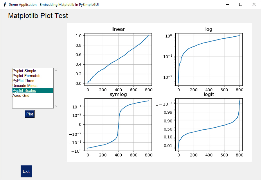
These programs demonstrate to you how to use the Elements and especially how to integtate PySimpleGUI with some of the popular open source technologies such as OpenCV, PyGame, PyPlot, and Matplotlib to name a few.
Many Demo Programs that are in the main folder will run on multiple ports of PySimpleGUI. There are alse port-specific Demo Programs. You'll find those in the folder with the port. So, Qt specific Demo Programs are in the PySimpleGUIQt folder.
Let's take a super-brief tour around PySimpleGUI before digging into the details. There are 2 levels of windowing support in PySimpleGUI - High Level and Customized.
The high-level calls are those that perform a lot of work for you. These are not custom made windows (those are the other way of interacting with PySimpleGUI).
Let's use one of these high level calls, the Popup and use it to create our first window, the obligatory "Hello World". It's a single line of code. You can use these calls like print statements, adding as many parameters and types as you desire.
import PySimpleGUI as sg

sg.Popup('Hello From PySimpleGUI!', 'This is the shortest GUI program ever!')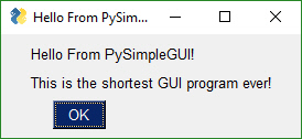
Or how about a custom GUI in 1 line of code? No kidding this is a valid program and it uses Elements and produce the same Widgets like you normally would in a tkinter program. It's just been compacted together is all, strictly for demonstration purposes as there's no need to go that extreme in compactness, unless you have a reason to and then you can be thankful it's possible to do.
import PySimpleGUI as sg

event, values = sg.Window('Get filename example', [[sg.Text('Filename')], [sg.Input(), sg.FileBrowse()], [sg.OK(), sg.Cancel()] ]).Read()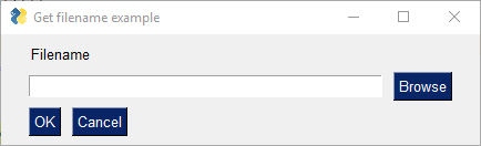
One day I will find the right words, and they will be simple. ― Jack Kerouac
That's nice that you can crunch things into 1 line, like in the above example, but it's not readable. Let's add some whitespace so you can see the beauty of the PySimpleGUI code.
Take a moment and look at the code below. Can you "see" the window looking at the layout variable, knowing that each line of code represents a single row of Elements? There are 3 "rows" of Elements shown in the window and there are 3 lines of code that define it.
Creating and reading the user's inputs for the window occupy the last 2 lines of code, one to create the window, the last line shows the window to the user and gets the input values (what button they clicked, what was input in the Input Element)
import PySimpleGUI as sg

sg.theme('Dark Blue 3')  # please make your creations colorful

layout = [	[sg.Text('Filename')],
          	[sg.Input(), sg.FileBrowse()],
	  		[sg.OK(), sg.Cancel()]]

window = sg.Window('Get filename example', layout)

event, values = window.Read()
window.close()
Unlike other GUI SDKs, you can likely understand every line of code you just read, even though you have not yet read a single instructional line from this document about how you write Elements in a layout.
There are no pesky classes you are required to write, no callback functions to worry about. None of that is required to show a window with some text, an input area and 2 buttons using PySimpleGUI.
The same code, in tktinter, is 5 times longer and I'm guessing you won't be able to just read it and understand it. While you were reading through the code, did you notice there are no comments, yet you still were able to understand, using intuition alone.
You will find this theme of Simple everywhere in and around PySimpleGUI. It's a way of thinking as well as an architecture direction. Remember, you, Mr./Ms. Developer, are at the center of the package. So, from your vantage point, of course everything should look and feel simple.
Not only that, it's the Pythonic thing to do. Have a look at line 3 of the "Zen of Python".
The Zen of Python, by Tim Peters
Beautiful is better than ugly. Explicit is better than implicit. Simple is better than complex. Complex is better than complicated. Flat is better than nested. Sparse is better than dense. Readability counts. Special cases aren't special enough to break the rules. Although practicality beats purity. Errors should never pass silently. Unless explicitly silenced. In the face of ambiguity, refuse the temptation to guess. There should be one-- and preferably only one --obvious way to do it. Although that way may not be obvious at first unless you're Dutch. Now is better than never. Although never is often better than right now. If the implementation is hard to explain, it's a bad idea. If the implementation is easy to explain, it may be a good idea. Namespaces are one honking great idea -- let's do more of those!
I just hope reading all these pages of documentation is going to make you believe that we're breaking suggestion:
If the implementation is hard to explain, it's a bad idea. If the implementation is easy to explain, it may be a good idea.
I don't think PySimpleGUI is difficult to explain, but I am striving to fully explain it so that you don't do this:
In the face of ambiguity, refuse the temptation to guess.
Sometimes you can guess and be fine. Other times, things may work, but the side effects are potentially significant. There may be a much better way to solve a problem - Log an Issue on GitHub!
And STILL the Zen of Python fits:
Beautiful is better than ugly.
but this fits too:
Although practicality beats purity.
Find a balance that works for you.
"But tkinter sucks" "It looks like the 1990s" (this one is often said by people that were not alive in the 1990s) "What Python GUI SDK will make my window look beautiful?" (posted to Reddit at least every 2 weeks)
These windows below were ALL made using PySimpleGUI, the tkinter version and they look good enough to not be simply scoffed at and dismissed. Remember, developer, you have a rather significant hand in how your application looks and operates. You certainly cannot pin it all on the GUIs you're using.
So many posts on Reddit asking which GUI is going to result in a "beautiful window", as if there's a magic GUI library that pretties things up for you. There are some calls in PySimpleGUI that will help you. For example, you can make a single call to "Chang the look and feel" which loads predefined color pallets so your windows can have some instant color and it matches.
Beautiful windows are created, not simply given to you. There are people that design and create artwork for user interfaces, you know that right? Artists draw buttons, artwork that you include in the window to make it nicer.
Some of these have been "polished", others like the Matplotlib example is more a functional example to show you it works.
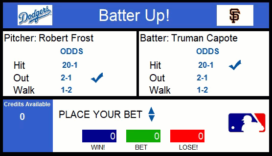
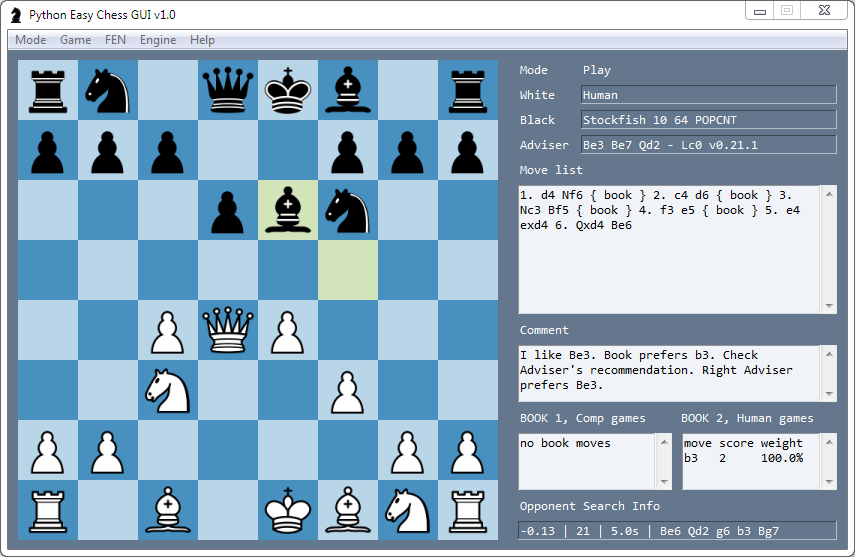
This chess program is capable of running multiple AI chess engines and was written by another user using PySimpleGUI.
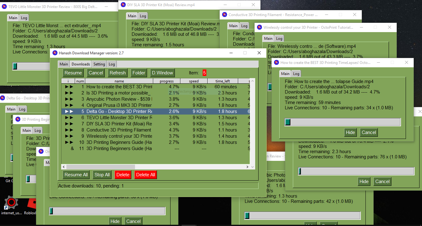
This downloader can download files as well as YouTube videos and metadata. If you're worried about multiple windows working, don't. Worried your project is "too much" or "too complex" for PySimpleGUI? Do an initial assessment if you want. Check out what others have done.
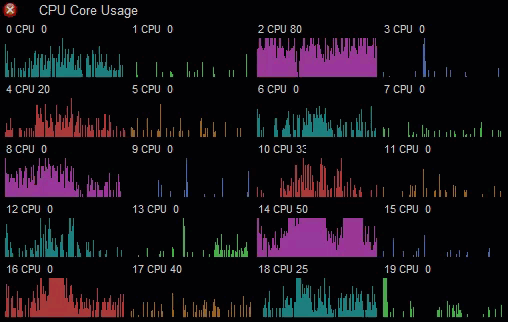
Your program have 2 or 3 windows and you're concerned? Below you'll see 11 windows open, each running independently with multiple tabs per window and progress meters that are all being updated concurrently.
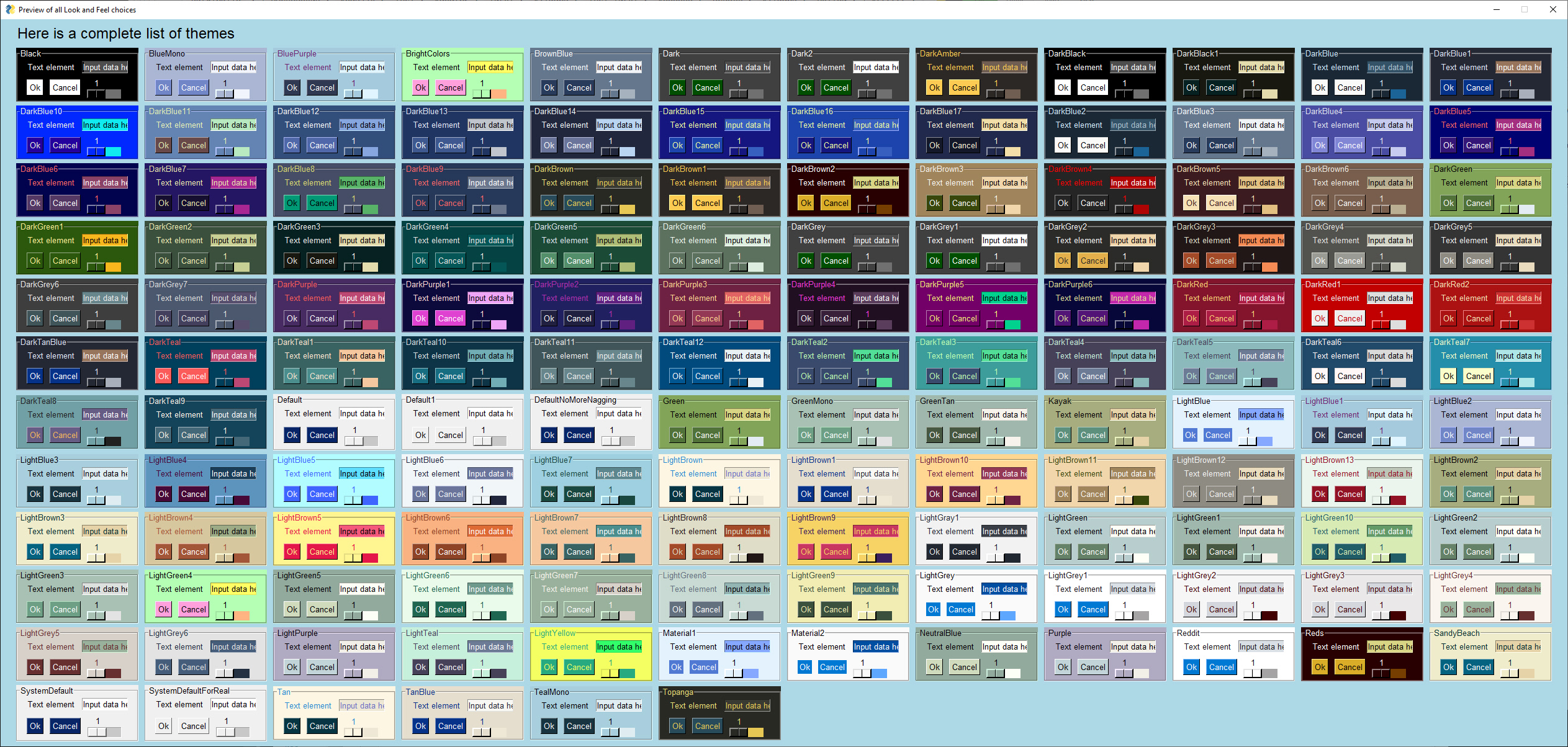
Just because you can't match a pair of socks doesn't mean your windows have to all look the same gray color. Choose from over 100 different "Themes". Add 1 line call to theme to instantly transform your window from gray to something more visually pleasing to interact with. If you mispell the theme name badly or specify a theme name is is missing from the table of allowed names, then a theme will be randomly assigned for you. Who knows, maybe the theme chosen you'll like and want to use instead of your original plan.
In PySimpleGUI release 4.6 the number of themes was dramatically increased from a couple dozen to over 100. To use the color schemes shown in the window below, add a call to theme('Theme Name) to your code, passing in the name of thd desired color theme. To see this window and the list of available themes on your releeae of softrware, call the function theme_previewer(). This will create a window with the frames like those below. It will shows you exactly what's available in your version of PySimpleGUI.
In release 4.9 another 32 Color Themes were added... here are the current choices
Make beautiful looking, alpha-blended (partially transparent) Rainmeter-style Desktop Widgets that run in the background.
Want to build a Crossword Puzzle? No problem, the drawing primitives are there for you.
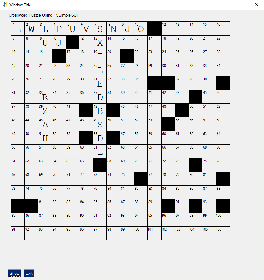
There are built-in drawing primitives
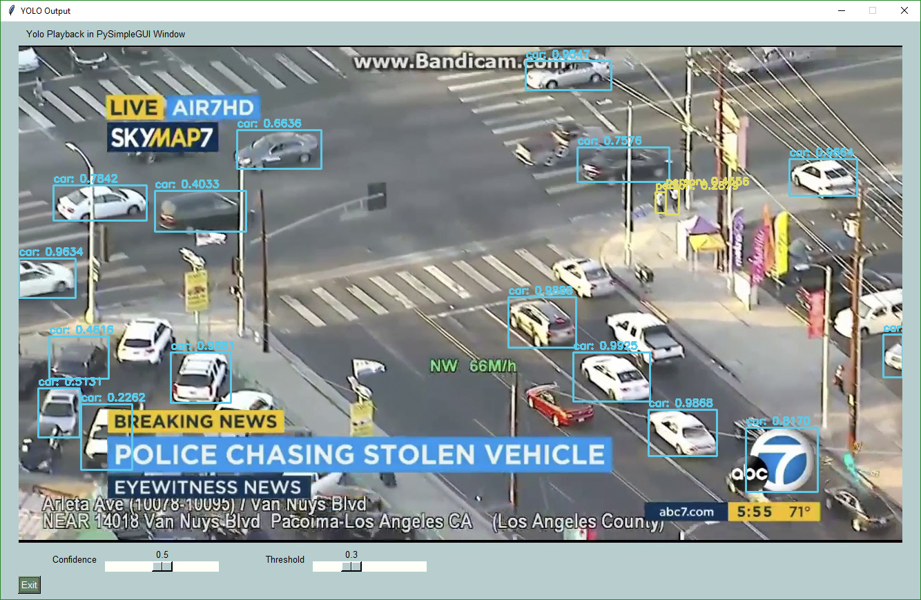
Frame from integration with a YOLO Machine Learning program that does object identification in realtime while allowing the user to adjust the algorithms settings using the sliders under the image. This level of interactivity with an AI algorithm is still unusual to find due to difficulty of merging the technologies of AI and GUI. It's no longer difficult. This program is under 200 lines of code.
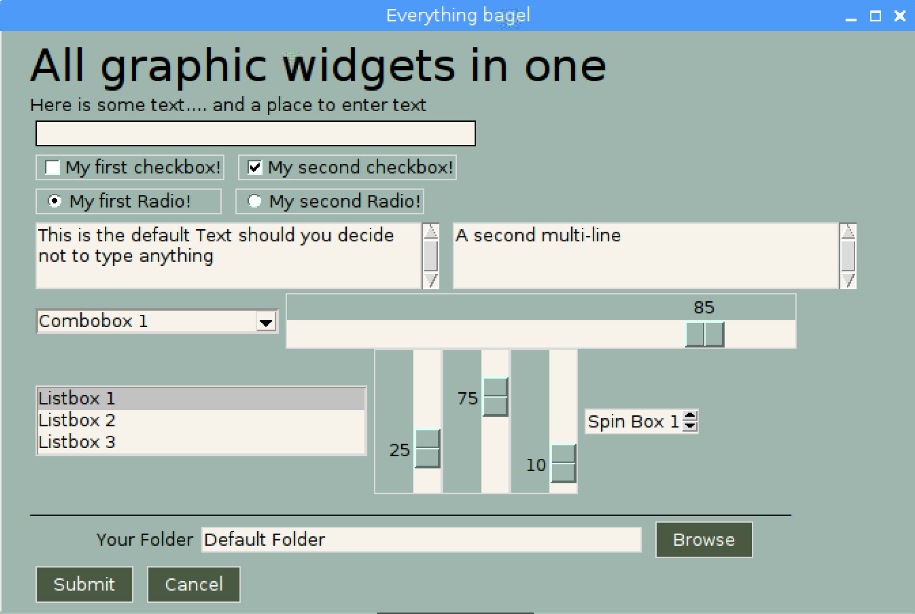
Perhaps you're looking for a way to interact with your Raspberry Pi in a more friendly way. Your PySimpleGUI code will run on a Pi with no problem. Tkinter is alive and well on the Pi platform. Here is a selection of some of the Elements shown on the Pi. You get the same Elements on the Pi as you do Windows and Linux.
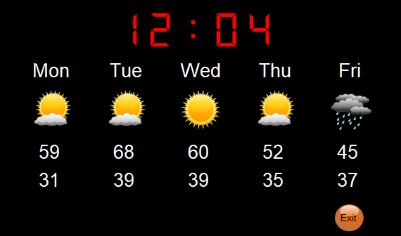
You can add custom artwork to make it look nice, like the Demo Program - Weather Forecast shown in this image:
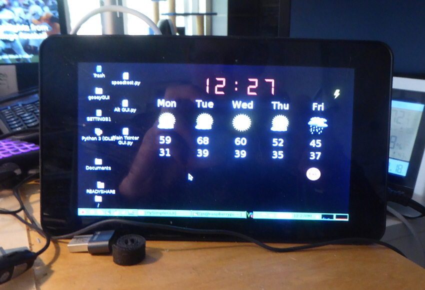
One thing to be aware of with Pi Windows, you cannot make them semi-transparent. This means that the Window.Disappear method will not work. Your window will not disappear. Setting the Alpha Channel will have no effect.
Don't forget that you can use custom artwork anywhere, including on the Pi. The weather application looks beautiful on the Pi. Notice there are no buttons or any of the normal looking Elements visible. It's possible to build nice looking applications, even on the lower-end platforms.
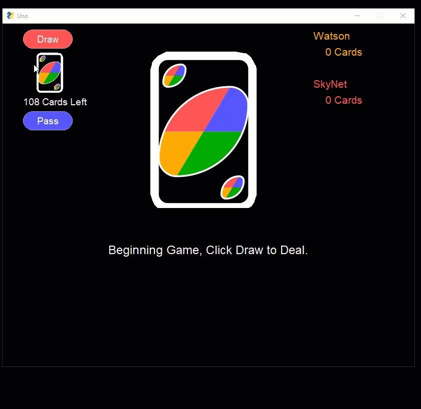
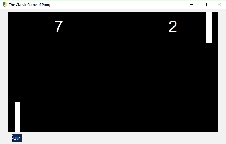
It's possible to create some cool games by simply using the built-in PySimpleGUI graphic primivites like those used in this game of pong. PyGame can also be embedded into a PySimpleGUI window and code is provided to you demonstrating how. There is also a demonstration of using the pymunk physics package that can also be used for games.
Games haven't not been explored much, yet, using PySimpleGUI.
Do you have the desire to share your code with other people in your department, or with friends and family? Many of them may not have Python on their computer. And in the corporate environment, it may not be possible for you to install Python on their computer.
PySimpleGUI + PyInstaller to the rescue!!
Combining PySimpleGUI with PyInstaller creates something truly remarkable and special, a Python program that looks like a Windows WinForms application.
The application you see below with a working menu was created in 20 lines of Python code. It is a single .EXE file that launches straight into the screen you see. And more good news, the only icon you see on the taskbar is the window itself... there is no pesky shell window. Nice, huh?
With a simple GUI, it becomes practical to "associate" .py files with the python interpreter on Windows. Double click a py file and up pops a GUI window, a more pleasant experience than opening a dos Window and typing a command line.
There is even a PySimpleGUI program that will take your PySimpleGUI program and turn it into an EXE. It's nice because you can use a GUI to select your file and all of the output is shown in the program's window, in realtime.
Feel free to skip all this if you don't care to know the backstory and reasons behind decisions.
There was a project looming and a GUI was needed. It wasn't a very complex GUI so thus began a search for a simplified GUI package that would enable me to work with tkinter easier. I found a few, and they were pretty popular too, but they lacked the full-compliment of Widgets and it was impossible to define my own window using those widgets.
A whacky idea came to mind... what if I wrote a simplified GUI and then used THAT to write my application. It would be a lot less code and it would be "easy" to write my application then. And that is exactly what was done.
First an early version of PySimpleGUI was written that had a subset of the Elements avaiable today. It had just enough for my application. Then I wrote my application in PySimpleGUI.
Thus PySimpleGUI was born out of necessity and it's been the necessity of others that have helped evolve it into the package it is today. It would not be 1/2 as good without the help of the community.
Once PySimpleGUI was done, it was time to start working on "the ports". And, of course, also this documentation.
The two "advanced concepts" that beginning Python students have with GUIs are the use of classes and callbacks with their associated communication and coordination mechanisms (semaphores, queues, etc)
How do you make a GUI interface easy enough for first WEEK Python students?
This meant classes could be used to build and use it, but classes can not be part of the code the user writes. Of course, an OO design is quite possible to use with PySimpleGUI, but it's not a requirement. The sample code and docs stay away from writing new classes in the user space for the most part.
What about those pesky callbacks? They're difficult for beginners to grasp and they're a bit of a pain in the ass to deal with. The way PySimpleGUI got around events was to utilize a "message passing" architecture instead.
Instead of a user function being called when there's some event, instead the information is "passed" to the user when they call the function Window.Read()
Everything is returned through this Window.Read call. Of course the underlying GUI frameworks still perform callbacks, but they all happen inside of PySimpleGUI where they are turned into messages to pass to you.
All of the boilerplate code, the event handling, widget creation, frames containing widgets, etc, are exactly the same objects and calls that you would be writing if you wrote directly in tktiner, Qt, etc. With all of this code out of the way and done for you, that leaves you with the task of doing something useful with the information the user entered. THAT, afterall, is the goal here.... getting user information and acting on it.
The full complement of Widgets are available to you via PySimpleGUI Elements. And those widgets are presented to you in a unique and fun way.
If you wish to learn more about the Architecture of PySimpleGUI, take a look at the Architecture document located on ReadTheDocs.
A GUI that's appealing to a broad audience that is highly customizable, easy to program, and is solid with few bugs and rarely crashes (99% of the time it's some other error that causes a crash).
PySimpleGUI is becoming more and more popular. The number of installs and the number of successes grows daily. Pip installs have exceeded 350,000 in the first year of existance. Over 300 people a day visit the GitHub and the project has 1,800 stars (thank you aweesome users!)
The number of ports is up to 4. The number of integrations with other technologies is constantly being expanded. It's a great time to try PySimpleGUI! You've got no more than 5 or 10 minutes to lose.
Caution is needed, however, when working with the unfinished ports. PySimpleGUI, the tkinter version, is the only fully complete port. Qt is next. All of its Elements are completed, but not all of the options of each element are done. PySimpleGUIWeb is next in order of completness and then finally PySimpleGUIWx.
While simple to use, PySimpleGUI has significant depth to be explored by more advanced programmers. The feature set goes way beyond the requirements of a beginner programmer, and into the required features needed for complex multi-windowed GUIs.
For those of you that have heard PySimpleGUI is only good for doing the most simplest of GUIs, this feature list should put that myth to rest. The SIMPLE part of PySimpleGUI is how much effort you expend to write a GUI, not the complexity of the program you are able to create. It's literally "simple" to do... and it is not limited to simple problems.
Features of PySimpleGUI include:
- Support for Python versions 2.7 and 3
- Text
- Single Line Input
- Buttons including these types:
- File Browse
- Files Browse
- Folder Browse
- SaveAs
- Normal button that returns event
- Close window
- Realtime
- Calendar chooser
- Color chooser
- Button Menu
- TTK Buttons or "normal" TK Buttons
- Checkboxes
- Radio Buttons
- Listbox
- Option Menu
- Menubar
- Button Menu
- Slider
- Spinner
- Dial
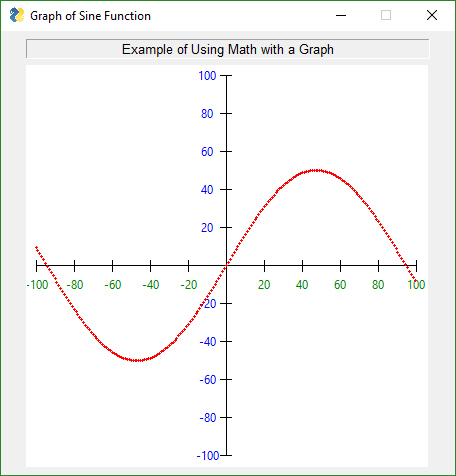
- Graph
- Frame with title
- Icons
- Multi-line Text Input
- Scroll-able Output
- Images
- Tables
- Trees
- Progress Bar Async/Non-Blocking Windows
- Tabbed windows
- Paned windows
- Persistent Windows
- Multiple Windows - Unlimited number of windows can be open at the same time
- Redirect Python Output/Errors to scrolling window
- 'Higher level' APIs (e.g. MessageBox, YesNobox, ...)
- Single-Line-Of-Code Proress Bar & Debug Print
- Complete control of colors, look and feel
- Selection of pre-defined palettes
- Button images
- Horizontal and Verticle Separators
- Return values as dictionary
- Set focus
- Bind return key to buttons
- Group widgets into a column and place into window anywhere
- Scrollable columns
- Keyboard low-level key capture
- Mouse scroll-wheel support
- Get Listbox values as they are selected
- Get slider, spinner, combo as they are changed
- Update elements in a live window
- Bulk window-fill operation
- Save / Load window to/from disk
- Borderless (no titlebar) windows (very classy looking)
- Always on top windows
- Menus with ALT-hotkey
- Right click pop-up menu
- Tooltips
- Clickable text
- Transparent windows
- Movable windows
- Animated GIFs
- No async programming required (no callbacks to worry about)
- Built-in debugger and REPL
- User expandable by accessing underlying GUI Framework widgets directly
With the developer being the focus, the center of it all, it was important to keep this mindset at all times, including now, today. Why is this such a big deal? Because this package was written so that the universe of Python applications can grow and can include EVERYONE into the GUI tent.
Up in 5 minutes
Success #1 has to happen immediately. Installing and then running your first GUI program. FIVE minutes is the target. The Pip install is under 1 minute. Depending on your IDE and development environment, running your first piece of code could be a copy, paste, and run. This isn't a joke target; it's for real serious.
Beginers and Advanted Together
Design an interface that both the complete beginner can understand and use that has enough depth that an advanced programmer can make some very nice looking GUIs amd not feel like they're playing with a "toy".
Success After Success
Success after success.... this is the model that will win developer's hearts. This is what users love about PySimpleGUI. Make your development progress in a way you can run and test your code often. Add a little bit, run it, see it on your screen, smile, move on.
Copy, Paste, Run.
The Cookbook and Demo Programs are there to fulfill this goal. First get the user seeing on their screen a working GUI that's similar in some way to what they want to create.
If you're wanting to play with OpenCV download the OpenCV Demo Programs and give them a try. Seeing your webcam running in the middle of a GUI window is quite a thrill if you're trying to integrate with the OpenCV package.
"Poof" instant running OpenCV based application == Happy Developer
Make Simpler Than Expected Interfaces
The Single Line Progress Meter is a good example. It requires one and only 1 line of code. Printing to a debug window is as easy as replacing print with sg.Print which will route your console output to a scrolling debug window.
Be Pythonic
Be Pythonic...
This one is difficult for me to define. The code implementing PySimpleGUI isn't PEP8 compliant, but it is consistent. The important thing was what the user saw and experienced while coding, NOT the choices for naming conventions in the implementation code. The user interface to PySimpleGUI now has a PEP8 compliant interface. The methods are snake_case now (in addition to retaining the older CamelCase names)
I ended up defining it as - attempt to use language constructs in a natural way and to exploit some of Python's interesting features. It's Python's lists and optional parameters make PySimpleGUI work smoothly.
Here are some Python-friendly aspects to PySimpleGUI:
- Windows are represented as Python lists of Elements
- Return values are an "event" such a button push and a list/dictionary of input values
- The SDK calls collapse down into a single line of Python code that presents a custom GUI and returns values should you want that extreme of a single-line soluition
- Elements are all classes. Users interact with elements using class methods but are not required to write their own classes
- Allow keys and other identifiers be any format you want. Don't limit user to particular types needlessly.
- While some disagree with the single source file, I find the benefits greatly outweigh the negatives
Teach GUI Programming to Beginners
By and large PySimpleGUI is a "pattern based" SDK. Complete beginners can copy these standard design patterns or demo programs and modify them without necessarily understanding all of the nuts and bolts of what's happening. For example, they can modify a layout by adding elements even though they may not yet grasp the list of lists concept of layouts.
Beginners certainly can add more if event == 'my button': statements to the event loop that they copied from the same design pattern. They will not have to write classes to use this package.
Capture Budding Graphic Designers & Non-Programmers
The hope is that beginners that are interested in graphic design, and are taking a Python course, will have an easy way to express themselves, right from the start of their Python experience. Even if they're not the best programmers they will be able express themselves to show custom GUI layouts, colors and artwork with ease.
Fill the GUI Gap (Democratize GUIs)
There is a noticeable gap in the Python GUI solution. Fill that gap and who knows what will happen. At the moment, to make a tradiional GUI window using tkinter, Qt, WxPython and Remi, it takes much more than a week, or a month of Python education to use these GUI packages.
They are out of reach of the beginners. Often WAY out of reach. And yet, time and time again, beginners that say they JUST STARTED with Python will ask on a Forum or Reddit for a GUI pacakage recommendation. 9 times out of 10 Qt is recommended. (smacking head with hand). What a waste of characters. You might as well have just told them, "give up".
Is There a There?
Maybe there's no "there there". Or maybe a simple GUI API will enable Python to dominate yet another computing discipline like it has so many others. This is one attempt to find out. So far, it sure looks like there's PLENTY of demand in this area.
There is a "Troubleshooting" section towards the end of this document should you run into real trouble. It goes into more detail about what you can do to help yourself.
Of course if you're installing for Qt, WxPython, Web, you'll use PySimpleGUIQt, PySimpleGUIWx, and PySimpleGUIWeb instead of straight PySimpleGUI in the instructions below. You should already have the underlying GUI Framework installed and perhaps tested. This includes tkinter, PySide2, WxPython, Remi
pip install --upgrade PySimpleGUI
On some systems you need to run pip3. (Linux and Mac)
pip3 install --upgrade PySimpleGUI
On a Raspberry Pi, this is should work:
sudo pip3 install --upgrade pysimplegui
Some users have found that upgrading required using an extra flag on the pip --no-cache-dir.
pip install --upgrade --no-cache-dir PySimpleGUI
On some versions of Linux you will need to first install pip. Need the Chicken before you can get the Egg (get it... Egg?)
sudo apt install python3-pip
tkinter is a requirement for PySimpleGUI (the only requirement). Some OS variants, such as Ubuntu, do not some with tkinter already installed. If you get an error similar to:
ImportError: No module named tkinter
then you need to install tkinter.
For python 2.7
sudo apt-get install python-tk
For python 3
sudo apt-get install python3-tk
More information about installing tkinter can be found here: https://www.techinfected.net/2015/09/how-to-install-and-use-tkinter-in-ubuntu-debian-linux-mint.html
IMPORTANT PySimpleGUI27 will disappear from the GitHub on Dec 31, 2019. PLEASE migrate to 3.6 at least. It's not painful for most people.
pip install --upgrade PySimpleGUI27
or
pip2 install --upgrade PySimpleGUI27
You may need to also install "future" for version 2.7
pip install future
or
pip2 install future
Like above, you may have to install either pip or tkinter. To do this on Python 2.7:
sudo apt install python-pip
sudo apt install python-tkinter
Once you have installed, or copied the .py file to your app folder, you can test the installation using python. At the command prompt start up Python.
From your commant line type:
python -m PySimpleGUI
Of course if you're on Linux/Mac and need to run using the command python3 then of course type that.
This will display the same window as these instructions:
>>> import PySimpleGUI27
>>> PySimpleGUI27.main()>>> import PySimpleGUI
>>> PySimpleGUI.main()You will see a "test harness" that exercises the SDK, tells you the version number, allows you to try
It's critical for you to be certain where your code is coming from and which version you're running.
Sometimes when debugging, questions arise as to exactly which PySimpleGUI you are running. The quick way to find this out is to again, run Python from the command line. This time you'll type:
>>> import PySimpleGUI as sg
>>> sg
When you type sg, Python will tell you the full patch to your PySimpleGUI file / package. This is critical information to know when debugging because it's really easy to forget you've got an old copy of PySimpleGUI laying around somewhere.
If you continue to have troubles with getting the right version of PySimpleGUI loaded, THE definitive way to determine where your program is getting PySimpleGUI from is to add a print to your program. It's that simple! You can also get the version you are running by also printing
import PySimpleGUI as sg

print(sg)
print(sg.version)
Just like when using the REPL >>> to determine the location, this print in your code will display the same path information.
If you're not connected to the net on your target machine, or pip isn't working, or you want to run the latest code from GitHub, then all you have to do is place the single PySimpleGUI source file PySimpleGUI.py (for tkinter port) and place it in your application's folder (the folder where the py file is that imports PySimpleGUI). Your application will load that local copy of PySimpleGUI as if it were a package.
Be sure that you delete this PySimpleGUI.py file if you install a newer pip version. Often the sequence of events is that a bug you've reported was fixed and checked into GitHub. You download the PySimpleGUI.py file (or the appropriately named one for your port) and put with your app. Then later your fix is posted with a new release on PyPI. You'll want to delete the GitHub one before you install from pip.
Python 2.7 or Python 3 tkinter
PySimpleGUI Runs on all Python3 platforms that have tkinter running on them. It has been tested on Windows, Mac, Linux, Raspberry Pi. Even runs on pypy3.
If you wish to create an EXE from your PySimpleGUI application, you will need to install PyInstaller. There are instructions on how to create an EXE at the bottom of this document.
A lot of people ask about IDEs, and many outright fear PyCharm. Listen up.... compared to your journey of learning Python, learning to use PyCharm as your IDE is NOTHING. It's a DAY typically (from 1 to 8 hours). Or, if you're really really new, perhaps as much as a week to get used to. So, we're not talking about you needing to learn to flap your arms and fly.
To sum up that paragraph, stop whining like a little b*tch. You're a grown man/woman, act like it. "But it's hard..." If you found this package, then you're a bright person :-) Have some confidence in yourself for Christ sake.... I do. Not going to lead you off some cliff, promise!
Some IDEs provide virtual environments, but it's optional. PyCharm is one example. For these, you will either use their GUI interface to add packages or use their built-in terminal to do pip installs. It's not recommended for beginners to be working with Virtual Environments. They can be quite confusing. However, if you are a seasoned professional developer and know what you're doing, there is nothing about PySimpleGUI that will prevent you from working this way. It's mostly a caution for beginners because more often than not, they get really messed up and confused.
A number of IDEs have known problems with PySimpleGUI. IDLE, Spyder, and Thonny all have known, demonstrable, problems with intermittent or inconsistent results, especially when a program exits and you want to continue to work with it. *** Any IDE that is based on tkinter is going to have issues with the straight PySimpleGUI port.*** This is NOT a PySimpleGUI problem.
The official list of supported IDEs is:
- PyCharm (or course this is THE IDE to use for use with PySimpleGUI)
- Wing
- Visual Studio
If you're on a Raspberry Pi or some other limited environment, then you'll may have to use IDLE or Thonny. Just be aware there could be problems using the debugger to debug due to both using tkinter.
Beginning with the 4.0 release of PySimpleGUI, the tkinter port, a whole new world opened up for PySimpleGUI programmers, one where referencing the readme and ReadTheDocs documentation is no longer needed. PyCharm and Wing both support these docstrings REALLY well and I'm sure Visual Studio does too. Why is this important? Because it will teach you the PySimpleGUI SDK as you use the package.
Don't know the parameters and various options for the InputText Element? It's a piece of cake with PyCharm. You can set PyCharm to automatically display documentation about the class, function, method, etc, that your cursor is currently sitting on. You can also manually bring up the documentation by pressing CONTROL+Q. When you do, you'll be treated to a window similar to this:
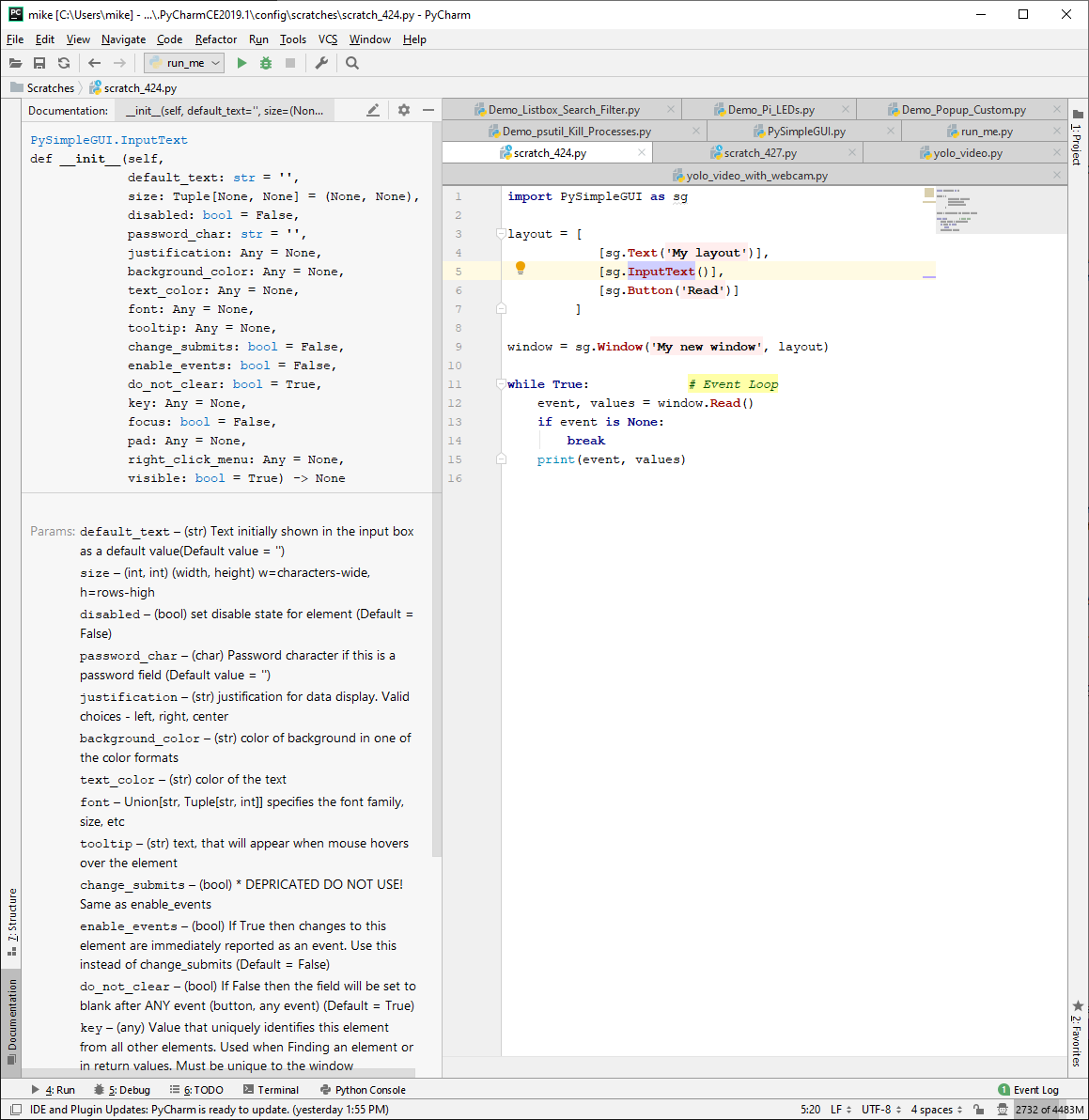
Note that my cursor is on InputText. On the left side of the screen, the InputText element's parameters are not just shown to you, but they are each individually described to you, and, the type is shown as well. I mean, honestly, how much more could you ask for?
OK, I suppose you could ask for a smaller window that just shows the parameters are you're typing them in. Well, OK, in PyCharm, when your cursor is between the ( ) press CONTROL+P. When you do, you'll be treated to a little window like this one:
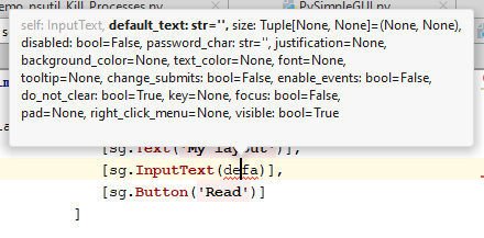
See.... written with the "Developer" in mind, at all times. It's about YOU, Mr/Ms Developer! So enjoy your package.
The other ports of PySimpleGUI (Qt, WxPython, Web) have not yet had their docstrings updated. They're NEXT in line to be better documented. Work on a tool has already begun to make that happen sooner than later.
To use in your code, simply import....
import PySimpleGUI as sg
Then use either "high level" API calls or build your own windows.
sg.Popup('This is my first Popup')
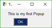
Yes, it's just that easy to have a window appear on the screen using Python. With PySimpleGUI, making a custom window appear isn't much more difficult. The goal is to get you running on your GUI within minutes, not hours nor days.
If you must run 3.7, try 3.7.2. It does work with PySimpleGUI with no known issues.
PySimpleGUI with Python 3.7.3 and 3.7.4+. tkinter is having issues with all the newer releases. Things like Table colors stopped working entirely. It's unclear if there's been a change that makes the tkinter API no longer working which means they are not backwards compatible. That would be a real shame. If so, more work needs to be done in PySimpleGUI
On December 31, 2019 the Python 2.7 version of PySimpleGUI will be deleted from the GitHub. Sorry but Legacy Python has no permanent home here. The security experts claim that supporting 2.7 is doing a diservice to the Python community. I understand why. There are some very narrow cases where 2.7 is required. If you have one, make a copy of PySimpleGUI27.py quickly before it disappears for good.
Beginning with release 4.3 of PySimpleGUI, all methods and function calls have PEP8 equivalents. This capability is only available, for the moment, on the PySimpleGUI tkinter port. It is being added, as quickly as possible, to all of the ports.
As long as you know you're sticking with tkinter for the short term, it's safe to use the new bindings.
Why the need for these bindings? Simply put, the PySimpleGUI SDK has a PEP8 violation in the method and function names. PySimpleGUI uses CamelCase names for methods and functions. PEP8 suggests using snake_case_variables instead.
This has not caused any problems and few complaints, but it's important the the interfaces into PySimpleGUI be compliant. Perhaps one of the reasons for lack of complaints is that the Qt library also uses SnakeCase for its methods. This practice has the effect of labelling a package as being "not Pythonic" and also suggests that ths package was originally used in another language and then ported to Python. This is exactly the situation with Qt. It was written for C++ and the interfaces continue to use C++ conventions.
PySimpleGUI was written in Python, for Python. The reason for the name problem was one of ignorance. The PEP8 convention wasn't understood by the developers when PySimpleGUI was designed and implemented.
You can, and will be able to for some time, use both names. However, at some point in the future, the CamelCase names will disappear. A utility is planned to do the conversion for the developer when the old names are remove from PySimpleGUI.
The help system will work with both names as will your IDE's docstring viewing. However, the result found will show the CamelCase names. For example help(sg.Window.read) will show the CamelCase name of the method/function. This is what will be returned:
Read(self, timeout=None, timeout_key='__TIMEOUT__')
To convert a CamelCase method/function name to snake_case, you simply place an _ where the Upper Case letter is located. If there are none, then only the first letter is changed.
Window.FindElement becomes Window.find_element
For the time being, class variables will remain the way they are currently. It is unusual, in PySimpleGUI, for class variables to be modified or read by the user code so the impact of leaving them is rarely seen in your code.
"High level calls" are those that start with "Popup". They are the most basic form of communications with the user. They are named after the type of window they create, a pop-up window. These windows are meant to be short lived while, either delivering information or collecting it, and then quickly disappearing.
Think of Popups as your first windows, sorta like your first bicycle. It worked well, but was limited. It probably wasn't long before you wanted more features and it seemed too limiting for your newly found sense of adventure.
When you've reached the point with Popups that you are thinking of filing a GitHub "Enhancement Issue" to get the Popup call extended to include a new feature that you think would be helpful.... not just to you but others is what you had in mind, right? For the good of others.
It's at THIS time that you should immediately turn to the section entitled "Custom Window API Calls - Your First Window". Congratulations, you just graduated and are not an official "GUI Designer". Oh, nevermind that you only started learning Python 2 weeks ago, you're a real GUI Designer now so buck up and start acting like one.
But, for now, let's stick with these 1-line window calls, the Popups.
Think of the Popup call as the GUI equivalent of a print statement. It's your way of displaying results to a user in the windowed world. Each call to Popup will create a new Popup window.
Popup calls are normally blocking. your program will stop executing until the user has closed the Popup window. A non-blocking window of Popup discussed in the async section.
Just like a print statement, you can pass any number of arguments you wish. They will all be turned into strings and displayed in the popup window.
There are a number of Popup output calls, each with a slightly different look (e.g. different button labels).
The list of Popup output functions are:
- Popup
- PopupOk
- PopupYesNo
- PopupCancel
- PopupOkCancel
- PopupError
- PopupTimed, PopupAutoClose
- PopupNoWait, PopupNonBlocking
The trailing portion of the function name after Popup indicates what buttons are shown. PopupYesNo shows a pair of button with Yes and No on them. PopupCancel has a Cancel button, etc.
While these are "output" windows, they do collect input in the form of buttons. The Popup functions return the button that was clicked. If the Ok button was clicked, then Popup returns the string 'Ok'. If the user clicked the X button to close the window, then the button value returned is None.
The function PopupTimed or PopupAutoClose are popup windows that will automatically close after come period of time.
Here is a quick-reference showing how the Popup calls look.
sg.Popup('Popup')  # Shows OK button
sg.PopupOk('PopupOk')  # Shows OK button
sg.PopupYesNo('PopupYesNo')  # Shows Yes and No buttons
sg.PopupCancel('PopupCancel')  # Shows Cancelled button
sg.PopupOKCancel('PopupOKCancel')  # Shows OK and Cancel buttons
sg.PopupError('PopupError')  # Shows red error button
sg.PopupTimed('PopupTimed')  # Automatically closes
sg.PopupAutoClose('PopupAutoClose')  # Same as PopupTimed
Preview of popups:
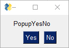
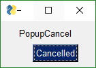
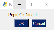
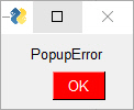
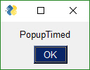
Popup - Display a popup Window with as many parms as you wish to include. This is the GUI equivalent of the "print" statement. It's also great for "pausing" your program's flow until the user can read some error messages.
Popup(args,
    title=None,
    button_color=None,
    background_color=None,
    text_color=None,
    button_type=0,
    auto_close=False,
    auto_close_duration=None,
    custom_text=(None, None),
    non_blocking=False,
    icon=None,
    line_width=None,
    font=None,
    no_titlebar=False,
    grab_anywhere=False,
    keep_on_top=False,
    location=(None, None))
Parameter Descriptions:
| Name | Meaning |
|---|---|
| *args | (Any) Variable number of your arguments. Load up the call with stuff to see! |
| title | (str) Optional title for the window. If none provided, the first arg will be used instead. |
| button_color | Tuple[str, str] Color of the buttons shown (text color, button color) |
| background_color | (str) Window's background color |
| text_color | (str) text color |
| button_type | (enum) NOT USER SET! Determines which pre-defined buttons will be shown (Default value = POPUP_BUTTONS_OK). There are many Popup functions and they call Popup, changing this parameter to get the desired effect. |
| auto_close | (bool) If True the window will automatically close |
| auto_close_duration | (int) time in seconds to keep window open before closing it automatically |
| custom_text | Union[Tuple[str, str], str] A string or pair of strings that contain the text to display on the buttons |
| non_blocking | (bool) If True then will immediately return from the function without waiting for the user's input. |
| icon | Union[str, bytes] icon to display on the window. Same format as a Window call |
| line_width | (int) Width of lines in characters. Defaults to MESSAGE_BOX_LINE_WIDTH |
| font | Union[str, tuple(font name, size, modifiers) specifies the font family, size, etc |
| no_titlebar | (bool) If True will not show the frame around the window and the titlebar across the top |
| grab_anywhere | (bool) If True can grab anywhere to move the window. If no_titlebar is True, grab_anywhere should likely be enabled too |
| location | Tuple[int, int] Location on screen to display the top left corner of window. Defaults to window centered on screen |
| return | Union[str, None] Returns text of the button that was pressed. None will be returned if user closed window with X |
The other output Popups are variations on parameters. Usually the button_type parameter is the primary one changed.
The other output Popups are variations on parameters. Usually the button_type parameter is the primary one changed.
The choices for button_type are:
POPUP_BUTTONS_YES_NO
POPUP_BUTTONS_CANCELLED
POPUP_BUTTONS_ERROR
POPUP_BUTTONS_OK_CANCEL
POPUP_BUTTONS_OK
POPUP_BUTTONS_NO_BUTTONS
Note that you should not call Popup yourself with different button_types. Rely on the Popup function named that sets that value for you. For example PopupYesNo will set the button type to POPUP_BUTTONS_YES_NO for you.
There is a scrolled version of Popups should you have a lot of information to display.
Show a scrolled Popup window containing the user's text that was supplied. Use with as many items to print as you want, just like a print statement.
PopupScrolled(args,
    title=None,
    button_color=None,
    background_color=None,
    text_color=None,
    yes_no=False,
    auto_close=False,
    auto_close_duration=None,
    size=(None, None),
    location=(None, None),
    non_blocking=False,
    no_titlebar=False,
    grab_anywhere=False,
    keep_on_top=False,
    font=None)
Parameter Descriptions:
| Name | Meaning |
|---|---|
| *args | (Any) Variable number of items to display |
| title | (str) Title to display in the window. |
| button_color | Tuple[str, str] button color (foreground, background) |
| yes_no | (bool) If True, displays Yes and No buttons instead of Ok |
| auto_close | (bool) if True window will close itself |
| auto_close_duration | Union[int, float] Older versions only accept int. Time in seconds until window will close |
| size | Tuple[int, int] (w,h) w=characters-wide, h=rows-high |
| location | Tuple[int, int] Location on the screen to place the upper left corner of the window |
| non_blocking | (bool) if True the call will immediately return rather than waiting on user input |
| return | Union[str, None, TIMEOUT_KEY] Returns text of the button that was pressed. None will be returned if user closed window with X |
PopupScrolled(*args, button_color=None, yes_no=False, auto_close=False, auto_close_duration=None, size=(None, None), location=(None, None), title=None, non_blocking=False)Typical usage:
sg.PopupScrolled(my_text)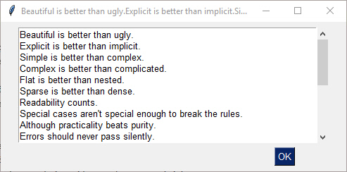
The PopupScrolled will auto-fit the window size to the size of the text. Specify None in the height field of a size parameter to get auto-sized height.
This call will create a scrolled box 80 characters wide and a height dependent upon the number of lines of text.
sg.PopupScrolled(my_text, size=(80, None))
Note that the default max number of lines before scrolling happens is set to 50. At 50 lines the scrolling will begin.
If non_blocking parameter is set, then the call will not blocking waiting for the user to close the window. Execution will immediately return to the user. Handy when you want to dump out debug info without disrupting the program flow.
Show Popup window and immediately return (does not block)
PopupNoWait(args,
    title=None,
    button_type=0,
    button_color=None,
    background_color=None,
    text_color=None,
    auto_close=False,
    auto_close_duration=None,
    non_blocking=True,
    icon=None,
    line_width=None,
    font=None,
    no_titlebar=False,
    grab_anywhere=False,
    keep_on_top=False,
    location=(None, None))
Parameter Descriptions:
| Name | Meaning |
|---|---|
| *args | |
| title | |
| button_type | (Default value = POPUP_BUTTONS_OK) |
| button_color | button color (foreground, background) |
| background_color | color of background |
| text_color | color of the text |
| auto_close | (Default = False) |
| auto_close_duration | |
| non_blocking | (Default = True) |
| icon | Icon to display |
| line_width | Width of lines in characters |
| font | specifies the font family, size, etc |
| no_titlebar | (Default = False) |
| grab_anywhere | If True can grab anywhere to move the window (Default = False) |
| location |
The Popup call PopupNoWait or PopupNonBlocking will create a popup window and then immediately return control back to you. All other popup functions will block, waiting for the user to close the popup window.
This function is very handy for when you're debugging and want to display something as output but don't want to change the programs's overall timing by blocking. Think of it like a print statement. There are no return values on one of these Popups.
There are Popup calls for single-item inputs. These follow the pattern of Popup followed by Get and then the type of item to get. There are 3 of these input Popups to choose from, each with settings enabling customization.
PopupGetText- get a single line of textPopupGetFile- get a filenamePopupGetFolder- get a folder name
Use these Popups instead of making a custom window to get one data value, call the Popup input function to get the item from the user. If you find the parameters are unable to create the kind of window you are looking for, then it's time for you to create your own window.
Use this Popup to get a line of text from the user.
Display Popup with text entry field. Returns the text entered or None if closed / cancelled
PopupGetText(message,
    title=None,
    default_text="",
    password_char="",
    size=(None, None),
    button_color=None,
    background_color=None,
    text_color=None,
    icon=None,
    font=None,
    no_titlebar=False,
    grab_anywhere=False,
    keep_on_top=False,
    location=(None, None))
Parameter Descriptions:
| Name | Meaning |
|---|---|
| message | (str) message displayed to user |
| title | (str) Window title |
| default_text | (str) default value to put into input area |
| password_char | (str) character to be shown instead of actually typed characters |
| size | Tuple[int, int] (width, height) of the InputText Element |
| button_color | Tuple[str, str] Color of the button (text, background) |
| background_color | (str) background color of the entire window |
| text_color | (str) color of the message text |
| icon | Union[bytes, str] filename or base64 string to be used for the window's icon |
| font | Union[str, Tuple[str, int]] specifies the font family, size, etc |
| no_titlebar | (bool) If True no titlebar will be shown |
| grab_anywhere | (bool) If True can click and drag anywhere in the window to move the window |
| keep_on_top | (bool) If True the window will remain above all current windows |
| location | Tuyple[int, int] (x,y) Location on screen to display the upper left corner of window |
| return | Union[str, None] Text entered or None if window was closed or cancel button clicked |
import PySimpleGUI as sg
text = sg.PopupGetText('Title', 'Please input something')
sg.Popup('Results', 'The value returned from PopupGetText', text)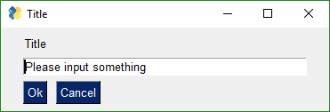
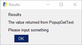
Gets a filename from the user. There are options to configure the type of dialog box to show. Normally an "Open File" dialog box is shown.
Display popup window with text entry field and browse button so that a file can be chosen by user.
PopupGetFile(message,
    title=None,
    default_path="",
    default_extension="",
    save_as=False,
    multiple_files=False,
    file_types=(('ALL Files', '*.*'),),
    no_window=False,
    size=(None, None),
    button_color=None,
    background_color=None,
    text_color=None,
    icon=None,
    font=None,
    no_titlebar=False,
    grab_anywhere=False,
    keep_on_top=False,
    location=(None, None),
    initial_folder=None)
Parameter Descriptions:
| Name | Meaning |
|---|---|
| message | (str) message displayed to user |
| title | (str) Window title |
| default_path | (str) path to display to user as starting point (filled into the input field) |
| default_extension | (str) If no extension entered by user, add this to filename (only used in saveas dialogs) |
| save_as | (bool) if True, the "save as" dialog is shown which will verify before overwriting |
| multiple_files | (bool) if True, then allows multiple files to be selected that are returned with ';' between each filename |
| file_types | Tuple[Tuple[str,str]] List of extensions to show using wildcards. All files (the default) = (("ALL Files", "."),) |
| no_window | (bool) if True, no PySimpleGUI window will be shown. Instead just the tkinter dialog is shown |
| size | Tuple[int, int] (width, height) of the InputText Element |
| button_color | Tuple[str, str] Color of the button (text, background) |
| background_color | (str) background color of the entire window |
| text_color | (str) color of the message text |
| icon | Union[bytes, str] filename or base64 string to be used for the window's icon |
| font | Union[str, Tuple[str, int]] specifies the font family, size, etc |
| no_titlebar | (bool) If True no titlebar will be shown |
| grab_anywhere | (bool) If True can click and drag anywhere in the window to move the window |
| keep_on_top | (bool) If True the window will remain above all current windows |
| location | Tuyple[int, int] (x,y) Location on screen to display the upper left corner of window |
| initial_folder | (str) location in filesystem to begin browsing |
| return | Union[str, None] string representing the file(s) chosen, None if cancelled or window closed with X |
If configured as an Open File Popup then (save_as is not True) the dialog box will look like this.
If you set the parameter save_As to True, then the dialog box looks like this:
If you choose a filename that already exists, you'll get a warning popup box asking if it's OK. You can also specify a file that doesn't exist. With an "Open" dialog box you cannot choose a non-existing file.
A typical call produces this window.
text = sg.PopupGetFile('Please enter a file name')
sg.Popup('Results', 'The value returned from PopupGetFile', text)
The window created to get a folder name looks the same as the get a file name. The difference is in what the browse button does. PopupGetFile shows an Open File dialog box while PopupGetFolder shows an Open Folder dialog box.
Display popup with text entry field and browse button so that a folder can be chosen.
PopupGetFolder(message,
    title=None,
    default_path="",
    no_window=False,
    size=(None, None),
    button_color=None,
    background_color=None,
    text_color=None,
    icon=None,
    font=None,
    no_titlebar=False,
    grab_anywhere=False,
    keep_on_top=False,
    location=(None, None),
    initial_folder=None)
Parameter Descriptions:
| Name | Meaning |
|---|---|
| message | (str) message displayed to user |
| title | (str) Window title |
| default_path | (str) path to display to user as starting point (filled into the input field) |
| no_window | (bool) if True, no PySimpleGUI window will be shown. Instead just the tkinter dialog is shown |
| size | Tuple[int, int] (width, height) of the InputText Element |
| button_color | Tuple[str, str] Color of the button (text, background) |
| background_color | (str) background color of the entire window |
| text_color | (str) color of the message text |
| icon | Union[bytes, str] filename or base64 string to be used for the window's icon |
| font | Union[str, Tuple[str, int]] specifies the font family, size, etc |
| no_titlebar | (bool) If True no titlebar will be shown |
| grab_anywhere | (bool) If True can click and drag anywhere in the window to move the window |
| keep_on_top | (bool) If True the window will remain above all current windows |
| location | Tuyple[int, int] (x,y) Location on screen to display the upper left corner of window |
| initial_folder | (str) location in filesystem to begin browsing |
| return | Union[str, None] string representing the path chosen, None if cancelled or window closed with X |
This is a typpical call
	text = sg.PopupGetFolder('Please enter a folder name')
	sg.Popup('Results', 'The value returned from PopupGetFolder', text)

The animated Popup enables you to easily display a "loading" style animation specified through a GIF file that is either stored in a file or a base64 variable.
Show animation one frame at a time. This function has its own internal clocking meaning you can call it at any frequency and the rate the frames of video is shown remains constant. Maybe your frames update every 30 ms but your event loop is running every 10 ms. You don't have to worry about delaying, just call it every time through the loop.
PopupAnimated(image_source,
    message=None,
    background_color=None,
    text_color=None,
    font=None,
    no_titlebar=True,
    grab_anywhere=True,
    keep_on_top=True,
    location=(None, None),
    alpha_channel=None,
    time_between_frames=0,
    transparent_color=None)
Parameter Descriptions:
| Name | Meaning |
|---|---|
| image_source | Union[str, bytes] Either a filename or a base64 string. |
| message | (str) An optional message to be shown with the animation |
| background_color | (str) color of background |
| text_color | (str) color of the text |
| font | Union[str, tuple) specifies the font family, size, etc |
| no_titlebar | (bool) If True then the titlebar and window frame will not be shown |
| grab_anywhere | (bool) If True then you can move the window just clicking anywhere on window, hold and drag |
| keep_on_top | (bool) If True then Window will remain on top of all other windows currently shownn |
| location | (int, int) (x,y) location on the screen to place the top left corner of your window. Default is to center on screen |
| alpha_channel | (float) Window transparency 0 = invisible 1 = completely visible. Values between are see through |
| time_between_frames | (int) Amount of time in milliseconds between each frame |
| transparent_color | (str) This color will be completely see-through in your window. Can even click through |
To close animated popups, call PopupAnimated with image_source=None. This will close all of the currently open PopupAnimated windows.
We all have loops in our code. 'Isn't it joyful waiting, watching a counter scrolling past in a text window? How about one line of code to get a progress meter, that contains statistics about your code?
OneLineProgressMeter(title,
			current_value,
			max_value,
			key,
			*args,
			orientation=None,
			bar_color=DEFAULT_PROGRESS_BAR_COLOR,
			button_color=None,
			size=DEFAULT_PROGRESS_BAR_SIZE,
			border_width=DEFAULT_PROGRESS_BAR_BORDER_WIDTH):
Here's the one-line Progress Meter in action!
for i in range(1,10000):
	sg.OneLineProgressMeter('My Meter', i+1, 10000, 'key','Optional message')
That line of code resulted in this window popping up and updating.
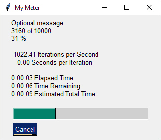
A meter AND fun statistics to watch while your machine grinds away, all for the price of 1 line of code.
With a little trickery you can provide a way to break out of your loop using the Progress Meter window. The cancel button results in a False return value from OneLineProgressMeter. It normally returns True.
Be sure and add one to your loop counter so that your counter goes from 1 to the max value. If you do not add one, your counter will never hit the max value. Instead it will go from 0 to max-1.
Another call in the 'Easy' families of APIs is EasyPrint. As is with other commonly used PySimpleGUI calls, there are other names for the same call. You can use Print or eprint in addition to EasyPrint. They all do the same thing, output to a debug window. If the debug window isn't open, then the first call will open it. No need to do anything but stick an 'sg.Print' call in your code. You can even replace your 'print' calls with calls to EasyPrint by simply sticking the statement
print = sg.EasyPrintat the top of your code.
Print is one of the better ones to use as it's easy to remember. It is simply print with a capital P. sg.Print('this will go to the debug window')
import PySimpleGUI as sg

for i in range(100):
	sg.Print(i)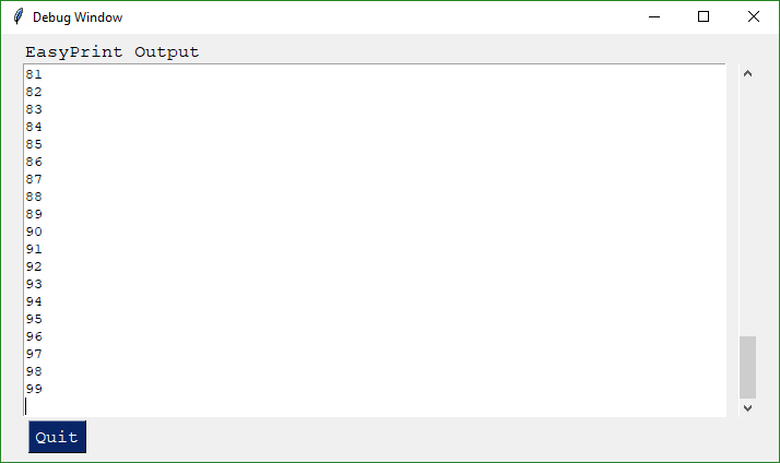
Or if you didn't want to change your code:
import PySimpleGUI as sg

print=sg.Print
for i in range(100):
print(i)
Just like the standard print call, EasyPrint supports the sep and end keyword arguments. Other names that can be used to call EasyPrint include Print, eprint, If you want to close the window, call the function EasyPrintClose.
You can change the size of the debug window using the SetOptions call with the debug_win_size parameter.
There is an option to tell PySimpleGUI to reroute all of your stdout and stderr output to this window. To do so call EasyPrint with the parameter do_not_reroute_stdout set to False. After calling it once with this parameter set to True, all future calls to a normalprint will go to the debug window.
If you close the debug window it will re-open the next time you Print to it. If you wish to close the window using your code, then you can call either EasyPrintClose() or PrintClose()
This is the FUN part of the programming of this GUI. In order to really get the most out of the API, you should be using an IDE that supports auto complete or will show you the definition of the function. This will make customizing go smoother.
This first section on custom windows is for your typical, blocking, non-persistent window. By this I mean, when you "show" the window, the function will not return until the user has clicked a button or closed the window with an X.
Two other types of windows exist.
- Persistent window - the
Window.read()method returns and the window continues to be visible. This is good for applications like a chat window or a timer or anything that stays active on the screen for a while. - Asynchronous window - the trickiest of the lot. Great care must be exercised. Examples are an MP3 player or status dashboard. Async windows are updated (refreshed) on a periodic basis. You can spot them easily as they will have a
timeoutparameter on the call to read.event, values = window.Read(timeout=100)
It's both not enjoyable nor helpful to immediately jump into tweaking each and every little thing available to you. Make some simple windows. Use the Cookbook and the Demo Programs as a way to learn and as a "starting point".
The good news to newcomers to GUI programming is that PySimpleGUI has a window designer. Better yet, the window designer requires no training, no downloads, and everyone knows how to use it.
It's a manual process, but if you follow the instructions, it will take only a minute to do and the result will be a nice looking GUI. The steps you'll take are:
- Sketch your GUI on paper
- Divide your GUI up into rows
- Label each Element with the Element name
- Write your Python code using the labels as pseudo-code
Let's take a couple of examples.
Enter a number.... Popular beginner programs are often based on a game or logic puzzle that requires the user to enter something, like a number. The "high-low" answer game comes to mind where you try to guess the number based on high or low tips.
Step 1- Sketch the GUI
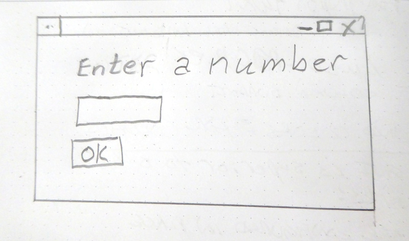
Step 2 - Divide into rows
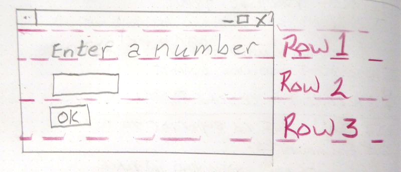
Step 3 - Label elements
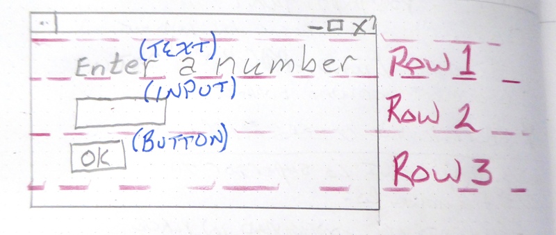
Step 4 - Write the code The code we're writing is the layout of the GUI itself. This tutorial only focuses on getting the window code written, not the stuff to display it, get results.
We have only 1 element on the first row, some text. Rows are written as a "list of elements", so we'll need [ ] to make a list. Here's the code for row 1
[ sg.Text('Enter a number') ]
Row 2 has 1 elements, an input field.
[ sg.Input() ]
Row 3 has an OK button
[ sg.OK() ]
Now that we've got the 3 rows defined, they are put into a list that represents the entire window.
layout = [ [sg.Text('Enter a Number')],
           [sg.Input()],
           [sg.OK()] ]
Finally we can put it all together into a program that will display our window.
import PySimpleGUI as sg

layout = [[sg.Text('Enter a Number')],
          [sg.Input()],
          [sg.OK()] ]

event, values = sg.Window('Enter a number example', layout).Read()

sg.Popup(event, values[0])
Your call to Read will return a dictionary, but will "look like a list" in how you access it. The first input field will be entry 0, the next one is 1, etc. Later you'll learn about the key parameter which allows you to use your own values to identify elements instead of them being numbered for you.
Let's say you've got a utility you've written that operates on some input file and you're ready to use a GUI to enter than filename rather than the command line. Follow the same steps as the previous example - draw your window on paper, break it up into rows, label the elements.
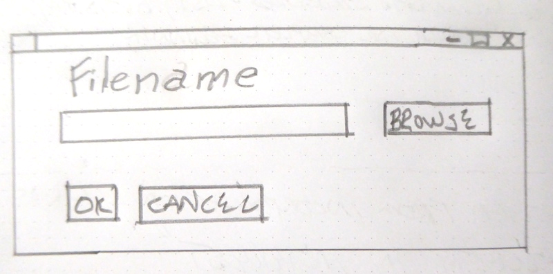

Writing the code for this one is just as straightforward. There is one tricky thing, that browse for a file button. Thankfully PySimpleGUI takes care of associating it with the input field next to it. As a result, the code looks almost exactly like the window on the paper.
import PySimpleGUI as sg

sg.theme('Dark Blue 3')  # please make your windows colorful

layout = [[sg.Text('Filename')],
			[sg.Input(), sg.FileBrowse()],
			[sg.OK(), sg.Cancel()] ]

window = sg.Window('Get filename example', layout)
event, values = window.read()
window.close()

sg.Popup(event, values[0])
Read on for detailed instructions on the calls that show the window and return your results.
All of your PySimpleGUI programs will utilize one of these 2 design patterns depending on the type of window you're implementing.
This will be the most common pattern you'll follow if you are not using an "event loop" (not reading the window multiple times). The window is read and closed.
The input fields in your window will be returned to you as a dictionary (syntactically it looks just like a list lookup)
import PySimpleGUI as sg

sg.theme('Dark Blue 3')  # please make your windows colorful

layout = [[sg.Text('SHA-1 and SHA-256 Hashes for the file')],
				 [sg.InputText(), sg.FileBrowse()],
				 [sg.Submit(), sg.Cancel()]]

window = sg.Window('SHA-1 & 256 Hash', layout)

event, values = window.read()
window.close()

source_filename = values[0] # the first input element is values[0]Some of the more advanced programs operate with the window remaining visible on the screen. Input values are collected, but rather than closing the window, it is kept visible acting as a way to both output information to the user and gather input data.
This code will present a window and will print values until the user clicks the exit button or closes window using an X.
import PySimpleGUI as sg

sg.theme('Dark Blue 3')  # please make your windows colorful

layout = [[sg.Text('Persistent window')],
		  [sg.Input()],
		  [sg.Button('Read'), sg.Exit()]]

window = sg.Window('Window that stays open', layout)

while True:
	event, values = window.read()
	if event is None or event == 'Exit':
		break
	print(event, values)

window.close()This is a slightly more complex, but maybe more realistic version that reads input from the user and displays that input as text in the window. Your program is likely to be doing both of those activities (input and output) so this will give you a big jump-start.
Do not worry yet what all of these statements mean. Just copy it so you can begin to play with it, make some changes. Experiment to see how thing work.
A final note... the parameter do_not_clear in the input call determines the action of the input field after a button event. If this value is True, the input value remains visible following button clicks. If False, then the input field is CLEARED of whatever was input. If you are building a "Form" type of window with data entry, you likely want False. The default is to NOT clear the input element (do_not_clear=True).
This example introduces the concept of "keys". Keys are super important in PySimpleGUI as they enable you to identify and work with Elements using names you want to use. Keys can be ANYTHING, except None. To access an input element's data that is read in the example below, you will use values['_IN_'] instead of values[0] like before.
import PySimpleGUI as sg

sg.theme('Dark Blue 3')  # please make your windows colorful

layout = [[sg.Text('Your typed chars appear here:'), sg.Text(size=(12,1), key='_OUTPUT_')],
          [sg.Input(key='_IN_')],
          [sg.Button('Show'), sg.Button('Exit')]]

window = sg.Window('Window Title', layout)

while True:  # Event Loop
    event, values = window.read()       # can also be written as event, values = window()
    print(event, values)
    if event is None or event == 'Exit':
        break
    if event == 'Show':
        # change the "output" element to be the value of "input" element
        window['_OUTPUT_'].update(values['_IN_'])
        # above line can also be written without the update specified
        window['_OUTPUT_'](values['_IN_'])

window.close()There actually is a PySimpleGUI Window Designer that uses Qt's window designer. It's outside the scope of this document however. You'll find the project here: https://github.com/nngogol/PySimpleGUIDesigner
I hope to start using it more soon.
While one goal was making it simple to create a GUI another just as important goal was to do it in a Pythonic manner. Whether it achieved these goals is debatable, but it was an attempt just the same.
The key to custom windows in PySimpleGUI is to view windows as ROWS of GUI Elements. Each row is specified as a list of these Elements. Put the rows together and you've got a window. This means the GUI is defined as a series of Lists, a Pythonic way of looking at things.
import PySimpleGUI as sg

sg.theme('Dark Blue 3')  # please make your windows colorful

layout = [[sg.Text('Rename files or folders')],
			[sg.Text('Source for Folders', size=(15, 1)), sg.InputText(), sg.FolderBrowse()],
			[sg.Text('Source for Files ', size=(15, 1)), sg.InputText(), sg.FolderBrowse()],
			[sg.Submit(), sg.Cancel()]]

window = sg.Window('Rename Files or Folders', layout)

event, values = window.read()
window.close()
folder_path, file_path = values[0], values[1]       # get the data from the values dictionary
print(folder_path, file_path)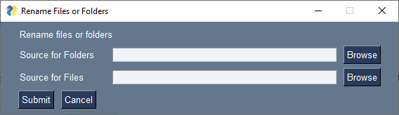
The first line of code after the import is a call to theme.
Until Dec 2019 the way a "theme" was specific in PySimpleGUI was to call change_look_and_feel. That call has been replaced by the more simple function theme.
Let's agree the window has 4 rows.
The first row only has text that reads Rename files or folders
The second row has 3 elements in it. First the text Source for Folders, then an input field, then a browse button.
Now let's look at how those 2 rows and the other two row from Python code:
layout = [[sg.Text('Rename files or folders')],
          [sg.Text('Source for Folders', size=(15, 1)), sg.InputText(), sg.FolderBrowse()],
          [sg.Text('Source for Files ', size=(15, 1)), sg.InputText(), sg.FolderBrowse()],
          [sg.Submit(), sg.Cancel()]]
See how the source code mirrors the layout? You simply make lists for each row, then submit that table to PySimpleGUI to show and get values from.
And what about those return values? Most people simply want to show a window, get the input values and do something with them. So why break up the code into button callbacks, etc, when I simply want my window's input values to be given to me.
For return values the window is scanned from top to bottom, left to right. Each field that's an input field will occupy a spot in the return values.
In our example window, there are 2 fields, so the return values from this window will be a dictionary with 2 values in it. Remember, if you do not specify a key when creating an element, one will be created for you. They are ints starting with 0. In this example, we have 2 input elements. They will be addressable as values[0] and values[1]
event, values = window.read()
folder_path, file_path = values[0], values[1]
In one statement we both show the window and read the user's inputs. In the next line of code the dictionary of return values is split into individual variables folder_path and file_path.
Isn't this what a Python programmer looking for a GUI wants? Something easy to work with to get the values and move on to the rest of the program, where the real action is taking place. Why write pages of GUI code when the same layout can be achieved with PySimpleGUI in 3 or 4 lines of code. 4 lines or 40? Most would choose 4.
There are 2 return values from a call to Window.read(), an event that caused the Read to return and values a list or dictionary of values. If there are no elements with keys in the layout, then it will be a list. However, some elements, like some buttons, have a key automatically added to them. It's best to use keys on all of your input type elements.
All Window Read calls return 2 values. By convention a read statement is written:
event, values = window.read()You don't HAVE to write your reads in this way. You can name your variables however you want. But if you want to code them in a way that other programmers using PySimpleGUI are used to, then use this statement.
The first parameter event describes why the read completed. Events are one of these:
For all Windows:
- Button click
- Window closed using X
For Windows that have specifically enabled these. Please see the appropriate section in this document to learn about how to enable these and what the event return values are.
- Keyboard key press
- Mouse wheel up/down
- Menu item selected
- An Element Changed (slider, spinner, etc)
- A list item was clicked
- Return key was pressed in input element
- Timeout waiting for event
- Text was clicked
- Combobox item chosen
- Table row selected
- etc
Most of the time the event will be a button click or the window was closed. The other Element-specific kinds of events happen when you set enable_events=True when you create the Element.
Another convention to follow is the check for windows being closed with an X. This is an critically important event to catch. If you don't check for this and you attempt to use the window, your program will crash. Please check for closed window and exit your program gracefully. Your users will like you for it.
Close your windows when you're done with them even though exiting the program will also close them. tkinter can generate an error/warning sometimes if you don't close the window. For other ports, such as PySimpleGUIWeb, not closing the Window will potentially cause your program to continue to run in the background.
To check for a closed window use this line of code:
if event is None:Putting it all together we end up with an "event loop" that looks something like this:
while True:
	event, values = window.read()
	if event is None:
		break
window.close()
You will very often see the examples and demo programs write this check as:
	event, values = window.read()
	if event in (None, 'Exit'):
		break
This if statement is the same as:
	if event is None or event == 'Exit':
		break
Instead of 'Exit' use the name/key of the button you want to exit the window (Cancel, Quit, etc)
By default buttons will always return a click event, or in the case of realtime buttons, a button down event. You don't have to do anything to enable button clicks. To disable the events, disable the button using its Update method.
You can enable an additional "Button Modified" event by setting enable_events=True in the Button call. These events are triggered when something 'writes' to a button, usually it's because the button is listed as a "target" in another button.
The button value from a Read call will be one of 2 values:
- The Button's text - Default
- The Button's key - If a key is specified
If a button has a key set when it was created, then that key will be returned, regardless of what text is shown on the button. If no key is set, then the button text is returned. If no button was clicked, but the window returned anyway, the event value is the key that caused the event to be generated. For example, if enable_events is set on an Input Element and someone types a character into that Input box, then the event will be the key of the input box.
If your window has an event loop where it is read over and over, remember to give your user an "out". You should always check for a None value and it's a good practice to provide an Exit button of some kind. Thus design patterns often resemble this Event Loop:
while True:
	event, values = window.read()
	if event is None or event == 'Quit':
		break
Actually, the more "Pythonic version" is used in most Demo Programs and examples. They do exactly the same thing.
while True:
	event, values = window.read()
	if event in (None, 'Quit'):
breakSome elements are capable of generating events when something happens to them. For example, when a slider is moved, or list item clicked on or table row clicked on. These events are not enabled by default. To enable events for an Element, set the parameter enable_events=True. This is the same as the older click_submits parameter. You will find the click_submits parameter still in the function definition. You can continue to use it. They are the same setting. An 'or' of the two values is used. In the future, click_submits will be removed so please migrate your code to using enable_events.
| Name | events |
|---|---|
| InputText | any change |
| Combo | item chosen |
| Listbox | selection changed |
| Radio | selection changed |
| Checkbox | selection changed |
| Spinner | new item selected |
| Multiline | any change |
| Text | clicked |
| Status Bar | clicked |
| Graph | clicked |
| Graph | dragged |
| Graph | drag ended (mouse up) |
| TabGroup | tab clicked |
| Slider | slider moved |
| Table | row selected |
| Tree | node selected |
| ButtonMenu | menu item chosen |
| Right click menu | menu item chosen |
You will receive the key for the MenuBar and ButtonMenu. Use that key to read the value in the return values dictionary. The value shown will be the full text plus key for the menu item chosen. Remember that you can put keys onto menu items. You will get the text and the key together as you defined it in the menu definition.
Unlike menu bar and button menus, you will directly receive the menu item text and its key value. You will not do a dictionary lookup to get the value. It is the event code returned from WindowRead().
Windows are capable of returning keyboard events. These are returned as either a single character or a string if it's a special key. Experiment is all I can say. The mouse scroll wheel events are also strings. Put a print in your code to see what's returned.
If you set a timeout parameter in your read, then the system TIMEOUT_KEY will be returned. If you specified your own timeout key in the Read call then that value will be what's returned instead.
The second parameter from a Read call is either a list or a dictionary of the input fields on the Window.
By default return values are a list of values, one entry for each input field, but for all but the simplest of windows the return values will be a dictionary. This is because you are likely to use a 'key' in your layout. When you do, it forces the return values to be a dictionary.
Each of the Elements that are Input Elements will have a value in the list of return values. If you know for sure that the values will be returned as a list, then you could get clever and unpack directly into variables.
event, (filename, folder1, folder2, should_overwrite) = sg.Window('My title', window_rows).Read()
Or, more commonly, you can unpack the return results separately. This is the preferred method because it works for both list and dictionary return values.
event, values = sg.Window('My title', window_rows).Read()
event, value_list = window.read()
value1 = value_list[0]
value2 = value_list[1]
	 ...
However, this method isn't good when you have a lot of input fields. If you insert a new element into your window then you will have to shuffle your unpacks down, modifying each of the statements to reference value_list[x].
The more common method is to request your values be returned as a dictionary by placing keys on the "important" elements (those that you wish to get values from and want to interact with)
For those of you that have not encountered a Python dictionary, don't freak out! Just copy and paste the sample code and modify it. Follow this design pattern and you'll be fine. And you might learn something along the way.
For windows longer than 3 or 4 fields you will want to use a dictionary to help you organize your return values. In almost all (if not all) of the demo programs you'll find the return values being passed as a dictionary. It is not a difficult concept to grasp, the syntax is easy to understand, and it makes for very readable code.
The most common window read statement you'll encounter looks something like this:
window = sg.Window("My title", layout).Read()
To use a dictionary, you will need to:
- Mark each input element you wish to be in the dictionary with the keyword
key.
If any element in the window has a key, then all of the return values are returned via a dictionary. If some elements do not have a key, then they are numbered starting at zero.
Let's take a look at your first dictionary-based window.
import PySimpleGUI as sg

sg.theme('Dark Blue 3')  # please make your windows colorful

layout = [
			[sg.Text('Please enter your Name, Address, Phone')],
			[sg.Text('Name', size=(15, 1)), sg.InputText('1', key='_NAME_')],
			[sg.Text('Address', size=(15, 1)), sg.InputText('2', key='_ADDRESS_')],
			[sg.Text('Phone', size=(15, 1)), sg.InputText('3', key='_PHONE_')],
			[sg.Submit(), sg.Cancel()]
			]

window = sg.Window('Simple data entry window', layout)
event, values = window.read()
window.close()

sg.Popup(event, values, values['_NAME_'], values['_ADDRESS_'], values['_PHONE_'])
To get the value of an input field, you use whatever value used as the key value as the index value. Thus to get the value of the name field, it is written as
values['_NAME_']
Think of the variable values in the same way as you would a list, however, instead of using 0,1,2, to reference each item in the list, use the values of the key. The Name field in the window above is referenced by values['_NAME_'].
You will find the key field used quite heavily in most PySimpleGUI windows unless the window is very simple.
One convention you'll see in many of the demo programs is keys being named in all caps with an underscores at the beginning and the end. You don't HAVE to do this... your key value may look like this:
key = '_NAME__'
The reason for this naming convention is that when you are scanning the code, these key values jump out at you. You instantly know it's a key. Try scanning the code above and see if those keys pop out.
key = '_NAME__'
All GUIs have one thing in common, an "event loop". Usually the GUI framework runs the event loop for you, but sometimes you want greater control and will run your own event loop. You often hear the term event loop when discussing embedded systems or on a Raspberry Pi.
With PySimpleGUI if your window will remain open following button clicks, then your code will have an event loop. If your program shows a single "one-shot" window, collects the data and then has no other GUI interaction, then you don't need an event loop.
There's nothing mysterious about event loops... they are loops where you take care of.... wait for it..... events. Events are things like button clicks, key strokes, mouse scroll-wheel up/down.
This little program has a typical PySimpleGUI Event Loop.
The anatomy of a PySimpleGUI event loop is as follows, generally speaking.
- The actual "loop" part is a
while Trueloop - "Read" the event and any input values the window has
- Check to see if window was closed or user wishes to exit
- A series of
if event ....statements
Here is a complete, short program to demonstrate each of these concepts.
import PySimpleGUI as sg

sg.ChangeLookAndFeel('GreenTan')

# ------ Menu Definition ------ #
menu_def = [['&File', ['&Open', '&Save', 'E&xit', 'Properties']],
            ['&Edit', ['Paste', ['Special', 'Normal', ], 'Undo'], ],
            ['&Help', '&About...'], ]

# ------ Column Definition ------ #
column1 = [[sg.Text('Column 1', background_color='lightblue', justification='center', size=(10, 1))],
           [sg.Spin(values=('Spin Box 1', '2', '3'), initial_value='Spin Box 1')],
           [sg.Spin(values=('Spin Box 1', '2', '3'), initial_value='Spin Box 2')],
           [sg.Spin(values=('Spin Box 1', '2', '3'), initial_value='Spin Box 3')]]

layout = [
    [sg.Menu(menu_def, tearoff=True)],
    [sg.Text('(Almost) All widgets in one Window!', size=(30, 1), justification='center', font=("Helvetica", 25), relief=sg.RELIEF_RIDGE)],
    [sg.Text('Here is some text.... and a place to enter text')],
    [sg.InputText('This is my text')],
    [sg.Frame(layout=[
    [sg.Checkbox('Checkbox', size=(10,1)),  sg.Checkbox('My second checkbox!', default=True)],
    [sg.Radio('My first Radio!     ', "RADIO1", default=True, size=(10,1)), sg.Radio('My second Radio!', "RADIO1")]], title='Options',title_color='red', relief=sg.RELIEF_SUNKEN, tooltip='Use these to set flags')],
    [sg.Multiline(default_text='This is the default Text should you decide not to type anything', size=(35, 3)),
     sg.Multiline(default_text='A second multi-line', size=(35, 3))],
    [sg.InputCombo(('Combobox 1', 'Combobox 2'), size=(20, 1)),
     sg.Slider(range=(1, 100), orientation='h', size=(34, 20), default_value=85)],
    [sg.InputOptionMenu(('Menu Option 1', 'Menu Option 2', 'Menu Option 3'))],
    [sg.Listbox(values=('Listbox 1', 'Listbox 2', 'Listbox 3'), size=(30, 3)),
     sg.Frame('Labelled Group',[[
     sg.Slider(range=(1, 100), orientation='v', size=(5, 20), default_value=25, tick_interval=25),
     sg.Slider(range=(1, 100), orientation='v', size=(5, 20), default_value=75),
     sg.Slider(range=(1, 100), orientation='v', size=(5, 20), default_value=10),
     sg.Column(column1, background_color='lightblue')]])],
    [sg.Text('_' * 80)],
    [sg.Text('Choose A Folder', size=(35, 1))],
    [sg.Text('Your Folder', size=(15, 1), auto_size_text=False, justification='right'),
     sg.InputText('Default Folder'), sg.FolderBrowse()],
    [sg.Submit(tooltip='Click to submit this form'), sg.Cancel()]]

window = sg.Window('Everything bagel', layout, default_element_size=(40, 1), grab_anywhere=False)
event, values = window.read()
window.close()

sg.Popup('Title',
         'The results of the window.',
         'The button clicked was "{}"'.format(event),
         'The values are', values)
This is a complex window with quite a bit of custom sizing to make things line up well. This is code you only have to write once. When looking at the code, remember that what you're seeing is a list of lists. Each row contains a list of Graphical Elements that are used to create the window. If you see a pair of square brackets [ ] then you know you're reading one of the rows. Each row of your GUI will be one of these lists.
This window may look "ugly" to you which is because no effort has been made to make it look nice. It's purely functional. There are 30 Elements in the window. THIRTY Elements. Considering what it does, it's miraculous or in the least incredibly impressive. Why? Because in less than 50 lines of code that window was created, shown, collected the results and showed the results in another window.
50 lines. It'll take you 50 lines of tkinter or Qt code to get the first 3 elements of the window written, if you can even do that.
No, let's be clear here... this window will take a massive amount of code using the conventional Python GUI packages. It's a fact and if you care to prove me wrong, then by ALL means PLEASE do it. Please write this window using tkinter, Qt, or WxPython and send the code!
Note this window even has a menubar across the top, something easy to miss.
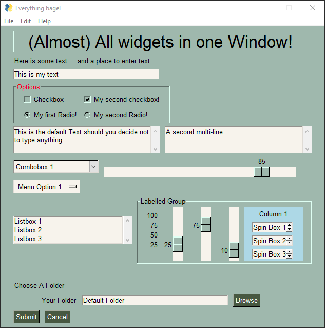
Clicking the Submit button caused the window call to return. The call to Popup resulted in this window.
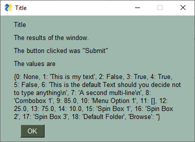
Note, event values can be None. The value for event will be the text that is displayed on the button element when it was created or the key for the button. If the user closed the window using the "X" in the upper right corner of the window, then event will be None. It is vitally important that your code contain the proper checks for None.
For "persistent windows", always give your users a way out of the window. Otherwise you'll end up with windows that never properly close. It's literally 2 lines of code that you'll find in every Demo Program. While you're at it, make sure a window.Close() call is after your event loop so that your window closes for sure.
You can see in the results Popup window that the values returned are a dictionary. Each input field in the window generates one item in the return values list. Input fields often return a string. Check Boxes and Radio Buttons return bool. Sliders return float or perhaps int depending on how you configured it or which port you're using.
If your window has no keys and it has no buttons that are "browse" type of buttons, then it will return values to you as a list instead of a dictionary. If possible PySimpleGUI tries to return the values as a list to keep things simple.
Note in the list of return values in this example, many of the keys are numbers. That's because no keys were specified on any of the elements (although one was automatically made for you). If you don't specify a key for your element, then a number will be sequentially assigned. For elements that you don't plan on modifying or reading values from, like a Text Element, you can skip adding keys. For other elements, you'll likely want to add keys so that you can easily access the values and perform operations on them.
If you're a Windows user you've seen windows show in their title bar "Not Responding" which is soon followed by a Windows popop stating that "Your program has stopped responding". Well, you too can make that message and popup appear if you so wish! All you need to do is execute an operation that takes "too long" (i.e. a few seconds) inside your event loop.
You have a couple of options for dealing this with. If your operation can be broken up into smaller parts, then you can call Window.Refresh() occassionally to avoid this message. If you're running a loop for example, drop that call in with your other work. This will keep the GUI happy and Window's won't complain.
If, on the other hand, your operation is not under your control or you are unable to add Refresh calls, then the next option available to you is to move your long operations into a thread.
There are a couple of demo programs available for you to see how to do this. You basically put your work into a thread. When the thread is completed, it tells the GUI by sending a message through a queue. The event loop will run with a timer set to a value that represents how "responsive" you want your GUI to be to the work completing.
These 2 demo programs are called
Demo_Threaded_Work.py - Best documented.  Single thread used for long task
Demo_Multithreaded_Long_Tasks.py - Similar to above, but with less fancy GUI. Allows you to set amount of time
These 2 particular demos have a LOT of comments showing you where to add your code, etc. The amount of code to do this is actually quite small and you don't need to understand the mechanisms used if you simply follow the demo that's been prepared for you.
While on the topic of multiple threads, another demo was prepared that shows how you can run multiple threads in your program that all communicate with the event loop in order to display something in the GUI window. Recall that for PySimpleGUI (at least the tkinter port) you cannot make PySimpleGUI calls in threads other than the main program thread.
The key to these threaded programs is communication from the threads to your event loop. The mechanism chosen for these demonstrations uses the Python built-in queue module. The event loop polls these queues to see if something has been sent over from one of the threads to be displayed.
You'll find the demo that shows multiple threads communicating with a single GUI is called:
Demo_Multithreaded_Queued.pyOnce again a warning is in order for plain PySimpleGUI (tkinter based) - your GUI must never run as anything but the main program thread and no threads can directly call PySimpleGUI calls.
You will find it much easier to write code using PySimpleGUI if you use an IDE such as PyCharm. The features that show you documentation about the API call you are making will help you determine which settings you want to change, if any. In PyCharm, two commands are particularly helpful.
Control-Q (when cursor is on function name) brings up a box with the function definition
Control-P (when cursor inside function call "()") shows a list of parameters and their default values
The most common use of PySimpleGUI is to display and collect information from the user. The most straightforward way to do this is using a "blocking" GUI call. Execution is "blocked" while waiting for the user to close the GUI window/dialog box.
You've already seen a number of examples above that use blocking windows. You'll know it blocks if the Read call has no timeout parameter.
A blocking Read (one that waits until an event happens) look like this:
event, values = window.read()A non-blocking / Async Read call looks like this:
event, values = window.Read(timeout=100)You can learn more about these async / non-blocking windows toward the end of this document.
In Dec 2019 the function change_look_and_feel was replaced by theme. The concept remains the same, but a new group of function alls makes it a lot easier to manage colors and other settings.
By default the PySimpleGUI color theme is now Dark Blue 3. Gone are the "system default" gray colors. If you want your window to be devoid of all colors so that the system chooses the colors (gray) for you, then set the theme to 'SystemDefault1' or Default1.
There are 130 themes available. You can preview these themes by calling theme_previewer() which will create a LARGE window displaying all of the color themes available.
As of this writing, these are your available themes.
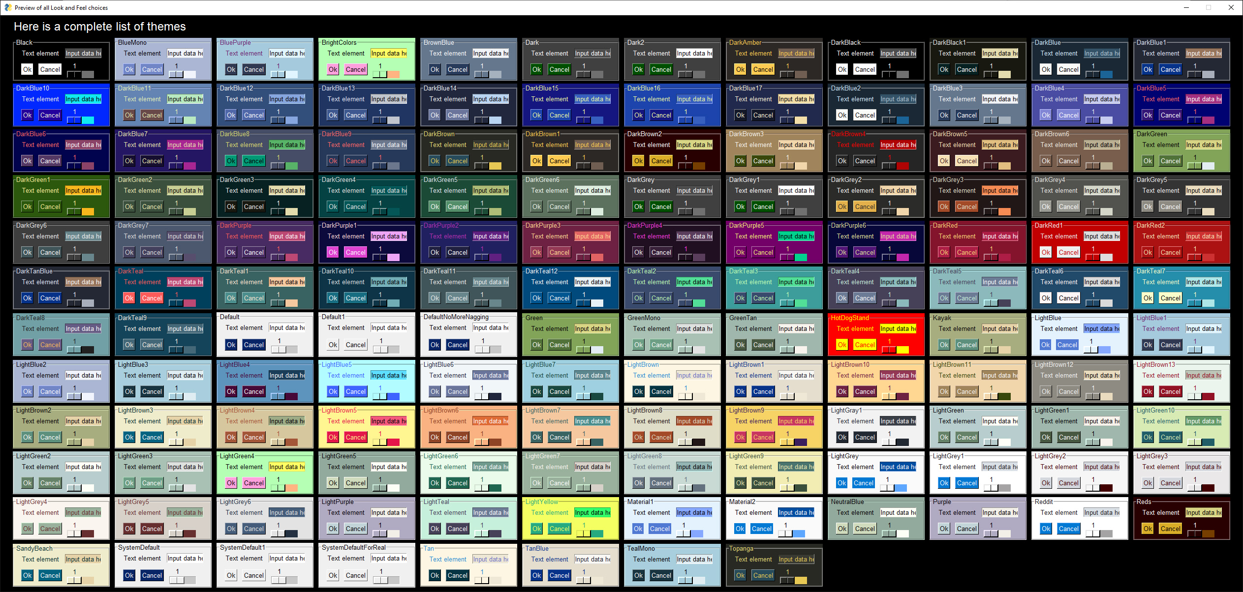
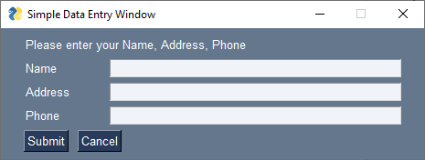
In Dec 2019 the default for all PySimpleGUI windows changed from the system gray with blue buttons to a more complete theme using a grayish blue with white text. Previouisly users were nagged into choosing color theme other than gray. Now it's done for you instead of nagging you.
If you're struggling with this color theme, then add a call to theme to change it.
Themes names that you specify can be "fuzzy". The text does not have to match exactly what you see printed. For example "Dark Blue 3" and "DarkBlue3" and "dark blue 3" all work.
One way to quickly determine the best setting for your window is to simply display your window using a lot of different themes. Add the line of code to set the theme - theme('Dark Green 1'), run your code, see if you like it, if not, change the theme string to 'Dark Green 2' and try again. Repeat until you find something you like.
The "Formula" for the string is:
Dark Color #
or
Light Color #
Color can be Blue, Green, Black, Gray, Purple, Brown, Teal, Red. The # is optional or can be from 1 to XX. Some colors have a lot of choices. There are 13 "Light Brown" choices for example.
If you're bent on having no colors at all in your window, then choose Default 1 or System Default 1.
If you want the original PySimpleGUI color scheme of a blue button and everything else gray then you can get that with the theme Default or System Default.
The basic theme function call is theme(theme_name). This sets the theme. Calling without a parameter, theme() will return the name of the current theme.
If you want to get or modify any of the theme settings, you can do it with these functions that you will find detailed information about in the function definitions section at the bottom of the document. Each will return the current value if no parameter is used.
theme_background_color
theme_border_width
theme_button_color
theme_element_background_color
theme_element_text_color
theme_input_background_color
theme_input_text_color
theme_progress_bar_border_width
theme_progress_bar_color
theme_slider_border_width
theme_slider_color
theme_text_color
These will help you get a list of available choices.
theme_list
theme_previewerThe first step is to create the window object using the desired window customizations.
Note - There is no direct support for "modal windows" in PySimpleGUI. All windows are accessable at all times unless you manually change the windows' settings.
IMPORTANT - Many of the Window methods require you to either call Window.Read or Window.Finalize (or set finalize=True in your Window call) before you call the method. This is because these 2 calls are what actually creates the window using the underlying GUI Framework. Prior to one of those calls, the methods are likely to crash as they will not yet have their underlying widgets created.
PySimpleGUI computes the exact center of your window and centers the window on the screen. If you want to locate your window elsewhere, such as the system default of (0,0), if you have 2 ways of doing this. The first is when the window is created. Use the location parameter to set where the window. The second way of doing this is to use the SetOptions call which will set the default window location for all windows in the future.
The auto-centering (default) location for your PySimpleGUI window may not be correct if you have multiple monitors on a Linux system. On Windows multiple monitors appear to work ok as the primary monitor the tkinter utilizes and reports on.
Linux users with multiple monitors that have a problem when running with the default location will need to specify the location the window should be placed when creating the window by setting the location parameter.
You can get your window's size by access the Size property. The window has to be Read once or Finalized in order for the value to be correct. Note that it's a property, not a call.
my_windows_size = window.Size
To finalize your window:
window = Window('My Title', layout, finalize=True)There are multiple ways to set the size of Elements. They are:
- The global default size - change using
SetOptionsfunction - At the Window level - change using the parameter
default_element_sizein your call toWindow - At the Element level - each element has a
sizeparameter
Element sizes are measured in characters (there are exceptions). A Text Element with size = (20,1) has a size of 20 characters wide by 1 character tall.
The default Element size for PySimpleGUI is (45,1).
There are a couple of widgets where one of the size values is in pixels rather than characters. This is true for Progress Meters and Sliders. The second parameter is the 'height' in pixels.
Should you wish to create cool looking windows that are clean with no windows titlebar, use the no_titlebar option when creating the window.
Be sure an provide your user an "exit" button or they will not be able to close the window! When no titlebar is enabled, there will be no icon on your taskbar for the window. Without an exit button you will need to kill via taskmanager... not fun.
Windows with no titlebar rely on the grab anywhere option to be enabled or else you will be unable to move the window.
Windows without a titlebar can be used to easily create a floating launcher.
Linux users! Note that this setting has side effects for some of the other Elements. Multi-line input doesn't work at all, for example So, use with caution.

This is a feature unique to PySimpleGUI.
Note - there is a warning message printed out if the user closes a non-blocking window using a button with grab_anywhere enabled. There is no harm in these messages, but it may be distressing to the user. Should you wish to enable for a non-blocking window, simply get grab_anywhere = True when you create the window.
To keep a window on top of all other windows on the screen, set keep_on_top = True when the window is created. This feature makes for floating toolbars that are very helpful and always visible on your desktop.
PySimpleGUI will set a default focus location for you. This generally means the first input field. You can set the focus to a particular element. If you are going to set the focus yourself, then you should turn off the automatic focus by setting use_default_focus=False in your Window call.
Beginning in release 4.7.0 PySimpleGUI supports both "normal" tk Buttons and ttk Buttons. This change was needed so that Mac users can use colors on their buttons. There is a bug that causes tk Buttons to not show text when you attempt to change the button color. Note that this problem goes away if you install Python from the official Python.org site rather than using Homebrew. A number of users have switched and are quite happy since even tk Buttons work on the Mac after the switch.
By default Mac users will get ttk Buttons when a Button Element is used. All other platforms will get a normal tk Button. There are ways to override this behavior. One is by using the parameter use_ttk_buttons when you create your window. If set to True, all buttons will be ttk Buttons in the window. If set to False, all buttons will be normal tk Buttons. If not set then the platform or the Button Element determines which is used.
If a system-wide setting is desired, then the default can be set using set_options. This will affect all windows such as popups and the debug window.
tkinter has a number of "Themes" that can be used with ttk widgets. In PySimpleGUI these widgets include - Table, Tree, Combobox, Button, ProgressBar, Tabs & TabGroups. Some elements have a 'theme' parameter but these are no longer used and should be ignored. The initial release of PySimpleGUI attempted to mix themes in a single window but since have learned this is not possible so instead it is set at the Window or the system level.
If a system-wide setting is desired, then the default can be set using set_options. This will affect all windows such as popups and the debug window.
The ttk theme choices depend on the platform. Linux has a shorter number of selections than Windows. These are the Windows choices: 'default', 'winnative', 'clam', 'alt', 'classic', 'vista', 'xpnative'
There are constants defined to help you with code completion to determine what your choices are. Theme constants start with THEME_. For example, the "clam" theme is THEME_CLAM
You're urged to experiment with this setting to determine which you like the most. They change the ttk-based elements in subtle but still significant ways.
When you are completely done with a window, you should close it and then delete it so that the resources, in particular the tkinter resources, are properly cleaned up.
If you wish to do this in 1 line of code, here's your line:
window.close(); del windowThe delete helps with a problem multi-threaded application encounter where tkinter complains that it is being called from the wrong thread (not the program's main thread)
After you have completed making your layout, stored in a variable called layout in these examples, you will create your window.
The creation part of a window involves 3 steps.
- Create a
Windowobject - Adding your Layout to the window
- Optional - Finalize if want to make changes prior to
Readcall
Over time the PySimpleGUI code has continued to compact, compress, so that as little code as possible will need to be written by the programmer.
This is the "long form" as each method is called individually.
window = sg.Window('My Title')
window.layout(layout)
window.finalize()The next level of compression that was done was to chain the calls together into a single line of code.
window = sg.Window('My Title').Layout(layout).finalize()Here's a novel concept, instead of using chaining, something that's foreign to beginners, use parameters to the Window call. And that is exactly what's happened as of 4.2 of the PySimpleGUI port.
window = sg.Window('My Title', layout, finalize=True)Rather than pushing the work onto the user of doing the layout and finalization calls, let the Window initialization code do it for you. Yea, it sounds totally obvious now, but it didn't a few months ago.
This capability has been added to all 4 PySimpleGUI ports but none are on PyPI just yet as there is some runtime required first to make sure nothing truly bad is going to happen.
Call to set the window layout. Must be called prior to Read. Most likely "chained" in line with the Window creation.
window = sg.Window('My window title', layout)Call to force a window to go through the final stages of initialization. This will cause the tkinter resources to be allocated so that they can then be modified. This also causes your window to appear. If you do not want your window to appear when Finalize is called, then set the Alpha to 0 in your window's creation parameters.
If you want to call an element's Update method or call a Graph element's drawing primitives, you must either call Read or Finalize prior to making those calls.
Read the Window's input values and button clicks in a blocking-fashion
Returns event, values. Adding a timeout can be achieved by setting timeout=number of milliseconds before the Read times out after which a "timeout event" is returned. The value of timeout_key will be returned as the event. If you do not specify a timeout key, then the value TIMEOUT_KEY will be returned.
If you set the timeout = 0, then the Read will immediately return rather than waiting for input or for a timeout. It's a truly non-blocking "read" of the window.
While at this point in the documentation you've not been shown very much about each Element available, you should read this section carefully as you can use the techniques you learn in here to build better, shorter, and easier to understand PySimpleGUI code.
If it feels like this layout section is too much too soon, then come back to this section after you're learned about each Element. Whatever order you find the least confusing is the best.
While you've not learned about Elements yet, it makes sense for this section to be up front so that you'll have learned how to use the elements prior to learning how each element works. At this point in your PySimpleGUI education, it is better for you to grasp time efficient ways of working with Elements than what each Element does. By learning now how to assemble Elements now, you'll have a good model to put the elements you learn into.
There are several aspects of PySimpleGUI that make it more "Pythonic" than other Python GUI SDKs. One of the areas that is unique to PySimpleGUI is how a window's "layout" is defined, specified or built. A window's "layout" is simply a list of lists of elements. As you've already learned, these lists combine to form a complete window. This method of defining a window is super-powerful because lists are core to the Python language as a whole and thus are very easy to create and manupulate.
Think about that for a moment and compare/contrast with Qt, tkinter, etc. With PySimpleGUI the location of your element in a matrix determines where that Element is shown in the window. It's so simple and that makes it incredibly powerful. Want to switch a row in your GUI that has text with the one below it that has an input element? No problem, swap the lines of code and you're done.
Layouts were designed to be visual. The idea is for you to be able to envision how a window will look by simplyh looking at the layout in the code. The CODE itself matches what is drawn on the screen. PySimpleGUI is a cross between straight Python code and a visual GUI designer.
In the process of creating your window, you can manipulate these lists of elements without having an impact on the elements or on your window. Until you perform a "layout" of the list, they are nothing more than lists containing objects (they just happen to be your window's elements).
Many times your window definition / layout will be a static, straightforward to create.
However, window layouts are not limited to being one of these staticly defined list of Elements.
There are 5 specific techniques of generating layouts discussed in this section. They can be used alone or in combination with each other.
- Layout + Layout concatenation
[[A]] + [[B]] = [[A], [B]] - Element Addition on Same Row
[[A] + [B]] = [[A, B]] - List Comprehension to generate a row
[A for x in range(10)] = [A,A,A,A,A...] - List Comprehension to generate multiple rows
[[A] for x in range(10)] = [[A],[A],...] - User Defined Elements / Comound Elements
Let's create a little layout that will be used to make a to-do list using PySimpleGUI.
import PySimpleGUI as sg

layout = [
            [sg.Text('1. '), sg.In(key=1)],
            [sg.Text('2. '), sg.In(key=2)],
            [sg.Text('3. '), sg.In(key=3)],
            [sg.Text('4. '), sg.In(key=4)],
            [sg.Text('5. '), sg.In(key=5)],
            [sg.Button('Save'), sg.Button('Exit')]
         ]

window = sg.Window('To Do List Example', layout)
event, values = window.read()
The output from this script was this window:
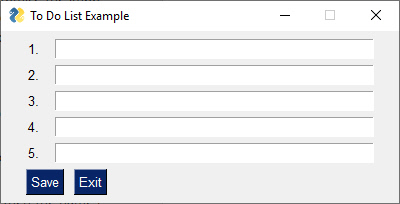
Take a moment and look at the code and the window that's generated. Are you able to look at the layout and envision the Window on the screen?
The brute force method works great on a list that's 5 items long, but what if your todo list had 40 items on it. THEN what? Well, that's when we turn to a "generated" layout, a layout that is generated by your code. Replace the layout= stuff from the previous example with this definition of the layout.
import PySimpleGUI as sg

layout = []
for i in range(1,6):
    layout += [sg.Text(f'{i}. '), sg.In(key=i)],
layout += [[sg.Button('Save'), sg.Button('Exit')]]

window = sg.Window('To Do List Example', layout)
event, values = window.read()
It produces the exact same window of course. That's progress.... went from writing out every row of the GUI to generating every row. If we want 48 items as suggested, change the range(1,6) to range(1,48). Each time through the list another row is added onto the layout.
BUT, we're not done yet!
This is Python, we're using lists to build something up, so we should be looking at list comprehensions. Let's change the for loop into a list comprehension. Recall that our for loop was used to concatenate 6 rows into a layout.
layout = [[sg.Text(f'{i}. '), sg.In(key=i)] for i in range(1,6)] Here we've moved the for loop to inside of the list definition (a list comprehension)
We have our rows built using the list comprehension, now we just need the buttons. They can be easily "tacked onto the end" by simple addition.
layout =  [[sg.Text(f'{i}. '), sg.In(key=i)] for i in range(1,6)]
layout += [[sg.Button('Save'), sg.Button('Exit')]]
Anytime you have 2 layouts, you can concatenate them by simple addition. Make sure your layout is a "list of lists" layout. In the above example, we know the first line is a generated layout of the input rows. The last line adds onto the layout another layout... note the format being [ [ ] ].
This button definition is an entire layout, making it possible to add to our list comprehension
[[sg.Button('Save'), sg.Button('Exit')]]
It's quite readable code. The 2 layouts line up visually quite well.
But let's not stop there with compressing the code. How about removing that += and instead change the layout into a single line with just a + between the two sets of row.
Doing this concatenation on one line, we end up with this single statement that creates the entire layout for the GUI:
layout = [[sg.Text(f'{i}. '), sg.In(key=i)] for i in range(1,6)] + [[sg.Button('Save'), sg.Button('Exit')]]And here we have our final program... all 4 lines.
import PySimpleGUI as sg

layout  = [[sg.Text(f'{i}. '), sg.In(key=i)] for i in range(1,6)] + [[sg.Button('Save'), sg.Button('Exit')]]

window = sg.Window('To Do List Example', layout)

event, values = window.read()
If you really wanted to crunch things down, you can make it a 2 line program (an import and 1 line of code) by moving the layout into the call to Window
import PySimpleGUI as sg

event, values = sg.Window('To Do List Example', layout=[[sg.Text(f'{i}. '), sg.In(key=i)] for i in range(1,6)] + [[sg.Button('Save'), sg.Button('Exit')]]).Read()In this example we're building a "table" that is 4 wide by 10 high using Input elements
The end results we're seeking is something like this:
HEADER 1    HEADER 2    HEADER 3    HEADER 4
INPUT       INPUT       INPUT       INPUT
INPUT       INPUT       INPUT       INPUT
INPUT       INPUT       INPUT       INPUT
INPUT       INPUT       INPUT       INPUT
INPUT       INPUT       INPUT       INPUT
INPUT       INPUT       INPUT       INPUT
INPUT       INPUT       INPUT       INPUT
INPUT       INPUT       INPUT       INPUT
INPUT       INPUT       INPUT       INPUT
INPUT       INPUT       INPUT       INPUT
Once the code is completed, here is how the result will appear:
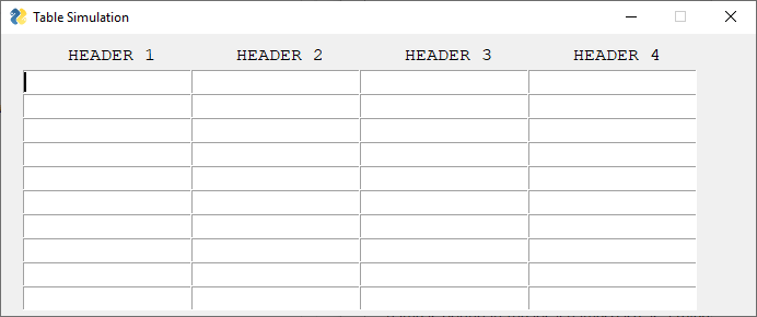
We're going to be building each row using a list comprehension and we'll build the table by concatenating rows using another list comprehension. That's a list comprehension that goes across and another list comprehension that goes down the layout, adding one row after another.
First let's build the header. There are 2 concepts to notice here:
import PySimpleGUI as sg

headings = ['HEADER 1', 'HEADER 2', 'HEADER 3','HEADER 4']  # the text of the headings
header =  [[sg.Text('  ')] + [sg.Text(h, size=(14,1)) for h in headings]]  # build header layout
There are 2 things in this code to note
- The list comprehension that makes the heading elements
- The spaces added onto the front
Let's start with the headers themselves.
This is the code that makes a row of Text Elements containing the text for the headers. The result is a list of Text Elements, a row.
[sg.Text(h, size=(14,1)) for h in headings]Then we add on a few spaces to shift the headers over so they are centered over their columns. We do this by simply adding a Text Element onto the front of that list of headings.
header = [[sg.Text(' ')] + [sg.Text(h, size=(14,1)) for h in headings]]This header variable is a layout with 1 row that has a bunch of Text elements with the headings.
The Input elements are arranged in a grid. To do this we will be using a double list comprehension. One will build the row the other will add the rows together to make the grid. Here's the line of code that does that:
input_rows = [[sg.Input(size=(15,1), pad=(0,0)) for col in range(4)] for row in range(10)]This portion of the statement makes a single row of 4 Input Elements
[sg.Input(size=(15,1), pad=(0,0)) for col in range(4)]Next we take that list of Input Elements and make as many of them as there are rows, 10 in this case. We're again using Python's awesome list comprehensions to add these rows together.
input_rows = [[sg.Input(size=(15,1), pad=(0,0)) for col in range(4)] for row in range(10)]The first part should look familiar since it was just discussed as being what builds a single row. To make the matrix, we simply take that single row and create 10 of them, each being a list.
Here is our final program that uses simple addition to add the headers onto the top of the input matrix. To make it more attractive, the color theme is set to 'Dark Brown 1'.
import PySimpleGUI as sg

sg.theme('Dark Brown 1')

headings = ['HEADER 1', 'HEADER 2', 'HEADER 3','HEADER 4']
header =  [[sg.Text('  ')] + [sg.Text(h, size=(14,1)) for h in headings]]

input_rows = [[sg.Input(size=(15,1), pad=(0,0)) for col in range(4)] for row in range(10)]

layout = header + input_rows

window = sg.Window('Table Simulation', layout, font='Courier 12')
event, values = window.read()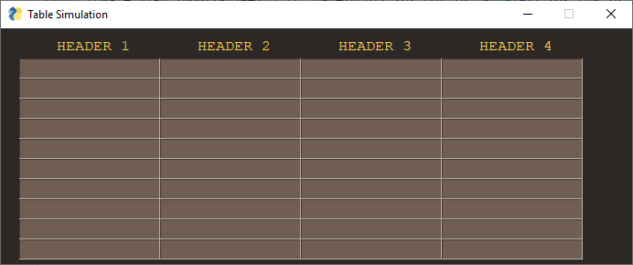
"User Defined Elements" and "Compound Elements" are one or more PySimpleGUI Elements that are wrapped in a function definition. In a layout, they have the appearance of being a custom elements of some type.
User Defined Elements are particularly useful when you set a lot of parameters on an element that you use over and over in your layout.
Let's say you're making a calculator application with buttons that have these settings:
- font = Helvetica 20
- size = 5,1
- button color = white on blue
The code for one of these buttons is:
sg.Button('1', button_color=('white', 'blue'), size=(5, 1), font=("Helvetica", 20))If you have 6 buttons across and 5 down, your layout will have 30 of these lines of text.
One row of these buttons could be written:
    [sg.Button('1', button_color=('white', 'blue'), size=(5, 1), font=("Helvetica", 20)),
     sg.Button('2', button_color=('white', 'blue'), size=(5, 1), font=("Helvetica", 20)),
     sg.Button('3', button_color=('white', 'blue'), size=(5, 1), font=("Helvetica", 20)),
     sg.Button('log', button_color=('white', 'blue'), size=(5, 1), font=("Helvetica", 20)),
     sg.Button('ln', button_color=('white', 'blue'), size=(5, 1), font=("Helvetica", 20)),
     sg.Button('-', button_color=('white', 'blue'), size=(5, 1), font=("Helvetica", 20))],
By using User Defined Elements, you can significantly shorten your layouts. Let's call our element CBtn. It would be written like this:
def CBtn(button_text):
    return sg.Button(button_text, button_color=('white', 'blue'), size=(5, 1), font=("Helvetica", 20))
Using your new CBtn Element, you could rewrite the row of buttons above as:
[CBtn('1'), CBtn('2'), CBtn('3'), CBtn('log'), CBtn('ln'), CBtn('-')],See the tremendous amount of code you do not havew to write! USE this construct any time you find yourself copying an element many times.
But let's not stop there.
Since we've been discussing list comprehensions, let's use them to create this row. The way to do that is to make a list of the symbols that go across the row make a loop that steps through that list. The result is a list that looks like this:
[CBtn(t) for t in ('1','2','3', 'log', 'ln', '-')],That code produces the same list as this one we created by hand:
[CBtn('1'), CBtn('2'), CBtn('3'), CBtn('log'), CBtn('ln'), CBtn('-')],Just like a Button can be returned from a User Defined Element, so can multiple Elements.
Going back to the To-Do List example we did earlier, we could have defined a User Defined Element that represented a To-Do Item and this time we're adding a checkbox. A single line from this list will be:
- The item # (a
TextElement) - A
CheckboxElement to indicate completed - An
InputElement to type in what to do
The definition of our User Element is this ToDoItem function. It is a single User Element that is a combination of 3 PySimpleGUI Elements.
def ToDoItem(num):
    return [sg.Text(f'{num}. '), sg.CBox(''), sg.In()]
This makes creating a list of 5 to-do items downright trivial when combined with the list comprehension techniques we learned earlier. Here is the code required to create 5 entries in our to-do list.
layout = [ToDoItem(x) for x in range(1,6)]We can then literally add on the buttons
layout = [ToDoItem(x) for x in range(1,6)] + [[sg.Button('Save'), sg.Button('Exit')]]And here is our final program
import PySimpleGUI as sg

def ToDoItem(num):
    return [sg.Text(f'{num}. '), sg.CBox(''), sg.In()]

layout = [ToDoItem(x) for x in range(1,6)] + [[sg.Button('Save'), sg.Button('Exit')]]

window = sg.Window('To Do List Example', layout)
event, values = window.read()
And the window it creates looks like this:
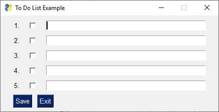
You will find information on Elements and all other classes and functions are located near the end of this manual. They are in 1 large section of the readme, in alphabetical order for easy lookups. This section's discussion of Elements is meant to teach you how they work. The other section has detailed call signatures and parameter definitions.
"Elements" are the building blocks used to create windows. Some GUI APIs use the term "Widget" to describe these graphic elements.
- Text
- Single Line Input
- Buttons including these types:
- File Browse
- Folder Browse
- Calendar picker
- Date Chooser
- Read window
- Close window ("Button" & all shortcut buttons)
- Realtime
- Checkboxes
- Radio Buttons
- Listbox
- Slider
- Multi-line Text Input/Output
- Multi-line Text Output (not on tkinter version)
- Scroll-able Output
- Vertical Separator
- Progress Bar
- Option Menu
- Menu
- ButtonMenu
- Frame
- Column
- Graph
- Image
- Table
- Tree
- Tab, TabGroup
- StatusBar
- Pane
- Stretch (Qt only)
- Sizer (plain PySimpleGUI only)
Some parameters that you will see on almost all Element creation calls include:
- key - Used with window.FindElement and with return values
- tooltip - Hover your mouse over the elemnt and you'll get a popup with this text
- size - (width, height) - usually measured in characters-wide, rows-high. Sometimes they mean pixels
- font - specifies the font family, size, etc
- colors - Color name or #RRGGBB string
- pad - Amount of padding to put around element
- enable_events - Turns on the element specific events
- visible - Make elements appear and disappear
Tooltips are text boxes that popup next to an element if you hold your mouse over the top of it. If you want to be extra kind to your window's user, then you can create tooltips for them by setting the parameter tooltip to some text string. You will need to supply your own line breaks / text wrapping. If you don't want to manually add them, then take a look at the standard library package textwrap.
Tooltips are one of those "polish" items that really dress-up a GUI and show's a level of sophistication. Go ahead, impress people, throw some tooltips into your GUI. You can change the color of the background of the tooltip on the tkinter version of PySimpleGUI by setting TOOLTIP_BACKGROUND_COLOR to the color string of your choice. The default value for the color is:
TOOLTIP_BACKGROUND_COLOR = "#ffffe0"
Info on setting default element sizes is discussed in the Window section above.
Specifies the amount of room reserved for the Element. For elements that are character based, such a Text, it is (# characters, # rows). Sometimes it is a pixel measurement such as the Image element. And sometimes a mix like on the Slider element (characters long by pixels wide).
Some elements, Text and Button, have an auto-size setting that is on by default. It will size the element based on the contents. The result is that buttons and text fields will be the size of the string creating them. You can turn it off. For example, for Buttons, the effect will be that all buttons will be the same size in that window.
In non-tkinter ports you can set the specific element sizes in 2 ways. One is to use the normal size parameter like you're used to using. This will be in characters and rows.
The other way is to use a new parameter, size_px. This parameter allows you to specify the size directly in pixels. A setting of size_px=(300,200) will create an Element that is 300 x 200 pixels.
Additionally, you can also indicate pixels using the size parameter, if the size exceeds the threshold for conversion. What does that mean? It means if your width is > 20 (DEFAULT_PIXEL_TO_CHARS_CUTOFF), then it is assumed you're talking pixels, not characters. However, some of the "normally large" Elements have a cutoff value of 100. These include, for example, the Multline and Output elements.
If you're curious about the math used to do the character to pixels conversion, it's quite crude, but functional. The conversion is completed with the help of this variable:
DEFAULT_PIXELS_TO_CHARS_SCALING = (10,26)
The conversion simply takes your size[0] and multiplies by 10 and your size[1] and multiplies it by 26.
A string representing color. Anytime colors are involved, you can specify the tkinter color name such as 'lightblue' or an RGB hex value '#RRGGBB'. For buttons, the color parameter is a tuple (text color, background color)
Anytime colors are written as a tuple in PySimpleGUI, the way to figure out which color is the background is to replace the "," with the word "on". ('white', 'red') specifies a button that is "white on red". Works anywhere there's a color tuple.
The amount of room around the element in pixels. The default value is (5,3) which means leave 5 pixels on each side of the x-axis and 3 pixels on each side of the y-axis. You can change this on a global basis using a call to SetOptions, or on an element basis.
If you want more pixels on one side than the other, then you can split the number into 2 number. If you want 200 pixels on the left side, and 3 pixels on the right, the pad would be ((200,3), 3). In this example, only the x-axis is split.
Specifies the font family, size, and style. Font families on Windows include:
- Arial
- Courier
- Comic,
- Fixedsys
- Times
- Verdana
- Helvetica (the default I think)
The fonts will vary from system to system, however, Tk 8.0 automatically maps Courier, Helvetica and Times to their corresponding native family names on all platforms. Also, font families cannot cause a font specification to fail on Tk 8.0 and greater.
If you wish to leave the font family set to the default, you can put anything not a font name as the family. The PySimpleGUI Demo programs and documentation use the family 'Any' to demonstrate this fact.. You could use "default" if that's more clear to you.
There are 2 formats that can be used to specify a font... a string, and a tuple Tuple - (family, size, styles) String - "Family Size Styles"
To specify an underlined, Helvetica font with a size of 15 the values: ('Helvetica', 15, 'underline italics') 'Helvetica 15 underline italics'
If you are going to do anything beyond the basic stuff with your GUI, then you need to understand keys. Keys are a way for you to "tag" an Element with a value that will be used to identify that element. After you put a key in an element's definition, the values returned from Read will use that key to tell you the value. For example, if you have an input field:
Input(key='mykey')
And your read looks like this: event, values = Read()
Then to get the input value from the read it would be: values['mykey']
You also use the same key if you want to call Update on an element. Please see the section below on Updates to understand that usage.
Keys can be ANYTHING. Let's say you have a window with a grid of input elements. You could use their row and column location as a key (a tuple)
key=(row, col)
Then when you read the values variable that's returned to you from calling Window.Read(), the key in the values variable will be whatever you used to create the element. In this case you would read the values as:
values[(row, col)]
Most of the time they are simple text strings. In the Demo Programs, keys are written with this convention:
_KEY_NAME_ (underscore at beginning and end with all caps letters) or '-KEY_NAME-. You don't have to follow that convention. It's used so that you can quickly spot when a key is being used.
To find an element's key, access the member variable .Key for the element. This assumes you've got the element in a variable already.
text_elem = sg.Text('', key='-TEXT-')

the_key = text_elem.KeyBeginning in version 3.17 you can create Elements that are initially invisible that you can later make visible.
To create an invisible Element, place the element in the layout like you normally would and add the parameter
visible=False.
Later when you want to make that Element visible you simply call the Element's Update method and pass in the parameter visible=True
This feature works best on Qt, but does work on the tkinter version as well. The visible parameter can also be used with the Column and Frame "container" Elements.
Note - Tkiner elements behave differently than Qt elements in how they arrange themselves when going from invisible to visible.
Tkinet elements tend to STACK themselves.
One workaround is to place the element in a Column with other elements on its row. This will hold the place of the row it is to be placed on. It will move the element to the end of the row however.
If you want to not only make the element invisible, on tkinter you can call `Element.
Qt elements tend to hold their place really well and the window resizes itself nicely. It is more precise and less klunky.
Perhaps not the best idea, but one that's done none the less is the naming of methods and functions. Some of the more "Heavily Travelled Elements" (and methods/functions) have "shortcuts".
In other words, I am lazy and don't like to type. The result is multiple ways to do exactly the same thing. Typically, the Demo Programs and other examples use the full name, or at least a longer name. Thankfully PyCharm will show you the same documentation regardless which you use.
This enables you to code much quicker once you are used to using the SDK. The Text Element, for example, has 3 different names Text, Txt orT. InputText can also be written Input or In .
The shortcuts aren't limited to Elements. The Window method Window.FindElement can be written as Window.Element because it's such a commonly used function. BUT,even that has now been shortened.
It's an ongoing thing. If you don't stay up to date and one of the newer shortcuts is used, you'll need to simply rename that shortcut in the code. For examples Replace sg.T with sg.Text if your version doesn't have sg.T in it.
Basic Element. It displays text.
layout = [
            [sg.Text('This is what a Text Element looks like')],
         ]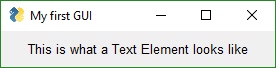
When creating a Text Element that you will later update, make sure you reserve enough characters for the new text. When a Text Element is created without a size parameter, it is created to exactly fit the characters provided.
With proportional spaced fonts (normally the default) the pixel size of one set of characters will differ from the pixel size of a different set of characters even though the set is of the same number of characters. In other words, not all letters use the same number of pixels. Look at the text you're reading right now and you will see this. An "i" takes up a less space then an "A".
There's been a fantastic leap forward in making PySimpleGUI code more compact.
Instead of writing:
window.FindElement(key).Update(new_value)You can now write it as:
window[key].Update(new_value)This change has been released to PyPI for PySimpleGUI
MANY Thanks is owed to the person that suggested and showed me how to do this. It's an incredible find.
This has to be one of the strangest syntactical contructs I've ever written.
It is best used in combination with FindElement (see prior section on how to shortcut FindElement).
Normally to change an element, you "find" it, then call its update method. The code usually looks like this, as you saw in the previous section:
window[key].update(new_value)The code can be further compressed by removing the .update characters, resulting in this very compact looking call:
window[key](new_value)Yes, that's a valid statement in Python.
What's happening is that the element itself is being called. You can also writing it like this:
elem = sg.Text('Some text', key='-TEXT-')
elem('new text value')
Side note - you can also call your window variable directly. If you "call" it it will actually call Window.read.
window = sg.Window(....)
event, values = window()

# is the same as
window = sg.Window(....)
event, values = window.read()
It is confusing looking however so when used, it might be a good idea to write a comment at the end of the statement to help out the poor beginner programmer coming along behind you.
Because it's such a foreign construct that someone with 1 week of Python classes will not reconize, the demos will continue to use the .update method.
It does not have to be used in conjuction with FindElement. The call works on any previously made Element. Sometimes elements are created, stored into a variable and then that variable is used in the layout. For example.
graph_element = sg.Graph(...... lots of parms ......)

layout = [[graph_element]]
.
.
.
graph_element(background_color='blue')      # this calls Graph.Update for the previously defined element
Hopefully this isn't too confusing. Note that the methods these shortcuts replace will not be removed. You can continue to use the old constructs without changes.
Already discussed in the common parameters section. Either string or a tuple.
Individual colors are specified using either the color names as defined in tkinter or an RGB string of this format:
"#RRGGBB" or "darkblue"
A True value for auto_size_text, when placed on Text Elements, indicates that the width of the Element should be shrunk do the width of the text. The default setting is True. You need to remember this when you create Text elements that you are using for output.
Text('', key='_TXTOUT_) will create a Text Element that has 0 length. If you try to output a string that's 5 characters, it won't be shown in the window because there isn't enough room. The remedy is to manually set the size to what you expect to output
Text('', size=(15,1), key='_TXTOUT_) creates a Text Element that can hold 15 characters.
The shorthand functions for Text are Txt and T
If you set the parameter enable_events then you will get an event if the user clicks on the Text.
This Element doubles as both an input and output Element.
layout = [[sg.Multiline('This is what a Multi-line Text Element looks like', size=(45,5))]]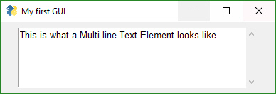
layout = [[sg.InputText('Default text')]]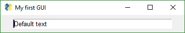
This used to really trip people up, but don't think so anymore. The do_not_clear parameter is initialized when creating the InputText Element. If set to False, then the input field's contents will be erased after every Window.Read() call. Use this setting for when your window is an "Input Form" type of window where you want all of the fields to be erased and start over again every time.
Also known as a drop-down list. Only required parameter is the list of choices. The return value is a string matching what's visible on the GUI.
layout = [[sg.Combo(['choice 1', 'choice 2'])]]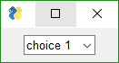
The standard listbox like you'll find in most GUIs. Note that the return values from this element will be a list of results, not a single result. This is because the user can select more than 1 item from the list (if you set the right mode).
layout = [[sg.Listbox(values=['Listbox 1', 'Listbox 2', 'Listbox 3'], size=(30, 6))]]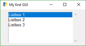
ListBoxes can cause a window to return from a Read call. If the flag enable_events is set, then when a user makes a selection, the Read immediately returns.
Another way ListBoxes can cause Reads to return is if the flag bind_return_key is set. If True, then if the user presses the return key while an entry is selected, then the Read returns. Also, if this flag is set, if the user double-clicks an entry it will return from the Read.
Sliders have a couple of slider-specific settings as well as appearance settings. Examples include the orientation and range settings.
layout = [[sg.Slider(range=(1,500),
         default_value=222,
         size=(20,15),
         orientation='horizontal',
         font=('Helvetica', 12))]]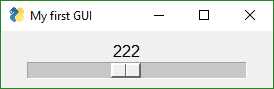
There is an important difference between Qt and tkinter sliders. On Qt, the slider values must be integer, not float. If you want your slider to go from 0.1 to 1.0, then make your slider go from 1 to 10 and divide by 10. It's an easy math thing to do and not a big deal. Just deal with it.... you're writing software after all. Presumably you know how to do these things. ;-)
Creates one radio button that is assigned to a group of radio buttons. Only 1 of the buttons in the group can be selected at any one time.
layout =  [
	[sg.Radio('My first Radio!', "RADIO1", default=True),
	sg.Radio('My second radio!', "RADIO1")]
]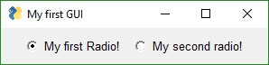
Checkbox elements are like Radio Button elements. They return a bool indicating whether or not they are checked.
layout = [[sg.Checkbox('My first Checkbox!', default=True), sg.Checkbox('My second Checkbox!')]]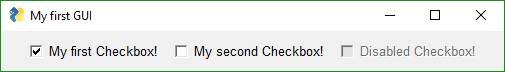
An up/down spinner control. The valid values are passed in as a list.
layout = [[sg.Spin([i for i in range(1,11)], initial_value=1), sg.Text('Volume level')]]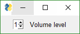
Images can be placed in your window provide they are in PNG, GIF, PPM/PGM format. JPGs cannot be shown because tkinter does not naively support JPGs. You can use the Python Imaging Library (PIL) package to convert your image to PNG prior to calling PySimpleGUI if your images are in JPG format.
layout = [
            [sg.Image(r'C:\PySimpleGUI\Logos\PySimpleGUI_Logo_320.png')],
         ]
You can specify an animated GIF as an image and can animate the GIF by calling UpdateAnimation. Exciting stuff!
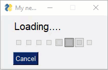
You can call the method without setting the time_between_frames value and it will show a frame and immediately move on to the next frame. This enables you to do the inter-frame timing.
Buttons are the most important element of all! They cause the majority of the action to happen. After all, it's a button press that will get you out of a window, whether it be Submit or Cancel, one way or another a button is involved in all windows. The only exception is to this is when the user closes the window using the "X" in the upper corner which means no button was involved.
The Types of buttons include:
- Folder Browse
- File Browse
- Files Browse
- File SaveAs
- File Save
- Close window (normal button)
- Read window
- Realtime
- Calendar Chooser
- Color Chooser
Close window - Normal buttons like Submit, Cancel, Yes, No, do NOT close the window... they used to. Now to close a window you need to use a CloseButton / CButton.
Folder Browse - When clicked a folder browse dialog box is opened. The results of the Folder Browse dialog box are written into one of the input fields of the window.
File Browse - Same as the Folder Browse except rather than choosing a folder, a single file is chosen.
Calendar Chooser - Opens a graphical calendar to select a date.
Color Chooser - Opens a color chooser dialog
Read window - This is a window button that will read a snapshot of all of the input fields, but does not close the window after it's clicked.
Realtime - This is another async window button. Normal button clicks occur after a button's click is released. Realtime buttons report a click the entire time the button is held down.
Most programs will use a combination of shortcut button calls (Submit, Cancel, etc), normal Buttons which leave the windows open and CloseButtons that close the window when clicked.
Sometimes there are multiple names for the same function. This is simply to make the job of the programmer quicker and easier. Or they are old names that are no longer used but kept around so that existing programs don't break.
The 4 primary windows of PySimpleGUI buttons and their names are:
Button=ReadButton=RButton=ReadFormButton(UseButton, others are old methods)CloseButton=CButtonRealtimeButtonDummyButton
You will find the long-form names in the older programs. ReadButton for example.
In Oct 2018, the definition of Button changed. Previously Button would CLOSE the window when clicked. It has been changed so the Button calls will leave the window open in exactly the same way as a ReadButton. They are the same calls now. To enables windows to be closed using buttons, a new button was added... CloseButton or CButton.
Your PySimpleGUI program is most likely going to contain only Button calls. The others are generally not foundin user code.
The most basic Button element call to use is Button
layout = [[sg.Button('Ok'), sg.Button('Cancel')]]
You will rarely see these 2 buttons in particular written this way. Recall that PySimpleGUI is focused on YOU (which generally directly means.... less typing). As a result, the code for the above window is normally written using shortcuts found in the next section.
You will typically see this instead of calls to Button:
layout = [[sg.Ok(), sg.Cancel()]]In reality Button is in fact being called on your behalf. Behind the scenes, sg.Ok and sg.Cancel call Button with the text set to Ok and Cancel and returning the results that then go into the layout. If you were to print the layout it will look identical to the first layout shown that has Button shown specifically in the layout.
In 2019 support for ttk Buttons was added. This gets around the problem of not being able to change button colors on a Mac. There are a number of places you can control whether or not ttk buttons are used, be it on MAc or other platform.
TTK Buttons and TK Buttons operate slightly differently. Button highlighting is one different. How images and text are displayed at the same time is another. You've got options now that weren't there previously. It's nice to see that Mac users can finally use the color themes.
These Pre-made buttons are some of the most important elements of all because they are used so much. They all basically do the same thing, set the button text to match the function name and set the parameters to commonly used values. If you find yourself needing to create a custom button often because it's not on this list, please post a request on GitHub. . They include:
- OK
- Ok
- Submit
- Cancel
- Yes
- No
- Exit
- Quit
- Help
- Save
- SaveAs
- Open
These buttons are used to show dialog boxes that choose something like a filename, date, color, etc. that are filled into an InputText Element (or some other "target".... see below regarding targets)
- CalendarButton
- ColorChooserButton
- FileBrowse
- FilesBrowse
- FileSaveAs
- FolderBrowse
IMPORT NOTE ABOUT SHORTCUT BUTTONS Prior to release 3.11.0, these buttons closed the window. Starting with 3.11 they will not close the window. They act like RButtons (return the button text and do not close the window)
If you are having trouble with these buttons closing your window, please check your installed version of PySimpleGUI by typing pip list at a command prompt. Prior to 3.11 these buttons close your window.
Using older versions, if you want a Submit() button that does not close the window, then you would instead use RButton('Submit'). Using the new version, if you want a Submit button that closes the window like the sold Submit() call did, you would write that as CloseButton('Submit') or CButton('Submit')
The FileBrowse, FolderBrowse, FileSaveAs , FilesSaveAs, CalendarButton, ColorChooserButton buttons all fill-in values into another element located on the window. The target can be a Text Element or an InputText Element or the button itself. The location of the element is specified by the target variable in the function call.
The Target comes in two forms.
- Key
- (row, column)
Targets that are specified using a key will find its target element by using the target's key value. This is the "preferred" method.
If the Target is specified using (row, column) then it utilizes a grid system. The rows in your GUI are numbered starting with 0. The target can be specified as a hard coded grid item or it can be relative to the button.
The (row, col) targeting can only target elements that are in the same "container". Containers are the Window, Column and Frame Elements. A File Browse button located inside of a Column is unable to target elements outside of that Column.
The default value for target is (ThisRow, -1). ThisRow is a special value that tells the GUI to use the same row as the button. The Y-value of -1 means the field one value to the left of the button. For a File or Folder Browse button, the field that it fills are generally to the left of the button is most cases. (ThisRow, -1) means the Element to the left of the button, on the same row.
If a value of (None, None) is chosen for the target, then the button itself will hold the information. Later the button can be queried for the value by using the button's key.
Let's examine this window as an example:
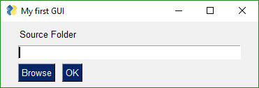
The InputText element is located at (1,0)... row 1, column 0. The Browse button is located at position (2,0). The Target for the button could be any of these values:
Target = (1,0)
Target = (-1,0)
The code for the entire window could be:
layout = [[sg.T('Source Folder')],
              [sg.In()],
              [sg.FolderBrowse(target=(-1, 0)), sg.OK()]]
or if using keys, then the code would be:
layout = [[sg.T('Source Folder')],
              [sg.In(key='input')],
              [sg.FolderBrowse(target='input'), sg.OK()]]
See how much easier the key method is?
One very handy trick is to make your target invisible. This will remove the ability to edit the chosen value like you normally would be able to with an Input Element. It's a way of making things look cleaner, less cluttered too perhaps.
There are 4 different types of File/Folder open dialog box available. If you are looking for a file to open, the FileBrowse is what you want. If you want to save a file, SaveAs is the button. If you want to get a folder name, then FolderBrowse is the button to use. To open several files at once, use the FilesBrowse button. It will create a list of files that are separated by ';'
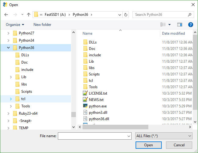
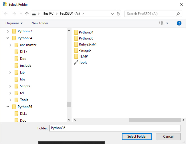
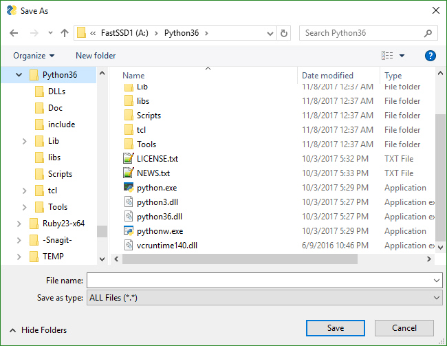
These buttons pop up a calendar chooser window. The chosen date is returned as a string.
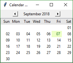
These buttons pop up a standard color chooser window. The result is returned as a tuple. One of the returned values is an RGB hex representation.
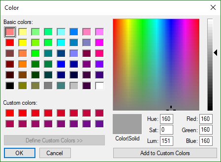
Not all buttons are created equal. A button that closes a window is different that a button that returns from the window without closing it. If you want to define your own button, you will generally do this with the Button Element Button, which closes the window when clicked.
layout = [[sg.Button('My Button')]]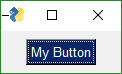
All buttons can have their text changed by changing the button_text parameter in the button call. It is this text that is returned when a window is read. This text will be what tells you which button was clicked. However, you can also use keys on your buttons so that they will be unique. If only the text were used, you would never be able to have 2 buttons in the same window with the same text.
layout = [[sg.Button('My Button', key='_BUTTON_KEY_')]]With this layout, the event that is returned from a Window.Read() call when the button is clicked will be "_BUTTON_KEY_"
Now this is an exciting feature not found in many simplified packages.... images on buttons! You can make a pretty spiffy user interface with the help of a few button images.
Your button images need to be in PNG or GIF format. When you make a button with an image, set the button background to the same color as the background. There's a button color TRANSPARENT_BUTTON that you can set your button color to in order for it to blend into the background. Note that this value is currently the same as the color as the default system background on Windows. If you want to set the button background color to the current system default, use the value COLOR_SYSTEM_DEFAULT as the background color.
This example comes from the Demo Media Player.py example program. Because it's a non-blocking button, it's defined as RButton. You also put images on blocking buttons by using Button.
sg.Button('Restart Song', button_color=sg.TRANSPARENT_BUTTON,
               image_filename=image_restart, image_size=(50, 50), image_subsample=2, border_width=0)
Three parameters are used for button images.
image_filename - Filename. Can be a relative path
image_size - Size of image file in pixels
image_subsample - Amount to divide the size by.  2 means your image will be 1/2 the size.  3 means 1/3
Here's an example window made with button images.
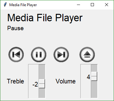
You'll find the source code in the file Demo Media Player. Here is what the button calls look like to create media player window
sg.Button('Pause', button_color=sg.TRANSPARENT_BUTTON,
             image_filename=image_pause,
             image_size=(50, 50),
             image_subsample=2,
             border_width=0)
Experimentation is sometimes required for these concepts to really sink in.
Normally buttons are considered "clicked" when the mouse button is let UP after a downward click on the button. What about times when you need to read the raw up/down button values. A classic example for this is a robotic remote control. Building a remote control using a GUI is easy enough. One button for each of the directions is a start. Perhaps something like this:
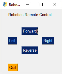
This window has 2 button types. There's the normal "Read Button" (Quit) and 4 "Realtime Buttons".
Here is the code to make, show and get results from this window:
import PySimpleGUI as sg

gui_rows = [[sg.Text('Robotics Remote Control')],
            [sg.T(' '  * 10), sg.RealtimeButton('Forward')],
            [sg.RealtimeButton('Left'), sg.T(' '  * 15), sg.RealtimeButton('Right')],
            [sg.T(' '  * 10), sg.RealtimeButton('Reverse')],
            [sg.T('')],
            [sg.Quit(button_color=('black', 'orange'))]
            ]

window = sg.Window('Robotics Remote Control', gui_rows)

#
# Some place later in your code...
# You need to perform a Read or Refresh call on your window every now and then or
# else it will apprear as if the program has locked up.
#
# your program's main loop
while (True):
    # This is the code that reads and updates your window
    event, values = window.Read(timeout=50)
    print(event)
    if event in ('Quit', None):
        break

window.Close()  # Don't forget to close your window!
This loop will read button values and print them. When one of the Realtime buttons is clicked, the call to window.Read will return a button name matching the name on the button that was depressed or the key if there was a key assigned to the button. It will continue to return values as long as the button remains depressed. Once released, the Read will return timeout events until a button is again clicked.
File Types
The FileBrowse & SaveAs buttons have an additional setting named file_types. This variable is used to filter the files shown in the file dialog box. The default value for this setting is
FileTypes=(("ALL Files", "*.*"),)
This code produces a window where the Browse button only shows files of type .TXT
layout = [[sg.In() ,sg.FileBrowse(file_types=(("Text Files", "*.txt"),))]]
NOTE - Mac users will not be able to use the file_types parameter. tkinter has a bug on Macs that will crash the program is a file_type is attempted so that feature had to be removed. Sorry about that!
The ENTER key The ENTER key is an important part of data entry for windows. There's a long tradition of the enter key being used to quickly submit windows. PySimpleGUI implements this by tying the ENTER key to the first button that closes or reads a window.
The Enter Key can be "bound" to a particular button so that when the key is pressed, it causes the window to return as if the button was clicked. This is done using the bind_return_key parameter in the button calls.
If there are more than 1 button on a window, the FIRST button that is of type Close window or Read window is used. First is determined by scanning the window, top to bottom and left to right.
The ButtonMenu element produces a unique kind of effect. It's a button, that when clicked, shows you a menu. It's like clicking one of the top-level menu items on a MenuBar. As a result, the menu definition take the format of a single menu entry from a normal menu definition. A normal menu definition is a list of lists. This definition is one of those lists.
['Menu', ['&Pause Graph', 'Menu item::optional_key']]The very first string normally specifies what is shown on the menu bar. In this case, the value is not used. You set the text for the button using a different parameter, the button_text parm.
One use of this element is to make a "fake menu bar" that has a colored background. Normal menu bars cannot have their background color changed. Not so with ButtonMenus.
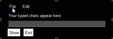
Return values for ButtonMenus are sent via the return values dictionary. If a selection is made, then an event is generated that will equal the ButtonMenu's key value. Use that key value to look up the value selected by the user. This is the same mechanism as the Menu Bar Element, but differs from the pop-up (right click) menu.
This element has limited usefulness and is being included more for completeness than anything else. It will draw a line between elements.
It works best when placed between columns or elements that span multiple rows. If on a "normal" row with elements that are only 1 row high, then it will only span that one row.
VerticalSeparator(pad=None)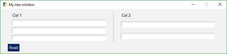
In PySimpleGUI, the tkinter port, there is no HorizontalSeparator Element. One will be added as a "stub" so that code is portable. It will likely do nothing just like the Stretch Element.
An easy way to get a horizontal line in PySimpleGUI is to use a Text Element that contains a line of underscores
sg.Text('_'*30) # make a horizontal line stretching 30 charactersThe ProgressBar element is used to build custom Progress Bar windows. It is HIGHLY recommended that you use OneLineProgressMeter that provides a complete progress meter solution for you. Progress Meters are not easy to work with because the windows have to be non-blocking and they are tricky to debug.
The easiest way to get progress meters into your code is to use the OneLineProgressMeter API. This consists of a pair of functions, OneLineProgressMeter and OneLineProgressMeterCancel. You can easily cancel any progress meter by calling it with the current value = max value. This will mark the meter as expired and close the window.
You've already seen OneLineProgressMeter calls presented earlier in this readme.
sg.OneLineProgressMeter('My Meter', i+1, 1000, 'key', 'Optional message')The return value for OneLineProgressMeter is:
True if meter updated correctly
False if user clicked the Cancel button, closed the window, or vale reached the max value.
Another way of using a Progress Meter with PySimpleGUI is to build a custom window with a ProgressBar Element in the window. You will need to run your window as a non-blocking window. When you are ready to update your progress bar, you call the UpdateBar method for the ProgressBar element itself.
import PySimpleGUI as sg

# layout the window
layout = [[sg.Text('A custom progress meter')],
          [sg.ProgressBar(1000, orientation='h', size=(20, 20), key='progressbar')],
          [sg.Cancel()]]

# create the window`
window = sg.Window('Custom Progress Meter', layout)
progress_bar = window['progressbar']
# loop that would normally do something useful
for i in range(1000):
    # check to see if the cancel button was clicked and exit loop if clicked
    event, values = window.read(timeout=10)
    if event == 'Cancel'  or event is None:
        break
  # update bar with loop value +1 so that bar eventually reaches the maximum
    progress_bar.UpdateBar(i + 1)
# done with loop... need to destroy the window as it's still open
window.close()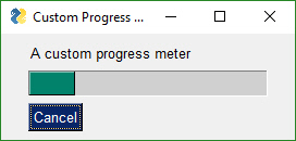
The Output Element is a re-direction of Stdout.
If you are looking for a way to quickly add the ability to show scrolling text within your window, then adding an Output Element is about as quick and easy as it gets.
Anything "printed" will be displayed in this element. This is the "trivial" way to show scrolling text in your window. It's as easy as dropping an Output Element into your window and then calling print as much as you want. The user will see a scrolling area of text inside their window.
IMPORTANT You will NOT see what you print until you call either window.Read or window.Refresh. If you want to immediately see what was printed, call window.Refresh() immediately after your print statement.
Output(size=(80,20))
Here's a complete solution for a chat-window using an Output Element. To display data that's received, you would to simply "print" it and it will show up in the output area. You'll find this technique used in several Demo Programs including the HowDoI application.
import PySimpleGUI as sg

def ChatBot():
    layout = [[(sg.Text('This is where standard out is being routed', size=[40, 1]))],
              [sg.Output(size=(80, 20))],
              [sg.Multiline(size=(70, 5), enter_submits=True),
               sg.Button('SEND', button_color=(sg.YELLOWS[0], sg.BLUES[0])),
               sg.Button('EXIT', button_color=(sg.YELLOWS[0], sg.GREENS[0]))]]

    window = sg.Window('Chat Window', layout, default_element_size=(30, 2))

    # ---===--- Loop taking in user input and using it to query HowDoI web oracle --- #
    while True:
        event, value = window.read()
        if event == 'SEND':
            print(value)
        else:
            break
    window.close()
ChatBot()Columns and Frames and Tabs are all "Container Elements" and behave similarly. This section focuses on Columns but can be applied elsewhere.
Starting in version 2.9 you'll be able to do more complex layouts by using the Column Element. Think of a Column as a window within a window. And, yes, you can have a Column within a Column if you want.
Columns are specified, like all "container elements", in exactly the same way as a window, as a list of lists.
Columns are needed when you want to specify more than 1 element in a single row.
For example, this layout has a single slider element that spans several rows followed by 7 Text and Input elements on the same row.
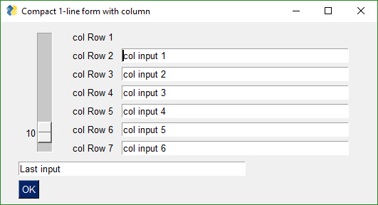
Without a Column Element you can't create a layout like this. But with it, you should be able to closely match any layout created using tkinter only.
import PySimpleGUI as sg

# Demo of how columns work
# window has on row 1 a vertical slider followed by a COLUMN with 7 rows
# Prior to the Column element, this layout was not possible
# Columns layouts look identical to window layouts, they are a list of lists of elements.

window = sg.Window('Columns')                                   # blank window

# Column layout
col = [[sg.Text('col Row 1')],
       [sg.Text('col Row 2'), sg.Input('col input 1')],
       [sg.Text('col Row 3'), sg.Input('col input 2')],
       [sg.Text('col Row 4'), sg.Input('col input 3')],
       [sg.Text('col Row 5'), sg.Input('col input 4')],
       [sg.Text('col Row 6'), sg.Input('col input 5')],
       [sg.Text('col Row 7'), sg.Input('col input 6')]]

layout = [[sg.Slider(range=(1,100), default_value=10, orientation='v', size=(8,20)), sg.Column(col)],
          [sg.In('Last input')],
          [sg.OK()]]

# Display the window and get values

window = sg.Window('Compact 1-line window with column', layout)
event, values = window.read()
window.Close()

sg.Popup(event, values, line_width=200)Beginning in Release 4.3 you can set the justification for any container element. This is done through the element_justification parameter. This will greatly help anyone that wants to center all of their content in a window. Previously it was difficult to do these kinds of layouts, if not impossible.
justify the Column element's row by setting the Column's justification parameter.
You can also justify the entire contents within a Column by using the Column's element_justification parameter.
With these parameter's it is possible to create windows that have their contents centered. Previously this was very difficult to do.
This is currently only available in the primary PySimpleGUI port.
They can also be used to justify a group of elements in a particular way.
Placing Column elements inside Columns elements make it possible to create a multitude of
New in 4.3 is the Sizer Element. This element is used to help create a container of a particular size. It can be placed inside of these PySimpleGUI items:
- Column
- Frame
- Tab
- Window
The implementation of a Sizer is quite simple. It returns an empty Column element that has a pad value set to the values passed into the Sizer. Thus isn't not a class but rather a "Shortcut function" similar to the pre-defined Buttons.
This feature is only available in the tkinter port of PySimpleGUI at the moment. A cross port is needed.
Frames work exactly the same way as Columns. You create layout that is then used to initialize the Frame. Like a Column element, it's a "Container Element" that holds one or more elements inside.
Notice how the Frame layout looks identical to a window layout. A window works exactly the same way as a Column and a Frame. They all are "container elements" - elements that contain other elements.
These container Elements can be nested as deep as you want. That's a pretty spiffy feature, right? Took a lot of work so be appreciative. Recursive code isn't trivial.
This code creates a window with a Frame and 2 buttons.
frame_layout = [
                  [sg.T('Text inside of a frame')],
                  [sg.CB('Check 1'), sg.CB('Check 2')],
               ]
layout = [
          [sg.Frame('My Frame Title', frame_layout, font='Any 12', title_color='blue')],
          [sg.Submit(), sg.Cancel()]
         ]

window = sg.Window('Frame with buttons', layout, font=("Helvetica", 12))In my opinion, the tkinter Canvas Widget is the most powerful of the tkinter widget. While I try my best to completely isolate the user from anything that is tkinter related, the Canvas Element is the one exception. It enables integration with a number of other packages, often with spectacular results.
However, there's another way to get that power and that's through the Graph Element, an even MORE powerful Element as it uses a Canvas that you can directly access if needed. The Graph Element has a large number of drawing methods that the Canvas Element does not have. Plus, if you need to, you can access the Graph Element's "Canvas" through a member variable.
**NOTE - The newest version of Matplotlib (3.1.0) no longer works with this technique. ** You must install 3.0.3 in order to use the Demo Matplotlib programs provided in the Demo Programs section.
One such integration is with Matploplib and Pyplot. There is a Demo program written that you can use as a design pattern to get an understanding of how to use the Canvas Widget once you get it.
def Canvas(canvas - a tkinter canvasf if you created one. Normally not set
         background_color - canvas color
         size - size in pixels
         pad - element padding for packing
         key - key used to lookup element
         tooltip - tooltip text)
The order of operations to obtain a tkinter Canvas Widget is:
    figure_x, figure_y, figure_w, figure_h = fig.bbox.bounds
    # define the window layout
    layout = [[sg.Text('Plot test')],
              [sg.Canvas(size=(figure_w, figure_h), key='canvas')],
              [sg.OK(pad=((figure_w / 2, 0), 3), size=(4, 2))]]

    # create the window and show it without the plot
    window = sg.Window('Demo Application - Embedding Matplotlib In PySimpleGUI', layout).Finalize()

    # add the plot to the window
    fig_photo = draw_figure(window.FindElement('canvas').TKCanvas, fig)

    # show it all again and get buttons
    event, values = window.read()
To get a tkinter Canvas Widget from PySimpleGUI, follow these steps:
- Add Canvas Element to your window
- Layout your window
- Call
window.Finalize()- this is a critical step you must not forget - Find the Canvas Element by looking up using key
- Your Canvas Widget Object will be the found_element.TKCanvas
- Draw on your canvas to your heart's content
- Call
window.read()- Nothing will appear on your canvas until you call Read
See Demo_Matplotlib.py for a Recipe you can copy.
TKCanvas - not a method but a property. Returns the tkinter Canvas Widget
All you math fans will enjoy this Element... and all you non-math fans will enjoy it even more.
I've found nothing to be less fun than dealing with a graphic's coordinate system from a GUI Framework. It's always upside down from what I want. (0,0) is in the upper left hand corner.... sometimes... or was it in the lower left? In short, it's a pain in the ass.
How about the ability to get your own location of (0,0) and then using those coordinates instead of what tkinter provides? This results in a very powerful capability - working in your own units, and then displaying them in an area defined in pixels.
If you've ever been frustrated with where (0,0) is located on some surface you draw on, then fear not, your frustration ends right here. You get to draw using whatever coordinate system you want. Place (0,0) anywhere you want, including not anywhere on your Graph. You could define a Graph that's all negative numbers between -2.1 and -3.5 in the X axis and -3 to -8.2 in the Y axis
There are 3 values you'll need to supply the Graph Element. They are:
- Size of the canvas in pixels
- The lower left (x,y) coordinate of your coordinate system
- The upper right (x,y) coordinate of your coordinate system
After you supply those values you can scribble all of over your graph by creating Graph Figures. Graph Figures are created, and a Figure ID is obtained by calling:
- DrawCircle
- DrawLine
- DrawPoint
- DrawRectangle
- DrawOval
- DrawImage
You can move your figures around on the canvas by supplying the Figure ID the x,y delta to move. It does not move to an absolute position, but rather an offset from where the figure is now. (Use Relocate to move to a specific location)
graph.MoveFigure(my_circle, 10, 10)
You'll also use this ID to delete individual figures you've drawn:
graph.DeleteFigure(my_circle)If you have eneabled events for your Graph Element, then you can receive mouse click events. If you additionally enable drag_submits in your creation of the Graph Element, then you will also get events when you "DRAG" inside of a window. A "Drag" is defined as a left button down and then the mouse is moved.
When a drag event happens, the event will be the Graph Element's key. The value returned in the values dictionary is a tuple of the (x,y) location of the mouse currently.
This means you'll get a "stream" of events. If the mouse moves, you'll get at LEAST 1 and likely a lot more than 1 event.
When you've got drag_submits enabled, there's a sticky situation that arises.... what happens when you're done dragging and you've let go of the mouse button? How is the "Mouse Up" event relayed back to your code.
The "Mouse Up" will generate an event to you with the value: Graph_key + '+UP'. Thus, if your Graph Element has a key of '_GRAPH_', then the event you will receive when the mouse button is released is: '_GRAPH_+UP'
Yea, it's a little weird, but it works. It's SIMPLE too. I recommend using the .startswith and .endswith built-ins when dealing with these kinds of string values.
Here is an example of the events and the values dictionary that was generated by clicking and dragging inside of a Graph Element with the key == 'graph':
graph {'graph': (159, 256)}
graph {'graph': (157, 256)}
graph {'graph': (157, 256)}
graph {'graph': (157, 254)}
graph {'graph': (157, 254)}
graph {'graph': (154, 254)}
graph {'graph': (154, 254)}
graph+UP {'graph': (154, 254)}
Table and Tree Elements are of the most complex in PySimpleGUI. They have a lot of options and a lot of unusual characteristics.
The values returned from a Window.Read call for the Table Element are a list of row numbers that are currently highlighted.
New in PySimpleGUIQt is the addition of the Table method Get. This method returns the table that is currently being shown in the GUI. This method was required in order to obtain any edits the user may have made to the table.
For the tkinter port, it will return the same values that was passed in when the table was created because tkinter Tables cannot be modified by the user (please file an Issue if you know a way).
There has been an elusive problem where clicking on or near the table's header caused tkinter to go crazy and resize the columns continuously as you moved the mouse.
This problem has existed since the first release of the Table element. It was fixed in release 4.3.
The tkinter that's been released in the past several releases of Python has a bug. Table colors of all types are not working, at all. The background of the rows never change. If that's important to you, you'll need to downgrade your Python version. 3.6 works really well with PySimpleGUI and tkinter.
If you wish to start your table as being an empty one, you will need to specify an empty table. This list comprehension will create an empty table with 15 rows and 6 columns.
data = [['' for row in range(15)]for col in range(6)]There are two ways to get events generated from Table Element.
change_submits event generated as soon as a row is clicked on
bind_return_key event generate when a row is double clicked or the return key is press while on a row.
The Tree Element and Table Element are close cousins. Many of the parameters found in the Table Element apply to Tree Elements. In particular the heading information, column widths, etc.
Unlike Tables there is no standard format for trees. Thus the data structure passed to the Tree Element must be constructed. This is done using the TreeData class. The process is as follows:
- Get a TreeData Object
- "Insert" data into the tree
- Pass the filled in TreeData object to Tree Element
def TreeData()
def Insert(self, parent, key, text, values, icon=None)
To "insert" data into the tree the TreeData method Insert is called.
Insert(parent_key, key, display_text, values)To indicate insertion at the head of the tree, use a parent key of "". So, every top-level node in the tree will have a parent node = ""
This code creates a TreeData object and populates with 3 values
treedata = sg.TreeData()

treedata.Insert("", '_A_', 'A', [1,2,3])
treedata.Insert("", '_B_', 'B', [4,5,6])
treedata.Insert("_A_", '_A1_', 'A1', ['can','be','anything'])
Note that you can use the same values for display_text and keys. The only thing you have to watch for is that you cannot repeat keys.
When Reading a window the Table Element will return a list of rows that are selected by the user. The list will be empty is no rows are selected.
If you wish to show an icon next to a tree item, then you specify the icon in the call to Insert. You pass in a filename or a Base64 bytes string using the optional icon parameter.
Here is the result of showing an icon with a tree entry.
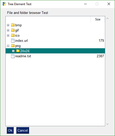
Tabs are another of PySimpleGUI "Container Elements". It is capable of "containing" a layout just as a window contains a layout. Other container elements include the Column and Frame elements.
Just like windows and the other container elements, the Tab Element has a layout consisting of any desired combination of Elements in any desired layouts. You can have Tabs inside of Tabs inside of Columns inside of Windows, etc.
Tab layouts look exactly like Window layouts, that is they are a list of lists of Elements.
How you place a Tab element into a window is different than all other elements. You cannot place a Tab directly into a Window's layout.
Also, tabs cannot be made invisible at this time. They have a visibily parameter but calling update will not change it.
Tabs are contained in TabGroups. They are not placed into other layouts. To get a Tab into your window, first place the Tab Element into a TabGroup Element and then place the TabGroup Element into the Window layout.
Let's look at this Window as an example:
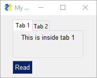
View of second tab:
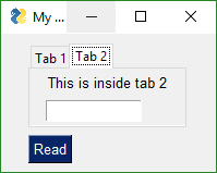
tab1_layout =  [[sg.T('This is inside tab 1')]]

tab2_layout = [[sg.T('This is inside tab 2')],
               [sg.In(key='in')]]
The layout for the entire window looks like this:
layout = [[sg.TabGroup([[sg.Tab('Tab 1', tab1_layout), sg.Tab('Tab 2', tab2_layout)]])],
              [sg.Button('Read')]]
The Window layout has the TabGroup and within the tab Group are the two Tab elements.
One important thing to notice about all of these container Elements and Windows layouts... they all take a "list of lists" as the layout. They all have a layout that looks like this [[ ]]
You will want to keep this [[ ]] construct in your head a you're debugging your tabbed windows. It's easy to overlook one or two necessary ['s
As mentioned earlier, the old-style Tabs were limited to being at the Window-level only. In other words, the tabs were equal in size to the entire window. This is not the case with the "new-style" tabs. This is why you're not going to be upset when you discover your old code no longer works with the new PySimpleGUI release. It'll be worth the few moments it'll take to convert your code.
Check out what's possible with the NEW Tabs!
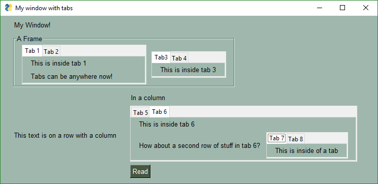
Check out Tabs 7 and 8. We've got a Window with a Column containing Tabs 5 and 6. On Tab 6 are... Tabs 7 and 8.
As of Release 3.8.0, not all of options shown in the API definitions of the Tab and TabGroup Elements are working. They are there as placeholders.
First we have the Tab layout definitions. They mirror what you see in the screen shots. Tab 1 has 1 Text Element in it. Tab 2 has a Text and an Input Element.
Tab Groups now return a value when a Read returns. They return which tab is currently selected. There is also a enable_events parameter that can be set that causes a Read to return if a Tab in that group is selected / changed. The key or title belonging to the Tab that was switched to will be returned as the value
x## Pane Element
New in version 3.20 is the Pane Element, a super-cool tkinter feature. You won't find this one in PySimpleGUIQt, only PySimpleGUI. It's difficult to describe one of these things. Think of them as "Tabs without labels" that you can slide.
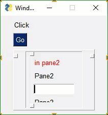
Each "Pane" of a Pane Element must be a Column Element. The parameter pane_list is a list of Column Elements.
Calls can get a little hairy looking if you try to declare everything in-line as you can see in this example.
sg.Pane([col5, sg.Column([[sg.Pane([col1, col2, col4], handle_size=15, orientation='v', background_color=None, show_handle=True, visible=True, key='_PANE_', border_width=0, relief=sg.RELIEF_GROOVE),]]),col3 ], orientation='h', background_color=None, size=(160,160), relief=sg.RELIEF_RAISED, border_width=0)Combing these with visibility make for an interesting interface with entire panes being hidden from view until neded by the user. It's one way of producing "dynamic" windows.
Starting in version 2.5 you can change the background colors for the window and the Elements.
Your windows can go from this:
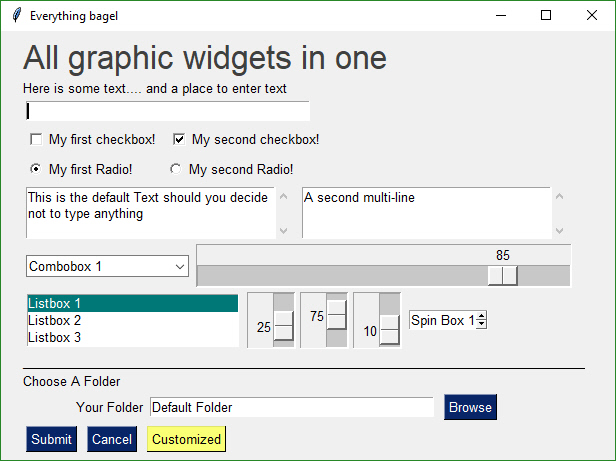
to this... with one function call...
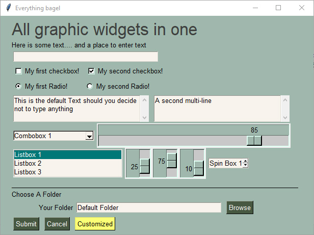
While you can do it on an element by element or window level basis, the easier way is to use either the theme calls or set_options. These calls will set colors for all window that are created.
Be aware that once you change these options they are changed for the rest of your program's execution. All of your windows will have that Theme, until you change it to something else.
This call sets a number of the different color options.
SetOptions(background_color='#9FB8AD',
       text_element_background_color='#9FB8AD',
       element_background_color='#9FB8AD',
       scrollbar_color=None,
       input_elements_background_color='#F7F3EC',
       progress_meter_color = ('green', 'blue')
button_color=('white','#475841'))This is a PySimpleGUIQt and PySimpleGUIWx only feature. Don't know of a way to do it using tkinter. Your source code for SystemTray is identical for the Qt and Wx implementations. You can switch frameworks by simply changing your import statement.
In addition to running normal windows, it's now also possible to have an icon down in the system tray that you can read to get menu events. There is a new SystemTray object that is used much like a Window object. You first get one, then you perform Reads in order to get events.
Here is the definition of the SystemTray object.
SystemTray(menu=None, filename=None, data=None, data_base64=None, tooltip=None):
        '''
 SystemTray - create an icon in the system tray
 :param menu: Menu definition
 :param filename: filename for icon
 :param data: in-ram image for icon
 :param data_base64: basee-64 data for icon
 :param tooltip: tooltip string '''
You'll notice that there are 3 different ways to specify the icon image. The base-64 parameter allows you to define a variable in your .py code that is the encoded image so that you do not need any additional files. Very handy feature.
Here is a design pattern you can use to get a jump-start.
This program will create a system tray icon and perform a blocking Read. If the item "Open" is chosen from the system tray, then a popup is shown.
import PySimpleGUIQt as sg

menu_def = ['BLANK', ['&Open', '---', '&Save', ['1', '2', ['a', 'b']], '&Properties', 'E&xit']]

tray = sg.SystemTray(menu=menu_def, filename=r'default_icon.ico')

while True:  # The event loop
  menu_item = tray.Read()
    print(menu_item)
    if menu_item == 'Exit':
        break
    elif menu_item == 'Open':
        sg.Popup('Menu item chosen', menu_item)
The design pattern creates an icon that will display this menu:
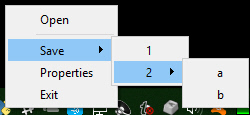
When specifying "icons", you can use 3 different formats.
filename- filenamedata_base64- base64 byte string- '
data- in-ram bitmap or other "raw" image
You will find 3 parameters used to specify these 3 options on both the initialize statement and on the Update method.
menu_def = ['BLANK', ['&Open', '&Save', ['1', '2', ['a', 'b']], '!&Properties', 'E&xit']]A menu is defined using a list. A "Menu entry" is a string that specifies:
- text shown
- keyboard shortcut
- key
See section on Menu Keys for more information on using keys with menus.
An entry without a key and keyboard shortcut is a simple string
'Menu Item'
If you want to make the "M" be a keyboard shortcut, place an & in front of the letter that is the shortcut.
'&Menu Item'
You can add "keys" to make menu items unique or as another way of identifying a menu item than the text shown. The key is added to the text portion by placing :: after the text.
'Menu Item::key'
The first entry can be ignored.'BLANK' was chosen for this example. It's this way because normally you would specify these menus under some heading on a menu-bar. But here there is no heading so it's filled in with any value you want.
Separators
If you want a separator between 2 items, add the entry '---' and it will add a separator item at that place in your menu.
Disabled menu entries
If you want to disable a menu entry, place a ! before the menu entry
def Read(timeout=None)
    '''
 Reads the context menu
 :param timeout: Optional.  Any value other than None indicates a non-blocking read
 :return:   String representing meny item chosen. None if nothing read.
    '''
The timeout parameter specifies how long to wait for an event to take place. If nothing happens within the timeout period, then a "timeout event" is returned. These types of reads make it possible to run asynchronously. To run non-blocked, specify timeout=0on the Read call.
Read returns the menu text, complete with key, for the menu item chosen. If you specified Open::key as the menu entry, and the user clicked on Open, then you will receive the string Open::key upon completion of the Read.
In addition to Menu Items, the Read call can return several special values. They include:
EVENT_SYSTEM_TRAY_ICON_DOUBLE_CLICKED - Tray icon was double clicked EVENT_SYSTEM_TRAY_ICON_ACTIVATED - Tray icon was single clicked EVENT_SYSTEM_TRAY_MESSAGE_CLICKED - a message balloon was clicked TIMEOUT_KEY is returned if no events are available if the timeout value is set in the Read call
Hides the icon. Note that no message balloons are shown while an icon is hidden.
def Hide()Does the same thing as hide
def Close()Shows a previously hidden icon
def UnHide()Shows a balloon above the icon in the system tray area. You can specify your own icon to be shown in the balloon, or you can set messageicon to one of the preset values.
This message has a custom icon.
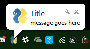
The preset messageicon values are:
SYSTEM_TRAY_MESSAGE_ICON_INFORMATION
SYSTEM_TRAY_MESSAGE_ICON_WARNING
SYSTEM_TRAY_MESSAGE_ICON_CRITICAL
SYSTEM_TRAY_MESSAGE_ICON_NOICON
ShowMessage(title, message, filename=None, data=None, data_base64=None, messageicon=None, time=10000):
'''
 Shows a balloon above icon in system tray
 :param title:  Title shown in balloon
 :param message: Message to be displayed
 :param filename: Optional icon filename
 :param data: Optional in-ram icon
 :param data_base64: Optional base64 icon
 :param time: How long to display message in milliseconds  :return:
 '''
Note, on windows it may be necessary to make a registry change to enable message balloons to be seen. To fix this, you must create the DWORD you see in this screenshot.
You can update any of these items within a SystemTray object
- Menu definition
- Icon
- Tooltip
Change them all or just 1.
There are multiple ways to customize PySimpleGUI. The call with the most granularity (allows access to specific and precise settings). The ChangeLookAndFeel call is in reality a single call to SetOptions where it changes 13 different settings.
Mac Users - You can't call ChangeLookAndFeel but you can call SetOptions with any sets of values you want. Nothing is being blocked or filtered.
These settings apply to all windows that are created in the future.
SetOptions. The options and Element options will take precedence over these settings. Settings can be thought of as levels of settings with the window-level being the highest and the Element-level the lowest. Thus the levels are:
- Global
- Window
- Element
Each lower level overrides the settings of the higher level. Once settings have been changed, they remain changed for the duration of the program (unless changed again).
Apologies that the next few pages are perhaps confusing. There have been a number of changes recently in PySimpleGUI's Read calls that added some really cool stuff, but at the expense of being not so simple. Part of the issue is an attempt to make sure existing code doesn't break. These changes are all in the area of non-blocking reads and reads with timeouts.
There are 2 ways to keep a window open after the user has clicked a button. One way is to use non-blocking windows (see the next section). The other way is to use buttons that 'read' the window instead of 'close' the window when clicked. The typical buttons you find in windows, including the shortcut buttons, close the window. These include OK, Cancel, Submit, etc. The Button Element also closes the window.
The RButton Element creates a button that when clicked will return control to the user, but will leave the window open and visible. This button is also used in Non-Blocking windows. The difference is in which call is made to read the window. The normal Read call with no parameters will block, a call with a timeout value of zero will not block.
Note that InputText and MultiLine Elements will be cleared when performing a Read. If you do not want your input field to be cleared after a Read then you can set the do_not_clear parameter to True when creating those elements. The clear is turned on and off on an element by element basis.
The reasoning behind this is that Persistent Windows are often "forms". When "submitting" a form you want to have all of the fields left blank so the next entry of data will start with a fresh window. Also, when implementing a "Chat Window" type of interface, after each read / send of the chat data, you want the input field cleared. Think of it as a Texting application. Would you want to have to clear your previous text if you want to send a second text?
The design pattern for Persistent Windows was already shown to you earlier in the document... here it is for your convenience.
import PySimpleGUI as sg

layout = [[sg.Text('Persistent window')],
          [sg.Input()],
          [sg.Button('Read'), sg.Exit()]]

window = sg.Window('Window that stays open', layout)

while True:
    event, values = window.read()
    if event is None or event == 'Exit':
        break
    print(event, values)

window.Close()Read with a timeout is a very good thing for your GUIs to use in a read non-blocking situation, you can use them. If your device can wait for a little while, then use this kind of read. The longer you're able to add to the timeout value, the less CPU time you'll be taking.
One way of thinking of reads with timeouts:
During the timeout time, you are "yielding" the processor to do other tasks.
But it gets better than just being a good citizen....your GUI will be more responsive than if you used a non-blocking read
Let's say you had a device that you want to "poll" every 100ms. The "easy way out" and the only way out until recently was this:
# YOU SHOULD NOT DO THIS....
while True:             # Event Loop
    event, values = window.ReadNonBlocking()   # DO NOT USE THIS CALL ANYMORE
    read_my_hardware() # process my device here
    time.sleep(.1)     # sleep 1/10 second
This program will quickly test for user input, then deal with the hardware. Then it'll sleep for 100ms, while your gui is non-responsive, then it'll check in with your GUI again. I fully realize this is a crude way of doing things. We're talking dirt simple stuff without trying to use threads, etc to 'get it right'. It's for demonstration purposes.
The new and better way.... using the Read Timeout mechanism, the sleep goes away.
# This is the right way to poll for hardware
while True:             # Event Loop
    event, values = window.Read(timeout = 100)
    read_my_hardware() # process my device here
This event loop will run every 100 ms. You're making a Read call, so anything that the use does will return back to you immediately, and you're waiting up to 100ms for the user to do something. If the user doesn't do anything, then the read will timeout and execution will return to the program.
You can easily spot a non-blocking call in PySimpleGUI. If you see a call to Window.Read() with a timeout parameter set to a value other than None, then it is a non-blocking call.
This call to read is asynchronous as it has a timeout value:
The new way
```python
event, values = sg.Read(timeout=20)
You should use the new way if you're reading this for the first time.
The difference in the 2 calls is in the value of event. For ReadNonBlocking, event will be None if there are no other events to report. There is a "problem" with this however. With normal Read calls, an event value of None signified the window was closed. For ReadNonBlocking, the way a closed window is returned is via the values variable being set to None.
If you're using the new, timeout=0 method, then an event value of None signifies that the window was closed, just like a normal Read. That leaves the question of what it is set to when not other events are happening. This value will be the value of timeout_key. If you did not specify a timeout_key value in your call to read, then it will be set to a default value of:
TIMEOUT_KEY = __timeout__
If you wanted to test for "no event" in your loop, it would be written like this:
while True:
    event, value = window.Read(timeout=0)
    if event is None:
        break # the use has closed the window
    if event == sg.TIMEOUT_KEY:
        print("Nothing happened")
Use async windows sparingly. It's possible to have a window that appears to be async, but it is not. Please try to find other methods before going to async windows. The reason for this plea is that async windows poll tkinter over and over. If you do not have a timeout in your Read and you've got nothing else your program will block on, then you will eat up 100% of the CPU time. It's important to be a good citizen. Don't chew up CPU cycles needlessly. Sometimes your mouse wants to move ya know?
Non-blocking (timeout=0) is generally reserved as a "last resort". Too many times people use non-blocking reads when a blocking read will do just fine.
Do Not use a timeout of less than 10ms. Otherwise you will simply thrash, spending your time trying to do some GUI stuff, only to be interruped by a timeout timer before it can get anything done. The results are potentially disasterous.
There is a hybrid approach... a read with a timeout. You'll score much higher points on the impressive meter if you're able to use a lot less CPU time by using this type of read.
The most legit time to use a non-blocking window is when you're working directly with hardware. Maybe you're driving a serial bus. If you look at the Event Loop in the Demo_OpenCV_Webcam.py program, you'll see that the read is a non-blocking read. However, there is a place in the event loop where blocking occurs. The point in the loop where you will block is the call to read frames from the webcam. When a frame is available you want to quickly deliver it to the output device, so you don't want your GUI blocking. You want the read from the hardware to block.
Another example can be found in the demo for controlling a robot on a Raspberry Pi. In that application you want to read the direction buttons, forward, backward, etc, and immediately take action. If you are using RealtimeButtons, your only option at the moment is to use non-blocking windows. You have to set the timeout to zero if you want the buttons to be real-time responsive.
However, with these buttons, adding a sleep to your event loop will at least give other processes time to execute. It will, however, starve your GUI. The entire time you're sleeping, your GUI isn't executing.
Let's say you do end up using non-blocking reads... then you've got some housekeeping to do. It's up to you to periodically "refresh" the visible GUI. The longer you wait between updates to your GUI the more sluggish your windows will feel. It is up to you to make these calls or your GUI will freeze.
There are 2 methods of interacting with non-blocking windows.
- Read the window just as you would a normal window
- "Refresh" the window's values without reading the window. It's a quick operation meant to show the user the latest values
With asynchronous windows the window is shown, user input is read, but your code keeps right on chugging. YOUR responsibility is to call PySimpleGUI.Read on a periodic basis. Several times a second or more will produce a reasonably snappy GUI.
If your window has a button that closes the window, then PySimpleGUI will automatically close the window for you. If all of your buttons are ReadButtons, then it'll be up to you to close the window when done.
To close a window, call the Close method.
window.Close()See the sample code on the GitHub named Demo Media Player for another example of Async windows. We're going to make a window and update one of the elements of that window every .01 seconds. Here's the entire code to do that.
import PySimpleGUI as sg
import time

# ----------------  Create Form  ----------------
sg.ChangeLookAndFeel('Black')
sg.SetOptions(element_padding=(0, 0))

layout = [[sg.Text('')],
         [sg.Text(size=(8, 2), font=('Helvetica', 20), justification='center', key='text')],
         [sg.ReadButton('Pause', key='button', button_color=('white', '#001480')),
          sg.ReadButton('Reset', button_color=('white', '#007339'), key='Reset'),
          sg.Exit(button_color=('white', 'firebrick4'), key='Exit')]]

window = sg.Window('Running Timer', layout, no_titlebar=True, auto_size_buttons=False, keep_on_top=True, grab_anywhere=True)

# ----------------  main loop  ----------------
current_time = 0
paused = False
start_time = int(round(time.time() * 100))
while (True):
    # --------- Read and update window --------
    event, values = window.Read(timeout=10)
    current_time = int(round(time.time() * 100)) - start_time
    # --------- Display timer in window --------
    window.FindElement('text').Update('{:02d}:{:02d}.{:02d}'.format((current_time // 100) // 60,
                                                                  (current_time // 100) % 60,
                                                                  current_time % 100))
Previously this program was implemented using a sleep in the loop to control the clock tick. This version uses the new timeout parameter. The result is a window that reacts quicker then the one with the sleep and the accuracy is just as good.
Any time you are thinking "I want an X Element to cause a Y Element to do something", then you want to use the enable_events option.
Instead of polling, try options that cause the window to return to you. By using non-blocking windows, you are polling. You can indeed create your application by polling. It will work. But you're going to be maxing out your processor and may even take longer to react to an event than if you used another technique.
Examples
One example is you have an input field that changes as you press buttons on an on-screen keypad.
If you want to change an Element's settings in your window after the window has been created, then you will call the Element's Update method.
NOTE a window must be Read or Finalized before any Update calls can be made. Also, not all settings available to you when you created the Element are available to you via its Update method.
Here is an example of updating a Text Element
import PySimpleGUI as sg

layout = [ [sg.Text('My layout', key='_TEXT_')],
           [sg.Button('Read')]]

window = sg.Window('My new window', layout)

while True:             # Event Loop
    event, values = window.read()
    if event is None:
        break
    window.Element('_TEXT_').Update('My new text value')
Notice the placement of the Update call. If you wanted to Update the Text Element prior to the Read call, outside of the event loop, then you must call Finalize on the window first.
In this example, the Update is done prior the Read. Because of this, the Finalize call is added to the Window creation.
import PySimpleGUI as sg

layout = [ [sg.Text('My layout', key='_TEXT_')],
           [sg.Button('Read')]
         ]

window = sg.Window('My new window', layout).Finalize()

window.Element('_TEXT_').Update('My new text value')

while True:             # Event Loop
  event, values = window.read()
    if event is None:
        break
Persistent windows remain open and thus continue to interact with the user after the Read has returned. Often the program wishes to communicate results (output information) or change an Element's values (such as populating a List Element).
You can use Update to do things like:
- Have one Element (appear to) make a change to another Element
- Disable a button, slider, input field, etc
- Change a button's text
- Change an Element's text or background color
- Add text to a scrolling output window
- Change the choices in a list
- etc
The way this is done is via an Update method that is available for nearly all of the Elements. Here is an example of a program that uses a persistent window that is updated.
In some programs these updates happen in response to another Element. This program takes a Spinner and a Slider's input values and uses them to resize a Text Element. The Spinner and Slider are on the left, the Text element being changed is on the right.
# Testing async window, see if can have a slider
# that adjusts the size of text displayed

import PySimpleGUI as sg
fontSize = 12
layout = [[sg.Spin([sz for sz in range(6, 172)], font=('Helvetica 20'), initial_value=fontSize, change_submits=True, key='spin'),
           sg.Slider(range=(6,172), orientation='h', size=(10,20),
           change_submits=True, key='slider', font=('Helvetica 20')),
           sg.Text("Aa", size=(2, 1), font="Helvetica "  + str(fontSize), key='text')]]

sz = fontSize
window = sg.Window("Font size selector", layout, grab_anywhere=False)
# Event Loop
while True:
    event, values= window.read()
    if event is None:
        break
    sz_spin = int(values['spin'])
    sz_slider = int(values['slider'])
    sz = sz_spin if sz_spin != fontSize else sz_slider
    if sz != fontSize:
        fontSize = sz
        font = "Helvetica "  + str(fontSize)
        window.FindElement('text').Update(font=font)
        window.FindElement('slider').Update(sz)
        window.FindElement('spin').Update(sz)

print("Done.")
Inside the event loop we read the value of the Spinner and the Slider using those Elements' keys.
For example, values['slider'] is the value of the Slider Element.
This program changes all 3 elements if either the Slider or the Spinner changes. This is done with these statements:
window.FindElement('text').Update(font=font)
window.FindElement('slider').Update(sz)
window.FindElement('spin').Update(sz)
Remember this design pattern because you will use it OFTEN if you use persistent windows.
It works as follows. The call to window.FindElement returns the Element object represented by they provided key. This element is then updated by calling it's Update method. This is another example of Python's "chaining" feature. We could write this code using the long-form:
text_element = window.FindElement('text')
text_element.Update(font=font)
The takeaway from this exercise is that keys are key in PySimpleGUI's design. They are used to both read the values of the window and also to identify elements. As already mentioned, they are used as targets in Button calls.
The Window method call that's used to find an element is:
FindElement
or the shortened version
Element
or even shorter (version 4.1+)
Elem
When you see a call to window.FindElement or window.Element, then you know an element is being addressed. Normally this is done so you can call the element's Update method.
Note that to change a progress meter's progress, you call UpdateBar, not Update.
NOTE - keyboard capture is currently formatted uniquely among the ports. For basic letters and numbers there is no great differences, but when you start adding Shift and Control or special keyus, they all behave slightly differently. Your best bet is to simply print what is being returned to you to determine what the format for the particular port is.
Beginning in version 2.10 you can capture keyboard key presses and mouse scroll-wheel events. Keyboard keys can be used, for example, to detect the page-up and page-down keys for a PDF viewer. To use this feature, there's a boolean setting in the Window call return_keyboard_events that is set to True in order to get keys returned along with buttons.
Keys and scroll-wheel events are returned in exactly the same way as buttons.
For scroll-wheel events, if the mouse is scrolled up, then the button text will be MouseWheel:Up. For downward scrolling, the text returned is MouseWheel:Down
Keyboard keys return 2 types of key events. For "normal" keys (a,b,c, etc), a single character is returned that represents that key. Modifier and special keys are returned as a string with 2 parts:
Key Sym:Key Code
Key Sym is a string such as 'Control_L'. The Key Code is a numeric representation of that key. The left control key, when pressed will return the value 'Control_L:17'
import PySimpleGUI as sg

# Recipe for getting keys, one at a time as they are released
# If want to use the space bar, then be sure and disable the "default focus"

text_elem = sg.Text(size=(18, 1))

layout = [[sg.Text("Press a key or scroll mouse")],
          [text_elem],
          [sg.Button("OK")]]

window = sg.Window("Keyboard Test", layout,  return_keyboard_events=True, use_default_focus=False)

# ---===--- Loop taking in user input --- #
while True:
    event, value = window.read()

    if event == "OK" or event is None:
        print(event, "exiting")
        break
    text_elem.Update(event)
You want to turn off the default focus so that there no buttons that will be selected should you press the spacebar.
Beginning in version 3.01 you can add a MenuBar to your window. You specify the menus in much the same way as you do window layouts, with lists. Menu selections are returned as events and as of 3.17, also as in the values dictionary. The value returned will be the entire menu entry, including the key if you specified one.
    menu_def = [['File', ['Open', 'Save', 'Exit',]],
                ['Edit', ['Paste', ['Special', 'Normal',], 'Undo'],],
                ['Help', 'About...'],]
Note the placement of ',' and of []. It's tricky to get the nested menus correct that implement cascading menus. See how paste has Special and Normal as a list after it. This means that Paste has a cascading menu with items Special and Normal.
To add a menu to a Window place the Menu or MenuBar element into your layout.
layout = [[sg.Menu(menu_def)]]
It doesn't really matter where you place the Menu Element in your layout as it will always be located at the top of the window.
When the user selects an item, it's returns as the event (along with the menu item's key if one was specified in the menu definition)
Button menus were introduced in version 3.21, having been previously released in PySimpleGUIQt. They work exactly the same and are source code compatible between PySimpleGUI and PySimpleGUIQt. These types of menus take a single menu entry where a Menu Bar takes a list of menu entries.
Return values for ButtonMenus are different than Menu Bars.
You will get back the ButtonMenu's KEY as the event. To get the actual item selected, you will look it up in the values dictionary. This can be done with the expression values[event]
Right Click Menus were introduced in version 3.21. Almost every element has a right_click_menu parameter and there is a window-level setting for rich click menu that will attach a right click menu to all elements in the window.
The menu definition is the same as the button menu definition, a single menu entry.
right_click_menu = ['&Right', ['Right', '!&Click', '&Menu', 'E&xit', 'Properties']]The first string in a right click menu and a button menu is ignored. It is not used. Normally you would put the string that is shown on the menu bar in that location.
Return values for right click menus are the same as MenuBars. The value chosen is returned as the event.
You have used ALT-key in other Windows programs to navigate menus. For example Alt-F+X exits the program. The Alt-F pulls down the File menu. The X selects the entry marked Exit.
The good news is that PySimpleGUI allows you to create the same kind of menus! Your program can play with the big-boys. And, it's trivial to do.
All that's required is for your to add an "&" in front of the letter you want to appear with an underscore. When you hold the Alt key down you will see the menu with underlines that you marked.
One other little bit of polish you can add are separators in your list. To add a line in your list of menu choices, create a menu entry that looks like this: '---'
This is an example Menu with underlines and a separator.
# ------ Menu Definition ------ #
menu_def = [['&File', ['&Open', '&Save', '---', 'Properties', 'E&xit'  ]],
            ['&Edit', ['Paste', ['Special', 'Normal',], 'Undo'],],
            ['&Help', '&About...'],]
And this is the spiffy menu it produced:
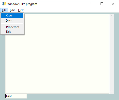
If you want one of your menu items to be disabled, then place a '!' in front of the menu entry. To disable the Paste menu entry in the previous examples, the entry would be:
['!&Edit', ['Paste', ['Special', 'Normal',], 'Undo'],]
If your want to change the disabled menu item flag / character from '!' to something else, change the variable MENU_DISABLED_CHARACTER
Beginning in version 3.17 you can add a key to your menu entries. The key value will be removed prior to be inserted into the menu. When you receive Menu events, the entire menu entry, including the key is returned. A key is indicated by adding :: after a menu entry, followed by the key.
To add the key _MY_KEY_ to the Special menu entry, the code would be:
['&Edit', ['Paste', ['Special::_MY_KEY_', 'Normal',], 'Undo'],]
If you want to change the characters that indicate a key follows from '::' to something else, change the variable MENU_KEY_SEPARATOR
Having read through the Menu section, you may have noticed that the right click menu and the button menu have a format that is a little odd as there is a part of it that is not utilized (the first very string). Perhaps the words "Not Used" should be in the examples.... But, there's a reason to retain words there that make sense.
The reason for this is an architectural one, but it also has a convienence for the user. You can put the individual menu items (button and right click) into a list and you'll have a menu bar definition.
This would work to make a menu bar from a series of these individual menu defintions:
menu_bar = [right_click_menu_1, right_click_menu_2, button_menu_def ]And, of course, the direction works the opposite too. You can take a Menu Bar definition and pull out an individual menu item to create a right click or button menu.
This is where PySimpleGUI continues to be simple, but the problem space just went into the realm of "Complex".
If you wish to run multiple windows in your event loop, then there are 2 methods for doing this.
- First window does not remain active while second window is visible
- First window remains active while second window is visible
You will find the 2 design matters in 2 demo programs in the Demo Program area of the GitHub (http://www.PySimpleGUI.com)
Critically important When creating a new window you must use a "fresh" layout every time. You cannot reuse a layout from a previous window. As a result you will see the layout for window 2 being defined inside of the larger event loop.
If you have a window layout that you used with a window and you've closed the window, you cannot use the specific elements that were in that window. You must RE-CREATE your layout variable every time you create a new window. Read that phrase again.... You must RE-CREATE your layout variable every time you create a new window. That means you should have a statemenat that begins with layout = . Sorry to be stuck on this point, but so many people seem to have trouble following this simple instruction.
Thou shalt not re-use a windows's layout.... ever!
Or more explicitly put....
If you are calling
Windowthen you should define your window layout in the statement just prior to theWindowcall.
There are several "Demo Programs" that will help you run multiple windows. Please download these programs and FOLLOW the example they have created for you.
Here is some of the code patterns you'll find when looking through the demo programs.
import PySimpleGUI as sg

# Design pattern 2 - First window remains active

layout = [[ sg.Text('Window 1'),],
          [sg.Input(do_not_clear=True)],
          [sg.Text(size=(15,1), key='_OUTPUT_')],
          [sg.Button('Launch 2'), sg.Button('Exit')]]

win1 = sg.Window('Window 1', layout)

win2_active = False
while True:
    ev1, vals1 = win1.Read(timeout=100)
    win1.FindElement('_OUTPUT_').Update(vals1[0])
    if ev1 is None or ev1 == 'Exit':
        break

     if not win2_active and ev1 == 'Launch 2':
        win2_active = True
        layout2 = [[sg.Text('Window 2')],
                   [sg.Button('Exit')]]

        win2 = sg.Window('Window 2', layout2)

    if win2_active:
        ev2, vals2 = win2.Read(timeout=100)
        if ev2 is None or ev2 == 'Exit':
            win2_active  = False
win2.Close()import PySimpleGUIQt as sg
# Design pattern 1 - First window does not remain active
layout = [[ sg.Text('Window 1'),],
[sg.Input(do_not_clear=True)],
[sg.Text(size=(15,1), key='_OUTPUT_')],
[sg.Button('Launch 2')]]
win1 = sg.Window('Window 1', layout)
win2_active=False
while True:
ev1, vals1 = win1.Read(timeout=100)
if ev1 is None:
break
win1.FindElement('_OUTPUT_').Update(vals1[0])
if ev1 == 'Launch 2' and not win2_active:
win2_active = True
win1.Hide()
layout2 = [[sg.Text('Window 2')], # note must create a layout from scratch every time. No reuse
[sg.Button('Exit')]]
win2 = sg.Window('Window 2', layout2)
while True:
ev2, vals2 = win2.Read()
if ev2 is None or ev2 == 'Exit':
win2.Close()
win2_active = False
win1.UnHide()
breakListen up if you are
- advanced programmers debugging some really hairy stuff
- programmers from another era that like to debug this way
- those that want to have "x-ray vision" into their code
- asked to use debugger to gather information
- running on a platform that lacks ANY debugger
- debugging a problem that happens only outside of a debugger environment
- finding yourself saying "but it works when running PyCharm"
Starting on June 1, 2019, a built-in version of the debugger imwatchingyou has been shipping in every copy of PySimpleGUI. It's been largely downplayed to gauge whether or not the added code and the added feature and the use of a couple of keys, would mess up any users. Over 30,000 users have installed PySimpleGUI since then and there's not be a single Issue filed nor comment/complaint made, so seems safe enough to normal users... so far....
So far no one has reported anything at all about the debugger. The assumption is that it is quietly lying dormant, waiting for you to press the BREAK or CONTROL + BREAK keys. It's odd no one has accidently done this and freaked out, logging an Issue.
The plain PySimpleGUI module has a debugger builtin. For the other ports, please use the package imwatchingyou.
This debugger provides you with something unique to most typical Python developers, the ability to "see" and interact with your code, while it is running. You can change variable values while your code continues to run.
Print statements are cool, but perhaps you're tired of seeing a printout of event and values:
Push Me {0: 'Input here'}
Push Me {0: 'Input here'}
Push Me {0: 'Input here'}
And would prefer to see this window updating continuously in the upper right corner of your display:
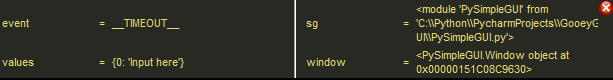
Notice how easy it is, using this window alone, to get the location that your PySimpleGUI package is coming from for sure, no guessing. Expect this window to be in your debugging future as it'll get asked for from time to time.
If your program is running with blocking Read calls, then you will want to add a timeout to your reads. This is because the debugger gets it's cycles by stealing a little bit of time from these async calls... but only when you have one of these debugger windows open so no bitching about wasted CPU time as there is none.
Your event loop will be modified from this blocking:
while True:
    event, values = window.read()
To this non-blocking:
while True:
    event, values = window.Read(timeout=200)
    if event == sg.TIMEOUT_KEY:
        continue
These 3 lines will in no way change how your application looks and performs. You can do this to any PySimpleGUI app that uses a blocking read and you'll not notice a difference. The reason this is a NOP (No-operation) is that when a timeout happens, the envent will be set to sg.TIMEOUT_KEY. If a timeout is returned as the event, the code simply ignores it and restarts the loop by executing a continue statement.
This timeout value of 200 means that your debugger GUI will be updated 5 times a second if nothing is happening. If this adds too much "drag" to your application, you can make the timeout larger. Try using 500 or 1000 instead of 100.
Let's say you're in a situation where a very intermettent bug has just happened and the debugger would really help you, but you don't have a timeout on your windows.Read() call. It's OK. Recall that the way the debugger gets its "cycles" is to borrow from your Read calls. What you need to do is alternate between using the debugger and then generating another pass through your event loop.
Maybe it's an OK button that will cause your loop to execute again (without exiting). If so, you can use it to help move the debugger along.
Yes, this is a major pain in the ass, but it's not THAT bad and compared to nothing in a time of crisis and this is potentially your "savior tool" that's going to save your ass, pressing that OK button a few times is going to look like nothing to you. You just want to dump out the value of a variable that holds an instance of your class!
Now that you understand how to add the debugger to your program, let's make a simple little program that you can use to follow these examples:
import PySimpleGUI as sg

window = sg.Window('Testing the Debugger', [[sg.Text('Debugger Tester'), sg.In('Input here'), sg.B('Push Me')]])

while True:
    event, values = window.Read(timeout=500)
    if event == sg.TIMEOUT_KEY:
        continue
    if event is None:
        break
    print(event, values)
window.Close()There are 2 debugger windows. One is called the "Popout" debugger window. The Popout window displays as many currently in-scope local variables as possible. This window is not interactive. It is meant to be a frequently updated "dashboard" or "snapshot" of your variables.
One "variable" shown in the popout window that is an often asked for piece of information when debugging Issues and that variable is sg (or whatever you named the PySimpleGUI pacakge when you did your import). The assumption is that your import is import PySimpleGUI as sg. If your import is different, then you'll see a different variable. The point is that it's shown here.
Exiting this window is done via the little red X, or using the rickt-click menu which is also used as one way to launch the Main Debugger Window
There are 3 ways of opening the Popout window.
- Press the
BREAKkey on your keyboard. - Call the function
show_debugger_popout_window(location=(x,y)) - Add
Debug()button to your layout - adds a little purple and yellow PySimpleGUI logo to your window
If you wish to use the debugger to find the location of THIS running program's PySimpleGUI package / the PySimpleGUI.py file, then all you need to do is:
- Press the
BREAKkey on your keyboard.- This is sometimes labelled as the
Cancelkey - May also have
Pauseprinted on key - On some US keyboards, it is located next to
Scroll Lockand/or abovePageUpkey
- This is sometimes labelled as the
- This will open a window located in the upper right corner of your screen that looks something like this:
- The information you are seeking is shown next to the
sgin the window You don't need to modify your program to get this info using this technique.
If your variable's value is too long and doesn't fit, then you'lll need to collect this information using the "Main Debugger Window"
The Popup window is a "Snapshot" of your local variables at the time the window was opened. This means any variables that did not exist at the time the Popout was created will not be shown. This window does NOT expand in size by adding new variables. Maybe in the future.
Now we're talking serious Python debugging!
Ever wish you had a repl>>> prompt that you could run while your program is running. Well, that's pretty much what you're getting with the PySimpleGUI debugger Main Window! Cool, huh? If you're not impressed, go get a cup of coffee and walk off that distraction in your head before carring on because we're in to some seriously cool shit here....
You'll find that this window has 2 tabs, one is labelled Variables and the other is labelled REPL & Watches
There are 3 ways to open the Main Debugger Window
- Press
Control+Breakon your PC keyboard - From the Popout Debug Window, right click and choose
Debuggerfrom the right click menu - From your code call
show_debugger_window(location=(x,y))
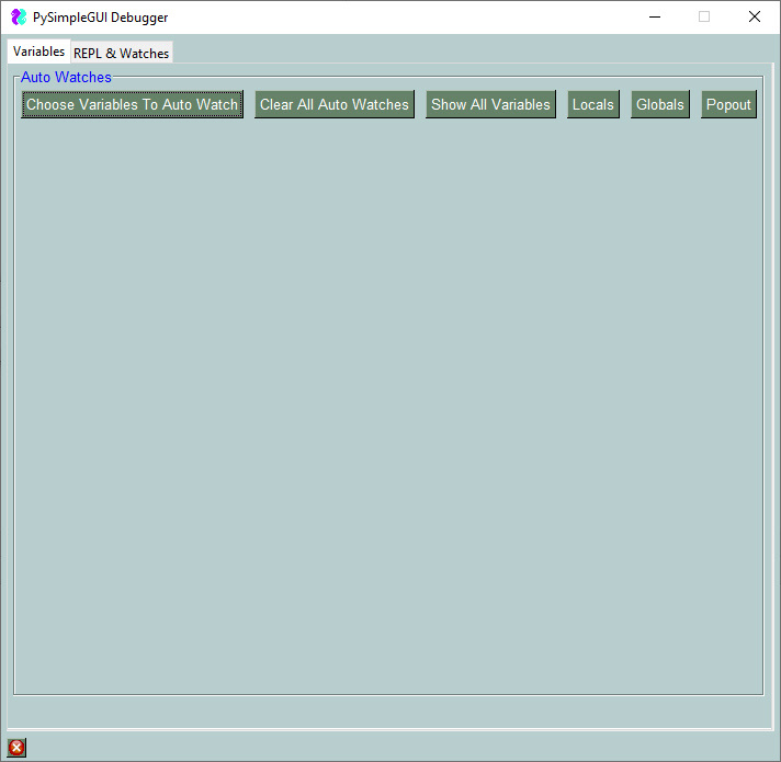
Notice the the "frame" surrounding this window is labelled "Auto Watches" in blue. Like the Popup window, this debugger window also "Watches" variables, which means continuously updates them as often as you call Window.Read.
The maximum number of "watches" you can have any any one time is 9.
You can simply click "Show All Variable" button and the list of watched variables will be automatically populard by the first 9 variables it finds. Or you can click the "Choose Variables to Auto Watch" button where you can individually choose what variables, and expressions you wish to display.
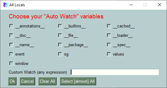
In this window we're checking checkboxes to display these variables:
event, sg, values, window, __file__
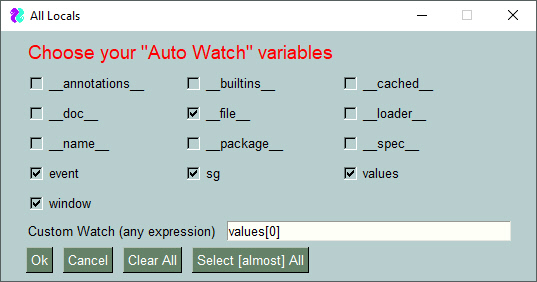
Additionally, you can see at the bottom of the window a "Custom Watch" has been defined. This can be any experession you want. Let's say you have a window with a LOT of values. Rather than looking through the values variable and finding the entry with the key you are looking for, the values variable's entry for a specific key is displayed.
In this example the Custom Watch entered was values[0]. After clicking on the "OK" button, indicating the variables are chosen that we wish to watch, this is the Main window that is shown:
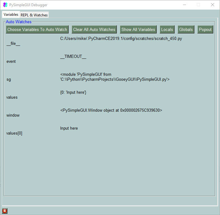
We can see the variables we checked as well as the defined expression values[0]. If you leave this window open, these values with continuously be updated, on the fly, every time we call the line in our example code window.Read(timeout=500). This means that the Main Debugger Window and these variables we defined will be updated every 500 milliseconds.
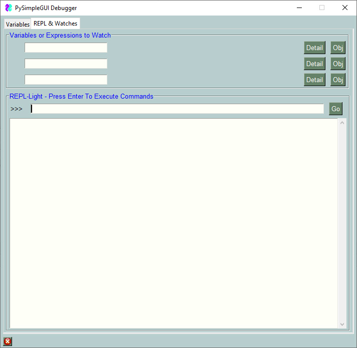
This tab is provided to you as a way to interact with your running program on a real-time basis.
If you want to quickly look at the values of variables, nearly ANY variables, then type the information into one of the 3 spaces provided to "Watch" either variables or experessions. In this example, the variable window was typed into the first slow.
Immediately after typing the character 'w', the information to the right was displayed. No button needs to be clicked. You merely neeed to type in a valid experession and it will be displayed to you.... and it will be displayed on an on-going, constantly-refreshing-basis.
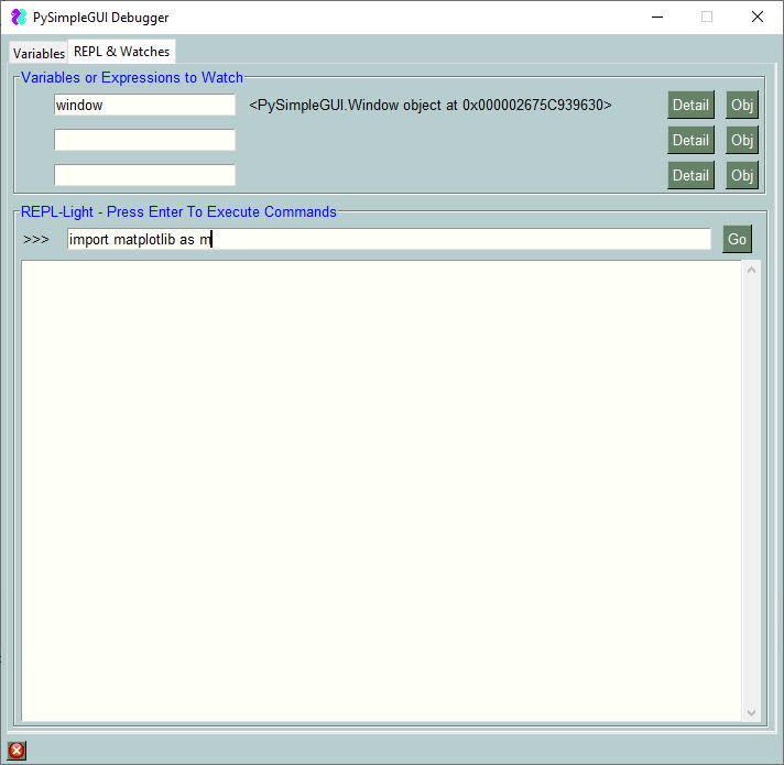
If the area to the right of the input field is too small, then you can click on the "Detail" button and you will be shown a popup, scrolled window with all of the information displayed as if it were printed.
I'm sure you've had the lovely experience of printing an object. When clicking the "Detail" button next to the window variable being shown, this window is shown:
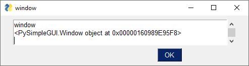
Oh, Python, -sigh-. I just want to see my window object printed.
PySimpleGUI has a fun and very useful function that is discussed in the docs named ObjToString which takes an object and converts it's contents it into a nicely formatted string. This function is used to create the text output when you click the Obj button. The result is this instead of the tiny window shown previously:
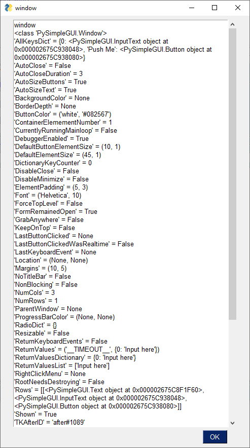
While not really a Python REPL prompt, this window's REPL >>> prompt is meant to act as much like one as possible. Here you can enter experessions and code too.
The uses for this prompt are so numerous and diverse that listing them all won't be attempted.
Think of this prompt as a way to get specific diagnostics information about your running program. It cannot be stressed enough that the power and the usefullness of this tool is in its ability to diagnose a running program, after you've already started it running.
In addition to displaying information, getting paths to packages, finding version information, you can execute code from the PySimpleGUI Debugger's REPL >>> prompt. You can type in any expression as well as any executable statement.
For example, want to see what PopupError looks like while you're running your program. From the REPL prompt, type:
sg.PopupError('This is an error popup')
The result is that you are shown a popup window with the text you supplied.
Using this runtime tool, you can be confident in the data you collect. Right?
There's no better way to find what version of a package that your program is using than to ask your program. This is so true. Think about it. Rather than go into PyCharm, look at your project's "Virtual Environment", follow some path to get to a window that lists packages installed for that project, get the verstion and your're done, right? Well, maybe. But are you CERTAIN your program is using THAT version of the package in question?
SO MUCH time has been wasted in the past when people KNEW, for sure, what version they were running. Or, they had NO CLUE what version, or no clue to find out. There's nothing wrong with not knowing how to do something. We ALL start there. Geeez..
A real world example.....
Let's pull together everything we've learned to now and use the debugger to solve a problem that happens often and sometimes it's not at all obvious how to find the answer.
We're using Matplotlib and want to find the "Version".
For this example, the little 12-line program in the section "A Sample Program For Us To Use" is being used.
That program does not import matplotlib. We have a couple of choices, we can change the code, we can can import the package from the debugger. Let's use the debgger.
Pull up the Main Debugger Window by pressing CONTROL+BREAK keys. Then click the "REPL * Watches" tab. At the >>> prompt we'll first import the package by typing:
import matplotlib as m
The result returned from Python calls that don't return anything is the value None. You will see the command you entered in the output area followed by "None", indicating success.
finally, type:
m.__version__
The entire set of operations is shown in this window:
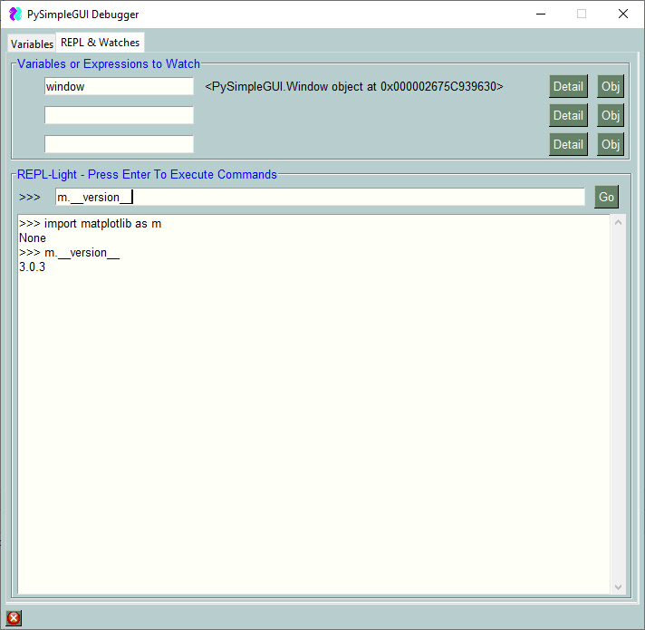
By convention you'll find many modules have a variable __version__ that has the package's version number. PySimpleGUI has one. As you can see matplotlib has one. The requests module has this variable.
For maximum compatibility, PySimpleGUI not only uses __version__, but also has the version contained in another variable version which has the version number because in some situations the __version__ is not available but the version variable is avaiable.
It is recommended that you use the variable version to get the PySimpleGUI version as it's so far been the most successful method.
tkinter, however does NOT.... of course.... follow this convention. No, to get the tkinter version, you need to look at the variable:
TkVersion
Here's the output from the REPL in the debugger showing the tkinter version:
>>> import tkinter as t
None
>>> t.TkVersion
8.6
>>> t.__version__
Exception module 'tkinter' has no attribute '__version__'
PySimpleGUI doesn't and can't provide every single setting available in the underlying GUI framework. Not all tkinter options are available for a Text Element. Same with PySimpleGUIQt and the other ports.
There are a few of reasons for this.
- Time & resource limits - The size of the PySimpleGUI development team is extremely small
- PySimpleGUI provides a "Unified API". This means the code is, in theory, portable across all of the PySimpleGUI ports without chaning the user's code (except for the import)
- PySimpleGUI is meant, by design, to be simple and cover 80% of the GUI problems.
However, PySimpleGUI programs are not dead ends!! Writing PySimpleGUI code and then getting to a point where you really really feel like you need to extend the Listbox to include the ability to change the "Selected" color. Maybe that's super-critical to your project. And maybe you find out late that the base PySimpleGUI code doesn't expose that tkinter capability. Fear not! The road does continue!!
Most of the user extensions / enhancements are at the "Element" level. You want some Element to do a trick that you cannot do using the existing PySimpleGUI APIs. It's just not possible. What to do?
What you need is access to the underlying GUI framework's "Widget". The good news is that you HAVE that access ready and waiting for you, for all of the ports of PySimpleGUI, not just the tkinter one.
The class variable Widget contains the tkinter, Qt, WxPython, or Remi widget. With that variable you can modify that widget directly.
You must first Read or Finalize the window before accessing the Widget class variable
The reason for the Finalize requirement is that until a Window is Read or is Finalized it is not actually created and populated with GUI Widgets. The GUI Widgets are created when you do these 2 operations.
Side note - You can stop using the .Finalize() call added onto your window creation and instead use the finalize parameter in the Window call.
OLD WAY:
window = sg.Window('Window Title', layout).Finalize()THE NEW WAY:
window = sg.Window('Window Title', layout, finalize=True)It's cleaner and less confusing for beginners who aren't necessarily trained in how chaining calls work. PySimpleGUI.
So far there have been 2 uses of this capability. One already mentioned is adding a new capability. The other way it's been used has been to fix a bug or make a workaround for a quirky behavior.
A recent Issue posted was that focus was always being set on a button in a tab when you switch tabs in tkinter. The user didn't want this to happen as it was putting an ugly black line around their nicely made graphical button.
There is no current way in PySimpleGUI to "disable focus" on an Element. That's essentially what was needed, the ability to tell tkinter that this widget should never get focus.
There is a way to tell tkinter that a widget should not get focus. The downside is that if you use your tab key to navigate, that element will never get focus. So, it's not only blocking focus for this automatic problem, but blocking it for all uses. Of course you can still click on the button.
The way through for this user was to modify the tkinter widget directly and tell it not to get focus. This was done in a single line of code:
window[button_key].Widget.config(takefocus=0)The absolute beauty to this solution is that tkinter does NOT need to be imported into the user's program for this statement to run. Python already know what kind of object .Widget is and can thus show you the various methods and class variables for that object. Most all tkinter options are strings so you don't need to import tkinter to get any enums.
Of course, in order to call the methods or access the object's class variables, you need to know the type of the underlying Widget being used. This document could list them all, but the downside is the widget could change types (not a good thing for people using the .Widget already!). It also saves space and time in getting this documentation published and available to you.
So, here's the way to get your element's widget's type:
print(type(window[your_element_key].Widget))In the case of the button example above, what is printed is:
<class 'tkinter.Button'>
I don't think that could be any clearer. Your job at this point is to look at the tkinter documentation to see what the methods are for the tkinter Button widget.
For this one you'll need some specific variables for the time being as there is no Window class variable that holds the window's representation in the GUI library being used.
For tkinter, at the moment, the window's root object is this:
sg.Window.TKrootThe type will vary in PySimpleGUI. It will either be:
tkinter.Tk()
tkinter.Toplevel()
Either way you'll access it using the same Window variable sg.Window.TKroot
Watch this space in the future for the more standardized variable name for this object. It may be something like Window.Widget as the Elements use or something like Window.GUIWindow.
If you wish to receive events directly from tkinter, but do it in a PySimpleGUI way, then you can do that and get those events returned to you via your standard Window.read() call.
Both the Elements and Window objects have a method called bind. You specify 2 parameters to this function. One is the string that is used to tell tkinter what events to bind. The other is a "key modifier" for Elements and a "key" for Windows.
The key_modifier in the Element.bind call is something that is added to your key. If your key is a string, then this modifier will be appended to your key and the event will be a single string.
If your element's key is not a string, then a tuple will be returned as the event (your_key, key_modifier)
This will enable you to continue to use your weird, non-string keys. Just be aware that you'll be getting back a tuple instead of your key in these situations.
The best example of when this can happen is in a Minesweeper game where each button is already a tuple of the (x,y) position of the button. Normal left clicks will return (x,y). A right click that was generated as a result of bind call will be ((x,y), key_modifier).
It'll be tricky for the user to parse these events, but it's assumed you're an advanced user if you're using this capability and are also using non-string keys.
There are 2 member variables that have also been added as shown in the documentation for the bind methods. This added variable contains the tkinter specific event information. In other words, the 'event' that tkinter normally sends back when a callback happens.
Here is sample code that shows how to make these calls.
Three events are being bound.
- Any button clicks in the window will return an event "Window Click" from window.read()
- Right clicking the "Go" buttons will return an event "Go+RIGHT CLICK+" from window.read()
- When the Input Element receives focus, an event "-IN-+FOCUS+" will be returned from window.read()
import PySimpleGUI as sg

sg.theme('Dark Green 2')

layout = [  [sg.Text('My Window')],
            [sg.Input(key='-IN-'), sg.Text(size=(15,1), key='-OUT-')],
            [sg.Button('Go'), sg.Button('Exit')]
              ]

window = sg.Window('Window Title', layout, finalize=True)

window['-IN-'].bind("<FocusIn>", '+FOCUS+')
window.bind("<Button-1>", 'Window Click')
window['Go'].bind("<Button-3>", '+RIGHT CLICK+')

while True:             # Event Loop
    event, values = window.read()
    print(event, values)
    if event in (None, 'Exit'):
        break

window.close(); del windowThis reference section was previously intermixed with the text explanation, diagrams, code samples, etc. That was OK early on, but now that there are more Elements and more methods are being added on a fequent basis, it means that keeping this list updated is a difficult chore if it has a lot of text all around it.
Hoping this is a change for the better and that users will be able to find the information they seek quicker.
NOTE that this documentatiuopn section is created using the GitHUB released PySimpleGUI.py file. Some of the calls may not be available to you or your port (Qt, Wx, Web). And some of the parameters may be different. We're working on adding docstrings to all the ports which will enable this kind of document to be available for each port.
This section of the documentation is generated directly from the source code. As a result, sometimes internal only functions or methods that you are not supposed to be calling are accidently shown in this documentation. Hopefully these accidents don't happen often.
Without further delay... here are all of the Elements and the Window class
Button Element - Defines all possible buttons. The shortcuts such as Submit, FileBrowse, ... each create a Button
Button(button_text="",
    button_type=7,
    target=(None, None),
    tooltip=None,
    file_types=(('ALL Files', '*.*'),),
    initial_folder=None,
    disabled=False,
    change_submits=False,
    enable_events=False,
    image_filename=None,
    image_data=None,
    image_size=(None, None),
    image_subsample=None,
    border_width=None,
    size=(None, None),
    auto_size_button=None,
    button_color=None,
    disabled_button_color=None,
    use_ttk_buttons=None,
    font=None,
    bind_return_key=False,
    focus=False,
    pad=None,
    key=None,
    visible=True,
    metadata=None)
Parameter Descriptions:
| Name | Meaning |
|---|---|
| button_text | (str) Text to be displayed on the button |
| button_type | (int) You should NOT be setting this directly. ONLY the shortcut functions set this |
| target | Union[str, Tuple[int, int]] key or (row,col) target for the button. Note that -1 for column means 1 element to the left of this one. The constant ThisRow is used to indicate the current row. The Button itself is a valid target for some types of button |
| tooltip | (str) text, that will appear when mouse hovers over the element |
| file_types | Tuple[Tuple[str, str], ...] the filetypes that will be used to match files. To indicate all files: (("ALL Files", "."),). Note - NOT SUPPORTED ON MAC |
| initial_folder | (str) starting path for folders and files |
| disabled | (bool) If True button will be created disabled |
| click_submits | (bool) DO NOT USE. Only listed for backwards compat - Use enable_events instead |
| enable_events | (bool) Turns on the element specific events. If this button is a target, should it generate an event when filled in |
| image_filename | (str) image filename if there is a button image. GIFs and PNGs only. |
| image_data | Union[bytes, str] Raw or Base64 representation of the image to put on button. Choose either filename or data |
| image_size | Tuple[int, int] Size of the image in pixels (width, height) |
| image_subsample | (int) amount to reduce the size of the image. Divides the size by this number. 2=1/2, 3=1/3, 4=1/4, etc |
| border_width | (int) width of border around button in pixels |
| size | Tuple[int, int] (width, height) of the button in characters wide, rows high |
| auto_size_button | (bool) if True the button size is sized to fit the text |
| button_color | Tuple[str, str] (text color, background color) of button. Easy to remember which is which if you say "ON" between colors. "red" on "green". |
| disabled_button_color | Tuple[str, str] colors to use when button is disabled (text, background). Use None for a color if don't want to change. Only ttk buttons support both text and background colors. tk buttons only support changing text color |
| use_ttk_buttons | (bool) True = use ttk buttons. False = do not use ttk buttons. None (Default) = use ttk buttons only if on a Mac and not with button images |
| font | Union[str, Tuple[str, int]] specifies the font family, size, etc |
| bind_return_key | (bool) If True the return key will cause this button to be pressed |
| focus | (bool) if True, initial focus will be put on this button |
| pad | (int, int) or ((int, int),(int,int)) Amount of padding to put around element (left/right, top/bottom) or ((left, right), (top, bottom)) |
| key | (Any) Used with window.FindElement and with return values to uniquely identify this element to uniquely identify this element |
| visible | (bool) set visibility state of the element |
| metadata | (Any) User metadata that can be set to ANYTHING |
Generates a click of the button as if the user clicked the button Calls the tkinter invoke method for the button
Click()Returns the current text shown on a button
GetText()
| Name | Meaning |
|---|---|
| return | (str) The text currently displayed on the button |
Sets the current focus to be on this element
SetFocus(force=False)
Parameter Descriptions:
| Name | Meaning |
|---|---|
| force | (bool) if True will call focus_force otherwise calls focus_set |
Called by application to change the tooltip text for an Element. Normally invoked using the Element Object such as: window.Element('key').SetToolTip('New tip').
SetTooltip(tooltip_text)
Parameter Descriptions:
| Name | Meaning |
|---|---|
| tooltip_text | (str) the text to show in tooltip. |
Changes some of the settings for the Button Element. Must call Window.Read or Window.Finalize prior
Update(text=None,
    button_color=(None, None),
    disabled=None,
    image_data=None,
    image_filename=None,
    visible=None,
    image_subsample=None,
    disabled_button_color=(None, None),
    image_size=None)
Parameter Descriptions:
| Name | Meaning |
|---|---|
| text | (str) sets button text |
| button_color | Tuple[str, str] (text color, background color) of button. Easy to remember which is which if you say "ON" between colors. "red" on "green" |
| disabled | (bool) disable or enable state of the element |
| image_data | Union[bytes, str] Raw or Base64 representation of the image to put on button. Choose either filename or data |
| image_filename | (str) image filename if there is a button image. GIFs and PNGs only. |
| disabled_button_color | Tuple[str, str] colors to use when button is disabled (text, background). Use None for a color if don't want to change. Only ttk buttons support both text and background colors. tk buttons only support changing text color |
| visible | (bool) control visibility of element |
| image_subsample | (int) amount to reduce the size of the image. Divides the size by this number. 2=1/2, 3=1/3, 4=1/4, etc |
| image_size | Tuple[int, int] Size of the image in pixels (width, height) |
Used to add tkinter events to an Element. The tkinter specific data is in the Element's member variable user_bind_event
bind(bind_string, key_modifier)
Parameter Descriptions:
| Name | Meaning |
|---|---|
| bind_string | The string tkinter expected in its bind function |
| key_modifier | Additional data to be added to the element's key when event is returned |
*** DEPRICATED *** Use Element.bind instead
button_rebound_callback(event)
Parameter Descriptions:
| Name | Meaning |
|---|---|
| event | (unknown) Not used in this function. |
Generates a click of the button as if the user clicked the button Calls the tkinter invoke method for the button
click()Causes the Element to expand to fill available space in the X and Y directions. Can specify which or both directions
expand(expand_x=False,
    expand_y=False,
    expand_row=True)
Parameter Descriptions:
| Name | Meaning |
|---|---|
| expand_x | (Bool) If True Element will expand in the Horizontal directions |
| expand_y | (Bool) If True Element will expand in the Vertical directions |
| expand_row | (Bool) If True the row containing the element will also expand. Without this your element is "trapped" within the row |
Return the size of an element in Pixels. Care must be taken as some elements use characters to specify their size but will return pixels when calling this get_size method.
get_size()
| Name | Meaning |
|---|---|
| return | Tuple[int, int] - Width, Height of the element |
Returns the current text shown on a button
get_text()
| Name | Meaning |
|---|---|
| return | (str) The text currently displayed on the button |
Hide the entire row an Element is located on. Use this if you must have all space removed when you are hiding an element, including the row container
hide_row()Sets the current focus to be on this element
set_focus(force=False)
Parameter Descriptions:
| Name | Meaning |
|---|---|
| force | (bool) if True will call focus_force otherwise calls focus_set |
Changes the size of an element to a specific size. It's possible to specify None for one of sizes so that only 1 of the element's dimensions are changed.
set_size(size=(None, None))
Parameter Descriptions:
| Name | Meaning |
|---|---|
| size | Tuple[int, int] The size in characters, rows typically. In some cases they are pixels |
Called by application to change the tooltip text for an Element. Normally invoked using the Element Object such as: window.Element('key').SetToolTip('New tip').
set_tooltip(tooltip_text)
Parameter Descriptions:
| Name | Meaning |
|---|---|
| tooltip_text | (str) the text to show in tooltip. |
Unhides (makes visible again) the row container that the Element is located on. Note that it will re-appear at the bottom of the window / container, most likely.
unhide_row()Changes some of the settings for the Button Element. Must call Window.Read or Window.Finalize prior
update(text=None,
    button_color=(None, None),
    disabled=None,
    image_data=None,
    image_filename=None,
    visible=None,
    image_subsample=None,
    disabled_button_color=(None, None),
    image_size=None)
Parameter Descriptions:
| Name | Meaning |
|---|---|
| text | (str) sets button text |
| button_color | Tuple[str, str] (text color, background color) of button. Easy to remember which is which if you say "ON" between colors. "red" on "green" |
| disabled | (bool) disable or enable state of the element |
| image_data | Union[bytes, str] Raw or Base64 representation of the image to put on button. Choose either filename or data |
| image_filename | (str) image filename if there is a button image. GIFs and PNGs only. |
| disabled_button_color | Tuple[str, str] colors to use when button is disabled (text, background). Use None for a color if don't want to change. Only ttk buttons support both text and background colors. tk buttons only support changing text color |
| visible | (bool) control visibility of element |
| image_subsample | (int) amount to reduce the size of the image. Divides the size by this number. 2=1/2, 3=1/3, 4=1/4, etc |
| image_size | Tuple[int, int] Size of the image in pixels (width, height) |
The Button Menu Element. Creates a button that when clicked will show a menu similar to right click menu
ButtonMenu(button_text,
    menu_def,
    tooltip=None,
    disabled=False,
    image_filename=None,
    image_data=None,
    image_size=(None, None),
    image_subsample=None,
    border_width=None,
    size=(None, None),
    auto_size_button=None,
    button_color=None,
    font=None,
    pad=None,
    key=None,
    tearoff=False,
    visible=True,
    metadata=None)
Parameter Descriptions:
| Name | Meaning |
|---|---|
| button_text | (str) Text to be displayed on the button |
| menu_def | List[List[str]] A list of lists of Menu items to show when this element is clicked. See docs for format as they are the same for all menu types |
| tooltip | (str) text, that will appear when mouse hovers over the element |
| disabled | (bool) If True button will be created disabled |
| image_filename | (str) image filename if there is a button image. GIFs and PNGs only. |
| image_data | Union[bytes, str] Raw or Base64 representation of the image to put on button. Choose either filename or data |
| image_size | Tuple[int, int] Size of the image in pixels (width, height) |
| image_subsample | (int) amount to reduce the size of the image. Divides the size by this number. 2=1/2, 3=1/3, 4=1/4, etc |
| border_width | (int) width of border around button in pixels |
| size | Tuple[int, int] (width, height) of the button in characters wide, rows high |
| auto_size_button | (bool) if True the button size is sized to fit the text |
| button_color | Tuple[str, str] (text color, background color) of button. Easy to remember which is which if you say "ON" between colors. "red" on "green" |
| font | Union[str, Tuple[str, int]] specifies the font family, size, etc |
| pad | (int, int) or ((int, int),(int,int)) Amount of padding to put around element (left/right, top/bottom) or ((left, right), (top, bottom)) |
| key | (Any) Used with window.FindElement and with return values to uniquely identify this element to uniquely identify this element |
| tearoff | (bool) Determines if menus should allow them to be torn off |
| visible | (bool) set visibility state of the element |
| metadata | (Any) User metadata that can be set to ANYTHING |
*** DEPRICATED *** Use Element.bind instead
ButtonReboundCallback(event)
Parameter Descriptions:
| Name | Meaning |
|---|---|
| event | (unknown) Not used in this function. |
Generates a click of the button as if the user clicked the button Calls the tkinter invoke method for the button
Click()Sets the current focus to be on this element
SetFocus(force=False)
Parameter Descriptions:
| Name | Meaning |
|---|---|
| force | (bool) if True will call focus_force otherwise calls focus_set |
Called by application to change the tooltip text for an Element. Normally invoked using the Element Object such as: window.Element('key').SetToolTip('New tip').
SetTooltip(tooltip_text)
Parameter Descriptions:
| Name | Meaning |
|---|---|
| tooltip_text | (str) the text to show in tooltip. |
Changes some of the settings for the ButtonMenu Element. Must call Window.Read or Window.Finalize prior
Update(menu_definition, visible=None)
Parameter Descriptions:
| Name | Meaning |
|---|---|
| menu_definition | (List[List]) New menu definition (in menu definition format) |
| visible | (bool) control visibility of element |
Used to add tkinter events to an Element. The tkinter specific data is in the Element's member variable user_bind_event
bind(bind_string, key_modifier)
Parameter Descriptions:
| Name | Meaning |
|---|---|
| bind_string | The string tkinter expected in its bind function |
| key_modifier | Additional data to be added to the element's key when event is returned |
*** DEPRICATED *** Use Element.bind instead
button_rebound_callback(event)
Parameter Descriptions:
| Name | Meaning |
|---|---|
| event | (unknown) Not used in this function. |
Causes the Element to expand to fill available space in the X and Y directions. Can specify which or both directions
expand(expand_x=False,
    expand_y=False,
    expand_row=True)
Parameter Descriptions:
| Name | Meaning |
|---|---|
| expand_x | (Bool) If True Element will expand in the Horizontal directions |
| expand_y | (Bool) If True Element will expand in the Vertical directions |
| expand_row | (Bool) If True the row containing the element will also expand. Without this your element is "trapped" within the row |
Return the size of an element in Pixels. Care must be taken as some elements use characters to specify their size but will return pixels when calling this get_size method.
get_size()
| Name | Meaning |
|---|---|
| return | Tuple[int, int] - Width, Height of the element |
Hide the entire row an Element is located on. Use this if you must have all space removed when you are hiding an element, including the row container
hide_row()Sets the current focus to be on this element
set_focus(force=False)
Parameter Descriptions:
| Name | Meaning |
|---|---|
| force | (bool) if True will call focus_force otherwise calls focus_set |
Changes the size of an element to a specific size. It's possible to specify None for one of sizes so that only 1 of the element's dimensions are changed.
set_size(size=(None, None))
Parameter Descriptions:
| Name | Meaning |
|---|---|
| size | Tuple[int, int] The size in characters, rows typically. In some cases they are pixels |
Called by application to change the tooltip text for an Element. Normally invoked using the Element Object such as: window.Element('key').SetToolTip('New tip').
set_tooltip(tooltip_text)
Parameter Descriptions:
| Name | Meaning |
|---|---|
| tooltip_text | (str) the text to show in tooltip. |
Unhides (makes visible again) the row container that the Element is located on. Note that it will re-appear at the bottom of the window / container, most likely.
unhide_row()Changes some of the settings for the ButtonMenu Element. Must call Window.Read or Window.Finalize prior
update(menu_definition, visible=None)
Parameter Descriptions:
| Name | Meaning |
|---|---|
| menu_definition | (List[List]) New menu definition (in menu definition format) |
| visible | (bool) control visibility of element |
Canvas(canvas=None,
    background_color=None,
    size=(None, None),
    pad=None,
    key=None,
    tooltip=None,
    right_click_menu=None,
    visible=True,
    metadata=None)
Parameter Descriptions:
| Name | Meaning |
|---|---|
| canvas | (tk.Canvas) Your own tk.Canvas if you already created it. Leave blank to create a Canvas |
| background_color | (str) color of background |
| size | Tuple[int,int] (width in char, height in rows) size in pixels to make canvas |
| pad | Amount of padding to put around element |
| key | (Any) Used with window.FindElement and with return values to uniquely identify this element |
| tooltip | (str) text, that will appear when mouse hovers over the element |
| right_click_menu | List[List[Union[List[str],str]]] A list of lists of Menu items to show when this element is right clicked. See user docs for exact format. |
| visible | (bool) set visibility state of the element |
| metadata | (Any) User metadata that can be set to ANYTHING |
*** DEPRICATED *** Use Element.bind instead
ButtonReboundCallback(event)
Parameter Descriptions:
| Name | Meaning |
|---|---|
| event | (unknown) Not used in this function. |
Sets the current focus to be on this element
SetFocus(force=False)
Parameter Descriptions:
| Name | Meaning |
|---|---|
| force | (bool) if True will call focus_force otherwise calls focus_set |
Called by application to change the tooltip text for an Element. Normally invoked using the Element Object such as: window.Element('key').SetToolTip('New tip').
SetTooltip(tooltip_text)
Parameter Descriptions:
| Name | Meaning |
|---|---|
| tooltip_text | (str) the text to show in tooltip. |
Used to add tkinter events to an Element. The tkinter specific data is in the Element's member variable user_bind_event
bind(bind_string, key_modifier)
Parameter Descriptions:
| Name | Meaning |
|---|---|
| bind_string | The string tkinter expected in its bind function |
| key_modifier | Additional data to be added to the element's key when event is returned |
*** DEPRICATED *** Use Element.bind instead
button_rebound_callback(event)
Parameter Descriptions:
| Name | Meaning |
|---|---|
| event | (unknown) Not used in this function. |
Causes the Element to expand to fill available space in the X and Y directions. Can specify which or both directions
expand(expand_x=False,
    expand_y=False,
    expand_row=True)
Parameter Descriptions:
| Name | Meaning |
|---|---|
| expand_x | (Bool) If True Element will expand in the Horizontal directions |
| expand_y | (Bool) If True Element will expand in the Vertical directions |
| expand_row | (Bool) If True the row containing the element will also expand. Without this your element is "trapped" within the row |
Return the size of an element in Pixels. Care must be taken as some elements use characters to specify their size but will return pixels when calling this get_size method.
get_size()
| Name | Meaning |
|---|---|
| return | Tuple[int, int] - Width, Height of the element |
Hide the entire row an Element is located on. Use this if you must have all space removed when you are hiding an element, including the row container
hide_row()Sets the current focus to be on this element
set_focus(force=False)
Parameter Descriptions:
| Name | Meaning |
|---|---|
| force | (bool) if True will call focus_force otherwise calls focus_set |
Changes the size of an element to a specific size. It's possible to specify None for one of sizes so that only 1 of the element's dimensions are changed.
set_size(size=(None, None))
Parameter Descriptions:
| Name | Meaning |
|---|---|
| size | Tuple[int, int] The size in characters, rows typically. In some cases they are pixels |
Called by application to change the tooltip text for an Element. Normally invoked using the Element Object such as: window.Element('key').SetToolTip('New tip').
set_tooltip(tooltip_text)
Parameter Descriptions:
| Name | Meaning |
|---|---|
| tooltip_text | (str) the text to show in tooltip. |
Unhides (makes visible again) the row container that the Element is located on. Note that it will re-appear at the bottom of the window / container, most likely.
unhide_row()Checkbox Element - Displays a checkbox and text next to it
Checkbox(text,
    default=False,
    size=(None, None),
    auto_size_text=None,
    font=None,
    background_color=None,
    text_color=None,
    change_submits=False,
    enable_events=False,
    disabled=False,
    key=None,
    pad=None,
    tooltip=None,
    visible=True,
    metadata=None)
Parameter Descriptions:
| Name | Meaning |
|---|---|
| text | (str) Text to display next to checkbox |
| default | (bool). Set to True if you want this checkbox initially checked |
| size | Tuple[int, int] (width, height) width = characters-wide, height = rows-high |
| auto_size_text | (bool) if True will size the element to match the length of the text |
| font | Union[str, Tuple[str, int]] specifies the font family, size, etc |
| background_color | (str) color of background |
| text_color | (str) color of the text |
| change_submits | (bool) DO NOT USE. Only listed for backwards compat - Use enable_events instead |
| enable_events | (bool) Turns on the element specific events. Checkbox events happen when an item changes |
| disabled | (bool) set disable state |
| key | (Any) Used with window.FindElement and with return values to uniquely identify this element |
| pad | (int, int) or ((int, int),(int,int)) Amount of padding to put around element (left/right, top/bottom) or ((left, right), (top, bottom)) |
| tooltip | (str) text, that will appear when mouse hovers over the element |
| visible | (bool) set visibility state of the element |
| metadata | (Any) User metadata that can be set to ANYTHING |
*** DEPRICATED *** Use Element.bind instead
ButtonReboundCallback(event)
Parameter Descriptions:
| Name | Meaning |
|---|---|
| event | (unknown) Not used in this function. |
Return the current state of this checkbox
Get()
| Name | Meaning |
|---|---|
| return | (bool) Current state of checkbox |
Sets the current focus to be on this element
SetFocus(force=False)
Parameter Descriptions:
| Name | Meaning |
|---|---|
| force | (bool) if True will call focus_force otherwise calls focus_set |
Called by application to change the tooltip text for an Element. Normally invoked using the Element Object such as: window.Element('key').SetToolTip('New tip').
SetTooltip(tooltip_text)
Parameter Descriptions:
| Name | Meaning |
|---|---|
| tooltip_text | (str) the text to show in tooltip. |
Changes some of the settings for the Checkbox Element. Must call Window.Read or Window.Finalize prior.
Note that changing visibility may cause element to change locations when made visible after invisible
Update(value=None,
    disabled=None,
    visible=None)
Parameter Descriptions:
| Name | Meaning |
|---|---|
| value | (bool) if True checks the checkbox, False clears it |
| disabled | (bool) disable or enable element |
| visible | (bool) control visibility of element |
Used to add tkinter events to an Element. The tkinter specific data is in the Element's member variable user_bind_event
bind(bind_string, key_modifier)
Parameter Descriptions:
| Name | Meaning |
|---|---|
| bind_string | The string tkinter expected in its bind function |
| key_modifier | Additional data to be added to the element's key when event is returned |
*** DEPRICATED *** Use Element.bind instead
button_rebound_callback(event)
Parameter Descriptions:
| Name | Meaning |
|---|---|
| event | (unknown) Not used in this function. |
Causes the Element to expand to fill available space in the X and Y directions. Can specify which or both directions
expand(expand_x=False,
    expand_y=False,
    expand_row=True)
Parameter Descriptions:
| Name | Meaning |
|---|---|
| expand_x | (Bool) If True Element will expand in the Horizontal directions |
| expand_y | (Bool) If True Element will expand in the Vertical directions |
| expand_row | (Bool) If True the row containing the element will also expand. Without this your element is "trapped" within the row |
Return the current state of this checkbox
get()
| Name | Meaning |
|---|---|
| return | (bool) Current state of checkbox |
Return the size of an element in Pixels. Care must be taken as some elements use characters to specify their size but will return pixels when calling this get_size method.
get_size()
| Name | Meaning |
|---|---|
| return | Tuple[int, int] - Width, Height of the element |
Hide the entire row an Element is located on. Use this if you must have all space removed when you are hiding an element, including the row container
hide_row()Sets the current focus to be on this element
set_focus(force=False)
Parameter Descriptions:
| Name | Meaning |
|---|---|
| force | (bool) if True will call focus_force otherwise calls focus_set |
Changes the size of an element to a specific size. It's possible to specify None for one of sizes so that only 1 of the element's dimensions are changed.
set_size(size=(None, None))
Parameter Descriptions:
| Name | Meaning |
|---|---|
| size | Tuple[int, int] The size in characters, rows typically. In some cases they are pixels |
Called by application to change the tooltip text for an Element. Normally invoked using the Element Object such as: window.Element('key').SetToolTip('New tip').
set_tooltip(tooltip_text)
Parameter Descriptions:
| Name | Meaning |
|---|---|
| tooltip_text | (str) the text to show in tooltip. |
Unhides (makes visible again) the row container that the Element is located on. Note that it will re-appear at the bottom of the window / container, most likely.
unhide_row()Changes some of the settings for the Checkbox Element. Must call Window.Read or Window.Finalize prior.
Note that changing visibility may cause element to change locations when made visible after invisible
update(value=None,
    disabled=None,
    visible=None)
Parameter Descriptions:
| Name | Meaning |
|---|---|
| value | (bool) if True checks the checkbox, False clears it |
| disabled | (bool) disable or enable element |
| visible | (bool) control visibility of element |
A container element that is used to create a layout within your window's layout
Column(layout,
    background_color=None,
    size=(None, None),
    pad=None,
    scrollable=False,
    vertical_scroll_only=False,
    right_click_menu=None,
    key=None,
    visible=True,
    justification="left",
    element_justification="left",
    metadata=None)
Parameter Descriptions:
| Name | Meaning |
|---|---|
| layout | List[List[Element]] Layout that will be shown in the Column container |
| background_color | (str) color of background of entire Column |
| size | Tuple[int, int] (width, height) size in pixels (doesn't work quite right, sometimes only 1 dimension is set by tkinter |
| pad | (int, int) or ((int, int),(int,int)) Amount of padding to put around element (left/right, top/bottom) or ((left, right), (top, bottom)) |
| scrollable | (bool) if True then scrollbars will be added to the column |
| vertical_scroll_only | (bool) if Truen then no horizontal scrollbar will be shown |
| right_click_menu | List[List[Union[List[str],str]]] A list of lists of Menu items to show when this element is right clicked. See user docs for exact format. |
| key | (any) Value that uniquely identifies this element from all other elements. Used when Finding an element or in return values. Must be unique to the window |
| visible | (bool) set visibility state of the element |
| justification | (str) set justification for the Column itself. Note entire row containing the Column will be affected |
| element_justification | (str) All elements inside the Column will have this justification 'left', 'right', 'center' are valid values |
| metadata | (Any) User metadata that can be set to ANYTHING |
*** DEPRICATED *** Use Element.bind instead
ButtonReboundCallback(event)
Parameter Descriptions:
| Name | Meaning |
|---|---|
| event | (unknown) Not used in this function. |
Sets the current focus to be on this element
SetFocus(force=False)
Parameter Descriptions:
| Name | Meaning |
|---|---|
| force | (bool) if True will call focus_force otherwise calls focus_set |
Called by application to change the tooltip text for an Element. Normally invoked using the Element Object such as: window.Element('key').SetToolTip('New tip').
SetTooltip(tooltip_text)
Parameter Descriptions:
| Name | Meaning |
|---|---|
| tooltip_text | (str) the text to show in tooltip. |
Changes some of the settings for the Column Element. Must call Window.Read or Window.Finalize prior
Update(visible=None)
Parameter Descriptions:
| Name | Meaning |
|---|---|
| visible | (bool) control visibility of element |
Not recommended user call. Used to add rows of Elements to the Column Element.
add_row(args)
Parameter Descriptions:
| Name | Meaning |
|---|---|
| *args | List[Element] The list of elements for this row |
Used to add tkinter events to an Element. The tkinter specific data is in the Element's member variable user_bind_event
bind(bind_string, key_modifier)
Parameter Descriptions:
| Name | Meaning |
|---|---|
| bind_string | The string tkinter expected in its bind function |
| key_modifier | Additional data to be added to the element's key when event is returned |
*** DEPRICATED *** Use Element.bind instead
button_rebound_callback(event)
Parameter Descriptions:
| Name | Meaning |
|---|---|
| event | (unknown) Not used in this function. |
Causes the Element to expand to fill available space in the X and Y directions. Can specify which or both directions
expand(expand_x=False,
    expand_y=False,
    expand_row=True)
Parameter Descriptions:
| Name | Meaning |
|---|---|
| expand_x | (Bool) If True Element will expand in the Horizontal directions |
| expand_y | (Bool) If True Element will expand in the Vertical directions |
| expand_row | (Bool) If True the row containing the element will also expand. Without this your element is "trapped" within the row |
Return the size of an element in Pixels. Care must be taken as some elements use characters to specify their size but will return pixels when calling this get_size method.
get_size()
| Name | Meaning |
|---|---|
| return | Tuple[int, int] - Width, Height of the element |
Hide the entire row an Element is located on. Use this if you must have all space removed when you are hiding an element, including the row container
hide_row()Can use like the Window.Layout method, but it's better to use the layout parameter when creating
layout(rows)
Parameter Descriptions:
| Name | Meaning |
|---|---|
| rows | List[List[Element]] The rows of Elements |
| return | (Column) Used for chaining |
Sets the current focus to be on this element
set_focus(force=False)
Parameter Descriptions:
| Name | Meaning |
|---|---|
| force | (bool) if True will call focus_force otherwise calls focus_set |
Changes the size of an element to a specific size. It's possible to specify None for one of sizes so that only 1 of the element's dimensions are changed.
set_size(size=(None, None))
Parameter Descriptions:
| Name | Meaning |
|---|---|
| size | Tuple[int, int] The size in characters, rows typically. In some cases they are pixels |
Called by application to change the tooltip text for an Element. Normally invoked using the Element Object such as: window.Element('key').SetToolTip('New tip').
set_tooltip(tooltip_text)
Parameter Descriptions:
| Name | Meaning |
|---|---|
| tooltip_text | (str) the text to show in tooltip. |
Unhides (makes visible again) the row container that the Element is located on. Note that it will re-appear at the bottom of the window / container, most likely.
unhide_row()Changes some of the settings for the Column Element. Must call Window.Read or Window.Finalize prior
update(visible=None)
Parameter Descriptions:
| Name | Meaning |
|---|---|
| visible | (bool) control visibility of element |
ComboBox Element - A combination of a single-line input and a drop-down menu. User can type in their own value or choose from list.
Combo(values,
    default_value=None,
    size=(None, None),
    auto_size_text=None,
    background_color=None,
    text_color=None,
    change_submits=False,
    enable_events=False,
    disabled=False,
    key=None,
    pad=None,
    tooltip=None,
    readonly=False,
    font=None,
    visible=True,
    metadata=None)
Parameter Descriptions:
| Name | Meaning |
|---|---|
| values | List[Any] values to choose. While displayed as text, the items returned are what the caller supplied, not text |
| default_value | (Any) Choice to be displayed as initial value. Must match one of values variable contents |
| size | Tuple[int, int] (width, height) width = characters-wide, height = rows-high |
| auto_size_text | (bool) True if element should be the same size as the contents |
| background_color | (str) color of background |
| text_color | (str) color of the text |
| change_submits | (bool) DEPRICATED DO NOT USE. Use enable_events instead |
| enable_events | (bool) Turns on the element specific events. Combo event is when a choice is made |
| disabled | (bool) set disable state for element |
| key | (Any) Used with window.FindElement and with return values to uniquely identify this element |
| pad | (int, int) or ((int, int),(int,int)) Amount of padding to put around element (left/right, top/bottom) or ((left, right), (top, bottom)) |
| tooltip | (str) text that will appear when mouse hovers over this element |
| readonly | (bool) make element readonly (user can't change). True means user cannot change |
| font | Union[str, Tuple[str, int]] specifies the font family, size, etc |
| visible | (bool) set visibility state of the element |
| metadata | (Any) User metadata that can be set to ANYTHING |
*** DEPRICATED *** Use Element.bind instead
ButtonReboundCallback(event)
Parameter Descriptions:
| Name | Meaning |
|---|---|
| event | (unknown) Not used in this function. |
Returns the current (right now) value of the Combo. DO NOT USE THIS AS THE NORMAL WAY OF READING A COMBO! You should be using values from your call to window.Read instead. Know what you're doing if you use it.
Get()
| Name | Meaning |
|---|---|
| return | Union[Any, None] Returns the value of what is currently chosen |
Sets the current focus to be on this element
SetFocus(force=False)
Parameter Descriptions:
| Name | Meaning |
|---|---|
| force | (bool) if True will call focus_force otherwise calls focus_set |
Called by application to change the tooltip text for an Element. Normally invoked using the Element Object such as: window.Element('key').SetToolTip('New tip').
SetTooltip(tooltip_text)
Parameter Descriptions:
| Name | Meaning |
|---|---|
| tooltip_text | (str) the text to show in tooltip. |
Changes some of the settings for the Combo Element. Must call Window.Read or Window.Finalize prior
Update(value=None,
    values=None,
    set_to_index=None,
    disabled=None,
    readonly=None,
    font=None,
    visible=None)
Parameter Descriptions:
| Name | Meaning |
|---|---|
| value | (Any) change which value is current selected hased on new list of previous list of choices |
| values | List[Any] change list of choices |
| set_to_index | (int) change selection to a particular choice starting with index = 0 |
| disabled | (bool) disable or enable state of the element |
| readonly | (bool) if True make element readonly (user cannot change any choices) |
| font | Union[str, Tuple[str, int]] specifies the font family, size, etc |
| visible | (bool) control visibility of element |
Used to add tkinter events to an Element. The tkinter specific data is in the Element's member variable user_bind_event
bind(bind_string, key_modifier)
Parameter Descriptions:
| Name | Meaning |
|---|---|
| bind_string | The string tkinter expected in its bind function |
| key_modifier | Additional data to be added to the element's key when event is returned |
*** DEPRICATED *** Use Element.bind instead
button_rebound_callback(event)
Parameter Descriptions:
| Name | Meaning |
|---|---|
| event | (unknown) Not used in this function. |
Causes the Element to expand to fill available space in the X and Y directions. Can specify which or both directions
expand(expand_x=False,
    expand_y=False,
    expand_row=True)
Parameter Descriptions:
| Name | Meaning |
|---|---|
| expand_x | (Bool) If True Element will expand in the Horizontal directions |
| expand_y | (Bool) If True Element will expand in the Vertical directions |
| expand_row | (Bool) If True the row containing the element will also expand. Without this your element is "trapped" within the row |
Returns the current (right now) value of the Combo. DO NOT USE THIS AS THE NORMAL WAY OF READING A COMBO! You should be using values from your call to window.Read instead. Know what you're doing if you use it.
get()
| Name | Meaning |
|---|---|
| return | Union[Any, None] Returns the value of what is currently chosen |
Return the size of an element in Pixels. Care must be taken as some elements use characters to specify their size but will return pixels when calling this get_size method.
get_size()
| Name | Meaning |
|---|---|
| return | Tuple[int, int] - Width, Height of the element |
Hide the entire row an Element is located on. Use this if you must have all space removed when you are hiding an element, including the row container
hide_row()Sets the current focus to be on this element
set_focus(force=False)
Parameter Descriptions:
| Name | Meaning |
|---|---|
| force | (bool) if True will call focus_force otherwise calls focus_set |
Changes the size of an element to a specific size. It's possible to specify None for one of sizes so that only 1 of the element's dimensions are changed.
set_size(size=(None, None))
Parameter Descriptions:
| Name | Meaning |
|---|---|
| size | Tuple[int, int] The size in characters, rows typically. In some cases they are pixels |
Called by application to change the tooltip text for an Element. Normally invoked using the Element Object such as: window.Element('key').SetToolTip('New tip').
set_tooltip(tooltip_text)
Parameter Descriptions:
| Name | Meaning |
|---|---|
| tooltip_text | (str) the text to show in tooltip. |
Unhides (makes visible again) the row container that the Element is located on. Note that it will re-appear at the bottom of the window / container, most likely.
unhide_row()Changes some of the settings for the Combo Element. Must call Window.Read or Window.Finalize prior
update(value=None,
    values=None,
    set_to_index=None,
    disabled=None,
    readonly=None,
    font=None,
    visible=None)
Parameter Descriptions:
| Name | Meaning |
|---|---|
| value | (Any) change which value is current selected hased on new list of previous list of choices |
| values | List[Any] change list of choices |
| set_to_index | (int) change selection to a particular choice starting with index = 0 |
| disabled | (bool) disable or enable state of the element |
| readonly | (bool) if True make element readonly (user cannot change any choices) |
| font | Union[str, Tuple[str, int]] specifies the font family, size, etc |
| visible | (bool) control visibility of element |
A Frame Element that contains other Elements. Encloses with a line around elements and a text label.
Frame(title,
    layout,
    title_color=None,
    background_color=None,
    title_location=None,
    relief="groove",
    size=(None, None),
    font=None,
    pad=None,
    border_width=None,
    key=None,
    tooltip=None,
    right_click_menu=None,
    visible=True,
    element_justification="left",
    metadata=None)
Parameter Descriptions:
| Name | Meaning |
|---|---|
| title | (str) text that is displayed as the Frame's "label" or title |
| layout | List[List[Elements]] The layout to put inside the Frame |
| title_color | (str) color of the title text |
| background_color | (str) background color of the Frame |
| title_location | (enum) location to place the text title. Choices include: TITLE_LOCATION_TOP TITLE_LOCATION_BOTTOM TITLE_LOCATION_LEFT TITLE_LOCATION_RIGHT TITLE_LOCATION_TOP_LEFT TITLE_LOCATION_TOP_RIGHT TITLE_LOCATION_BOTTOM_LEFT TITLE_LOCATION_BOTTOM_RIGHT |
| relief | (enum) relief style. Values are same as other elements with reliefs. Choices include RELIEF_RAISED RELIEF_SUNKEN RELIEF_FLAT RELIEF_RIDGE RELIEF_GROOVE RELIEF_SOLID |
| size | Tuple[int, int] (width in characters, height in rows) (note this parameter may not always work) |
| font | Union[str, Tuple[str, int]] specifies the font family, size, etc |
| pad | (int, int) or ((int, int),(int,int)) Amount of padding to put around element (left/right, top/bottom) or ((left, right), (top, bottom)) |
| border_width | (int) width of border around element in pixels |
| key | (any) Value that uniquely identifies this element from all other elements. Used when Finding an element or in return values. Must be unique to the window |
| tooltip | (str) text, that will appear when mouse hovers over the element |
| right_click_menu | List[List[Union[List[str],str]]] A list of lists of Menu items to show when this element is right clicked. See user docs for exact format. |
| visible | (bool) set visibility state of the element |
| element_justification | (str) All elements inside the Frame will have this justification 'left', 'right', 'center' are valid values |
| metadata | (Any) User metadata that can be set to ANYTHING |
*** DEPRICATED *** Use Element.bind instead
ButtonReboundCallback(event)
Parameter Descriptions:
| Name | Meaning |
|---|---|
| event | (unknown) Not used in this function. |
Sets the current focus to be on this element
SetFocus(force=False)
Parameter Descriptions:
| Name | Meaning |
|---|---|
| force | (bool) if True will call focus_force otherwise calls focus_set |
Called by application to change the tooltip text for an Element. Normally invoked using the Element Object such as: window.Element('key').SetToolTip('New tip').
SetTooltip(tooltip_text)
Parameter Descriptions:
| Name | Meaning |
|---|---|
| tooltip_text | (str) the text to show in tooltip. |
Changes some of the settings for the Frame Element. Must call Window.Read or Window.Finalize prior
Update(value=None, visible=None)
Parameter Descriptions:
| Name | Meaning |
|---|---|
| value | (Any) New text value to show on frame |
| visible | (bool) control visibility of element |
Used to add tkinter events to an Element. The tkinter specific data is in the Element's member variable user_bind_event
bind(bind_string, key_modifier)
Parameter Descriptions:
| Name | Meaning |
|---|---|
| bind_string | The string tkinter expected in its bind function |
| key_modifier | Additional data to be added to the element's key when event is returned |
*** DEPRICATED *** Use Element.bind instead
button_rebound_callback(event)
Parameter Descriptions:
| Name | Meaning |
|---|---|
| event | (unknown) Not used in this function. |
Causes the Element to expand to fill available space in the X and Y directions. Can specify which or both directions
expand(expand_x=False,
    expand_y=False,
    expand_row=True)
Parameter Descriptions:
| Name | Meaning |
|---|---|
| expand_x | (Bool) If True Element will expand in the Horizontal directions |
| expand_y | (Bool) If True Element will expand in the Vertical directions |
| expand_row | (Bool) If True the row containing the element will also expand. Without this your element is "trapped" within the row |
Return the size of an element in Pixels. Care must be taken as some elements use characters to specify their size but will return pixels when calling this get_size method.
get_size()
| Name | Meaning |
|---|---|
| return | Tuple[int, int] - Width, Height of the element |
Hide the entire row an Element is located on. Use this if you must have all space removed when you are hiding an element, including the row container
hide_row()Sets the current focus to be on this element
set_focus(force=False)
Parameter Descriptions:
| Name | Meaning |
|---|---|
| force | (bool) if True will call focus_force otherwise calls focus_set |
Changes the size of an element to a specific size. It's possible to specify None for one of sizes so that only 1 of the element's dimensions are changed.
set_size(size=(None, None))
Parameter Descriptions:
| Name | Meaning |
|---|---|
| size | Tuple[int, int] The size in characters, rows typically. In some cases they are pixels |
Called by application to change the tooltip text for an Element. Normally invoked using the Element Object such as: window.Element('key').SetToolTip('New tip').
set_tooltip(tooltip_text)
Parameter Descriptions:
| Name | Meaning |
|---|---|
| tooltip_text | (str) the text to show in tooltip. |
Unhides (makes visible again) the row container that the Element is located on. Note that it will re-appear at the bottom of the window / container, most likely.
unhide_row()Changes some of the settings for the Frame Element. Must call Window.Read or Window.Finalize prior
update(value=None, visible=None)
Parameter Descriptions:
| Name | Meaning |
|---|---|
| value | (Any) New text value to show on frame |
| visible | (bool) control visibility of element |
Creates an area for you to draw on.  The MAGICAL property this Element has is that you interact
with the element using your own coordinate system.  This is an important point!!  YOU define where the location
is for (0,0).  Want (0,0) to be in the middle of the graph like a math 4-quadrant graph?  No problem!  Set your
lower left corner to be (-100,-100) and your upper right to be (100,100) and you've got yourself a graph with
(0,0) at the center.
One of THE coolest of the Elements.
You can also use float values. To do so, be sure and set the float_values parameter.
Mouse click and drag events are possible and return the (x,y) coordinates of the mouse
Drawing primitives return an "id" that is referenced when you want to operation on that item (e.g. to erase it)
Graph(canvas_size,
    graph_bottom_left,
    graph_top_right,
    background_color=None,
    pad=None,
    change_submits=False,
    drag_submits=False,
    enable_events=False,
    key=None,
    tooltip=None,
    right_click_menu=None,
    visible=True,
    float_values=False,
    metadata=None)
Parameter Descriptions:
| Name | Meaning |
|---|---|
| canvas_size | Tuple[int, int] (width, height) size of the canvas area in pixels |
| graph_bottom_left | Tuple[int, int] (x,y) The bottoms left corner of your coordinate system |
| graph_top_right | Tuple[int, int] (x,y) The top right corner of your coordinate system |
| background_color | (str) background color of the drawing area |
| pad | (int, int) or ((int, int),(int,int)) Amount of padding to put around element (left/right, top/bottom) or ((left, right), (top, bottom)) |
| change_submits | (bool) * DEPRICATED DO NOT USE! Same as enable_events |
| drag_submits | (bool) if True and Events are enabled for the Graph, will report Events any time the mouse moves while button down |
| enable_events | (bool) If True then clicks on the Graph are immediately reported as an event. Use this instead of change_submits |
| key | (any) Value that uniquely identifies this element from all other elements. Used when Finding an element or in return values. Must be unique to the window |
| tooltip | (str) text, that will appear when mouse hovers over the element |
| right_click_menu | List[List[Union[List[str],str]]] A list of lists of Menu items to show when this element is right clicked. See user docs for exact format. |
| visible | (bool) set visibility state of the element (Default = True) |
| float_values | (bool) If True x,y coordinates are returned as floats, not ints |
| metadata | (Any) User metadata that can be set to ANYTHING |
Changes Z-order of figures on the Graph. Brings the indicated figure to the front of all other drawn figures
BringFigureToFront(figure)
Parameter Descriptions:
| Name | Meaning |
|---|---|
| figure | (int) value returned by tkinter when creating the figure / drawing |
Not a user callable method. Used to get Graph click events. Called by tkinter when button is released
ButtonPressCallBack(event)
Parameter Descriptions:
| Name | Meaning |
|---|---|
| event | (event) event info from tkinter. Contains the x and y coordinates of a click |
*** DEPRICATED *** Use Element.bind instead
ButtonReboundCallback(event)
Parameter Descriptions:
| Name | Meaning |
|---|---|
| event | (unknown) Not used in this function. |
Remove from the Graph the figure represented by id. The id is given to you anytime you call a drawing primitive
DeleteFigure(id)
Parameter Descriptions:
| Name | Meaning |
|---|---|
| id | (int) the id returned to you when calling one of the drawing methods |
Draws different types of arcs. Uses a "bounding box" to define location
DrawArc(top_left,
    bottom_right,
    extent,
    start_angle,
    style=None,
    arc_color="black",
    line_width=1)
Parameter Descriptions:
| Name | Meaning |
|---|---|
| top_left | Union[Tuple[int, int], Tuple[float, float]] the top left point of bounding rectangle |
| bottom_right | Union[Tuple[int, int], Tuple[float, float]] the bottom right point of bounding rectangle |
| extent | (float) Andle to end drawing. Used in conjunction with start_angle |
| start_angle | (float) Angle to begin drawing. Used in conjunction with extent |
| style | (str) Valid choices are One of these Style strings- 'pieslice', 'chord', 'arc', 'first', 'last', 'butt', 'projecting', 'round', 'bevel', 'miter' |
| arc_color | (str) color to draw arc with |
| return | Union[int, None] id returned from tkinter that you'll need if you want to manipulate the arc |
Draws a circle, cenetered at the location provided. Can set the fill and outline colors
DrawCircle(center_location,
    radius,
    fill_color=None,
    line_color="black",
    line_width=1)
Parameter Descriptions:
| Name | Meaning |
|---|---|
| center_location | Union [Tuple[int, int], Tuple[float, float]] Center location using USER'S coordinate system |
| radius | Union[int, float] Radius in user's coordinate values. |
| fill_color | (str) color of the point to draw |
| line_color | (str) color of the outer line that goes around the circle (sorry, can't set thickness) |
| line_width | (int) width of the line around the circle, the outline, in pixels |
| return | Union[int, None] id returned from tkinter that you'll need if you want to manipulate the circle |
Places an image onto your canvas. It's a really important method for this element as it enables so much
DrawImage(filename=None,
    data=None,
    location=(None, None),
    color="black",
    font=None,
    angle=0)
Parameter Descriptions:
| Name | Meaning |
|---|---|
| filename | (str) if image is in a file, path and filename for the image. (GIF and PNG only!) |
| data | Union[str, bytes] if image is in Base64 format or raw? format then use instead of filename |
| location | Union[Tuple[int, int], Tuple[float, float]] the (x,y) location to place image's top left corner |
| color | (str) text color |
| font | Union[str, Tuple[str, int]] specifies the font family, size, etc |
| angle | (float) Angle 0 to 360 to draw the text. Zero represents horizontal text |
| return | Union[int, None] id returned from tkinter that you'll need if you want to manipulate the image |
Draws a line from one point to another point using USER'S coordinates. Can set the color and width of line
DrawLine(point_from,
    point_to,
    color="black",
    width=1)
Parameter Descriptions:
| Name | Meaning |
|---|---|
| point_from | Union[Tuple[int, int], Tuple[float, float]] Starting point for line |
| point_to | Union[Tuple[int, int], Tuple[float, float]] Ending point for line |
| color | (str) Color of the line |
| width | (int) width of line in pixels |
| return | Union[int, None] id returned from tktiner or None if user closed the window. id is used when you want to manipulate the line |
Draws an oval based on coordinates in user coordinate system. Provide the location of a "bounding rectangle"
DrawOval(top_left,
    bottom_right,
    fill_color=None,
    line_color=None,
    line_width=1)
Parameter Descriptions:
| Name | Meaning |
|---|---|
| top_left | Union[Tuple[int, int], Tuple[float, float]] the top left point of bounding rectangle |
| bottom_right | Union[Tuple[int, int], Tuple[float, float]] the bottom right point of bounding rectangle |
| fill_color | (str) color of the interrior |
| line_color | (str) color of outline of oval |
| line_width | (int) width of the line around the oval, the outline, in pixels |
| return | Union[int, None] id returned from tkinter that you'll need if you want to manipulate the oval |
Draws a "dot" at the point you specify using the USER'S coordinate system
DrawPoint(point,
    size=2,
    color="black")
Parameter Descriptions:
| Name | Meaning |
|---|---|
| point | Union [Tuple[int, int], Tuple[float, float]] Center location using USER'S coordinate system |
| size | Union[int, float] Radius? (Or is it the diameter?) in user's coordinate values. |
| color | (str) color of the point to draw |
| return | Union[int, None] id returned from tkinter that you'll need if you want to manipulate the point |
Draw a rectangle given 2 points. Can control the line and fill colors
DrawRectangle(top_left,
    bottom_right,
    fill_color=None,
    line_color=None,
    line_width=None)
Parameter Descriptions:
| Name | Meaning |
|---|---|
| top_left | Union[Tuple[int, int], Tuple[float, float]] the top left point of rectangle |
| bottom_right | Union[Tuple[int, int], Tuple[float, float]] the bottom right point of rectangle |
| fill_color | (str) color of the interior |
| line_color | (str) color of outline |
| return | Union[int, None] id returned from tkinter that you'll need if you want to manipulate the rectangle |
Draw some text on your graph. This is how you label graph number lines for example
DrawText(text,
    location,
    color="black",
    font=None,
    angle=0,
    text_location="center")
Parameter Descriptions:
| Name | Meaning |
|---|---|
| text | (str) text to display |
| location | Union[Tuple[int, int], Tuple[float, float]] location to place first letter |
| color | (str) text color |
| font | Union[str, Tuple[str, int]] specifies the font family, size, etc |
| angle | (float) Angle 0 to 360 to draw the text. Zero represents horizontal text |
| text_location | (enum) "anchor" location for the text. Values start with TEXT_LOCATION_ |
| return | Union[int, None] id returned from tkinter that you'll need if you want to manipulate the text |
Erase the Graph - Removes all figures previously "drawn" using the Graph methods (e.g. DrawText)
Erase()Given a figure, returns the upper left and lower right bounding box coordinates
GetBoundingBox(figure)
Parameter Descriptions:
| Name | Meaning |
|---|---|
| figure | a previously drawing figure |
| return | Union[Tuple[int, int, int, int], Tuple[float, float, float, float]] (upper left x, upper left y, lower right x, lower right y |
Returns a list of figures located at a particular x,y location within the Graph
GetFiguresAtLocation(location)
Parameter Descriptions:
| Name | Meaning |
|---|---|
| location | Union[Tuple[int, int], Tuple[float, float]] point to check |
| return | List[int] a list of previously drawn "Figures" (returned from the drawing primitives) |
Moves the entire drawing area (the canvas) by some delta from the current position. Units are indicated in your coordinate system indicated number of ticks in your coordinate system
Move(x_direction, y_direction)
Parameter Descriptions:
| Name | Meaning |
|---|---|
| x_direction | Union[int, float] how far to move in the "X" direction in your coordinates |
| y_direction | Union[int, float] how far to move in the "Y" direction in your coordinates |
Moves a previously drawn figure using a "delta" from current position
MoveFigure(figure,
    x_direction,
    y_direction)
Parameter Descriptions:
| Name | Meaning |
|---|---|
| figure | (id) Previously obtained figure-id. These are returned from all Draw methods |
| x_direction | Union[int, float] delta to apply to position in the X direction |
| y_direction | Union[int, float] delta to apply to position in the Y direction |
Move a previously made figure to an arbitrary (x,y) location. This differs from the Move methods because it uses absolute coordinates versus relative for Move
RelocateFigure(figure,
    x,
    y)
Parameter Descriptions:
| Name | Meaning |
|---|---|
| figure | (id) Previously obtained figure-id. These are returned from all Draw methods |
| x | Union[int, float] location on X axis (in user coords) to move the upper left corner of the figure |
| y | Union[int, float] location on Y axis (in user coords) to move the upper left corner of the figure |
Changes Z-order of figures on the Graph. Sends the indicated figure to the back of all other drawn figures
SendFigureToBack(figure)
Parameter Descriptions:
| Name | Meaning |
|---|---|
| figure | (int) value returned by tkinter when creating the figure / drawing |
Sets the current focus to be on this element
SetFocus(force=False)
Parameter Descriptions:
| Name | Meaning |
|---|---|
| force | (bool) if True will call focus_force otherwise calls focus_set |
Called by application to change the tooltip text for an Element. Normally invoked using the Element Object such as: window.Element('key').SetToolTip('New tip').
SetTooltip(tooltip_text)
Parameter Descriptions:
| Name | Meaning |
|---|---|
| tooltip_text | (str) the text to show in tooltip. |
Changes some of the settings for the Graph Element. Must call Window.Read or Window.Finalize prior
Update(background_color=None, visible=None)
Parameter Descriptions:
| Name | Meaning |
|---|---|
| background_color | color of background |
| visible | (bool) control visibility of element |
Used to add tkinter events to an Element. The tkinter specific data is in the Element's member variable user_bind_event
bind(bind_string, key_modifier)
Parameter Descriptions:
| Name | Meaning |
|---|---|
| bind_string | The string tkinter expected in its bind function |
| key_modifier | Additional data to be added to the element's key when event is returned |
Changes Z-order of figures on the Graph. Brings the indicated figure to the front of all other drawn figures
bring_figure_to_front(figure)
Parameter Descriptions:
| Name | Meaning |
|---|---|
| figure | (int) value returned by tkinter when creating the figure / drawing |
Not a user callable method. Used to get Graph click events. Called by tkinter when button is released
button_press_call_back(event)
Parameter Descriptions:
| Name | Meaning |
|---|---|
| event | (event) event info from tkinter. Contains the x and y coordinates of a click |
*** DEPRICATED *** Use Element.bind instead
button_rebound_callback(event)
Parameter Descriptions:
| Name | Meaning |
|---|---|
| event | (unknown) Not used in this function. |
Changes the corrdinate system to a new one. The same 2 points in space are used to define the coorinate system - the bottom left and the top right values of your graph.
change_coordinates(graph_bottom_left, graph_top_right)
Parameter Descriptions:
| Name | Meaning |
|---|---|
| graph_bottom_left | Tuple[int, int] (x,y) The bottoms left corner of your coordinate system |
| graph_top_right | Tuple[int, int] (x,y) The top right corner of your coordinate system |
Remove from the Graph the figure represented by id. The id is given to you anytime you call a drawing primitive
delete_figure(id)
Parameter Descriptions:
| Name | Meaning |
|---|---|
| id | (int) the id returned to you when calling one of the drawing methods |
Draws different types of arcs. Uses a "bounding box" to define location
draw_arc(top_left,
    bottom_right,
    extent,
    start_angle,
    style=None,
    arc_color="black",
    line_width=1)
Parameter Descriptions:
| Name | Meaning |
|---|---|
| top_left | Union[Tuple[int, int], Tuple[float, float]] the top left point of bounding rectangle |
| bottom_right | Union[Tuple[int, int], Tuple[float, float]] the bottom right point of bounding rectangle |
| extent | (float) Andle to end drawing. Used in conjunction with start_angle |
| start_angle | (float) Angle to begin drawing. Used in conjunction with extent |
| style | (str) Valid choices are One of these Style strings- 'pieslice', 'chord', 'arc', 'first', 'last', 'butt', 'projecting', 'round', 'bevel', 'miter' |
| arc_color | (str) color to draw arc with |
| return | Union[int, None] id returned from tkinter that you'll need if you want to manipulate the arc |
Draws a circle, cenetered at the location provided. Can set the fill and outline colors
draw_circle(center_location,
    radius,
    fill_color=None,
    line_color="black",
    line_width=1)
Parameter Descriptions:
| Name | Meaning |
|---|---|
| center_location | Union [Tuple[int, int], Tuple[float, float]] Center location using USER'S coordinate system |
| radius | Union[int, float] Radius in user's coordinate values. |
| fill_color | (str) color of the point to draw |
| line_color | (str) color of the outer line that goes around the circle (sorry, can't set thickness) |
| line_width | (int) width of the line around the circle, the outline, in pixels |
| return | Union[int, None] id returned from tkinter that you'll need if you want to manipulate the circle |
Places an image onto your canvas. It's a really important method for this element as it enables so much
draw_image(filename=None,
    data=None,
    location=(None, None),
    color="black",
    font=None,
    angle=0)
Parameter Descriptions:
| Name | Meaning |
|---|---|
| filename | (str) if image is in a file, path and filename for the image. (GIF and PNG only!) |
| data | Union[str, bytes] if image is in Base64 format or raw? format then use instead of filename |
| location | Union[Tuple[int, int], Tuple[float, float]] the (x,y) location to place image's top left corner |
| color | (str) text color |
| font | Union[str, Tuple[str, int]] specifies the font family, size, etc |
| angle | (float) Angle 0 to 360 to draw the text. Zero represents horizontal text |
| return | Union[int, None] id returned from tkinter that you'll need if you want to manipulate the image |
Draws a line from one point to another point using USER'S coordinates. Can set the color and width of line
draw_line(point_from,
    point_to,
    color="black",
    width=1)
Parameter Descriptions:
| Name | Meaning |
|---|---|
| point_from | Union[Tuple[int, int], Tuple[float, float]] Starting point for line |
| point_to | Union[Tuple[int, int], Tuple[float, float]] Ending point for line |
| color | (str) Color of the line |
| width | (int) width of line in pixels |
| return | Union[int, None] id returned from tktiner or None if user closed the window. id is used when you want to manipulate the line |
Draws an oval based on coordinates in user coordinate system. Provide the location of a "bounding rectangle"
draw_oval(top_left,
    bottom_right,
    fill_color=None,
    line_color=None,
    line_width=1)
Parameter Descriptions:
| Name | Meaning |
|---|---|
| top_left | Union[Tuple[int, int], Tuple[float, float]] the top left point of bounding rectangle |
| bottom_right | Union[Tuple[int, int], Tuple[float, float]] the bottom right point of bounding rectangle |
| fill_color | (str) color of the interrior |
| line_color | (str) color of outline of oval |
| line_width | (int) width of the line around the oval, the outline, in pixels |
| return | Union[int, None] id returned from tkinter that you'll need if you want to manipulate the oval |
Draws a "dot" at the point you specify using the USER'S coordinate system
draw_point(point,
    size=2,
    color="black")
Parameter Descriptions:
| Name | Meaning |
|---|---|
| point | Union [Tuple[int, int], Tuple[float, float]] Center location using USER'S coordinate system |
| size | Union[int, float] Radius? (Or is it the diameter?) in user's coordinate values. |
| color | (str) color of the point to draw |
| return | Union[int, None] id returned from tkinter that you'll need if you want to manipulate the point |
Draw a rectangle given 2 points. Can control the line and fill colors
draw_rectangle(top_left,
    bottom_right,
    fill_color=None,
    line_color=None,
    line_width=None)
Parameter Descriptions:
| Name | Meaning |
|---|---|
| top_left | Union[Tuple[int, int], Tuple[float, float]] the top left point of rectangle |
| bottom_right | Union[Tuple[int, int], Tuple[float, float]] the bottom right point of rectangle |
| fill_color | (str) color of the interior |
| line_color | (str) color of outline |
| return | Union[int, None] id returned from tkinter that you'll need if you want to manipulate the rectangle |
Draw some text on your graph. This is how you label graph number lines for example
draw_text(text,
    location,
    color="black",
    font=None,
    angle=0,
    text_location="center")
Parameter Descriptions:
| Name | Meaning |
|---|---|
| text | (str) text to display |
| location | Union[Tuple[int, int], Tuple[float, float]] location to place first letter |
| color | (str) text color |
| font | Union[str, Tuple[str, int]] specifies the font family, size, etc |
| angle | (float) Angle 0 to 360 to draw the text. Zero represents horizontal text |
| text_location | (enum) "anchor" location for the text. Values start with TEXT_LOCATION_ |
| return | Union[int, None] id returned from tkinter that you'll need if you want to manipulate the text |
Erase the Graph - Removes all figures previously "drawn" using the Graph methods (e.g. DrawText)
erase()Causes the Element to expand to fill available space in the X and Y directions. Can specify which or both directions
expand(expand_x=False,
    expand_y=False,
    expand_row=True)
Parameter Descriptions:
| Name | Meaning |
|---|---|
| expand_x | (Bool) If True Element will expand in the Horizontal directions |
| expand_y | (Bool) If True Element will expand in the Vertical directions |
| expand_row | (Bool) If True the row containing the element will also expand. Without this your element is "trapped" within the row |
Given a figure, returns the upper left and lower right bounding box coordinates
get_bounding_box(figure)
Parameter Descriptions:
| Name | Meaning |
|---|---|
| figure | a previously drawing figure |
| return | Union[Tuple[int, int, int, int], Tuple[float, float, float, float]] (upper left x, upper left y, lower right x, lower right y |
Returns a list of figures located at a particular x,y location within the Graph
get_figures_at_location(location)
Parameter Descriptions:
| Name | Meaning |
|---|---|
| location | Union[Tuple[int, int], Tuple[float, float]] point to check |
| return | List[int] a list of previously drawn "Figures" (returned from the drawing primitives) |
Return the size of an element in Pixels. Care must be taken as some elements use characters to specify their size but will return pixels when calling this get_size method.
get_size()
| Name | Meaning |
|---|---|
| return | Tuple[int, int] - Width, Height of the element |
Hide the entire row an Element is located on. Use this if you must have all space removed when you are hiding an element, including the row container
hide_row()Moves the entire drawing area (the canvas) by some delta from the current position. Units are indicated in your coordinate system indicated number of ticks in your coordinate system
move(x_direction, y_direction)
Parameter Descriptions:
| Name | Meaning |
|---|---|
| x_direction | Union[int, float] how far to move in the "X" direction in your coordinates |
| y_direction | Union[int, float] how far to move in the "Y" direction in your coordinates |
Moves a previously drawn figure using a "delta" from current position
move_figure(figure,
    x_direction,
    y_direction)
Parameter Descriptions:
| Name | Meaning |
|---|---|
| figure | (id) Previously obtained figure-id. These are returned from all Draw methods |
| x_direction | Union[int, float] delta to apply to position in the X direction |
| y_direction | Union[int, float] delta to apply to position in the Y direction |
Move a previously made figure to an arbitrary (x,y) location. This differs from the Move methods because it uses absolute coordinates versus relative for Move
relocate_figure(figure,
    x,
    y)
Parameter Descriptions:
| Name | Meaning |
|---|---|
| figure | (id) Previously obtained figure-id. These are returned from all Draw methods |
| x | Union[int, float] location on X axis (in user coords) to move the upper left corner of the figure |
| y | Union[int, float] location on Y axis (in user coords) to move the upper left corner of the figure |
Changes Z-order of figures on the Graph. Sends the indicated figure to the back of all other drawn figures
send_figure_to_back(figure)
Parameter Descriptions:
| Name | Meaning |
|---|---|
| figure | (int) value returned by tkinter when creating the figure / drawing |
Sets the current focus to be on this element
set_focus(force=False)
Parameter Descriptions:
| Name | Meaning |
|---|---|
| force | (bool) if True will call focus_force otherwise calls focus_set |
Changes the size of an element to a specific size. It's possible to specify None for one of sizes so that only 1 of the element's dimensions are changed.
set_size(size=(None, None))
Parameter Descriptions:
| Name | Meaning |
|---|---|
| size | Tuple[int, int] The size in characters, rows typically. In some cases they are pixels |
Called by application to change the tooltip text for an Element. Normally invoked using the Element Object such as: window.Element('key').SetToolTip('New tip').
set_tooltip(tooltip_text)
Parameter Descriptions:
| Name | Meaning |
|---|---|
| tooltip_text | (str) the text to show in tooltip. |
Unhides (makes visible again) the row container that the Element is located on. Note that it will re-appear at the bottom of the window / container, most likely.
unhide_row()Changes some of the settings for the Graph Element. Must call Window.Read or Window.Finalize prior
update(background_color=None, visible=None)
Parameter Descriptions:
| Name | Meaning |
|---|---|
| background_color | color of background |
| visible | (bool) control visibility of element |
Image Element - show an image in the window. Should be a GIF or a PNG only
Image(filename=None,
    data=None,
    background_color=None,
    size=(None, None),
    pad=None,
    key=None,
    tooltip=None,
    right_click_menu=None,
    visible=True,
    enable_events=False,
    metadata=None)
Parameter Descriptions:
| Name | Meaning |
|---|---|
| filename | (str) image filename if there is a button image. GIFs and PNGs only. |
| data | Union[bytes, str] Raw or Base64 representation of the image to put on button. Choose either filename or data |
| background_color | color of background |
| size | Tuple[int, int] (width, height) size of image in pixels |
| pad | (int, int) or ((int, int),(int,int)) Amount of padding to put around element (left/right, top/bottom) or ((left, right), (top, bottom)) |
| key | (Any) Used with window.FindElement and with return values to uniquely identify this element to uniquely identify this element |
| tooltip | (str) text, that will appear when mouse hovers over the element |
| right_click_menu | List[List[Union[List[str],str]]] A list of lists of Menu items to show when this element is right clicked. See user docs for exact format. |
| visible | (bool) set visibility state of the element |
| enable_events | (bool) Turns on the element specific events. For an Image element, the event is "image clicked" |
| metadata | (Any) User metadata that can be set to ANYTHING |
*** DEPRICATED *** Use Element.bind instead
ButtonReboundCallback(event)
Parameter Descriptions:
| Name | Meaning |
|---|---|
| event | (unknown) Not used in this function. |
Sets the current focus to be on this element
SetFocus(force=False)
Parameter Descriptions:
| Name | Meaning |
|---|---|
| force | (bool) if True will call focus_force otherwise calls focus_set |
Called by application to change the tooltip text for an Element. Normally invoked using the Element Object such as: window.Element('key').SetToolTip('New tip').
SetTooltip(tooltip_text)
Parameter Descriptions:
| Name | Meaning |
|---|---|
| tooltip_text | (str) the text to show in tooltip. |
Changes some of the settings for the Image Element. Must call Window.Read or Window.Finalize prior
Update(filename=None,
    data=None,
    size=(None, None),
    visible=None)
Parameter Descriptions:
| Name | Meaning |
|---|---|
| filename | (str) filename to the new image to display. |
| data | Union[str, tkPhotoImage] Base64 encoded string OR a tk.PhotoImage object |
| size | Tuple[int,int] size of a image (w,h) w=characters-wide, h=rows-high |
| visible | (bool) control visibility of element |
Show an Animated GIF. Call the function as often as you like. The function will determine when to show the next frame and will automatically advance to the next frame at the right time. NOTE - does NOT perform a sleep call to delay
UpdateAnimation(source, time_between_frames=0)
Parameter Descriptions:
| Name | Meaning |
|---|---|
| source | Union[str,bytes] Filename or Base64 encoded string containing Animated GIF |
| time_between_frames | (int) Number of milliseconds to wait between showing frames |
Used to add tkinter events to an Element. The tkinter specific data is in the Element's member variable user_bind_event
bind(bind_string, key_modifier)
Parameter Descriptions:
| Name | Meaning |
|---|---|
| bind_string | The string tkinter expected in its bind function |
| key_modifier | Additional data to be added to the element's key when event is returned |
*** DEPRICATED *** Use Element.bind instead
button_rebound_callback(event)
Parameter Descriptions:
| Name | Meaning |
|---|---|
| event | (unknown) Not used in this function. |
Causes the Element to expand to fill available space in the X and Y directions. Can specify which or both directions
expand(expand_x=False,
    expand_y=False,
    expand_row=True)
Parameter Descriptions:
| Name | Meaning |
|---|---|
| expand_x | (Bool) If True Element will expand in the Horizontal directions |
| expand_y | (Bool) If True Element will expand in the Vertical directions |
| expand_row | (Bool) If True the row containing the element will also expand. Without this your element is "trapped" within the row |
Return the size of an element in Pixels. Care must be taken as some elements use characters to specify their size but will return pixels when calling this get_size method.
get_size()
| Name | Meaning |
|---|---|
| return | Tuple[int, int] - Width, Height of the element |
Hide the entire row an Element is located on. Use this if you must have all space removed when you are hiding an element, including the row container
hide_row()Sets the current focus to be on this element
set_focus(force=False)
Parameter Descriptions:
| Name | Meaning |
|---|---|
| force | (bool) if True will call focus_force otherwise calls focus_set |
Changes the size of an element to a specific size. It's possible to specify None for one of sizes so that only 1 of the element's dimensions are changed.
set_size(size=(None, None))
Parameter Descriptions:
| Name | Meaning |
|---|---|
| size | Tuple[int, int] The size in characters, rows typically. In some cases they are pixels |
Called by application to change the tooltip text for an Element. Normally invoked using the Element Object such as: window.Element('key').SetToolTip('New tip').
set_tooltip(tooltip_text)
Parameter Descriptions:
| Name | Meaning |
|---|---|
| tooltip_text | (str) the text to show in tooltip. |
Unhides (makes visible again) the row container that the Element is located on. Note that it will re-appear at the bottom of the window / container, most likely.
unhide_row()Changes some of the settings for the Image Element. Must call Window.Read or Window.Finalize prior
update(filename=None,
    data=None,
    size=(None, None),
    visible=None)
Parameter Descriptions:
| Name | Meaning |
|---|---|
| filename | (str) filename to the new image to display. |
| data | Union[str, tkPhotoImage] Base64 encoded string OR a tk.PhotoImage object |
| size | Tuple[int,int] size of a image (w,h) w=characters-wide, h=rows-high |
| visible | (bool) control visibility of element |
Show an Animated GIF. Call the function as often as you like. The function will determine when to show the next frame and will automatically advance to the next frame at the right time. NOTE - does NOT perform a sleep call to delay
update_animation(source, time_between_frames=0)
Parameter Descriptions:
| Name | Meaning |
|---|---|
| source | Union[str,bytes] Filename or Base64 encoded string containing Animated GIF |
| time_between_frames | (int) Number of milliseconds to wait between showing frames |
Display a single text input field. Based on the tkinter Widget `Entry`
InputText(default_text="",
    size=(None, None),
    disabled=False,
    password_char="",
    justification=None,
    background_color=None,
    text_color=None,
    font=None,
    tooltip=None,
    change_submits=False,
    enable_events=False,
    do_not_clear=True,
    key=None,
    focus=False,
    pad=None,
    use_readonly_for_disable=True,
    right_click_menu=None,
    visible=True,
    metadata=None)
Parameter Descriptions:
| Name | Meaning |
|---|---|
| default_text | (str) Text initially shown in the input box as a default value(Default value = '') |
| size | Tuple[int, int] (width, height) w=characters-wide, h=rows-high |
| disabled | (bool) set disable state for element (Default = False) |
| password_char | (char) Password character if this is a password field (Default value = '') |
| justification | (str) justification for data display. Valid choices - left, right, center |
| background_color | (str) color of background in one of the color formats |
| text_color | (str) color of the text |
| font | Union[str, Tuple[str, int]] specifies the font family, size, etc |
| tooltip | (str) text, that will appear when mouse hovers over the element |
| change_submits | (bool) * DEPRICATED DO NOT USE! Same as enable_events |
| enable_events | (bool) If True then changes to this element are immediately reported as an event. Use this instead of change_submits (Default = False) |
| do_not_clear | (bool) If False then the field will be set to blank after ANY event (button, any event) (Default = True) |
| key | (any) Value that uniquely identifies this element from all other elements. Used when Finding an element or in return values. Must be unique to the window |
| focus | (bool) Determines if initial focus should go to this element. |
| pad | (int, int) or ((int, int), (int, int)) Tuple(s). Amount of padding to put around element. Normally (horizontal pixels, vertical pixels) but can be split apart further into ((horizontal left, horizontal right), (vertical above, vertical below)) |
| use_readonly_for_disable | (bool) If True (the default) tkinter state set to 'readonly'. Otherwise state set to 'disabled' |
| right_click_menu | List[List[Union[List[str],str]]] A list of lists of Menu items to show when this element is right clicked. See user docs for exact format. |
| visible | (bool) set visibility state of the element (Default = True) |
| metadata | (Any) User metadata that can be set to ANYTHING |
*** DEPRICATED *** Use Element.bind instead
ButtonReboundCallback(event)
Parameter Descriptions:
| Name | Meaning |
|---|---|
| event | (unknown) Not used in this function. |
Read and return the current value of the input element. Must call Window.Read or Window.Finalize prior
Get()
| Name | Meaning |
|---|---|
| return | (str) current value of Input field or '' if error encountered |
Sets the current focus to be on this element
SetFocus(force=False)
Parameter Descriptions:
| Name | Meaning |
|---|---|
| force | (bool) if True will call focus_force otherwise calls focus_set |
Called by application to change the tooltip text for an Element. Normally invoked using the Element Object such as: window.Element('key').SetToolTip('New tip').
SetTooltip(tooltip_text)
Parameter Descriptions:
| Name | Meaning |
|---|---|
| tooltip_text | (str) the text to show in tooltip. |
Changes some of the settings for the Input Element. Must call Window.Read or Window.Finalize prior
Update(value=None,
    disabled=None,
    select=None,
    visible=None,
    text_color=None,
    background_color=None,
    move_cursor_to="end")
Parameter Descriptions:
| Name | Meaning |
|---|---|
| value | (str) new text to display as default text in Input field |
| disabled | (bool) disable or enable state of the element (sets Entry Widget to readonly or normal) |
| select | (bool) if True, then the text will be selected |
| visible | (bool) change visibility of element |
| text_color | (str) change color of text being typed |
| background_color | (str) change color of the background |
| move_cursor_to | Union[int, str] Moves the cursor to a particular offset. Defaults to 'end' |
Used to add tkinter events to an Element. The tkinter specific data is in the Element's member variable user_bind_event
bind(bind_string, key_modifier)
Parameter Descriptions:
| Name | Meaning |
|---|---|
| bind_string | The string tkinter expected in its bind function |
| key_modifier | Additional data to be added to the element's key when event is returned |
*** DEPRICATED *** Use Element.bind instead
button_rebound_callback(event)
Parameter Descriptions:
| Name | Meaning |
|---|---|
| event | (unknown) Not used in this function. |
Causes the Element to expand to fill available space in the X and Y directions. Can specify which or both directions
expand(expand_x=False,
    expand_y=False,
    expand_row=True)
Parameter Descriptions:
| Name | Meaning |
|---|---|
| expand_x | (Bool) If True Element will expand in the Horizontal directions |
| expand_y | (Bool) If True Element will expand in the Vertical directions |
| expand_row | (Bool) If True the row containing the element will also expand. Without this your element is "trapped" within the row |
Read and return the current value of the input element. Must call Window.Read or Window.Finalize prior
get()
| Name | Meaning |
|---|---|
| return | (str) current value of Input field or '' if error encountered |
Return the size of an element in Pixels. Care must be taken as some elements use characters to specify their size but will return pixels when calling this get_size method.
get_size()
| Name | Meaning |
|---|---|
| return | Tuple[int, int] - Width, Height of the element |
Hide the entire row an Element is located on. Use this if you must have all space removed when you are hiding an element, including the row container
hide_row()Sets the current focus to be on this element
set_focus(force=False)
Parameter Descriptions:
| Name | Meaning |
|---|---|
| force | (bool) if True will call focus_force otherwise calls focus_set |
Changes the size of an element to a specific size. It's possible to specify None for one of sizes so that only 1 of the element's dimensions are changed.
set_size(size=(None, None))
Parameter Descriptions:
| Name | Meaning |
|---|---|
| size | Tuple[int, int] The size in characters, rows typically. In some cases they are pixels |
Called by application to change the tooltip text for an Element. Normally invoked using the Element Object such as: window.Element('key').SetToolTip('New tip').
set_tooltip(tooltip_text)
Parameter Descriptions:
| Name | Meaning |
|---|---|
| tooltip_text | (str) the text to show in tooltip. |
Unhides (makes visible again) the row container that the Element is located on. Note that it will re-appear at the bottom of the window / container, most likely.
unhide_row()Changes some of the settings for the Input Element. Must call Window.Read or Window.Finalize prior
update(value=None,
    disabled=None,
    select=None,
    visible=None,
    text_color=None,
    background_color=None,
    move_cursor_to="end")
Parameter Descriptions:
| Name | Meaning |
|---|---|
| value | (str) new text to display as default text in Input field |
| disabled | (bool) disable or enable state of the element (sets Entry Widget to readonly or normal) |
| select | (bool) if True, then the text will be selected |
| visible | (bool) change visibility of element |
| text_color | (str) change color of text being typed |
| background_color | (str) change color of the background |
| move_cursor_to | Union[int, str] Moves the cursor to a particular offset. Defaults to 'end' |
A List Box.  Provide a list of values for the user to choose one or more of.   Returns a list of selected rows
when a window.Read() is executed.
Listbox(values,
    default_values=None,
    select_mode=None,
    change_submits=False,
    enable_events=False,
    bind_return_key=False,
    size=(None, None),
    disabled=False,
    auto_size_text=None,
    font=None,
    no_scrollbar=False,
    background_color=None,
    text_color=None,
    key=None,
    pad=None,
    tooltip=None,
    right_click_menu=None,
    visible=True,
    metadata=None)
Parameter Descriptions:
| Name | Meaning |
|---|---|
| values | List[Any] list of values to display. Can be any type including mixed types as long as they have str method |
| default_values | List[Any] which values should be initially selected |
| select_mode | [enum] Select modes are used to determine if only 1 item can be selected or multiple and how they can be selected. Valid choices begin with "LISTBOX_SELECT_MODE_" and include: LISTBOX_SELECT_MODE_SINGLE LISTBOX_SELECT_MODE_MULTIPLE LISTBOX_SELECT_MODE_BROWSE LISTBOX_SELECT_MODE_EXTENDED |
| change_submits | (bool) DO NOT USE. Only listed for backwards compat - Use enable_events instead |
| enable_events | (bool) Turns on the element specific events. Listbox generates events when an item is clicked |
| bind_return_key | (bool) If True, then the return key will cause a the Listbox to generate an event |
| size | Tuple(int, int) (width, height) width = characters-wide, height = rows-high |
| disabled | (bool) set disable state for element |
| auto_size_text | (bool) True if element should be the same size as the contents |
| font | Union[str, Tuple[str, int]] specifies the font family, size, etc |
| background_color | (str) color of background |
| text_color | (str) color of the text |
| key | (Any) Used with window.FindElement and with return values to uniquely identify this element |
| pad | (int, int) or ((int, int),(int,int)) Amount of padding to put around element (left/right, top/bottom) or ((left, right), (top, bottom)) |
| tooltip | (str) text, that will appear when mouse hovers over the element |
| right_click_menu | List[List[Union[List[str],str]]] A list of lists of Menu items to show when this element is right clicked. See user docs for exact format. |
| visible | (bool) set visibility state of the element |
| metadata | (Any) User metadata that can be set to ANYTHING |
*** DEPRICATED *** Use Element.bind instead
ButtonReboundCallback(event)
Parameter Descriptions:
| Name | Meaning |
|---|---|
| event | (unknown) Not used in this function. |
Returns the items currently selected as a list of indexes
GetIndexes()
| Name | Meaning |
|---|---|
| return | List[int] A list of offsets into values that is currently selected |
Returns list of Values provided by the user in the user's format
GetListValues()
| Name | Meaning |
|---|---|
| return | List[Any]. List of values. Can be any / mixed types -> [] |
Sets the current focus to be on this element
SetFocus(force=False)
Parameter Descriptions:
| Name | Meaning |
|---|---|
| force | (bool) if True will call focus_force otherwise calls focus_set |
Called by application to change the tooltip text for an Element. Normally invoked using the Element Object such as: window.Element('key').SetToolTip('New tip').
SetTooltip(tooltip_text)
Parameter Descriptions:
| Name | Meaning |
|---|---|
| tooltip_text | (str) the text to show in tooltip. |
Set listbox highlighted choices
SetValue(values)
Parameter Descriptions:
| Name | Meaning |
|---|---|
| values | List[Any] new values to choose based on previously set values |
Changes some of the settings for the Listbox Element. Must call Window.Read or Window.Finalize prior
Update(values=None,
    disabled=None,
    set_to_index=None,
    scroll_to_index=None,
    visible=None)
Parameter Descriptions:
| Name | Meaning |
|---|---|
| values | List[Any] new list of choices to be shown to user |
| disabled | (bool) disable or enable state of the element |
| set_to_index | Union[int, list, tuple] highlights the item(s) indicated. If parm is an int one entry will be set. If is a list, then each entry in list is highlighted |
| scroll_to_index | (int) scroll the listbox so that this index is the first shown |
| visible | (bool) control visibility of element |
Used to add tkinter events to an Element. The tkinter specific data is in the Element's member variable user_bind_event
bind(bind_string, key_modifier)
Parameter Descriptions:
| Name | Meaning |
|---|---|
| bind_string | The string tkinter expected in its bind function |
| key_modifier | Additional data to be added to the element's key when event is returned |
*** DEPRICATED *** Use Element.bind instead
button_rebound_callback(event)
Parameter Descriptions:
| Name | Meaning |
|---|---|
| event | (unknown) Not used in this function. |
Causes the Element to expand to fill available space in the X and Y directions. Can specify which or both directions
expand(expand_x=False,
    expand_y=False,
    expand_row=True)
Parameter Descriptions:
| Name | Meaning |
|---|---|
| expand_x | (Bool) If True Element will expand in the Horizontal directions |
| expand_y | (Bool) If True Element will expand in the Vertical directions |
| expand_row | (Bool) If True the row containing the element will also expand. Without this your element is "trapped" within the row |
Returns the items currently selected as a list of indexes
get_indexes()
| Name | Meaning |
|---|---|
| return | List[int] A list of offsets into values that is currently selected |
Returns list of Values provided by the user in the user's format
get_list_values()
| Name | Meaning |
|---|---|
| return | List[Any]. List of values. Can be any / mixed types -> [] |
Return the size of an element in Pixels. Care must be taken as some elements use characters to specify their size but will return pixels when calling this get_size method.
get_size()
| Name | Meaning |
|---|---|
| return | Tuple[int, int] - Width, Height of the element |
Hide the entire row an Element is located on. Use this if you must have all space removed when you are hiding an element, including the row container
hide_row()Sets the current focus to be on this element
set_focus(force=False)
Parameter Descriptions:
| Name | Meaning |
|---|---|
| force | (bool) if True will call focus_force otherwise calls focus_set |
Changes the size of an element to a specific size. It's possible to specify None for one of sizes so that only 1 of the element's dimensions are changed.
set_size(size=(None, None))
Parameter Descriptions:
| Name | Meaning |
|---|---|
| size | Tuple[int, int] The size in characters, rows typically. In some cases they are pixels |
Called by application to change the tooltip text for an Element. Normally invoked using the Element Object such as: window.Element('key').SetToolTip('New tip').
set_tooltip(tooltip_text)
Parameter Descriptions:
| Name | Meaning |
|---|---|
| tooltip_text | (str) the text to show in tooltip. |
Set listbox highlighted choices
set_value(values)
Parameter Descriptions:
| Name | Meaning |
|---|---|
| values | List[Any] new values to choose based on previously set values |
Unhides (makes visible again) the row container that the Element is located on. Note that it will re-appear at the bottom of the window / container, most likely.
unhide_row()Changes some of the settings for the Listbox Element. Must call Window.Read or Window.Finalize prior
update(values=None,
    disabled=None,
    set_to_index=None,
    scroll_to_index=None,
    visible=None)
Parameter Descriptions:
| Name | Meaning |
|---|---|
| values | List[Any] new list of choices to be shown to user |
| disabled | (bool) disable or enable state of the element |
| set_to_index | Union[int, list, tuple] highlights the item(s) indicated. If parm is an int one entry will be set. If is a list, then each entry in list is highlighted |
| scroll_to_index | (int) scroll the listbox so that this index is the first shown |
| visible | (bool) control visibility of element |
Menu Element is the Element that provides a Menu Bar that goes across the top of the window, just below titlebar.
Here is an example layout.  The "&" are shortcut keys ALT+key.
Is a List of -  "Item String" + List
Where Item String is what will be displayed on the Menubar itself.
The List that follows the item represents the items that are shown then Menu item is clicked
Notice how an "entry" in a mennu can be a list which means it branches out and shows another menu, etc. (resursive)
menu_def = [['&File', ['!&Open', '&Save::savekey', '---', '&Properties', 'E&xit']],
            ['!&Edit', ['!&Paste', ['Special', 'Normal', ], 'Undo'], ],
            ['&Debugger', ['Popout', 'Launch Debugger']],
            ['&Toolbar', ['Command &1', 'Command &2', 'Command &3', 'Command &4']],
            ['&Help', '&About...'], ]
Finally, "keys" can be added to entries so make them unique.  The "Save" entry has a key associated with it. You
can see it has a "::" which signifies the beginning of a key.  The user will not see the key portion when the
menu is shown.  The key portion is returned as part of the event.
Menu(menu_definition,
    background_color=None,
    size=(None, None),
    tearoff=False,
    pad=None,
    key=None,
    visible=True,
    metadata=None)
Parameter Descriptions:
| Name | Meaning |
|---|---|
| menu_definition | List[List[Tuple[str, List[str]]] |
| background_color | (str) color of the background |
| size | Tuple[int, int] Not used in the tkinter port |
| tearoff | (bool) if True, then can tear the menu off from the window ans use as a floating window. Very cool effect |
| pad | (int, int) or ((int, int),(int,int)) Amount of padding to put around element (left/right, top/bottom) or ((left, right), (top, bottom)) |
| key | (any) Value that uniquely identifies this element from all other elements. Used when Finding an element or in return values. Must be unique to the window |
| visible | (bool) set visibility state of the element |
| metadata | (Any) User metadata that can be set to ANYTHING |
*** DEPRICATED *** Use Element.bind instead
ButtonReboundCallback(event)
Parameter Descriptions:
| Name | Meaning |
|---|---|
| event | (unknown) Not used in this function. |
Sets the current focus to be on this element
SetFocus(force=False)
Parameter Descriptions:
| Name | Meaning |
|---|---|
| force | (bool) if True will call focus_force otherwise calls focus_set |
Called by application to change the tooltip text for an Element. Normally invoked using the Element Object such as: window.Element('key').SetToolTip('New tip').
SetTooltip(tooltip_text)
Parameter Descriptions:
| Name | Meaning |
|---|---|
| tooltip_text | (str) the text to show in tooltip. |
Update a menubar - can change the menu definition and visibility. The entire menu has to be specified
Update(menu_definition=None, visible=None)
Parameter Descriptions:
| Name | Meaning |
|---|---|
| menu_definition | List[List[Tuple[str, List[str]]] |
| visible | (bool) control visibility of element |
Used to add tkinter events to an Element. The tkinter specific data is in the Element's member variable user_bind_event
bind(bind_string, key_modifier)
Parameter Descriptions:
| Name | Meaning |
|---|---|
| bind_string | The string tkinter expected in its bind function |
| key_modifier | Additional data to be added to the element's key when event is returned |
*** DEPRICATED *** Use Element.bind instead
button_rebound_callback(event)
Parameter Descriptions:
| Name | Meaning |
|---|---|
| event | (unknown) Not used in this function. |
Causes the Element to expand to fill available space in the X and Y directions. Can specify which or both directions
expand(expand_x=False,
    expand_y=False,
    expand_row=True)
Parameter Descriptions:
| Name | Meaning |
|---|---|
| expand_x | (Bool) If True Element will expand in the Horizontal directions |
| expand_y | (Bool) If True Element will expand in the Vertical directions |
| expand_row | (Bool) If True the row containing the element will also expand. Without this your element is "trapped" within the row |
Return the size of an element in Pixels. Care must be taken as some elements use characters to specify their size but will return pixels when calling this get_size method.
get_size()
| Name | Meaning |
|---|---|
| return | Tuple[int, int] - Width, Height of the element |
Hide the entire row an Element is located on. Use this if you must have all space removed when you are hiding an element, including the row container
hide_row()Sets the current focus to be on this element
set_focus(force=False)
Parameter Descriptions:
| Name | Meaning |
|---|---|
| force | (bool) if True will call focus_force otherwise calls focus_set |
Changes the size of an element to a specific size. It's possible to specify None for one of sizes so that only 1 of the element's dimensions are changed.
set_size(size=(None, None))
Parameter Descriptions:
| Name | Meaning |
|---|---|
| size | Tuple[int, int] The size in characters, rows typically. In some cases they are pixels |
Called by application to change the tooltip text for an Element. Normally invoked using the Element Object such as: window.Element('key').SetToolTip('New tip').
set_tooltip(tooltip_text)
Parameter Descriptions:
| Name | Meaning |
|---|---|
| tooltip_text | (str) the text to show in tooltip. |
Unhides (makes visible again) the row container that the Element is located on. Note that it will re-appear at the bottom of the window / container, most likely.
unhide_row()Update a menubar - can change the menu definition and visibility. The entire menu has to be specified
update(menu_definition=None, visible=None)
Parameter Descriptions:
| Name | Meaning |
|---|---|
| menu_definition | List[List[Tuple[str, List[str]]] |
| visible | (bool) control visibility of element |
Multiline Element - Display and/or read multiple lines of text.  This is both an input and output element.
Other PySimpleGUI ports have a separate MultilineInput and MultilineOutput elements.  May want to split this
one up in the future too.
Multiline(default_text="",
    enter_submits=False,
    disabled=False,
    autoscroll=False,
    border_width=None,
    size=(None, None),
    auto_size_text=None,
    background_color=None,
    text_color=None,
    change_submits=False,
    enable_events=False,
    do_not_clear=True,
    key=None,
    focus=False,
    font=None,
    pad=None,
    tooltip=None,
    right_click_menu=None,
    visible=True,
    metadata=None)
Parameter Descriptions:
| Name | Meaning |
|---|---|
| default_text | (str) Initial text to show |
| enter_submits | (bool) if True, the Window.Read call will return is enter key is pressed in this element |
| disabled | (bool) set disable state |
| autoscroll | (bool) If True the contents of the element will automatically scroll as more data added to the end |
| border_width | (int) width of border around element in pixels |
| size | Tuple[int, int] (width, height) width = characters-wide, height = rows-high |
| auto_size_text | (bool) if True will size the element to match the length of the text |
| background_color | (str) color of background |
| text_color | (str) color of the text |
| change_submits | (bool) DO NOT USE. Only listed for backwards compat - Use enable_events instead |
| enable_events | (bool) Turns on the element specific events. Spin events happen when an item changes |
| do_not_clear | if False the element will be cleared any time the Window.Read call returns |
| key | (Any) Used with window.FindElement and with return values to uniquely identify this element to uniquely identify this element |
| focus | (bool) if True initial focus will go to this element |
| font | Union[str, Tuple[str, int]] specifies the font family, size, etc |
| pad | (int, int) or ((int, int),(int,int)) Amount of padding to put around element (left/right, top/bottom) or ((left, right), (top, bottom)) |
| tooltip | (str) text, that will appear when mouse hovers over the element |
| right_click_menu | List[List[Union[List[str],str]]] A list of lists of Menu items to show when this element is right clicked. See user docs for exact format. |
| visible | (bool) set visibility state of the element |
| metadata | (Any) User metadata that can be set to ANYTHING |
*** DEPRICATED *** Use Element.bind instead
ButtonReboundCallback(event)
Parameter Descriptions:
| Name | Meaning |
|---|---|
| event | (unknown) Not used in this function. |
Return current contents of the Multiline Element
Get()
| Name | Meaning |
|---|---|
| return | (str) current contents of the Multiline Element (used as an input type of Multiline |
Sets the current focus to be on this element
SetFocus(force=False)
Parameter Descriptions:
| Name | Meaning |
|---|---|
| force | (bool) if True will call focus_force otherwise calls focus_set |
Called by application to change the tooltip text for an Element. Normally invoked using the Element Object such as: window.Element('key').SetToolTip('New tip').
SetTooltip(tooltip_text)
Parameter Descriptions:
| Name | Meaning |
|---|---|
| tooltip_text | (str) the text to show in tooltip. |
Changes some of the settings for the Multiline Element. Must call Window.Read or Window.Finalize prior
Update(value=None,
    disabled=None,
    append=False,
    font=None,
    text_color=None,
    background_color=None,
    text_color_for_value=None,
    background_color_for_value=None,
    visible=None,
    autoscroll=None)
Parameter Descriptions:
| Name | Meaning |
|---|---|
| value | (str) new text to display |
| disabled | (bool) disable or enable state of the element |
| append | (bool) if True then new value will be added onto the end of the current value. if False then contents will be replaced. |
| font | Union[str, Tuple[str, int]] specifies the font family, size, etc |
| text_color | (str) color of the text |
| background_color | (str) color of background |
| visible | (bool) set visibility state of the element |
| autoscroll | (bool) if True then contents of element are scrolled down when new text is added to the end |
Used to add tkinter events to an Element. The tkinter specific data is in the Element's member variable user_bind_event
bind(bind_string, key_modifier)
Parameter Descriptions:
| Name | Meaning |
|---|---|
| bind_string | The string tkinter expected in its bind function |
| key_modifier | Additional data to be added to the element's key when event is returned |
*** DEPRICATED *** Use Element.bind instead
button_rebound_callback(event)
Parameter Descriptions:
| Name | Meaning |
|---|---|
| event | (unknown) Not used in this function. |
Causes the Element to expand to fill available space in the X and Y directions. Can specify which or both directions
expand(expand_x=False,
    expand_y=False,
    expand_row=True)
Parameter Descriptions:
| Name | Meaning |
|---|---|
| expand_x | (Bool) If True Element will expand in the Horizontal directions |
| expand_y | (Bool) If True Element will expand in the Vertical directions |
| expand_row | (Bool) If True the row containing the element will also expand. Without this your element is "trapped" within the row |
Return current contents of the Multiline Element
get()
| Name | Meaning |
|---|---|
| return | (str) current contents of the Multiline Element (used as an input type of Multiline |
Return the size of an element in Pixels. Care must be taken as some elements use characters to specify their size but will return pixels when calling this get_size method.
get_size()
| Name | Meaning |
|---|---|
| return | Tuple[int, int] - Width, Height of the element |
Hide the entire row an Element is located on. Use this if you must have all space removed when you are hiding an element, including the row container
hide_row()Sets the current focus to be on this element
set_focus(force=False)
Parameter Descriptions:
| Name | Meaning |
|---|---|
| force | (bool) if True will call focus_force otherwise calls focus_set |
Changes the size of an element to a specific size. It's possible to specify None for one of sizes so that only 1 of the element's dimensions are changed.
set_size(size=(None, None))
Parameter Descriptions:
| Name | Meaning |
|---|---|
| size | Tuple[int, int] The size in characters, rows typically. In some cases they are pixels |
Called by application to change the tooltip text for an Element. Normally invoked using the Element Object such as: window.Element('key').SetToolTip('New tip').
set_tooltip(tooltip_text)
Parameter Descriptions:
| Name | Meaning |
|---|---|
| tooltip_text | (str) the text to show in tooltip. |
Unhides (makes visible again) the row container that the Element is located on. Note that it will re-appear at the bottom of the window / container, most likely.
unhide_row()Changes some of the settings for the Multiline Element. Must call Window.Read or Window.Finalize prior
update(value=None,
    disabled=None,
    append=False,
    font=None,
    text_color=None,
    background_color=None,
    text_color_for_value=None,
    background_color_for_value=None,
    visible=None,
    autoscroll=None)
Parameter Descriptions:
| Name | Meaning |
|---|---|
| value | (str) new text to display |
| disabled | (bool) disable or enable state of the element |
| append | (bool) if True then new value will be added onto the end of the current value. if False then contents will be replaced. |
| font | Union[str, Tuple[str, int]] specifies the font family, size, etc |
| text_color | (str) color of the text |
| background_color | (str) color of background |
| visible | (bool) set visibility state of the element |
| autoscroll | (bool) if True then contents of element are scrolled down when new text is added to the end |
Option Menu is an Element available ONLY on the tkinter port of PySimpleGUI.  It's is a widget that is unique
to tkinter.  However, it looks much like a ComboBox.  Instead of an arrow to click to pull down the list of
choices, another little graphic is shown on the widget to indicate where you click.  After clicking to activate,
it looks like a Combo Box that you scroll to select a choice.
OptionMenu(values,
    default_value=None,
    size=(None, None),
    disabled=False,
    auto_size_text=None,
    background_color=None,
    text_color=None,
    key=None,
    pad=None,
    tooltip=None,
    visible=True,
    metadata=None)
Parameter Descriptions:
| Name | Meaning |
|---|---|
| values | List[Any] Values to be displayed |
| default_value | (Any) the value to choose by default |
| size | Tuple[int, int] (width, height) size in characters (wide) and rows (high) |
| disabled | (bool) control enabled / disabled |
| auto_size_text | (bool) True if size of Element should match the contents of the items |
| background_color | (str) color of background |
| text_color | (str) color of the text |
| key | (Any) Used with window.FindElement and with return values to uniquely identify this element |
| pad | (int, int) or ((int, int),(int,int)) Amount of padding to put around element (left/right, top/bottom) or ((left, right), (top, bottom)) |
| tooltip | (str) text that will appear when mouse hovers over this element |
| visible | (bool) set visibility state of the element |
| metadata | (Any) User metadata that can be set to ANYTHING |
*** DEPRICATED *** Use Element.bind instead
ButtonReboundCallback(event)
Parameter Descriptions:
| Name | Meaning |
|---|---|
| event | (unknown) Not used in this function. |
Sets the current focus to be on this element
SetFocus(force=False)
Parameter Descriptions:
| Name | Meaning |
|---|---|
| force | (bool) if True will call focus_force otherwise calls focus_set |
Called by application to change the tooltip text for an Element. Normally invoked using the Element Object such as: window.Element('key').SetToolTip('New tip').
SetTooltip(tooltip_text)
Parameter Descriptions:
| Name | Meaning |
|---|---|
| tooltip_text | (str) the text to show in tooltip. |
Changes some of the settings for the OptionMenu Element. Must call Window.Read or Window.Finalize prior
Update(value=None,
    values=None,
    disabled=None,
    visible=None)
Parameter Descriptions:
| Name | Meaning |
|---|---|
| value | (Any) the value to choose by default |
| values | List[Any] Values to be displayed |
| disabled | (bool) disable or enable state of the element |
| visible | (bool) control visibility of element |
Used to add tkinter events to an Element. The tkinter specific data is in the Element's member variable user_bind_event
bind(bind_string, key_modifier)
Parameter Descriptions:
| Name | Meaning |
|---|---|
| bind_string | The string tkinter expected in its bind function |
| key_modifier | Additional data to be added to the element's key when event is returned |
*** DEPRICATED *** Use Element.bind instead
button_rebound_callback(event)
Parameter Descriptions:
| Name | Meaning |
|---|---|
| event | (unknown) Not used in this function. |
Causes the Element to expand to fill available space in the X and Y directions. Can specify which or both directions
expand(expand_x=False,
    expand_y=False,
    expand_row=True)
Parameter Descriptions:
| Name | Meaning |
|---|---|
| expand_x | (Bool) If True Element will expand in the Horizontal directions |
| expand_y | (Bool) If True Element will expand in the Vertical directions |
| expand_row | (Bool) If True the row containing the element will also expand. Without this your element is "trapped" within the row |
Return the size of an element in Pixels. Care must be taken as some elements use characters to specify their size but will return pixels when calling this get_size method.
get_size()
| Name | Meaning |
|---|---|
| return | Tuple[int, int] - Width, Height of the element |
Hide the entire row an Element is located on. Use this if you must have all space removed when you are hiding an element, including the row container
hide_row()Sets the current focus to be on this element
set_focus(force=False)
Parameter Descriptions:
| Name | Meaning |
|---|---|
| force | (bool) if True will call focus_force otherwise calls focus_set |
Changes the size of an element to a specific size. It's possible to specify None for one of sizes so that only 1 of the element's dimensions are changed.
set_size(size=(None, None))
Parameter Descriptions:
| Name | Meaning |
|---|---|
| size | Tuple[int, int] The size in characters, rows typically. In some cases they are pixels |
Called by application to change the tooltip text for an Element. Normally invoked using the Element Object such as: window.Element('key').SetToolTip('New tip').
set_tooltip(tooltip_text)
Parameter Descriptions:
| Name | Meaning |
|---|---|
| tooltip_text | (str) the text to show in tooltip. |
Unhides (makes visible again) the row container that the Element is located on. Note that it will re-appear at the bottom of the window / container, most likely.
unhide_row()Changes some of the settings for the OptionMenu Element. Must call Window.Read or Window.Finalize prior
update(value=None,
    values=None,
    disabled=None,
    visible=None)
Parameter Descriptions:
| Name | Meaning |
|---|---|
| value | (Any) the value to choose by default |
| values | List[Any] Values to be displayed |
| disabled | (bool) disable or enable state of the element |
| visible | (bool) control visibility of element |
Output Element - a multi-lined text area where stdout and stderr are re-routed to.
Output(size=(None, None),
    background_color=None,
    text_color=None,
    pad=None,
    font=None,
    tooltip=None,
    key=None,
    right_click_menu=None,
    visible=True,
    metadata=None)
Parameter Descriptions:
| Name | Meaning |
|---|---|
| size | Tuple[int, int] (w,h) w=characters-wide, h=rows-high |
| background_color | (str) color of background |
| text_color | (str) color of the text |
| pad | (int, int) or ((int, int),(int,int)) Amount of padding to put around element (left/right, top/bottom) or ((left, right), (top, bottom)) |
| font | Union[str, Tuple[str, int]] specifies the font family, size, etc |
| tooltip | (str) text, that will appear when mouse hovers over the element |
| key | (Any) Used with window.FindElement and with return values to uniquely identify this element to uniquely identify this element |
| right_click_menu | List[List[Union[List[str],str]]] A list of lists of Menu items to show when this element is right clicked. See user docs for exact format. |
| visible | (bool) set visibility state of the element |
| metadata | (Any) User metadata that can be set to ANYTHING |
*** DEPRICATED *** Use Element.bind instead
ButtonReboundCallback(event)
Parameter Descriptions:
| Name | Meaning |
|---|---|
| event | (unknown) Not used in this function. |
Returns the current contents of the output. Similar to Get method other Elements
Get()
| Name | Meaning |
|---|---|
| return | (str) the current value of the output |
Sets the current focus to be on this element
SetFocus(force=False)
Parameter Descriptions:
| Name | Meaning |
|---|---|
| force | (bool) if True will call focus_force otherwise calls focus_set |
Called by application to change the tooltip text for an Element. Normally invoked using the Element Object such as: window.Element('key').SetToolTip('New tip').
SetTooltip(tooltip_text)
Parameter Descriptions:
| Name | Meaning |
|---|---|
| tooltip_text | (str) the text to show in tooltip. |
Changes some of the settings for the Output Element. Must call Window.Read or Window.Finalize prior
Update(value=None, visible=None)
Parameter Descriptions:
| Name | Meaning |
|---|---|
| value | (str) string that will replace current contents of the output area |
| visible | (bool) control visibility of element |
Used to add tkinter events to an Element. The tkinter specific data is in the Element's member variable user_bind_event
bind(bind_string, key_modifier)
Parameter Descriptions:
| Name | Meaning |
|---|---|
| bind_string | The string tkinter expected in its bind function |
| key_modifier | Additional data to be added to the element's key when event is returned |
*** DEPRICATED *** Use Element.bind instead
button_rebound_callback(event)
Parameter Descriptions:
| Name | Meaning |
|---|---|
| event | (unknown) Not used in this function. |
Causes the Element to expand to fill available space in the X and Y directions. Can specify which or both directions
expand(expand_x=False, expand_y=False)
Parameter Descriptions:
| Name | Meaning |
|---|---|
| expand_x | (Bool) If True Element will expand in the Horizontal directions |
| expand_y | (Bool) If True Element will expand in the Vertical directions |
Return the size of an element in Pixels. Care must be taken as some elements use characters to specify their size but will return pixels when calling this get_size method.
get_size()
| Name | Meaning |
|---|---|
| return | Tuple[int, int] - Width, Height of the element |
Hide the entire row an Element is located on. Use this if you must have all space removed when you are hiding an element, including the row container
hide_row()Sets the current focus to be on this element
set_focus(force=False)
Parameter Descriptions:
| Name | Meaning |
|---|---|
| force | (bool) if True will call focus_force otherwise calls focus_set |
Changes the size of an element to a specific size. It's possible to specify None for one of sizes so that only 1 of the element's dimensions are changed.
set_size(size=(None, None))
Parameter Descriptions:
| Name | Meaning |
|---|---|
| size | Tuple[int, int] The size in characters, rows typically. In some cases they are pixels |
Called by application to change the tooltip text for an Element. Normally invoked using the Element Object such as: window.Element('key').SetToolTip('New tip').
set_tooltip(tooltip_text)
Parameter Descriptions:
| Name | Meaning |
|---|---|
| tooltip_text | (str) the text to show in tooltip. |
Unhides (makes visible again) the row container that the Element is located on. Note that it will re-appear at the bottom of the window / container, most likely.
unhide_row()Changes some of the settings for the Output Element. Must call Window.Read or Window.Finalize prior
update(value=None, visible=None)
Parameter Descriptions:
| Name | Meaning |
|---|---|
| value | (str) string that will replace current contents of the output area |
| visible | (bool) control visibility of element |
A sliding Pane that is unique to tkinter. Uses Columns to create individual panes
Pane(pane_list,
    background_color=None,
    size=(None, None),
    pad=None,
    orientation="vertical",
    show_handle=True,
    relief="raised",
    handle_size=None,
    border_width=None,
    key=None,
    visible=True,
    metadata=None)
Parameter Descriptions:
| Name | Meaning |
|---|---|
| pane_list | List[Column] Must be a list of Column Elements. Each Column supplied becomes one pane that's shown |
| background_color | (str) color of background |
| size | Tuple[int, int] (w,h) w=characters-wide, h=rows-high How much room to reserve for the Pane |
| pad | (int, int) or ((int, int),(int,int)) Amount of padding to put around element (left/right, top/bottom) or ((left, right), (top, bottom)) |
| orientation | (str) 'horizontal' or 'vertical' or ('h' or 'v'). Direction the Pane should slide |
| show_handle | (bool) if True, the handle is drawn that makes it easier to grab and slide |
| relief | (enum) relief style. Values are same as other elements that use relief values. RELIEF_RAISED RELIEF_SUNKEN RELIEF_FLAT RELIEF_RIDGE RELIEF_GROOVE RELIEF_SOLID |
| handle_size | (int) Size of the handle in pixels |
| border_width | (int) width of border around element in pixels |
| key | (any) Value that uniquely identifies this element from all other elements. Used when Finding an element or in return values. Must be unique to the window |
| visible | (bool) set visibility state of the element |
| metadata | (Any) User metadata that can be set to ANYTHING |
*** DEPRICATED *** Use Element.bind instead
ButtonReboundCallback(event)
Parameter Descriptions:
| Name | Meaning |
|---|---|
| event | (unknown) Not used in this function. |
Sets the current focus to be on this element
SetFocus(force=False)
Parameter Descriptions:
| Name | Meaning |
|---|---|
| force | (bool) if True will call focus_force otherwise calls focus_set |
Called by application to change the tooltip text for an Element. Normally invoked using the Element Object such as: window.Element('key').SetToolTip('New tip').
SetTooltip(tooltip_text)
Parameter Descriptions:
| Name | Meaning |
|---|---|
| tooltip_text | (str) the text to show in tooltip. |
Changes some of the settings for the Pane Element. Must call Window.Read or Window.Finalize prior
Update(visible=None)
Parameter Descriptions:
| Name | Meaning |
|---|---|
| visible | (bool) control visibility of element |
Used to add tkinter events to an Element. The tkinter specific data is in the Element's member variable user_bind_event
bind(bind_string, key_modifier)
Parameter Descriptions:
| Name | Meaning |
|---|---|
| bind_string | The string tkinter expected in its bind function |
| key_modifier | Additional data to be added to the element's key when event is returned |
*** DEPRICATED *** Use Element.bind instead
button_rebound_callback(event)
Parameter Descriptions:
| Name | Meaning |
|---|---|
| event | (unknown) Not used in this function. |
Causes the Element to expand to fill available space in the X and Y directions. Can specify which or both directions
expand(expand_x=False,
    expand_y=False,
    expand_row=True)
Parameter Descriptions:
| Name | Meaning |
|---|---|
| expand_x | (Bool) If True Element will expand in the Horizontal directions |
| expand_y | (Bool) If True Element will expand in the Vertical directions |
| expand_row | (Bool) If True the row containing the element will also expand. Without this your element is "trapped" within the row |
Return the size of an element in Pixels. Care must be taken as some elements use characters to specify their size but will return pixels when calling this get_size method.
get_size()
| Name | Meaning |
|---|---|
| return | Tuple[int, int] - Width, Height of the element |
Hide the entire row an Element is located on. Use this if you must have all space removed when you are hiding an element, including the row container
hide_row()Sets the current focus to be on this element
set_focus(force=False)
Parameter Descriptions:
| Name | Meaning |
|---|---|
| force | (bool) if True will call focus_force otherwise calls focus_set |
Changes the size of an element to a specific size. It's possible to specify None for one of sizes so that only 1 of the element's dimensions are changed.
set_size(size=(None, None))
Parameter Descriptions:
| Name | Meaning |
|---|---|
| size | Tuple[int, int] The size in characters, rows typically. In some cases they are pixels |
Called by application to change the tooltip text for an Element. Normally invoked using the Element Object such as: window.Element('key').SetToolTip('New tip').
set_tooltip(tooltip_text)
Parameter Descriptions:
| Name | Meaning |
|---|---|
| tooltip_text | (str) the text to show in tooltip. |
Unhides (makes visible again) the row container that the Element is located on. Note that it will re-appear at the bottom of the window / container, most likely.
unhide_row()Changes some of the settings for the Pane Element. Must call Window.Read or Window.Finalize prior
update(visible=None)
Parameter Descriptions:
| Name | Meaning |
|---|---|
| visible | (bool) control visibility of element |
Progress Bar Element - Displays a colored bar that is shaded as progress of some operation is made
ProgressBar(max_value,
    orientation=None,
    size=(None, None),
    auto_size_text=None,
    bar_color=(None, None),
    style=None,
    border_width=None,
    relief=None,
    key=None,
    pad=None,
    visible=True,
    metadata=None)
Parameter Descriptions:
| Name | Meaning |
|---|---|
| max_value | (int) max value of progressbar |
| orientation | (str) 'horizontal' or 'vertical' |
| size | Tuple[int, int] Size of the bar. If horizontal (chars wide, pixels high), vert (pixels wide, rows high) |
| auto_size_text | (bool) Not sure why this is here |
| bar_color | Tuple[str, str] The 2 colors that make up a progress bar. One is the background, the other is the bar |
| style | (str) Progress bar style defined as one of these 'default', 'winnative', 'clam', 'alt', 'classic', 'vista', 'xpnative' |
| border_width | (int) The amount of pixels that go around the outside of the bar |
| relief | (str) relief style. Values are same as progress meter relief values. Can be a constant or a string: RELIEF_RAISED RELIEF_SUNKEN RELIEF_FLAT RELIEF_RIDGE RELIEF_GROOVE RELIEF_SOLID (Default value = DEFAULT_PROGRESS_BAR_RELIEF) |
| key | (Any) Used with window.FindElement and with return values to uniquely identify this element to uniquely identify this element |
| pad | (int, int) or ((int, int),(int,int)) Amount of padding to put around element (left/right, top/bottom) or ((left, right), (top, bottom)) |
| visible | (bool) set visibility state of the element |
| metadata | (Any) User metadata that can be set to ANYTHING |
*** DEPRICATED *** Use Element.bind instead
ButtonReboundCallback(event)
Parameter Descriptions:
| Name | Meaning |
|---|---|
| event | (unknown) Not used in this function. |
Sets the current focus to be on this element
SetFocus(force=False)
Parameter Descriptions:
| Name | Meaning |
|---|---|
| force | (bool) if True will call focus_force otherwise calls focus_set |
Called by application to change the tooltip text for an Element. Normally invoked using the Element Object such as: window.Element('key').SetToolTip('New tip').
SetTooltip(tooltip_text)
Parameter Descriptions:
| Name | Meaning |
|---|---|
| tooltip_text | (str) the text to show in tooltip. |
Changes some of the settings for the ProgressBar Element. Must call Window.Read or Window.Finalize prior
Update(visible=None)
Parameter Descriptions:
| Name | Meaning |
|---|---|
| visible | (bool) control visibility of element |
Change what the bar shows by changing the current count and optionally the max count
UpdateBar(current_count, max=None)
Parameter Descriptions:
| Name | Meaning |
|---|---|
| current_count | (int) sets the current value |
| max | (int) changes the max value |
Used to add tkinter events to an Element. The tkinter specific data is in the Element's member variable user_bind_event
bind(bind_string, key_modifier)
Parameter Descriptions:
| Name | Meaning |
|---|---|
| bind_string | The string tkinter expected in its bind function |
| key_modifier | Additional data to be added to the element's key when event is returned |
*** DEPRICATED *** Use Element.bind instead
button_rebound_callback(event)
Parameter Descriptions:
| Name | Meaning |
|---|---|
| event | (unknown) Not used in this function. |
Causes the Element to expand to fill available space in the X and Y directions. Can specify which or both directions
expand(expand_x=False,
    expand_y=False,
    expand_row=True)
Parameter Descriptions:
| Name | Meaning |
|---|---|
| expand_x | (Bool) If True Element will expand in the Horizontal directions |
| expand_y | (Bool) If True Element will expand in the Vertical directions |
| expand_row | (Bool) If True the row containing the element will also expand. Without this your element is "trapped" within the row |
Return the size of an element in Pixels. Care must be taken as some elements use characters to specify their size but will return pixels when calling this get_size method.
get_size()
| Name | Meaning |
|---|---|
| return | Tuple[int, int] - Width, Height of the element |
Hide the entire row an Element is located on. Use this if you must have all space removed when you are hiding an element, including the row container
hide_row()Sets the current focus to be on this element
set_focus(force=False)
Parameter Descriptions:
| Name | Meaning |
|---|---|
| force | (bool) if True will call focus_force otherwise calls focus_set |
Changes the size of an element to a specific size. It's possible to specify None for one of sizes so that only 1 of the element's dimensions are changed.
set_size(size=(None, None))
Parameter Descriptions:
| Name | Meaning |
|---|---|
| size | Tuple[int, int] The size in characters, rows typically. In some cases they are pixels |
Called by application to change the tooltip text for an Element. Normally invoked using the Element Object such as: window.Element('key').SetToolTip('New tip').
set_tooltip(tooltip_text)
Parameter Descriptions:
| Name | Meaning |
|---|---|
| tooltip_text | (str) the text to show in tooltip. |
Unhides (makes visible again) the row container that the Element is located on. Note that it will re-appear at the bottom of the window / container, most likely.
unhide_row()Changes some of the settings for the ProgressBar Element. Must call Window.Read or Window.Finalize prior
update(visible=None)
Parameter Descriptions:
| Name | Meaning |
|---|---|
| visible | (bool) control visibility of element |
Change what the bar shows by changing the current count and optionally the max count
update_bar(current_count, max=None)
Parameter Descriptions:
| Name | Meaning |
|---|---|
| current_count | (int) sets the current value |
| max | (int) changes the max value |
Radio Button Element - Used in a group of other Radio Elements to provide user with ability to select only
1 choice in a list of choices.
Radio(text,
    group_id,
    default=False,
    disabled=False,
    size=(None, None),
    auto_size_text=None,
    background_color=None,
    text_color=None,
    font=None,
    key=None,
    pad=None,
    tooltip=None,
    change_submits=False,
    enable_events=False,
    visible=True,
    metadata=None)
Parameter Descriptions:
| Name | Meaning |
|---|---|
| text | (str) Text to display next to button |
| group_id | (Any) Groups together multiple Radio Buttons. Any type works |
| default | (bool). Set to True for the one element of the group you want initially selected |
| disabled | (bool) set disable state |
| size | Tuple[int, int] (width, height) width = characters-wide, height = rows-high |
| auto_size_text | (bool) if True will size the element to match the length of the text |
| background_color | (str) color of background |
| text_color | (str) color of the text |
| font | Union[str, Tuple[str, int]] specifies the font family, size, etc |
| key | (Any) Used with window.FindElement and with return values to uniquely identify this element |
| pad | (int, int) or ((int, int),(int,int)) Amount of padding to put around element (left/right, top/bottom) or ((left, right), (top, bottom)) |
| tooltip | (str) text, that will appear when mouse hovers over the element |
| change_submits | (bool) DO NOT USE. Only listed for backwards compat - Use enable_events instead |
| enable_events | (bool) Turns on the element specific events. Radio Button events happen when an item is selected |
| visible | (bool) set visibility state of the element |
| metadata | (Any) User metadata that can be set to ANYTHING |
*** DEPRICATED *** Use Element.bind instead
ButtonReboundCallback(event)
Parameter Descriptions:
| Name | Meaning |
|---|---|
| event | (unknown) Not used in this function. |
A snapshot of the value of Radio Button -> (bool)
Get()
| Name | Meaning |
|---|---|
| return | (bool) True if this radio button is selected |
Sets all Radio Buttons in the group to not selected
ResetGroup()Sets the current focus to be on this element
SetFocus(force=False)
Parameter Descriptions:
| Name | Meaning |
|---|---|
| force | (bool) if True will call focus_force otherwise calls focus_set |
Called by application to change the tooltip text for an Element. Normally invoked using the Element Object such as: window.Element('key').SetToolTip('New tip').
SetTooltip(tooltip_text)
Parameter Descriptions:
| Name | Meaning |
|---|---|
| tooltip_text | (str) the text to show in tooltip. |
Changes some of the settings for the Radio Button Element. Must call Window.Read or Window.Finalize prior
Update(value=None,
    disabled=None,
    visible=None)
Parameter Descriptions:
| Name | Meaning |
|---|---|
| value | (bool) if True change to selected and set others in group to unselected |
| disabled | (bool) disable or enable state of the element |
| visible | (bool) control visibility of element |
Used to add tkinter events to an Element. The tkinter specific data is in the Element's member variable user_bind_event
bind(bind_string, key_modifier)
Parameter Descriptions:
| Name | Meaning |
|---|---|
| bind_string | The string tkinter expected in its bind function |
| key_modifier | Additional data to be added to the element's key when event is returned |
*** DEPRICATED *** Use Element.bind instead
button_rebound_callback(event)
Parameter Descriptions:
| Name | Meaning |
|---|---|
| event | (unknown) Not used in this function. |
Causes the Element to expand to fill available space in the X and Y directions. Can specify which or both directions
expand(expand_x=False,
    expand_y=False,
    expand_row=True)
Parameter Descriptions:
| Name | Meaning |
|---|---|
| expand_x | (Bool) If True Element will expand in the Horizontal directions |
| expand_y | (Bool) If True Element will expand in the Vertical directions |
| expand_row | (Bool) If True the row containing the element will also expand. Without this your element is "trapped" within the row |
A snapshot of the value of Radio Button -> (bool)
get()
| Name | Meaning |
|---|---|
| return | (bool) True if this radio button is selected |
Return the size of an element in Pixels. Care must be taken as some elements use characters to specify their size but will return pixels when calling this get_size method.
get_size()
| Name | Meaning |
|---|---|
| return | Tuple[int, int] - Width, Height of the element |
Hide the entire row an Element is located on. Use this if you must have all space removed when you are hiding an element, including the row container
hide_row()Sets all Radio Buttons in the group to not selected
reset_group()Sets the current focus to be on this element
set_focus(force=False)
Parameter Descriptions:
| Name | Meaning |
|---|---|
| force | (bool) if True will call focus_force otherwise calls focus_set |
Changes the size of an element to a specific size. It's possible to specify None for one of sizes so that only 1 of the element's dimensions are changed.
set_size(size=(None, None))
Parameter Descriptions:
| Name | Meaning |
|---|---|
| size | Tuple[int, int] The size in characters, rows typically. In some cases they are pixels |
Called by application to change the tooltip text for an Element. Normally invoked using the Element Object such as: window.Element('key').SetToolTip('New tip').
set_tooltip(tooltip_text)
Parameter Descriptions:
| Name | Meaning |
|---|---|
| tooltip_text | (str) the text to show in tooltip. |
Unhides (makes visible again) the row container that the Element is located on. Note that it will re-appear at the bottom of the window / container, most likely.
unhide_row()Changes some of the settings for the Radio Button Element. Must call Window.Read or Window.Finalize prior
update(value=None,
    disabled=None,
    visible=None)
Parameter Descriptions:
| Name | Meaning |
|---|---|
| value | (bool) if True change to selected and set others in group to unselected |
| disabled | (bool) disable or enable state of the element |
| visible | (bool) control visibility of element |
A slider, horizontal or vertical
Slider(range=(None, None),
    default_value=None,
    resolution=None,
    tick_interval=None,
    orientation=None,
    disable_number_display=False,
    border_width=None,
    relief=None,
    change_submits=False,
    enable_events=False,
    disabled=False,
    size=(None, None),
    font=None,
    background_color=None,
    text_color=None,
    key=None,
    pad=None,
    tooltip=None,
    visible=True,
    metadata=None)
Parameter Descriptions:
| Name | Meaning |
|---|---|
| range | Union[Tuple[int, int], Tuple[float, float]] slider's range (min value, max value) |
| default_value | Union[int, float] starting value for the slider |
| resolution | Union[int, float] the smallest amount the slider can be moved |
| tick_interval | Union[int, float] how often a visible tick should be shown next to slider |
| orientation | (str) 'horizontal' or 'vertical' ('h' or 'v' also work) |
| disable_number_display | (bool) if True no number will be displayed by the Slider Element |
| border_width | (int) width of border around element in pixels |
| relief | (enum) relief style. RELIEF_RAISED RELIEF_SUNKEN RELIEF_FLAT RELIEF_RIDGE RELIEF_GROOVE RELIEF_SOLID |
| change_submits | (bool) * DEPRICATED DO NOT USE! Same as enable_events |
| enable_events | (bool) If True then moving the slider will generate an Event |
| disabled | (bool) set disable state for element |
| size | Tuple[int, int] (width in characters, height in rows) |
| font | Union[str, Tuple[str, int]] specifies the font family, size, etc |
| background_color | (str) color of slider's background |
| text_color | (str) color of the slider's text |
| key | (any) Value that uniquely identifies this element from all other elements. Used when Finding an element or in return values. Must be unique to the window |
| pad | (int, int) or ((int, int),(int,int)) Amount of padding to put around element (left/right, top/bottom) or ((left, right), (top, bottom)) |
| tooltip | (str) text, that will appear when mouse hovers over the element |
| visible | (bool) set visibility state of the element |
| metadata | (Any) User metadata that can be set to ANYTHING |
*** DEPRICATED *** Use Element.bind instead
ButtonReboundCallback(event)
Parameter Descriptions:
| Name | Meaning |
|---|---|
| event | (unknown) Not used in this function. |
Sets the current focus to be on this element
SetFocus(force=False)
Parameter Descriptions:
| Name | Meaning |
|---|---|
| force | (bool) if True will call focus_force otherwise calls focus_set |
Called by application to change the tooltip text for an Element. Normally invoked using the Element Object such as: window.Element('key').SetToolTip('New tip').
SetTooltip(tooltip_text)
Parameter Descriptions:
| Name | Meaning |
|---|---|
| tooltip_text | (str) the text to show in tooltip. |
Changes some of the settings for the Slider Element. Must call Window.Read or Window.Finalize prior
Update(value=None,
    range=(None, None),
    disabled=None,
    visible=None)
Parameter Descriptions:
| Name | Meaning |
|---|---|
| value | Union[int, float] sets current slider value |
| range | Union[Tuple[int, int], Tuple[float, float] Sets a new range for slider |
| disabled | (bool) disable or enable state of the element |
| visible | (bool) control visibility of element |
Used to add tkinter events to an Element. The tkinter specific data is in the Element's member variable user_bind_event
bind(bind_string, key_modifier)
Parameter Descriptions:
| Name | Meaning |
|---|---|
| bind_string | The string tkinter expected in its bind function |
| key_modifier | Additional data to be added to the element's key when event is returned |
*** DEPRICATED *** Use Element.bind instead
button_rebound_callback(event)
Parameter Descriptions:
| Name | Meaning |
|---|---|
| event | (unknown) Not used in this function. |
Causes the Element to expand to fill available space in the X and Y directions. Can specify which or both directions
expand(expand_x=False,
    expand_y=False,
    expand_row=True)
Parameter Descriptions:
| Name | Meaning |
|---|---|
| expand_x | (Bool) If True Element will expand in the Horizontal directions |
| expand_y | (Bool) If True Element will expand in the Vertical directions |
| expand_row | (Bool) If True the row containing the element will also expand. Without this your element is "trapped" within the row |
Return the size of an element in Pixels. Care must be taken as some elements use characters to specify their size but will return pixels when calling this get_size method.
get_size()
| Name | Meaning |
|---|---|
| return | Tuple[int, int] - Width, Height of the element |
Hide the entire row an Element is located on. Use this if you must have all space removed when you are hiding an element, including the row container
hide_row()Sets the current focus to be on this element
set_focus(force=False)
Parameter Descriptions:
| Name | Meaning |
|---|---|
| force | (bool) if True will call focus_force otherwise calls focus_set |
Changes the size of an element to a specific size. It's possible to specify None for one of sizes so that only 1 of the element's dimensions are changed.
set_size(size=(None, None))
Parameter Descriptions:
| Name | Meaning |
|---|---|
| size | Tuple[int, int] The size in characters, rows typically. In some cases they are pixels |
Called by application to change the tooltip text for an Element. Normally invoked using the Element Object such as: window.Element('key').SetToolTip('New tip').
set_tooltip(tooltip_text)
Parameter Descriptions:
| Name | Meaning |
|---|---|
| tooltip_text | (str) the text to show in tooltip. |
Unhides (makes visible again) the row container that the Element is located on. Note that it will re-appear at the bottom of the window / container, most likely.
unhide_row()Changes some of the settings for the Slider Element. Must call Window.Read or Window.Finalize prior
update(value=None,
    range=(None, None),
    disabled=None,
    visible=None)
Parameter Descriptions:
| Name | Meaning |
|---|---|
| value | Union[int, float] sets current slider value |
| range | Union[Tuple[int, int], Tuple[float, float] Sets a new range for slider |
| disabled | (bool) disable or enable state of the element |
| visible | (bool) control visibility of element |
A spinner with up/down buttons and a single line of text. Choose 1 values from list
Spin(values,
    initial_value=None,
    disabled=False,
    change_submits=False,
    enable_events=False,
    size=(None, None),
    auto_size_text=None,
    font=None,
    background_color=None,
    text_color=None,
    key=None,
    pad=None,
    tooltip=None,
    visible=True,
    metadata=None)
Parameter Descriptions:
| Name | Meaning |
|---|---|
| values | List[Any] List of valid values |
| initial_value | (Any) Initial item to show in window. Choose from list of values supplied |
| disabled | (bool) set disable state |
| change_submits | (bool) DO NOT USE. Only listed for backwards compat - Use enable_events instead |
| enable_events | (bool) Turns on the element specific events. Spin events happen when an item changes |
| size | Tuple[int, int] (width, height) width = characters-wide, height = rows-high |
| auto_size_text | (bool) if True will size the element to match the length of the text |
| font | Union[str, Tuple[str, int]] specifies the font family, size, etc |
| background_color | (str) color of background |
| text_color | (str) color of the text |
| key | (Any) Used with window.FindElement and with return values to uniquely identify this element |
| pad | (int, int) or ((int, int),(int,int)) Amount of padding to put around element (left/right, top/bottom) or ((left, right), (top, bottom)) |
| tooltip | (str) text, that will appear when mouse hovers over the element |
| visible | (bool) set visibility state of the element |
| metadata | (Any) User metadata that can be set to ANYTHING |
*** DEPRICATED *** Use Element.bind instead
ButtonReboundCallback(event)
Parameter Descriptions:
| Name | Meaning |
|---|---|
| event | (unknown) Not used in this function. |
Return the current chosen value showing in spinbox. This value will be the same as what was provided as list of choices. If list items are ints, then the item returned will be an int (not a string)
Get()
| Name | Meaning |
|---|---|
| return | (Any) The currently visible entry |
Sets the current focus to be on this element
SetFocus(force=False)
Parameter Descriptions:
| Name | Meaning |
|---|---|
| force | (bool) if True will call focus_force otherwise calls focus_set |
Called by application to change the tooltip text for an Element. Normally invoked using the Element Object such as: window.Element('key').SetToolTip('New tip').
SetTooltip(tooltip_text)
Parameter Descriptions:
| Name | Meaning |
|---|---|
| tooltip_text | (str) the text to show in tooltip. |
Changes some of the settings for the Spin Element. Must call Window.Read or Window.Finalize prior
Update(value=None,
    values=None,
    disabled=None,
    visible=None)
Parameter Descriptions:
| Name | Meaning |
|---|---|
| value | (Any) set the current value from list of choices |
| values | List[Any] set available choices |
| disabled | (bool) disable or enable state of the element |
| visible | (bool) control visibility of element |
Used to add tkinter events to an Element. The tkinter specific data is in the Element's member variable user_bind_event
bind(bind_string, key_modifier)
Parameter Descriptions:
| Name | Meaning |
|---|---|
| bind_string | The string tkinter expected in its bind function |
| key_modifier | Additional data to be added to the element's key when event is returned |
*** DEPRICATED *** Use Element.bind instead
button_rebound_callback(event)
Parameter Descriptions:
| Name | Meaning |
|---|---|
| event | (unknown) Not used in this function. |
Causes the Element to expand to fill available space in the X and Y directions. Can specify which or both directions
expand(expand_x=False,
expand_y=False,
expand_row=True)
Parameter Descriptions:
| Name | Meaning |
|---|---|
| expand_x | (Bool) If True Element will expand in the Horizontal directions |
| expand_y | (Bool) If True Element will expand in the Vertical directions |
| expand_row | (Bool) If True the row containing the element will also expand. Without this your element is "trapped" within the row |
Return the current chosen value showing in spinbox. This value will be the same as what was provided as list of choices. If list items are ints, then the item returned will be an int (not a string)
get()
| Name | Meaning |
|---|---|
| return | (Any) The currently visible entry |
Return the size of an element in Pixels. Care must be taken as some elements use characters to specify their size but will return pixels when calling this get_size method.
get_size()
| Name | Meaning |
|---|---|
| return | Tuple[int, int] - Width, Height of the element |
Hide the entire row an Element is located on. Use this if you must have all space removed when you are hiding an element, including the row container
hide_row()Sets the current focus to be on this element
set_focus(force=False)
Parameter Descriptions:
| Name | Meaning |
|---|---|
| force | (bool) if True will call focus_force otherwise calls focus_set |
Changes the size of an element to a specific size. It's possible to specify None for one of sizes so that only 1 of the element's dimensions are changed.
set_size(size=(None, None))
Parameter Descriptions:
| Name | Meaning |
|---|---|
| size | Tuple[int, int] The size in characters, rows typically. In some cases they are pixels |
Called by application to change the tooltip text for an Element. Normally invoked using the Element Object such as: window.Element('key').SetToolTip('New tip').
set_tooltip(tooltip_text)
Parameter Descriptions:
| Name | Meaning |
|---|---|
| tooltip_text | (str) the text to show in tooltip. |
Unhides (makes visible again) the row container that the Element is located on. Note that it will re-appear at the bottom of the window / container, most likely.
unhide_row()Changes some of the settings for the Spin Element. Must call Window.Read or Window.Finalize prior
update(value=None,
values=None,
disabled=None,
visible=None)
Parameter Descriptions:
| Name | Meaning |
|---|---|
| value | (Any) set the current value from list of choices |
| values | List[Any] set available choices |
| disabled | (bool) disable or enable state of the element |
| visible | (bool) control visibility of element |
A StatusBar Element creates the sunken text-filled strip at the bottom. Many Windows programs have this line
StatusBar(text,
size=(None, None),
auto_size_text=None,
click_submits=None,
enable_events=False,
relief="sunken",
font=None,
text_color=None,
background_color=None,
justification=None,
pad=None,
key=None,
tooltip=None,
visible=True,
metadata=None)
Parameter Descriptions:
| Name | Meaning |
|---|---|
| text | (str) Text that is to be displayed in the widget |
| size | Tuple[(int), (int)] (w,h) w=characters-wide, h=rows-high |
| auto_size_text | (bool) True if size should fit the text length |
| click_submits | (bool) DO NOT USE. Only listed for backwards compat - Use enable_events instead |
| enable_events | (bool) Turns on the element specific events. StatusBar events occur when the bar is clicked |
| relief | (enum) relief style. Values are same as progress meter relief values. Can be a constant or a string: RELIEF_RAISED RELIEF_SUNKEN RELIEF_FLAT RELIEF_RIDGE RELIEF_GROOVE RELIEF_SOLID |
| font | Union[str, Tuple[str, int]] specifies the font family, size, etc |
| text_color | (str) color of the text |
| background_color | (str) color of background |
| justification | (str) how string should be aligned within space provided by size. Valid choices = left, right, center |
| pad | (int, int) or ((int, int),(int,int)) Amount of padding to put around element (left/right, top/bottom) or ((left, right), (top, bottom)) |
| key | (Any) Used with window.FindElement and with return values to uniquely identify this element to uniquely identify this element |
| tooltip | (str) text, that will appear when mouse hovers over the element |
| visible | (bool) set visibility state of the element |
| metadata | (Any) User metadata that can be set to ANYTHING |
*** DEPRICATED *** Use Element.bind instead
ButtonReboundCallback(event)
Parameter Descriptions:
| Name | Meaning |
|---|---|
| event | (unknown) Not used in this function. |
Sets the current focus to be on this element
SetFocus(force=False)
Parameter Descriptions:
| Name | Meaning |
|---|---|
| force | (bool) if True will call focus_force otherwise calls focus_set |
Called by application to change the tooltip text for an Element. Normally invoked using the Element Object such as: window.Element('key').SetToolTip('New tip').
SetTooltip(tooltip_text)
Parameter Descriptions:
| Name | Meaning |
|---|---|
| tooltip_text | (str) the text to show in tooltip. |
Changes some of the settings for the Status Bar Element. Must call Window.Read or Window.Finalize prior
Update(value=None,
background_color=None,
text_color=None,
font=None,
visible=None)
Parameter Descriptions:
| Name | Meaning |
|---|---|
| value | (str) new text to show |
| background_color | (str) color of background |
| text_color | (str) color of the text |
| font | Union[str, Tuple[str, int]] specifies the font family, size, etc |
| visible | (bool) set visibility state of the element |
Used to add tkinter events to an Element. The tkinter specific data is in the Element's member variable user_bind_event
bind(bind_string, key_modifier)
Parameter Descriptions:
| Name | Meaning |
|---|---|
| bind_string | The string tkinter expected in its bind function |
| key_modifier | Additional data to be added to the element's key when event is returned |
*** DEPRICATED *** Use Element.bind instead
button_rebound_callback(event)
Parameter Descriptions:
| Name | Meaning |
|---|---|
| event | (unknown) Not used in this function. |
Causes the Element to expand to fill available space in the X and Y directions. Can specify which or both directions
expand(expand_x=False,
expand_y=False,
expand_row=True)
Parameter Descriptions:
| Name | Meaning |
|---|---|
| expand_x | (Bool) If True Element will expand in the Horizontal directions |
| expand_y | (Bool) If True Element will expand in the Vertical directions |
| expand_row | (Bool) If True the row containing the element will also expand. Without this your element is "trapped" within the row |
Return the size of an element in Pixels. Care must be taken as some elements use characters to specify their size but will return pixels when calling this get_size method.
get_size()
| Name | Meaning |
|---|---|
| return | Tuple[int, int] - Width, Height of the element |
Hide the entire row an Element is located on. Use this if you must have all space removed when you are hiding an element, including the row container
hide_row()Sets the current focus to be on this element
set_focus(force=False)
Parameter Descriptions:
| Name | Meaning |
|---|---|
| force | (bool) if True will call focus_force otherwise calls focus_set |
Changes the size of an element to a specific size. It's possible to specify None for one of sizes so that only 1 of the element's dimensions are changed.
set_size(size=(None, None))
Parameter Descriptions:
| Name | Meaning |
|---|---|
| size | Tuple[int, int] The size in characters, rows typically. In some cases they are pixels |
Called by application to change the tooltip text for an Element. Normally invoked using the Element Object such as: window.Element('key').SetToolTip('New tip').
set_tooltip(tooltip_text)
Parameter Descriptions:
| Name | Meaning |
|---|---|
| tooltip_text | (str) the text to show in tooltip. |
Unhides (makes visible again) the row container that the Element is located on. Note that it will re-appear at the bottom of the window / container, most likely.
unhide_row()Changes some of the settings for the Status Bar Element. Must call Window.Read or Window.Finalize prior
update(value=None,
background_color=None,
text_color=None,
font=None,
visible=None)
Parameter Descriptions:
| Name | Meaning |
|---|---|
| value | (str) new text to show |
| background_color | (str) color of background |
| text_color | (str) color of the text |
| font | Union[str, Tuple[str, int]] specifies the font family, size, etc |
| visible | (bool) set visibility state of the element |
Tab Element is another "Container" element that holds a layout and displays a tab with text. Used with TabGroup only
Tabs are never placed directly into a layout. They are always "Contained" in a TabGroup layout
Tab(title,
layout,
title_color=None,
background_color=None,
font=None,
pad=None,
disabled=False,
border_width=None,
key=None,
tooltip=None,
right_click_menu=None,
visible=True,
element_justification="left",
metadata=None)
Parameter Descriptions:
| Name | Meaning |
|---|---|
| title | (str) text to show on the tab |
| layout | List[List[Element]] The element layout that will be shown in the tab |
| title_color | (str) color of the tab text (note not currently working on tkinter) |
| background_color | (str) color of background of the entire layout |
| font | Union[str, Tuple[str, int]] specifies the font family, size, etc |
| pad | (int, int) or ((int, int),(int,int)) Amount of padding to put around element (left/right, top/bottom) or ((left, right), (top, bottom)) |
| disabled | (bool) If True button will be created disabled |
| border_width | (int) width of border around element in pixels |
| key | (any) Value that uniquely identifies this element from all other elements. Used when Finding an element or in return values. Must be unique to the window |
| tooltip | (str) text, that will appear when mouse hovers over the element |
| right_click_menu | List[List[Union[List[str],str]]] A list of lists of Menu items to show when this element is right clicked. See user docs for exact format. |
| visible | (bool) set visibility state of the element |
| element_justification | (str) All elements inside the Tab will have this justification 'left', 'right', 'center' are valid values |
| metadata | (Any) User metadata that can be set to ANYTHING |
*** DEPRICATED *** Use Element.bind instead
ButtonReboundCallback(event)
Parameter Descriptions:
| Name | Meaning |
|---|---|
| event | (unknown) Not used in this function. |
Create a tkinter event that mimics user clicking on a tab. Must have called window.Finalize / Read first!
Select()Sets the current focus to be on this element
SetFocus(force=False)
Parameter Descriptions:
| Name | Meaning |
|---|---|
| force | (bool) if True will call focus_force otherwise calls focus_set |
Called by application to change the tooltip text for an Element. Normally invoked using the Element Object such as: window.Element('key').SetToolTip('New tip').
SetTooltip(tooltip_text)
Parameter Descriptions:
| Name | Meaning |
|---|---|
| tooltip_text | (str) the text to show in tooltip. |
Changes some of the settings for the Tab Element. Must call Window.Read or Window.Finalize prior
Update(disabled=None, visible=None)
Parameter Descriptions:
| Name | Meaning |
|---|---|
| disabled | (bool) disable or enable state of the element |
| visible | (bool) control visibility of element |
Used to add tkinter events to an Element. The tkinter specific data is in the Element's member variable user_bind_event
bind(bind_string, key_modifier)
Parameter Descriptions:
| Name | Meaning |
|---|---|
| bind_string | The string tkinter expected in its bind function |
| key_modifier | Additional data to be added to the element's key when event is returned |
*** DEPRICATED *** Use Element.bind instead
button_rebound_callback(event)
Parameter Descriptions:
| Name | Meaning |
|---|---|
| event | (unknown) Not used in this function. |
Causes the Element to expand to fill available space in the X and Y directions. Can specify which or both directions
expand(expand_x=False,
expand_y=False,
expand_row=True)
Parameter Descriptions:
| Name | Meaning |
|---|---|
| expand_x | (Bool) If True Element will expand in the Horizontal directions |
| expand_y | (Bool) If True Element will expand in the Vertical directions |
| expand_row | (Bool) If True the row containing the element will also expand. Without this your element is "trapped" within the row |
Return the size of an element in Pixels. Care must be taken as some elements use characters to specify their size but will return pixels when calling this get_size method.
get_size()
| Name | Meaning |
|---|---|
| return | Tuple[int, int] - Width, Height of the element |
Hide the entire row an Element is located on. Use this if you must have all space removed when you are hiding an element, including the row container
hide_row()Create a tkinter event that mimics user clicking on a tab. Must have called window.Finalize / Read first!
select()Sets the current focus to be on this element
set_focus(force=False)
Parameter Descriptions:
| Name | Meaning |
|---|---|
| force | (bool) if True will call focus_force otherwise calls focus_set |
Changes the size of an element to a specific size. It's possible to specify None for one of sizes so that only 1 of the element's dimensions are changed.
set_size(size=(None, None))
Parameter Descriptions:
| Name | Meaning |
|---|---|
| size | Tuple[int, int] The size in characters, rows typically. In some cases they are pixels |
Called by application to change the tooltip text for an Element. Normally invoked using the Element Object such as: window.Element('key').SetToolTip('New tip').
set_tooltip(tooltip_text)
Parameter Descriptions:
| Name | Meaning |
|---|---|
| tooltip_text | (str) the text to show in tooltip. |
Unhides (makes visible again) the row container that the Element is located on. Note that it will re-appear at the bottom of the window / container, most likely.
unhide_row()Changes some of the settings for the Tab Element. Must call Window.Read or Window.Finalize prior
update(disabled=None, visible=None)
Parameter Descriptions:
| Name | Meaning |
|---|---|
| disabled | (bool) disable or enable state of the element |
| visible | (bool) control visibility of element |
TabGroup Element groups together your tabs into the group of tabs you see displayed in your window
TabGroup(layout,
tab_location=None,
title_color=None,
tab_background_color=None,
selected_title_color=None,
selected_background_color=None,
background_color=None,
font=None,
change_submits=False,
enable_events=False,
pad=None,
border_width=None,
theme=None,
key=None,
tooltip=None,
visible=True,
metadata=None)
Parameter Descriptions:
| Name | Meaning |
|---|---|
| layout | List[List[Tab]] Layout of Tabs. Different than normal layouts. ALL Tabs should be on first row |
| tab_location | (str) location that tabs will be displayed. Choices are left, right, top, bottom, lefttop, leftbottom, righttop, rightbottom, bottomleft, bottomright, topleft, topright |
| title_color | (str) color of text on tabs |
| tab_background_color | (str) color of all tabs that are not selected |
| selected_title_color | (str) color of tab text when it is selected |
| selected_background_color | (str) color of tab when it is selected |
| background_color | (str) color of background area that tabs are located on |
| font | Union[str, Tuple[str, int]] specifies the font family, size, etc |
| change_submits | (bool) * DEPRICATED DO NOT USE! Same as enable_events |
| enable_events | (bool) If True then switching tabs will generate an Event |
| pad | (int, int) or ((int, int),(int,int)) Amount of padding to put around element (left/right, top/bottom) or ((left, right), (top, bottom)) |
| border_width | (int) width of border around element in pixels |
| theme | (enum) DEPRICATED - You can only specify themes using set options or when window is created. It's not possible to do it on an element basis |
| key | (any) Value that uniquely identifies this element from all other elements. Used when Finding an element or in return values. Must be unique to the window |
| tooltip | (str) text, that will appear when mouse hovers over the element |
| visible | (bool) set visibility state of the element |
| metadata | (Any) User metadata that can be set to ANYTHING |
*** DEPRICATED *** Use Element.bind instead
ButtonReboundCallback(event)
Parameter Descriptions:
| Name | Meaning |
|---|---|
| event | (unknown) Not used in this function. |
Searches through the layout to find the key that matches the text on the tab. Implies names should be unique
FindKeyFromTabName(tab_name)
Parameter Descriptions:
| Name | Meaning |
|---|---|
| tab_name | |
| return | Union[key, None] Returns the key or None if no key found |
Returns the current value for the Tab Group, which will be the currently selected tab's KEY or the text on the tab if no key is defined. Returns None if an error occurs. Note that this is exactly the same data that would be returned from a call to Window.Read. Are you sure you are using this method correctly?
Get()
| Name | Meaning |
|---|---|
| return | Union[Any, None] The key of the currently selected tab or the tab's text if it has no key |
Sets the current focus to be on this element
SetFocus(force=False)
Parameter Descriptions:
| Name | Meaning |
|---|---|
| force | (bool) if True will call focus_force otherwise calls focus_set |
Called by application to change the tooltip text for an Element. Normally invoked using the Element Object such as: window.Element('key').SetToolTip('New tip').
SetTooltip(tooltip_text)
Parameter Descriptions:
| Name | Meaning |
|---|---|
| tooltip_text | (str) the text to show in tooltip. |
Used to add tkinter events to an Element. The tkinter specific data is in the Element's member variable user_bind_event
bind(bind_string, key_modifier)
Parameter Descriptions:
| Name | Meaning |
|---|---|
| bind_string | The string tkinter expected in its bind function |
| key_modifier | Additional data to be added to the element's key when event is returned |
*** DEPRICATED *** Use Element.bind instead
button_rebound_callback(event)
Parameter Descriptions:
| Name | Meaning |
|---|---|
| event | (unknown) Not used in this function. |
Causes the Element to expand to fill available space in the X and Y directions. Can specify which or both directions
expand(expand_x=False,
expand_y=False,
expand_row=True)
Parameter Descriptions:
| Name | Meaning |
|---|---|
| expand_x | (Bool) If True Element will expand in the Horizontal directions |
| expand_y | (Bool) If True Element will expand in the Vertical directions |
| expand_row | (Bool) If True the row containing the element will also expand. Without this your element is "trapped" within the row |
Searches through the layout to find the key that matches the text on the tab. Implies names should be unique
find_key_from_tab_name(tab_name)
Parameter Descriptions:
| Name | Meaning |
|---|---|
| tab_name | |
| return | Union[key, None] Returns the key or None if no key found |
Returns the current value for the Tab Group, which will be the currently selected tab's KEY or the text on the tab if no key is defined. Returns None if an error occurs. Note that this is exactly the same data that would be returned from a call to Window.Read. Are you sure you are using this method correctly?
get()
| Name | Meaning |
|---|---|
| return | Union[Any, None] The key of the currently selected tab or the tab's text if it has no key |
Return the size of an element in Pixels. Care must be taken as some elements use characters to specify their size but will return pixels when calling this get_size method.
get_size()
| Name | Meaning |
|---|---|
| return | Tuple[int, int] - Width, Height of the element |
Hide the entire row an Element is located on. Use this if you must have all space removed when you are hiding an element, including the row container
hide_row()Can use like the Window.Layout method, but it's better to use the layout parameter when creating
layout(rows)
Parameter Descriptions:
| Name | Meaning |
|---|---|
| rows | List[List[Element]] The rows of Elements |
| return | (Frame) Used for chaining |
Sets the current focus to be on this element
set_focus(force=False)
Parameter Descriptions:
| Name | Meaning |
|---|---|
| force | (bool) if True will call focus_force otherwise calls focus_set |
Changes the size of an element to a specific size. It's possible to specify None for one of sizes so that only 1 of the element's dimensions are changed.
set_size(size=(None, None))
Parameter Descriptions:
| Name | Meaning |
|---|---|
| size | Tuple[int, int] The size in characters, rows typically. In some cases they are pixels |
Called by application to change the tooltip text for an Element. Normally invoked using the Element Object such as: window.Element('key').SetToolTip('New tip').
set_tooltip(tooltip_text)
Parameter Descriptions:
| Name | Meaning |
|---|---|
| tooltip_text | (str) the text to show in tooltip. |
Unhides (makes visible again) the row container that the Element is located on. Note that it will re-appear at the bottom of the window / container, most likely.
unhide_row()Table(values,
headings=None,
visible_column_map=None,
col_widths=None,
def_col_width=10,
auto_size_columns=True,
max_col_width=20,
select_mode=None,
display_row_numbers=False,
num_rows=None,
row_height=None,
font=None,
justification="right",
text_color=None,
background_color=None,
alternating_row_color=None,
header_text_color=None,
header_background_color=None,
header_font=None,
row_colors=None,
vertical_scroll_only=True,
hide_vertical_scroll=False,
size=(None, None),
change_submits=False,
enable_events=False,
bind_return_key=False,
pad=None,
key=None,
tooltip=None,
right_click_menu=None,
visible=True,
metadata=None)
Parameter Descriptions:
| Name | Meaning |
|---|---|
| values | List[List[Union[str, int, float]]] |
| headings | List[str] The headings to show on the top line |
| visible_column_map | List[bool] One entry for each column. False indicates the column is not shown |
| col_widths | List[int] Number of characters that each column will occupy |
| def_col_width | (int) Default column width in characters |
| auto_size_columns | (bool) if True columns will be sized automatically |
| max_col_width | (int) Maximum width for all columns in characters |
| select_mode | (enum) Select Mode. Valid values start with "TABLE_SELECT_MODE_". Valid values are: TABLE_SELECT_MODE_NONE TABLE_SELECT_MODE_BROWSE TABLE_SELECT_MODE_EXTENDED |
| display_row_numbers | (bool) if True, the first column of the table will be the row # |
| num_rows | (int) The number of rows of the table to display at a time |
| row_height | (int) height of a single row in pixels |
| font | Union[str, Tuple[str, int]] specifies the font family, size, etc |
| justification | (str) 'left', 'right', 'center' are valid choices |
| text_color | (str) color of the text |
| background_color | (str) color of background |
| alternating_row_color | (str) if set then every other row will have this color in the background. |
| header_text_color | (str) sets the text color for the header |
| header_background_color | (str) sets the background color for the header |
| header_font | Union[str, Tuple[str, int]] specifies the font family, size, etc |
| row_colors | List[Union[Tuple[int, str], Tuple[Int, str, str]] list of tuples of (row, background color) OR (row, foreground color, background color). Sets the colors of listed rows to the color(s) provided (note the optional foreground color) |
| vertical_scroll_only | (bool) if True only the vertical scrollbar will be visible |
| hide_vertical_scroll | (bool) if True vertical scrollbar will be hidden |
| size | Tuple[int, int] DO NOT USE! Use num_rows instead |
| change_submits | (bool) DO NOT USE. Only listed for backwards compat - Use enable_events instead |
| enable_events | (bool) Turns on the element specific events. Table events happen when row is clicked |
| bind_return_key | (bool) if True, pressing return key will cause event coming from Table, ALSO a left button double click will generate an event if this parameter is True |
| pad | (int, int) or ((int, int),(int,int)) Amount of padding to put around element (left/right, top/bottom) or ((left, right), (top, bottom)) |
| key | (Any) Used with window.FindElement and with return values to uniquely identify this element to uniquely identify this element |
| tooltip | (str) text, that will appear when mouse hovers over the element |
| right_click_menu | List[List[Union[List[str],str]]] A list of lists of Menu items to show when this element is right clicked. See user docs for exact format. |
| visible | (bool) set visibility state of the element |
| metadata | (Any) User metadata that can be set to ANYTHING |
*** DEPRICATED *** Use Element.bind instead
ButtonReboundCallback(event)
Parameter Descriptions:
| Name | Meaning |
|---|---|
| event | (unknown) Not used in this function. |
Dummy function for tkinter port. In the Qt port you can read back the values in the table in case they were edited. Don't know yet how to enable editing of a Tree in tkinter so just returning the values provided by user when Table was created or Updated.
Get()
| Name | Meaning |
|---|---|
| return | List[List[Any]] the current table values (for now what was originally provided up updated) |
Sets the current focus to be on this element
SetFocus(force=False)
Parameter Descriptions:
| Name | Meaning |
|---|---|
| force | (bool) if True will call focus_force otherwise calls focus_set |
Called by application to change the tooltip text for an Element. Normally invoked using the Element Object such as: window.Element('key').SetToolTip('New tip').
SetTooltip(tooltip_text)
Parameter Descriptions:
| Name | Meaning |
|---|---|
| tooltip_text | (str) the text to show in tooltip. |
Changes some of the settings for the Table Element. Must call Window.Read or Window.Finalize prior
Update(values=None,
num_rows=None,
visible=None,
select_rows=None,
alternating_row_color=None,
row_colors=None)
Parameter Descriptions:
| Name | Meaning |
|---|---|
| values | List[List[Union[str, int, float]]] A new 2-dimensional table to show |
| num_rows | (int) How many rows to display at a time |
| visible | (bool) if True then will be visible |
| select_rows | List[int] List of rows to select as if user did |
| alternating_row_color | (str) the color to make every other row |
| row_colors | List[Union[Tuple[int, str], Tuple[Int, str, str]] list of tuples of (row, background color) OR (row, foreground color, background color). Changes the colors of listed rows to the color(s) provided (note the optional foreground color) |
Used to add tkinter events to an Element. The tkinter specific data is in the Element's member variable user_bind_event
bind(bind_string, key_modifier)
Parameter Descriptions:
| Name | Meaning |
|---|---|
| bind_string | The string tkinter expected in its bind function |
| key_modifier | Additional data to be added to the element's key when event is returned |
*** DEPRICATED *** Use Element.bind instead
button_rebound_callback(event)
Parameter Descriptions:
| Name | Meaning |
|---|---|
| event | (unknown) Not used in this function. |
Causes the Element to expand to fill available space in the X and Y directions. Can specify which or both directions
expand(expand_x=False,
expand_y=False,
expand_row=True)
Parameter Descriptions:
| Name | Meaning |
|---|---|
| expand_x | (Bool) If True Element will expand in the Horizontal directions |
| expand_y | (Bool) If True Element will expand in the Vertical directions |
| expand_row | (Bool) If True the row containing the element will also expand. Without this your element is "trapped" within the row |
Dummy function for tkinter port. In the Qt port you can read back the values in the table in case they were edited. Don't know yet how to enable editing of a Tree in tkinter so just returning the values provided by user when Table was created or Updated.
get()
| Name | Meaning |
|---|---|
| return | List[List[Any]] the current table values (for now what was originally provided up updated) |
Return the size of an element in Pixels. Care must be taken as some elements use characters to specify their size but will return pixels when calling this get_size method.
get_size()
| Name | Meaning |
|---|---|
| return | Tuple[int, int] - Width, Height of the element |
Hide the entire row an Element is located on. Use this if you must have all space removed when you are hiding an element, including the row container
hide_row()Sets the current focus to be on this element
set_focus(force=False)
Parameter Descriptions:
| Name | Meaning |
|---|---|
| force | (bool) if True will call focus_force otherwise calls focus_set |
Changes the size of an element to a specific size. It's possible to specify None for one of sizes so that only 1 of the element's dimensions are changed.
set_size(size=(None, None))
Parameter Descriptions:
| Name | Meaning |
|---|---|
| size | Tuple[int, int] The size in characters, rows typically. In some cases they are pixels |
Called by application to change the tooltip text for an Element. Normally invoked using the Element Object such as: window.Element('key').SetToolTip('New tip').
set_tooltip(tooltip_text)
Parameter Descriptions:
| Name | Meaning |
|---|---|
| tooltip_text | (str) the text to show in tooltip. |
Unhides (makes visible again) the row container that the Element is located on. Note that it will re-appear at the bottom of the window / container, most likely.
unhide_row()Changes some of the settings for the Table Element. Must call Window.Read or Window.Finalize prior
update(values=None,
num_rows=None,
visible=None,
select_rows=None,
alternating_row_color=None,
row_colors=None)
Parameter Descriptions:
| Name | Meaning |
|---|---|
| values | List[List[Union[str, int, float]]] A new 2-dimensional table to show |
| num_rows | (int) How many rows to display at a time |
| visible | (bool) if True then will be visible |
| select_rows | List[int] List of rows to select as if user did |
| alternating_row_color | (str) the color to make every other row |
| row_colors | List[Union[Tuple[int, str], Tuple[Int, str, str]] list of tuples of (row, background color) OR (row, foreground color, background color). Changes the colors of listed rows to the color(s) provided (note the optional foreground color) |
Text - Display some text in the window. Usually this means a single line of text. However, the text can also be multiple lines. If multi-lined there are no scroll bars.
Text(text="",
size=(None, None),
auto_size_text=None,
click_submits=False,
enable_events=False,
relief=None,
font=None,
text_color=None,
background_color=None,
border_width=None,
justification=None,
pad=None,
key=None,
right_click_menu=None,
tooltip=None,
visible=True,
metadata=None)
Parameter Descriptions:
| Name | Meaning |
|---|---|
| text | (str) The text to display. Can include /n to achieve multiple lines |
| size | Tuple[int, int] (width, height) width = characters-wide, height = rows-high |
| auto_size_text | (bool) if True size of the Text Element will be sized to fit the string provided in 'text' parm |
| click_submits | (bool) DO NOT USE. Only listed for backwards compat - Use enable_events instead |
| enable_events | (bool) Turns on the element specific events. Text events happen when the text is clicked |
| relief | (str/enum) relief style around the text. Values are same as progress meter relief values. Should be a constant that is defined at starting with "RELIEF_" - RELIEF_RAISED, RELIEF_SUNKEN, RELIEF_FLAT, RELIEF_RIDGE, RELIEF_GROOVE, RELIEF_SOLID |
| font | Union[str, Tuple[str, int]] specifies the font family, size, etc |
| text_color | (str) color of the text |
| background_color | (str) color of background |
| border_width | (int) number of pixels for the border (if using a relief) |
| justification | (str) how string should be aligned within space provided by size. Valid choices = left, right, center |
| pad | (int, int) or ((int, int),(int,int)) Amount of padding to put around element (left/right, top/bottom) or ((left, right), (top, bottom)) |
| key | (Any) Used with window.FindElement and with return values to uniquely identify this element to uniquely identify this element |
| right_click_menu | List[List[Union[List[str],str]]] A list of lists of Menu items to show when this element is right clicked. See user docs for exact format. |
| tooltip | (str) text, that will appear when mouse hovers over the element |
| visible | (bool) set visibility state of the element |
| metadata | (Any) User metadata that can be set to ANYTHING |
*** DEPRICATED *** Use Element.bind instead
ButtonReboundCallback(event)
Parameter Descriptions:
| Name | Meaning |
|---|---|
| event | (unknown) Not used in this function. |
Sets the current focus to be on this element
SetFocus(force=False)
Parameter Descriptions:
| Name | Meaning |
|---|---|
| force | (bool) if True will call focus_force otherwise calls focus_set |
Called by application to change the tooltip text for an Element. Normally invoked using the Element Object such as: window.Element('key').SetToolTip('New tip').
SetTooltip(tooltip_text)
Parameter Descriptions:
| Name | Meaning |
|---|---|
| tooltip_text | (str) the text to show in tooltip. |
Changes some of the settings for the Text Element. Must call Window.Read or Window.Finalize prior
Update(value=None,
background_color=None,
text_color=None,
font=None,
visible=None)
Parameter Descriptions:
| Name | Meaning |
|---|---|
| value | (str) new text to show |
| background_color | (str) color of background |
| text_color | (str) color of the text |
| font | Union[str, Tuple[str, int]] specifies the font family, size, etc |
| visible | (bool) set visibility state of the element |
Used to add tkinter events to an Element. The tkinter specific data is in the Element's member variable user_bind_event
bind(bind_string, key_modifier)
Parameter Descriptions:
| Name | Meaning |
|---|---|
| bind_string | The string tkinter expected in its bind function |
| key_modifier | Additional data to be added to the element's key when event is returned |
*** DEPRICATED *** Use Element.bind instead
button_rebound_callback(event)
Parameter Descriptions:
| Name | Meaning |
|---|---|
| event | (unknown) Not used in this function. |
Causes the Element to expand to fill available space in the X and Y directions. Can specify which or both directions
expand(expand_x=False,
expand_y=False,
expand_row=True)
Parameter Descriptions:
| Name | Meaning |
|---|---|
| expand_x | (Bool) If True Element will expand in the Horizontal directions |
| expand_y | (Bool) If True Element will expand in the Vertical directions |
| expand_row | (Bool) If True the row containing the element will also expand. Without this your element is "trapped" within the row |
Return the size of an element in Pixels. Care must be taken as some elements use characters to specify their size but will return pixels when calling this get_size method.
get_size()
| Name | Meaning |
|---|---|
| return | Tuple[int, int] - Width, Height of the element |
Hide the entire row an Element is located on. Use this if you must have all space removed when you are hiding an element, including the row container
hide_row()Sets the current focus to be on this element
set_focus(force=False)
Parameter Descriptions:
| Name | Meaning |
|---|---|
| force | (bool) if True will call focus_force otherwise calls focus_set |
Changes the size of an element to a specific size. It's possible to specify None for one of sizes so that only 1 of the element's dimensions are changed.
set_size(size=(None, None))
Parameter Descriptions:
| Name | Meaning |
|---|---|
| size | Tuple[int, int] The size in characters, rows typically. In some cases they are pixels |
Called by application to change the tooltip text for an Element. Normally invoked using the Element Object such as: window.Element('key').SetToolTip('New tip').
set_tooltip(tooltip_text)
Parameter Descriptions:
| Name | Meaning |
|---|---|
| tooltip_text | (str) the text to show in tooltip. |
Unhides (makes visible again) the row container that the Element is located on. Note that it will re-appear at the bottom of the window / container, most likely.
unhide_row()Changes some of the settings for the Text Element. Must call Window.Read or Window.Finalize prior
update(value=None,
background_color=None,
text_color=None,
font=None,
visible=None)
Parameter Descriptions:
| Name | Meaning |
|---|---|
| value | (str) new text to show |
| background_color | (str) color of background |
| text_color | (str) color of the text |
| font | Union[str, Tuple[str, int]] specifies the font family, size, etc |
| visible | (bool) set visibility state of the element |
Create a tooltip for a given widget
(inspired by https://stackoverflow.com/a/36221216)
This is an INTERNALLY USED only class. Users should not refer to this class at all.
ToolTip(widget,
text,
timeout=400)
Parameter Descriptions:
| Name | Meaning |
|---|---|
| widget | (widget type varies) The tkinter widget |
| text | (str) text for the tooltip. It can inslude |
| timeout | (int) Time in milliseconds that mouse must remain still before tip is shown |
Called by tkinter when mouse enters a widget
enter(event=None)
Parameter Descriptions:
| Name | Meaning |
|---|---|
| event | from tkinter. Has x,y coordinates of mouse |
Destroy the tooltip window
hidetip()Called by tktiner when mouse exits a widget
leave(event=None)
Parameter Descriptions:
| Name | Meaning |
|---|---|
| event | from tkinter. Event info that's not used by function. |
Schedule a timer to time how long mouse is hovering
schedule()Creates a topoltip window with the tooltip text inside of it
showtip()Cancel timer used to time mouse hover
unschedule()Tree Element - Presents data in a tree-like manner, much like a file/folder browser. Uses the TreeData class
to hold the user's data and pass to the element for display.
Tree(data=None,
headings=None,
visible_column_map=None,
col_widths=None,
col0_width=10,
def_col_width=10,
auto_size_columns=True,
max_col_width=20,
select_mode=None,
show_expanded=False,
change_submits=False,
enable_events=False,
font=None,
justification="right",
text_color=None,
background_color=None,
header_text_color=None,
header_background_color=None,
header_font=None,
num_rows=None,
row_height=None,
pad=None,
key=None,
tooltip=None,
right_click_menu=None,
visible=True,
metadata=None)
Parameter Descriptions:
| Name | Meaning |
|---|---|
| data | (TreeData) The data represented using a PySimpleGUI provided TreeData class |
| headings | List[str] List of individual headings for each column |
| visible_column_map | List[bool] Determines if a column should be visible. If left empty, all columns will be shown |
| col_widths | List[int] List of column widths so that individual column widths can be controlled |
| col0_width | (int) Size of Column 0 which is where the row numbers will be optionally shown |
| def_col_width | (int) default column width |
| auto_size_columns | (bool) if True, the size of a column is determined using the contents of the column |
| max_col_width | (int) the maximum size a column can be |
| select_mode | (enum) Use same values as found on Table Element. Valid values include: TABLE_SELECT_MODE_NONE TABLE_SELECT_MODE_BROWSE TABLE_SELECT_MODE_EXTENDED |
| show_expanded | (bool) if True then the tree will be initially shown with all nodes completely expanded |
| change_submits | (bool) DO NOT USE. Only listed for backwards compat - Use enable_events instead |
| enable_events | (bool) Turns on the element specific events. Tree events happen when row is clicked |
| font | Union[str, Tuple[str, int]] specifies the font family, size, etc |
| justification | (str) 'left', 'right', 'center' are valid choices |
| text_color | (str) color of the text |
| background_color | (str) color of background |
| header_text_color | (str) sets the text color for the header |
| header_background_color | (str) sets the background color for the header |
| header_font | Union[str, Tuple[str, int]] specifies the font family, size, etc |
| num_rows | (int) The number of rows of the table to display at a time |
| row_height | (int) height of a single row in pixels |
| pad | (int, int) or ((int, int),(int,int)) Amount of padding to put around element (left/right, top/bottom) or ((left, right), (top, bottom)) |
| key | (Any) Used with window.FindElement and with return values to uniquely identify this element to uniquely identify this element |
| tooltip | (str) text, that will appear when mouse hovers over the element |
| right_click_menu | List[List[Union[List[str],str]]] A list of lists of Menu items to show when this element is right clicked. See user docs for exact format. |
| visible | (bool) set visibility state of the element |
| metadata | (Any) User metadata that can be set to ANYTHING |
*** DEPRICATED *** Use Element.bind instead
ButtonReboundCallback(event)
Parameter Descriptions:
| Name | Meaning |
|---|---|
| event | (unknown) Not used in this function. |
Sets the current focus to be on this element
SetFocus(force=False)
Parameter Descriptions:
| Name | Meaning |
|---|---|
| force | (bool) if True will call focus_force otherwise calls focus_set |
Called by application to change the tooltip text for an Element. Normally invoked using the Element Object such as: window.Element('key').SetToolTip('New tip').
SetTooltip(tooltip_text)
Parameter Descriptions:
| Name | Meaning |
|---|---|
| tooltip_text | (str) the text to show in tooltip. |
Changes some of the settings for the Tree Element. Must call Window.Read or Window.Finalize prior
Update(values=None,
key=None,
value=None,
text=None,
icon=None,
visible=None)
Parameter Descriptions:
| Name | Meaning |
|---|---|
| values | (TreeData) Representation of the tree |
| key | (Any) identifies a particular item in tree to update |
| value | (Any) sets the node identified by key to a particular value |
| text | (str) sets the node identified by ket to this string |
| icon | Union[bytes, str] can be either a base64 icon or a filename for the icon |
| visible | (bool) control visibility of element |
Not a user function. Recursive method that inserts tree data into the tkinter treeview widget.
add_treeview_data(node)
Parameter Descriptions:
| Name | Meaning |
|---|---|
| node | (TreeData) The node to insert. Will insert all nodes from starting point downward, recursively |
Used to add tkinter events to an Element. The tkinter specific data is in the Element's member variable user_bind_event
bind(bind_string, key_modifier)
Parameter Descriptions:
| Name | Meaning |
|---|---|
| bind_string | The string tkinter expected in its bind function |
| key_modifier | Additional data to be added to the element's key when event is returned |
*** DEPRICATED *** Use Element.bind instead
button_rebound_callback(event)
Parameter Descriptions:
| Name | Meaning |
|---|---|
| event | (unknown) Not used in this function. |
Causes the Element to expand to fill available space in the X and Y directions. Can specify which or both directions
expand(expand_x=False,
expand_y=False,
expand_row=True)
Parameter Descriptions:
| Name | Meaning |
|---|---|
| expand_x | (Bool) If True Element will expand in the Horizontal directions |
| expand_y | (Bool) If True Element will expand in the Vertical directions |
| expand_row | (Bool) If True the row containing the element will also expand. Without this your element is "trapped" within the row |
Return the size of an element in Pixels. Care must be taken as some elements use characters to specify their size but will return pixels when calling this get_size method.
get_size()
| Name | Meaning |
|---|---|
| return | Tuple[int, int] - Width, Height of the element |
Hide the entire row an Element is located on. Use this if you must have all space removed when you are hiding an element, including the row container
hide_row()Sets the current focus to be on this element
set_focus(force=False)
Parameter Descriptions:
| Name | Meaning |
|---|---|
| force | (bool) if True will call focus_force otherwise calls focus_set |
Changes the size of an element to a specific size. It's possible to specify None for one of sizes so that only 1 of the element's dimensions are changed.
set_size(size=(None, None))
Parameter Descriptions:
| Name | Meaning |
|---|---|
| size | Tuple[int, int] The size in characters, rows typically. In some cases they are pixels |
Called by application to change the tooltip text for an Element. Normally invoked using the Element Object such as: window.Element('key').SetToolTip('New tip').
set_tooltip(tooltip_text)
Parameter Descriptions:
| Name | Meaning |
|---|---|
| tooltip_text | (str) the text to show in tooltip. |
Not a user function. Callback function that happens when an item is selected from the tree. In this method, it saves away the reported selections so they can be properly returned.
treeview_selected(event)
Parameter Descriptions:
| Name | Meaning |
|---|---|
| event | (Any) An event parameter passed in by tkinter. Not used |
Unhides (makes visible again) the row container that the Element is located on. Note that it will re-appear at the bottom of the window / container, most likely.
unhide_row()Changes some of the settings for the Tree Element. Must call Window.Read or Window.Finalize prior
update(values=None,
key=None,
value=None,
text=None,
icon=None,
visible=None)
Parameter Descriptions:
| Name | Meaning |
|---|---|
| values | (TreeData) Representation of the tree |
| key | (Any) identifies a particular item in tree to update |
| value | (Any) sets the node identified by key to a particular value |
| text | (str) sets the node identified by ket to this string |
| icon | Union[bytes, str] can be either a base64 icon or a filename for the icon |
| visible | (bool) control visibility of element |
Class that user fills in to represent their tree data. It's a very simple tree representation with a root "Node"
with possibly one or more children "Nodes". Each Node contains a key, text to display, list of values to display
and an icon. The entire tree is built using a single method, Insert. Nothing else is required to make the tree.
Instantiate the object, initializes the Tree Data, creates a root node for you
TreeData()Inserts a node into the tree. This is how user builds their tree, by Inserting Nodes This is the ONLY user callable method in the TreeData class
Insert(parent,
key,
text,
values,
icon=None)
Parameter Descriptions:
| Name | Meaning |
|---|---|
| parent | (Node) the parent Node |
| key | (Any) Used to uniquely identify this node |
| text | (str) The text that is displayed at this node's location |
| values | List[Any] The list of values that are displayed at this node |
| icon | Union[str, bytes] |
Contains information about the individual node in the tree
Node(parent,
key,
text,
values,
icon=None)
Inserts a node into the tree. This is how user builds their tree, by Inserting Nodes This is the ONLY user callable method in the TreeData class
insert(parent,
key,
text,
values,
icon=None)
Parameter Descriptions:
| Name | Meaning |
|---|---|
| parent | (Node) the parent Node |
| key | (Any) Used to uniquely identify this node |
| text | (str) The text that is displayed at this node's location |
| values | List[Any] The list of values that are displayed at this node |
| icon | Union[str, bytes] |
Vertical Separator Element draws a vertical line at the given location. It will span 1 "row". Usually paired with
Column Element if extra height is needed
VerticalSeparator(pad=None)
Parameter Descriptions:
| Name | Meaning |
|---|---|
| pad | (int, int) or ((int, int),(int,int)) Amount of padding to put around element (left/right, top/bottom) or ((left, right), (top, bottom)) |
*** DEPRICATED *** Use Element.bind instead
ButtonReboundCallback(event)
Parameter Descriptions:
| Name | Meaning |
|---|---|
| event | (unknown) Not used in this function. |
Sets the current focus to be on this element
SetFocus(force=False)
Parameter Descriptions:
| Name | Meaning |
|---|---|
| force | (bool) if True will call focus_force otherwise calls focus_set |
Called by application to change the tooltip text for an Element. Normally invoked using the Element Object such as: window.Element('key').SetToolTip('New tip').
SetTooltip(tooltip_text)
Parameter Descriptions:
| Name | Meaning |
|---|---|
| tooltip_text | (str) the text to show in tooltip. |
Used to add tkinter events to an Element. The tkinter specific data is in the Element's member variable user_bind_event
bind(bind_string, key_modifier)
Parameter Descriptions:
| Name | Meaning |
|---|---|
| bind_string | The string tkinter expected in its bind function |
| key_modifier | Additional data to be added to the element's key when event is returned |
*** DEPRICATED *** Use Element.bind instead
button_rebound_callback(event)
Parameter Descriptions:
| Name | Meaning |
|---|---|
| event | (unknown) Not used in this function. |
Causes the Element to expand to fill available space in the X and Y directions. Can specify which or both directions
expand(expand_x=False,
expand_y=False,
expand_row=True)
Parameter Descriptions:
| Name | Meaning |
|---|---|
| expand_x | (Bool) If True Element will expand in the Horizontal directions |
| expand_y | (Bool) If True Element will expand in the Vertical directions |
| expand_row | (Bool) If True the row containing the element will also expand. Without this your element is "trapped" within the row |
Return the size of an element in Pixels. Care must be taken as some elements use characters to specify their size but will return pixels when calling this get_size method.
get_size()
| Name | Meaning |
|---|---|
| return | Tuple[int, int] - Width, Height of the element |
Hide the entire row an Element is located on. Use this if you must have all space removed when you are hiding an element, including the row container
hide_row()Sets the current focus to be on this element
set_focus(force=False)
Parameter Descriptions:
| Name | Meaning |
|---|---|
| force | (bool) if True will call focus_force otherwise calls focus_set |
Changes the size of an element to a specific size. It's possible to specify None for one of sizes so that only 1 of the element's dimensions are changed.
set_size(size=(None, None))
Parameter Descriptions:
| Name | Meaning |
|---|---|
| size | Tuple[int, int] The size in characters, rows typically. In some cases they are pixels |
Called by application to change the tooltip text for an Element. Normally invoked using the Element Object such as: window.Element('key').SetToolTip('New tip').
set_tooltip(tooltip_text)
Parameter Descriptions:
| Name | Meaning |
|---|---|
| tooltip_text | (str) the text to show in tooltip. |
Unhides (makes visible again) the row container that the Element is located on. Note that it will re-appear at the bottom of the window / container, most likely.
unhide_row()Represents a single Window
Window(title,
layout=None,
default_element_size=(45, 1),
default_button_element_size=(None, None),
auto_size_text=None,
auto_size_buttons=None,
location=(None, None),
size=(None, None),
element_padding=None,
margins=(None, None),
button_color=None,
font=None,
progress_bar_color=(None, None),
ba


 React
React
 Typescript
 Django
 Laravel
 Facebook
 Microsoft
 Google
 Alibaba
 D3
D3
 Tencent