In this lesson we look at how decoupling certain functions into isolated actions allows us to de-couple handlers from the component they operate on.
- Explain how modularizing actions helps us modularize applications
- Describe the anatomy of a React action
- Move from event handler to generic action
One way to communicate between components is by passing around handler functions, e.g. a button usually has an onClick handler, while a custom modal component might accept an onClose function.
While it's certainly possible to structure your component hierarchy using on... handlers, this approach is rather inflexible and leads to a lot of code duplication in the long term.
In this lesson we're going to be learning how decoupling those functions into isolated actions allows us to de-couple handlers from the component they operate on.
A lot of components have two states:
- a toggle button for instance is either "on" or "off"
- an input field can be enabled or disabled
- a checkbox can either be ticked or unticked
- a long paragraph of text could either be collapsed or expanded
Let's first have a look at a simple example: A toggle button.

A toggle button can either be enabled or disabled.
Using what we already learned about state, we could easily implement such a switch:
class ToggleButton extends React.Component {
  constructor (props) {
    super(props);
    this.state = {
      // initially our `ToggleButton` is
      enabled: false
    };
  }
  handleClick () {
    this.setState({
      // negate enabled
      enabled: !this.state.enabled
    });
  }
  render () {
    return (
      <button onClick={this.handleClick}>
        {this.state.enabled ? 'Enabled' : 'Disabled'}
      </button>
    );
  }
}
Our component renders a button. If the toggle button is in the enabled state, we display the "Enabled" label, otherwise we consider the button to be "Disabled".
Not only toggle buttons can be toggled, but also checkboxes can be. A checkbox is either enabled or disabled.
Implementing a form containing a checkbox (e.g. for one of those legal disclaimers) is trivial:
Similar to the toggle button above, the checkbox would have an enabled and disabled state.
class ChocolateDisclaimer extends React.Component {
constructor (props) {
super(props);
this.state = {
// a customer first has to promise not to store the chocolate in the
// fridge
enabled: false
};
}
handleClick () {
this.setState({
enabled: !this.state.enabled
});
}
render () {
return (
<form>
<label>
<input type='checkbox' checked={this.state.enabled} onClick={this.handleClick} />
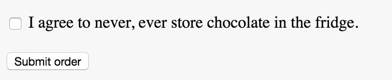
I agree to never, ever store chocolate in the fridge.
</label>
<button onClick={...} disabled={this.state.enabled}>Submit order</button>
</form>
)
}
}As we can see, this component looks fairly similar to the toggle button above. The only real difference is that instead of a toggle "button", we now have an input of type checkbox. Other than that, everything remains the same.
Wouldn't it be nice if we could de-duplicate this logic and extract out the redundant handleClick handler?
If we look at the code of the toggle button and chocolate disclaimer, we notice that the click handlers are completely identical.
Code redundancy is never a good thing; therefore we should try to extract out our handleClick function.
One way would be to have a super-class Toggleable that both ChocolateDisclaimer and ToggleButton inherit from:
class Toggleable extends React.Component {
  toggleState () {
    this.setState({
      enabled: !this.state.enabled
    });
  }
}
ToggleButton could then inherit from this superclass:
class ToggleButton extends Toggleable {
  constructor (props) {
    super(props);
    this.state = {
      // initially our `ToggleButton` is
      enabled: false
    };
  }
  render () {
    return (
      <button onClick={this.toggleState}>
        {this.state.enabled ? 'Enabled' : 'Disabled'}
      </button>
    );
  }
}
This is already a bit better, but becomes quickly unmanageable. A component might for instance be Toggleable and Submittable… which becomes a bit messy very quickly. JavaScript doesn't support multiple-inheritance (inheriting from more than one class at once) and building our own mixin system is a bit unnecessary.
Instead, we can extract out our handler into a separate "action".
An action is just a plain function that accepts a context (ctx) and arbitrary additional arguments (for instance the event itself in case we want to
.preventDefault()):
function toggleState (ctx, ev) {
  ctx.setState({
    enabled: !ctx.state.enabled
  });
}
ctx is the this context of the component that the action is "bound" to.
The above action could be used in the ToggleButton as well as the ChocolateDisclaimer.
In both cases, the context would be this. The action would be bound inside the component's constructor function:
class ToggleButton extends React.Component {
  constructor (props) {
    super(props);
    this.state = { enabled: false };
    this.toggleState = () => toggleState(this);
  }
  render () {
    // ...
  }
}
Instead of using an arrow function, we could also "curry" the toggleState function. Currying a functions means converting a function that accepts multiple arguments into a function that accepts one argument at a time:
function toggleState (ctx, ev) {
  ctx.setState({
    enabled: !ctx.state.enabled
  });
}
could also be written as
const toggleState = ctx => {
  // actual event handler
  return ev => {
    ctx.setState({
      enabled: !ctx.state.enabled
    });
  }
}
or, if you want to keep it really concise:
const toggleState = ctx => ev =>
  ctx.setState({
    enabled: !ctx.state.enabled
  });
This has the advantage that we no longer need to wrap our toggleState function inside the component's constructor:
class ToggleButton extends React.Component {
  constructor (props) {
    // ...
    this.toggleState = () => toggleState(this);
  }
  // ...
}
could instead be written as without the outer arrow function:
class ToggleButton extends React.Component {
  constructor (props) {
    // ...
    this.toggleState = toggleState(this);
  }
  // ...
}
And that's it! Now we modularized our toggleState handler! Instead of duplicating our handleClick handler, we can now apply the toggleState function to anything that can be toggled or turned on / off. It doesn't matter if it's a button, "Collapse"-button, input or lightsaber. Everything that can be enabled or disabled can be toggled by our toggleState function.


 React
React
 Typescript
 Django
 Laravel
 Facebook
 Microsoft
 Google
 Alibaba
 D3
D3
 Tencent