A collection of PySimpleGUI based tools to help analyze the spread of the COVID-19 virus
The Johns Hopkins GitHub repository and dataset has become an amazing resource for anyone wishing to get detailed information about the COVID-19 situation.
The source data for these can be found here:
https://github.com/CSSEGISandData/COVID-19/tree/master/csse_covid_19_data/csse_covid_19_time_series
There are currently 2 tools checked in.
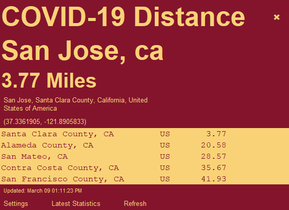
1 - The COVID-19 Distance Widget that is from the PSG-Widgets repository
2 - The COVID-19 Confirmed Cases Graphs
3 - "Realtime Stats" - Stats that update continuously
If you want to run the Python code, you need to install PySimpleGUI. You'll also need geopy if you want to run the Widget.
These are easily installable via pip.
If you don't want to bother with setting up a Python environment and just want to run the programs by themselves, then you'll find EXE files in this GitHhub. The EXE files were created using the PySimpleGUI-exemaker program (available via pip). It uses pyinstaller as described in the PySimpleGUI documentation.
Viewing multiple series of data as a grid of graphs enables the viewer to quickly and easily get both the big picture as well as information on indivdual countries. It's much like the way Tableau displays data.
Rather than using Matplotlib or any other graphing packages, this program uses PySimpleGUI's built-in drawing primitives. The code to create a graph is literally a couple of lines of code. One is a for-each statement that forms the loop, the other line of code draws the bars.
This program uses the Johns Hopkins Time-Series data that is posted here:

Two files are used, one for confirmed cases, the other for deaths.
Each graph displays a header that shows the country name, the number of new cases/deaths in the last data point and the % increase this value represents.

New in version 4.0 is the ability to view as cumulative stats or individual. It's important to be able to view the data in a variety of ways now. Cumulative isn't as important as the numbers of new cases/deaths.

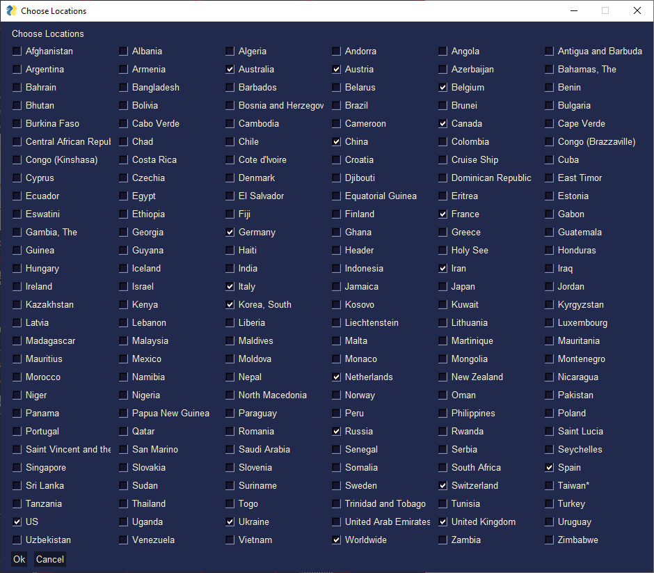
The first time you run the program it will create a default config file. You will be shown the "settings" and the "choose locations" windows. Any time you change the settings / locations, your choices will be saved in the file named C19-Graph.cfg. This file is a JSON file. If it gets corrupted (it shouldn't), delete it and run the program again to create a new one.
The country list is generated from the data file. Choose the locations you want to graph using this GUI window. Make sure the number of graphs you configure in your settings is large enough to hold your chosen countries. The default setting is 8 graphs - 4 columns in 2 rows.
In addition to being able to chose the locations to display, you can also set:
- The data to display - confirmed cases or deaths
- The PySimpleGUI Color Theme
- Number of graphs (rows and columns)
- The size of each graph in pixels
- Scaling - autoscaled or scale to a particular value
- Number of days to display

The default view displays only the current values and has autoscaling initially enabled. Autoscaling will set each graph's max Y value to the max value found in the data for the country. All graphs will be the same height when autoscaled. Autoscaled graphs enable you to easily compare the 'shape' of the curves.

When autoscaling is turned off the absolute values for each country are displayed. This enables you to see which countries have more cases than the other countries. It's immediately evident that Italy has the most cases in this graph.
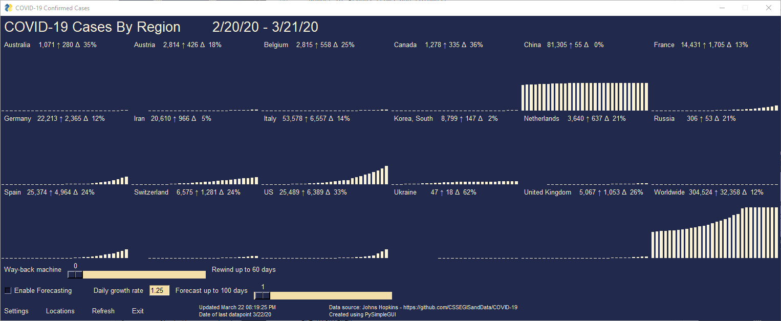
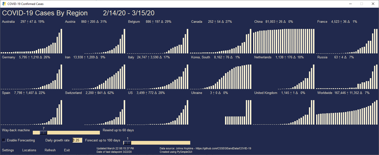
Use the slider labeled "Way back machine" to adjust the range of dates that are displayed. The very top of the window displays the range being shown. By stepping the slider one day at a time you can watch the changes over time.
In this graph the data has been rewound 7 days and shows at the top that 2/14/20 to 3/15/20 are displayed:
Caution Advised - The prediction feature is based on a simple exponential growth formula. You have control over the growth rate which has a default value of 1.25. This means that each day's change will be 1.25 times the prior day's change. It's meant to help inform you of one possible outcome among many.
One thing that is become clear, it's the citizens in each country that has direct control over how quickly and how much the virus spreads. You as an individual have the potential to help or hurt your local population. Each person that gets the virus spreads it to 2 to 3 people. By staying home, away from other people, you reduce both the chance you catch the virus and the number of other people you potentially expose if you are infected.
Predicted values are shown in red.
Use the "Enable Forecasting" checkbox on the main window to enable forecasting. Then use the slider to change the number of days into the future to predict. As mentioned previously, you can change the default growth rate of 1.25 to any value. When you enable forecasting, the number of rows in your window will double. If you disable forecasting, the number of rows will halve. Be sure you have enough graphs configured in your settings to display all of the countries you selected.
This graph is showing the predicted number of deaths 7 days into the future.
Want to see 81 countries in 1 shot? No problem. The limit on the number of graphs is limited only by how much data is available. If you have a large enough display then you can easily create a 200 or more graph display.
The big picture is that we're all in the exact same virus infested boat.
The lessons learned will be from each other.


This program is based on the graphing program previously released (see above).
Rather than graphing the historical values, it shows you in realtime how the statistics would change if the latest rate of change continues. In other words, the values are computed. It is not meant to be a super-accurate representation of the data, but rather meant to show you the SPEED at which the cases or deaths are arriving.
Think of it like a series of "gas pumps" that are all updating in realtime. Some countries are adding cases rapidly, others not so quickly.
For example, the total number of new cases worldwide is currently going up at a rate of 0.84 cases per second. So, you'll see a counter for "Worldwide" that is increasing every second by 0.84.
It's another "raise awareness" / look at the data in a different way that's not so mind-numbing.
This program is located in this GitHub under the name COVID19_Realtime_Stats.py. The corresponding EXE file is in the EXE folder.
This was the first of these tools developed and was publised in the PSG Widgets Repo first.
Sorry this is the first entry, but better late than never
- Choice of cumulative or individual data points - super important now
- Added a frame around each graph so there is less confusion about what coutry label goes with which graph. The labels are at the top of the graphs, but was easy to mix up. It takes more space, but since you can change graph sizes in the settings it's not a big deal
- Can choose the settings file. This was added a version back but worth mentioning. The default settings file is always shown first. If you want to have multiple configurations, for example one with many many countries, you can save as a new config file and load it. k
This may be the first major health crisys captured in this much detail and made available widely to the research community / public. It'll be the best documented and will make post-mortems much easier to perform down the road when we piece together "what really happened".
https://www.who.int/emergencies/diseases/novel-coronavirus-2019
Download their daily PDF files that have the "Situation Report" for the most up to date information.
Have a suggestion? Open an Issue with your ideas.
At the moment, the focus is on expanding this software using a design I've already created rather than rolling in suggested changes by other people. Feel free to folk the repo and go crazy. Please understand that submitting a change doesn't mean it'll be automatically accepted. If it's not and you think you'll be upset, then perhaps skip submitting it.
Copyright 2020 PySimpleGUI.com