Code Monkey home page Code Monkey logo

material-ui-popup-state's Introduction

material-ui-popup-state

CircleCI Coverage Status semantic-release Commitizen friendly npm version

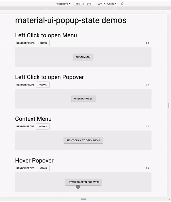
Takes care of the boilerplate for common Menu, Popover and Popper use cases.

Provides a Custom React Hook that keeps track of the local state for a single popup, and functions to connect trigger, toggle, and popover/menu/popper components to the state.

Also provides a Render Props Component that keeps track of the local state for a single popup, and passes the state and mutation functions to a child render function.

Requirements

Requires MUI >= 5.0.0 and React >= 16.8.0. For MUI v4 you'll need material-ui-popup-state@^1.9.3.

Table of Contents

Installation

npm install --save material-ui-popup-state

Examples with React Hooks

Menu

import * as React from 'react'
import Button from '@mui/material/Button'
import Menu from '@mui/material/Menu'
import MenuItem from '@mui/material/MenuItem'
import {
  usePopupState,
  bindTrigger,
  bindMenu,
} from 'material-ui-popup-state/hooks'

const MenuPopupState = () => {
  const popupState = usePopupState({ variant: 'popover', popupId: 'demoMenu' })
  return (
    <div>
      <Button variant="contained" {...bindTrigger(popupState)}>
        Open Menu
      </Button>
      <Menu {...bindMenu(popupState)}>
        <MenuItem onClick={popupState.close}>Cake</MenuItem>
        <MenuItem onClick={popupState.close}>Death</MenuItem>
      </Menu>
    </div>
  )
}

export default MenuPopupState

Popover

import React from 'react'
import PropTypes from 'prop-types'
import { withStyles } from '@mui/material/styles'
import Typography from '@mui/material/Typography'
import Button from '@mui/material/Button'
import Popover from '@mui/material/Popover'
import {
  usePopupState,
  bindTrigger,
  bindPopover,
} from 'material-ui-popup-state/hooks'

const styles = (theme) => ({
  typography: {
    margin: theme.spacing.unit * 2,
  },
})

const PopoverPopupState = ({ classes }) => {
  const popupState = usePopupState({
    variant: 'popover',
    popupId: 'demoPopover',
  })
  return (
    <div>
      <Button variant="contained" {...bindTrigger(popupState)}>
        Open Popover
      </Button>
      <Popover
        {...bindPopover(popupState)}
        anchorOrigin={{
          vertical: 'bottom',
          horizontal: 'center',
        }}
        transformOrigin={{
          vertical: 'top',
          horizontal: 'center',
        }}
      >
        <Typography className={classes.typography}>
          The content of the Popover.
        </Typography>
      </Popover>
    </div>
  )
}

PopoverPopupState.propTypes = {
  classes: PropTypes.object.isRequired,
}

export default withStyles(styles)(PopoverPopupState)

Popper

import React from 'react'
import PropTypes from 'prop-types'
import { withStyles } from '@mui/material/styles'
import Typography from '@mui/material/Typography'
import Button from '@mui/material/Button'
import Popper from '@mui/material/Popper'
import {
  usePopupState,
  bindToggle,
  bindPopper,
} from 'material-ui-popup-state/hooks'
import Fade from '@mui/material/Fade'
import Paper from '@mui/material/Paper'

const styles = (theme) => ({
  typography: {
    padding: theme.spacing.unit * 2,
  },
})

const PopperPopupState = ({ classes }) => {
  const popupState = usePopupState({ variant: 'popper', popupId: 'demoPopper' })
  return (
    <div>
      <Button variant="contained" {...bindToggle(popupState)}>
        Toggle Popper
      </Button>
      <Popper {...bindPopper(popupState)} transition>
        {({ TransitionProps }) => (
          <Fade {...TransitionProps} timeout={350}>
            <Paper>
              <Typography className={classes.typography}>
                The content of the Popper.
              </Typography>
            </Paper>
          </Fade>
        )}
      </Popper>
    </div>
  )
}

PopperPopupState.propTypes = {
  classes: PropTypes.object.isRequired,
}

export default withStyles(styles)(PopperPopupState)

React Hooks API

Bind Functions

material-ui-popup-state/hooks exports several helper functions you can use to connect components easily:

  • anchorRef: creates a ref function to pass to the anchorEl (by default, the currentTarget of the mouse event that triggered the popup is used; only use anchorRef if you want a different element to be the anchor).
  • bindMenu: creates props to control a Menu component.
  • bindPopover: creates props to control a Popover component.
  • bindPopper: creates props to control a Popper component.
  • bindDialog: creates props to control a Dialog component.
  • bindTrigger: creates props for a component that opens the popup when clicked.
  • bindContextMenu: creates props for a component that opens the popup on when right clicked (contextmenu event). NOTE: bindPopover/bindMenu will position the Popover/Menu to the contextmenu event location. To position using the contextmenu target element instead, pass anchorReference="anchorEl" after {...bindPopover(popupState)}/{...bindMenu(popupState)}.
  • bindToggle: creates props for a component that toggles the popup when clicked.
  • bindHover: creates props for a component that opens the popup while hovered. NOTE: See this guidance if you are using bindHover with Popover or Menu.
  • bindFocus: creates props for a component that opens the popup while focus.
  • bindDoubleClick: creates props for a component that opens the popup while double click.

To use one of these functions, you should call it with the object returned by usePopupState and spread the return value into the desired element:

import * as React from 'react'
import Button from '@mui/material/Button'
import Menu from '@mui/material/Menu'
import MenuItem from '@mui/material/MenuItem'
import {
  usePopupState,
  bindTrigger,
  bindMenu,
} from 'material-ui-popup-state/hooks'

const MenuPopupState = () => {
  const popupState = usePopupState({ variant: 'popover', popupId: 'demoMenu' })
  return (
    <div>
      <Button variant="contained" {...bindTrigger(popupState)}>
        Open Menu
      </Button>
      <Menu {...bindMenu(popupState)}>
        <MenuItem onClick={popupState.close}>Cake</MenuItem>
        <MenuItem onClick={popupState.close}>Death</MenuItem>
      </Menu>
    </div>
  )
}

export default MenuPopupState

usePopupState

This is a Custom Hook that uses useState internally, therefore the Rules of Hooks apply to usePopupState.

usePopupState Props

variant ('popover', 'popper', or 'dialog', required)

Use 'popover' if your popup is a Popover or Menu; use 'popper' if your popup is a Popper.

Right now this only affects whether bindTrigger/bindToggle/bindHover return an aria-controls prop or an aria-describedby prop.

popupId (string, optional but strongly encouraged)

The id for the popup component. It will be passed to the child props so that the trigger component may declare the same id in an ARIA prop.

disableAutoFocus (boolean, optional)

If true, will not steal focus when the popup is opened. (And bindPopover/bindMenu) will inject disableAutoFocus, disableEnforceFocus, and disableRestoreFocus).

Defaults to true when the popup is opened by the bindHover or bindFocus element.

usePopupState return value

An object with the following properties:

  • open([eventOrAnchorEl]): opens the popup. You must pass in an anchor element or an event with a currentTarget, otherwise the popup will not position properly and you will get a warning; MUI needs an anchor element to position the popup.
  • close(): closes the popup
  • toggle([eventOrAnchorEl]): opens the popup if it is closed, or closes the popup if it is open. If the popup is currently closed, you must pass an anchor element or an event with a currentTarget, otherwise the popup will not position properly and you will get a warning; MUI needs an anchor element to position the popup.
  • setOpen(open, [eventOrAnchorEl]): sets whether the popup is open. If open is truthy, you must pass in an anchor element or an event with a currentTarget, otherwise the popup will not position properly and you will get a warning; MUI needs an anchor element to position the popup.
  • isOpen: true/false if the popup is open/closed
  • anchorEl: the current anchor element
  • anchorPosition: the current anchor position
  • setAnchorEl: sets the anchor element (the currentTarget of the triggering mouse event is used by default unless you have called setAnchorEl)
  • popupId: the popupId prop you passed to PopupState
  • variant: the variant prop you passed to PopupState

Examples with Render Props

Menu

import * as React from 'react'
import Button from '@mui/material/Button'
import Menu from '@mui/material/Menu'
import MenuItem from '@mui/material/MenuItem'
import PopupState, { bindTrigger, bindMenu } from 'material-ui-popup-state'

const MenuPopupState = () => (
  <PopupState variant="popover" popupId="demoMenu">
    {(popupState) => (
      <React.Fragment>
        <Button variant="contained" {...bindTrigger(popupState)}>
          Open Menu
        </Button>
        <Menu {...bindMenu(popupState)}>
          <MenuItem onClick={popupState.close}>Cake</MenuItem>
          <MenuItem onClick={popupState.close}>Death</MenuItem>
        </Menu>
      </React.Fragment>
    )}
  </PopupState>
)

export default MenuPopupState

Popover

import React from 'react'
import PropTypes from 'prop-types'
import { withStyles } from '@mui/material/styles'
import Typography from '@mui/material/Typography'
import Button from '@mui/material/Button'
import Popover from '@mui/material/Popover'
import PopupState, { bindTrigger, bindPopover } from 'material-ui-popup-state'

const styles = (theme) => ({
  typography: {
    margin: theme.spacing.unit * 2,
  },
})

const PopoverPopupState = ({ classes }) => (
  <PopupState variant="popover" popupId="demoPopover">
    {(popupState) => (
      <div>
        <Button variant="contained" {...bindTrigger(popupState)}>
          Open Popover
        </Button>
        <Popover
          {...bindPopover(popupState)}
          anchorOrigin={{
            vertical: 'bottom',
            horizontal: 'center',
          }}
          transformOrigin={{
            vertical: 'top',
            horizontal: 'center',
          }}
        >
          <Typography className={classes.typography}>
            The content of the Popover.
          </Typography>
        </Popover>
      </div>
    )}
  </PopupState>
)

PopoverPopupState.propTypes = {
  classes: PropTypes.object.isRequired,
}

export default withStyles(styles)(PopoverPopupState)

Mouse Over Interaction

import React from 'react'
import PropTypes from 'prop-types'
import { withStyles } from '@mui/material/styles'
import Typography from '@mui/material/Typography'
import HoverPopover from 'material-ui-popup-state/HoverPopover'
import PopupState, { bindHover, bindPopover } from 'material-ui-popup-state'

const styles = (theme) => ({
  popover: {
    pointerEvents: 'none',
  },
  paper: {
    padding: theme.spacing.unit,
  },
})

const HoverPopoverPopupState = ({ classes }) => (
  <PopupState variant="popover" popupId="demoPopover">
    {(popupState) => (
      <div>
        <Typography {...bindHover(popupState)}>
          Hover with a Popover.
        </Typography>
        <HoverPopover
          {...bindPopover(popupState)}
          className={classes.popover}
          classes={{
            paper: classes.paper,
          }}
          anchorOrigin={{
            vertical: 'bottom',
            horizontal: 'center',
          }}
          transformOrigin={{
            vertical: 'top',
            horizontal: 'center',
          }}
        >
          <Typography>The content of the Popover.</Typography>
        </HoverPopover>
      </div>
    )}
  </PopupState>
)

HoverPopoverPopupState.propTypes = {
  classes: PropTypes.object.isRequired,
}

export default withStyles(styles)(HoverPopoverPopupState)

Popper

import React from 'react'
import PropTypes from 'prop-types'
import { withStyles } from '@mui/material/styles'
import Typography from '@mui/material/Typography'
import Button from '@mui/material/Button'
import Popper from '@mui/material/Popper'
import PopupState, { bindToggle, bindPopper } from 'material-ui-popup-state'
import Fade from '@mui/material/Fade'
import Paper from '@mui/material/Paper'

const styles = (theme) => ({
  typography: {
    padding: theme.spacing.unit * 2,
  },
})

const PopperPopupState = ({ classes }) => (
  <PopupState variant="popper" popupId="demoPopper">
    {(popupState) => (
      <div>
        <Button variant="contained" {...bindToggle(popupState)}>
          Toggle Popper
        </Button>
        <Popper {...bindPopper(popupState)} transition>
          {({ TransitionProps }) => (
            <Fade {...TransitionProps} timeout={350}>
              <Paper>
                <Typography className={classes.typography}>
                  The content of the Popper.
                </Typography>
              </Paper>
            </Fade>
          )}
        </Popper>
      </div>
    )}
  </PopupState>
)

PopperPopupState.propTypes = {
  classes: PropTypes.object.isRequired,
}

export default withStyles(styles)(PopperPopupState)

Render Props API

Bind Functions

material-ui-popup-state exports several helper functions you can use to connect components easily:

  • anchorRef: creates a ref function to pass to the anchorEl (by default, the currentTarget of the mouse event that triggered the popup is used; only use anchorRef if you want a different element to be the anchor).
  • bindMenu: creates props to control a Menu component.
  • bindPopover: creates props to control a Popover component.
  • bindPopper: creates props to control a Popper component.
  • bindDialog: creates props to control a Dialog component.
  • bindTrigger: creates props for a component that opens the popup when clicked.
  • bindContextMenu: creates props for a component that opens the popup on when right clicked (contextmenu event). NOTE: bindPopover/bindMenu will position the Popover/Menu to the contextmenu event location. To position using the contextmenu target element instead, pass anchorReference="anchorEl" after {...bindPopover(popupState)}/{...bindMenu(popupState)}.
  • bindToggle: creates props for a component that toggles the popup when clicked.
  • bindHover: creates props for a component that opens the popup while hovered. NOTE: See this guidance if you are using bindHover with Popover or Menu.
  • bindFocus: creates props for a component that opens the popup while hovered.

To use one of these functions, you should call it with the props PopupState passed to your child function, and spread the return value into the desired element:

import * as React from 'react'
import Button from '@mui/material/Button'
import Menu from '@mui/material/Menu'
import MenuItem from '@mui/material/MenuItem'
import PopupState, { bindTrigger, bindMenu } from 'material-ui-popup-state'

const MenuPopupState = () => (
  <PopupState variant="popover" popupId="demoMenu">
    {(popupState) => (
      <React.Fragment>
        <Button variant="contained" {...bindTrigger(popupState)}>
          Open Menu
        </Button>
        <Menu {...bindMenu(popupState)}>
          <MenuItem onClick={popupState.close}>Cake</MenuItem>
          <MenuItem onClick={popupState.close}>Death</MenuItem>
        </Menu>
      </React.Fragment>
    )}
  </PopupState>
)

export default MenuPopupState

PopupState Props

variant ('popover', 'popper', or 'dialog', required)

Use 'popover' if your popup is a Popover or Menu; use 'popper' if your popup is a Popper.

Right now this only affects whether bindTrigger/bindToggle/bindHover return an aria-controls prop or an aria-describedby prop.

popupId (string, optional but strongly encouraged)

The id for the popup component. It will be passed to the child props so that the trigger component may declare the same id in an ARIA prop.

disableAutoFocus (boolean, optional)

If true, will not steal focus when the popup is opened. (And bindPopover/bindMenu) will inject disableAutoFocus, disableEnforceFocus, and disableRestoreFocus).

Defaults to true when the popup is opened by the bindHover or bindFocus element.

children ((popupState: InjectedProps) => ?React.Node, required)

The render function. It will be called with an object containing the following props (exported as the InjectedProps type):

  • open([eventOrAnchorEl]): opens the popup
  • close(): closes the popup
  • toggle([eventOrAnchorEl]): opens the popup if it is closed, or closes the popup if it is open.
  • setOpen(open, [eventOrAnchorEl]): sets whether the popup is open.
  • isOpen: true/false if the popup is open/closed
  • anchorEl: the current anchor element
  • anchorPosition: the current anchor position
  • setAnchorEl: sets the anchor element (the currentTarget of the triggering mouse event is used by default unless you have called setAnchorEl)
  • popupId: the popupId prop you passed to PopupState
  • variant: the variant prop you passed to PopupState

Using Popover and Menu with bindHover

MUI's Modal (used by Popover and Menu) blocks pointer events to all other components, interfering with bindHover (the popover or menu will open when the mouse enters the bindHover element, but won't close when the mouse leaves). You can use the following components to work around this:

import HoverMenu from 'material-ui-popup-state/HoverMenu'
import HoverPopover from 'material-ui-popup-state/HoverPopover'

These are just wrapper components that pass inline styles to prevent Modal from blocking pointer events.

Chaining event handlers

What if you need to perform additional actions in onClick, but it's being injected by {...bindTrigger(popupState)} etc?

There are two options:

Chaining event handlers manually

This is the most straightforward, explicit option.

const button = (
  <Button
    {...bindTrigger(popupState)}
    onClick={(e: React.MouseEvent) => {
      bindTrigger(popupState).onClick(e)
      performCustomAction(e)
    }}
  >
    Open Menu
  </Button>
)

Using material-ui-popup-state/chainEventHandlers

If you don't like the above option, you can use the provided material-ui-popup-state/chainEventHandlers helper:

import { chainEventHandlers } from 'material-ui-popup-state/chainEventHandlers'

const button = (
  <Button
    {...chainEventHandlers(bindTrigger(popupState), {
      onClick: (e: React.MouseEvent) => {
        bindTrigger(popupState).onClick(e)
        performCustomAction(e)
      },
    })}
  >
    Open Menu
  </Button>
)

chainEventHandlers accepts a variable number of props arguments and combines any function props of the same name into a function that invokes the chained functions in sequence. For all other properties the behavior is like Object.assign.

Warning

chainEventHandlers doesn't memoize the combined event handler functions, so they will cause components to rerender. If you need memoized functions, you will need to perform the memoization with your own code, for example using React.useCallback and chaining event handlers manually.

material-ui-popup-state's People

Contributors

adamscybot avatar alecf avatar formatlos avatar greenkeeper[bot] avatar heyimaster avatar jedwards1211 avatar renovate-bot avatar renovate[bot] avatar stefensuhat avatar timmikeladze avatar

Stargazers

 avatar  avatar  avatar  avatar  avatar  avatar  avatar  avatar  avatar  avatar  avatar  avatar  avatar  avatar  avatar  avatar  avatar  avatar  avatar  avatar  avatar  avatar  avatar  avatar  avatar  avatar  avatar  avatar  avatar  avatar  avatar  avatar  avatar  avatar  avatar  avatar  avatar  avatar  avatar  avatar  avatar  avatar  avatar  avatar  avatar  avatar  avatar  avatar  avatar  avatar  avatar  avatar  avatar  avatar  avatar  avatar  avatar  avatar  avatar  avatar  avatar  avatar  avatar  avatar  avatar  avatar  avatar  avatar  avatar  avatar  avatar  avatar  avatar  avatar  avatar  avatar  avatar  avatar  avatar  avatar  avatar  avatar  avatar  avatar  avatar  avatar  avatar  avatar  avatar  avatar  avatar  avatar  avatar  avatar  avatar  avatar  avatar  avatar  avatar  avatar

Watchers

 avatar  avatar  avatar  avatar  avatar  avatar  avatar

material-ui-popup-state's Issues

[Doc] Multiple states within a map

Nice library! I am currently struggling to find the most optimal way to use the hooks within a map to keep track of multiple menus' state.

This is the dirty code - really not optimal - I came up with so far:

export default () => {
  const resourcesMenuState = usePopupState({
    popupId: "resources",
    variant: "popover",
  });
  const servicesMenuState = usePopupState({
    popupId: "services",
    variant: "popover",
  });

  return (
    <nav>
      <MenuList disablePadding className={classes.menuList}>
        {routes.map((route) => (
          <div key={uid(route)}>
            <MenuItem
              {...(route.name === "Resources" && bindHover(resourcesMenuState))}
              {...(route.name === "Services" && bindHover(servicesMenuState))}
              // --- SNIP ---
            >
              {route.name}
            </MenuItem>
            {route.routes && (
              <Menu
                {...(route.name === "Resources" &&
                  bindMenu(resourcesMenuState))}
                {...(route.name === "Services" && bindMenu(servicesMenuState))}
                // --- SNIP ---
              >
                {route.routes.map((nestedRoute) => (
                  <MenuItem
                    key={uid(nestedRoute)}
                    // Dirty hack - can handle only 2 menus
                    onClick={
                      route.name === 'Resources'
                        ? resourcesState.close
                        : servicesState.close
                    }
                    // --- SNIP ---
                  >
                    {nestedRoute.name}
                  </MenuItem>
                ))}
              </Menu>
            )}
          </div>
        ))}
      </MenuList>
    </nav>
  );
};

Could you please provide an optimal example on how to achieve this?

On mouse out is not working with bindHover(popupState) method

On mouse hover the events are working properly but on mouse out it's not removing the popper or popover, is there a way to close hover event on mouse out something like bindOut(popuState)?

OnClick event also not triggering on the same, is there a way to add the click event too?

<PopupState variant="popover" popupId="demo-popup-popover">
  {(popupState) => (
    <div>
      <Button variant="contained" onClick={() => alert("sdf")} {...bindHover(popupState)}>
        Open Popover
      </Button>
      <Popover
        {...bindPopover(popupState)}
        anchorOrigin={{
          vertical: 'bottom',
          horizontal: 'center',
        }}
        transformOrigin={{
          vertical: 'top',
          horizontal: 'center',
        }}
      >
        <Typography sx={{ p: 2 }}>The content of the Popover.</Typography>
      </Popover>
    </div>
  )}
</PopupState>

In the above code snippet onClick event should trigger and get the alert as well

Thanks in advance :)

TypeScript aria-* props should not be null

I just tested the latest version 1.5.0 of this package with its added TypeScript types. Unfortunately, I can't use it because my TypeScript compiler now gives me tons of warnings, since it seems that the aria-* props returned in the bindTrigger or other bind-methods might be null, and the Aria Props set by React are only allowed to be either undefined or their proper type (for example aria-describedby can only be a string or undefined, but not null).

Here is the type of bindTrigger with null in their types:

export function bindTrigger(
  popupState: PopupState
): {
  'aria-owns'?: string | null | undefined
  'aria-describedby'?: string | null | undefined
  'aria-haspopup': true | null | undefined
  onClick: (event: SyntheticEvent<any>) => void
}

Here is an excerpt of the AriaAttributes by @types/react:

// All the WAI-ARIA 1.1 attributes from https://www.w3.org/TR/wai-aria-1.1/
interface AriaAttributes {
    // ...
    'aria-describedby'?: string;
    // ...
}

I'm not sure how the type definitions were made for this project, but it seems the solution would be to just get rid of all the | null types for aria-* props.

I was using TypeScript version 3.7.3 when testing this.

How to test component in testing-library?

This is my main component. When I click on the button popover shows notifications. Let's see...

const NotificationDropdown = ({ unread = 0 }) => (
  <PopupState variant="popover">
    {popupState => {
      const { isOpen } = popupState

      return (
        <>
          <Button open={isOpen} unread={unread} {...bindTrigger(popupState)} />
          <Popover
            {...bindPopover(popupState)}
            anchorOrigin={makeOrigin('bottom', 'center')}
            transformOrigin={makeOrigin('top', 'center')}
          >
            <Notifications data-testid="notification-content" />
          </Popover>
        </>
      )
    }}
  </PopupState>
)

I tried write tests for that:

 const Component = ({ unread }) => (
    <>
      <NotificationDropdown unread={unread} />
      <span data-testid="somewhere">For click action</span>
    </>
  )

  it('should be closed after click somewhere', async () => {
    render(Component)

    clickElementByTestId('notification-btn')
    const contentNotification = screen.queryByTestId('notification-content')

    expect(contentNotification).toBeInTheDocument() // Good
    clickElementByTestId('notification-btn')
    expect(contentNotification).not.toBeInTheDocument() // Fail! The document still exits.
  })

Maybe it's an issue with animation (during the assertion component it's in the animation process). But I tried delay assertion for example:

    jest.advanceTimersByTime(2000)

    await waitFor(() => {
      expect(contentNotification).not.toBeInTheDocument()
    })

But I got the same results.

How to fix it?

HoverPopover does not close with fast mouse movements

Hello everyone,

I'm trying to use the HoverPopover on several components. To do so I used the Popover-Example from the docs and adapted it to render more than one button:

import * as React from 'react'
import Button from '@material-ui/core/Button'
import { usePopupState, bindHover, bindPopover } from 'material-ui-popup-state/hooks'
import { Typography } from '@material-ui/core'
import Popover from 'material-ui-popup-state/HoverPopover'

const PopoverText = () => {
    const popupState = usePopupState({
        variant: 'popover',
        popupId: 'demoPopover',
    })

    return (
        <div>
            <Button variant="contained" {...bindHover(popupState)}>
                Open Popover
            </Button>
            <Popover
                {...bindPopover(popupState)}
                anchorOrigin={{
                    vertical: 'bottom',
                    horizontal: 'center',
                }}
                transformOrigin={{
                    vertical: 'top',
                    horizontal: 'center',
                }}
            >
                <Typography>
                    The content of the Popover.
                </Typography>
            </Popover>
        </div>
    )
}

export const TwoTablesNoCollapse = ({ ...args }) => (
    <>
        <PopoverText />
        <PopoverText />
        <PopoverText />
        <PopoverText />
        <PopoverText />
        <PopoverText />
        <PopoverText />
        <PopoverText />
        <PopoverText />
        <PopoverText />
    </>

);

Everything works fine, except with fast mouse movements. The showing popover does not disappear anymore. To get an idea of what I mean I add a small video:

Peek 2021-06-28 13-01

This is a problem because the Popover itself blocks any scroll events as mentioned in another issue (#37). This way, the page is not scrollable until the user closes the Popover by revisiting the corresponding element with the mouse.

I found the following as a workaround in this particular case

    return (
        <div onMouseLeave={popupState.close}>
            <Button variant="contained" {...bindHover(popupState)}>
                Open Popover
            </Button>

but since this is just a toy-example and I need to use this in a table on each table cell, I cannot wrap every table cell in a div (or something similar) without effecting the layout.

Error in production when building with vite 2.7+

It was fine until i updated vite to 2.7. It uses rollup internally.
When i remove all uses of this library problem also disappears.
Error is:
TypeError: gM is not a function
at vM (core.js:28)
at core.js:24

I tried to disable minification and it produces something like: interopRequireWildcard error
Name depends on build due to minification, but error is the same every time. Any ideas why could cause the issue?

Now i'm using:
react 17.0.2
Vite 2.7.6
material-ui-popup-state: 2.0.0

Passing functions to onClick

I have created a dropdown meny with an Image acting like the trigger like so:

    <Image
          alt="Plus"
          aria-controls="long-menu"
          className={classes.plus}
          src={Plus}
          {...bindTrigger(popupState)}
          // onClick={handleClick}
        />

I want to pass a function called handleClick to onClick, but if I remove the comment then it overrides the onClick function generated by bindtrigger. I wanted to ask if there is a way to pass handleClick to the generated onClick?

Property for removable arrow indicator in popper

Hello.

Is there a property in Popper wihtin the MUI tooltip component which allows me to show or not show the arrow indicator above the tooltip?

I have not yet come across this when reading through the documentation.

Thank you

bindHover doesn't work on Material v4

Hello. I use the version with Hooks for cascading menus. The problem is bindHover doesn't work on version 4. Actually, it works till the latest v4 alpha. Could you please help with a workaround? Here is codesandbox. Thank you for your time.

Hover Poppers stay open under certain condition

Hi there,

I'm trying to add Poppers that open on hover, so I'm using bindHover. It works, but it seems the Poppers only close if the mouse leaves the trigger without going over the Popper itself. If the mouse goes over the Popper before leaving the trigger, then the Popper stays open even after it leaves both the trigger and the Popper. This is happening on the latest two versions (1.8.0 and 1.8.1), I haven't tried any other versions.

I've uploaded a video here since I'm not sure if my description was very clear.

Sizing

Thanks for building this!
I am struggling to custom size the Popper... I have tried styling the enclosing DIV, without success.
Any pointers will be apprecaited.

Function components cannot be given refs

I started getting this warning when I updated to React 16.8:

Warning: Function components cannot be given refs. Attempts to access this ref will fail. Did you mean to use React.forwardRef()?

Here's the full stack trace:

image

Any suggestions? It looks like @PiotrF over in #9 (comment) was having a similar issue.

The automated release is failing ๐Ÿšจ

๐Ÿšจ The automated release from the master branch failed. ๐Ÿšจ

I recommend you give this issue a high priority, so other packages depending on you could benefit from your bug fixes and new features.

You can find below the list of errors reported by semantic-release. Each one of them has to be resolved in order to automatically publish your package. Iโ€™m sure you can resolve this ๐Ÿ’ช.

Errors are usually caused by a misconfiguration or an authentication problem. With each error reported below you will find explanation and guidance to help you to resolve it.

Once all the errors are resolved, semantic-release will release your package the next time you push a commit the master branch. You can also manually restart the failed CI job that runs semantic-release.

If you are not sure how to resolve this, here is some links that can help you:

If those donโ€™t help, or if this issue is reporting something you think isnโ€™t right, you can always ask the humans behind semantic-release.


The push permission to the Git repository is required.

semantic-release cannot push the version tag to the branch master on remote Git repository.

Please refer to the authentication configuration documentation to configure the Git credentials on your CI environment.


Good luck with your project โœจ

Your semantic-release bot ๐Ÿ“ฆ๐Ÿš€

Add support for forwarding ref inside tooltip

When inserting a button inside a tooltip, the positioning is wrong.

Example:

import React from 'react';
import Menu from "@material-ui/core/Menu"
import MenuItem from "@material-ui/core/MenuItem"
import { bindMenu, bindToggle, usePopupState } from 'material-ui-popup-state/hooks'
import IconButton from "@material-ui/core/IconButton";
import SettingsIcon from "@material-ui/icons/Settings";
import Tooltip from "@material-ui/core/Tooltip";


export function UserSettings() {
    const popupState = usePopupState({variant: 'popover', popupId: 'userSettings'})
    
    return (
        <>
            <Tooltip title="Settings" aria-label="settings">
                <IconButton {...bindToggle(popupState)}>
                    <SettingsIcon />
                </IconButton>
            </Tooltip>
            <Menu {...bindMenu(popupState)}>
                <MenuItem>bla</MenuItem>
            </Menu>
        </>
    )
}

aria-controls for menus

The MUI documentation appears to suggest that a Button should use aria-controls to indicate the Menu it is connected to. However this library always uses aria-owns instead.

https://material-ui.com/components/menus/#menus

I'm not sure about other screen readers. However trying VoiceOver on Chrome I do notice a stark difference. With aria-controls I am taken to the first menu item but with this library's aria-owns I am stuck outside of the menu in a bad state.

MUIv5 rc0 changed requirement

โ€‹[core] Rename packages (#28049) @mnajdova

replace @material-ui/* prefix with @mui/*:

@material-ui/system -> @mui/system
@material-ui/styles -> @mui/styles
@material-ui/lab -> @mui/lab
@material-ui/types -> @mui/types
@material-ui/styled-engine -> @mui/styled-engine
@material-ui/styled-engine-sc ->@mui/styled-engine-sc
@material-ui/private-theming -> @mui/private-theming
@material-ui/codemod -> @mui/codemod
except these 3 packages that are renamed.

@material-ui/core => @mui/material        // represents Material Design components.
@material-ui/icons => @mui/icons-material // represents Material Design icons.
@material-ui/unstyled => @mui/core        // fully functional components with minimum styles.
Note: @mui/core (previously @material-ui/unstyled) is not the same as @material-ui/core.

Looks like it need another update for rc.0 material-ui

Can't resolve 'babel-runtime/helpers/possibleConstructorReturn'

Error stack

Module not found: Error: Can't resolve 'babel-runtime/helpers/possibleConstructorReturn' in 'C:\Users\User\Documents\Source\app\node_modules\material-ui-popup-state' @ ./node_modules/material-ui-popup-state/index.js 20:34-92

Dependencies

"dependencies": { "@babel/polyfill": "7.2.5", "@babel/runtime": "^7.3.1", "@material-ui/core": "^3.9.0", "@material-ui/icons": "^3.0.2", "chalk": "^2.4.1", "classnames": "^2.2.6", "compression": "1.7.3", "connected-react-router": "6.3.0", "cross-env": "5.2.0", "express": "4.16.4", "fontfaceobserver": "2.1.0", "formik": "^1.4.2", "history": "4.7.2", "hoist-non-react-statics": "3.3.0", "immutability-helper": "^3.0.0", "immutable": "4.0.0-rc.12", "intl": "1.2.5", "invariant": "2.2.4", "ip": "1.1.5", "jss": "^9.8.7", "loadable-components": "2.2.3", "lodash": "4.17.11", "material-ui-chip-input": "^1.0.0-beta.13", "material-ui-popup-state": "^1.0.2", "minimist": "1.2.0", "moment": "^2.24.0", "notistack": "^0.4.1", "numeral": "^2.0.6", "prop-types": "^15.6.2", "query-string": "^6.2.0", "raw-loader": "^1.0.0", "react": "16.8.1", "react-dom": "16.8.1", "react-helmet": "5.2.0", "react-icons": "^3.3.0", "react-intl": "2.8.0", "react-jss": "^8.6.1", "react-redux": "6.0.0", "react-router-dom": "4.3.1", "react-svg-inline": "^2.1.1", "redux": "4.0.1", "redux-act": "^1.7.0", "redux-immutable": "4.0.0", "redux-react-session": "^2.5.0", "redux-saga": "1.0.1", "reselect": "4.0.0", "sanitize.css": "8.0.0", "shortid": "^2.2.14", "styled-components": "4.1.3", "typeface-roboto": "^0.0.54", "uuid": "^3.3.2", "warning": "4.0.3", "yup": "^0.26.10" }, "devDependencies": { "@babel/cli": "7.2.3", "@babel/core": "7.2.2", "@babel/plugin-proposal-class-properties": "7.3.0", "@babel/plugin-syntax-dynamic-import": "7.2.0", "@babel/plugin-transform-modules-commonjs": "7.2.0", "@babel/plugin-transform-react-constant-elements": "7.2.0", "@babel/plugin-transform-react-inline-elements": "7.2.0", "@babel/plugin-transform-runtime": "^7.2.0", "@babel/preset-env": "7.3.1", "@babel/preset-react": "7.0.0", "@babel/register": "7.0.0", "add-asset-html-webpack-plugin": "3.1.3", "babel-core": "7.0.0-bridge.0", "babel-eslint": "10.0.1", "babel-loader": "8.0.5", "babel-plugin-dynamic-import-node": "2.2.0", "babel-plugin-inline-react-svg": "^1.0.1", "babel-plugin-lodash": "3.3.4", "babel-plugin-react-intl": "3.0.1", "babel-plugin-react-transform": "3.0.0", "babel-plugin-styled-components": "1.10.0", "babel-plugin-transform-react-remove-prop-types": "0.4.24", "circular-dependency-plugin": "5.0.2", "compare-versions": "3.4.0", "compression-webpack-plugin": "2.0.0", "coveralls": "3.0.2", "create-index": "^2.3.0", "css-loader": "2.1.0", "dotenv-webpack": "^1.7.0", "enzyme": "3.8.0", "enzyme-adapter-react-16": "1.9.1", "enzyme-to-json": "3.3.5", "eslint": "5.13.0", "eslint-config-airbnb": "17.1.0", "eslint-config-airbnb-base": "13.1.0", "eslint-config-prettier": "4.0.0", "eslint-import-resolver-webpack": "0.11.0", "eslint-plugin-import": "2.16.0", "eslint-plugin-jsx-a11y": "6.2.1", "eslint-plugin-prettier": "3.0.1", "eslint-plugin-react": "7.12.4", "eslint-plugin-redux-saga": "1.0.0", "file-loader": "3.0.1", "html-loader": "0.5.5", "html-webpack-plugin": "3.2.0", "image-webpack-loader": "4.6.0", "imports-loader": "0.8.0", "jest-cli": "24.1.0", "jest-styled-components": "6.3.1", "lint-staged": "8.1.3", "ngrok": "3.1.1", "node-plop": "0.17.3", "null-loader": "0.1.1", "offline-plugin": "5.0.6", "plop": "2.2.0", "pre-commit": "1.2.2", "prettier": "1.16.4", "react-app-polyfill": "0.2.1", "react-styleguidist": "^8.0.6", "react-test-renderer": "16.8.1", "rimraf": "2.6.3", "shelljs": "^0.8.2", "style-loader": "0.23.1", "stylelint": "9.10.1", "stylelint-config-recommended": "2.1.0", "stylelint-config-styled-components": "0.1.1", "stylelint-processor-styled-components": "1.5.2", "svg-url-loader": "2.3.2", "terser-webpack-plugin": "1.2.2", "url-loader": "1.1.2", "webpack": "4.29.3", "webpack-cli": "3.2.3", "webpack-dev-middleware": "3.5.2", "webpack-hot-middleware": "2.24.3 ", "webpack-pwa-manifest": "4.0.0", "whatwg-fetch": "^3.0.0" }

Can't navigate with up/down on keyboard if I hover over certain parts of a Hover Menu

See the Hover Menu demo here: https://jcoreio.github.io/material-ui-popup-state/#hover-menu

Expected Behaviour

If I hover over any part of the button that triggers the opening of a Hover Menu, I should be able to navigate through menu items by pressing the up or down keys.

Actual Behaviour

Hovering over the button chrome allows for keying up/down, but if I hover over any children of the menu (even if it's just the text), I'm no longer able to use the up/down keys to navigate.

Reproduction Steps

  1. Navigate to the hover menu section of the demo
  2. Hover over the corner of the button - you should see the menu pop up with one of the options selected and you can use up/down keys
  3. Move your mouse over the text of the button - you should see the selection disappear and you are no longer able to use up/down keys

Environment

Windows 10.19043
Chrome/Firefox/Edge

Keyboard interaction for cascading hover menus

Currently using the keys to navigate to a MenuItem for a submenu doesn't open the submenu. I need to think carefully about how to handle this. MenuItem seems to trigger onClick when enter is pressed while it's focused. But no onClick is injected by bindHover.

But also, some cascading menus (macOS at least) also support opening the submenu with the right arrow key. So I need to investigate UI precedents and decide if I just match macOS or support multiple options.

@material-ui/types included in beta

The beta branch has a "@material-ui/types": "^6.0.1", dependency inside it. Grepping through the code it appears this dep is not actually used anywhere in the code.

Responsive Dropdown activates links below

Hello,

As you can see on a video below, when I click About > Our Team - it clicks the other menu below which is Help Center. When clicking About > Media - it clicks on a button below the dropdown opening a link.
It seems as if the dropdown has a lower priority or as if it is not visible.

If there are no links/content below the dropdown - it work perfect and goes to according links.

Do you think you can help me with that?
Thank you so much!

ezgif com-gif-maker (2)

Compatible with Material-ui Dialog component ?

Hello,

I wonder if your package is compatible with Material-ui Dialog component ?

I tested with bindContextMenu and bindPopper and I got the following warning :

Warning: React does not recognize the `anchorEl` prop on a DOM element. If you intentionally want it to appear in the DOM as a custom attribute, spell it as lowercase `anchorel` instead. If you accidentally passed it from a parent component, remove it from the DOM element.
    at div
    at Portal (http://localhost:3000/yt_gaming_library/static/js/vendors~main.chunk.js:21031:24)
    at Modal (http://localhost:3000/yt_gaming_library/static/js/vendors~main.chunk.js:18183:83)
    at Dialog (http://localhost:3000/yt_gaming_library/static/js/vendors~main.chunk.js:7695:29)
    at WithStyles(ForwardRef(Dialog)) (http://localhost:3000/yt_gaming_library/static/js/vendors~main.chunk.js:52648:31)
    at CardDialog (http://localhost:3000/yt_gaming_library/static/js/main.chunk.js:790:75)
    at div
    at Paper (http://localhost:3000/yt_gaming_library/static/js/vendors~main.chunk.js:19945:23)
    at WithStyles(ForwardRef(Paper)) (http://localhost:3000/yt_gaming_library/static/js/vendors~main.chunk.js:52648:31)
    at Card (http://localhost:3000/yt_gaming_library/static/js/vendors~main.chunk.js:4801:23)
    at WithStyles(ForwardRef(Card)) (http://localhost:3000/yt_gaming_library/static/js/vendors~main.chunk.js:52648:31)
    at CardEntry (http://localhost:3000/yt_gaming_library/static/js/main.chunk.js:1131:90)
    at div
    at Grid (http://localhost:3000/yt_gaming_library/static/js/vendors~main.chunk.js:11900:35)
    at WithStyles(ForwardRef(Grid)) (http://localhost:3000/yt_gaming_library/static/js/vendors~main.chunk.js:52648:31)
    at div
    at Grid (http://localhost:3000/yt_gaming_library/static/js/vendors~main.chunk.js:11900:35)
    at WithStyles(ForwardRef(Grid)) (http://localhost:3000/yt_gaming_library/static/js/vendors~main.chunk.js:52648:31)
    at GamesGallery (http://localhost:3000/yt_gaming_library/static/js/main.chunk.js:1397:5)
    at Connect(GamesGallery) (http://localhost:3000/yt_gaming_library/static/js/vendors~main.chunk.js:103314:75)
    at Route (http://localhost:3000/yt_gaming_library/static/js/vendors~main.chunk.js:106219:29)
    at div
    at Grid (http://localhost:3000/yt_gaming_library/static/js/vendors~main.chunk.js:11900:35)
    at WithStyles(ForwardRef(Grid)) (http://localhost:3000/yt_gaming_library/static/js/vendors~main.chunk.js:52648:31)
    at main
    at Router (http://localhost:3000/yt_gaming_library/static/js/vendors~main.chunk.js:105854:30)
    at BrowserRouter (http://localhost:3000/yt_gaming_library/static/js/vendors~main.chunk.js:105474:35)
    at Provider (http://localhost:3000/yt_gaming_library/static/js/vendors~main.chunk.js:103027:20)
    at div
    at ThemeProvider (http://localhost:3000/yt_gaming_library/static/js/vendors~main.chunk.js:51350:24)
    at Root (http://localhost:3000/yt_gaming_library/static/js/main.chunk.js:4756:80)
    at Connect(Root) (http://localhost:3000/yt_gaming_library/static/js/vendors~main.chunk.js:103314:75)
    at I18nextProvider (http://localhost:3000/yt_gaming_library/static/js/vendors~main.chunk.js:98533:19)

As Dialog requires open attribute (but not anchorEl), I have to use a ugly workaround to not have this error :

// workaround as React doesn't support anchorEl for Dialog
const {anchorEl: _notNeeded, ...dialogProps} = bindPopper(popupState);

<Dialog
            aria-labelledby="game-context-dialog-title"
            {...dialogProps}
>

</Dialog>

Thanks in advance

Example with ClickAwayListener

I tired wrapping this with ClickAwayListener but not effect. Is there a way to wrap the popper with a ClickAwayListener?

'deferOpenClose' does not exist in type '{ parentPopupState?: PopupState}'

I am trying to recreate and adapt the cascading hover menus example, and frankly, I'm struggling to get it to work. When I try to use this code:

  const popupState = usePopupState({
    popupId: `popup-$${id}`,
    variant: "popover",
    deferOpenClose: true
  });

I get the typescript error:

Object literal may only specify known properties, and 'deferOpenClose' does not exist in type '{ parentPopupState?: PopupState | null | undefined; popupId: string | null | undefined; variant: Variant; disableAutoFocus?: boolean | null | undefined; }'.ts(2345)

Has something changed since the time the example was written and now? Might this have something to do with having trouble getting the hover to properly open the submenu?

I am using the following versions of the relevant packages:

    "react": "^17.0.2",
    "react-dom": "^17.0.2",
    "react-scripts": "^4.0.3",
    "@material-ui/core": "^4.12.1",
    "material-ui-popup-state": "^1.8.4",

bindHover on menu

hey there
I'm trying to use bindHover with bindMenu but when mouse moves on sub menu list is closed...
am I doing something wrong ?
if not I think it's good feature to add

                        {
                            popupState => (
                                <React.Fragment>
                                    <MenuItem
                                        className={classes.menuItem}
                                        {...bindHover(popupState)}>
                                        {item.title}
                                    </MenuItem>
                                    <Menu
                                        anchorOrigin={{
                                            vertical: "bottom",
                                            horizontal: "right"
                                        }}
                                        className={classes.popover}
                                        getContentAnchorEl={null}
                                        TransitionComponent={Fade}
                                        {...bindMenu(popupState)}
                                    >
                                        elevation={1}
                                        >
                                        {
                                            item.subMenu.map((sub, j) =>
                                                <NavLink to={sub.path} key={j}>
                                                    <MenuItem
                                                        className={classes.subMenu}
                                                    >
                                                        {sub.title}
                                                    </MenuItem>
                                                </NavLink>
                                            )}
                                    </Menu>
                                </React.Fragment>
                            )
                        }
                    </PopupState>```

How to use open([eventOrAnchorEl])

I am trying to use popupState.open in a component I have created, but I'm a bit confused on how it's meant to be used. I essentially want to use this to re-render my popup, because I have some dynamically rendering components (i.e. the popup renders, I click a button in the popup, and more stuff shows up). Depending on screen size the dynamic content will show off the screen until I re-engage the popup.

I tried just calling popupState.open() with no parameters, and it works, but I get this error: eventOrAnchorEl should be defined if setAnchorEl is not used. I actually do have an event that I can pass in (I assumed it could take an event judging by name), but it changes the location and throws this warning: the anchorEl prop provided to the component is invalid. The anchor element should be part of the document layout. Make sure the element is present in the document or that it's not display none.

If it's okay to just use popupState.open(), I may just keep doing that.

I'm sure I'm just not fully understanding how things should work, but any guidance would be appreciated. Thanks.

PaperProps breaks Hover Menu

Sending PaperProps breaks the "hover transfer" for Hover Menu.
When moving the mouse from the button to the menu it instantly closes.

I guess it's because the submitted PaperProps(at least the style) override Hover Menu's own, instead of them being combined.

Modified example from this example

import * as React from 'react'
import Menu from 'material-ui-popup-state/HoverMenu'
import MenuItem from '@material-ui/core/MenuItem'
import Button from '@material-ui/core/Button'
import {
  usePopupState,
  bindHover,
  bindMenu,
} from 'material-ui-popup-state/hooks'

const MenuPopupState = () => {
  const popupState = usePopupState({ variant: 'popover', popupId: 'demoMenu' })
  return (
    <React.Fragment>
      <Button variant="contained" {...bindHover(popupState)}>
        Hover to open Menu
      </Button>
      <Menu
        {...bindMenu(popupState)}
        getContentAnchorEl={null}
        anchorOrigin={{ vertical: 'bottom', horizontal: 'left' }}
        transformOrigin={{ vertical: 'top', horizontal: 'left' }}
        PaperProps={{ style: { borderRadius: 2 } }} // <--- This breaks the hover
      >
        <MenuItem onClick={popupState.close}>Cake</MenuItem>
        <MenuItem onClick={popupState.close}>Death</MenuItem>
      </Menu>
    </React.Fragment>
  )
}

export default MenuPopupState

Support for MUI v5

Hey. MUI v5 beta is out and I was wondering if this library be supporting it?

Delay Before Popover Appears

for the Mouse Over Interaction is it possible to have a delay (for debounce purposes) before the popover appears? i.e. Instead of the content showing up immediately, a user has to hover for about 800ms before the popover shows up.

Transition duration doesn't work because that just delays the animation, an 800ms transitionDuration just makes the fade come in over 800ms.

Can't navigate with up/down on keyboard if children of Hover Menu are custom components

I'm looking for guidance on how to resolve this. I've created a reusable wrapper component for the popupstate hook as well as custom components for the menu items. No matter what I do, I can't make a menu keyable unless it has MenuItem as a direct child - even if the custom component returns a MenuItem and forwards a ref.

I've created a minimal reproduction here: https://codesandbox.io/s/sleepy-wood-u6pnj?file=/src/App.js

There are three buttons in this repo:

  1. First button has three custom children (not keyable)
  2. Second button has one MenuItem and two custom children (keyable)
  3. Third button is from the demo (keyable)

Responsive HoverPopover

Hello,
I'm having issue with bindHover hook for my menu buttons on responsive.
When I open the page on tablet or smartphone sometimes you click and nothing happens.
For example, I reload the page, click to "about" - no dropdown. When you click to "help center" it works for both buttons.
It happens for all browsers. I can't find any solid answer regarding "hover on responsive".

Below is my navigation menu:
ezgif com-gif-maker

My code for 2 hover menu items:
Screen Shot 2020-12-02 at 1 19 36 PM

I find that the same thing happens in "material-ui-popup-state demos" when I go to responsive view:
ezgif com-gif-maker (1)

Could you please help me with that?
Thank you.

Material UI v5

Description

Material UI has released v5. Any plans to upgrade to @mui/*?

React does not recognize the `ModalClasses` prop on a DOM element.

I get the following error in the console.

Warning: React does not recognize the ModalClasses prop on a DOM element. If you intentionally want it to appear in the DOM as a custom attribute, spell it as lowercase modalclasses instead. If you accidentally passed it from a parent component, remove it from the DOM element.
in div (created by ForwardRef(Modal))
in ForwardRef(Portal) (created by ForwardRef(Modal))
in ForwardRef(Modal) (created by ForwardRef(Popover))
in ForwardRef(Popover) (created by WithStyles(ForwardRef(Popover)))
in WithStyles(ForwardRef(Popover)) (created by ForwardRef)
in ForwardRef (created by WithStyles(ForwardRef))

react: 16.12.0
material-UI: 4.7.2
material-ui-popup-state: 1.4.1

Scroll bar is gone with using CascadingHoverMenus

The hover menu was ported with nextjs + typescript.

When hover, scrollbar disappears and occurs under the new css attribute of body padding-right: 20px; overflow: hidden;. I used the example 'CascadingHoverMenus'.

The first status is position: static and when scroll down, position: fixed. I changed it to position: sticky and the symptoms were the same.

Attaching the GIF below:

Kapture 2020-09-02 at 15 02 38

The code i wrote is as follows:

import React, { Fragment } from 'react'
import Link from 'next/link'
import styled from 'styled-components'

import { HoverMenu, MenuItem } from '@Components/Basic'
import { ExpandMore, ChevronRight } from '@Components/Icons'
import PopupState, { bindHover, bindMenu } from 'material-ui-popup-state'

import { IDesktopMenu } from './DesktopMenu'

const getPopupId = (str: string) => str.toLocaleLowerCase().replace(/\s/g, '-')

const TextWrapper = styled.div`
  color: ${(props: any) => props.theme.colors.black};
`

// FIXME: to change ParentPopupState type
const ParentPopupState: any = React.createContext(null)

const CascadingHoverMenus: React.FunctionComponent<IDesktopMenu.IProps> = ({ menuItem, hideOnScroll }): JSX.Element => {
  // TODO: to convert to recursive function
  return (
    <PopupState style={{ overflow: 'hidden' }} variant="popover" popupId={getPopupId(menuItem.name)}>
      {popupState => {
        return (
          <Fragment>
            <MenuItem {...bindHover(popupState)}>
              <TextWrapper>
                {menuItem.name}
                <ExpandMore />
              </TextWrapper>
            </MenuItem>
            <ParentPopupState.Provider value={popupState}>
              <HoverMenu
                {...bindMenu(popupState)}
                anchorOrigin={{ vertical: 'bottom', horizontal: 'left' }}
                transformOrigin={{ vertical: 'top', horizontal: 'left' }}
                getContentAnchorEl={null}
              >
                {menuItem.items.map(lv2 => {
                  if (!lv2.items) {
                    return (
                      <Link href={lv2.link}>
                        <MenuItem onClick={popupState.close}>{lv2.name}</MenuItem>
                      </Link>
                    )
                  }
                  return (
                    <Submenu popupId={getPopupId(lv2.name)} title={lv2.name}>
                      {lv2.items.map(lv3 => {
                        if (!lv3.items) {
                          return (
                            <Link href={lv3.link}>
                              <MenuItem onClick={popupState.close}>{lv3.name}</MenuItem>
                            </Link>
                          )
                        }
                      })}
                    </Submenu>
                  )
                })}
              </HoverMenu>
            </ParentPopupState.Provider>
          </Fragment>
        )
      }}
    </PopupState>
  )
}

export default CascadingHoverMenus

// FIXME: to change Submenu type
const Submenu: any = React.forwardRef(({ title, popupId, children, ...props }: { title: any; popupId: any; children: any }, ref: any) => (
  <ParentPopupState.Consumer>
    {parentPopupState => (
      <PopupState variant="popover" popupId={getPopupId(popupId)} parentPopupState={parentPopupState}>
        {popupState => (
          <ParentPopupState.Provider value={popupState}>
            <MenuItem {...bindHover(popupState)} selected={popupState.isOpen} ref={ref}>
              <span>{title}</span>
              <ChevronRight />
            </MenuItem>
            <HoverMenu
              {...bindMenu(popupState)}
              anchorOrigin={{ vertical: 'top', horizontal: 'right' }}
              transformOrigin={{ vertical: 'top', horizontal: 'left' }}
              getContentAnchorEl={null}
              {...props}
            >
              {children}
            </HoverMenu>
          </ParentPopupState.Provider>
        )}
      </PopupState>
    )}
  </ParentPopupState.Consumer>
))

I'd appreciate it if you could tell me the solution.

bindHover almost working

I am facing a problem with the bindHover hook, it all works on enter but when I leave the MenuItem I hovered on, the Menu does not automatically close:

image

I am using the following versions of Material-UI:

  • "@material-ui/core": "^4.9.14",
  • "@material-ui/icons": "^4.9.1",
  • "@material-ui/styles": "^4.9.14"

Might be related to #9.

Recommend Projects

  • React photo React

    A declarative, efficient, and flexible JavaScript library for building user interfaces.

  • Vue.js photo Vue.js

    ๐Ÿ–– Vue.js is a progressive, incrementally-adoptable JavaScript framework for building UI on the web.

  • Typescript photo Typescript

    TypeScript is a superset of JavaScript that compiles to clean JavaScript output.

  • TensorFlow photo TensorFlow

    An Open Source Machine Learning Framework for Everyone

  • Django photo Django

    The Web framework for perfectionists with deadlines.

  • D3 photo D3

    Bring data to life with SVG, Canvas and HTML. ๐Ÿ“Š๐Ÿ“ˆ๐ŸŽ‰

Recommend Topics

  • javascript

    JavaScript (JS) is a lightweight interpreted programming language with first-class functions.

  • web

    Some thing interesting about web. New door for the world.

  • server

    A server is a program made to process requests and deliver data to clients.

  • Machine learning

    Machine learning is a way of modeling and interpreting data that allows a piece of software to respond intelligently.

  • Game

    Some thing interesting about game, make everyone happy.

Recommend Org

  • Facebook photo Facebook

    We are working to build community through open source technology. NB: members must have two-factor auth.

  • Microsoft photo Microsoft

    Open source projects and samples from Microsoft.

  • Google photo Google

    Google โค๏ธ Open Source for everyone.

  • D3 photo D3

    Data-Driven Documents codes.