


React-Toastify allow you to add notification to your app with ease.
$ npm install --save react-toastify
$ yarn add react-toastify
If you use a style loader you can import the stylesheet as follow :
import 'react-toastify/dist/ReactToastify.min.css' - Can display a react component inside the toast !
- Don't rely on
findDOMNodeor any DOM hack - Has
onOpenandonClosehooks. Both can access the props passed to the react component rendered inside the toast - Can be positioned per toast
- Can remove toast programmatically
- Define behavior per toast
- Easy to setup
- Super easy to customize
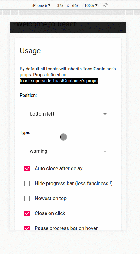
By default all toasts will inherits ToastContainer's props. Props defined on toast supersede ToastContainer's props.
  import React, { Component } from 'react';
  import { ToastContainer, toast } from 'react-toastify';
  import 'react-toastify/dist/ReactToastify.min.css';

  class App extends Component {
    notify = () => toast("Wow so easy !");

    render(){
      return (
        <div>
        <button onClick={this.notify}>Notify !</button>
        {/* One container to rule them all! */}
        <ToastContainer
          position="top-right"
          type="default"
          autoClose={5000}
          hideProgressBar={false}
          newestOnTop={false}
          closeOnClick
          pauseOnHover
        />
        {/*Can be written <ToastContainer />. Props defined are the same as the default one. */}
        </div>
      );
    }
}By default all the toasts will be positionned on the top right of your browser. If a position is set on a toast, the one defined on ToastContainer will be overwritten
The following values are allowed: top-right, top-center, top-left, bottom-right, bottom-center, bottom-left
For convenience, toast expose a POSITION property to avoid any typo.
 // toast.POSITION.TOP_LEFT, toast.POSITION.TOP_RIGHT, toast.POSITION.TOP_CENTER
 // toast.POSITION.BOTTOM_LEFT,toast.POSITION.BOTTOM_RIGHT, toast.POSITION.BOTTOM_CENTER

  import React, { Component } from 'react';
  import { toast } from 'react-toastify';

  class Position extends Component {
    notify = () => {
      toast("Default Notification !");
    toast.success("Success Notification !", {
      position: toast.POSITION.TOP_CENTER
    });
    toast.error("Error Notification !", {
      position: toast.POSITION.TOP_LEFT
    });
    toast.warn("Warning Notification !", {
      position: toast.POSITION.BOTTOM_LEFT
    });
    toast.info("Info Notification !", {
      position: toast.POSITION.BOTTOM_CENTER
    });
    toast("Custom Style Notification !", {
      position: toast.POSITION.BOTTOM_RIGHT,
      className: 'dark-toast',
      progressClassName: 'transparent-progress'
    });
  };

    render(){
      return <button onClick={this.notify}>Notify</button>;
    }
}An id is returned each time you display a toast, use it to remove a given toast programmatically by calling toast.dismiss(id)
Without args, all the displayed toasts will be dismissed.
  import React, { Component } from 'react';
  import { toast } from 'react-toastify';

  class Example extends Component {
    toastId = null;

    notify = () => this.toastId = toast("Lorem ipsum dolor");
Define hook
    dismiss = () =>  toast.dismiss(this.toastId);

    dismissAll = () =>  toast.dismiss();

    render(){
      return (
        <div>
          <button onClick={this.notify}>Notify</button>
          <button onClick={this.dismiss}>Dismiss</button>
          <button onClick={this.dismissAll}>Dismiss All</button>
        </div>
      );
    }
}To prevent duplicates, you can check if a given toast is active by calling toast.isActive(id) like the snippet below. With this approach, you can decide with more precision whether or not you want to display a toast.
  import React, { Component } from 'react';
  import { toast } from 'react-toastify';

  class Example extends Component {
    toastId = null;

    notify = () => {
      if (! toast.isActive(this.toastId)) {
        this.toastId = toast("I cannot be duplicated !");
      }
    }

    render(){
      return (
        <div>
          <button onClick={this.notify}>Notify</button>
        </div>
      );
    }
}You can define two hooks on toast:
- onOpen is called inside componentDidMount
- onClose is called inside componentWillUnmount
  import React, { Component } from 'react';
  import { toast } from 'react-toastify';

  class Hook extends Component {
    notify = () => toast("Lorem ipsum dolor", {
      onOpen: (childrenProps) => window.alert('I counted to infinity once then..'),
      onClose: (childrenProps) => window.alert('I counted to infinity twice')
    });

    render(){
      return <button onClick={this.notify}>Notify</button>;
    }
}When you use a custom close button, your button will receive a closeToast props. You need to call it in order to close the toast. The customCloseButton can be passed to the ToastContainer so all the toast display the custom close or you can set it by toast.
If customCloseButton is set to false, the close button will be not displayed.
  import React, { Component } from 'react';
  import { toast } from 'react-toastify';

  const CloseButton = ({ YouCanPassProps, closeToast }) => (
    <i
      className="material-icons"
      onClick={closeToast}
    >
    delete
    </i>
  );

  class CustomClose extends Component {
    notify = () => {
      toast("The close button change when Chuck Norris display a toast",{
        closeButton: <CloseButton YouCanPassProps="foo" />
      });
    };

    render(){
      return <button onClick={this.notify}>Notify</button>;
    }
}Taste and colours are not always the same ! You have several options.
- Overwrite
toastify-contentandtoastify__progress - Create two css classes and pass them to a toast
.dark-toast{
  background: #323232;
  color: #fff;
}

.dark-toast > .toastify__close{
  color: #fff;
}

.transparent-progress{
  background:  rgba(255,255,255,.7);
}

.fancy-progress{
  background: repeating-radial-gradient(red, yellow 10%, green 15%);
}
  import React, { Component } from 'react';
  import { toast } from 'react-toastify';

  class Style extends Component {
    notify = () => {
      toast("Dark style notification with default type progress bar",{
        className: 'dark-toast',
        autoClose: 5000
      });

      toast("Dark style with transparent progress bar, the one used with others types.",{
        className: 'dark-toast',
        progressClassName: 'transparent-progress',
        autoClose: 5000
      });

      toast("Dark style with ugly progress bar",{
        className: 'dark-toast',
        progressClassName: 'fancy-progress',
        autoClose: 5000
      });
    };

    render(){
      return <button onClick={this.notify}>Notify</button>;
    }
}- Or pass your classes to the ToastContainer to set the classes for all your toast in one shot.
  render(){
    return(
      {/*Component*/}
      <ToastContainer
        toastClassName="dark-toast"
        progressClassName="transparent-progress"
      />
      {/*Component*/}
    );
}On mobile the toast will take all the width available.
| Props | Type | Default | Description |
|---|---|---|---|
| position | string | top-right | One of top-right, top-center, top-left, bottom-right, bottom-center, bottom-left |
| autoClose | false or int | 5000 | Delay in ms to close the toast. If set to false, the notification need to be closed manualy |
| closeButton | React Element or false | - | A React Component to replace the default close button or false to hide the button |
| hideProgressBar | bool | false | Display or not the progress bar below the toast(remaining time) |
| pauseOnHover | bool | true | Keep the timer running or not on hover |
| closeOnClick | bool | true | Dismiss toast on click |
| newestOnTop | bool | false | Display newest toast on top |
| className | string | - | Add optional classes to the container |
| style | object | - | Add optional inline style to the container |
| toastClassName | string | - | Add optional classes to the toast |
| bodyClassName | string | - | Add optional classes to the toast body |
| progressClassName | string | - | Add optional classes to the progress bar |
All the method of toast return a toastId except dismiss and isActive.
The toastId can be used to remove a toast programmatically or to check if the toast is displayed.
| Parameter | Type | Required | Description |
|---|---|---|---|
| content | string\ | React Element | ✓ |
| options | object | ✘ | Possible keys : autoClose, type, closeButton, hideProgressBar |
- Available options :
type: Kind of notification. One of "default", "success", "info", "warning", "error". You can usetoast.TYPE.INFOand so on to avoid any typo.onOpen: Called inside componentDidMountonClose: Called inside componentWillUnmountautoClose: same as ToastContainer.closeButton: same as ToastContainer.closeOnClick: same as ToastContainer.hideProgressBar: same as ToastContainer.position: same as ToastContainerpauseOnHover: same as ToastContainerclassName: same as ToastContainer toastClassNamebodyClassName: same as ToastContainerprogressClassName: same as ToastContainer
const Img = ({ src }) => <div><img width={48} src={src} /></div>;
const options = {
    onOpen: props => console.log(props.foo),
    onClose: props => console.log(props.foo),
    autoClose: 6000,
    closeButton: <FontAwesomeCloseButton />,
    type: toast.TYPE.INFO,
    hideProgressBar: false,
    position: toast.POSITION.TOP_LEFT,
    pauseOnHover: true
};

const toastId = toast(<Img foo={bar}/>, options) // default, type: 'default'
toast.success("Hello", options) // add type: 'success' to options
toast.info("World", options) // add type: 'info' to options
toast.warn(<Img />, options) // add type: 'warning' to options
toast.error(<Img />, options) // add type: 'error' to options
toast.dismiss() // Remove all toasts !
toast.dismiss(toastId) // Remove given toast
toast.isActive(toastId) //Check if a toast is displayed or not| Chrome | Firefox | IE 11 | Edge | Safari |
|---|---|---|---|---|
| ✔ | ✔ | ✔ | ✔ | ✔ |
This version may introduce breaking changes due to redesign. My apologies.
But, it brings a lots of new and exciting features !
- The default design has been reviewed. The component is now usable out of the box without the need to touch the css. Relate to issue #28
- The toast timer can keep running on hover. issue #33
- Added a possibility to check if a given toast is displayed or not. By using that method we can prevent duplicate. issue #3
- Can decide to close the toast on click
- Can show newest toast on top
- Can define additionnal className for toastissue #21
- Much more mobile ready than the past
- The space in of left boxes from window & right boxes from window is different.issue #25
- Partial support of ie11. I still need to fix the animation but I need a computer with ie11 for that xD issue #26
- Toast can now be positioned individually !
- Can now remove a toast programmatically. When you display a toast, the function return a toastId. You can use it
as follow to remove a given toast
toast.dismiss(toastId) - If the container is not mounted, the notification will be added to a queue and dispatched as soon as the container is mounted. For more details check issue #4
- Added --no-idents flag to cssnano to avoid animation name collision with others libs.
- Tests are no longer transpiled
- That version does not bring any features but it brings tests made with the amazing jest and aslo Travis CI integration.
- React and react-dom are now peer dependencies
- Don't try to pass down the props when we render a string like so :
toast(<div>hello</div>)
- Fixed the test to check if the toast can be rendered
- React v16 ready : moving to prop-types and react-transition-group
- Internal rewrite of components. The implementation wasn't bad but it wasn't good either. A better props validation has been added has well.
- Removed useless dependencies. I was using the Object.values polyfill when a one line forEach can do the same is my case.
- Now I believe it's even easier to style the components. The sass sources files are now included when you install the package via yarn or npm
- The default close button has been replaced.
- A progress bar is now visible to track the remaining time before the notification is closed. Of course if you don't like it, you are free to disable it.
- You can choose to display a close button or not.
- Event pointer is set to none to avoid losing pointer events on everything beneath the toast container when no toast are displayed
- The
closeToastcallback is also passed down to your component.
- PropTypes package update
- Dead code elimination
- Possibility to use a custom close button. Check the api docs of ToastContainer and toast.
I was storing react component into state which is a bad practice. What should Go in State This is no more the case now. The separation of concern between the data and the view is respected.
- Was calling cloneElement on undefined which cause your console bleed. See issue #2
- Added Object.values polyfill otherwise won't work with IE or EDGE. I ♥ IE.
- OnClose and OnOpen can access all the props passed to the component. Before only the props passed using toast options were accessible
- Passing prop using toast option will be removed at the next release. It doesn't make sense to keep both way to pass props. Use the react way instead
- Added onOpen callback
- Added onClose callback
Any suggestions and pull request are welcome !
Licensed under MIT

 React
React
 Typescript
 Django
 Laravel
 Facebook
 Microsoft
 Google
 Alibaba
 D3
D3
 Tencent