brotheryouUI is an open source component library based on vue3 that is only supported in vue3. The project uses technology Vue3+vite+typescript. Please download and use it
import { createApp } from 'vue'
import App from './App.vue'
import borUi from 'brotheryou'

createApp(App).use(borUi).mount('#app')
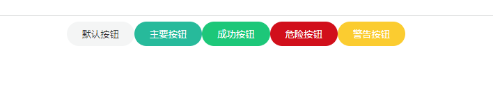
按钮的基础用法
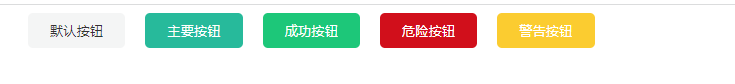
<bro-button>默认按钮</bro-button>
<bro-button type="primary">主要按钮</bro-button>
<bro-button type="success">成功按钮</bro-button>
<bro-button type="danger">危险按钮</bro-button>
<bro-button type="warning">警告按钮</bro-button>
属性 size
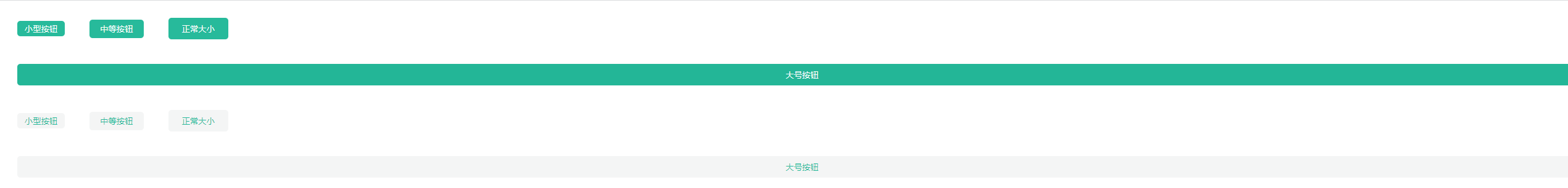
<bro-button size="mini" type="primary">小型按钮</bro-button>
<bro-button size="normal" type="primary">中等按钮</bro-button>
<bro-button type="primary">正常大小</bro-button>
<bro-button size="large" type="primary">大号按钮</bro-button>
<bro-button plain size="mini" type="primary">小型按钮</bro-button>
<bro-button plain size="normal" type="primary">中等按钮</bro-button>
<bro-button plain type="primary">正常大小</bro-button>
<bro-button plain size="large" type="primary">大号按钮</bro-button>
属性 plain
<bro-button plain>默认按钮</bro-button>
<bro-button plain type="primary">主要按钮</bro-button>
<bro-button plain type="success">成功按钮</bro-button>
<bro-button plain type="danger">危险按钮</bro-button>
<bro-button plain type="warning">警告按钮</bro-button>
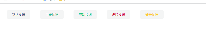
属性disabled
<bro-button disabled>默认按钮</bro-button>
<bro-button disabled type="primary">主要按钮</bro-button>
<bro-button disabled type="success">成功按钮</bro-button>
<bro-button disabled type="danger">危险按钮</bro-button>
<bro-button disabled type="warning">警告按钮</bro-button>
<br>
<br>
<bro-button plain disabled>默认按钮</bro-button>
<bro-button plain disabled type="primary">主要按钮</bro-button>
<bro-button plain disabled type="success">成功按钮</bro-button>
<bro-button plain disabled type="danger">危险按钮</bro-button>
<bro-button plain disabled type="warning">警告按钮</bro-button>
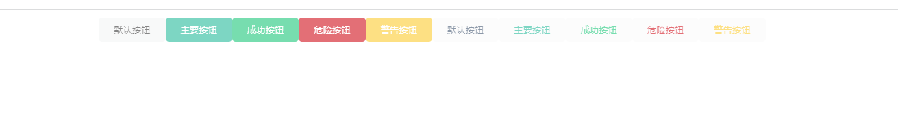
属性 round
<bro-button round>默认按钮</bro-button>
<bro-button round type="primary">主要按钮</bro-button>
<bro-button round type="success">成功按钮</bro-button>
<bro-button round type="danger">危险按钮</bro-button>
<bro-button round type="warning">警告按钮</bro-button>
| 属性 |
说明 |
类型 |
可选值 |
默认值 |
| size |
尺寸 |
string |
mini/normal/medium/large |
— |
| type |
类型 |
string |
default/primary/success/danger/warning |
— |
| plain |
是否为朴素 |
boolean |
— |
false |
| round |
是否为圆角 |
boolean |
— |
false |
| disabled |
是否禁用 |
boolean |
— |
false |
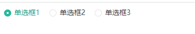
<script setup lang="ts">
import { ref } from 'vue'
const radio1 = ref('单选框1')
</script>

<template>
  <bro-radio v-model="radio1" label="单选框1">单选框1</bro-radio>
  <bro-radio v-model="radio1" label="单选框2">单选框2</bro-radio>
  <bro-radio v-model="radio1" label="单选框3">单选框3</bro-radio>
</template>
<script setup lang="ts">
import { ref } from 'vue'
const radio1 = ref('单选框1')
</script>

<template>
  <bro-radio v-model="radio1" label="单选框1" disabled >单选框1</bro-radio>
  <bro-radio v-model="radio1" label="单选框2">单选框2</bro-radio>
  <bro-radio v-model="radio1" label="单选框3">单选框3</bro-radio>
</template>### 带边框(border)
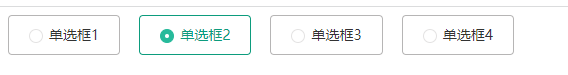
<script setup lang="ts">
import { ref } from 'vue'
const radio1 = ref('单选框1')
</script>

<template>
  <bro-radio v-model="radio1" label="单选框1" border >单选框1</bro-radio>
  <bro-radio v-model="radio1" label="单选框2" border >单选框2</bro-radio>
  <bro-radio v-model="radio1" label="单选框3" border >单选框3</bro-radio>
    <bro-radio v-model="radio1" label="单选框4" border>单选框4</bro-radio>
</template>
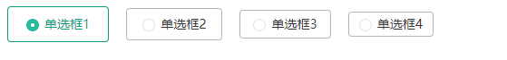
<script setup lang="ts">
import { ref } from 'vue'
const radio1 = ref('单选框1')
</script>

<template>
  <bro-radio v-model="radio1" label="单选框1" border size="large">单选框1</bro-radio>
  <bro-radio v-model="radio1" label="单选框2" border size="medium">单选框2</bro-radio>
  <bro-radio v-model="radio1" label="单选框3" border size="small">单选框3</bro-radio>
    <bro-radio v-model="radio1" label="单选框4" border size="mini">单选框4</bro-radio>
</template>
| 属性 |
说明 |
类型 |
可选值 |
默认值 |
| v-model |
选中绑定的值 |
string |
— |
— |
| label |
单选框对应的值 |
string |
— |
— |
| disabled |
是否禁用单选框 |
boolean |
— |
false |
| size |
radio的尺寸 |
string |
large/medium/small/mini |
large |
| name |
原生name属性 |
string |
— |
— |
| 事件名 |
说明 |
回调 |
| change |
绑定值变化时触发的事件 |
选中的值 |
<script setup lang="ts">
import { ref } from 'vue'
const value1 = ref(true)
</script>
<template>
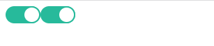
<bro-switch v-model="value1" />
<bro-switch v-model="value1" />
</template>
<script setup lang="ts">
import { ref } from 'vue'
const value1 = ref(true)
</script>
<template>
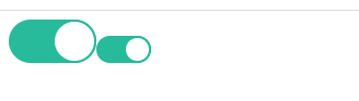
<bro-switch v-model="value1" :width="80" />
<bro-switch v-model="value1" />
</template>
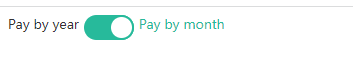
使用active-text属性与inactive-text属性来设置开关的文字描述。
<script setup lang="ts">
import { ref } from 'vue'
const value1 = ref(true)
</script>

<template>
  <bro-switch v-model="value1"  inactive-text="Pay by year" active-text="Pay by month"  />
</template>
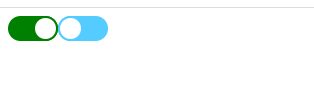
closeColor 属性可以配置自定义关闭颜色
openColor 属性可以配置自定义开启颜色
<script setup lang="ts">
import { ref } from 'vue'
const value1 = ref(true)
const value2 = ref(false)
</script>

<template>
   <bro-switch v-model="value1" closeColor="red" openColor="green" />
  <bro-switch v-model="value2" closeColor="#5cf" openColor="#1a1" />
</template>
设置disabled属性,接受一个Boolean,设置true即可禁用。

| 属性 |
说明 |
类型 |
可选值 |
默认值 |
| v-model |
绑定值 |
boolean |
— |
— |
| disabled |
是否禁用 |
boolean |
— |
false |
| :width |
自定义尺寸 |
number |
— |
50 |
| active-text |
开启文字描述 |
string |
— |
— |
| inactive-text |
关闭文字描述 |
string |
— |
— |
| openColor |
自定义开启颜色 |
string |
— |
#409eff |
| closeColor |
自定义关闭颜色 |
string |
— |
#dcdfe6 |
| 事件名称 |
说明 |
回调参数 |
| change |
switch状态发生变化时候的回调函数 |
最新的状态值 |

<template>
    <bro-alert
    />
</template>
| 属性 |
说明 |
类型 |
可选值 |
默认值 |
| type |
类型 |
string |
info,success, error,warn |
info |
| message |
展示的内容 |
string |
— |
info alert |
| closable |
是否可关闭 |
boolean |
— |
3000 |
| during |
停留时间 |
string|number |
large/medium/small/mini |
large |
<template>
<bro-input v-model='msg'/>
{{msg}}
</template>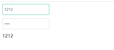
<template>
  <bro-input v-model='msg'/>
  <bro-input type="password" v-model='msg'/>
	{{msg}}
</template>
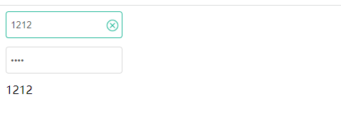
<template>
  <bro-input v-model='msg' clearable/>
  <bro-input type="password" v-model='msg'/>
{{msg}}
</template>
| 属性 |
说明 |
类型 |
可选值 |
默认值 |
| type |
类型 |
string |
text,password |
text |
| modeValue/v-model |
双向绑定 |
string |
— |
- |
| placeholder |
输入框为空时占位符 |
string |
— |
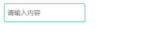
请输入内容 |
| disabled |
禁用 |
Boolean |
true/false |
false |
| width |
输入框宽度 |
string |
--- |
150 |
| height |
输入框高度 |
string |
--- |
20 |
| clearable |
清空 |
Boolean |
true/false |
false |
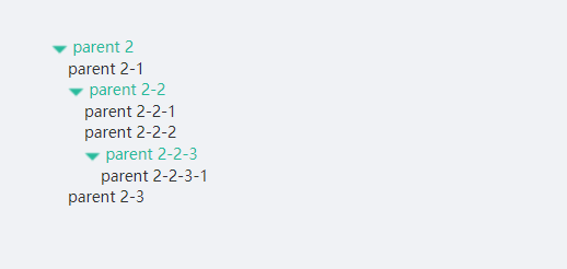
<script setup lang="ts">
const list =
  {name:'parent 2',key:1,children:[
        {name:'parent 2-1',key:3},
        {name:'parent 2-2',key:4,children:[{
          name:'parent 2-2-1',key:5,
        },
        {
          name:'parent 2-2-2',key:6,
        },
        {
          name:'parent 2-2-3',key:7,children:[{
              name:'parent 2-2-3-1',key:8
          }]
        }]},
         {name:'parent 2-3',key:9}
    ]}

</script>

<template>
<bro-tree-item :list="list">
</bro-tree-item>
</template>
| 属性 |
说明 |
类型 |
可选值 |
默认值 |
| list |
类型 |
object |
-- |
-- |

<script setup lang="ts">
const list = [{
  url:'http://img.haihaina.cn/Shinichi.jpeg'
},
{
  url:'http://img.haihaina.cn/Shinichi1.jpeg'
},
{
  url:'http://img.haihaina.cn/Shinichi5.jpeg'
},
{
  url:'http://img.haihaina.cn/Shinichi6.jpeg'
}]
</script>

<template>
<broCarousel :list="list"  />
</template><script setup lang="ts">
const list = [{
url:'http://img.haihaina.cn/Shinichi.jpeg'
},
{
url:'http://img.haihaina.cn/Shinichi1.jpeg'
},
{
url:'http://img.haihaina.cn/Shinichi5.jpeg'
},
{
url:'http://img.haihaina.cn/Shinichi6.jpeg'
}]
</script>
<template>
<broCarousel :list="list" autoplay />
</template>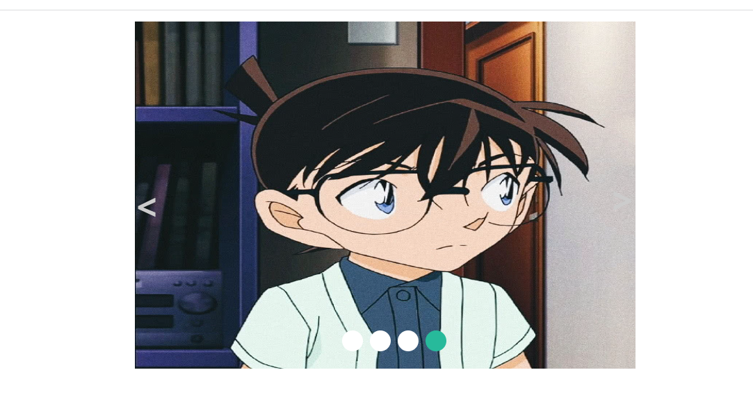
<script setup lang="ts">
const list = [{
  broUrl:'http://img.haihaina.cn/Shinichi.jpeg'
},
{
  broUrl:'http://img.haihaina.cn/Shinichi1.jpeg'
},
{
  broUrl:'http://img.haihaina.cn/Shinichi5.jpeg'
},
{
  broUrl:'http://img.haihaina.cn/Shinichi6.jpeg'
}]
</script>

<template>

<broCarousel :list="list" autoplay url="broUrl" />
</template>
| 属性 |
说明 |
类型 |
可选值 |
默认值 |
| list |
渲染数据 |
Array |
-- |
-- |
| url |
渲染图片name |
String |
-- |
url |
| autoplay |
是否自动轮播 |
Boolean |
true/false |
false |
| duration |
轮播间隔 |
Number |
-- |
1500 |
| width |
轮播图宽度 |
Nmber |
-- |
720 |
| height |
轮播图高度 |
Number |
-- |
500 |
<script setup lang="ts">
// import broCarousel from './components/Carousel/broCarousel.vue';
import { reactive,ref } from 'vue';
interface FormState {
name:string,
pwd:string
}
const formData:FormState = reactive({name:'',pwd:''})
const handleSubmit = ()=>{
}
</script>
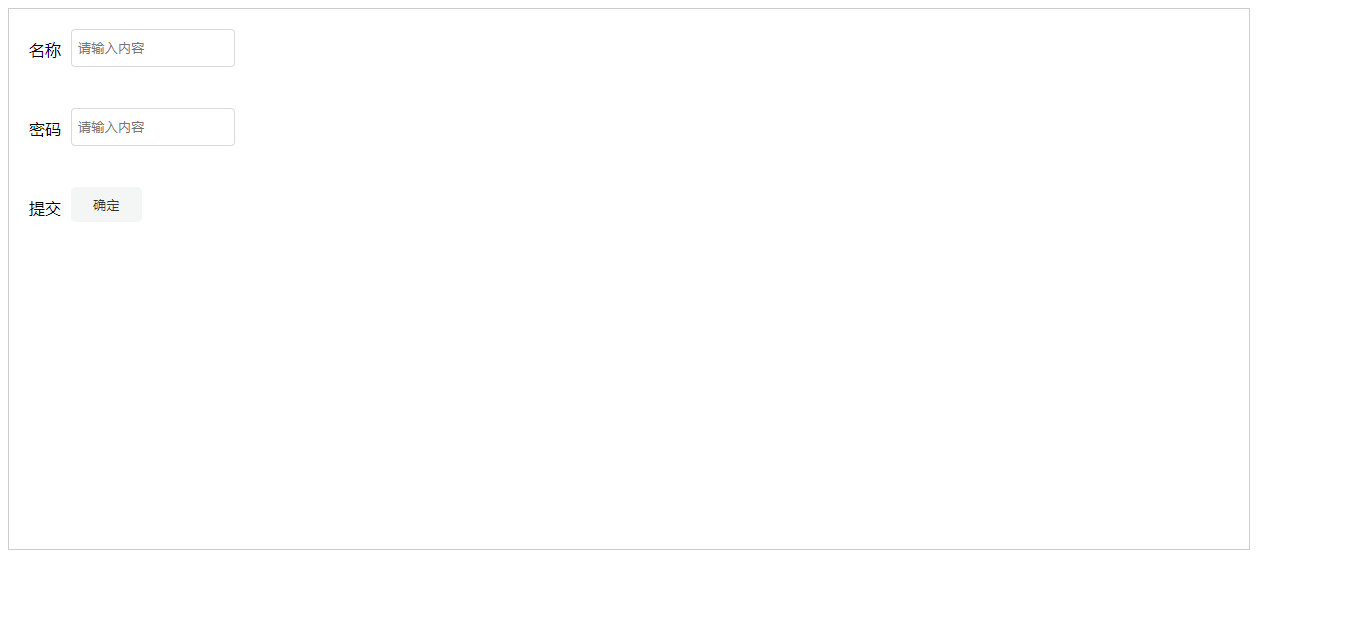
<template>
<bro-form ref="formRef">
<bro-form-item label="名称" >
<bro-input v-model="formData.name" height="30" />
</bro-form-item>
<bro-form-item label="密码">
<bro-input v-model="formData.pwd" height="30" />
</bro-form-item>
<bro-form-item label="提交" >
<bro-button @click="handleSubmit">确定</bro-button>
</bro-form-item>
</bro-form>
</template>
<script lang="ts" setup>
import {ref,reactive} from 'vue'

interface FormState {
  name:string,
  pwd:string
}
const formData:FormState = reactive({name:'',pwd:''})

const rules = {
  name: [
    {
      required: true,
      message: '请输入名称',
    },
  ],
  pwd: [
    {
      required: true,
      message: '请输入密码',
    },
  ],
}
const formRef = ref<any>('')
const handleSubmit = ()=>{
  formRef.value.validate((valid:boolean)=>{
    console.log('valid',valid)
  })
}
</script>
<template>
 <bro-form ref="formRef" :model="formData" :rules="rules">
 <bro-form-item label="名称" prop="name">
  <bro-input  v-model="formData.name" height="30"  />
 </bro-form-item>
  <bro-form-item label="密码" prop="pwd">
  <bro-input  v-model="formData.pwd" height="30"  />
 </bro-form-item>
   <bro-form-item label="提交" >
  <bro-button @click="handleSubmit">确定</bro-button>
 </bro-form-item>
 </bro-form>
</template>
| 属性 |
说明 |
类型 |
可选值 |
默认值 |
| mode |
校验数据 |
Array |
— |
-—— |
| rules |
校验规则 |
Array |
—— |
—— |
| width |
表单宽度 |
Number |
—— |
1200 |
| height |
表单高度 |
Number |
—— |
500 |
| 属性 |
说明 |
类型 |
可选值 |
默认值 |
| label |
label |
string |
— |
-—— |
| prop |
校验name |
string |
—— |
—— |


 React
React
 Typescript
 Django
 Laravel
 Facebook
 Microsoft
 Google
 Alibaba
 D3
D3
 Tencent