Layout Or UI for Mobile Phones and Tablets.
I am just wondering about, how we can achieve or implement layouts for Mobile and Tablets. For example, In the older implementation, we can, implements these res folder layouts for different screens, for the land folder for landscape, and for tablet layout-600dp, layout-720dp.
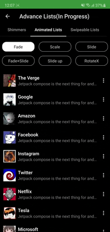
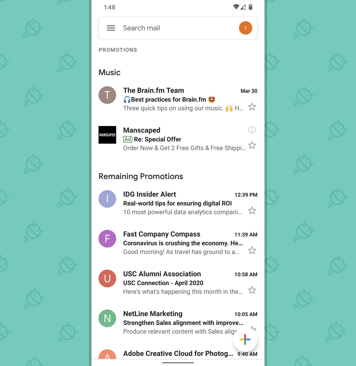
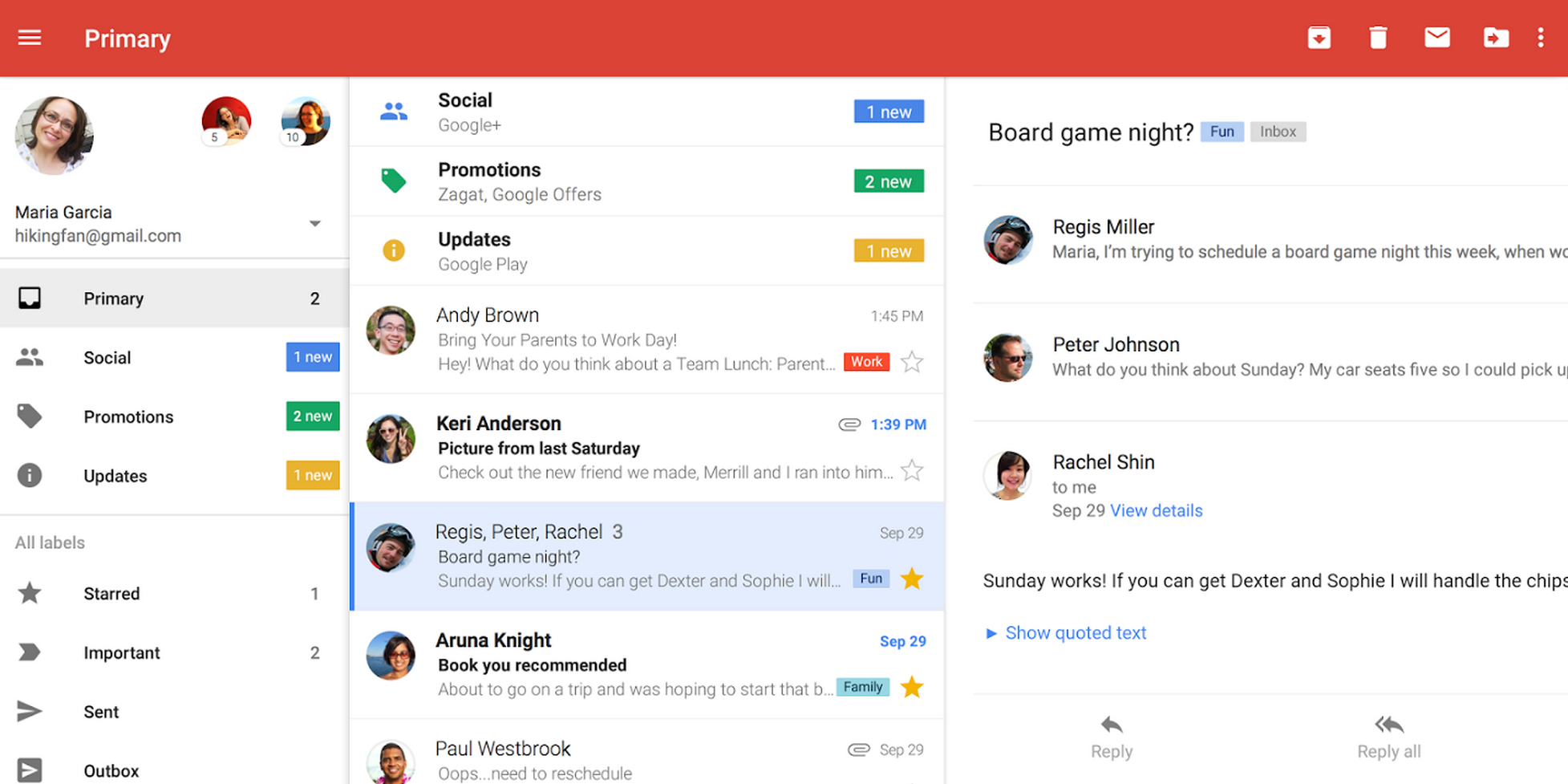
I also go through, all of your demo apps example, and if we talk about the Gmail app example, On a Mobile phone the listing is normal, but on a tablet, we can see listing and details of that particular selection.
Describe the solution you'd like
How we can achieve this. In terms of UI and Behaviour of app for Mobile and Tablet. Because in general, the layout for tablet and mobile is different in terms of sizing, detailing and UX.
Describe alternatives you've considered
Please check the Gmail app on Mobile and Tablet.
Additional context
I am also attaching the screens shots for your reference.
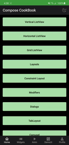
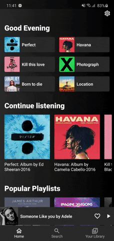
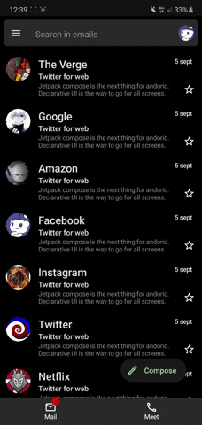
Mobile Phone:

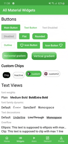
Tablet :

Second Thing
As of now if we are using, XML for layouts we can use same layout for different activities and fragments. I am just wondering how we can achieve in jetpack compose.
If you can guide us in this context that will be very helpful.
In last, thanks a lot for this repo. @Gurupreet
Learning and implementing...


 React
React
 Typescript
 Django
 Laravel
 Facebook
 Microsoft
 Google
 Alibaba
 D3
D3
 Tencent