tooltip ui component for react


- support ie8,ie8+,chrome,firefox,safari

var Tooltip = require('rc-tooltip');
var React = require('react');
var ReactDOM = require('react-dom')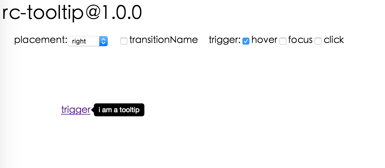
ReactDOM.render(<Tooltip placement="left" trigger={['click']} overlay={<span>tooltip</span>}><a href='#'>hover</a></Tooltip>, container);http://localhost:8007/examples/index.md
online example: http://react-component.github.io/tooltip/examples/
| name | type | default | description |
|---|---|---|---|
| overlayClassName | string | additional className added to popup overlay | |
| trigger | string[] | ['hover'] | which actions cause tooltip shown. enum of 'hover','click','focus' |
| mouseEnterDelay | number | 0 | delay time to show when mouse enter.unit: s. |
| mouseLeaveDelay | number | 0.1 | delay time to hide when mouse leave.unit: s. |
| overlayStyle | Object | additional style of overlay node | |
| wrapStyle | Object | additional style of wrap node | |
| prefixCls | String | rc-tooltip | prefix class name |
| transitionName | String | same as https://github.com/react-component/css-transition-group | |
| onVisibleChange | Function | call when visible is changed | |
| visible | boolean | whether tooltip is visible | |
| defaultVisible | boolean | whether tooltip is visible initially | |
| placement | String|Object | one of ['left','right','top','bottom', 'topLeft', 'topRight', 'bottomLeft', 'bottomRight'] or alignConfig of [dom-align](https://github.com/yiminghe/dom-align) | |
| overlay | React.Element | popup content | |
| getTooltipContainer | function | function returning html node which will act as tooltip contaier |
npm install
npm start
http://localhost:8007/tests/runner.html?coverage
rc-tooltip is released under the MIT license.


 React
React
 Typescript
 Django
 Laravel
 Facebook
 Microsoft
 Google
 Alibaba
 D3
D3
 Tencent