Code Monkey home page Code Monkey logo

vue-data-ui's Introduction


vue-data-ui

npm MadeWithVueJs.com shield GitHub issues NPM npm Static Badge

Interactive documentation

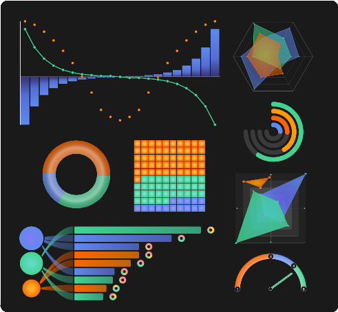
A user-empowering data visualization Vue components library.

Available components:

Charts

Mini charts

3d

Tables

Rating

Utilities

Installation

npm i vue-data-ui

You can declare components globally in your main.js:

import { createApp } from 'vue'
import App from "./App.vue";
// Include the css;
import "vue-data-ui/style.css";

// You can declare Vue Data UI components globally
import { VueUiRadar } from "vue-data-ui";

const app = createApp(App);

app.component("VueUiRadar", VueUiRadar);
app.mount('#app');

Or you can import just what you need in your files:

<script setup>
  import { VueUiRadar, VueUiXy } from "vue-data-ui";
</script>

Since v.2.0.38, you can also use the "VueDataUi" universal component, just specifying which component you are using. You can of course use the slots provided, if the target component has them.

<script setup>
import { ref } from "vue";
import { VueDataUi } from "vue-data-ui";
// Include the css;
import "vue-data-ui/style.css";

const config = ref({...});
const dataset = ref([...]);

</script>

<template>

  <VueDataUi
    component="VueUiXy"
    :config="config"
    :dataset="dataset"
  />

</template>

Typescript

Types are available in the 'vue-data-ui.d.ts' file under the types directory of the package.

Nuxt

This repo contains a boilerplate implementation of the vue-data-ui package in Nuxt

Customizable tooltips

Charts with tooltips have a config option to customize tooltip contents:


customFormat: ({ seriesIndex, datapoint, series, config }) => {
  return `<div>${ ... }</div>`;
}

Slots

#svg slot

Most Vue Data UI chart components include a #svg slot you can use to introduce customized svg elements (shapes, text, etc).

<VueUiXy :dataset="dataset" :config="config">
  <template #svg="{ svg }">
    <foreignObject x="100" y="0" height="100" width="150">
      <div>
        This is a custom caption
      </div>
    </foreignObject>
  </template>
</VueUiXy>

The svg slot also works when using the VueDataUi universal component, if the component it wraps supports it.

#legend slot (since v.2.0.41)

All charts expose a #legend slot except for:

  • VueUiHeatmap
  • VueUiRelationCircle
  • VueUiSparkHistogram
  • VueUiSparkStackbar
  • VueUiSparkbar
  • VueUiSparkgauge
  • VueUiSparkline
  • VueUiThermometer
  • VueUiTiremarks
  • VueUiWheel

The legend slot also works when using the VueDataUi universal component, if the component it wraps supports it. It is recommended to set the show legend config attribute to false, to hide the default legend.

<VueUiDonut :config="config" :dataset="dataset">
  <template #legend="{ legend }">
    <div v-for="item in legend">
      {{ legend.name }}
    </div>
  </template>
</VueUiDonut>

Tooltip #tooltip-before & #tooltip-after slots

Since v.2.0.57, it is possible to further customize tooltip contents with #tooltip-before and #tooltip-after slots. It is that easy to include an image, another chart or any other content into your tooltips. It's an alternative to the config option tooltip.customFormat, in case richer tooltip content is needed.

Both slots expose the following object:

{
  datapoint,
  seriesIndex,
  series,
  config,
}

The following charts bear these slots:

  • VueUiAgePyramid
  • VueUiCandlestick
  • VueUiDonut
  • VueUiGalaxy
  • VueUiHeatmap
  • VueUiMolecule
  • VueUiNestedDonuts
  • VueUiOnion
  • VueUiQuadrant
  • VueUiRadar
  • VueUiRings
  • VueUiScatter
  • VueUiTreemap
  • VueUiVerticalBar
  • VueUiXy *
  • VueUiwaffle

* VueUiXy slots specifically expose the following additional attributes:


{
  ...,
  bars,
  lines,
  plots
}

<VueUiDonut :config="config" :dataset="dataset">
  <template #tooltip-before={ datapoint, seriesIndex, dataset, config }">
    <div>
      This content shows first
    </div>
  </template>
  <template #tooltip-after={ datapoint, seriesIndex, dataset, config }">
    <div>
      This content shows last
    </div>
  </template>
</VueUiDonut>

The #tooltip-before & #tooltip-after slots also works when using the VueDataUi universal component, if the component it wraps supports them.

Config

If for some reason you can't access the documentation website and need to get the default config object for a component:

import { getVueDataUiConfig } from "vue-data-ui";

const defaultConfigXy = getVueDataUiConfig("vue_ui_xy");

vue-data-ui's People

Contributors

graphieros avatar

Stargazers

 avatar  avatar  avatar  avatar  avatar  avatar  avatar  avatar  avatar  avatar  avatar  avatar  avatar  avatar  avatar  avatar  avatar  avatar  avatar  avatar  avatar  avatar  avatar  avatar  avatar  avatar  avatar  avatar  avatar  avatar  avatar  avatar  avatar  avatar  avatar  avatar  avatar  avatar  avatar  avatar  avatar  avatar  avatar  avatar  avatar  avatar  avatar  avatar  avatar  avatar  avatar  avatar  avatar  avatar  avatar  avatar  avatar  avatar  avatar  avatar  avatar  avatar  avatar  avatar  avatar  avatar  avatar  avatar  avatar  avatar  avatar  avatar  avatar  avatar  avatar  avatar  avatar  avatar  avatar  avatar  avatar  avatar  avatar  avatar  avatar  avatar  avatar  avatar  avatar  avatar  avatar  avatar  avatar  avatar  avatar  avatar  avatar  avatar  avatar  avatar

Watchers

 avatar  avatar

vue-data-ui's Issues

Enhancement Proposal: Customizable Chart Tooltips

Hey there!

First and foremost, I'd like to express my admiration for the quality of the code in this repository. The work accomplished here is impressive, and in my opinion, it deserves even greater recognition.

I'm interested in utilizing some of the charts available in this project. However, the current lack of customization options for tooltips is a significant limitation for my use case. I believe providing a way to customize tooltips could enhance the flexibility and usability of these charts.

Would you be open to considering a pull request that introduces the option to customize tooltips? From my initial review, it appears that most charts rely on a useTooltip(params) function. My proposal is to expose this function, allowing users to customize tooltip content while maintaining the default implementation as the fallback.

I've already implemented a tweaked version of this for my personal use on the heatmap chart and would be thrilled to contribute it back as a standard feature. Please let me know if this is something the project could benefit from, and if so, any specific guidelines or preferences you have for contributions.

Nuxt setup

Hey, nice project!

Would you be open to also writing some docs code to get a minimum version up and running, to test if the library even works as well as some general docs for how to set this up on Nuxt.js? I am also struggling to get the types to work.
I get this error: Cannot find module 'vue-data-ui' or its corresponding type declarations.ts(2307
I also noticed that the component does get rendered, but it has no reactivity like the tooltips showing or the options doing anything
This is my component file:

<script lang="ts" setup>
import "vue-data-ui/style.css"
import { VueUiXy } from "vue-data-ui";


const config = {
    chart: {
        fontFamily: "inherit"
    }
}

const dataset = [
    {
        name: "Series 1",
        series: [-55, -34, -21, -13, -8, -5, -3, -2, -1, -1, 0, 1, 1, 2, 3, 5, 8, 13, 21, 34, 55],
        type: "bar"
        ,
        color: "rgb(95,139,238)",
    },
    {
        name: "Series 2",
        series: [55, 34, 21, 13, 8, 5, 3, 2, 1, 1, 0, -1, -1, -2, -3, -5, -8, -13, -21, -34, -55],
        type:
            "line"
        ,
        color: "rgb(66,211,146)",
        useProgression: true,
        dataLabels: false
    },
    {
        name: "Series 3",
        series: [64, 60, 52, 42, 30, 16, 0, -18, -38, -46, -50, -46, -38, -18, 0, 16, 30, 42, 52, 60, 64],
        type:
            "plot"
        ,
        color: "rgb(255,100,0)"
    },
    {
        name: "Target",
        series: [30, 30, 30, 30, 30, 30, 30, 30, 30, 30, 30, 30, 30, 30, 30, 30, 30, 30, 30, 30, 30],
        type: "line",
        color: "#404040",
        dashed: true,
        useTag: "start",
        dataLabels: false,
    },
];

</script>
<template>
    <VueUiXy :config="config" :dataset="dataset" />
</template>

Recommend Projects

  • React photo React

    A declarative, efficient, and flexible JavaScript library for building user interfaces.

  • Vue.js photo Vue.js

    ๐Ÿ–– Vue.js is a progressive, incrementally-adoptable JavaScript framework for building UI on the web.

  • Typescript photo Typescript

    TypeScript is a superset of JavaScript that compiles to clean JavaScript output.

  • TensorFlow photo TensorFlow

    An Open Source Machine Learning Framework for Everyone

  • Django photo Django

    The Web framework for perfectionists with deadlines.

  • D3 photo D3

    Bring data to life with SVG, Canvas and HTML. ๐Ÿ“Š๐Ÿ“ˆ๐ŸŽ‰

Recommend Topics

  • javascript

    JavaScript (JS) is a lightweight interpreted programming language with first-class functions.

  • web

    Some thing interesting about web. New door for the world.

  • server

    A server is a program made to process requests and deliver data to clients.

  • Machine learning

    Machine learning is a way of modeling and interpreting data that allows a piece of software to respond intelligently.

  • Game

    Some thing interesting about game, make everyone happy.

Recommend Org

  • Facebook photo Facebook

    We are working to build community through open source technology. NB: members must have two-factor auth.

  • Microsoft photo Microsoft

    Open source projects and samples from Microsoft.

  • Google photo Google

    Google โค๏ธ Open Source for everyone.

  • D3 photo D3

    Data-Driven Documents codes.