#Vincent


###A Python to Vega translator
The folks at Trifacta are making it easy to build visualizations on top of D3 with Vega. Vincent makes it easy to build Vega with Python.
The data capabilities of Python. The visualization capabilities of JavaScript.
Vincent takes Python data structures (tuples, lists, dicts, and Pandas DataFrames) and translates them into Vega visualization grammar. It allows for quick iteration of visualization designs via simple addition and subtraction of grammar elements, and outputs the final visualization to JSON.
Lets build the Vega bar chart example with Vincent manually, then show some shortcuts to help get there a little faster, as well as methods for manipulating the components. First, create a Vincent object, which will initialize with some default parameters for the visualization:
>>> import vincent
>>> vis = vincent.Vega()
Now add some data. We could pass a dict, but nested tuples will keep our data sorted properly:
>>> vis.tabular_data((('A', 28), ('B', 55), ('C', 43), ('D', 91), ('E', 81), ('F', 53),
                     ('G', 19), ('H', 87), ('I', 52)))
Pass components to the visualization grammar as keyword arguments (skipping the 'marks' component here for brevity):
>>> vis.build_component(axes=[{"type":"x", "scale":"x"},{"type":"y", "scale":"y"}],
                        scales=[{"name":"x", "type":"ordinal", "range":"width",
                                 "domain":{"data":"table", "field":"data.x"}},
                                {"name":"y", "range":"height", "nice":True,
                                 "domain":{"data":"table", "field":"data.y"}}])
One option is to output to JSON:
>>> vis.to_json(path)Then copy/paste the JSON output to Vega's online editor, where you should see a replica of the example.
The other option is to output the Vega grammar and data into separate JSONs, as well as a simple HTML scaffold, then fire up a simple Python server locally:
>>> vis.to_json(path, split_data=True, html=True)$ python -m SimpleHTTPServer 8000
CD to your path and point your browser at http://localhost:8000/vega_template.html to see your visualization. Please see the README in the examples folder for a more complete description of running the example files.
Creating visualizations manually is a little tedious. The vincent.Vega() object can be subclassed to pre-define components and parameters. Lets take a shortcut and use the Bar class:
>>> import random
>>> vis = vincent.Bar()
>>> vis.tabular_data([random.randint(10, 100) for x in range(0, 21, 1)])
>>> vis.to_json(path)
Vincent also allows you to add and subtract components at varying levels of nesting depth in order to change the visualization. Vincent syntax for modifying component pieces on the fly is:
Addition: += ( New Value, Component, Component index, Keywords into nested structure )
Removal: -= ( Old key, Component, Component index, Keywords into nested structure )
For example, if we wanted to change the bar plot to an area plot:
>>> vis -= ('width', 'marks', 0, 'properties', 'enter')
>>> vis += ('area', 'marks', 0, 'type')
>>> vis += ({'value': 'basis'}, 'marks', 0, 'properties', 'enter', 'interpolate')
>>> vis += ('linear', 'scales', 0, 'type')
>>> vis.to_json(path)
You can create new visualizations from existing Vega objects with similar syntax
>>> new_vis = vis + ('area', 'marks', 0, 'type')
>>> newer_vis = new_vis - ('scale', 'axes', 0)
Vincent also plays nice with Pandas DatetimeIndex, and allows for simple axis labeling and titling:
import vincent
import pandas as pd

# All of the following import code comes from Wes McKinney's book, Python for Data Analysis

import pandas.io.data as web
all_data = {}
for ticker in ['AAPL', 'GOOG']:
    all_data[ticker] = web.get_data_yahoo(ticker, '1/1/2010', '1/1/2013')
price = pd.DataFrame({tic: data['Adj Close']
                      for tic, data in all_data.iteritems()})

# Create line graph, with monthly plotting on the axes
line = vincent.Line()
line.tabular_data(price, columns=['AAPL'], axis_time='month')
line.to_json(path)

# Manipulate the axis tick/tick label orientation
line += ({'labels': {'angle': {'value': 25}}}, 'axes', 0, 'properties')
line += ({'value': 22}, 'axes', 0, 'properties', 'labels', 'dx')
line.update_vis(padding={'bottom': 50, 'left': 30, 'right': 30, 'top': 10})
line.update_vis(width=800, height=300)

# Add axis labels and a title
line.axis_label(y_label='AAPL Price', title='AAPL Stock Price 1/1/2010-1/1/2013')
line.to_json(path)
Vincent fully supports the mapping component of Vega, allowing for rapid creation of regular maps and chloropleths by binding Python data structures to geoJSON data:
# Regular map, no data binding
vis = vincent.Map(width=1000, height=800)
vis.geo_data(projection='albersUsa', scale=1000, counties=r'county_geo.json')
vis += ('2B4ECF', 'marks', 0, 'properties', 'enter', 'stroke', 'value')
vis.geo_data(states=r'state_geo.json')
vis -= ('fill', 'marks', 1, 'properties', 'enter')
vis.to_json(path)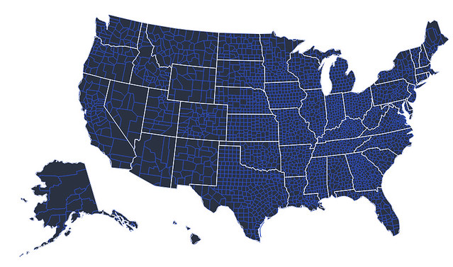
# Bind Pandas DataFrame to map
vis = vincent.Map(width=1000, height=800)
vis.tabular_data(dataframe, columns=['FIPS_Code', 'Unemployment_rate_2011'])
vis.geo_data(projection='albersUsa', scale=1000, bind_data='data.id',
             counties=r'county_geo.json')
vis += (["#f5f5f5","#000045"], 'scales', 0, 'range')
vis.to_json(path)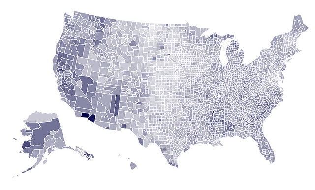
I also have Vincent incorporated into a fork of Mike Dewar's d3py, with a pull request to merge into the main repo.
For now, here is the syntax for using the d3py fork:
import d3py
import pandas as pd
import random

x = range(0, 21, 1)
y = [random.randint(25, 100) for num in range(0, 21, 1)]

df = pd.DataFrame({'x': x, 'y': y})

# Create Pandas figure
fig = d3py.PandasFigure(df, 'd3py_area', port=8080, columns=['x', 'y'])

# Add Vega Area plot
fig += d3py.vega.Area()

# Add interpolation to figure data
fig.vega += ({'value': 'basis'}, 'marks', 0, 'properties', 'enter',
            'interpolate')
fig.show()pandas
requests (for shapefiles only)
Note: Vincent is still in beta, but we are moving quickly towards a V1.0 release. Expect API/syntax to stay mostly fixed, with major changes incorporated before V1.0.


