- Explain the difference between a responsive website and a mobile-specific website.
- Compare mobile-first to desktop-first responsive design
- Use media queries to adjust styles for different viewport sizes.
- Identify and use relative units like
em,rem,vh,vw, etc.. - List the different media query values and their conditions.
- Use the iOS simulator, Safari console, and Chrome Dev tools to debug responsive CSS.
Ultimately we are trying to answer the question:
How do we build web applications and sites for an optimal interaction experience on a multitude of devices?
In the beginning, there was no CSS. Every site looked nearly identical. As styling web pages became more common, developers began structuring their pages with table layouts and fixed-width CSS.
Many designers still ask
What are the most common dimensions for a website design?
You tell me! http://screensiz.es (5 min)
What makes a design fixed? What makes a design fluid? What makes a site responsive?
Check out mediaqueri.es for inspiration.
One way to create optimal experiences for mobile users is a dedicated mobile site.
You know you're on one when you see m. in the url!
Compare https://m.ups.com with https://ups.com
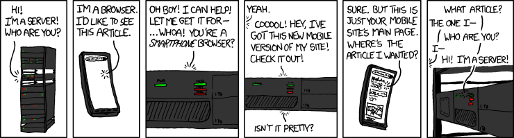
Avoid these... please.
- Flexible (or Fluid) Grids
- Flexible Images (or Media)
- Media Specific Layouts
A grid based layout which adjusts with screen size.
Coming soon to a lesson near you.
We need images that fit their containers.
It turns max-width: 100% is the answer. Most of the time. For any media.
Even as our flexible container resizes, shrinking or enlarging our image, the image’s aspect ratio remains intact.
img,
embed,
object,
video {
  max-width: 100%;
}One way to adjust the styles depending on the device's size is by using media queries:
body{
  background: papayawhip;
}

@media (max-width: 400px){
  body{
    background: tomato;
  }
}
Using media queries, we can group our css rules according to the size of our expected viewing devises. This media query says, if our viewport is less than 400px, use the following css rules.
The 400px corresponds to the device's viewport. A device's viewport is different from both its screen size and resolution. Check out this article if you're interested in why.
Other possible values include
/* these are most commonly used */
min-width | max-width | min-height | max-height

/* these are possible, but less common */
| width | height
| device-width | min-device-width | max-device-width
| device-height | min-device-height | max-device-height
| aspect-ratio | min-aspect-ratio | max-aspect-ratio | max-device-aspect-ratio
| device-aspect-ratio | min-device-aspect-ratio |
| color | min-color | max-color
| color-index | min-color-index | max-color-index
| monochrome | min-monochrome | max-monochrome
| resolution | min-resolution | max-resolution
| scan | grid
Working with the example above, create a jsfiddle, codepen, or webpage that includes at least two media queries.
When the viewport is less than 800px wide, make the background yellow. When the viewport is less than 400px wide, make the background green.

Try out a few of the properties above. You can combine media queries to get several different results.
i.e. what combination of media queries could produce the following grid as the viewport changes size?
| green | yellow | red |
|---|---|---|
| turqouise | green | purple |
You should have just seen these in your research.
A. The "and" clause
@media (min-width: 700px) and (orientation: landscape) { ... }A. Comma separated List
@media (min-width: 700px), handheld and (orientation: landscape)A. Applies to the whole media query and returns true if the media query would otherwise return false (such as monochrome on a color display or a screen width of 600px with a min-width: 700px feature query). See more here
Q. What is the difference between starting with the smallest viewport and applying styles as the viewport size increases and starting with the largest viewport size as the default?
A. See below.
A. Yes.
A. No.
So far, we've been working with pixels (absolute unit of measurement) and percentages (relative unit of measurements)
Form groups with your tables to research, discuss (15 min), and demo one of the following pair:
- em and rem
- vh and vw
- vmin and vmax
- ex and ch
https://github.com/ga-dc/craigslist_grid
https://github.com/ga-dc/responsive_007
Be sure to include
<meta name="viewport" content="width=device-width">Mobile Safari introduced the "viewport meta tag" to let web developers control the viewport's size and scale. Many other mobile browsers now support this tag, although it is not part of any web standard. This setting makes the width of the browser’s viewport equal to the width of the device’s screen.
- What are the three components of responsive web design?
- How do we "and" two media queries?
- What is the name of the design pattern where the initial designs support mobile, then we move to larger devices?
- Sizes, sizes, and more sizes
- fluid media:
img, embed, object, video { max-width: 1 }; @media (max-width: 400px) { ... }- min/max-width, min/max-height
- And:
@media (max-width: 400px) and (orientation: portrait) { ... } - Or (comma separated):
@media (min-width: 700px), handheld and (orientation: landscape) { ... }
- The post that introduced us to responsive web design
- http://screensiz.es
- http://mediaqueri.es
- Media Query Logical Operators
- Viewports
- Book: Responsive Web Design, Ethan Marcotte


 React
React
 Typescript
 Django
 Laravel
 Facebook
 Microsoft
 Google
 Alibaba
 D3
D3
 Tencent