funkhaus / factory-archive Goto Github PK
View Code? Open in Web Editor NEWThe Funkhaus component Factory - a proof of concept for an upcoming component marketplace
The Funkhaus component Factory - a proof of concept for an upcoming component marketplace


This component is used on homepage to display BlockFeatured in alternating layout. Please build this after you have built BlockFeatured.
Please also see attached screenshots for quick reference.
Email [email protected] for the design password.
props: {
    items: {
        // Mock: api.pages
        type: Array,
        default: () => []
    }
}
Build BlockFeatured first. Use CSS to override alignment of blocks.
List out any components that are used by this new component. For example, if you are building a grid that is made up of block components.
BlockFeatured is used for each block in the gridTime estimate: 0.5hrs
Budget: $100

Some text with logos in it. Hover on each logo brings up a cross fading slideshow of rapid images.
Note the "EXPLORE ->" hover state too.
Each logo should be wrapped in a nuxt link, linking to:
/elastic
/rock-paper-scissors
/a52
/primary
/jax
/indestructible
Please also see attached screenshots for quick reference.
If no mobile designs provided, please use your best judgment for responsiveness.
Email [email protected] for the design password.
I'd expect the text and logos to be hardcoded into this component. By it's nature, it's hard to imagine how to place the logos and have them have the slideshow hover states.
props: {
    rpsImages: {
        // Mock: api.images. An array of images used in each slideshow.
        type: Array,
        default: () => []
    },
    // And repeated for each company logo
    elasticImages = []
    primaryImages = []
    a52Images = []
    jaxImages = []
    indestructibleImages = []
}
Time estimate: 4hrs
Budget: $400


This component is used as a footer. It has a few variations. It can have different text/address and social links per company, and a different logo per company.
The "Forever Linda" link can just be a placeholder URL for now, I will update with real one when we have it.
Please also see attached screenshots for quick reference.
Email [email protected] for the design password.
Sample logos here:
https://www.dropbox.com/s/2uikuggsml8x3px/logo-makemake.svg?dl=0
https://www.dropbox.com/s/q18kfz723zuodob/logo-elastic.svg?dl=0
address: This will be the address in bottom left. Could be two or more.
logo: This will be an SVG of the logo used in center.
menuLocation: {
    type: String,
    default: ""
}
--color-company for the font color.min-height: 400px--color-black.Menu in bottom right should be a <ul> and hardcoded to placeholder URLs for now. I will replace it with a <wp-menu> component later. It will be helpful to have the CSS in place though.
Time estimate: 1hrs
Budget: $100

This component is used on the News landing page to display BlockNews in an alternating layout.
Please also see attached screenshots for quick reference.
Email [email protected] for the design password.
props: {
    items: {
        // Mock: api.pages
        type: Array,
        default: () => []
    }
}
BlockNews is used for the blocksTime estimate: 1hrs
Budget: $100
This component is used on the about page to display awards. The awards numbers should count up when they become visible.
Please also see attached screenshots for quick reference.
If no mobile designs provided, please use your best judgment for responsiveness.
Email [email protected] for the design password.
Note that the component is the PINK part, you do not need to add the black that is at top of component.
props: {
    items: {
        // Mock: [{count: 20, title: "Cannes Lions"}, {...}, {...}]
        type: Array,
        default: () => []
    },
    title: {
          type: String,
          default: "About"
    }
}
List any developer tips here
--color-pink for the background colorposition: absolute the awards title out from the top of the section.<section> tag for outer markup. Awards should be a h2 tag.Time estimate: 2hrs
Budget: $200

This component is used on work detail pages to display a gallery of images.
Please also see attached screenshots for quick reference.
If no mobile designs provided, please use your best judgment for responsiveness.
Email [email protected] for the design password.
Note that the designs show a name above and below the slideshow, that is not part of this component.
props: {
    images: {
        // Mock: api.pages
        type: Array,
        default: () => []
    }
}
List any developer tips here
--unit-100vh for the height of the slideshow. Give it a min-height of 300px too.--color-grey and then hover state on the arrows is to go --color-orange.--color-orangeArrows and pagination dots should advance slideshow, and arrow keys on keyboard. These are built into slideshow so just mentioned to test them.
List out any components that are used by this new component. For example, if you are building a grid that is made up of block components.
wp-image for the imagesTime estimate: 1.5hrs
Budget: $150

This component is used on the News page to display recent posts. The hover state scales up the image and moves the text over the image.
Please also see attached screenshots for quick reference.
Note that the layout alternates when used in a GridNews so build it with that in mind.
If no mobile designs provided, please use your best judgment for responsiveness.
Email [email protected] for the design password.
props: {
    image: {
        // Mock: api.image
        type: Object,
        default: () => {}
    },
    title: {
        type: String,
        default: ""
    },
    date: {
        type: String,
        default: ""
    },
    to: {
        type: String,
        default: ""
    },
}
List any developer tips here
--color-pink for the font colorList out any components that are used by this new component. For example, if you are building a grid that is made up of block components.
nuxt-linkwp-image for the imageTime estimate: 1hrs
Budget: $100


This component is used to display a list of names (as links) that on hover show an image. Sometimes the names are in columns, sometimes they are in a comma separated sentence.
column variant, If more than 7 names, go to 2 columns, if more than 14 names, go to 3 columns.commaPlease also see attached screenshots for quick reference.
Desktop:
On mobile, no hover state (so no images loaded, just link). On mobile, go to one column of names. Comma variant just wraps (see designs).
Email [email protected] for the design password.
props: {
    items: {
        // Mock: api.pages (each item contains the name, and the image)
        type: Array,
        default: () => []
    },
    title: {
        // Only used on the sentence variant
        type: String,
        default: ""
    },
    variant: {
        type: String,
        default: "column" // Or comma
    },
    date: {
        type: String,
        default: ""
    }
}
--color-company for the font color, other wise in comma mode use --color-black.is-variant-${this.variant} as a class, and use that to style variants differently I think.wp-image for the background hover image@/utils/tools.js contains a sortColumns function that might help with the names. Or CSS flexbox?Time estimate: 2hrs
Budget: $250


This component is used on all the sub-company's homepage's.
It has several variants, sometimes it has logos, credits, an image, or a date.
Note the hover state (yellow screenshot). This hover state
Please also see attached screenshots for quick reference.
Email [email protected] for the design password.
props: {
    image: {
        // Mock: api.image
        type: Object,
        default: () => {}
    },
    logos: {
        // Mock: api.logos
        type: Array,
        default: () => []
    },
    date: {
        type: String,
        default: ""
    },
    title: {
        type: String,
        default: ""
    },
    to: {
        type: String,
        default: ""
    },
    credits: {
        // Will be text, each credit on new line.
        type: String,
        default: ""
    },
   creditsVisible: {
        // This is used to define how many credits lines to show in the not-hovered state
        type: Number,
        default: 1
    },
    isPost: { // Used to set the variant that has no image
        type: Boolean,
        default: false
    }
}
nuxt-link.wp-image is used for the background imageI expect this to take 4 hours to complete, and will pay $400 for it.


This component is used on the Work and Directory grid pages. It has a hover state that scales up the image, and moves the text over the image.
Please also see attached screenshots for quick reference.
**Note that the block will need to be alternated when used in GridWork, so best to build this with that in mind. **
Note the variant without the credit prop.
If no mobile designs provided, please use your best judgment for responsiveness.
Email [email protected] for the design password.
props: {
    image: {
        // Mock: api.images[0]
        type: Object,
        default: () => {}
    },
    title: {
        type: String,
        default: "" // "HP - Meant To Move"
    },
    credit: {
        type: String,
        default: "" // Optional
    },
    to: {
        type: String,
        default: ""
    }
}
List any developer tips here
--color-orange for the font colorList out any components that are used by this new component. For example, if you are building a grid that is made up of block components.
nuxt-link<split-title> for the two lines of the title<wp-image> for the imageTime estimate: 1hrs
Budget: $100
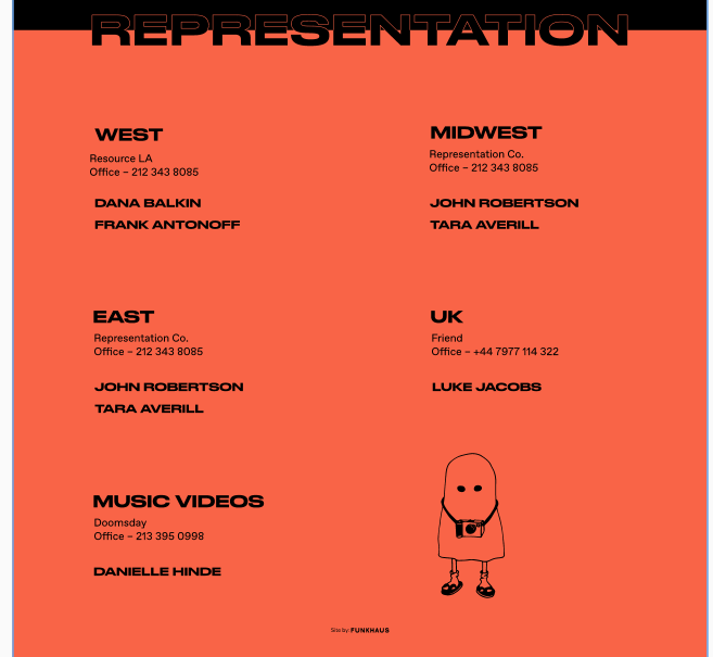
This component is used on the Contact page to give contact information.
Please also see attached screenshots for quick reference.
If no mobile designs provided, please use your best judgment for responsiveness.
Email [email protected] for the design password.
Note that the component is the RED part, you do not need to add the black that is at top of component.
region = {
     title: "West",
     text: "Resource LA/nOffice – 212 343 8085",
     people: {name: "Dana Balkin", email: "[email protected]"}
}

props: {
    regions: {
        type: Array,
        default: () => [{...region}, {...region}, {...region}]
    },
    title: {
          type: String,
          default: "Representation"
    }
}
List any developer tips here
--color-red for the text colorposition: absolute the awards title out from the top of the section.<section> tag for outer markup. Awards should be a h2 tag.<a> that links to https://funkhaus.us target _blank.SVG for illustration can be found here: https://www.dropbox.com/sh/j5ddp8f4w8l3ii3/AAAZ1BC1JIgUBC2IKikh9xD2a?dl=0
Time estimate: 2hrs
Budget: $200
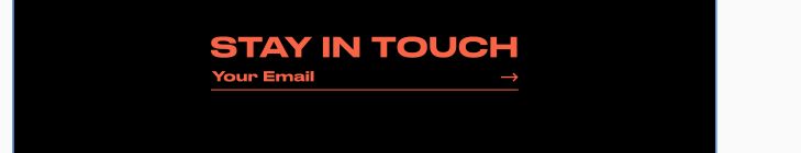
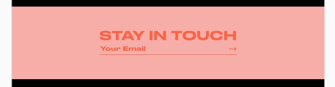
This component is used on the homepage and contact page to capture users email into mailchimp.
Please also see attached screenshots for quick reference.
If no mobile designs provided, please use your best judgment for responsiveness.
Email [email protected] for the design password.
List any developer tips here
--color-red for the font color--color-red for the background/deep/ CSS to override the colors for the contact page variant.List out any components that are used by this new component. For example, if you are building a grid that is made up of block components.
Time estimate: 1.5hrs
Budget: $150
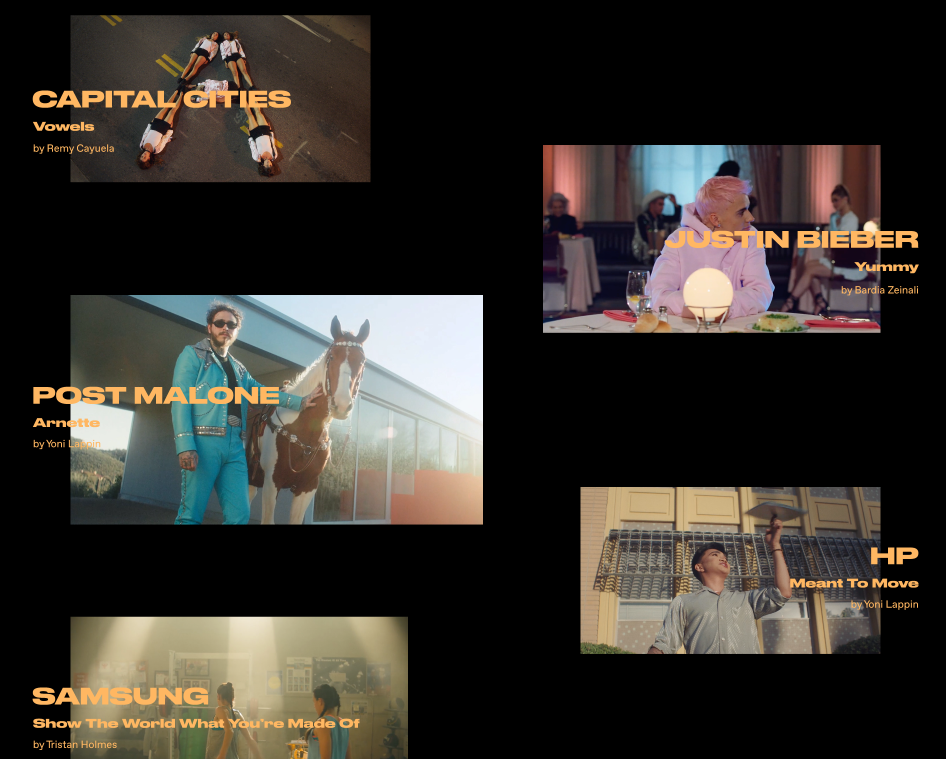
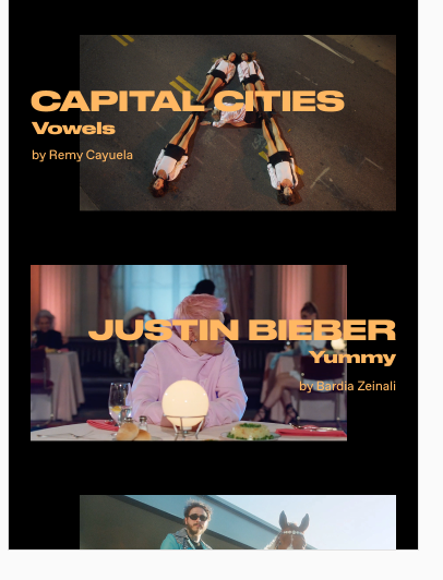
This component is used on the homepage to display featured work. Hover state moves the second image up, and the primary image slightly inwards.
Please also see attached screenshots for quick reference.
Email [email protected] for the design password.
Note the way the hover state slides up. Also note that when used on a page, the alignment alternates.
props: {
    imagePrimary: {
        // Mock: api.images[0]
        type: Object,
        default: () => {}
    },
    imageSecondary: {
        // Mock: api.images[1]
        type: Object,
        default: () => {}
    },
    title: {
        type: String,
        default: "" // "HP - Meant To Move"
    },
    credit: {
        type: String,
        default: "" // Yoni Lappin
    },
    to: {
        type: String,
        default: ""
    }
}
List any developer tips here
--color-orange for the font colorby in front of the credit in code.GridFeatured in mind for alternating layoutPlease note the hover state animation in the XD link.
List out any components that are used by this new component.
wp-image for both images. You want to use the aspectRatio prop to 56.25 for both images.split-text for the title. Have it be a <h2> tag please.Time estimate: 1hrs
Budget: $100


This component is used on the contact page to display team contact details. It changes color and rotates the images on hover.
Please also see attached screenshots for quick reference.
If no mobile designs provided, please use your best judgment for responsiveness.
Email [email protected] for the design password.
props: {
    name: {
        type: String,
        default: ""
    },
    title: {
        type: String,
        default: ""
    },
    email: {
        type: String,
        default: ""
    }
}
List any developer tips here
--color-red for the font color--color-pink for the hover state<a> tag with mailto:${this.email} as the hrefShould open a new email on click
The SVGs should be a kebab-case of the name prepending with animal-${_kebabCase(this.name)}.svg.
SVG's are here: https://www.dropbox.com/sh/j5ddp8f4w8l3ii3/AAAZ1BC1JIgUBC2IKikh9xD2a?dl=0
Time estimate: 1hrs
Budget: $100

This component is used as the main menu. It opens on top of the site. Hover state outlines text using text-stroke CSS.
Please also see attached screenshots for quick reference.
It's easy to see the design in the mobile versions.
The hamburger-dot is not in this component. That would be a separate on.
Email [email protected] for the design password.
This will use the <wp-menu> component, which we can't easily develop in Factory because it does a Nuxt fetch. it can be feed items to mock it, which is what we should do for this.
This will use clip-path on the open animation, but that is also not something we are going to worry about in this component build. I will build that animation separately as I build the site. So simply make a fixed position, full screen container with the large text and hover state outlines of text.
Sizing the text is a tough one. Ideally it fills the screen in height, but not if it's going to cause the text to wrap or not fit in width wise. I wish there was a way to "object-fit: cover" a menu somehow. Please propose a solution to this before starting on this component. Ideally the solution doesn't involve lots of breakpoints.
Time estimate: 1hrs
Budget: $100


This component is a fixed footer used at the bottom of most pages. It contains a <wp-menu> that will just link to social media.
Please also see attached screenshots for quick reference.
Email [email protected] for the design password.
props: {
    items: {
        // Mock: api.menuItems
        type: Array,
        default: () => []
    }
}
List any developer tips here
--color-footer-background and --color-footer-text for the colorsNote the hove state text outline effect.
List out any components that are used by this new component. For example, if you are building a grid that is made up of block components.
<wp-menu> see here is used for the menu. You can pass in the mockitems to wp-menu :items="items" for now.Time estimate: 1hrs
Budget: $100


This component is used on Directors landing pages and Work category pages to display BlockWork in an alternating fashion.
Please also see attached screenshots for quick reference.
Note mobile design shows first two blocks have same alignment, this is a design bug. They should alternate down the page in a single column.
If no mobile designs provided, please use your best judgment for responsiveness.
Email [email protected] for the design password.
props: {
    items: {
        // Mock: api.pages
        type: Array,
        default: () => []
    }
}
Use CSS to get the alternating and offset layout.
BlockWork is used for the blocks in the girdTime estimate: 1hrs
Budget: $100
Please also see attached screenshots for quick reference.
If no mobile designs provided, please use your best judgment for responsiveness.
Email [email protected] for the design password.
props: {
    image: {
        // Mock: api.image
        type: Object,
        default: () => {}
    },
    date: {
        type: String,
        default: ""
    },
    title: {
        type: String,
        default: ""
    },
    excerpt: {
        type: String,
        default: ""
    },
    to: {
        type: String,
        default: ""
    },
    category: {
        type: String,
        default: ""
    }
}
wp-image is used for the image@/utils/tools.js for a handy date function.Time estimate: 0.5hrs
Budget: $50


This component is used on the About page to highlight recent press.
Please also see attached screenshots for quick reference.
If no mobile designs provided, please use your best judgment for responsiveness.
Email [email protected] for the design password.
Note that the component is the BLACK part, you do not need to add the pink that is at top of component.
props: {
    items: {
        // Mock: [{title: "Promo Survey - Feminism & Music Videos Part 2"}, {...}, {...}]
        type: Array,
        default: () => []
    },
    title: {
          type: String,
          default: "Recent Press"
    }
}
List any developer tips here
--color-pink for the text colorposition: absolute the awards title out from the top of the section.<section> tag for outer markup. Awards should be a h2 tag.position:absolute them to move them out of the flow.SVGs for illustrations can be found here: https://www.dropbox.com/sh/j5ddp8f4w8l3ii3/AAAZ1BC1JIgUBC2IKikh9xD2a?dl=0
Time estimate: 2hrs
Budget: $200

A 80vh height banner with an image and a link.
The image will be uploaded with some shadow on it, so no need to worry about putting opacity or filters on the image.
Note hover state of the explore prompt (arrow moves sideways).
Please also see attached screenshots for quick reference.
If no mobile designs provided, please use your best judgment for responsiveness.
Email [email protected] for the design password.
props: {
    image: {
        // Mock: api.image
        type: Object,
        default: () => {}
    },
    text: {
        type: String,
        default: "Originals"
    },
    prompt: {
        type: String,
        default: "Explore"
    },
    to: {
        type: String,
        default: ""
    }
}
wp-image is used for the background imagenuxt-link around the text and prompt. Please add 20px to this to make it easy to click.Time estimate: 0.5hrs
Budget: $50

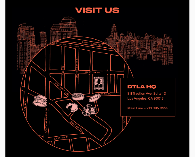
This component is used on the contact page to display a map. Note the hover states of the icons on the map.
Please also see attached screenshots for quick reference.
If no mobile designs provided, please use your best judgment for responsiveness.
Email [email protected] for the design password.
props: {
    title: {
        type: String,
        default: "Visit Us"
    },
    text: {
        type: String,
        default: ""
       // Mock as <h2>DTLA HQ</h2><address>...</address><p>Main Line - 213....</p>
    },
}
List any developer tips here
--color-red for the font color% so that is scales correctly.Not the hover states for all the SVGs
SVGs for illustrations can be found here: https://www.dropbox.com/sh/j5ddp8f4w8l3ii3/AAAZ1BC1JIgUBC2IKikh9xD2a?dl=0
Time estimate: 1.5hrs
Budget: $150
 React
React
A declarative, efficient, and flexible JavaScript library for building user interfaces.
🖖 Vue.js is a progressive, incrementally-adoptable JavaScript framework for building UI on the web.
 Typescript
TypeScript is a superset of JavaScript that compiles to clean JavaScript output.
An Open Source Machine Learning Framework for Everyone
 Django
The Web framework for perfectionists with deadlines.
 Laravel
A PHP framework for web artisans
Bring data to life with SVG, Canvas and HTML. 📊📈🎉
JavaScript (JS) is a lightweight interpreted programming language with first-class functions.
Some thing interesting about web. New door for the world.
A server is a program made to process requests and deliver data to clients.
Machine learning is a way of modeling and interpreting data that allows a piece of software to respond intelligently.
Some thing interesting about visualization, use data art
Some thing interesting about game, make everyone happy.
 Facebook
We are working to build community through open source technology. NB: members must have two-factor auth.
 Microsoft
Open source projects and samples from Microsoft.
 Google
Google ❤️ Open Source for everyone.
 Alibaba
Alibaba Open Source for everyone
 D3
D3
Data-Driven Documents codes.
 Tencent
China tencent open source team.