This covers some example code for Flutter framework by google using dart programming language.
- Flutter structure
- Scaffold and app bar widgets
- Colors and Text/add fonts
- Stateless widgets and hot reload
- Image assets from network and assets
- Buttons and icons
- containers and padding
- Rows
- Colums
- Flutter outline and shortcuts
- Expanded widgets

Before starting lets Remove These annoying lines before every widgets.....
open analysis_options.yaml and scroll down.
after rules paste this code
prefer_const_constructors : false
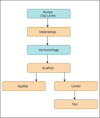
Root files of an app
import 'package:flutter/material.dart';

void main() {
  runApp(MaterialApp(
    home: Scaffold(
      appBar: AppBar(
        title: Text('Flutter by ratul'),
        centerTitle: true,
        backgroundColor: Colors.red[400],
      ),  //AppBar  <--
      body: Center(
          child:Text('hello flutter'),
      ), //Center  <--
    ),   // Scaffold  <--
  ));  // MaterialApp  <--
}
Inside text widgets I've done some styling
import 'package:flutter/material.dart';

void main() {
  runApp(MaterialApp(
    home: Scaffold(
      appBar: AppBar(
        title: Text('Flutter by ratul'),
        centerTitle: true,
        backgroundColor: Colors.red[400],
      ),
      body: Center(
        child: Text('Hello there this is body',
        style: TextStyle(
            fontSize: 20,
          fontWeight: FontWeight.bold,
          letterSpacing: 2,
          color: Colors.amber[400],
        ),
        ),
      ),
    ),
  ));
}
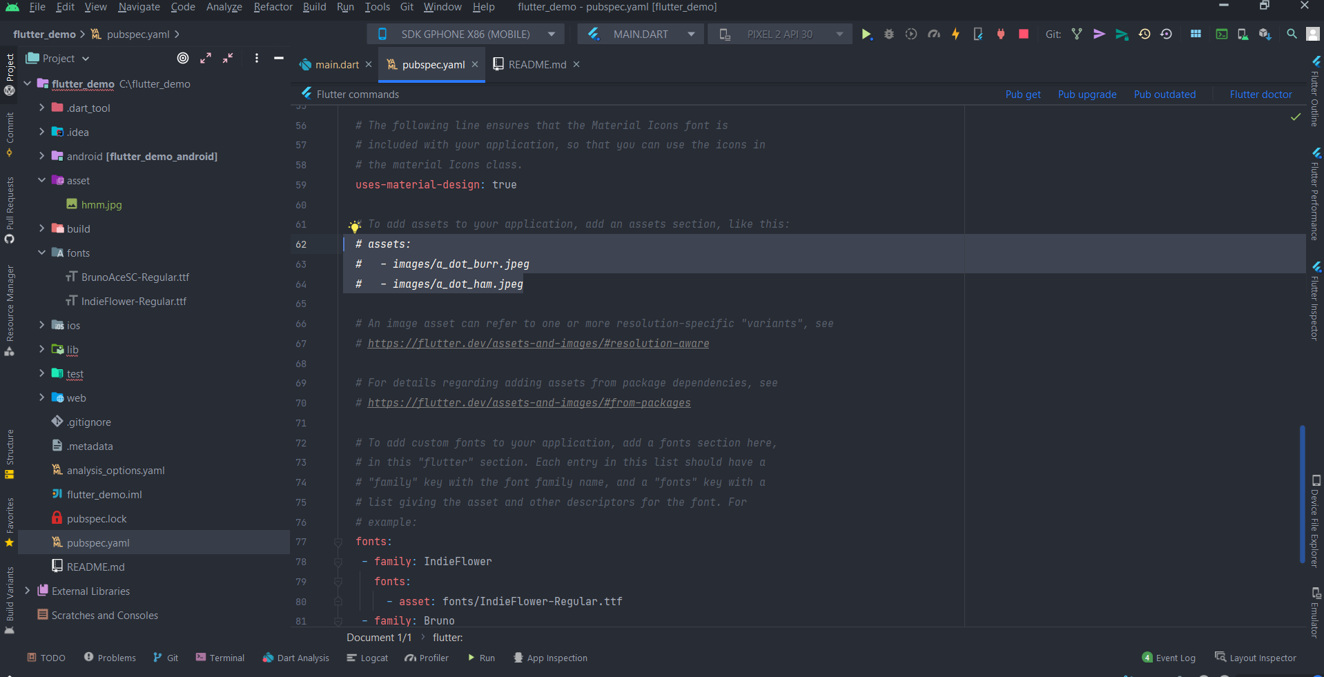
For example I've used https://fonts.google.com/ to download fonts
To import fonts download and make a directory in project called fonts and paste (Downloaded_fonts).ttf file.
Edit this part of pubspec.yaml file -->
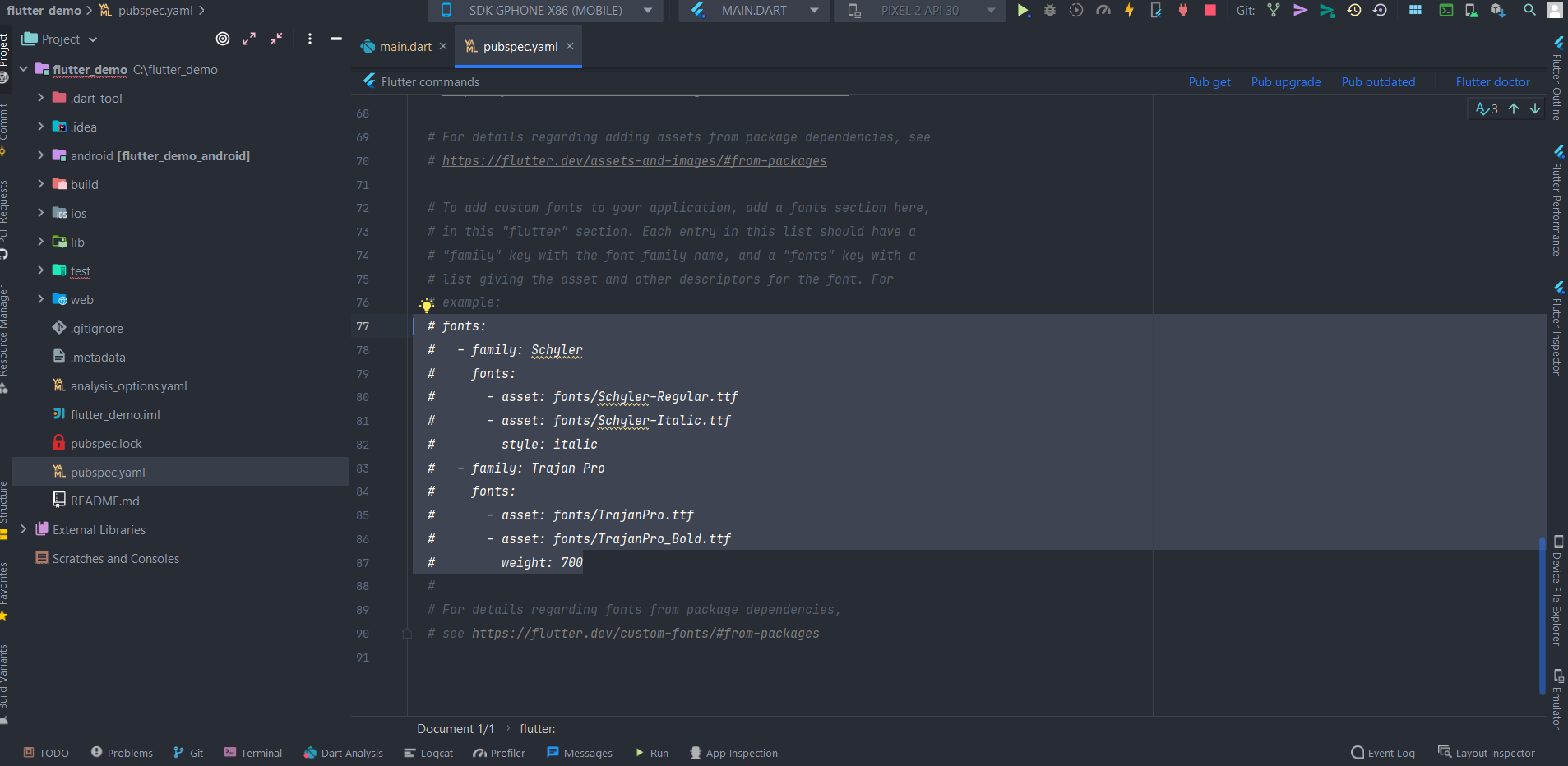
To uncommentctrl+/
To reverse back shift+tab
use shift+tab two times & then tab one time to allign properly
fontFamily: 'IndieFlower',
pubspec.yaml changed code -->
   - family: IndieFlower
     fonts:
       - asset: fonts/IndieFlower-Regular.ttf
   - family: Bruno
     fonts:
       - asset: fonts/BrunoAceSC-Regular.ttf
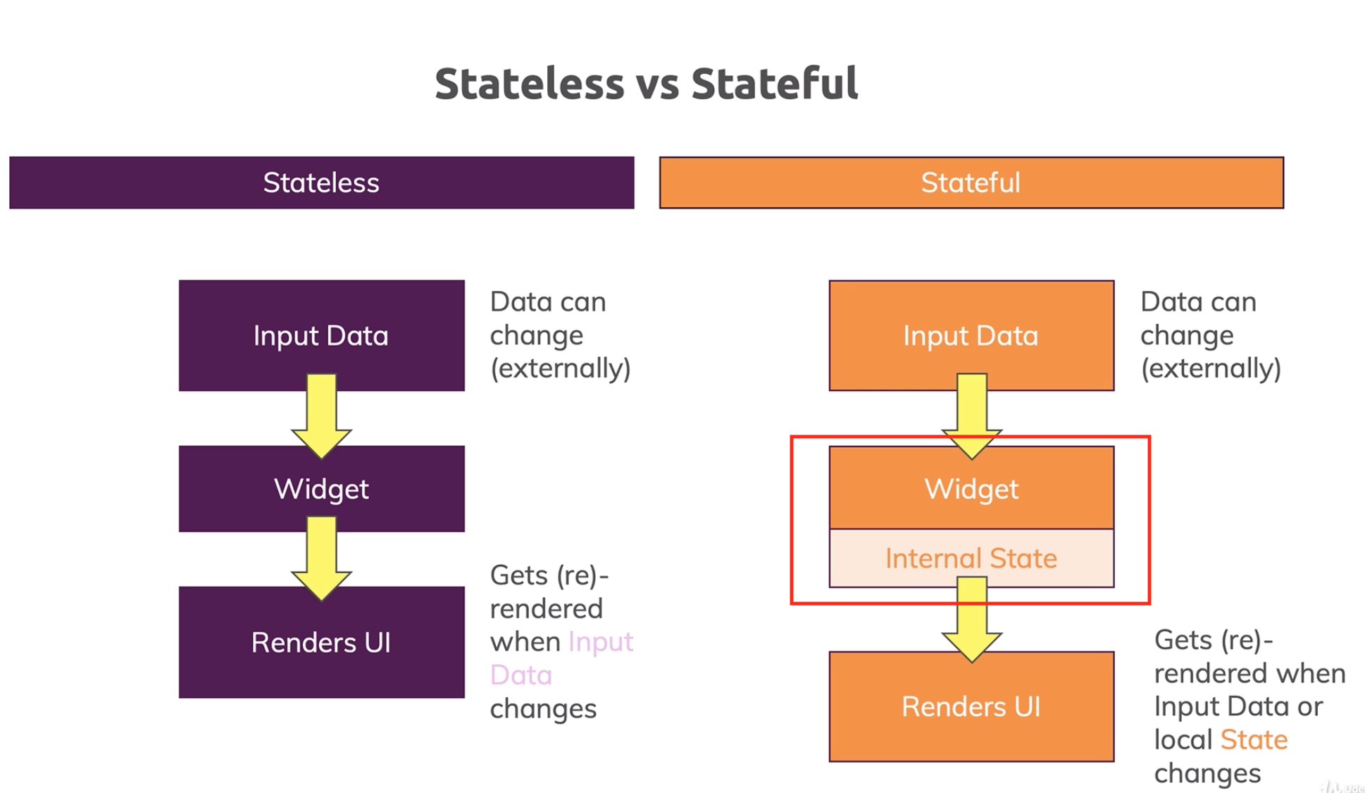
Tired of reloading again and again. So do Stateless widgets
To build the class with android studio use this shortcut Stateless and class will be created. Example::::
import 'package:flutter/material.dart';

void main() {
  runApp(MaterialApp(
    home: Home(),
  ));
}

class Home extends StatelessWidget {
  const Home({Key? key}) : super(key: key);

  @override
  Widget build(BuildContext context) {
    return Scaffold(
      appBar: AppBar(
        title: Text('Flutter by Ratul'),
        centerTitle: true,
        backgroundColor: Colors.red[400],
      ),
      body: Center(
        child: Text('Hello there this is body',
          style: TextStyle(
            fontSize: 20,
            fontFamily: 'IndieFlower',
            fontWeight: FontWeight.bold,
            letterSpacing: 2,
            color: Colors.amber[400],
          ),
        ),
      ),
    );
  }
}
ctrl + s to auto run and save
For network image
Image(
    image: NetworkImage('https://img-9gag-fun.9cache.com/photo/arox7VX_460s.jpg'),
        ),
For asset (image pubesc.yaml change code here) <--
Image(
    image: AssetImage('assets/hmm.jpg'),
    ),
shortcut
Image.asset('assets/hmm.jpg'),

so now lets create some buttons to press hudai for no reason.... less gooo... Here's some examples of button codes.....
OutlinedButton
OutlinedButton(
onPressed: (){},
child: Text('outlined button', style: TextStyle(
letterSpacing: 2,
fontWeight: FontWeight.bold,
fontSize: 30,
),),
),
FilledButton
FilledButton(
onPressed: () {
print('guta kn dili');
},
child: Text('filled button'),
),
ElevatedButton
ElevatedButton(
onPressed: () {
print('guta kn dili');
},
child: Text('Elevated button'),
),
MaterialButton
MaterialButton(
onPressed: () {},
child: Text('ok'),
),
FloatingActionButton
FloatingActionButton(
onPressed: () {},
child: Text('f'),
),
IconButton
IconButton(
onPressed: () {},
icon: Icon(
Icons.mail,
),
color: Colors.amber,
iconSize: 40,
),
ElevatedButton with icon
ElevatedButton.icon(
onPressed: () {
print('guta kn dili ');
},
icon: Icon(Icons.mail, color: Colors.red[400],),
label: Text('mail me',
style: TextStyle(
color: Colors.green,
fontFamily: 'Bruno',
fontSize: 15,
),
),
style: ElevatedButton.styleFrom(
backgroundColor: Colors.amber,
),
),

we can add padding, margins and unga bunga for containers
Example::
Container(padding: EdgeInsets.all(20),
          margin: EdgeInsets.all(20),
          color: Colors.blueAccent,
          child: Text('container'),
        ),
padding is the birer part
margin is the vitorer part
we use EdgeInsets.all or EdgeInsets.fromTRB or something like this to use margin or padding for our needs....
For multiple widgets entry in row wise we use rows widget.
Example:::
Row(
        mainAxisAlignment: MainAxisAlignment.end,
        crossAxisAlignment: CrossAxisAlignment.start,
        children: [
          Container(
            padding: EdgeInsets.all(20),
            margin: EdgeInsets.all(30),
            color: Colors.green,
            child: Text('one'),
          ),
          Container(
            padding: EdgeInsets.fromLTRB(20, 40, 20, 40),
            margin: EdgeInsets.all(20),
            child: Text('two'),
            decoration: BoxDecoration(
              color: Colors.red,
              border: Border.all(
                color: Colors.purpleAccent,
                width: 10,
              ),
            ),
          ),
          Container(
            padding: EdgeInsets.fromLTRB(20, 50, 20, 50),
            color: Colors.amber,
            margin: EdgeInsets.all(20),
            child: Text('three'),
          ),
        ],
      ),
mainAxisAlignment means align in horizontally as horizontal is the main axis for row. Oposite for the crossAxisAlignment.
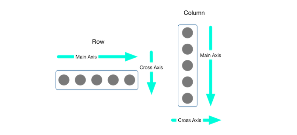
Column(
        mainAxisAlignment: MainAxisAlignment.end,
        crossAxisAlignment: CrossAxisAlignment.start,
        children: [
          Container(
            padding: EdgeInsets.all(20),
            margin: EdgeInsets.all(30),
            color: Colors.green,
            child: Text('one'),
          ),
          Container(
            padding: EdgeInsets.fromLTRB(20, 40, 20, 40),
            margin: EdgeInsets.all(20),
            child: Text('two'),
            decoration: BoxDecoration(
              color: Colors.red,
              border: Border.all(
                color: Colors.purpleAccent,
                width: 10,
              ),
            ),
          ),
          Container(
            padding: EdgeInsets.fromLTRB(20, 50, 20, 50),
            color: Colors.amber,
            margin: EdgeInsets.all(20),
            child: Text('three'),
          ),
        ],
      ),
Hover mouse over a function and a light bulb will appear. When press the bulb life jinga dala. You can wrap, remove or replace widgets with any other widgets without writing any code again.
Next on the right side there is a menu called flutter outline. open it. it will show nothing. Then press ctrl + function that I wanna see and then it will show full flutter tree there.
Center(
        child: Padding(
          padding: EdgeInsets.all(60),  //It's mainly  mergins space
          child: Container(
            padding: EdgeInsets.all(30),   // it's paddding or inside space
            color: Colors.amber,
            child: Text('helloo theee'),
          ),
        ),
      ),
we can use direct padding to for padding without a container.
For me if I forget
Row(
        children: [
          Container(
            padding: EdgeInsets.all(20),
            color: Colors.red,
            child: Text('one'),
          ),
          Container(
            color: Colors.green,
            padding: EdgeInsets.all(50),
            margin: EdgeInsets.all(20),
            child: Text('two'),
          ),
          Container(
            color: Colors.amber,
            padding: EdgeInsets.all(70),
            child: Text('three'),
          ),
        ],
      ),
Expanded widgets expands duh ( :| )
Row(
        children: [
          Expanded(
            flex: 4,
              child: Image.asset('assets/hmm.jpg')
          ),
          Expanded(
            flex: 10,
            child: Container(
              padding: EdgeInsets.all(30.0),
              color: Colors.red,
              child: Text('one'),
            ),
          ),
          Expanded(
            flex: 4,
            child: Container(
              color: Colors.green,
              padding: EdgeInsets.all(30.0),
              child: Text('two'),
            ),
          ),
          Expanded(
            flex: 5,
            child: Container(
              color: Colors.amber,
              padding: EdgeInsets.all(30.0),
              child: Text('three'),
            ),
          ),
        ],
      ),
here in flex: 3 flex means we can set the width any container will take. 3 means here it will take 3 portion of it's width.
without flex everything will take same space.
Lets do a simple app
import 'package:flutter/material.dart';

void main() {
  runApp(MaterialApp(
    home: Home(),
  ));
}

class Home extends StatelessWidget {
  const Home({Key? key}) : super(key: key);

  @override
  Widget build(BuildContext context) {
    return Scaffold(
      backgroundColor: Colors.grey[900],
      appBar: AppBar(
        title: Text('Flutter by Ratul'),
        centerTitle: true,
        backgroundColor: Colors.black54,
        elevation: 0, // removes the drop shadow from appbar
      ),
      body: Padding(
        padding: EdgeInsets.all(20),
        child: Column(
          crossAxisAlignment: CrossAxisAlignment.start,
          children: [
            Center(
              child: CircleAvatar(
                backgroundImage: AssetImage('assets/hmm.jpg'),
                radius: 40,
              ),
            ),
            Divider(
              height: 60,
              color: Colors.grey[800],
            ),
            Text(
              'NAME',
              style: TextStyle(
                color: Colors.grey,
                letterSpacing: 2,
              ),
            ),
            SizedBox(
              height: 10,
            ),
            Text(
              'Ratul Hasan',
              style: TextStyle(
                fontSize: 28,
                fontWeight: FontWeight.bold,
                color: Colors.amberAccent,
              ),
            ),
            SizedBox(
              height: 30,
            ),
            Text(
              'Company Name',
              style: TextStyle(
                color: Colors.grey,
                letterSpacing: 2,
              ),
            ),
            SizedBox(
              height: 10,
            ),
            Text(
              "Onnesok",
              style: TextStyle(
                fontSize: 28,
                fontWeight: FontWeight.bold,
                color: Colors.amberAccent,
              ),
            ),
            SizedBox(
              height: 30,
            ),
            Row(
              children: [
                Text(
                  'Email Developer :',
                  style: TextStyle(
                    color: Colors.grey,
                    letterSpacing: 2,
                  ),
                ),
                SizedBox(
                  width: 15,
                ),
                ElevatedButton.icon(
                  onPressed: () {},
                  icon: Icon(
                    Icons.mail,
                    color: Colors.red,
                  ),
                  label: Text(
                    'Email me',
                    style: TextStyle(
                      color: Colors.black87,
                      letterSpacing: 2,
                    ),
                  ),
                  style: ElevatedButton.styleFrom(
                    backgroundColor: Colors.amberAccent,
                  ),
                ),
              ],
            ),
            SizedBox(height: 15,),
            Row(
              children: [
                Text(
                  'Mail Address:',
                  style: TextStyle(
                    letterSpacing: 2,
                    color: Colors.grey,
                  ),
                ),
                SizedBox(width: 10,),
                Text(
                  '[email protected],',
                  style: TextStyle(
                    letterSpacing: 2,
                    color: Colors.red[400],
                  ),
                )
              ],
            ),
          ],
        ),
      ),
      floatingActionButton: FloatingActionButton(
        onPressed: () {
          print('guta dis na sagol');
        },
        child: Text('hehe'),
      ),
    );
  }
}

import 'package:flutter/material.dart';

void main() {
  runApp(MaterialApp(
    home: Home(),
  ));
}

class Home extends StatefulWidget {
  const Home({Key? key}) : super(key: key);

  @override
  State<Home> createState() => _HomeState();
}

class _HomeState extends State<Home> {

  int count = 0;

  @override
  Widget build(BuildContext context) {
    return Scaffold(
      backgroundColor: Colors.grey[900],
      appBar: AppBar(
        title: Text('Flutter by Ratul'),
        centerTitle: true,
        backgroundColor: Colors.black54,
        elevation: 0, // removes the drop shadow from appbar
      ),
      body: Padding(
        padding: EdgeInsets.all(10),
        child: Column(
          crossAxisAlignment: CrossAxisAlignment.start,
          children: [
            Center(
              child: CircleAvatar(
                backgroundImage: AssetImage('assets/hmm.jpg'),
                radius: 40,
              ),
            ),
            Divider(
              height: 60,
              color: Colors.grey[800],
            ),
            Text(
              'NAME',
              style: TextStyle(
                color: Colors.grey,
                letterSpacing: 2,
              ),
            ),
            SizedBox(
              height: 10,
            ),
            Text(
              'Ratul Hasan',
              style: TextStyle(
                fontSize: 28,
                fontWeight: FontWeight.bold,
                color: Colors.amberAccent,
              ),
            ),
            SizedBox(
              height: 30,
            ),
            Text(
              'Company Name',
              style: TextStyle(
                color: Colors.grey,
                letterSpacing: 2,
              ),
            ),
            SizedBox(
              height: 10,
            ),
            Text(
              "Onnesok",
              style: TextStyle(
                fontSize: 28,
                fontWeight: FontWeight.bold,
                color: Colors.amberAccent,
              ),
            ),
            SizedBox(
              height: 30,
            ),
            Row(
              children: [
                Text(
                  'Email Developer :',
                  style: TextStyle(
                    color: Colors.grey,
                    letterSpacing: 2,
                  ),
                ),
                SizedBox(
                  width: 15,
                ),
                ElevatedButton.icon(
                  onPressed: () {},
                  icon: Icon(
                    Icons.mail,
                    color: Colors.red,
                  ),
                  label: Text(
                    'Email me',
                    style: TextStyle(
                      color: Colors.black87,
                      letterSpacing: 2,
                    ),
                  ),
                  style: ElevatedButton.styleFrom(
                    backgroundColor: Colors.amberAccent,
                  ),
                ),
              ],
            ),
            SizedBox(height: 15,),
            Row(
              children: [
                Text(
                  'Mail Address:',
                  style: TextStyle(
                    letterSpacing: 2,
                    color: Colors.grey,
                  ),
                ),
                SizedBox(width: 10,),
                Expanded(
                  child: Text(
                    '[email protected]',
                    style: TextStyle(
                      letterSpacing: 2,
                      color: Colors.red[400],
                    ),
                  ),
                ),
              ],
            ),
            SizedBox(height: 40,),
            Center(
              child: Expanded(
                child: Text(
                  '$count',
                  style: TextStyle(
                    letterSpacing: 2,
                    color: Colors.green[400],
                    fontSize: 50,
                    fontFamily: 'IndieFlower',
                  ),
                ),
              ),
            ),

          ],
        ),
      ),
      floatingActionButton: FloatingActionButton(
        onPressed: () {
          setState(() {
            count+=1;
          });
        },
        child: Icon(
          Icons.add,
          color: Colors.black87,
        ),
      ),
    );
  }
}
type stf and it will create a Stateful class for you. Inside the widget declare variable and kaj kor.
to set state we have to use anaother widget called setState widget. It does unga bunga change inside the code or changes state.

 React
React
 Typescript
 Django
 Laravel
 Facebook
 Microsoft
 Google
 Alibaba
 D3
D3
 Tencent