You can access the files of this project, which analyzes people working in the field of data science according to countries and working wages.
First, we will download the libraries we will use.
For the dataset link of my work: https://www.kaggle.com/datasets/ruchi798/data-science-job-salaries
!pip install country_converter
import country_converter as coco
import pandas as pd
import numpy as np
import seaborn as sns
import plotly.express as px
import matplotlib.pyplot as plt
import pycountry
from wordcloud import WordCloud
import warnings;
warnings.filterwarnings('ignore')df.head()
!pip install pycountry
resi_country_list = []
comp_country_list = []
for country_code in df.employee_residence:
    resi_country_list.append(pycountry.countries.get(alpha_2=country_code).name)

for country_code in df.company_location:
    comp_country_list.append(pycountry.countries.get(alpha_2=country_code).name)

df['employee_residence'] = resi_country_list
df['company_location'] = comp_country_listdf.remote_ratio.replace([100,50,0], ['Remote', 'Hybrid' ,'On-site'],inplace = True)
df.experience_level.replace(['EN','MI','SE', 'EX'], ['Entry', 'Mid', 'Senior', 'Executive'], inplace = True)jobs = df.groupby('job_title').size().reset_index().sort_values(by=0,ascending = False)
jobs.head()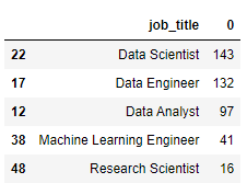
figure_size()
sns.set_style("darkgrid")
sns.barplot(x='job_title',y=0,data = jobs[:10],palette = 'magma')
plt.title('Top Jobs Titles')
plt.xlabel('Job Title')
plt.ylabel('Counts')
plt.xticks(rotation=45)
plt.show()
ax2= px.treemap(df,path=['job_title'],title="Top Job Titles")
ax2.show()
px.histogram(df, x=df.job_title.sort_values(), color = 'experience_level', height = 800, barmode = 'group',
             color_discrete_sequence=px.colors.qualitative.Dark24, template = "plotly_white",
             text_auto  = True, title = 'Count of number of people with all experience levels in each job')
figure_size()
px.scatter(df, x=df.employee_residence.sort_values(), y = df.company_location.sort_values(), color = 'remote_ratio',
           labels ={"x":'Employee Residence', "y":'Company Location', "remote_ratio":'Work Type'},
           color_discrete_sequence=px.colors.qualitative.Light24, template = 'plotly_white',
           title = 'Company Location VS Employee Residence for type of work(Remote, Hybrid or On-site)')
