Hello! This is a repository that I created for understand the Gryd-System and become a professional at the most scarefull part of WEB Development: RESPONSIVE. Until get there, I'll be using this repository to share my journey and also to help myself remembering the topics.
If you're reading this and have any doupt or tip/addition that can be helpfull, please contact me .
Thanks for visiting!
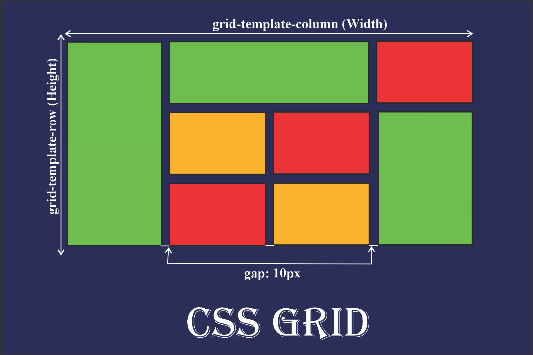
In a simple way we can define Grid System as a graphic design that divides your screen into lines and columns creating cells. The purpose of it, is to simplyfie the organization of components, pleacing them within specficly "blocks".This system provides a structured layout, making it easier to arrange and align elements on the screenHeres an example:
HTML
In your HTML, you'll need to include a container, represented by a class. The concept is akin to a real container - a box that houses elements and those ones are limited to the defined area of it

CSS
Here is where most of the things happen. The first thing is set the propertie grid in the container's class display

The next you step would set the tags grid-template-columns and grid-template-rows, which is going to define the number and size of columns and rows

In the example, 2 columns of 300px each is create, and also 2 rows of 1 fr each. You can add how many rows and colums you want, just need to enter a new comand like : 200px 1fr or 1rem.
This code could be improve by using the command repeat(), where you pass the number of rows/columns and sets the size

References
Video used in this code:
Link: https://www.youtube.com/watch?v=NvnJRLTG_5Y
Channel: Fernanda Kipper | Dev

 React
React
 Typescript
 Django
 Laravel
 Facebook
 Microsoft
 Google
 Alibaba
 D3
D3
 Tencent