Code Monkey home page Code Monkey logo

kimia-ui's Introduction

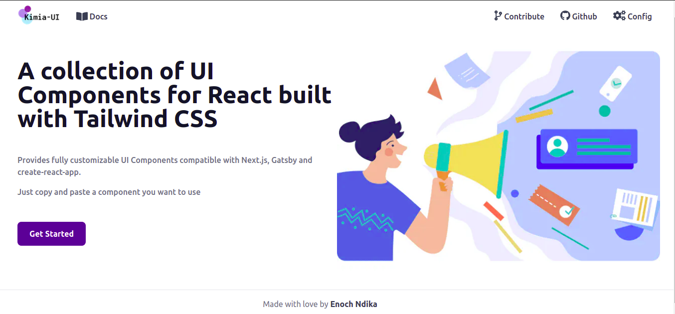
UI Components for React built with Tailwind CSS 3

Kimia-UI

Why this approach?

Tailwind CSS is a utility-first CSS framework for rapidly building custom user interfaces. Il allows you writing your style without leaving your HTML.

The biggest disadvantage of Tailwind CSS is the risk of having too long classes that will make our code not readable enough.

As React is component-based, we can extract component logic with its classes and reuse them elsewhere which will result in more readable code with more components and fewer classes.

That's why I have created this collection of UI components fully customizable. Just copy and paste a component you want to use

All the components are in the packages directory.

Each component contains 2 sub-directories

  • examples : contains examples for each variant of the component in TypeScript

  • snippets : contains examples for each variant of the component in plain React

๐Ÿ“‹ Add a new component

To add a new component :

Create your new directory in src/packages/{yourComponentName} Inside your folder, you will create 2 subfolders and one file

  • examples : will contains examples for your component in TypeScript**
  • snippets : Will contains examples in plain React and will be used as code snippet to copy
  • {your component name}.tsx will contains the logic of your components

Create your new file(route) in src/pages/components/{your component name}. Then you will import all the examples and snippets for your component

Browser Support

These components are compatible with all browsers

Chrome Firefox Edge Safari Opera

Contribution

If you would like to contribute on the project, fixing bugs, improve accessibility or open an issue, please follow our Contribution guide

First, run the development server:

npm run dev
# or
yarn dev

Open http://localhost:3000 with your browser to see the result.

kimia-ui's People

Contributors

ari7946 avatar enochndika avatar

Stargazers

 avatar  avatar  avatar  avatar  avatar  avatar  avatar  avatar  avatar  avatar  avatar  avatar  avatar  avatar  avatar  avatar  avatar  avatar  avatar  avatar  avatar  avatar  avatar  avatar  avatar  avatar  avatar  avatar  avatar  avatar  avatar  avatar  avatar  avatar  avatar  avatar  avatar  avatar  avatar  avatar  avatar  avatar  avatar  avatar  avatar  avatar  avatar  avatar  avatar  avatar  avatar  avatar  avatar  avatar  avatar  avatar  avatar  avatar  avatar  avatar  avatar  avatar  avatar  avatar  avatar  avatar  avatar  avatar  avatar  avatar  avatar  avatar  avatar  avatar  avatar  avatar  avatar  avatar  avatar  avatar  avatar  avatar  avatar  avatar  avatar  avatar  avatar  avatar  avatar  avatar  avatar  avatar  avatar  avatar  avatar  avatar  avatar  avatar  avatar  avatar

Watchers

 avatar  avatar  avatar  avatar  avatar  avatar  avatar  avatar  avatar

kimia-ui's Issues

How can we able to open and close multiple accordian headers independently in accordian component?

I want my multiple AccordianHeader to be open and closed , when we wish to close by clicking over that particular header.

Now, what code you provide, it works ( i.e. the user can open only single accordion at one time) but I want to open multiple accordian header as per my wish and close similarly, keeping different id for different Accordian are not empower to open.

Here is your code, just tell what changes need to be done to enable above feature.

import { useState, useRef } from 'react';
export const AccordionPage = () => {
  const [activeItem, setActiveItem] = useState('');
  const toggleActiveItem = (id) => () => {
    setActiveItem((prevState) => (prevState !== id ? id : ''));
  };
  return (
    <div>
      <AccordionHeader
        id="item-1"
        activeItem={activeItem}
        onClick={toggleActiveItem('item-1')}
      >
        Accordion Group Item #1
      </AccordionHeader>
      <Accordion id="item-1" isOpen={activeItem}>
        <p className="mb-4">
          Lorem ipsum dolor sit amet, consectetur adipiscing elit, sed do
          eiusmod tempor incididunt ut labore et dolore magna aliqua. Ut enim ad
          minim veniam, quis nostrud exercitation ullamco laboris nisi ut
          aliquip ex ea commodo consequat.
        </p>
        <p>
          Sed ut perspiciatis unde omnis iste natus error sit voluptatem
          accusantium doloremque laudantium, totam rem aperiam, eaque ipsa quae
          ab illo inventore veritatis et quasi architecto beatae vitae dicta
          sunt explicabo.
        </p>
      </Accordion>
      <AccordionHeader
        id="item-2"
        activeItem={activeItem}
        onClick={toggleActiveItem('item-2')}
      >
        Accordion Group Item #2
      </AccordionHeader>
      <Accordion id="item-2" isOpen={activeItem}>
        <p className="mb-4">
          Lorem ipsum dolor sit amet, consectetur adipiscing elit. Integer nec
          odio. Praesent libero. Sed cursus ante dapibus diam. Sed nisi. Nulla
          quis sem at nibh elementum imperdiet. Duis sagittis ipsum. Praesent
          mauris. Fusce nec tellus sed augue semper porta.
        </p>
        <p>
          At vero eos et accusamus et iusto odio dignissimos ducimus qui
          blanditiis praesentium voluptatum deleniti atque corrupti quos dolores
          et quas molestias excepturi sint occaecati cupiditate non provident,
          similique sunt in culpa qui officia deserunt mollitia animi.
        </p>
      </Accordion>
      <AccordionHeader
        id="item-3"
        activeItem={activeItem}
        onClick={toggleActiveItem('item-3')}
      >
        Accordion Group Item #3
      </AccordionHeader>
      <Accordion id="item-3" isOpen={activeItem}>
        <p className="mb-4">
          dales ligula in libero. Sed dignissim lacinia nunc. Curabitur tortor.
          Pellentesque nibh. Aenean quam. In scelerisque sem at dolor. Maecenas
          mattis. Sed convallis tristique sem. Proin ut ligula vel nunc egestas
          porttitor. Morbi lectus risus, iaculis.
        </p>
        <p>
          Nulla metus metus, ullamcorper vel, tincidunt sed, euismod in, nibh.
          Quisque volutpat condimentum velit. Class aptent taciti sociosqu ad
          litora torquent per conubia nostra, per inceptos himenaeos. Nam nec
          ante.
        </p>
      </Accordion>
    </div>
  );
};
/* Logic */
const style = {
  accordion: `overflow-hidden md:overflow-x-hidden transition-height ease duration-300 text-gray-600`,
  accordionHeader: `block focus:outline-none bg-gray-800 text-white border-b my-2 p-3`,
};
const Accordion = ({ children, id, isOpen }) => {
  const ref = useRef();
  const inlineStyle =
    isOpen === id ? { height: ref.current?.scrollHeight } : { height: 0 };
  return (
    <div id={id} className={style.accordion} ref={ref} style={inlineStyle}>
      {children}
    </div>
  );
};
const AccordionHeader = ({ activeItem, id, children, ...rest }) => (
  <div role="button" {...rest} className={style.accordionHeader}>
    {children}
    <span className="float-right">
      {activeItem === id ? (
        <AngleUpIcon className="mt-1 h-4" />
      ) : (
        <AngleDownIcon className="mt-1 h-4" />
      )}
    </span>
  </div>
);
const AngleUpIcon = (props) => (
  <svg
    fill="white"
    strokeWidth="0"
    viewBox="0 0 320 512"
    xmlns="http://www.w3.org/2000/svg"
    {...props}
  >
    <path d="M177 159.7l136 136c9.4 9.4 9.4 24.6 0 33.9l-22.6 22.6c-9.4 9.4-24.6 9.4-33.9 0L160 255.9l-96.4 96.4c-9.4 9.4-24.6 9.4-33.9 0L7 329.7c-9.4-9.4-9.4-24.6 0-33.9l136-136c9.4-9.5 24.6-9.5 34-.1z" />
  </svg>
);
const AngleDownIcon = (props) => (
  <svg
    stroke="currentColor"
    fill="white"
    strokeWidth="0"
    viewBox="0 0 320 512"
    xmlns="http://www.w3.org/2000/svg"
    {...props}
  >
    <path d="M143 352.3L7 216.3c-9.4-9.4-9.4-24.6 0-33.9l22.6-22.6c9.4-9.4 24.6-9.4 33.9 0l96.4 96.4 96.4-96.4c9.4-9.4 24.6-9.4 33.9 0l22.6 22.6c9.4 9.4 9.4 24.6 0 33.9l-136 136c-9.2 9.4-24.4 9.4-33.8 0z" />
  </svg>
);

Npm package

Are there any plans to publish the components as an NPM package?

Background scrolls when modal is open

Describe the bug
When any modal is open and user tries to scroll, the page in the background scrolls.

To Reproduce
Steps to reproduce the behavior:

  1. Go to 'https://kimia-ui.vercel.app/components/modal'
  2. Open any modal
  3. Scroll up or down'
  4. See the background page is scrolling

Expected behavior
When modal is open, user should be able to scroll only the modal contents if it has scrollable contents.

Screenshots
https://gyazo.com/d5a9336fd65f175f7b9ae8fee9c94f14

Desktop (please complete the following information):

  • OS: [Windows]
  • Browser [Chrome]
  • Version 90.0.4430.85

Smartphone (please complete the following information):

  • Not tested

Is there any plan to create Infinite Slider?

The above gif is the actual infinite slider component. I want to build this in ReactJS without manipulating DOM(without using prepend and append methods). I want to implement this by using transform CSS property with value as translateX(domWidth). I am able to slide each card in right and left directions, if any element is present in the right and left directions respectively.

However, I cannot translate smoothly (as shown in the GIF) to first card when I am at last card and click right arrow. Similarly, when I am about to translate to last card when I am at first and click left arrow.

How can I handle this extreme situation and create alike like attached?

Are you guys planning to build such a dynamic component ?
infinite_slider

Recommend Projects

  • React photo React

    A declarative, efficient, and flexible JavaScript library for building user interfaces.

  • Vue.js photo Vue.js

    ๐Ÿ–– Vue.js is a progressive, incrementally-adoptable JavaScript framework for building UI on the web.

  • Typescript photo Typescript

    TypeScript is a superset of JavaScript that compiles to clean JavaScript output.

  • TensorFlow photo TensorFlow

    An Open Source Machine Learning Framework for Everyone

  • Django photo Django

    The Web framework for perfectionists with deadlines.

  • D3 photo D3

    Bring data to life with SVG, Canvas and HTML. ๐Ÿ“Š๐Ÿ“ˆ๐ŸŽ‰

Recommend Topics

  • javascript

    JavaScript (JS) is a lightweight interpreted programming language with first-class functions.

  • web

    Some thing interesting about web. New door for the world.

  • server

    A server is a program made to process requests and deliver data to clients.

  • Machine learning

    Machine learning is a way of modeling and interpreting data that allows a piece of software to respond intelligently.

  • Game

    Some thing interesting about game, make everyone happy.

Recommend Org

  • Facebook photo Facebook

    We are working to build community through open source technology. NB: members must have two-factor auth.

  • Microsoft photo Microsoft

    Open source projects and samples from Microsoft.

  • Google photo Google

    Google โค๏ธ Open Source for everyone.

  • D3 photo D3

    Data-Driven Documents codes.