elvis-project / vis-ualizer Goto Github PK
View Code? Open in Web Editor NEW:bar_chart: A data visualization extension for various VIS projects.
:bar_chart: A data visualization extension for various VIS projects.


Provide a network data set of a four voice composition with pitch names, including octave designation.
@musicus, could you commit some sample data?
We should be able to select the second group cluster and be able to show it as an individual bar graph.
Creation of a simple interface for individual graphs, display options, export options, data swaps, color palette swaps, zooms, searches, highlight certain sections, etc.
These should be individual tickets, just floating the idea of a simple toolbar.
Ability to export all generated visualizations as .svg file (you've already done it).
The nodes that occur more frequently need to be larger in size in order to show degree centrality (a slightly altered data set need to be provided).
I would be great to have a button that reads explode with which a pie chart can be broken into pieces. The button should be a toggle and once pushed should read implode, so when pushed again the pie pieces are united into a circle again.
A drop down menu where the parts (soprano, alto, tenor, bass), and the overall score (no name) could be selected would be super useful.
Excellent. I see it has begun ... close this issue.
We need to start thinking about packaging VIS-Ualizer. Ideally it should be pip-installable, including dependencies. To use it should only require import visualizer from a python script.
For the individual bar graph it would be great to have a dropdown menu that would be dynamically populated (for the properly formatted CSV, or JSON data), for example graph bar 1, graph bar 2, ..., graph bar n, in order to quickly swap the data for faster comparison.
Of course...but I'm particularly thinking of these:
and/or
A y-zoom on the piano roll would be useful.
You can re-use the data from the bar-graphs.
We need to have an index pages that lists all the graph types. Once a graph type has been selected then only that particular graph type (and its individual page) will be displayed.
When hovering over a pitch stream a pitch name hover should appear.
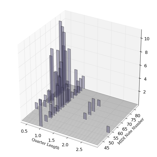
This will spawn probably a series of other issues: There should be a piano roll. Here is an example. It'd be great if one could zoom into specific sections, and of course scrolling (perhaps animated).
Provide network data set for four voices in MIDI pitches to be used in a larger network graph.
We should be able zoom in and out with two corresponding buttons. This is helpful when dealing with many clusters that may have many bars.
Mike Bostock wrote a guide on how re-usable chart code ought to be structured: http://bost.ocks.org/mike/chart/
Should we follow this structure?
Being able to toggle rounded lines / straight lines.
What types of visualizations do we want to have?
There is a graph called a Dolan Plot. We should have that one as well. However, I will need to get data for you. It is very similar to the piano roll, but only plots if the entry of an instrument exists or not, and its dynamic levels ...
OR
Nodes (in the force directed graphs) should not overlap, and not touch each other.
Sometimes a piece can have a G# and an Ab, which on a piano roll would occupy the same space, (are called enharmonically respelled pitches). The voice containing the pitch should change the color shade to either lighter or darker to indicate whether the default pitch or the enharmonically respelled pitch was used.
Upload network data that includes data to show degree centrality, in order to scale nodes in order of importance.
So that we can scale the nodes.
We should have a colour-blind friendly colour scheme option for the heat maps.
The data utilized here is similar to clustered bar graphs:
OR
For clustered bar graphs it would be great to have a dropdown menu that would be dynamically populated (for the properly formatted CSV, or JSON data), for example set 1 (consisting of first group, second group, and third group), set 2, ..., set n, in order to quickly swap the data for faster comparison.
We should be able to zoom in and out.
A declarative, efficient, and flexible JavaScript library for building user interfaces.
🖖 Vue.js is a progressive, incrementally-adoptable JavaScript framework for building UI on the web.
TypeScript is a superset of JavaScript that compiles to clean JavaScript output.
An Open Source Machine Learning Framework for Everyone
The Web framework for perfectionists with deadlines.
A PHP framework for web artisans
Bring data to life with SVG, Canvas and HTML. 📊📈🎉
JavaScript (JS) is a lightweight interpreted programming language with first-class functions.
Some thing interesting about web. New door for the world.
A server is a program made to process requests and deliver data to clients.
Machine learning is a way of modeling and interpreting data that allows a piece of software to respond intelligently.
Some thing interesting about visualization, use data art
Some thing interesting about game, make everyone happy.
We are working to build community through open source technology. NB: members must have two-factor auth.
Open source projects and samples from Microsoft.
Google ❤️ Open Source for everyone.
Alibaba Open Source for everyone
Data-Driven Documents codes.
China tencent open source team.


